New Work

Surviving Winter In MI, Or Unleashing My Inner Bob Ross

I am like a plant. If I don’t stand in the sun every day I wilt. Unfortunately, I also live in Michigan and I am more wimpy about the cold with each year that passes. Incidentally, I have not been outside as much as I should over the last 2 months. I am always a big fan of if you can’t be outside, bring the outside in so I recently started doing something I never thought I would do after university classes … Painting landscapes!

Though I feel most at peace during a walk in the woods, I always shied away from nature paintings because I tend to lose interest creating something that one could easily just look out their window or at a photo to see. But then I remembered Eyvind Earle, who did the breathtaking background illustrations for Disney’s Sleeping Beauty. He was able to capture a dreamlike quality in his landscapes that still showed us a world that was comforting and familiar, but that we couldn’t quite access in our waking hours.

Growing up in Midland, MI one of our local landmarks is Dow Gardens, a Japanese style garden that celebrates color and geometry. I chose this place as the subject for my first largescale landscape, replacing the blues and greens with purples, yellow ochres, teal, black, and burgundy. I embellished with abstract patterned upholstery fabric for some of the trees, floral cutouts and lily pads for the foreground, and accented some of the rocks and branches with metallic acrylic.

I actually just finished the above piece this past weekend though I started it before my triptych below. Just as I was starting my landscape, I was contacted by King’s Daughters Assisted Living, also in Midland (I live only a city over now but still work in Midland!), to come up with a piece of art for a blank wall they had that would tie together their newly renovated space. I was excited to not only put my painting brain, but my interior design brain as well, to use for this project. The new upholstery and decor was all in blues and greens, but much of the carpet in this mid-century-modern building was a brilliant fire engine red, and that was staying. I immediately thought of the red bridge at Dow Gardens, and suggested this nature scene as a way to tie together the carpet and the new furnishings. Many of the residents at King’s Daughters lived in Midland for decades, and being surrounded by images of familiar places brings joy and comfort, especially for those struggling with memory.

I’m inspired to capture more locations from my own past as I continue to develop my acrylic painting, a relatively new focus for me. Maybe some architecture will be next!

Advertisement
Standard
Interior Design

Pantone Color Of The Year 2019: Living Coral

One of the most exciting things about the changing over of a new year is finding out what Pantone’s new Color Of The Year will be. No, I’m not kidding – I am a dork. Purple being my favorite color, I knew 2018’s Ultra Violet hue was going to be hard to beat. 

2019’s Living Coral is by no means an unpleasant color, but it isn’t a color I wear a lot or use in my art or design. I think it’s a little too pastel and preppy for me, but I’ve found I like it infinitely better when paired with black or grey, because black makes everything better. This was my philosophy with making some original-to-the-house bright yellow and silver foil wallpaper work in my bathroom update last year, and this personal rule of mine has held up!

I was hard pressed to even find any art I have done over the last 10 years that included this coral hue aside from “The Rush Hour”. This piece of art can be seen below, along with some of my favorite interiors, wallpaper, fabric, clothing, and flowers that pay homage to our 2019 Color Of The Year.

I am going to make it my goal now to create some coral colored artwork for the new year! I’m excited to see what comes from working with unexpected colors.

Enjoy the last wee bits of 2018 everyone! I hope it’s been a good one!

Standard
New Work

I’m Back With Some New Art!

This first piece in a new series was a long time coming … I am obsessed with working small, and tend to work in 11×14 or maybe 16×20 max, and wanted to start doing pieces that were at least 18×24 or larger to allow me to include more detail and further develop the background in my pieces. My new series, Dwell, really taps into my background of interior design study. These pieces will contemplate how our environment affects us, but also how we interact with and affect it. The word dwell also has a double meaning, not just the physical space where we live but the places we create inside us that we allow our mind to dwell in. How are these psychological spaces affecting us, and how much control do we have over them or they over us?

“Dwell In Possibility” was a challenge for me because it involved a lot of brown, a color I literally never use in art. I tend to create pieces that are mostly grayscale tones with pops of bright color, and gray just would not have been right for the earthy feeling I wished to evoke. The other challenge to this piece was that I was creating an interior that was not very attractive or intricate … the remains of a decaying building, dirt floor, rough wood paneled walls, weathered plaster ceiling once grand but now stripped of any color or design … The only furnishing an abandoned, sun bleached chair frame.

dwell in possibility

I did a lot of layering of different media overtop one another, and used my clear prismacolor pencil blender for the first time in my entire life. I usually use a white pencil to blend, but this time I couldn’t use an opaque blender because I wanted to be able to still see the underlayer of watercolor through the blended pencil. I left the flowers and hair purely impressionistic watercolor as opposed to the detail in the background and the model’s face. I didn’t use as much dimensional mixed media as usual, not wanting to add too much clutter, and stuck to a lace fabric overlay on her dress and clusters of beads for the centers of the poppy flowers.

dwell in possibility progress

The closer you look, you will see there is a lot more going on than just a smiling woman holding a bouquet. She is already stationed in an odd setting, an old deteriorated building. She is surrounded by decay, including uprooted, dying plants. Even some of the flowers in her hands are dead or dying, but they are slowly coming back to life as she grasps onto them, holds them and nurtures them. Behind her through the door there is a cavern of light, where a grand tree has taken hold. There are no leaves yet, hardly any soil for his roots to grasp onto, yet he is still alive somehow. Robins circle around, a bird that symbolically means rebirth. Change and growth are always possible.

As you can also see, I can’t seem to put down the metallic gold acrylic lately! At work, my students always want to cover everything they make in metallics and glitter, which often makes me shake my head, but I can understand the temptation ;). Speaking of which, I am starting a new class called Creative Minds where each week students will be learning about an accomplished artist of the past or present, and completing a small project based on that artist’s iconic style with a focus on artists with disabilities and mental health. I will be sharing my projects as well as some of the students’ interpretations, so be on the look out for a new project post each week! I am hoping some of you reading this will want to try it at home yourself. It’s always fun to play :D!

Standard
Interior Design

Bathroom Remodels – Inspirations On The Cheap!

I became a first time home buyer as of this summer, falling in love with a house that had great bones, a lot of potential, but some wacky aesthetic choices. The home had a single owner which was great … except that owner looked to have not made any design changes since she first moved in.

My boyfriend and I are both young-ish and not super rich, but there was no way we could live in this. So began a journey of creativity, (some blood while ripping out tack strips and carpet staples), sweat, and tears.

Bathrooms can be hands down the most expensive rooms to renovate. We really had to scrimp in some areas since we were trying to renovate an entire house in a little under 6 months. If you have a bathroom you hate that at least has fixtures that are in working order, it is completely possible to get creative and change the look without having to replace major features such as the toilet, tub, vanity, or even lighting.

This is what we started with. You can’t tell as much in the photos, but NOTHING matched! The stain on the door was different than on the paneling which was different than on the vanity. Mixing wood tones can be cool, but in a room this small … yikes! There was also silver in the (actually pretty nice) foil wallpaper as well as chrome hardware in the room but the mirror and lighting fixture were a brushed brass. The window was painted white as was the trim and the door to a small cabinet set into the wall, which was a bit odd, and the window had a scalloped decorative molding around it that just wasn’t doing anything for the overall look. The floor was just unfinished cement which we took as a blessing since we figured if there had been floor, we just would have been ripping it out :P. To me, the vanity and the lighting fixture were the biggest eyesores. However, we ended up spending over our predetermined lighting budget on new lighting fixtures for the rest of the house. Also, after many agonizing trips to every hardware and “everything” store in the area as well as many online perusals, we learned that it was going to be more costly than expected to have a vanity at least as big as the one we already had in the room. We were going to have to end up sacrificing either size or quality or both, and it just didn’t make sense to replace our current vanity with something smaller and less functional or with less longevity just to have a more modern look.

Just like The Rolling Stones said, Paint it black!

People seriously underestimate the difference a coat of paint can make. They always say you aren’t supposed to paint small rooms in dark colors, but rules were made to be broken. I have always loved black and golden yellow together, and I knew I wanted to keep the wallpaper in this room as the one thing original to the house. Keeping the room from being broken up into a bunch of smaller sections by having the half paneling flow right into the floor by using a deep black on both helps make the room feel less closed in. Painting the paneling a modern gloss black turns it from grandma’s house to vintage chic. I used the same gloss black on the vanity, which downplayed some of the carving and details on it I’d felt were too old-fashioned for my taste. All the molding and window trim in the house is white, so we wanted to keep that still. To tie that in as well as the white and cream swirl finish on the counter and the white tile in the shower, I spray painted the hardware with white lacquer spray. I used Rustoleum black gloss enamel on the mirror and lighting fixture. We used stick-on floor tiles in a black marble for the floor, which are super inexpensive but look way nicer than just putting in linoleum. They are not at all complicated to install oneself as they are literally  like giant stickers and you just keep building around the first tile you put in, keeping one flush to the other.

I made the funny (yet super convenient) little closet just a part of the woodwork by painting it in the same black as well, and following the design of the vanity by keeping the hardware gloss white. The bathroom window is very large, and people tend to be nude in the bathroom so we definitely needed a curtain. I didn’t want to add in another pattern with the wallpaper being so wild already but didn’t want it to look like we just had a big black sheet over the window either. So, I opted for a matte-on-shiny subtle pattern, in black again for consistency. You can’t see it, but FYI, we removed the scalloped edge on the window! The fun black and white artwork is actually a matted and framed page from an art magazine. Magazines are some of the best sources for inexpensive artwork if you need something in a smaller size.

I am well aware that not everyone would want to make friends with this wallpaper, but the same techniques I used can be adopted to fit any style. There were so many different simple choices that could have been made to lend vastly different results in this room. If someone wanted to keep the wallpaper but give the room a more cute, shabby chic, cottage look they could have painted all the woodwork white instead of black. A soft grey would have also been an option. The mirror and vanity lighting could have been painted white or grey to compliment the paneling color choice, or just finished in chrome to match with the sink and shower hardware. The wallpaper could have been ripped down and any color paint imaginable could have been put in its place for a more simple, traditional look without the retro nods. Or, it could have been painted and wall stamps, decals, or stencils could have been used over-top to add some pattern. The ideas could go on and on, and all without having to do any major construction or buy a bunch of new stuff. Remember, something like this can also be a great intermediary step so you can still be comfortable while you wait and save up for a complete overhaul. You don’t have to wait to win the lottery before you can love your home! 🙂

Standard
Interior Design, Project Ideas

Back After Design Overload!

Ok, so I have not posted at all really in the last 2 months. Shown below is the reason why…

I mentioned in my long ago previous post that my boyfriend and I had just purchased our first home. Well, as you can see the interior is pretty retro, though sadly not in the cute, hip, etsy sort of way. We have been doing a lot of DIY renovations, and though stressful and time consuming, it has also been such a rewarding experience to put my design skills to the test and recreate a whole house interior to my own specific tastes (Well, almost my own. There was my boyfriend to consider as well, and yes, there were fights, but we still love each other <3.). It’s hard to believe it was only a year ago I was working with my parents on their bathroom renovations. Granted, my budget as a just starting out 20-something was quite different ;), but that’s where creativity comes in! Our home hardly resembles these before pictures now, and we are nearing the home stretch. I don’t want to post any photos until everything is completely transformed, so be sure to check back later for the big reveal.

I am a person who fancies many different aesthetics, so the hardest part was deciding exactly what way we wanted to go with our renovation. Here are some of my favorite DIY renovations I’ve spotted for each major room.

Living Room

modern-white-blowing-font-b-tree-b-font-font-b-wall-b-font-font-b-decal

Trees and other nature forms are one of my favorite accents for interiors because their shapes and sizes are limitless, and at least for me, bringing the outdoors in has calming qualities. Decals including the one shown above are available everywhere online, but can be pricey (This one would end up totaling $150 for all 3 pieces.). Simple branch forms are something even a non-drawer can put on their wall if they make a pattern or outline on the wall before painting. When you do it yourself, not only do you save money but you have more control over the color and shape of your design. A wall design should fill blank space to make a room look more balanced, and compliment the arrangement and flow of the furniture placement, as seen above.

Kitchen

If you spend any time on Pinterest, you will know that Scrapbooking paper has become as all purpose as duct tape. You can even use it to create a unique, artsy looking backsplash. Tile can be ultra expensive, but you can still get a fun tiled look using squares of scrapbooking paper, affixed and sealed with mod podge or any other clear sealer. From my experience, mod podge can sometimes still have a slightly “sticky” feel even after cured. There are a variety of other slightly more expensive sealers available at any local craft store that provide a better finish. It is key to use a gloss finish so any food splatters can be easily wiped off, and to remember that if your surface your are affixing the decoupage to is bumpy or rough, your finished design will be bumpy and rough. Sanding is your friend when affixing any sort of backsplash :).

Bathroom 

1420874190735

What’s great about this superhero themed bathroom from DIY Network is that once you repaint the shelving, change the accents, and switch out the comic book style artwork it can be re-themed at the home owner’s whim. I am a big fan of leaving the bones neutral so that you are not locked into a certain theme or style forever. Though this design was themed as a “little boy’s” bathroom, I personally believe it could also be a fantastic adult woman’s bathroom ;), and was actually planning on doing a superhero themed bathroom in our house until we happened to find a home with dreamy vintage floral wallpaper that we wanted to save.

Bedroom

our-humble-abode-blog-guest-bedroom

For whatever reason, I hate headboards. However, I am obsessed with finding ways to add extra shelving and storage in general. My boyfriend and I are both bibliophiles, so I thought this unique setup from Better Homes and Gardens was a great way to provide adequate shelving for books while staying space efficient, and giving a finished headboard look by bordering the top of the bed with blank wall. The sconces for extra reading light are a great functional idea as well.

Office

If you love color but don’t actually want to commit to rainbow walls, taping up paint swatches is an easily changeable idea. I love the creative genius vibe from the picture on the left, and can easily imagine notes and project ideas scribbled on each of the swatches as well, using the decoration as a kind of living idea board. If you find that look too chaotic, there is the more contained, orderly version on the right.

The final step in any interior re-do, which I will be starting on soon, is filling in with finishing touches such as artwork and other decor. These small final details often make the biggest impact in your space. Don’t just buy canvas prints from Bed Bath and Beyond, it is worth searching the online marketplace for original designs by working artists that are oftentimes more affordable and so much higher quality than mass produced, big box store pictures. Some wonderful sites include Redbubble, Society6, Zazzle, Ebay, and DeviantArt. It’s also worth checking out the Facebook marketplace if you use Facebook. I sell original artwork and prints on many of these sites, and have included links below. I also work with my art students, who are primarily adult artists with disabilities, in empowering them to market and sell their artwork in both our organization’s Ebay Store and Redbubble Shop. Besides art prints, many of the students enjoy glass and ceramics painting which make for great one-of-a-kind accent pieces.

Happy designing!

My Moongirl Designs Redbubble Shop

Moongirl Designs Ebay Store

Moongirl Designs Zazzle Store

Moongirl Designs Society6

Standard
Art Education, Techniques and Tutorials

Colors Aren’t Scary! Understanding The Color Wheel.

A new Artshop semester has started at Creative 360.  One of the biggest concerns my students bring to my attention in classes is “How do  I know which colors to use?” What colors can they mix together, and what colors basically turn to poo the moment they touch each other? Everyone probably has some vague memory of the color wheel from way back when in elementary school art class, but few remember what it actually is aside from a pretty rainbow circle.

printable-color-wheel-tertiary-colors2

Primary colors are like the color gods and goddesses. They are colors you don’t mix anything to get, they just are, and they are used to create all other color life. See the starred sections above, red yellow and blue. In between the primary colors, the color wheel shows you what will happen if you mix two of them together. For example, in between the red and blue space are various shades of purple, depending on if you mix in more red or more blue. If you mix all 3 primaries together, you get a neutral color (brown or grey/black depending whether there is more warm red or yellow, or more cool blue present).

Contrasting colors are colors that are opposite each other on the color wheel, note the black connecting line. Contrasting colors as a rule look amazing together due to how boldly they play off of each other (There are a lot of sports teams I can think of whose colors are blue and orange for example, and I don’t even follow sports!). However, if you mix them to try to make a new color, they will completely neutralize each other into a grayish or brownish color. Remember how all 3 primaries mixed together make a neutral? Well, think of why this would happen when you mix orange and blue, contrasting colors, together… Orange is made with red and yellow, add the blue, and you have all 3 primaries mixing.

Complementary colors are colors that are right next to each other on the color wheel. Because they are very similar, these colors always look pleasing together as well.

Look familar? The artwork on the left uses a contrasting color scheme of red and seafoam green. On the right a complementary color scheme is used with all different shades of purple, and some pink and dark red accents.

These color pairings aren’t just for artwork, they work well in interiors and clothing as well. Below is an interior idea based on my watercolor painting “If The Ocean Dreamed” that I mocked up on Polyvore, which is a really fun interior and style designing website to play around on. All items you can add to your “set” include links where they can be purchased as well.

47120f53515b0118a06ceaa705a7ea3b

Once you’ve got the gist of it, you can become a C O L O R  M A S T E R and even get tricky and combine both contrasting AND complementary color schemes in one, like below. This is another fun set I put together on Polyvore using clothing I am selling on zazzle covered in my original artwork. This tank top features my piece, “Be My Eyes”. In styling this outfit, I used the contrasting color scheme of yellow and purple with the gold and plum apparel, but also added in some pink with the accessories as pink is a reddish hue that would be next to purple on the color wheel.

dfd8dc78bad5b070db0f0489b770551e1

The last type of basic color scheme is triadic. A triadic color scheme uses three colors that are equidistant from each other on the color wheel. Using only the primary colors red, yellow, and blue would be a triadic scheme as they are spaced equally apart on the color wheel. Another triadic scheme is green, orange, and purple, which I’ve used in the interior below.

344a8aa27feebce0011ec12180c5868d1

Appropriate that I will be going on an adventure to Lowe’s to collect paint chips shortly after I post this as my boyfriend and I will be moving from an apartment into a new home by mid June, and this means …. I can paint the walls! 

I have to end this post like a proud art-parent with a selection of my Artshop students’ work from my watercolor class last semester. Looking forward to teaching another great class!


Standard
Interior Design

Retro Tile Bathrooms Before and After

Even though I studied interior design in college and ended up going in a different direction afterward, I still love it. From time to time, I do still assist friends/family/acquaintances with their designing woes, and I’ve had a couple of fun opportunities over the last year or two to work with my parents in updating my childhood home. I worked with them to choose fixtures, finishes, and furnishings for the home’s guest and master bath, and they used a kitchen and bath design business and a remodeling contractor from the local Midland area to bring the project to completion.

My parents and I have pretty different design styles. They can be a little uneasy at times about bold colors, and favor timelessness. My mother definitely has a traditional style, and is not one of those people who wants to change a design up every other year (or even every 5). She especially wants more “permanent” aspects such as tile and cabinetry to be something neutral so that the space can be updated in the future if need be with not much more than a different color of paint on the walls.

The house’s original bathrooms were done up in (now vintage) tile, as were many in the neighborhood when originally built. My best friend down the street actually had an identical guest bathroom to ours, only accented in white instead of grey and sans crazy wallpaper. We decided to pay homage to the origins and stay with the idea of retro, bold, fun tile, but this time in black and white.

wp-1472597936784.jpg

Before: I may have mentioned the original guest bathroom was pink. In fact, this bathroom was just so into being pink that even the door and the window molding is pink. This is basically Dolores Umbridge‘s dream bathroom. It’s so odd and distinctly vintage, however, that it did have a certain charm and I was a little bummed to see it go. Yes, the ceiling is wallpapered – pretty trippy.

blue-bath-montage.jpg.jpg

After: Saying bye-bye to the original vintage was so worth it, however, for the end result. Since we didn’t have to worry about the guest bathroom transitioning into a bedroom like we did for the master bath, we could go with a fun color not present anywhere else in the house, and chose a cheerful pool blue. Being the only color present that isn’t a neutral, the room is pleasant even for those who don’t like to be surrounded by rainbows 24/7. The white is broken up by pops of black in the striping and the textile accents. The ceiling is still kind of fun, though certainly not wallpapered! I chose a paler shade of blue rather than just going with a stark white to balance the already ever present, high contrast, bold blue- to – bright white transitions. My parents also love antiques, and there is a variety of vintage glassware and decor scattered throughout. We also chose some unique vintage inspired hardware that further adds to the little air of whimsy in this room. The artwork on the wall is a print of one of my watercolor and ink pieces, The Idealist.

wp-1472597943538.jpg

Before: The master bath had already been through one soft redo in the 90s due to some cabinetry that was not faring too well. It had mainly been done for utilitarian reasons, and had pretty much the opposite problem of the guest bathroom … it was very, very bland.

gold-bath-montage.jpg.jpg

After: Hello, gold! Black and gold play off of each other so well, so a lot more black was incorporated into this bathroom. The cabinetry and shower are opposite each other, so to balance all the white tile with the dark counters we outlined the shower itself and the inset shelf in black tile, and used a more concentrated floor tile. The photography on the walls are photos of birds my dad took, one of his hobbies being hiking and “collecting” birds on his journeys via snapshots. And, of course, more vintage glassware (I have an addiction! Luckily, they love it too).

Another fun project completed! Next, my parents will be picking my brain about the living room. Maybe I can talk them into more brightly colored walls … maybe even purple! Only time will tell ;). (Mom, if you are reading this, I promise I’m joking).

Standard
Interior Design

8 Interior Essentials For A Happy, Interesting Space

When I finally got a dependable, non-commission-based-or-freelancing-big-person-job last year, my boyfriend and I talked and decided after 4 years it was a good time to pull our resources and find a place together. Unfortunately, fall and winter got super busy and then it was the holidays and then it was march and we had visited ZERO houses. So, in order to not make a hasty decision about something super important, we decided I could chill in my one bedroom apartment a little longer and keep saving money until we found somewhere awesome to live. I have to say, the place has its benefits. Though extra space is not one of them, it is:

A) Within walking distance of Mooney’s Ice Cream. I don’t need to explain what an asset this is. In a list of cohabiting concerns, not being close enough to 30+ delicious varieties of ice cream  cones at whim was right up there with having stinky socks piled on top of my reading chair. So basically, a pretty big deal.

B) I’m on the second floor and have a fun little balcony that is just excellent for drinking wine upon at night on summer evenings. We call it the veranda … what are delusions of grandeur again?

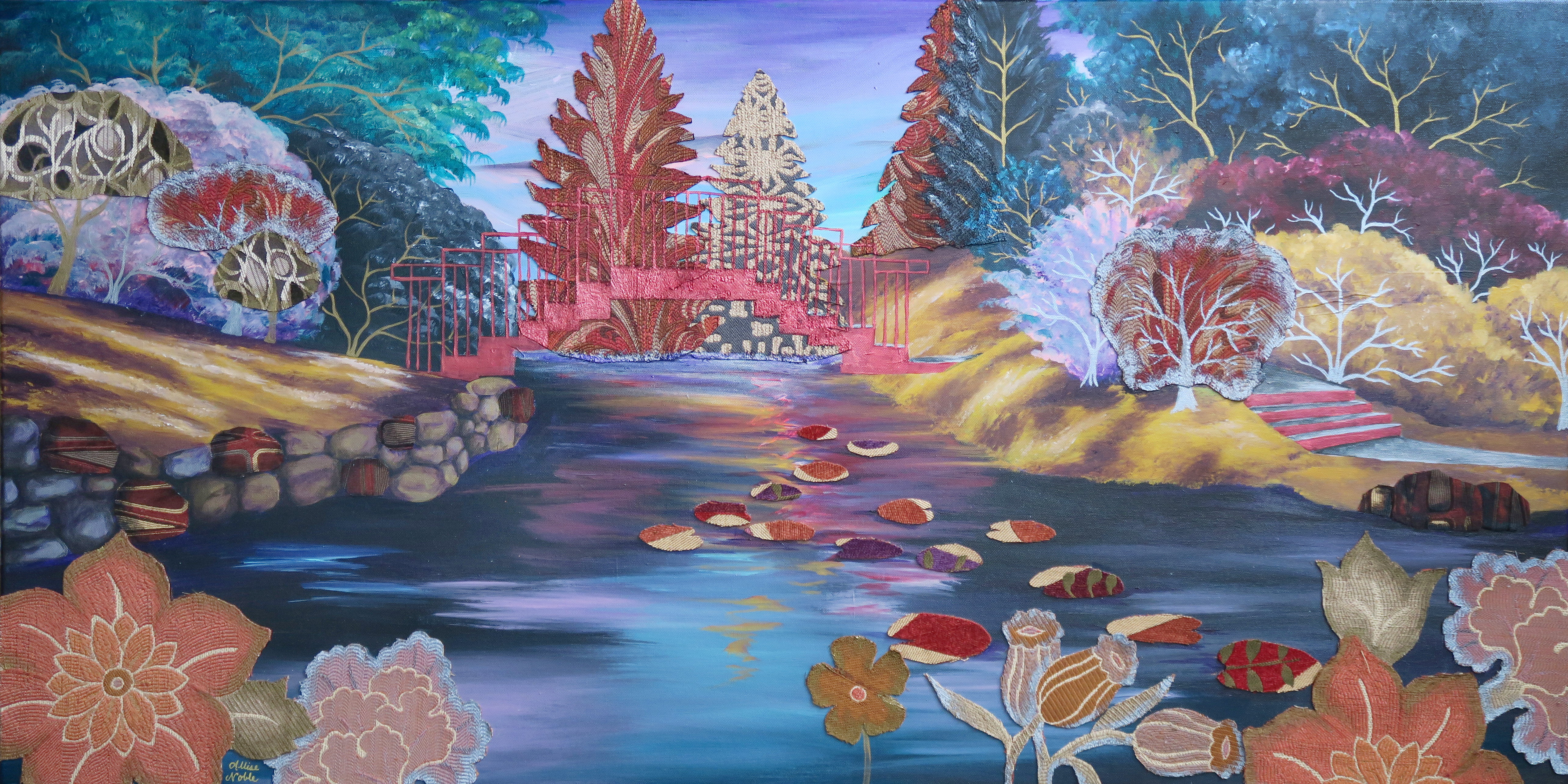
I am very much a visual person, and can tend towards being as much of a perfectionist in the decoration of my living space as the creation of my art. I always worried with a space that was not-so-much-space, and with the fun apartment restriction of being stuck with stark white stucco walls, always stucco, I wouldn’t be able to truly express myself with my home, or get it to look as awesome as I pictured in my head. Add to that the fact that I studied Interior Design in college, and I place pretty fierce expectations upon myself. However, I found there are plenty of easy things you can do to bring together a small area and make your space stand out. The essentials are …

A teapot with personality. 

a26619af3f34baa449f4746ce6f6c1e2

Going back to the apartment thing; in a one or two bedroom apartment, it can be hard for your kitchen to really feel like a kitchen when it’s about 15 square feet. Oftentimes this space gets ignored. A brightly colored or fun patterned teapot sitting out on the stove top can wake it up a bit and make it a little more inviting, which is a good thing when you have just had the longest day ever and know you have to go home and cook ;).

Art from different times and cultures.

Another simple way to add interest is to mix in some vintage here and there, and add elements inspired by cultures different from your own. The collection above are all pieces I have up in my apartment. I have always loved retro 1960s illustration and art nouveau, and have been interested in asian culture since junior high. Your inspiration may be different, but either way including vintage and multicultural design will make any space more intriguing and inspiring to live in.

Glam lamps.

Especially in an apartment, you don’t get to choose your major lighting fixtures, and the ones that are up are usually pretty bland and unassuming. So, you have to express yourself with your lamps. You can’t always have a chandelier or some other eye catching fixture on your ceiling, but you can have it on your end table :). I had to include that unicorn one on the end just for fun.

Fun rugs.

When you have a small space with an open floor plan, rugs are awesome for visually dividing your space into “rooms”, different areas of function so that your space doesn’t just look like a jumbled sea of furniture. They can also add a bold design element, like art on your floor!

Neutral Pattern.

For someone like me who likes to change things up every other month, it’s a good idea to keep your main staple pieces a neutral color. Plenty of fun contrasting patterns keeps it from being boring. My houndstooth and zebra print accented sofa purchased at an employee discount makes my full year of misery working in sales totally worth it.

Colorful Vintage Glassware.

a2a25c729228cf5010070f242e8fa7c0

I love vintage glassware. I’m an antique store addict, and swear I have accumulated enough retro goblets and wine glasses to open my own bar.Everyone needs a contingency plan, right? My favorite antique glass is LE Smith’s Moon and Stars design, shown above. Glass from the 20s through 80s comes in nearly every color under the rainbow so there’s something to match everyone’s favorite color.

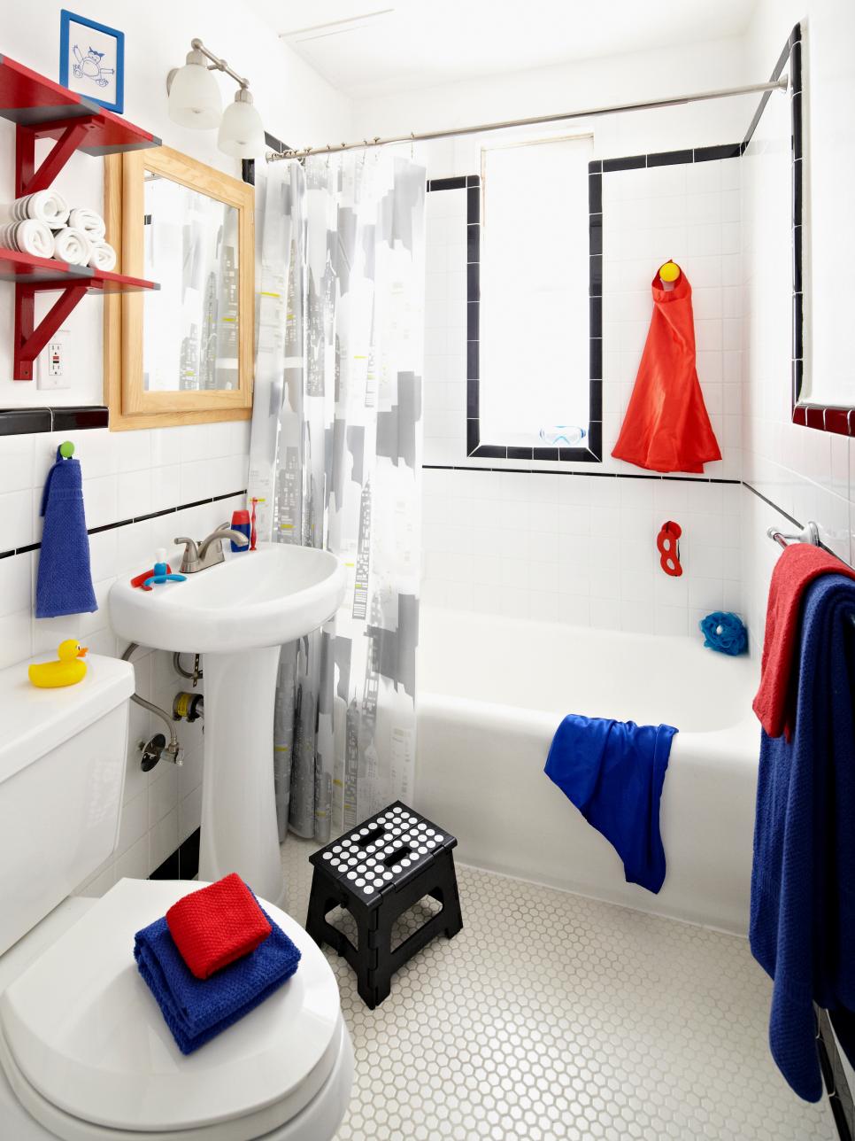
Kids Stuff (Whether You Have Kids Or Not).

When we’re a kid, we dream about the day we will have our own place. We envision building a slide that takes us from one floor to the other, and an entire room that’s just a gigantic ball pit. Then we grow up and become boring. I am a big believer in injecting a bit of fun into the place you’re going to go to sleep in at night, and have no problem paying homage to a favorite cartoon character here or there. I have a spider-man plaque hung up in my bathroom, and for awhile even had his and hers matching spider-man loofahs (I was Spider-man, he was Venom.). Finally, he complained that they were too small and made for children and can he please have a normal cleaning apparatus for when he stays over! They shot water out of their mouths when you squeezed the vinyl character sitting atop the fluffy cleaning part, that is an important point to be made. His loss.

Attractive Storage.

I don’t know if these fun little patterned boxes have an official name, but all I know is they make having piles of crap look chic as hell – enough said.

What are some of your go-to’s for an intriguing living space?

Standard
Exhibitions and Other News

New Job + Adventures In Upcycling

Many of you who have read my blog before have probably heard me talk about Express Yourself Artshop, an art and wellness program open for adult students of varying abilities, especially those with disabilities. Artshop is one of the programs I have taught with since its beginning a little over 2 years ago. Our Program Coordinator moved out of town last month, and being that Artshop has always been my favorite out of all the programs I teach with, I applied for the position. This week it is official, from now on I will be with Artshop full time. I have a lot of ideas, a ton of brilliant people helping me, and I cannot wait to see how the program grows and evolves. I dare you to watch the video below and be in a bad mood.

Life is funny, and I never ended up actually working “officially” in the field that I went to college for, but am now doing something I never would have imagined. I’m not one for cliches but the old saying “Knowledge is never wasted” certainly rings true, and I see my interior design background creeping in in little ways throughout my current work. In my new DIY Decor class this semester, I’ve been exploring creating classy, elegant and beautiful decorations for the home using cheap, everyday materials. My students and I have combined my two loves; stylish and artistic decor, and recycling, or up-cycling in this case (basically never wasting anything). They have blown me away with their fantastic vision and their own unique style that they bring to the projects. There is a lot going on, and I’m excited to share more with you in the coming weeks and months.

Coasters by Lori : Wood Samples (It pays to have a boyfriend who works at a furniture store ;)) covered in book pages and magazine cutouts accented in metallic acrylic. Felt is applied to the bottom to prevent scratching. Sealed with mod podge aka my lifeblood.

Coasters by Lori : Wood Samples (It pays to have a boyfriend who works at a furniture store ;)) covered in book pages and magazine cutouts, accented in metallic acrylic. Felt is applied to the bottom to prevent scratching. Sealed with mod podge aka my lifeblood.

Salt and Pepper Shakers by Amber : Empty glass spice jars with holes punched in the lids. The tops are painted with enamel and the jars are wrapped with fabric and ribbon accent, sealed, again, with mod podge.

Salt and Pepper Shakers by Amber : Empty glass spice jars with holes punched in the lids. The tops are painted with enamel and the jars are wrapped with fabric and a ribbon accent, sealed, again, with mod podge.

Abstract Wall Art by Lori : Modern art using Sharpie pens and cutouts from transparent file folders

Abstract Wall Art by Lori : Modern art using Sharpie pens and cutouts from transparent file folders

Decorative Terrarium by Colleen : It's amazing what you can do with some fake plants , ribbon, and raffia.

Decorative Terrarium by Colleen : It’s amazing what you can do with an olive jar, some fake plants , ribbon, and raffia.

Decorative Terrarium by Michelle : All you need is an empty salsa jar, some fabric flowers on stems, ribbon to wrap around the lid base, and a little bit of creativity.

Decorative Terrarium by Michelle : All you need is an empty salsa jar, some fabric flowers on stems, ribbon to wrap around the lid base, and a little bit of creativity.

Standard
Project Ideas

Book Pages and Metallic Paint = Instant Classy.

Every so often I get bored and dissatisfied with the state of my walls and need a change. I’d had some Alice In Wonderland etching coloring book pages framed above my couch since I’d moved into the apartment. I’d filled them in with markers, giving Alice hot pink hair, and my boyfriend was even starting to comment, “So… are you ever going to take those down?” Apparently the appeal of pink haired punker Alice was lost on him, and he also couldn’t fathom why I would hang up coloring book pages when I have so much of my own art at my disposal. I do decorate my home with some of my own work obviously, but you have to understand, I get real tired of staring at my own art. I’m staring at it the whole time I’m working on it, and when it comes to my walls, I want to give my eyes something new to get excited over. The coloring pages had overstayed their welcome a bit, and the magic marker was getting ridiculously sun-faded. But, I didn’t want to spend the time making 3 new fine art pieces just to hang above my couch when I knew I had exhibits coming up to get ready for.

I don’t know if anyone uses those 12×12 paper flip calendars anymore … They are a bit of a relic nowadays, but I always insist on getting one from those giant kiosks in the middle of the mall set up around Christmas simply for the cool pictures. Art Deco is one of my absolute favorite design periods, so for the past 2 years I’ve gotten the Erte calendar. This fashion artist is responsible for the loveliness below – so yes, he completely rocks.

You can buy 12×12 scrapbook frames at any craft store and hang calendar page art as is (the cheapest prints you will ever find), but I decided to take it a step further to create the trio below.

trioThese pieces only took an afternoon to create. First off, a background made of book pages makes anything look instantly classy. If you are like me and love books, tearing one to pieces could take a lot of soul-searching. Therefore, I picked up the most dull, dry, uninspiring book I could possibly find from the red dot $1 bin at Barnes and Noble so that I wouldn’t feel I was doing any disservice. The opposite, I felt I was improving upon the provided material by turning it into art. I first tore out about 6 pages per picture, then adhered 3 pages layered on top and 3 on bottom to the cardboard backer that always comes with frames. I found brushing tacky glue onto the back with a combination of a cheap throwaway paintbrush and one’s finger worked best. I then flattened the bookpage-covered-cardboards under a pile of magazines to dry. While the glue was drying on those, I found 3 calendar pictures I liked and cut out the main subject from each page. You could do this with any calendar theme, cutting out a large central image be it a flower, an animal, a boat, your favorite entertainer, whatever makes you happy to look at. I then brushed tacky glue onto the back of each of my calendar cutouts. I pressed them on, smoothing them out with my fingers, making sure there were no bubbles, and then put the pieces back under the magazines to dry flat. Next, out comes the metallic paint! Metallic acrylic paints are just magic and make every single thing look way better. You don’t have to be an artist at all to accent your new decoupage calendar pictures with paint. The “distressed” look goes awesome with the torn out book pages, and for this technique the messier the better. Grab a large flat brush, and make sure you keep it dry – don’t dip it in water until you are finished. Dip some paint on your brush and simply swipe across your piece. The paint will naturally catch where the pages layer and overlap lending a cool texture. If you don’t feel intuitive with the paint, an easy out is to simply paint along the edge of the image you glued down to emphasize it, and also brush along the corners or all the edges of the actual rectangular piece to “frame” your collage. You’ll be surprised at how amazing these turn out. You’ll have people asking where you bought them, when all it was was less than $5 of supplies and a couple of hours.

Doing more rearranging later due to visiting the Midland Antique Festival and buying yet more wall art, I decided to make a wall collage above my dining table which is something I’ve always wanted to do. My framed original portrait drawing, collaborative mixed media canvas piece I’d made with my boyfriend, and my crazy little 60s-big-eyed-circus-child all had a vintage, weathered look to them with lots of beige and ivory amongst the pops of color. I needed some super small pieces to tuck in between the gaps in the arrangement, but 5×7-8×10 frames are usually meant for table tops and just don’t look right on the wall, and the frames’ heavy, dark edges were taking away from my more focal pieces. I needed something on a small canvas, but once again, was pressed for time. Though I wanted my collage to look good, I did not want to make 2 miniature acrylic paintings with all the other projects I had going. I had a value pack of 8×10 canvases I’d gotten at Michaels that calculated out to $1 per frame at the end, and decided, what the heck? When in doubt, cover them in book pages. Once I had the entire front and sides of the canvases covered in tacky-glued pages, I went to Staples and got 2 of my original works printed small on standard printer paper, tore the edges to make them uneven, and glued them to the relative center of my canvas. If you don’t make art yourself, you could still do the same thing with magazine pictures, digital photos you’ve taken, or works by famous artists copied from art history books. Antique or vintage-inspired images look best with the book page background. Of course, I had to metallic up the edges with some gold paint, and once again I had put in an hour or two of work for a really cool end product.

I fell off a chair and dented the entire right half of myself trying to hang this up, so it better look kickass!

I fell off a chair and dented the entire right half of my body trying to hang this up, so it better look damn good!

I hope some of you will try this out. Even not-so-great looking decor can be super expensive, and these projects are FUN even for non-artists (promise!) and will add a ton of personality to your abode. Collaging is even suggested as a relaxation technique when under extreme stress, so this project could be just what your day off needs. I’ll be taking a break from art and heading off to Ludington tomorrow for a mid-week weekend of hiking, swimming, and generally being outdoors from morning till the wee hours of the night. Hopefully I come back refreshed and inspired ^_^.

21

Standard