New Work

(More) Quarantine Art

Since about mid-November, my state when through a second, more mild, quarantine which put classes and activities in my Artshop program temporarily on hold and sent me back to working from home again. I will be plunging back into things as they reopen TOMORROW, so today I’d like to share some of the work I finished over the last couple months.

This first piece was a very fun commission where I was asked to do a surreal portrait in my signature mixed media, vintage inspired style but based on the song “Little Wing” by Jimi Hendrix. I was given some guidelines as to the type of figure portrayed and color scheme, but otherwise the project was completely open ended. And so, this piece was born, communicating a sense of love and positivity, openness, kindness and warmth, and creative spirit.

Little Wing Commission, Prismacolor Pencil and Mixed Media

It felt really good during this time, which to be honest though less restrictive seemed to be a hell of a lot more frustrating than the first full quarantine, to continue the trend of just working on creating some beautiful, uplifting imagery. The piece below is my largest to date at 4 entire feet high! That may not seem like a big deal to some, but everyone who knows my work knows I work small, “big” for me usually being 18×24″. Also note, no people or animals in this piece! I have another large canvas still untouched, and to really step out of my box I think I should do something architectural next.

Where The Light Is Held, Acrylic and Fabric

I also finished a full size bird palette knife painting, the rest of what I’d completed being minis. Yes, these are real birds! I’m always saving photos of exotic and interesting birds on Pinterest, and the colors and adorable yet zany plumage coming out of the top of these guys’ heads was irresistible. I found a couple of reference images, and decided I had to throw a baby in there too.

I don’t know about the rest of you, but my new year starts tomorrow. Wish me luck!

Advertisement
Standard
Techniques and Tutorials

Happy Heart Art Watercolor Demo

Hope you all are staying safe out there! This easy do-at-home illustration project is inspired by all the happy heart art I’ve been seeing in person as I walk through my neighborhood and in photos and videos online. It is a difficult, unfortunate situation we are experiencing across the globe, but we can always turn to creativity to make connections to others even when we cannot be in close proximity, and to create joy in our own life in uncertain times.

For this project, you will need only paper (obviously watercolor paper is ideal but if you don’t have any on hand, any heavier paper that will take water a little better can work), an assortment of brushes, a permanent fine liner pen (Sharpies will work), watercolor paints, and water soluble markers (classic washable crayolas work if you don’t have traditional watercolor or art markers).

This is a fun illustration to try for all ages, and you can really get creative and make it your own. You can even make it a self portrait to express how you are feeling! Give this simple project a go, and if you have kids in the house encourage them to join you :).


Sending love <3! As always, if you try this out at home and have any issues feel free to shoot me a comment or message, I’m here to help!

If you enjoyed this, check out my other watercolor tutorials:

Barn Owl

Jellyfish

Tiger

Stained Glass Tree Illustration


Standard
Techniques and Tutorials

Stained Glass Tree Watercolor Tutorial

Hello all! I’m still keeping in the spirit of encouraging quarantine creativity since here in the US we are kind of locked down until this virus situation is under control. There is no better time to try something new because time is something a lot of us have an abundance of right now. I wanted to share one of my favorite watercolor lessons today.

This watercolor tree can be done in so many different shapes and color schemes, and is the perfect way to practice blending with watercolors.

Some tips for along the way:

  • You will want your paints to have a wash consistency for this project … which means you are adding a decent amount of water to your paint so that it is quite runny.
  • If you find yourself getting too much liquid on the paper at once to where it is creating a pool, after dipping your brush in paint tap it on a nearby rag or paper towel first. Also remember, you can always use a rag or paper towel to blot extra water off your paper and try again.
  • If you are still seeing a line in between your two colors as you blend, you can wash over the transition with a damp brush dipped in plain water to encourage the colors to bleed together more seamlessly.
  • Remember, if two colors are wet they will bleed into each other when they touch. This is great for blending, but not so great for different color sections located next to teach other in our tree. Don’t fill in shapes in your tree branches that are right next to each other one after the other. By jumping around, you will allow time for drying.
  • Any permanent pen or marker works for the outline – like a basic Sharpie.
  • HAVE FUN! Practice really does help. You will probably see that you like your blends that you do later in the game better than your first couple. That’s ok, you are learning! Don’t worry about perfection just enjoy the process.

If you try this, feel free to share a picture in the comments! Enjoy a creative Sunday!

Standard
Techniques and Tutorials

Mid-Century Modern Tea Party – Ladybug

The Mid-Century modern design style has been having a moment for awhile now, and while I’m not usually one to latch onto trends I have always liked the geometric, retro aesthetic of this period.

Illustrations from this period are colorful and based on combinations of simple shapes and lines, which make them accessible to even those who don’t consider themselves “artists”. In this series, I am going to show you how to create some cute mid-century modern inspired bugs and flowers in honor of Spring. I will be painting on glassware (I’ve been dying to do something with these clear tea mugs!), but you can create any of these designs the same way on paper with any drawing or painting materials you may have on hand.

Start with a red vertical oval for your ladybug, and scatter some different large polka dots around it for our flower heads. Paint goes onto glass differently than on paper because it can’t absorb into the surface, so you will need to let your shapes dry and add another coat or two for solid coverage. Try to smooth out your paint as flat and even as possible, spreading out any “globs”.

Once we have our red oval, we are done with our ladybug for awhile. Focusing on the flowers, I added two sets of concentric circles to the bottom of my large dots in different colors, letting the paint dry in between each addition.

After that, it’s time for the leaves! Our leaves will just be simple teardrop shapes, placed next to each other at an angle centered underneath our flower heads. Once the green was dry, I added some white dots down the center of my leaves for some extra decoration. You can add a dotted pattern by dipping the end of your paint brush in paint, and touching it to your glass (or paper) using the paint brush end like a stamp.

Last is the line work that brings everything together and makes it pop. For this part, you can either use a black paint marker or a small detail brush with a pointed tip. Outline all of the shapes that make up your flower in black. I added a teardrop shape to the very center of my flower, but you can also just outline the concentric circles and leave the center alone. I added a line connecting the head to the leaves to finish our flowers. For the ladybug, I put a line down the center of my oval and outlined around the entire shape. I then added a half circle in black sticking up from the top, with two short lines for antennae. I used the end of my paintbrush to add a dot to the end of each antennae. If you have some larger paintbrushes, you can also use the end to stamp the larger dots on the ladybug’s body. Otherwise, just use a round brush with a pointed tip to outline a circle shape in the size you want and then fill it in.

Voila! See, that wasn’t so hard :). You can make some beautiful Spring designs to cover anything your heart desires once you learn the basics of how to build forms with simple shapes. I will be doing 4 designs in all with different flowers and insects, check back for more!


Standard
Art Education, Project Ideas

Elizabeth Jameson – Creative Minds Art History Project

Hello all, it’s time for another artist based creative project! I have a great group of ladies in my Creative Minds class this semester at Artshop, and have loved seeing how they interpret the techniques of the masters and make their creations their own. Though often times the focus of my class is renowned artists from history, I also love sharing inspiring and accomplished artists from the present with my students. I work primarily with adults with disabilities so I especially enjoy the opportunity to share the stories of artists with disabilities with the class, and how the artist’s identity as a person with a disability influenced their art and legacy.

Elizabeth Jameson is a visionary artist who found her creativity through an unexpected MS diagnosis. Jameson is a Doctor of Law, and her lifelong passion and driving force for her career was to fight injustice and poverty through the law, striving to make a difference. In the late 70s and early 80s her health took a turn suddenly, and she was eventually diagnosed with Multiple Sclerosis. Due to the progressive nature of her illness she was unable to continue working, and she felt her purpose was lost. A caring friend pushed her into trying an art class just to get her out of the house, and this class ended up changing the way Jameson saw the world and her life. Art teaches us to look at the world through a creative lens, and upon receiving her usual MRI scans from a doctor’s appointment, she came up with  the idea to etch in the stark, clinical and emotionless black and white images with rainbow colors. Her work evolved from there. Today, Jameson is still living her dream of changing the world, and says the goal of her work is to encourage others to, “contemplate the beauty of the brain, discuss what it means to live in an imperfect body, and to stare directly at the imperfect brain’s beauty and complexity with curiosity”. She collaborates with Neuroscientists and a studio assistant to continue her work.

jameson_carousel_utep-gift-1

Messages that can be learned from Jameson’s art and story are that with creativity it is never too late to begin, it doesn’t make you any less of an artist to ask for assistance, and individuals with disabilities have an unlimited potential to change the world for the better.

Obviously, we don’t have access to MRI machines ;), but to pay homage to Jameson’s art we did drawings with colored pencil on black paper. Students were asked to imagine a visual representation of the inside of their head, thinking about the emotions or memories different colors may symbolize, what straight, smooth lines versus wavy or jagged lines may say about what is going on inside their head, and to think of any representational forms that speak to who they are. Some students chose to indicate blocks of color for the different things that consume their thoughts, and some chose to do an all-over image or pattern. One student even dated hers in acknowledgement that one’s mental state changes over time.

I can see this project being an interesting activity for any age, and was pleased within my class on how a dialogue between the students about the meaning of their developing “artistic MRIs” grew as they worked.

As always, feel free to steal, share, or try it yourself at home :). I am hoping others will enjoy and become inspired by trying this project out.


Standard
Project Ideas

Sonia Delaunay – Creative Minds Art History Project

I live in Michigan, and we have been having some wild weather over the past couple of weeks, including over 10 snow days! Since I teach a couple art classes in the program I run in addition to coordinating all the goings on, I still have to get work done on snow days, just without my fun project break :(. I was excited to finally get to host my classes again this week and share a long awaited project with my group! This week’s artist was Sonia Delaunay.

sonia-delaunay

Sonia Delaunay was an abstract artist and designer who not only painted but worked in fabric and costume design, and in 1964 became the first living female artist to have a retrospective exhibition at The Louvre in Paris!

7b8e0747794bbfd304f8ea05fc0fb013

The literal geometry she brought to her most famous costume work for the play The Gas Heart by avante garde poet Tristan Tzara is just fabulous.

Saturday Night Live

You know you’ve got a good thing going if David Bowie is on board! He wore a getup inspired by her cubist suit when he performed on Saturday Night Live in 1979.

Remembered most for her paintings, a lot of her fashion work gets glazed over which is a shame, because it is her fashion and costumes that I personally find the most interesting. Delaunay’s fashion work was revolutionary at the time because she didn’t just take her paintings and hang them on bodies… Her designs for clothing were specifically configured to work with women’s body shapes, and the clothing themselves was functionally designed for movement, not decoration. Come to think of it, this may still be considered revolutionary today! Given this, it was only fitting that our class project be something wearable. Inspired by Delaunay’s colorful, geometric art and design, my class created fabric collage necklaces.

I am all for any chance to upcycle! Discarded leather upholstery samples were cut into boomerang shapes to be used as a base for the collage bib necklaces. I pre-selected fabric for the students to choose from that meshed with the inspiration artist’s colorful, abstract style. All of my students have some form of disability, and a couple struggle with dexterity. Providing prepared shapes cut from matte board for the students to trace gave them a helpful guide to encourage project success and allow them to be able to work independently. They were also encouraged to look for shapes in the fabrics’ patterns that they could follow, as one did with a large red flower. Regular ballpoint ink pens can be used to trace the shapes on the back of the fabric. Fabric scissors were used to then cut out the shapes. Shapes were arranged on the base, and then students used a junky brush to paint tacky glue on the back of their fabric pieces and press them down. Once dry, holes were punched in the ends and jewelry chain attached and voila! Ready to wear!

Lesson planning has been so inspirational to me in my own art and handmade journey, and has pushed me to think outside of the box and come up with ideas I never would have otherwise. Creating this project inspired me to work on my own statement necklaces using not only fabric but my velvet vintage millinery florals I love to collect from ebay and local antique fairs. These necklaces are for sale in my own ebay shop for $25. More designs coming soon!

Standard
Project Ideas

Piet Mondrian – Creative Minds Art History Project

piet.mondrianI promised I’d catch up in posting all my Creative Minds art history projects from the Fall and Winter semesters!

You may not recognize the name “Piet Mondrian“, but I guarantee you’ll recognize his imagery. Mondrian was interested in simplifying art down to its basic essence, and creating a type of universal design that could be used for everything: visual art, furniture, architecture, clothing … I’d say he was pretty successful, as his primary colored designs composed out of different sized squares and rectangles bordered by bold black lines can be found covering posters, furniture, jewelry, shirts, and the pair of Nikes I would buy if I were rich.

We do a lot of painting in the Express Yourself Artshop program, so though we easily could have done the whole “make a grid on canvas with blue painter’s tape” thing, I wanted to try something more original – transferring a Mondrian design onto glass. The glass we used was just glass from the inside of an inexpensive frame. This could be done in any size. The actual frame could easily be used on a future project. We used primarily colored tissue paper for our rectangles, though we happened to have a bit of patterned and textured vellum on hand that can be found in the scrapbooking section of craft stores and is great for mixed media art. The goal is to use thin, transparent paper so light can shine through the glass. I cut a variety of different sized rectangles and squares out of scrap cardboard for students to use as a pattern. Students chose their colors, and then traced different shapes using the patterns until they had a good pile to choose from. They then laid out their shapes on the glass to create the desired pattern. After they were happy with their design, it was time to glue. We just used traditional liquid school glue, but squeezed the glue out on a piece of foil and used a crappy paint brush to paint the glue on the back of the paper so it didn’t get too saturated.


The front of the finished product is going to be the glass side without anything glued to it, so if you do end up using papers with a one-sided pattern, you need to glue the side you want to see face down. Once the paper dried, we trimmed any paper that was hanging off of the glass and used a ruler to draw on the glass side (NOT the side the paper was glued on to) with a black, medium tip paint marker. This sharpens and finishes the design, and also disguises any uneven edges.

These can be as simple or as intricate as you want, and are a fun project with a beautiful end result that can be completed fairly independently by all ages and abilities. My students with disabilities who struggle with dexterity were still able to do this on their own and end up with a piece of art they were proud of. Display in a clear plastic plate stand … It would be especially cool in front of a window or other lighted area. Have fun creating :)!

Standard
Art Education, Techniques and Tutorials

Colors Aren’t Scary! Understanding The Color Wheel.

A new Artshop semester has started at Creative 360.  One of the biggest concerns my students bring to my attention in classes is “How do  I know which colors to use?” What colors can they mix together, and what colors basically turn to poo the moment they touch each other? Everyone probably has some vague memory of the color wheel from way back when in elementary school art class, but few remember what it actually is aside from a pretty rainbow circle.

printable-color-wheel-tertiary-colors2

Primary colors are like the color gods and goddesses. They are colors you don’t mix anything to get, they just are, and they are used to create all other color life. See the starred sections above, red yellow and blue. In between the primary colors, the color wheel shows you what will happen if you mix two of them together. For example, in between the red and blue space are various shades of purple, depending on if you mix in more red or more blue. If you mix all 3 primaries together, you get a neutral color (brown or grey/black depending whether there is more warm red or yellow, or more cool blue present).
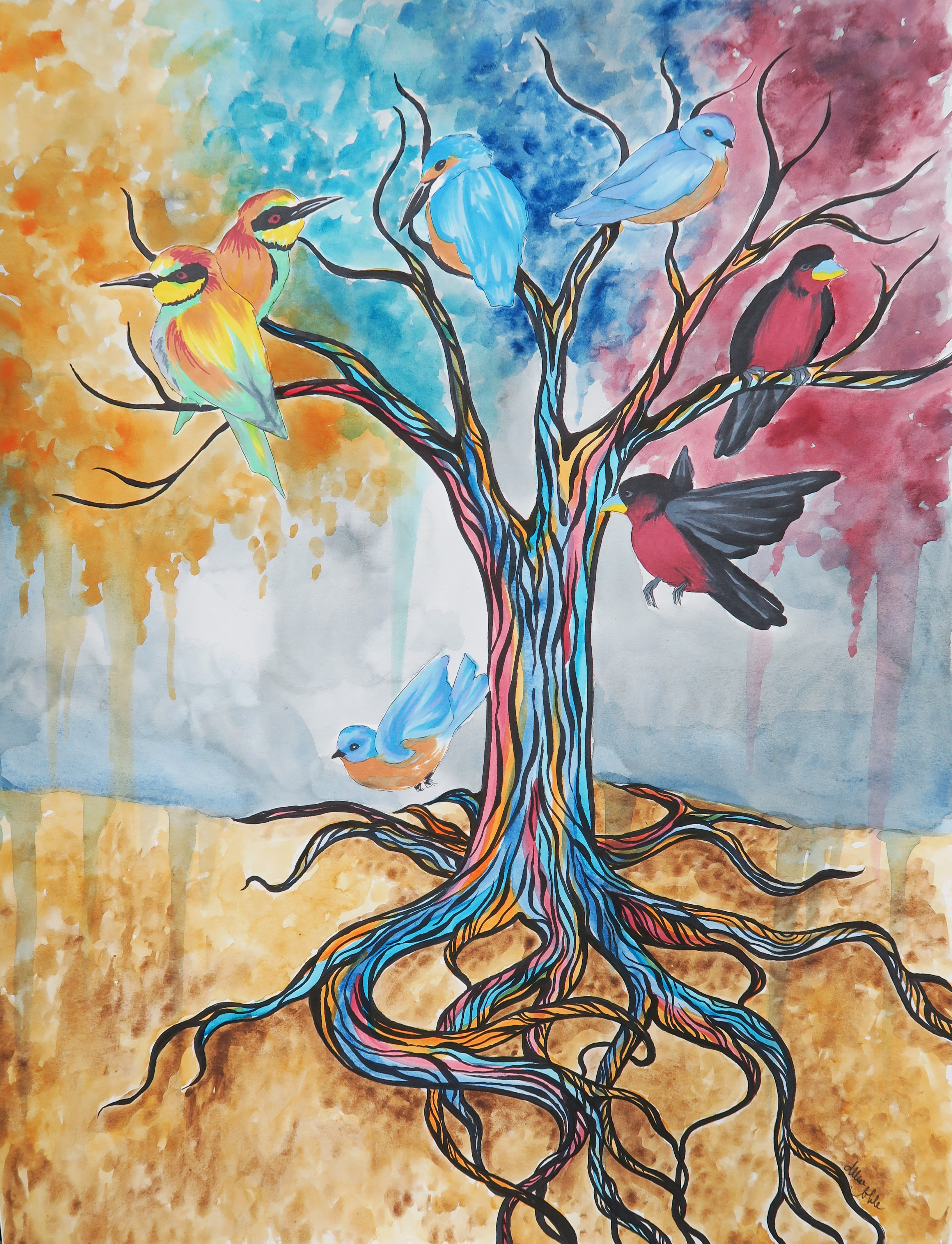
Contrasting colors are colors that are opposite each other on the color wheel, note the black connecting line. Contrasting colors as a rule look amazing together due to how boldly they play off of each other (There are a lot of sports teams I can think of whose colors are blue and orange for example, and I don’t even follow sports!). However, if you mix them to try to make a new color, they will completely neutralize each other into a grayish or brownish color. Remember how all 3 primaries mixed together make a neutral? Well, think of why this would happen when you mix orange and blue, contrasting colors, together… Orange is made with red and yellow, add the blue, and you have all 3 primaries mixing.

Complementary colors are colors that are right next to each other on the color wheel. Because they are very similar, these colors always look pleasing together as well.

Look familar? The artwork on the left uses a contrasting color scheme of red and seafoam green. On the right a complementary color scheme is used with all different shades of purple, and some pink and dark red accents.

These color pairings aren’t just for artwork, they work well in interiors and clothing as well. Below is an interior idea based on my watercolor painting “If The Ocean Dreamed” that I mocked up on Polyvore, which is a really fun interior and style designing website to play around on. All items you can add to your “set” include links where they can be purchased as well.

47120f53515b0118a06ceaa705a7ea3b

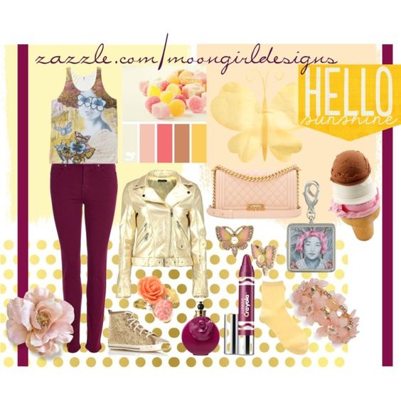
Once you’ve got the gist of it, you can become a C O L O R  M A S T E R and even get tricky and combine both contrasting AND complementary color schemes in one, like below. This is another fun set I put together on Polyvore using clothing I am selling on zazzle covered in my original artwork. This tank top features my piece, “Be My Eyes”. In styling this outfit, I used the contrasting color scheme of yellow and purple with the gold and plum apparel, but also added in some pink with the accessories as pink is a reddish hue that would be next to purple on the color wheel.

dfd8dc78bad5b070db0f0489b770551e1

The last type of basic color scheme is triadic. A triadic color scheme uses three colors that are equidistant from each other on the color wheel. Using only the primary colors red, yellow, and blue would be a triadic scheme as they are spaced equally apart on the color wheel. Another triadic scheme is green, orange, and purple, which I’ve used in the interior below.

344a8aa27feebce0011ec12180c5868d1

Appropriate that I will be going on an adventure to Lowe’s to collect paint chips shortly after I post this as my boyfriend and I will be moving from an apartment into a new home by mid June, and this means …. I can paint the walls! 

I have to end this post like a proud art-parent with a selection of my Artshop students’ work from my watercolor class last semester. Looking forward to teaching another great class!


Standard
Exhibitions and Other News

Tall Ships Show

This weekend was the opening of the annual Tall Ships exhibit at Studio 23 in Bay City. This was my first year entering, and I was excited to have both of my pieces accepted. The elements of nature in my artwork tend to be way more enchanted forest than nautical or aquatic, but I decided to challenge myself to work outside of my usual themes. The piece on the left, “Underwater Dreaming”, may be the most colorful piece I’ve ever created. It’s very tropical which is out of my norm, but maintains the elements of fashion and surrealism that I so love. The piece on the right, “An Existence Aquatic”, was created two years ago when I was in a watercolor and ink illustration phase, and has a steampunk-mermaid feel to it.

For a step-by-step look at how “Underwater Dreaming” was created, please visit my previous post. These pieces are available in print form in both my eBay Store and Redbubble Shop.

Standard
Exhibitions and Other News

Art Clash 2016 – The Adventures of Allise and Heather

This past weekend I once again participated in Do-All‘s Art Clash with my PIC of 3 years Heather Deogracia. Art Clashes/Art Battles are getting increasingly popular. They are live art competitions where artists are given a limited time (usually 3 hours) to complete a work of art from start to finish. As you can imagine, it’s super nerve-wracking. We didn’t even take any photos together until after the relief of the competition’s end, because we were so nervous that we were white as ghosts! (Or, ok, we’re both pretty pale. Whiter than usual I guess 😉 ).

(In the second picture above, we were supposed to be making snooty faces but I still innately smiled the minute the photo timer got to 1 second … Damn you, social conditioning!)

6e97a9bd884cdb8e841d8637c6234c75

In addition to being my forever Art Clash companion, Heather is also in my Studio Art class at Artshop! This awesome lady came into class on the first day of spring semester and said, “I know what I want my project to be. I want to make a mermaid tale”. This is why she is one of my favorite people. I have not had my body traced on giant paper since elementary school. It was hilarious.

Back to the Art Clash, I really thought I was simplifying this year by doing a happy watercolor tree instead of trying to do something with people or portraits, my usual subject matter of choice. BUT THOSE BIRDS! The detailing was so much more time consuming than I expected, even using prismacolor markers rather than colored pencil. I truly thought I wasn’t going to finish, was cursing myself for drawing so many of them to begin with, and found myself chanting louder and louder inside my own head “The birds, the BIRDS, THE BIRDS!”

11718422-mmmain

I should have learned by now, it all works out in the end.

I present to you, “Color The World”, 18×24 Watercolor and Ink.

art clash allise

I’ve posted this design to my Redbubble Shop, which offers the print on a variety of fun products. Traditional photographic prints are also for sale in my Ebay Store. Wondering what I’ll do next year … one thing is for certain – no more birds.


Standard