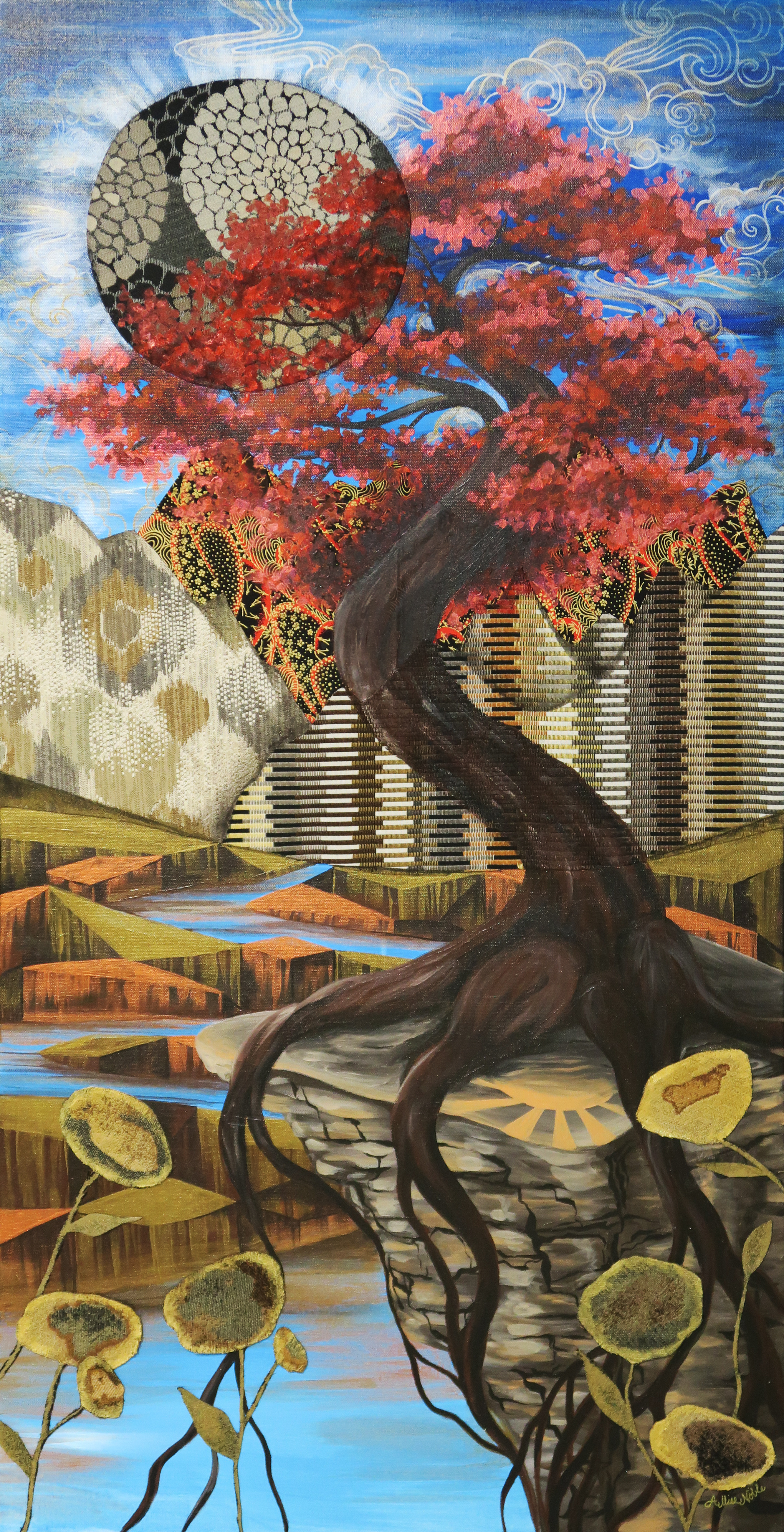
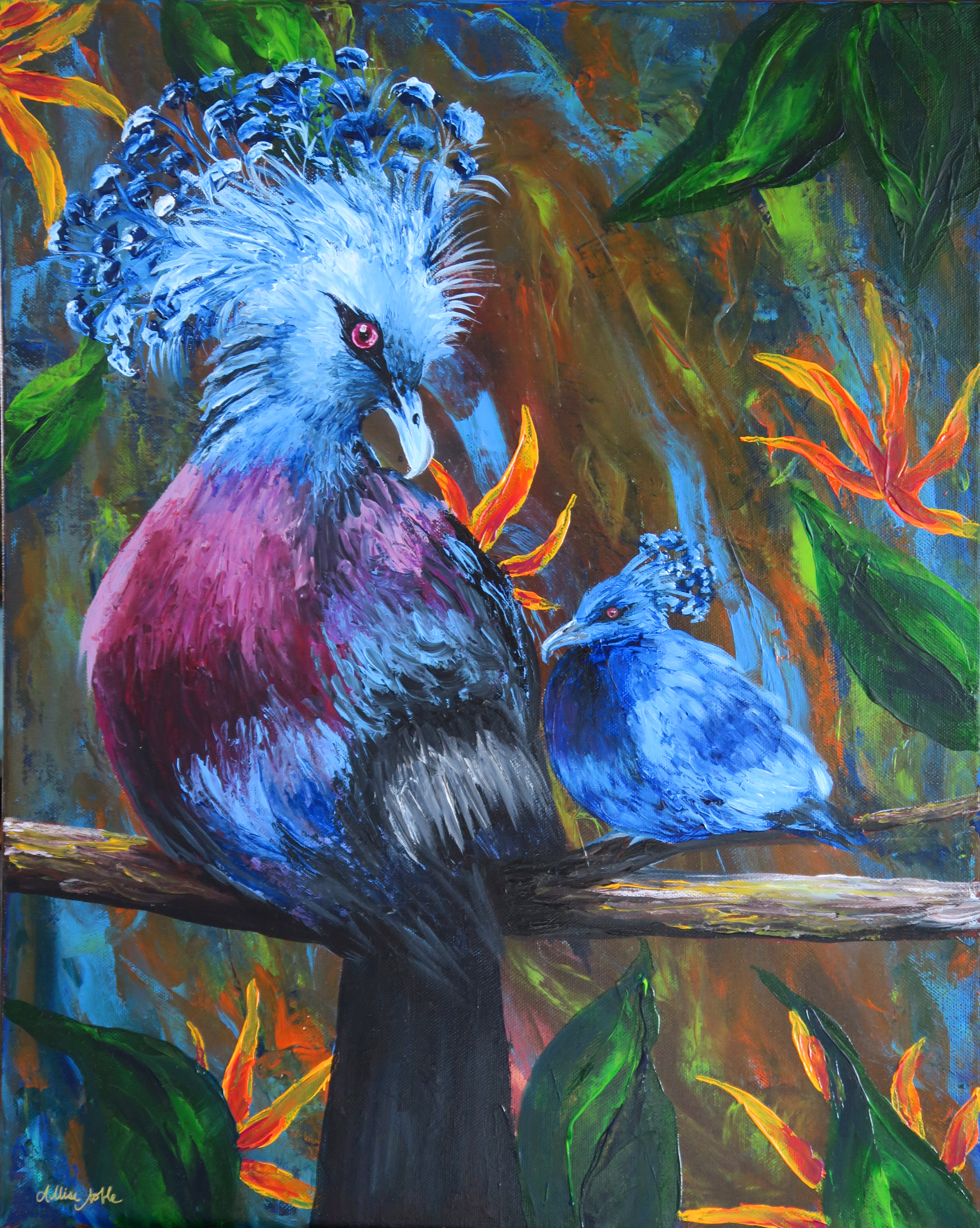
I feel like I’ve been sharing more class projects than studio projects lately, and wanted to update everyone on what I’ve been up to. I am still continuing to work on my series based on the symbolism of color, but have been trying to complete some smaller projects in between that are less about some complex visual metaphor and more focused on the interplay of pattern and things that I just plain find visually interesting. If I become to singularly focused on only one specific project I’ve found it makes me more susceptible to artist block, and I’ve also had a mentally and emotionally taxing last couple weeks that left me needing some of that creation therapy I’m always urging my students towards (nothing serious, never fear! This too shall pass and all that jazz…).

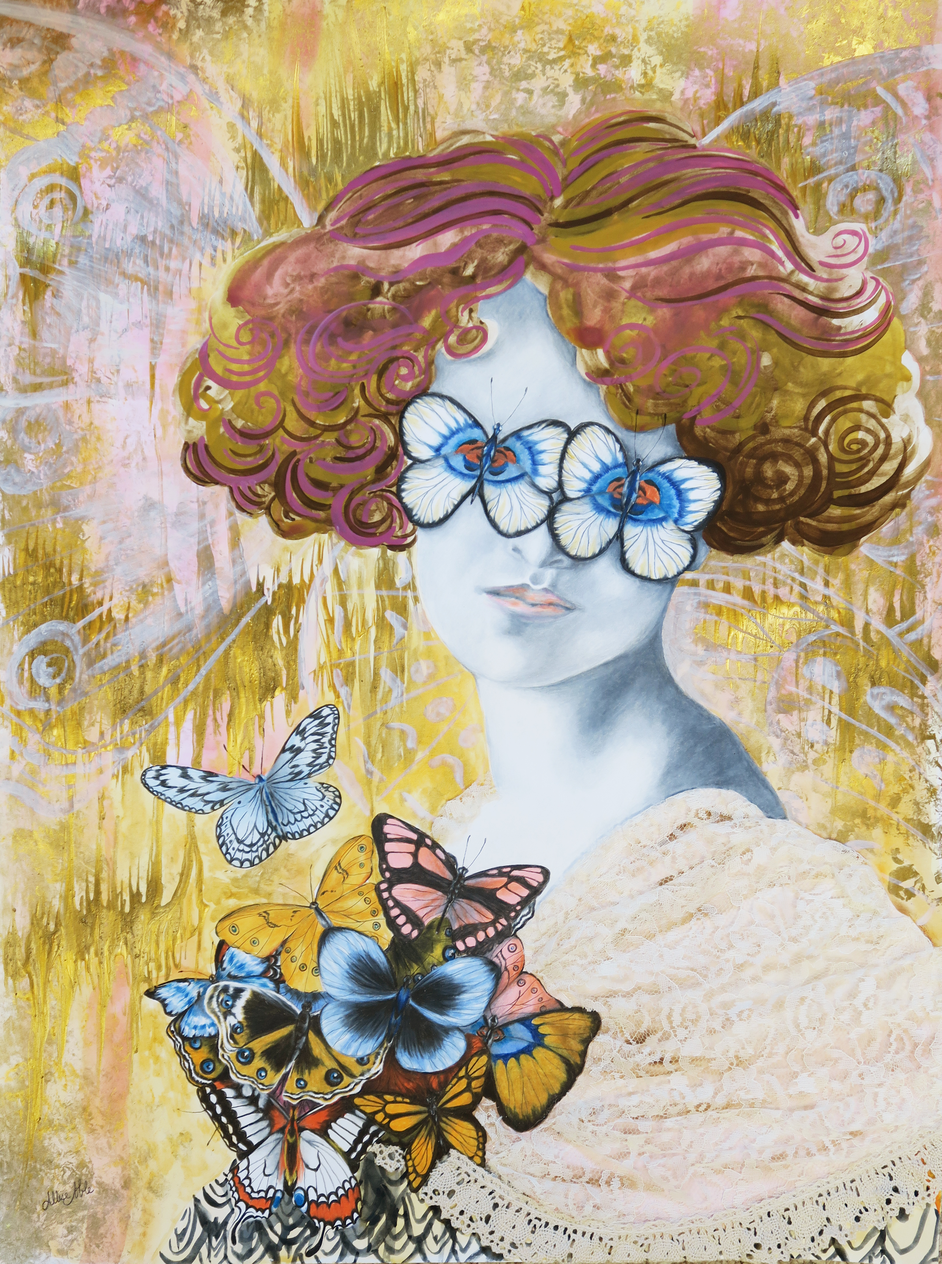
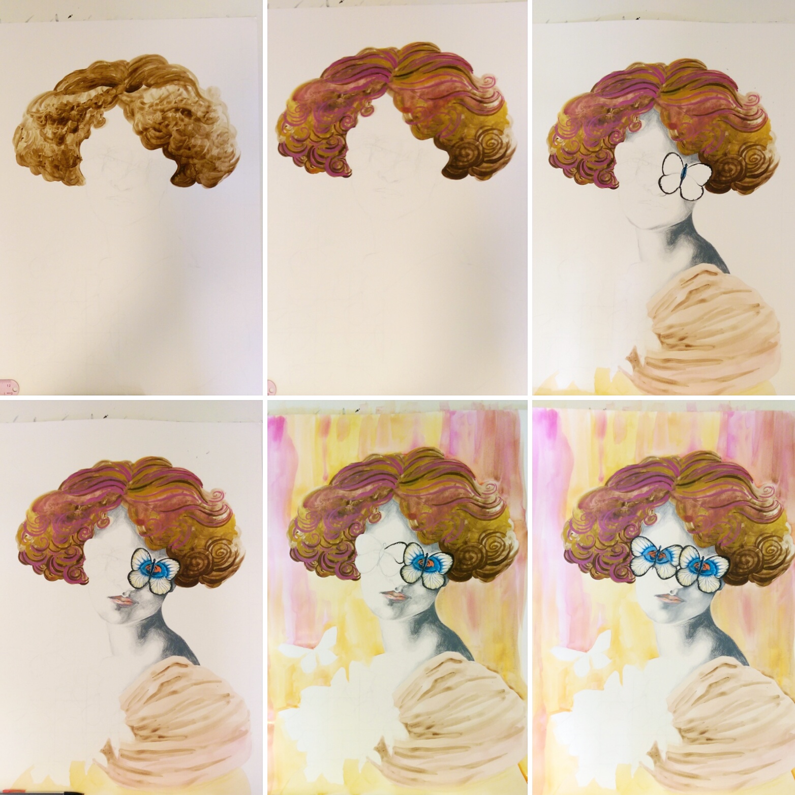
12×16 Prismacolor Pencil and Mixed Media

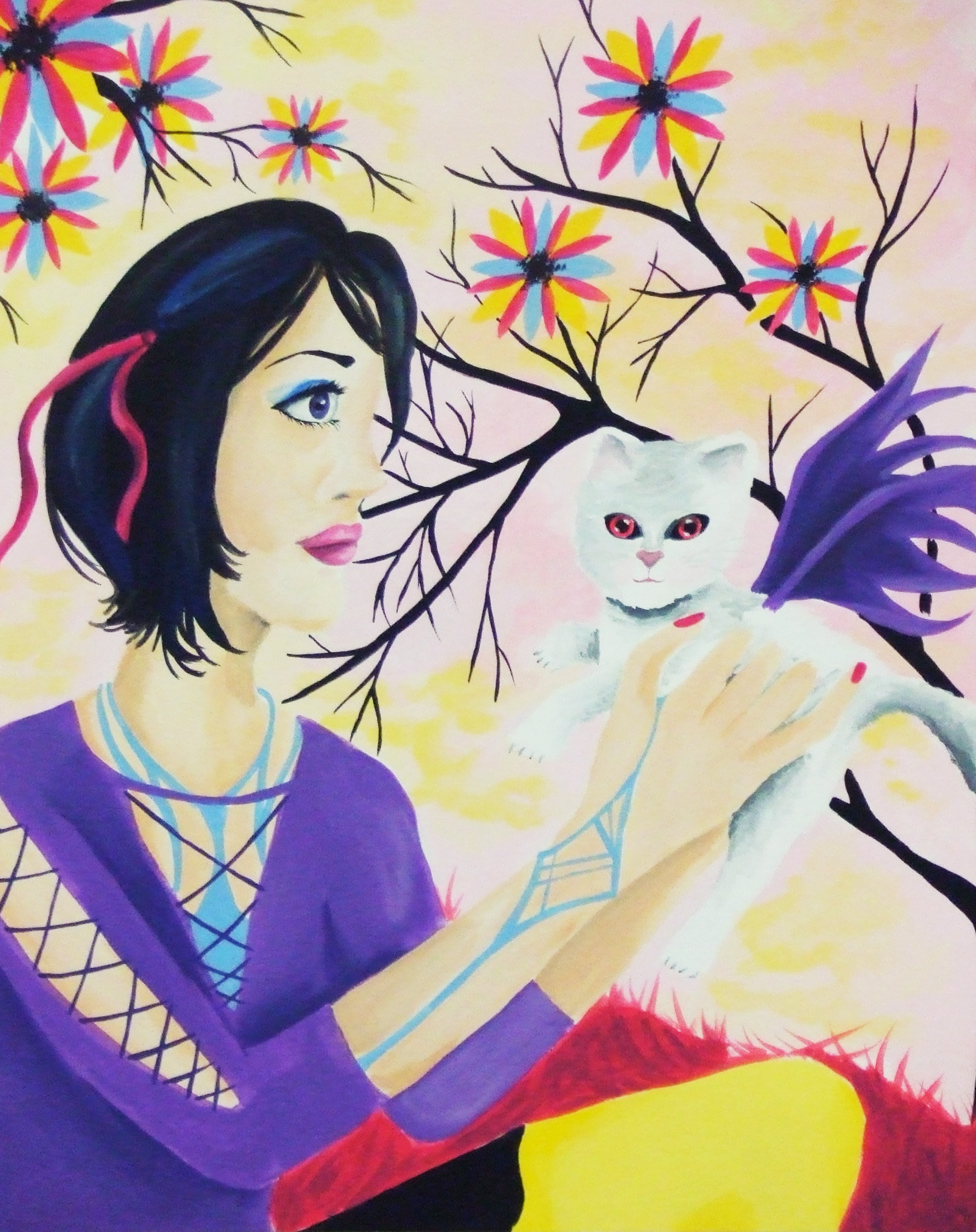
8×10 Prismacolor Pencil and Watercolor
The amazing news is that all 3 of these projects from watercolor to mixed media to a doll repaint not only provided a bit of sunlight in my miniature storm, but also found good homes with art appreciators!
For a lot of my teens and early-mid 20s I felt like I didn’t have a cohesive aesthetic because I appreciate so many different types of visuals. Even when I get dressed in the morning, am I going to be goth, street style, barbie, androgynous, hippie, stepford wife, some odd hybrid of them all … It entirely depends on my mood for the day. I feel like in the last 5 years I’ve finally been able to marry my inspirations of nature and living things, the fashion world, vintage and antique, graphic patterns, and eerie elegance into a specific style without getting repetitive and monotonous.
Though I am not a very techy person and resisted bothering with both instagram and pinterest for longer than most, I have to admit I am now completely addicted to both for the constant stream of visual inspiration. To me though, at least looking at art and design on social media is a positive force, so long as you aren’t using it to compare yourself negatively to the journey of other creators! Today I wanted to share the current visuals I am feeling connected to right now. All are photography and fashion, which is an idea I feel like I try to bring into my drawings. I had a huge interest in pursuing photography for the longest time in college, but one can only focus on so much and eventually drawing won out! I also would have loved to go into fashion design but alas, I hate sewing machines!

Creepy Kids by Ukrainian fashion artist Dina Lynnyk.
Lynnyk collaborated with photographer Roma Pashkovskiy to make this aptly titled series of disconcerting fashion collages happen. The mainly monochromatic yet still surprising color palettes, detail in the wardrobe and accessorizing, and the incorporation of wildlife in the form of winged friends in many of the images drew me into this project right away (I’ve long been a fan of matching birds to clothing). Also, the pale stares! It makes you stop, and it is undoubtedly creepy but there is still such an elegance to it, like these children are some evolved form we have just discovered.
 Gareth Pugh Spring and Summer 2015 Collection.
Gareth Pugh is an English fashion designer, and though my favorite image was from his Spring collection a couple of years ago, the inclusion of all-absorbing optic-art geometric prints are just as present in his current Spring collection for 2019. Many of his models are obscured in some way or completely covered by the designs, demonstrating garments’ power to quite literally transform the wearer into something or someone completely new. His hard edged, high contrast designs when photographed almost look like an ink drawing or painting, making the model a living work of art.
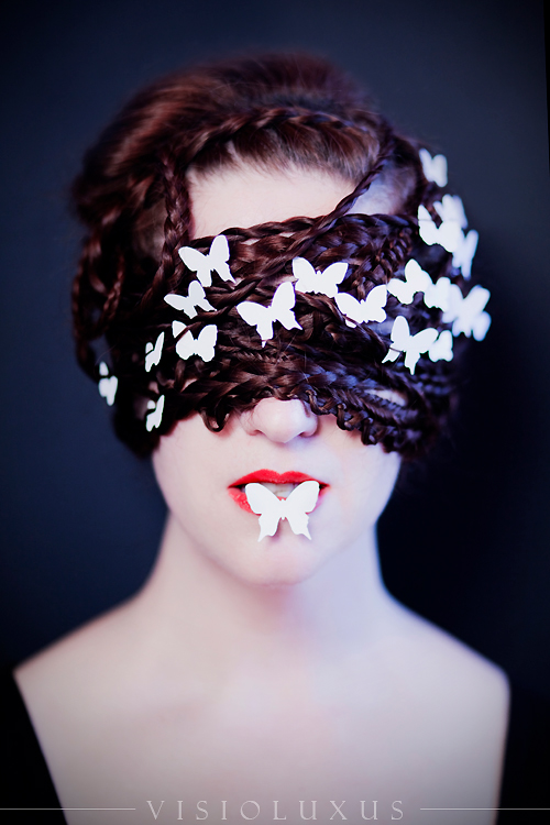 Elisa Lazo de Valdez, French Postcards Photography.
Elisa Lazo de Valdez is a portrait photographer who specializes in surreal, dreamlike, fairy-tale images. Many of her costumes, makeup, and props are detailed and elaborate. Though it was these images that drew me to her work in the first place, I was struck by how simple this incredibly creative photograph was as far as decoration, yet the strong impact that results. I’ve been including butterflies in a lot of my new art since Spring began, which is probably another reason why this particular piece attracted me.
 Matières Fécales.
I saved the most out-there for last. Montreal-based couple Hannah Rose Dalton and Steven Raj Bhaskaran make up the design duo whose name translates in English to, well, Fecal Matter. Everything sounds more elegant in French … The couple are their art, appearing in public with no hair or eyebrows and alien-like makeup on the regular. Their designs are futuristic and slightly painful looking, but then there are nods to Victorian fashion at times, and every so often surprising botanical motifs will show up like in this favorite image of mine. Of their name, the couple says it is a comment on the relationship humans have with material possessions, their disposable nature. They also claim the unpleasant brand name forces the buyer to purchase one of their garments because they actually like it, not because they just want to own or advertise a certain name-brand. To me, some of their work seems like it’s more focused on shock value than creating art, but nevertheless there have been creations of theirs that have intrigued and inspired me, and that is no small thing.
Be sure to check out my Pinterest if you want to see more curated images of bizarre fashion and surreal portraits, as well as some really killer pescatarian recipes ;).


![fIMG_3759[1] sq](https://i0.wp.com/artistallisenicole.com/wp-content/uploads/2019/05/fimg_37591-sq.jpg?w=228&h=228&crop=1&ssl=1 "fIMG_3759[1] sq")
![fIMG_3761[1] sq](https://i0.wp.com/artistallisenicole.com/wp-content/uploads/2019/05/fimg_37611-sq.jpg?w=228&h=228&crop=1&ssl=1 "fIMG_3761[1] sq")


 An additional challenge – my two loves are watercolor and colored pencil, and I especially love to utilize these two vastly different mediums together. What paper to use, though? Colored pencils just cannot blend on watercolor paper with the strongly textured, bumpy surface so I tend to opt for mixed media paper when using wet and dry mediums together. However, watercolor does not act the same way on mixed media paper as on traditional watercolor paper. Doing wet-on-wet color application leads to some really blotchy, unpleasant results so I had to be patient and do a lot more light layering to build up to the look I wanted.