Techniques and Tutorials

Good Omens for 2022 With Pantone’s Very Peri

It’s that time of year again! Yes, a day after New Year’s, but also the time when Pantone assigns the new Color Of The Year ;). I actually found out what the new color was going to be before Christmas, but just got around to doing my annual themed artwork after the holidays. I hope it means something that 2022’s color is one of my favorite hues!

The collage of lovely Very Peri art inspiration above is by myself (including some of my recent Christmas themed ACEOs), Emiliano Vega, Bonne Idee Art, Coral REEFlections, Giacomo Carmagnola, Artologica, and beautyspock.

Happy New Year!

Advertisement
Standard
Throwback Art

Throwback Chapter 3 : Fashion Victim

Welcome to the next part in my series using the past to delve into why I create what I do… I hope others find this interesting and entertaining, and I hope it helps readers reconnect with their past selves and realize how all of those different “us-es” had a part in creating who we are today, even those versions of us we don’t like to spend too much time with.

Though you wouldn’t know it from my own childhood attire, fashion was always a large part of my artwork and I loved imagining my own clothing designs (Note me designing Barbie clothes in our home office on Windows95. Note also, I was wearing unnecessary glasses with the lenses popped out for fashion far before mid-2000s hipsters existed.) I adored designing extravagant imaginary partywear, but was also awkward and uncomfortable in my own skin. It took me awhile to ever give a thought to actually trying to look cool myself ;). Once I got into upper elementary school, I idolized the girls in Disney channel movies who rode dirt bikes and skateboards and never seemed to be afraid of what other people thought of them. I really just wanted to be a cool tomboy but I had no athletic ability whatsoever, and I did actually care a lot at that time about what other people were thinking about me, so … I wasn’t too sure what to do with that. It didn’t stop me from rocking a soccer uniform at Disney despite the fact I’d never touched a soccer ball in my life.

My parents always encouraged art and creativity, and come to find I created my first “mixed media” project with my mom, using cutouts from scrap fabric for dresses at age 4. As I got older, my designs became a bit more sophisticated and I even began naming the pieces in my collection with such enticing titles as “Wide Country Gown”, among others.

Around 15, I finally got a clue and started developing my own personal style which also filtered its way into my artwork. I got hooked on loud, unique, alternative fashion that had a retro flair, and even became a bit interested in the whole club kid aesthetic though by happenstance of my birth year I kind of missed the whole raver trend. Below on the left is what I imagined it was probably like.

I’ve been told my interest in both fashion and interior design stand out in my work, and as I mentioned in my first throwback post people have always played a central role in my art. The way individuals choose to decorate both themselves and their external environment are central to telling part of the story of who they are.

Over this year, my passion for wearable art has jumped off the page and into reality as I began designing my own upcycled clothing. This was at first dove into as a project to help my art students with disabilities lead their own fashion show, and then for myself as I realized this is something I really enjoy.

This is also the first year I had the confidence to participate in some local modeling projects for art friends, and it was an absolute blast. Expression via how I visually adorn myself has been another way I have used art as a tool for communication over the years as someone who is an unwilling introvert due to social anxiety. People are all living sculptures, for the most part wonderful and fascinating (and yes, also challenging at times), and the ability to use how we visually present ourselves to show who we are to others before even speaking is an intriguing tool.

Like with my other art, with my wearables I hope to inspire, make people smile, and help them feel confident and comfortable in who they are. My pieces are available for purchase via ebay, etsy, and facebook so pick your poison ;). Let me know what types of colors, patterns, or images make you feel the most inspired and powerful!

Standard
Project Ideas, Techniques and Tutorials

Charley Harper: Creative Minds Art History Project

I was first drawn to Charley Harper‘s work in the gift shop of a local museum. One of my dad’s main hobbies is birding and wildlife photography, and Harper’s Mid-Century-Modern style illustrations just screamed the perfect birthday gift.

Harper grew up on a farm in the Midwest, and was inspired by the wildlife he experienced around him. He called his style “minimal realism”, taking in the world around him and distilling the imagery he observed down to the most essential details. He said, “When I look at a wildlife or nature subject, I don’t see the feathers in the wings, I just count the wings. I see exciting shapes, color combinations, patterns, textures, fascinating behavior and endless possibilities for making interesting pictures. I regard the picture as an ecosystem in which all the elements are interrelated, interdependent, perfectly balanced, without trimming or unutilized parts; and herein lies the lure of painting; in a world of chaos, the picture is one small rectangle in which the artist can create an ordered universe.”

Inspired by images from Harper’s body of work that capture his signature style, I encouraged my students this week to create their own minimal realist birds. Though Harper’s works were painted, they bare quite the resemblance to modern day digital art and graphic design. Instead of painting, we used a collage format to create our Charley Harper Birds. We used paint chip samples for our vibrantly colored creatures, colored cardstock for the background, and paint markers to add the linework details. From working on repainting the interior and exterior of a house over the last couple years, I had an accumulation of samples but never felt right throwing away even the colors I ended up not using. Upcycling to the rescue! At an arts non-profit, we love free materials ;). We outlined our geometric shapes onto the samples with a pencil, then cut them out and adhered them to a foam core board base (any heavier paper would work as well) with a standard glue stick. I’d suggest laying out the entire design before gluing in case you want to make some changes before the final masterpiece.

I teach adults with varying physical, psychological, and intellectual disabilities but this project is perfect for all ages and abilities. It is all inspired by simple geometric shapes and blocks of color, and can be done as simple or with as much detail as the artist desires. We created our works in an easy-to-frame 5×7″ size.

I hope you are inspired to try this at home (This would also be a fun project for bored kids, hint hint 😉 )! This is a simple, whimsical project that you don’t have to be an “artist” to enjoy. Unwind after work and get crafty with some basic, easy to access materials. As always, if you end up making one of these yourself I’d love to see pictures!

Standard
Artists To Know, New Work

New Projects and Oddities

I feel like I’ve been sharing more class projects than studio projects lately, and wanted to update everyone on what I’ve been up to. I am still continuing to work on my series based on the symbolism of color, but have been trying to complete some smaller projects in between that are less about some complex visual metaphor and more focused on the interplay of pattern and things that I just plain find visually interesting. If I become to singularly focused on only one specific project I’ve found it makes me more susceptible to artist block, and I’ve also had a mentally and emotionally taxing last couple weeks that left me needing some of that creation therapy I’m always urging my students towards (nothing serious, never fear! This too shall pass and all that jazz…).


The amazing news is that all 3 of these projects from watercolor to mixed media to a doll repaint not only provided a bit of sunlight in my miniature storm, but also found good homes with art appreciators!


For a lot of my teens and early-mid 20s I felt like I didn’t have a cohesive aesthetic because I appreciate so many different types of visuals. Even when I get dressed in the morning, am I going to be goth, street style, barbie, androgynous, hippie, stepford wife, some odd hybrid of them all … It entirely depends on my mood for the day. I feel like in the last 5 years I’ve finally been able to marry my inspirations of nature and living things, the fashion world, vintage and antique, graphic patterns, and eerie elegance into a specific style without getting repetitive and monotonous.

Though I am not a very techy person and resisted bothering with both instagram and pinterest for longer than most, I have to admit I am now completely addicted to both for the constant stream of visual inspiration. To me though, at least looking at art and design on social media is a positive force, so long as you aren’t using it to compare yourself negatively to the journey of other creators! Today I wanted to share the current visuals I am feeling connected to right now. All are photography and fashion, which is an idea I feel like I try to bring into my drawings. I had a huge interest in pursuing photography for the longest time in college, but one can only focus on so much and eventually drawing won out! I also would have loved to go into fashion design but alas, I hate sewing machines!

creepy_kids_by_dina_lynnyk-inspiratu_6

Creepy Kids by Ukrainian fashion artist Dina Lynnyk.

Lynnyk collaborated with photographer Roma Pashkovskiy to make this aptly titled series of disconcerting fashion collages happen. The mainly monochromatic yet still surprising color palettes, detail in the wardrobe and accessorizing, and the incorporation of wildlife in the form of winged friends in many of the images drew me into this project right away (I’ve long been a fan of matching birds to clothing). Also, the pale stares! It makes you stop, and it is undoubtedly creepy but there is still such an elegance to it, like these children are some evolved form we have just discovered.

97d1ee4d4d8547cb3083b34a19013a47Gareth Pugh Spring and Summer 2015 Collection.

Gareth Pugh is an English fashion designer, and though my favorite image was from his Spring collection a couple of years ago, the inclusion of all-absorbing optic-art geometric prints are just as present in his current Spring collection for 2019. Many of his models are obscured in some way or completely covered by the designs, demonstrating garments’ power to quite literally transform the wearer into something or someone completely new. His hard edged, high contrast designs when photographed almost look like an ink drawing or painting, making the model a living work of art. 


ab830156054015.5609a2c8de3fcElisa Lazo de ValdezFrench Postcards Photography.

Elisa Lazo de Valdez is a portrait photographer who specializes in surreal, dreamlike, fairy-tale images. Many of her costumes, makeup, and props are detailed and elaborate. Though it was these images that drew me to her work in the first place, I was struck by how simple this incredibly creative photograph was as far as decoration, yet the strong impact that results. I’ve been including butterflies in a lot of my new art since Spring began, which is probably another reason why this particular piece attracted me.


9b514eda1ec08bca74b6f8bfb9466475Matières Fécales.

I saved the most out-there for last. Montreal-based couple Hannah Rose Dalton and Steven Raj Bhaskaran make up the design duo whose name translates in English to, well, Fecal Matter. Everything sounds more elegant in French …  The couple are their art, appearing in public with no hair or eyebrows and alien-like makeup on the regular. Their designs are futuristic and slightly painful looking, but then there are nods to Victorian fashion at times, and every so often surprising botanical motifs will show up like in this favorite image of mine. Of their name, the couple says it is a comment on the relationship humans have with material possessions, their disposable nature. They also claim the unpleasant brand name forces the buyer to purchase one of their garments because they actually like it, not because they just want to own or advertise a certain name-brand. To me, some of their work seems like it’s more focused on shock value than creating art, but nevertheless there have been creations of theirs that have intrigued and inspired me, and that is no small thing.

Be sure to check out my Pinterest if you want to see more curated images of bizarre fashion and surreal portraits, as well as some really killer pescatarian recipes ;).


Standard
Project Ideas

Sonia Delaunay – Creative Minds Art History Project

I live in Michigan, and we have been having some wild weather over the past couple of weeks, including over 10 snow days! Since I teach a couple art classes in the program I run in addition to coordinating all the goings on, I still have to get work done on snow days, just without my fun project break :(. I was excited to finally get to host my classes again this week and share a long awaited project with my group! This week’s artist was Sonia Delaunay.

sonia-delaunay

Sonia Delaunay was an abstract artist and designer who not only painted but worked in fabric and costume design, and in 1964 became the first living female artist to have a retrospective exhibition at The Louvre in Paris!

7b8e0747794bbfd304f8ea05fc0fb013

The literal geometry she brought to her most famous costume work for the play The Gas Heart by avante garde poet Tristan Tzara is just fabulous.

Saturday Night Live

You know you’ve got a good thing going if David Bowie is on board! He wore a getup inspired by her cubist suit when he performed on Saturday Night Live in 1979.

Remembered most for her paintings, a lot of her fashion work gets glazed over which is a shame, because it is her fashion and costumes that I personally find the most interesting. Delaunay’s fashion work was revolutionary at the time because she didn’t just take her paintings and hang them on bodies… Her designs for clothing were specifically configured to work with women’s body shapes, and the clothing themselves was functionally designed for movement, not decoration. Come to think of it, this may still be considered revolutionary today! Given this, it was only fitting that our class project be something wearable. Inspired by Delaunay’s colorful, geometric art and design, my class created fabric collage necklaces.

I am all for any chance to upcycle! Discarded leather upholstery samples were cut into boomerang shapes to be used as a base for the collage bib necklaces. I pre-selected fabric for the students to choose from that meshed with the inspiration artist’s colorful, abstract style. All of my students have some form of disability, and a couple struggle with dexterity. Providing prepared shapes cut from matte board for the students to trace gave them a helpful guide to encourage project success and allow them to be able to work independently. They were also encouraged to look for shapes in the fabrics’ patterns that they could follow, as one did with a large red flower. Regular ballpoint ink pens can be used to trace the shapes on the back of the fabric. Fabric scissors were used to then cut out the shapes. Shapes were arranged on the base, and then students used a junky brush to paint tacky glue on the back of their fabric pieces and press them down. Once dry, holes were punched in the ends and jewelry chain attached and voila! Ready to wear!

Lesson planning has been so inspirational to me in my own art and handmade journey, and has pushed me to think outside of the box and come up with ideas I never would have otherwise. Creating this project inspired me to work on my own statement necklaces using not only fabric but my velvet vintage millinery florals I love to collect from ebay and local antique fairs. These necklaces are for sale in my own ebay shop for $25. More designs coming soon!

Standard
Artists To Know

Artists To Know: Black History Month

It’s been awhile since I’ve done an Artists To Know post, and I wanted to take the opportunity for February to highlight some of my favorite black artists currently working – most new, some mentioned before. Enjoy, and be inspired!

Lina Iris Viktor

lina-iris-viktor-2

Viktor is a British – Liberian artist based in New York who creates “queenly self portraits with a futuristic edge”. Everyone knows I’m a sucker for surreal, fantasy-like portraiture and after coming across the image above, I had an instant new favorite! Viktor studied film, photography, and design and uses all of these backgrounds to create her unique fantasy worlds that combine elements of painting, sculpture, photography, and performance. What makes her art so compelling to me is the contrast of seemingly opposite elements … Her works are detailed with a lot of pattern and texture to look at but the colors are kept minimal; many of the scenes she creates are contemporary or futuristic in appearance, but still contain elements of the classical. As well as a diverse study of art, she also had a diverse upbringing as far as culture, being raised in London by Liberian parents and also spending time living in Johannesburg, South Africa. Viktor aims to use her immersive scenes to convey a philosophical commentary on both a social and historical “preconception of blackness”. Her work is a category all its own.

Woodrow Nash

913b1dfcfcc3abddeeb0ffb6a59646c5

Nash is an artist from Akron, OH who works in stoneware, earthenware, terracotta, and porcelain. He is most well known for his unique bust sculptures that capture an expression, depth, and personality that I have never felt before in this type of art. He began as an illustrator, working as a fashion illustrator in New York in the mid 70s and then returning to the Midwest to do technical illustrations. Just as he uses multiple materials for his sculptures, he also employs various firing methods from pit firing, to electric, to raku (one of my personal favorites!). He calls his style “African nouveau”, because although it is influenced by African cultural aesthetic he blends in elements of art nouveau, and his sculptures tend to appeal to a wider audience beyond just those of African heritage. Each gorgeous figure he creates has a story, and they draw you in instantly.

Kehinde Wiley

If you can’t already tell, creative portraiture is my thing. I love portraits that transport the viewer to a new place of the artists’ making, where every pattern that is used is not only decorative, but an element that is used to speak to the subject’s unique psychology. I have been a fan of Wiley’s unique, powerful style of portraiture for a long time, and was excited when he was chosen to do Obama’s official portrait. Possessing a MFA from Yale, he combines contemporary figures with aesthetic elements from the past, giving his portraits a surreal, timeless feel. One of his most recent projects for the Saint Louis Art Museum featured oil paintings of black men and women dressed in their own clothing, styled for their usual everyday, posed in traditional poses from European and American art history to make a comment about under-representation. The photographic realism coupled with ornate pattern and creative approach make it no wonder his work has garnered the acclaim it has. His art is a testament to the fact that it is possible for an artist to stay true to themselves and not follow the crowd, and still be successful.

Tawny Chatmon

Picture1

A self proclaimed “army brat”, Chatmon did a lot of traveling as a kid and had resided in 3 different continents by the age of 12. Once settled in the US, she turned more in the creative direction of theater. She didn’t start getting into photography until her early 20s, when she was gifted a camera at 19 and through self teaching and experimentation saw an opportunity to make a living through the lens. After losing her father to a battle with cancer in 2010, Chatmon’s portrait photography became not only a career but a way to communicate and process emotions, an art. What first drew me to her work was the image above, part of her series titled “Deeply Embedded”. The composition and heavy use of pattern on the clothing reminded  me a bit of Gustav Klimt, one of my favorites from art history. Chatmon writes about this series on her website, “Deeply Embedded was created during a time where I continued to come across negativity centered around natural black hair & styles. Anger followed by frustration and sadness forced me to refocus that energy into creating work to speak for me as our words fell upon deaf ears.” There are many different forms of beauty in our world, and photography is the perfect medium to capture that fact.

Pierre Jean-Louis


I love art that plays with the merging of people and their environments, which is why I found this 26 year old artist’s work so inspiring. This self taught artist from New Jersey grew up in a deeply conservative religious household, but also a deeply creative one being the son of successful Haitian painter Bonaventure Jean-Louis. He moved beyond his roots with multimedia approaches, taking his inspiration from the beauty of the natural world that God has created, and with his series “Black Girl Magic”, explores specifically the beauty of natural hair. Models’ hair is transformed into forest, flowers, and galaxies, making a comment against exclusionary beauty standards.

I hope you will take the time to explore more of these artists’ amazing work. It was so hard to pick just one or two images to highlight!

Standard
Artist Bio

On Creativity & Leadership: New Year New Perspective

Though new year’s resolutions can be cliche and oft forgotten, using the turning of a year as an opportunity to refocus can’t hurt. My ongoing goal for this year is to not let the fear of others’ perceptions make me question my decisions either in art or as a leader. Not that I should never question why I am doing what I’m doing; questioning oneself is healthy and necessary, but only if done for the right reasons.

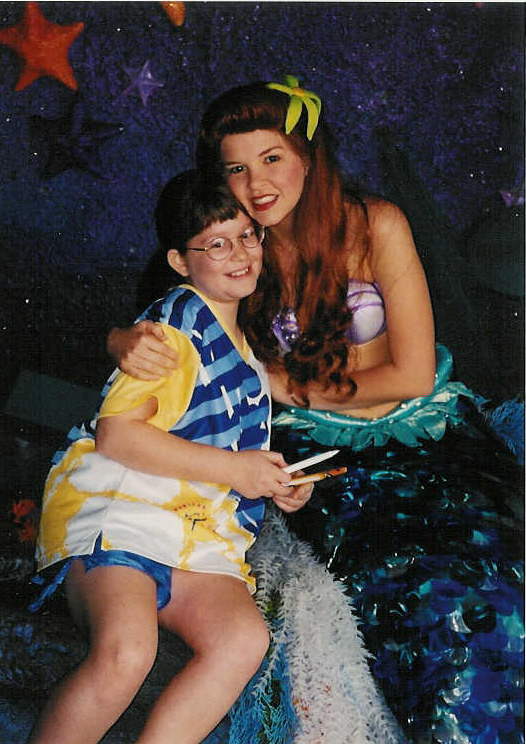
A quick background blurb for those new to the blog – My day job is running an inclusive creative classes program geared towards adults with disabilities and mental health, and I am also a freelance artist.

I was hit with this the other day when I came home from the first week of the program’s new semester on a high, because a new student had taken me aside and let me know that they had not been out in public to participate in group activities in a long time, and that I had been a stabilizing presence that kept them calm and made them feel safe. As I was browsing through facebook while waiting for dinner to cook, I came across an article (mainly aimed at women) that stated that being called reliable, stabilizing, nice, or accommodating were not compliments and were basically code for being a complete doormat. As an independent minded person, this horrified me. Immediately, every time I’d been called any of those adjectives by others rushed through my head and halfway through creating a plan to deconstruct and rebuild my entire personality, I suddenly stopped and asked myself why I was doing this. I don’t know the person who wrote this article personally, nor do they know me. Why does this opinion suddenly hold so much weight? Should I instead be unkind, stubborn, leave a path of division and stress in my wake? It makes no sense for either women or men to live their life that way.

wonder-woman-superman

Though it may not be fierce or glamorous or fit neatly within an awe-inspiring superhero persona, I don’t really want to be the leader who is kicking ass and taking names ;). I don’t want to be the leader that refuses to see the progress and can only focus on past mistakes in the people I work with. I don’t want to be the leader that kicks an employee when they’re down; I don’t want people to come to me with vulnerability, saying “Hey, I may need some extra support this week because I’m having a tough time with____________, or this hard thing just happened in my life, or I’m having this mental health struggle right now,” etc. and my response is, “That’s not my problem, leave your issues at home.” I can still hold people accountable without tearing down their self worth, and I don’t need the approval of those that are on the outside looking in that don’t know my group like I do.

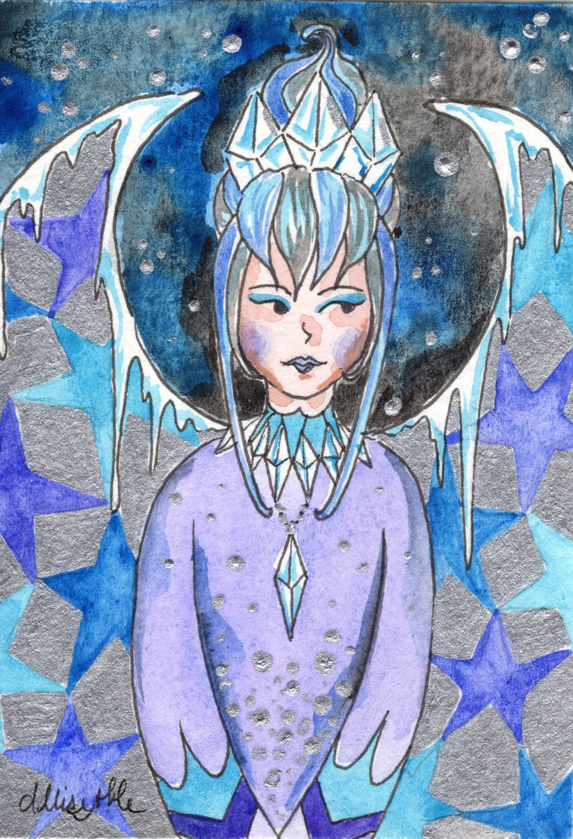
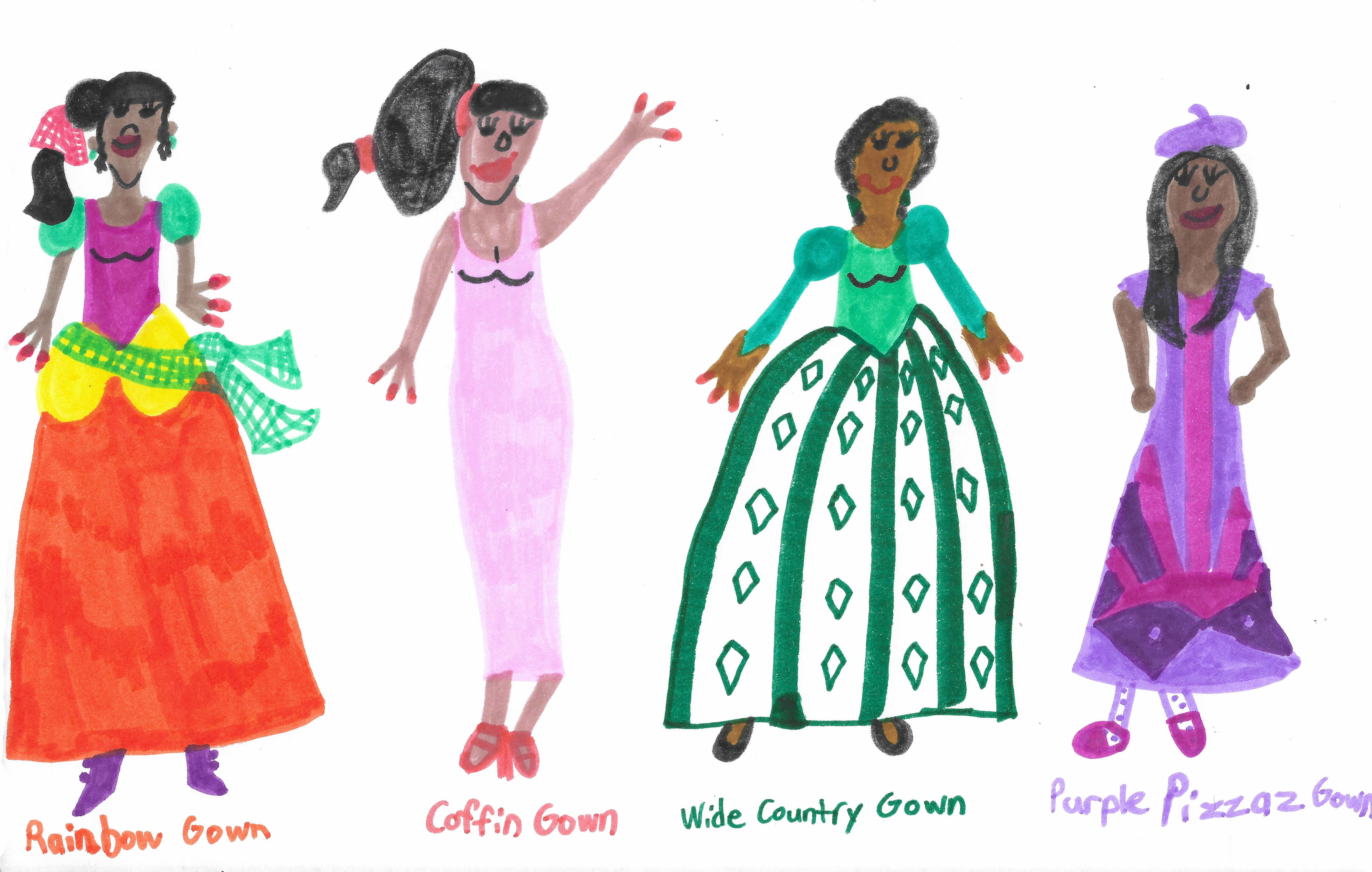
I realized that without knowing it, I’d slipped into these same bad habits with my art … I’ve mentioned before how it was hard knowing what direction to go in after completing my last big 12 part series I’d worked on for around 2 years. When trying to come up with new concepts, I found myself constantly questioning myself based on how a new project may be perceived, and getting nowhere. If I start using more bright colors than usual will people think I’ve lost my edge, if I use my more dark imagery will I come across as an aging Hot Topic shopper, Will men feel left out since I draw mostly women, If I draw men will they think I’m trying to speak for them … ??? I’d gotten a lot of commissions done in the time since and some just-for-fun personal projects, but nothing with a strong direction.

When beginning your next creative endeavor for 2019, whether on your own or leading/educating a group, keep yourself in check by asking the right questions:

What kind of creator do I want to be? This question sounds simple, but is an ongoing process. I remember taking a fascinating hybrid philosophy/law class in college to fulfill one of my freshman year gen eds, and we started by discussing the tombstone question, basically when you’re gone, what do you want written on your tombstone? How do you want to be remembered? Now let that answer be in the back of your mind and guide your decisions, because our daily choices determine who we will become. Once you decide what kind of creator you want to be, the steps you need to take as a creative, the events you need to participate in, the programs you need to donate your time to, will no longer seem so up in the air, and won’t be so susceptible to changing with the wind the minute you hear a bit of noise.

Who am I trying to reach with this project? Oftentimes creative projects won’t be all about you, so there are indeed times you need to consider others’ possible responses to your work. But, if you are trying to appease everyone you will end up running yourself in circles, leading to a sub-par result that in trying to say everything to everyone, says nothing. Think of who you want to speak to with your project – It’s ok for you to create something that isn’t intended to resonate with everyone. Chances are, there will be others outside of your target that will end up getting something out of it, too.

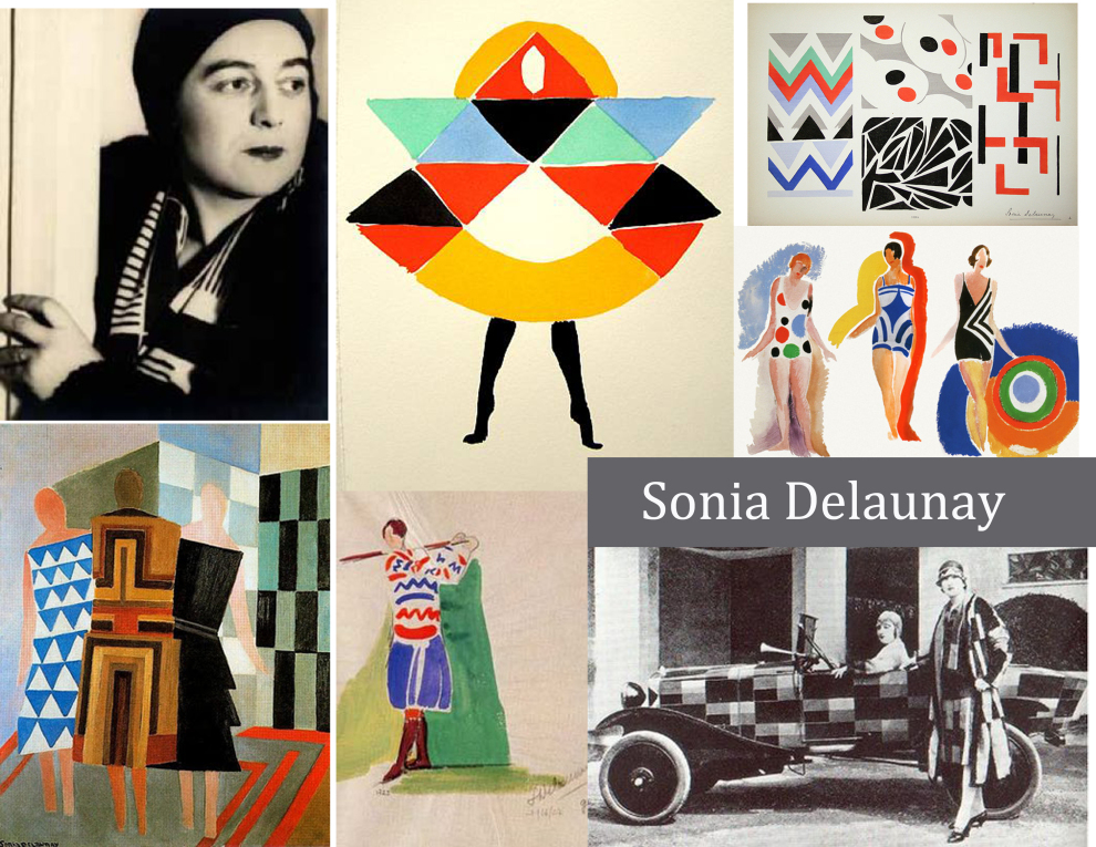
What experiences am I drawing my ideas from? Creation flows most easily when it comes from the fount of something that the creator is passionate or knowledgeable about. Think about what in the world gets you stirred up, either positively or negatively. Think about what experiences you’ve had that have impacted you, that you remember every detail of; again, positive or negative. There may be an artist out there whose aesthetic and ideas you really admire, an artist you wish you could create exactly like, but it likely isn’t possible since they have a different story than you. Find your own voice rather than trying to retell another person’s story. And, if in the end you do want to use your voice to tell the stories of others, make sure you do your research and ask questions!

How would I want to be guided? Methods of leadership or teaching aren’t one size fits all as different styles are more effective for certain personality types, but this question is a good starting point. It pretty much boils down to the golden rule, and asking in each situation, “How would I want to be treated?” I’ve heard horror stories of art instructors sending students away in tears after a critique of their work. Yes, the work of a student or a fellow artist you are collaborating with may not meet your expectations, but how is destroying their enthusiasm for creation or any hope in them that they can improve going to help them get to where you want them to be? In leadership, treat others how you would hope they’d treat you, it’s really that simple.

What is distracting me from my purpose right now? Be mindful of what is going on when you feel yourself getting derailed like I described happening to me earlier … Stop yourself and note what activity was going on when the switch occurred, and what stimuli you were taking in. Is it criticism from toxic people in your life, comparing yourself to others on social media, taking opposing views personally without the lens of evaluation, forcing yourself into a box that is antithetical to who you are … Write it down if you have to, and when you start to notice a pattern do your best to remove or lessen that thing in your life, whether it means taking a break from certain friends or family members or spending less time putzing about online.

I have to decide for myself what kind of leader, and what type of creator I want to be… and so do you!


Standard
Interior Design

Pantone Color Of The Year 2019: Living Coral

One of the most exciting things about the changing over of a new year is finding out what Pantone’s new Color Of The Year will be. No, I’m not kidding – I am a dork. Purple being my favorite color, I knew 2018’s Ultra Violet hue was going to be hard to beat. 

2019’s Living Coral is by no means an unpleasant color, but it isn’t a color I wear a lot or use in my art or design. I think it’s a little too pastel and preppy for me, but I’ve found I like it infinitely better when paired with black or grey, because black makes everything better. This was my philosophy with making some original-to-the-house bright yellow and silver foil wallpaper work in my bathroom update last year, and this personal rule of mine has held up!

I was hard pressed to even find any art I have done over the last 10 years that included this coral hue aside from “The Rush Hour”. This piece of art can be seen below, along with some of my favorite interiors, wallpaper, fabric, clothing, and flowers that pay homage to our 2019 Color Of The Year.

I am going to make it my goal now to create some coral colored artwork for the new year! I’m excited to see what comes from working with unexpected colors.

Enjoy the last wee bits of 2018 everyone! I hope it’s been a good one!

Standard
Artists To Know

Artists To Know: In Dreams

I haven’t done an “Artists To Know” installment in quite awhile, and have bookmarks of inspiring artists piling up by the minute – The internet is wonderful ^_^! The artists I have picked today all create dreamlike worlds through their art, causing the viewer to get lost in detailed landscapes that could only exist in the artists’ imaginations, almost as if they are inviting viewers into their own inner fantasies. All are 2-dimensional works this time except the last, which is really something special, so be sure to look all the way to the end! This style of fantasy-like, surreal art is my absolute favorite. I hope you enjoy, or at least see something you’ve never seen before!

Lucy Hardie

lucy-hardie2

Lucy Hardie is an Australian artist who began her education at a Waldorf school built by her parents. With her parents’ encouragement, she studied art history and the Masters at an earlier age than most. This foundation was obvious to me right away in the style and subject matter of her work. Parts of it look like they are from another time… but then other parts resemble a time that has not yet existed, and this seamless meshing of the two along with the exquisite fine details are what make her work so captivating to me.

Hsaio Ron Cheng


Hsaio Ron Cheng hails from Taiwan, and is a digital artist and illustrator. The bio on her website says she was born in 1986, only 2 years before me which makes me feel like I’m slacking! Her portfolio encompasses a wide range of personal and commercial work, all in her signature palette of peachy, pastel, diluted colors. The unusual color choices are actually what first drew me to her work, and made her illustrations stand out.

Daria Hilazatova

1900775_orig

Daria Hilazatova describes herself as a “full-time artist, part-time elf” in the bio on her website, and sites her inspiration as “fairytales, theater, and nonsense”. Whimsical and fantastical theatrical elements abound in all of her drawings. Her illustrations are distinct and different from anything else I have ever seen, truly 100% from the artist’s imagination. The other element that differentiates her art from anything I’ve seen previously is the insane amount of detail! One has to squint to see all of the intricate patterns making up each image, and the longer one looks, the more they notice details they had originally missed.

Alexandra Levasseur

25_screen-shot-2013-07-30-at-32737-pm

The image above is what first prompted me to investigate more of Levasseur’s work, but she also has a ton of fantastic paintings in which the subjects are merging into painted landscapes which I’d encourage you to check out on her website. There is strong movement and emotion in each of her pieces, all of which are incredibly surreal. Her figures are realistic, but she mixes in a lot of more painterly or sketchy elements as well, making it look as if her subjects have jumped inside a delightful hand painted world and gotten lost there.

Benjamin Shine

benjaminshine-8

I told you the last one was a good one! I can’t even wrap my brain around how this works, but below is a video that shows artist Benjamin Shine in action as he creates his tulle “paintings”. Shine studied fashion design at The Surrey Institute of Art and Design and Central St Martins in London. I can’t even iron shirts properly, so conceiving of how these gorgeous, smokey portraits can be born out of an iron and some thread makes my head nearly explode. Who said there is nothing new under the sun? Shine has certainly discovered something that has never been done before.

I hope you’ve enjoyed your Sunday inspiration! Get out there and do something amazing with the rest of your weekend! 🙂


Standard
Interior Design

Bathroom Remodels – Inspirations On The Cheap!

I became a first time home buyer as of this summer, falling in love with a house that had great bones, a lot of potential, but some wacky aesthetic choices. The home had a single owner which was great … except that owner looked to have not made any design changes since she first moved in.

My boyfriend and I are both young-ish and not super rich, but there was no way we could live in this. So began a journey of creativity, (some blood while ripping out tack strips and carpet staples), sweat, and tears.

Bathrooms can be hands down the most expensive rooms to renovate. We really had to scrimp in some areas since we were trying to renovate an entire house in a little under 6 months. If you have a bathroom you hate that at least has fixtures that are in working order, it is completely possible to get creative and change the look without having to replace major features such as the toilet, tub, vanity, or even lighting.

This is what we started with. You can’t tell as much in the photos, but NOTHING matched! The stain on the door was different than on the paneling which was different than on the vanity. Mixing wood tones can be cool, but in a room this small … yikes! There was also silver in the (actually pretty nice) foil wallpaper as well as chrome hardware in the room but the mirror and lighting fixture were a brushed brass. The window was painted white as was the trim and the door to a small cabinet set into the wall, which was a bit odd, and the window had a scalloped decorative molding around it that just wasn’t doing anything for the overall look. The floor was just unfinished cement which we took as a blessing since we figured if there had been floor, we just would have been ripping it out :P. To me, the vanity and the lighting fixture were the biggest eyesores. However, we ended up spending over our predetermined lighting budget on new lighting fixtures for the rest of the house. Also, after many agonizing trips to every hardware and “everything” store in the area as well as many online perusals, we learned that it was going to be more costly than expected to have a vanity at least as big as the one we already had in the room. We were going to have to end up sacrificing either size or quality or both, and it just didn’t make sense to replace our current vanity with something smaller and less functional or with less longevity just to have a more modern look.

Just like The Rolling Stones said, Paint it black!

People seriously underestimate the difference a coat of paint can make. They always say you aren’t supposed to paint small rooms in dark colors, but rules were made to be broken. I have always loved black and golden yellow together, and I knew I wanted to keep the wallpaper in this room as the one thing original to the house. Keeping the room from being broken up into a bunch of smaller sections by having the half paneling flow right into the floor by using a deep black on both helps make the room feel less closed in. Painting the paneling a modern gloss black turns it from grandma’s house to vintage chic. I used the same gloss black on the vanity, which downplayed some of the carving and details on it I’d felt were too old-fashioned for my taste. All the molding and window trim in the house is white, so we wanted to keep that still. To tie that in as well as the white and cream swirl finish on the counter and the white tile in the shower, I spray painted the hardware with white lacquer spray. I used Rustoleum black gloss enamel on the mirror and lighting fixture. We used stick-on floor tiles in a black marble for the floor, which are super inexpensive but look way nicer than just putting in linoleum. They are not at all complicated to install oneself as they are literally  like giant stickers and you just keep building around the first tile you put in, keeping one flush to the other.

I made the funny (yet super convenient) little closet just a part of the woodwork by painting it in the same black as well, and following the design of the vanity by keeping the hardware gloss white. The bathroom window is very large, and people tend to be nude in the bathroom so we definitely needed a curtain. I didn’t want to add in another pattern with the wallpaper being so wild already but didn’t want it to look like we just had a big black sheet over the window either. So, I opted for a matte-on-shiny subtle pattern, in black again for consistency. You can’t see it, but FYI, we removed the scalloped edge on the window! The fun black and white artwork is actually a matted and framed page from an art magazine. Magazines are some of the best sources for inexpensive artwork if you need something in a smaller size.

I am well aware that not everyone would want to make friends with this wallpaper, but the same techniques I used can be adopted to fit any style. There were so many different simple choices that could have been made to lend vastly different results in this room. If someone wanted to keep the wallpaper but give the room a more cute, shabby chic, cottage look they could have painted all the woodwork white instead of black. A soft grey would have also been an option. The mirror and vanity lighting could have been painted white or grey to compliment the paneling color choice, or just finished in chrome to match with the sink and shower hardware. The wallpaper could have been ripped down and any color paint imaginable could have been put in its place for a more simple, traditional look without the retro nods. Or, it could have been painted and wall stamps, decals, or stencils could have been used over-top to add some pattern. The ideas could go on and on, and all without having to do any major construction or buy a bunch of new stuff. Remember, something like this can also be a great intermediary step so you can still be comfortable while you wait and save up for a complete overhaul. You don’t have to wait to win the lottery before you can love your home! 🙂

Standard