Artists To Know

Artists To Know: Surreal Sculpture At FIA

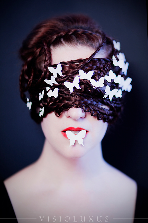
It’s been quite awhile since I’ve done an Artists To Know post (or a post in general!). Now that things are opening back up again in Michigan I visited the Flint Institute of Art a couple of weekends ago on a whim and saw so much beautiful sculpture work. This was the perfect opportunity to break my hiatus, especially since I myself have finally been taking some clay classes at my workplace after being intimidated by basically any sculptural medium for over a decade after some pretty big fails in gradeschool :P.

Sergei Isupov

Shadow

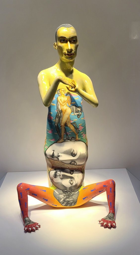
Anyone who knows me knows I am all about portraits and figures, and representing the human essence in art. On his website, Estonian-American sculptor Isupov states, “Everything that surrounds and excites me is automatically processed and transformed into an artwork. The essence of my work is not in the medium or the creative process, but in the human beings and their incredible diversity. When I think of myself and my works, I’m not sure I create them, perhaps they create me.” I really connect with these thoughts, and feel the same way about the portrait based art I create. I am drawn in by the surreal nature of his work and the strong story arc of his pieces. As a primarily 2D artist, I also appreciate how he incorporates 2D processes into his 3D art, such as the detailed paintings over the surfaces of his sculptures, almost as if the images across their body are allowing you a glimpse into their memories or fleeting thoughts. I am excited to learn more about this artist and investigate his other work.

Christopher A. Vicini

Idiotheim

Surprising nowadays, but I could find no online presence for this artist, aside from a closeup of this sculpture I photographed on Flickr. Therefore, I wasn’t able to learn much about the artist or his process, but I can tell you what made me stop and look longer at this piece. Like the previous piece, there was a strong story being told, but one that was not necessarily obvious and left the viewer to get creative with their narrative to an extent. It is assembled like a collage of Grandma’s nic-nacks, but when you look closer you see all is not what it seems. It reminded me of something you may see when you are walking around a house inside of a dream, familiar but with an odd twist. I also thought making it all white had an interesting effect – all form and detail being dictated by light and shadows.

Rudy Autio

Autio was born in Montanna where he has remained for most of his career, heading up the ceramics department at the University of Montanna for almost 30 years. Like with the first artist, I believe I was drawn to this because of the aspect of wrapping a painting around a 3D form. The style feels classic and modern at the same time, and the fact that there is a “hidden” scene on the back, making it almost a different sculpture depending how you are viewing it, was a lot of fun.

Joan Bankemper

Pimlico

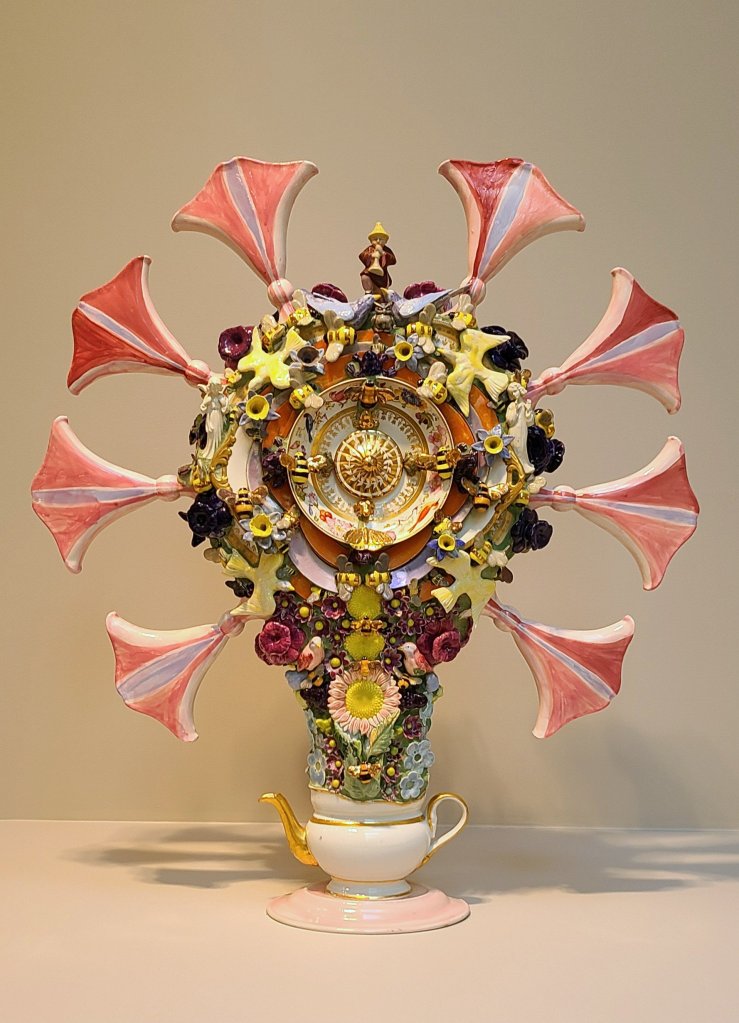
I was interested to learn upon visiting Bankemper’s website that she actually primarily creates public installations based on sustainability and community gardening and farming. In her sculpture, she utilizes discarded or broken tableware and gives them a new life by combining them with ceramics pieces from molds she has collected over the years. Her work reminds me of walking into an antique or thrift store, but in Wonderland as Alice.

Karen Willenbrink-Johnsen

Falcons Series

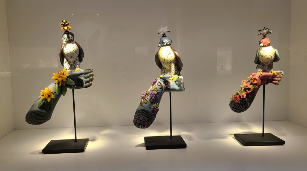
Karen collaborates with her husband Devin as an artist team to create amazing glassworks inspired by nature. She does a lot of work inspired by birds, which is what grabbed my attention as birds are one of my favorite motifs in art. I love the concept of this trio, and would never have guessed that something like this could be formed out of glass. I like that the birds are stylized, and the flowers winding up the arms remind me of gorgeous 3-dimensional tattoos.

Pavel Hlava

Flower

Plava was “a pioneer for contemporary glass art in the Czech Republic” and came to be quite well known in the United States over the course of his career. As you can see from the other pieces I selected to highlight here, I am not usually as into art that is purely geometric and abstract. However, his pieces, of which this one was my favorite, were a different story. The detailed, fractal quality that shed beautiful rainbow light in patterns around the piece and the unique colors as well as the fact that there were layers of geometry even inside each of the external patterns gave his pieces a depth that had me standing in front of them staring, losing track of the world around me.

Lucio Bulbacco

Watcher

You can’t tell here but this piece is TALL. The first thing I must note is the deep grape purple color choice because though purple is my favorite color, it is not a color you see a lot in art. Even in my own work it just doesn’t come up often, which just adds to the regal mystery of this figure. The scrolling organic shapes that make up her form give her the look of a mystical spirit made of vapor, and there is a soft, wafting smokiness to her despite the fact that she is made out of hard glass.

It was so difficult to choose only a selection of art to highlight – I took a lot of pictures! I hope what I’ve shared inspires you, and if you have any favorite artists please share with me in the comments! I’m always looking to discover more creators.

Advertisement
Standard
Artists To Know, New Work

New Projects and Oddities

I feel like I’ve been sharing more class projects than studio projects lately, and wanted to update everyone on what I’ve been up to. I am still continuing to work on my series based on the symbolism of color, but have been trying to complete some smaller projects in between that are less about some complex visual metaphor and more focused on the interplay of pattern and things that I just plain find visually interesting. If I become to singularly focused on only one specific project I’ve found it makes me more susceptible to artist block, and I’ve also had a mentally and emotionally taxing last couple weeks that left me needing some of that creation therapy I’m always urging my students towards (nothing serious, never fear! This too shall pass and all that jazz…).


The amazing news is that all 3 of these projects from watercolor to mixed media to a doll repaint not only provided a bit of sunlight in my miniature storm, but also found good homes with art appreciators!


For a lot of my teens and early-mid 20s I felt like I didn’t have a cohesive aesthetic because I appreciate so many different types of visuals. Even when I get dressed in the morning, am I going to be goth, street style, barbie, androgynous, hippie, stepford wife, some odd hybrid of them all … It entirely depends on my mood for the day. I feel like in the last 5 years I’ve finally been able to marry my inspirations of nature and living things, the fashion world, vintage and antique, graphic patterns, and eerie elegance into a specific style without getting repetitive and monotonous.

Though I am not a very techy person and resisted bothering with both instagram and pinterest for longer than most, I have to admit I am now completely addicted to both for the constant stream of visual inspiration. To me though, at least looking at art and design on social media is a positive force, so long as you aren’t using it to compare yourself negatively to the journey of other creators! Today I wanted to share the current visuals I am feeling connected to right now. All are photography and fashion, which is an idea I feel like I try to bring into my drawings. I had a huge interest in pursuing photography for the longest time in college, but one can only focus on so much and eventually drawing won out! I also would have loved to go into fashion design but alas, I hate sewing machines!

creepy_kids_by_dina_lynnyk-inspiratu_6

Creepy Kids by Ukrainian fashion artist Dina Lynnyk.

Lynnyk collaborated with photographer Roma Pashkovskiy to make this aptly titled series of disconcerting fashion collages happen. The mainly monochromatic yet still surprising color palettes, detail in the wardrobe and accessorizing, and the incorporation of wildlife in the form of winged friends in many of the images drew me into this project right away (I’ve long been a fan of matching birds to clothing). Also, the pale stares! It makes you stop, and it is undoubtedly creepy but there is still such an elegance to it, like these children are some evolved form we have just discovered.

97d1ee4d4d8547cb3083b34a19013a47Gareth Pugh Spring and Summer 2015 Collection.

Gareth Pugh is an English fashion designer, and though my favorite image was from his Spring collection a couple of years ago, the inclusion of all-absorbing optic-art geometric prints are just as present in his current Spring collection for 2019. Many of his models are obscured in some way or completely covered by the designs, demonstrating garments’ power to quite literally transform the wearer into something or someone completely new. His hard edged, high contrast designs when photographed almost look like an ink drawing or painting, making the model a living work of art. 


ab830156054015.5609a2c8de3fcElisa Lazo de ValdezFrench Postcards Photography.

Elisa Lazo de Valdez is a portrait photographer who specializes in surreal, dreamlike, fairy-tale images. Many of her costumes, makeup, and props are detailed and elaborate. Though it was these images that drew me to her work in the first place, I was struck by how simple this incredibly creative photograph was as far as decoration, yet the strong impact that results. I’ve been including butterflies in a lot of my new art since Spring began, which is probably another reason why this particular piece attracted me.


9b514eda1ec08bca74b6f8bfb9466475Matières Fécales.

I saved the most out-there for last. Montreal-based couple Hannah Rose Dalton and Steven Raj Bhaskaran make up the design duo whose name translates in English to, well, Fecal Matter. Everything sounds more elegant in French …  The couple are their art, appearing in public with no hair or eyebrows and alien-like makeup on the regular. Their designs are futuristic and slightly painful looking, but then there are nods to Victorian fashion at times, and every so often surprising botanical motifs will show up like in this favorite image of mine. Of their name, the couple says it is a comment on the relationship humans have with material possessions, their disposable nature. They also claim the unpleasant brand name forces the buyer to purchase one of their garments because they actually like it, not because they just want to own or advertise a certain name-brand. To me, some of their work seems like it’s more focused on shock value than creating art, but nevertheless there have been creations of theirs that have intrigued and inspired me, and that is no small thing.

Be sure to check out my Pinterest if you want to see more curated images of bizarre fashion and surreal portraits, as well as some really killer pescatarian recipes ;).


Standard
Project Ideas

Sonia Delaunay – Creative Minds Art History Project

I live in Michigan, and we have been having some wild weather over the past couple of weeks, including over 10 snow days! Since I teach a couple art classes in the program I run in addition to coordinating all the goings on, I still have to get work done on snow days, just without my fun project break :(. I was excited to finally get to host my classes again this week and share a long awaited project with my group! This week’s artist was Sonia Delaunay.

sonia-delaunay

Sonia Delaunay was an abstract artist and designer who not only painted but worked in fabric and costume design, and in 1964 became the first living female artist to have a retrospective exhibition at The Louvre in Paris!

7b8e0747794bbfd304f8ea05fc0fb013

The literal geometry she brought to her most famous costume work for the play The Gas Heart by avante garde poet Tristan Tzara is just fabulous.

Saturday Night Live

You know you’ve got a good thing going if David Bowie is on board! He wore a getup inspired by her cubist suit when he performed on Saturday Night Live in 1979.

Remembered most for her paintings, a lot of her fashion work gets glazed over which is a shame, because it is her fashion and costumes that I personally find the most interesting. Delaunay’s fashion work was revolutionary at the time because she didn’t just take her paintings and hang them on bodies… Her designs for clothing were specifically configured to work with women’s body shapes, and the clothing themselves was functionally designed for movement, not decoration. Come to think of it, this may still be considered revolutionary today! Given this, it was only fitting that our class project be something wearable. Inspired by Delaunay’s colorful, geometric art and design, my class created fabric collage necklaces.

I am all for any chance to upcycle! Discarded leather upholstery samples were cut into boomerang shapes to be used as a base for the collage bib necklaces. I pre-selected fabric for the students to choose from that meshed with the inspiration artist’s colorful, abstract style. All of my students have some form of disability, and a couple struggle with dexterity. Providing prepared shapes cut from matte board for the students to trace gave them a helpful guide to encourage project success and allow them to be able to work independently. They were also encouraged to look for shapes in the fabrics’ patterns that they could follow, as one did with a large red flower. Regular ballpoint ink pens can be used to trace the shapes on the back of the fabric. Fabric scissors were used to then cut out the shapes. Shapes were arranged on the base, and then students used a junky brush to paint tacky glue on the back of their fabric pieces and press them down. Once dry, holes were punched in the ends and jewelry chain attached and voila! Ready to wear!

Lesson planning has been so inspirational to me in my own art and handmade journey, and has pushed me to think outside of the box and come up with ideas I never would have otherwise. Creating this project inspired me to work on my own statement necklaces using not only fabric but my velvet vintage millinery florals I love to collect from ebay and local antique fairs. These necklaces are for sale in my own ebay shop for $25. More designs coming soon!

Standard
Project Ideas

Piet Mondrian – Creative Minds Art History Project

piet.mondrianI promised I’d catch up in posting all my Creative Minds art history projects from the Fall and Winter semesters!

You may not recognize the name “Piet Mondrian“, but I guarantee you’ll recognize his imagery. Mondrian was interested in simplifying art down to its basic essence, and creating a type of universal design that could be used for everything: visual art, furniture, architecture, clothing … I’d say he was pretty successful, as his primary colored designs composed out of different sized squares and rectangles bordered by bold black lines can be found covering posters, furniture, jewelry, shirts, and the pair of Nikes I would buy if I were rich.

We do a lot of painting in the Express Yourself Artshop program, so though we easily could have done the whole “make a grid on canvas with blue painter’s tape” thing, I wanted to try something more original – transferring a Mondrian design onto glass. The glass we used was just glass from the inside of an inexpensive frame. This could be done in any size. The actual frame could easily be used on a future project. We used primarily colored tissue paper for our rectangles, though we happened to have a bit of patterned and textured vellum on hand that can be found in the scrapbooking section of craft stores and is great for mixed media art. The goal is to use thin, transparent paper so light can shine through the glass. I cut a variety of different sized rectangles and squares out of scrap cardboard for students to use as a pattern. Students chose their colors, and then traced different shapes using the patterns until they had a good pile to choose from. They then laid out their shapes on the glass to create the desired pattern. After they were happy with their design, it was time to glue. We just used traditional liquid school glue, but squeezed the glue out on a piece of foil and used a crappy paint brush to paint the glue on the back of the paper so it didn’t get too saturated.


The front of the finished product is going to be the glass side without anything glued to it, so if you do end up using papers with a one-sided pattern, you need to glue the side you want to see face down. Once the paper dried, we trimmed any paper that was hanging off of the glass and used a ruler to draw on the glass side (NOT the side the paper was glued on to) with a black, medium tip paint marker. This sharpens and finishes the design, and also disguises any uneven edges.

These can be as simple or as intricate as you want, and are a fun project with a beautiful end result that can be completed fairly independently by all ages and abilities. My students with disabilities who struggle with dexterity were still able to do this on their own and end up with a piece of art they were proud of. Display in a clear plastic plate stand … It would be especially cool in front of a window or other lighted area. Have fun creating :)!

Standard