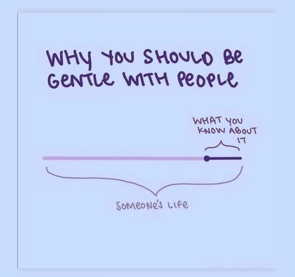
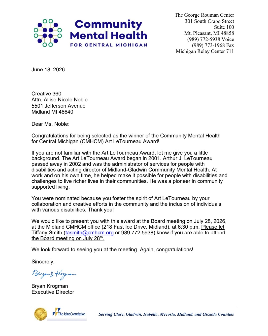
Working in the arts/non-profit sector as well as running your own business is a challenge, but amongst the hard parts there have been so many happy surprises. None has been quite so satisfying as the news I received end of last week, that I was being recognized for my creative work with disability inclusion. The timing is interesting as it lines up with an inclusion focused Art Talk I am scheduled to give this week at Studio 23, a local gallery and also comes at a time where guidelines for community inclusion are being shall we say “reinterpreted”, and unfortunately not for the positive.
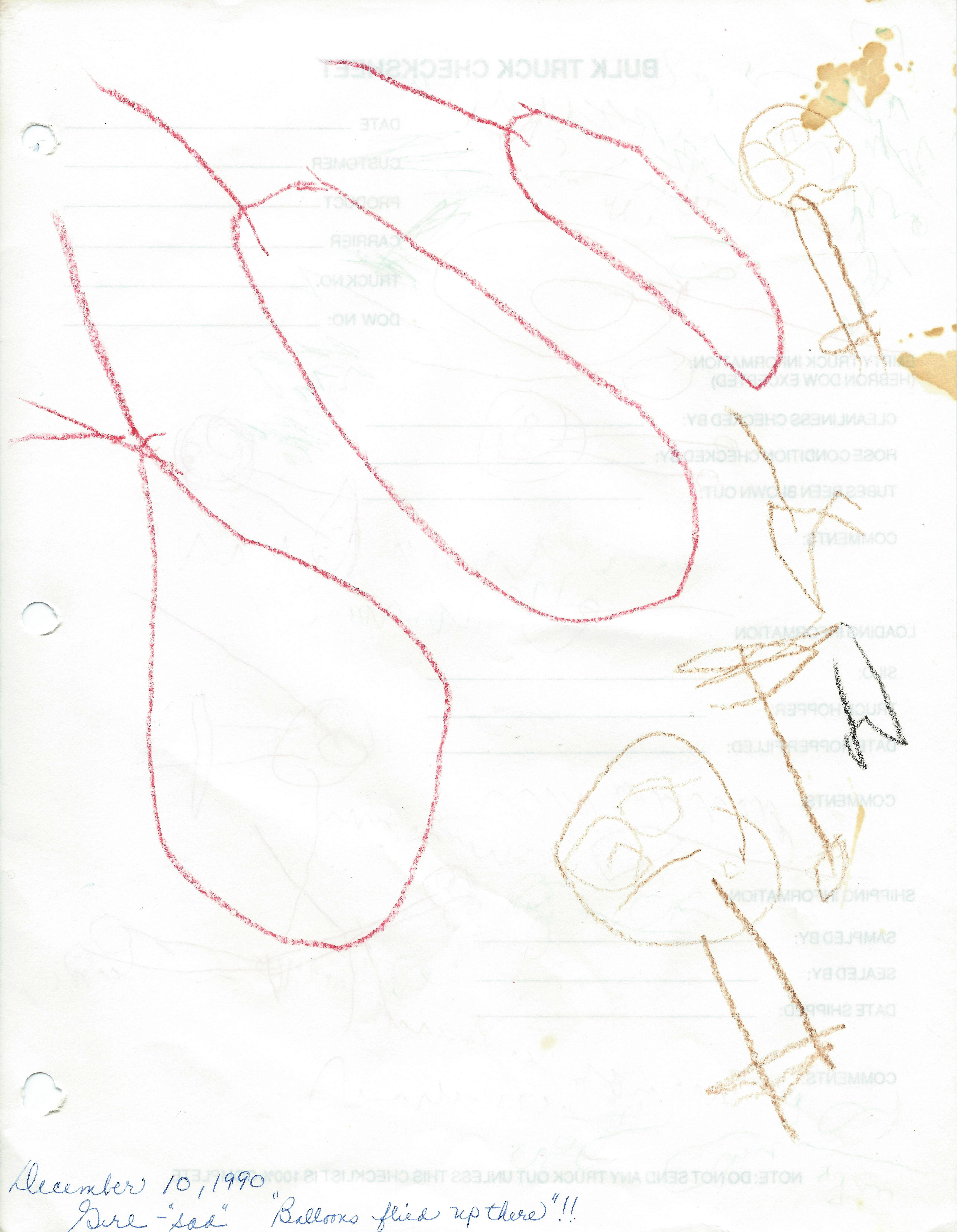
So, how did I come to lead an inclusive arts program with a special focus on serving adults with disabilities and mental health struggles for … 13 years now! Previously, I had never even made it to 12 months at any given job. It seems there were signs from the beginning that I’d come around to something like this one day. I started drawing when I was 2, and my mom even kept evidence. I had always been drawn to art, and as I became elementary aged I enjoyed school and envied my teachers for getting to stay in that environment even as grownups. I soon would be playing school at home, lining up my cabbage patch kids in little doll desks, creating fake worksheets, and my parents even got me a real gradebook (back when everything was still done on paper!) and blackboard. In 2nd grade, we had some kids from the special education classrooms join our classroom for the first half of the day, and one of the girls that I sat by on the swings during morning recess asked if I would meet her at lunch and sit next to her. So, that day I joined her at her table thinking nothing of it. After lunch, all the other kids in my class were asking me “Why did you sit at the (r-word) table today?” I was completely confused that I seem to have broken some special rule that I hadn’t known existed. Years later, this lady would still be in my hometown and funny enough would end up taking one of my painting classes! As I got older, I realized my feelings about being a public school teacher had been a bit idyllic, and didn’t see myself lasting long term. So, I went to school for art but with a major in interior design for practicality. I didn’t realize that interior design jobs where you are actually getting to focus on the “design” part are far and few between especially as a newbie. Most people and places know what they want (whether it looks good or not!) and were looking for someone to order materials and coordinate installment. After a parade of ill fitting jobs, I got an email from the local art guild I was a part of that a local arts center was looking for teachers for a new program that had moved to their location – no experience necessary. I started with Artshop at Creative 360 as a class assistant, then teacher, then program lead in a short amount of time. I had found my place. The program had growing pains, and morphed and changed and restructured many times as programs depending on grants and community support often will. Today, I still work with some students that started with me over 10 years ago. I also go to public schools once a year to do special visual arts programs through Michigan Arts Access. I teach classes of all levels now all over the area within a 45 minute vicinity, but what got me into teaching was working with students with disabilities.
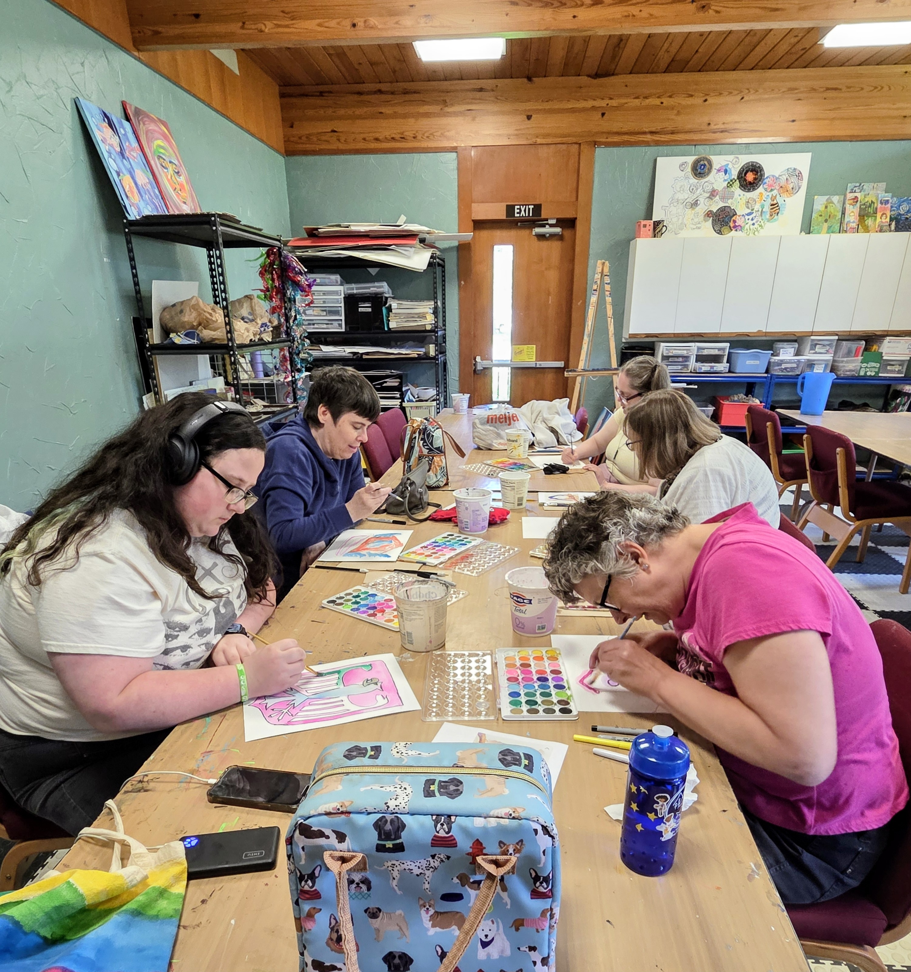
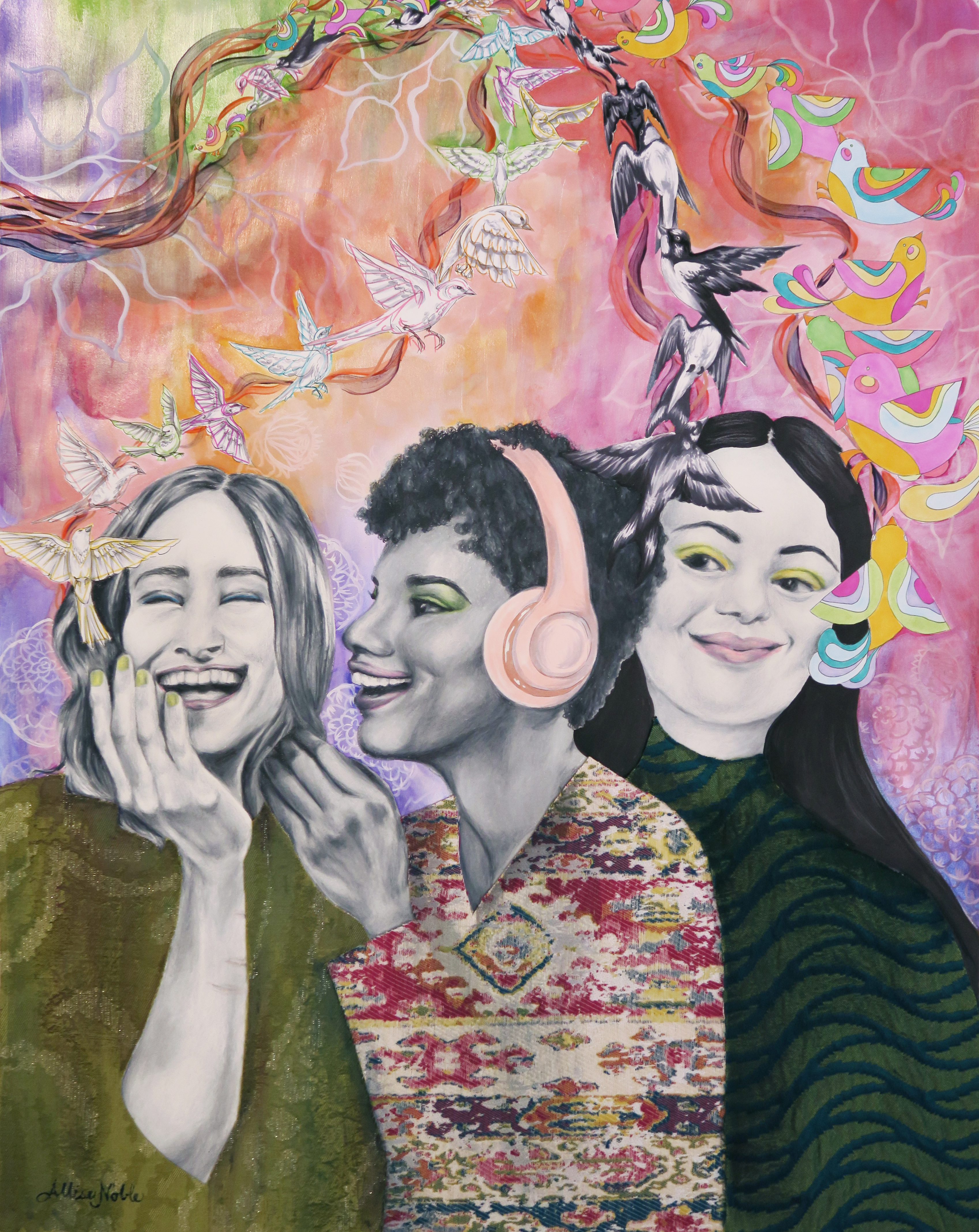
My focus in any of my inclusive classes is helping students create high quality fine art in a way that works for them. We learn about other accomplished artists with disabilities (You can view posts about all of my Creative Minds projects from the archives for examples of these lessons), and we learn that many artists from the past and present got help finishing their projects and had teams of assistants, so help is ok!
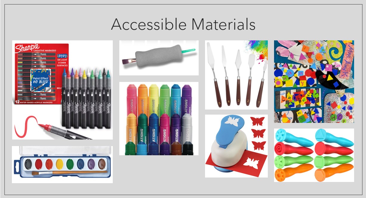
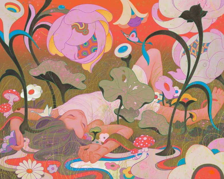
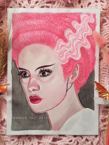
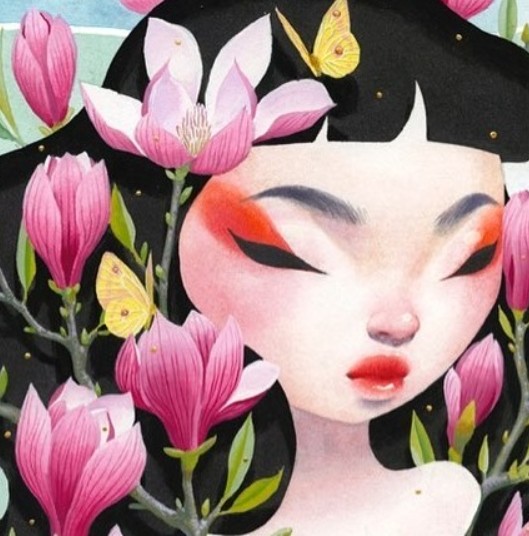
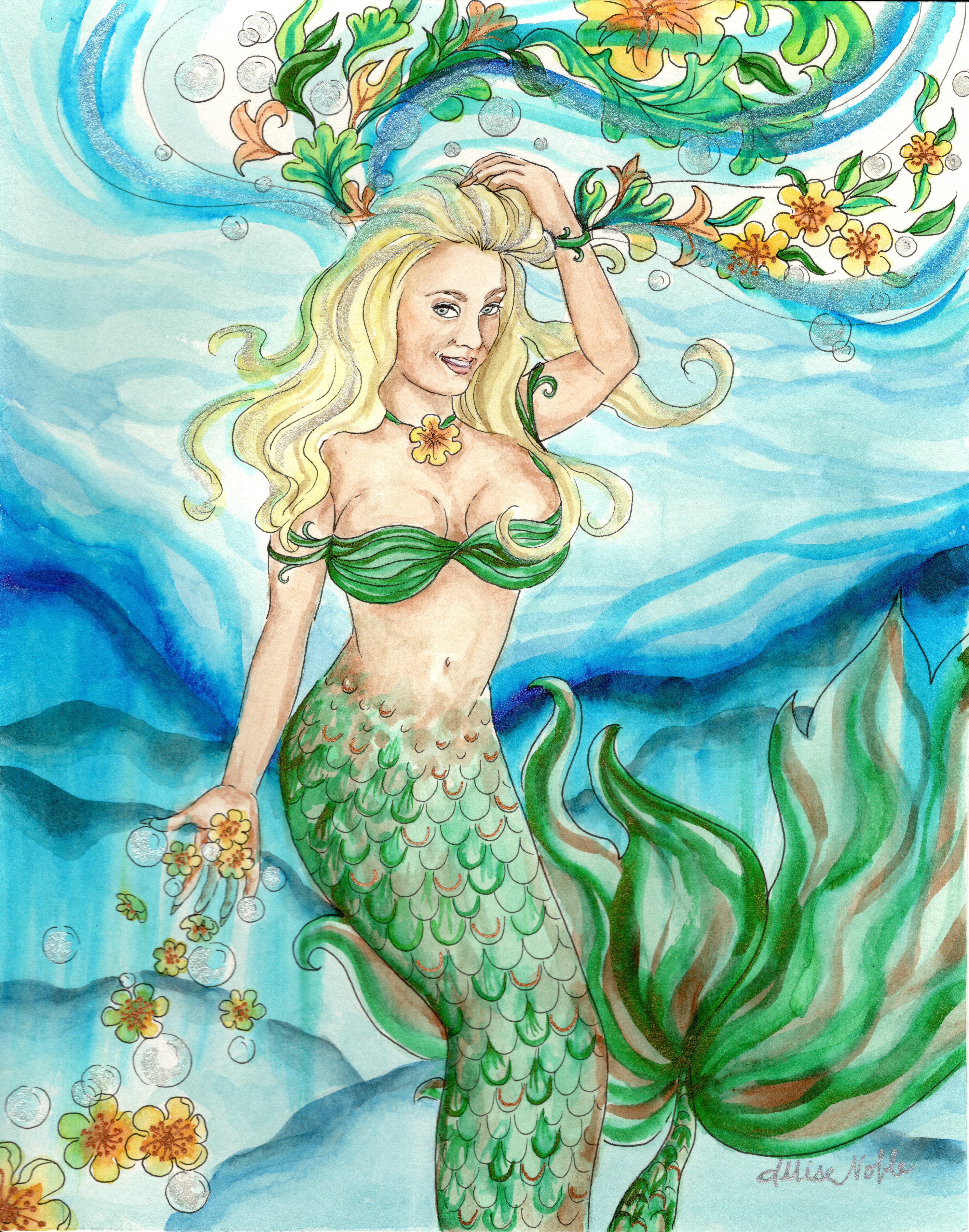
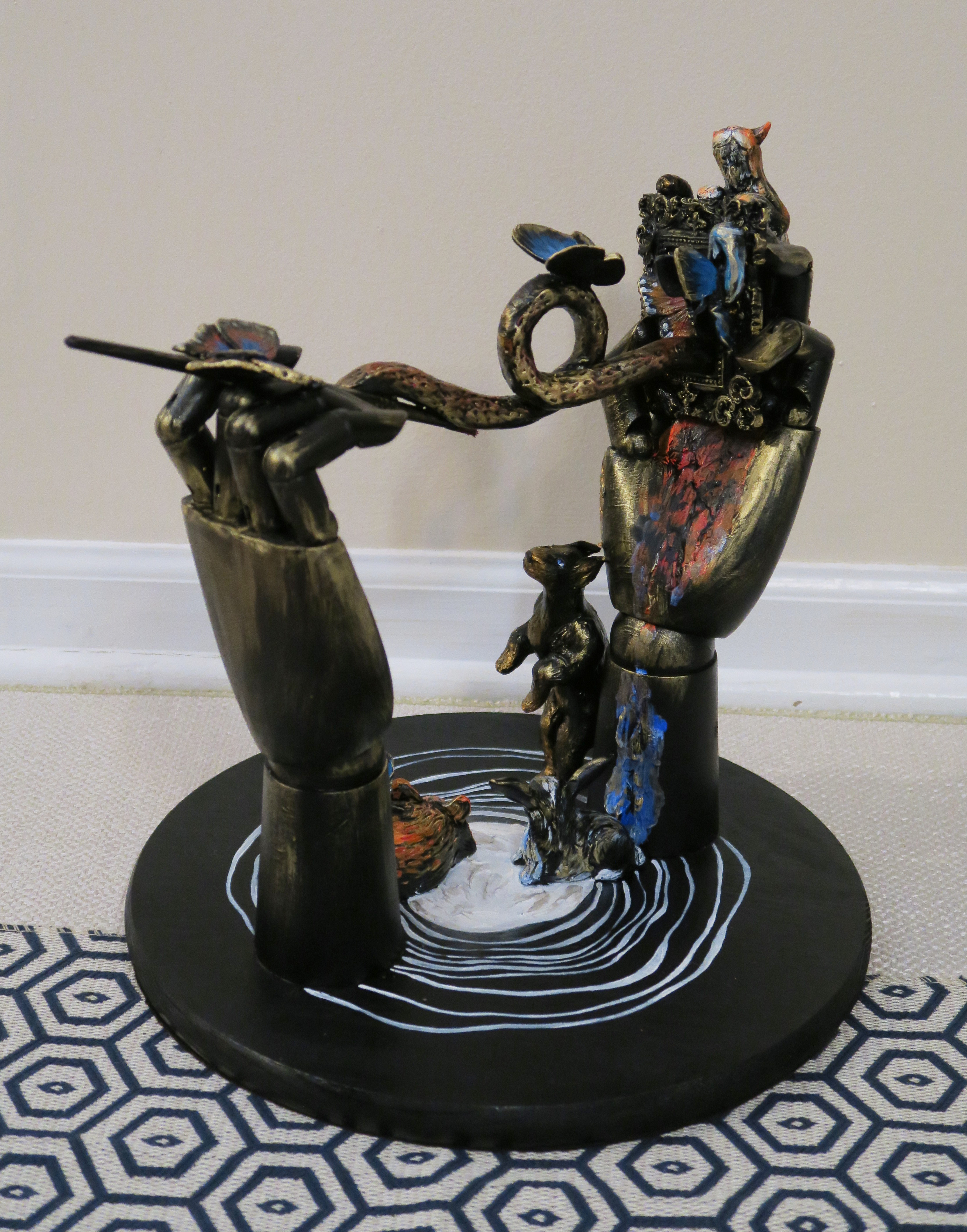
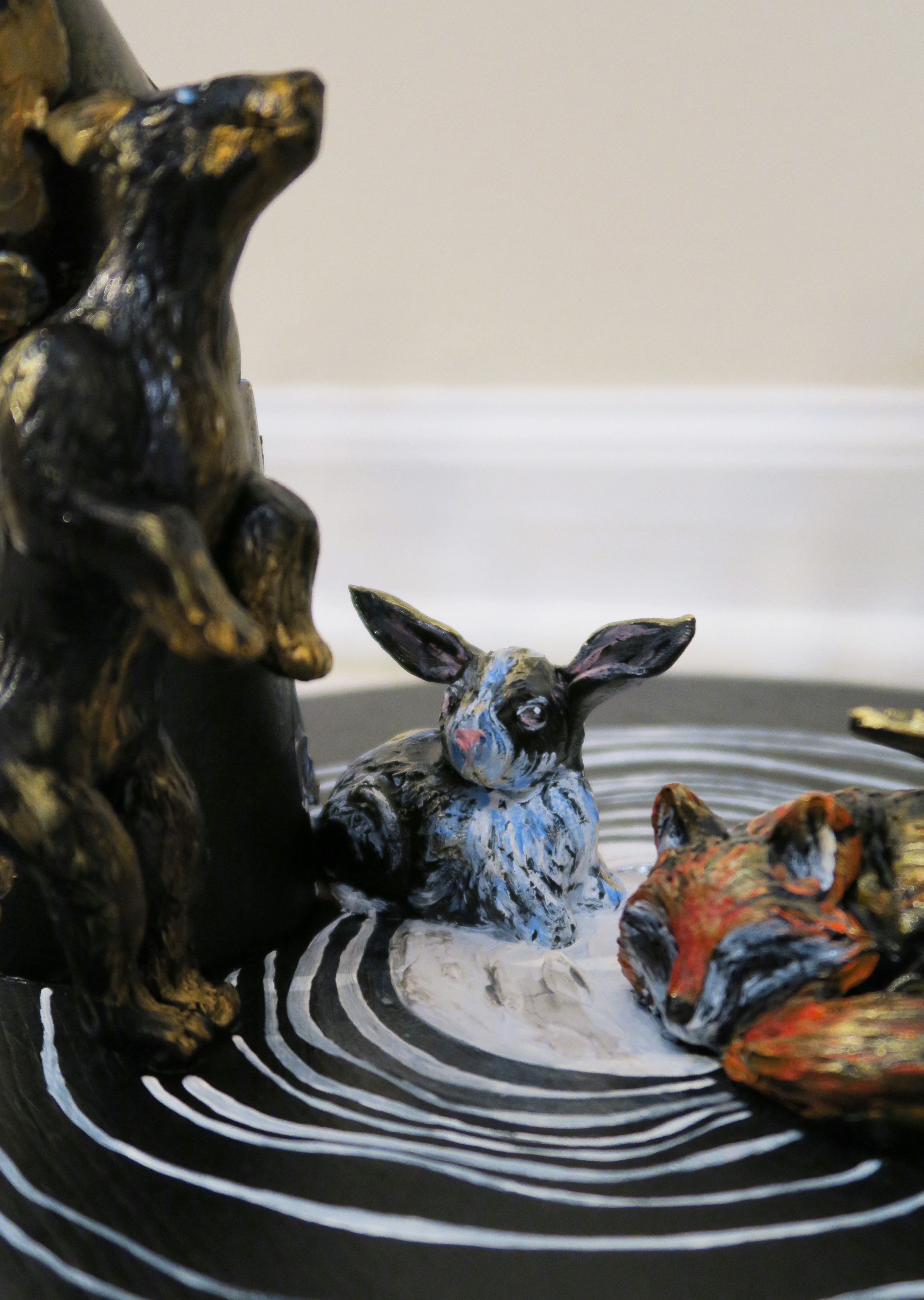
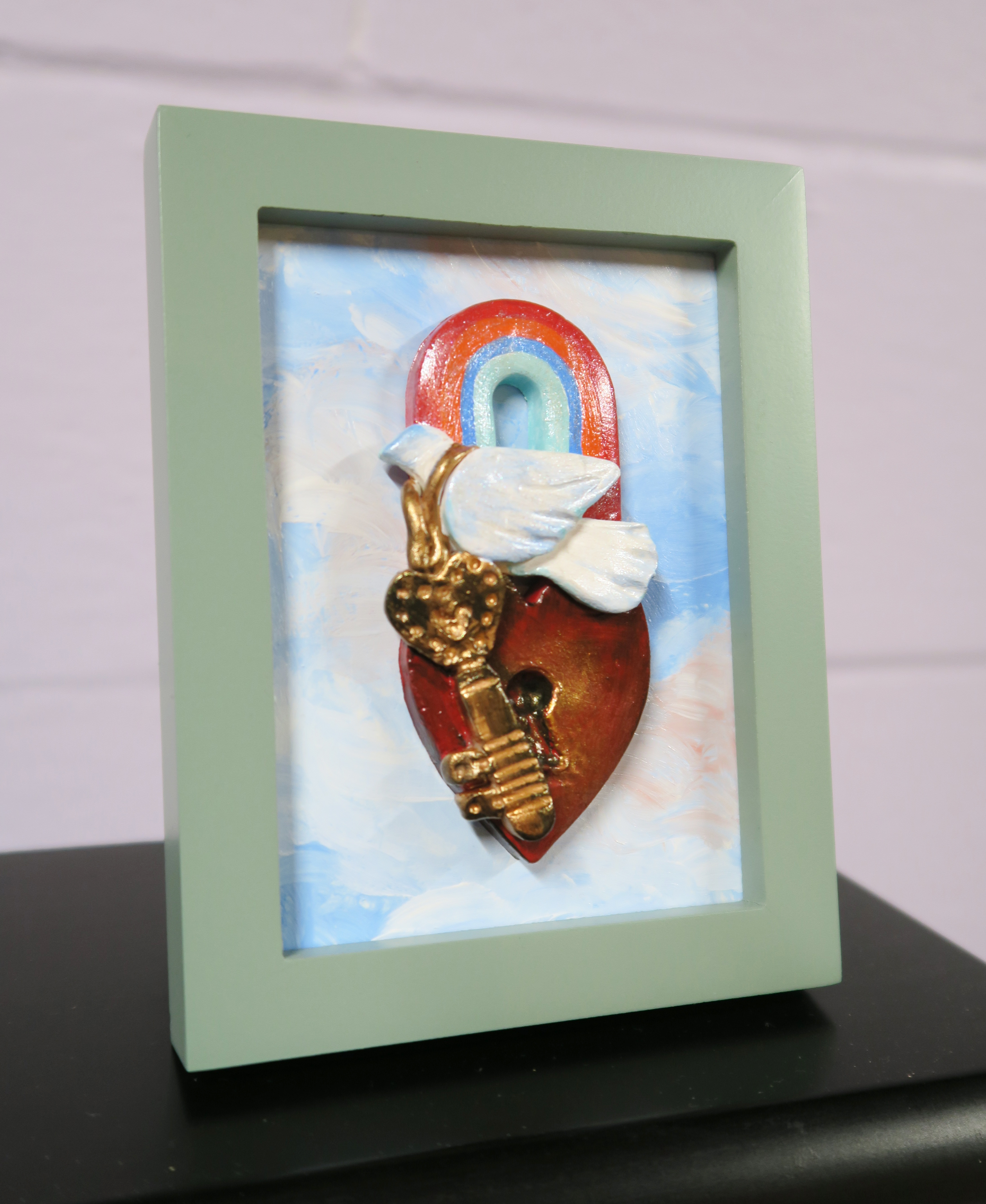
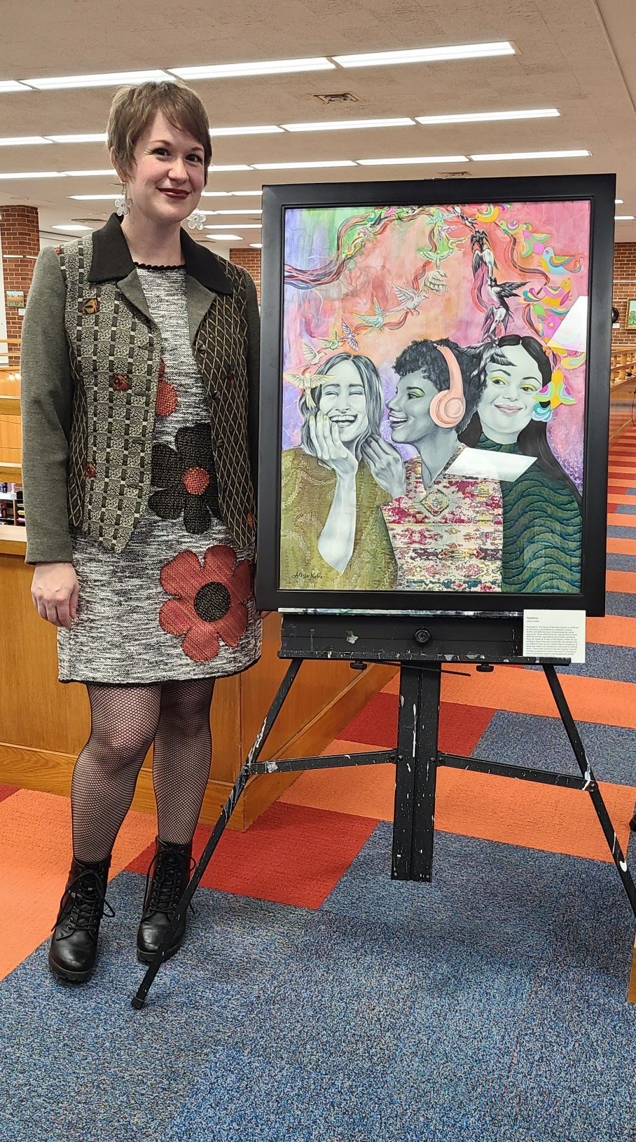
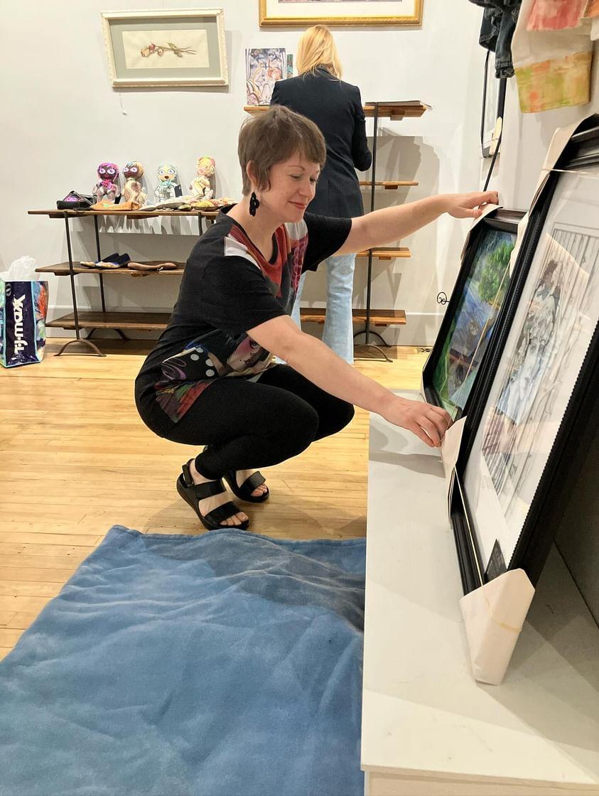
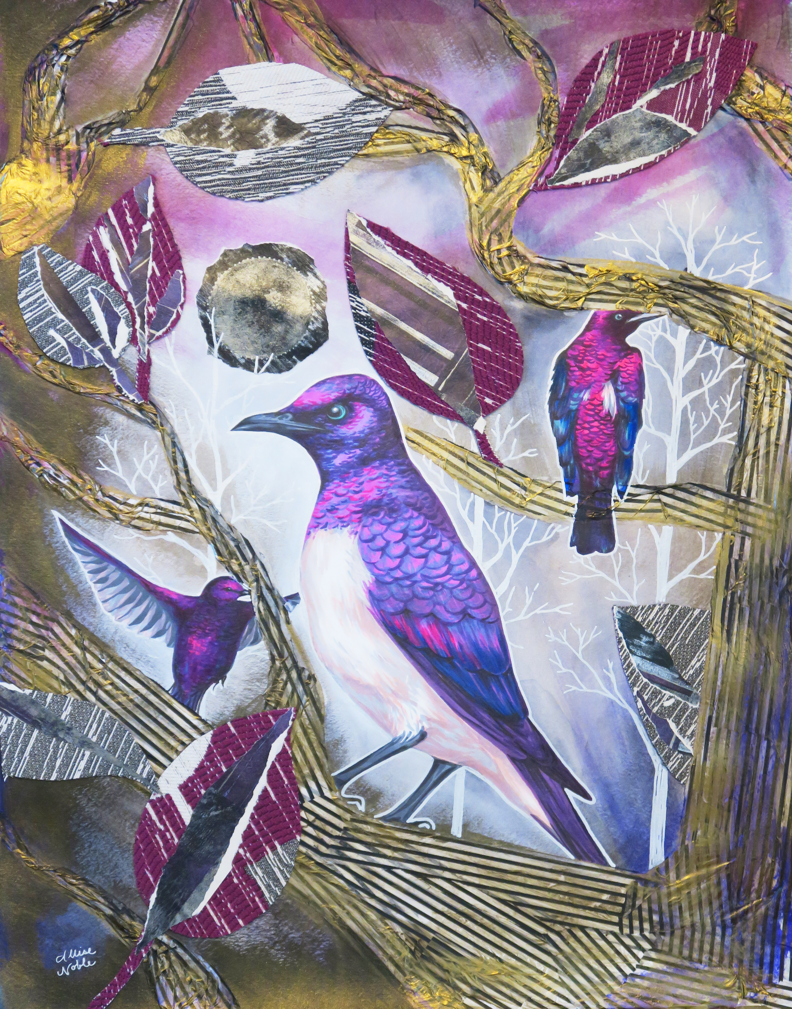
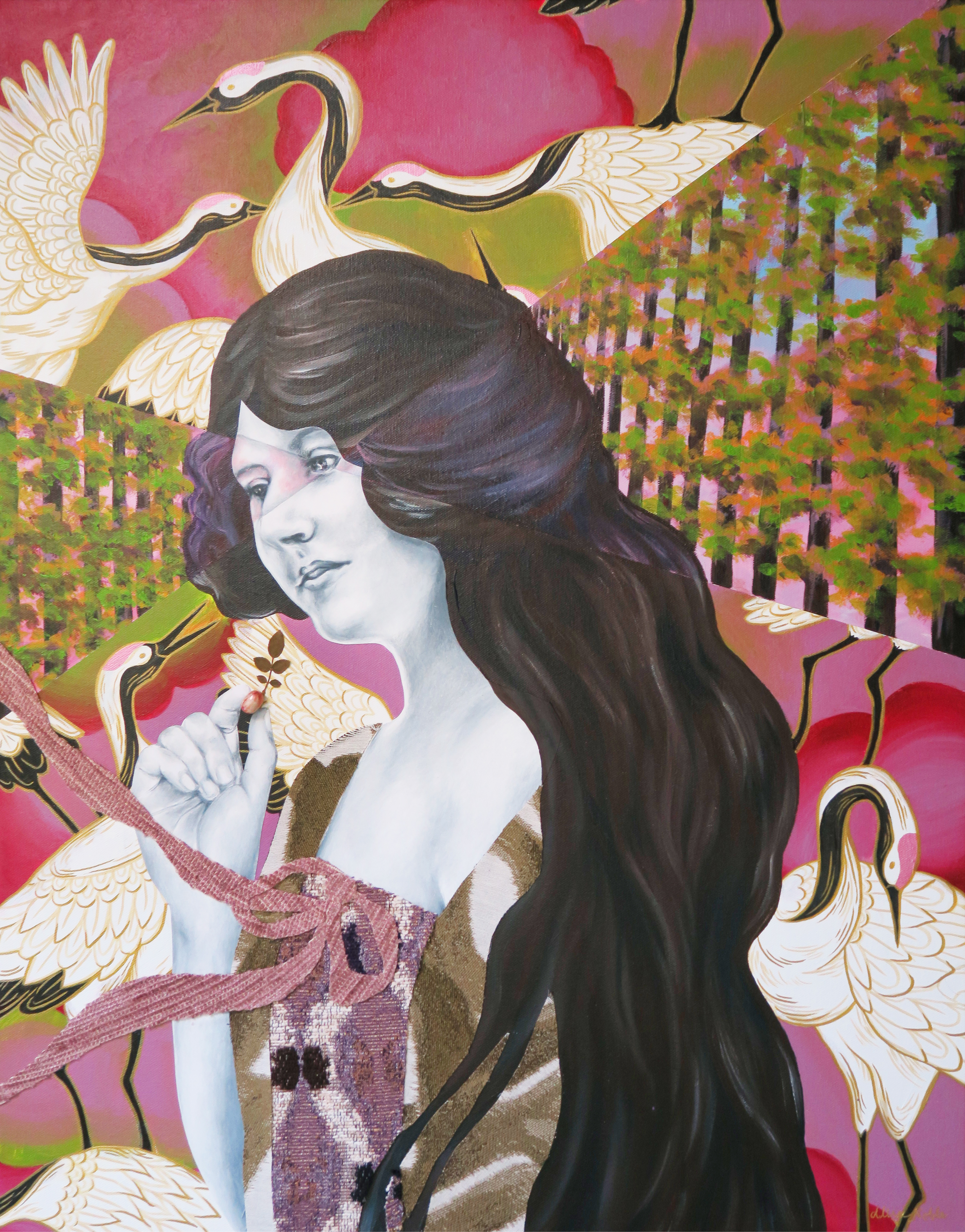
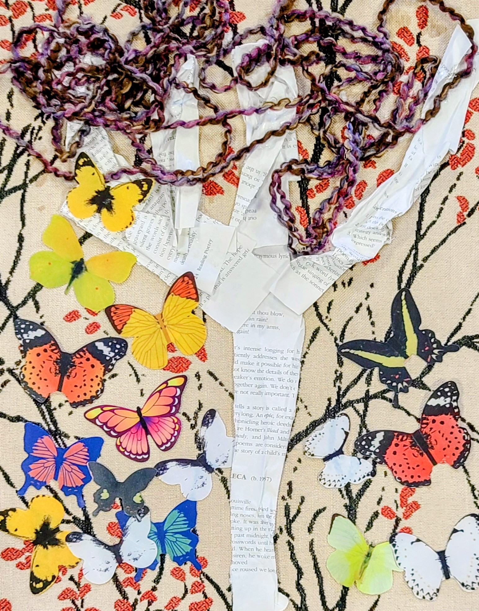
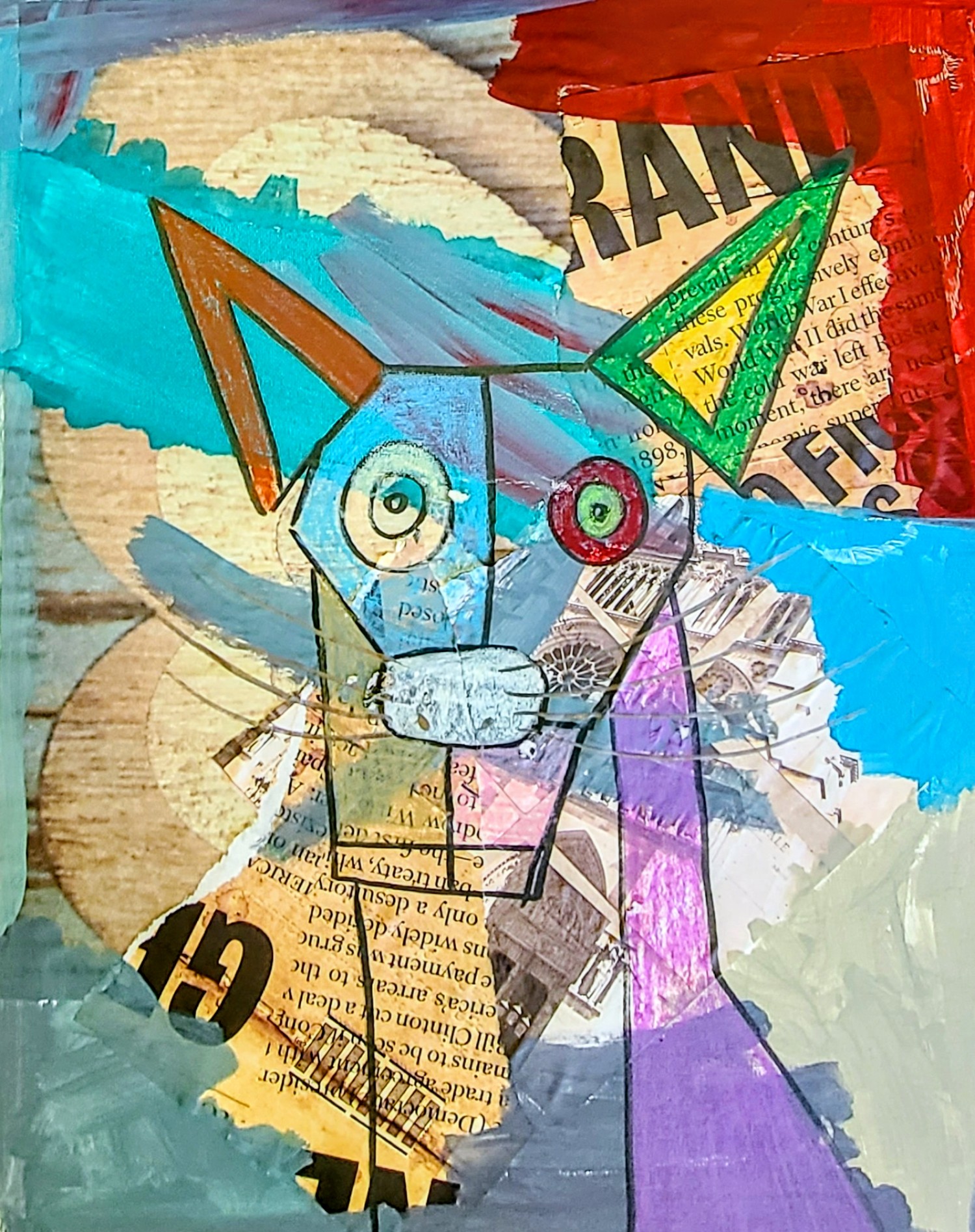
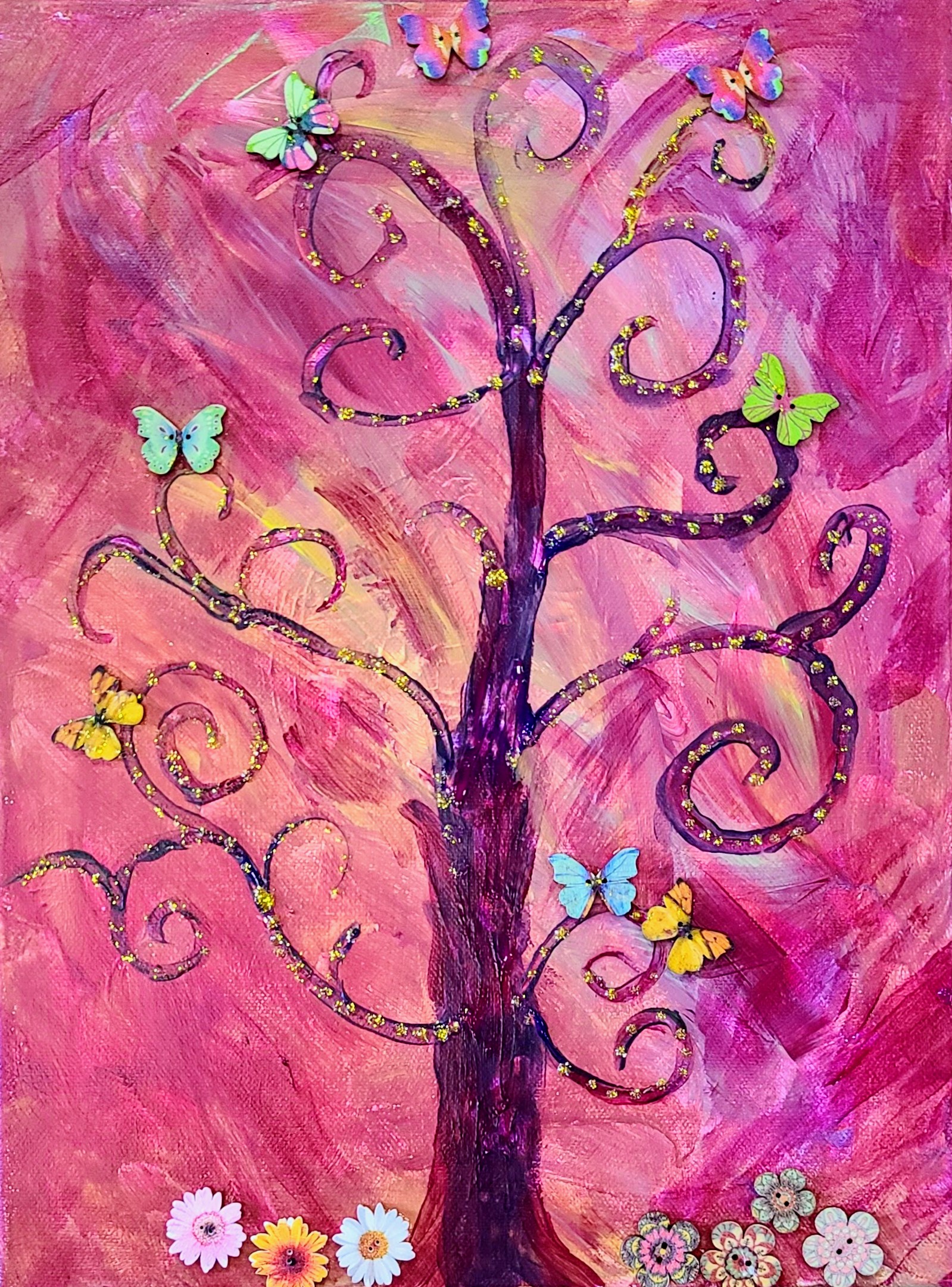
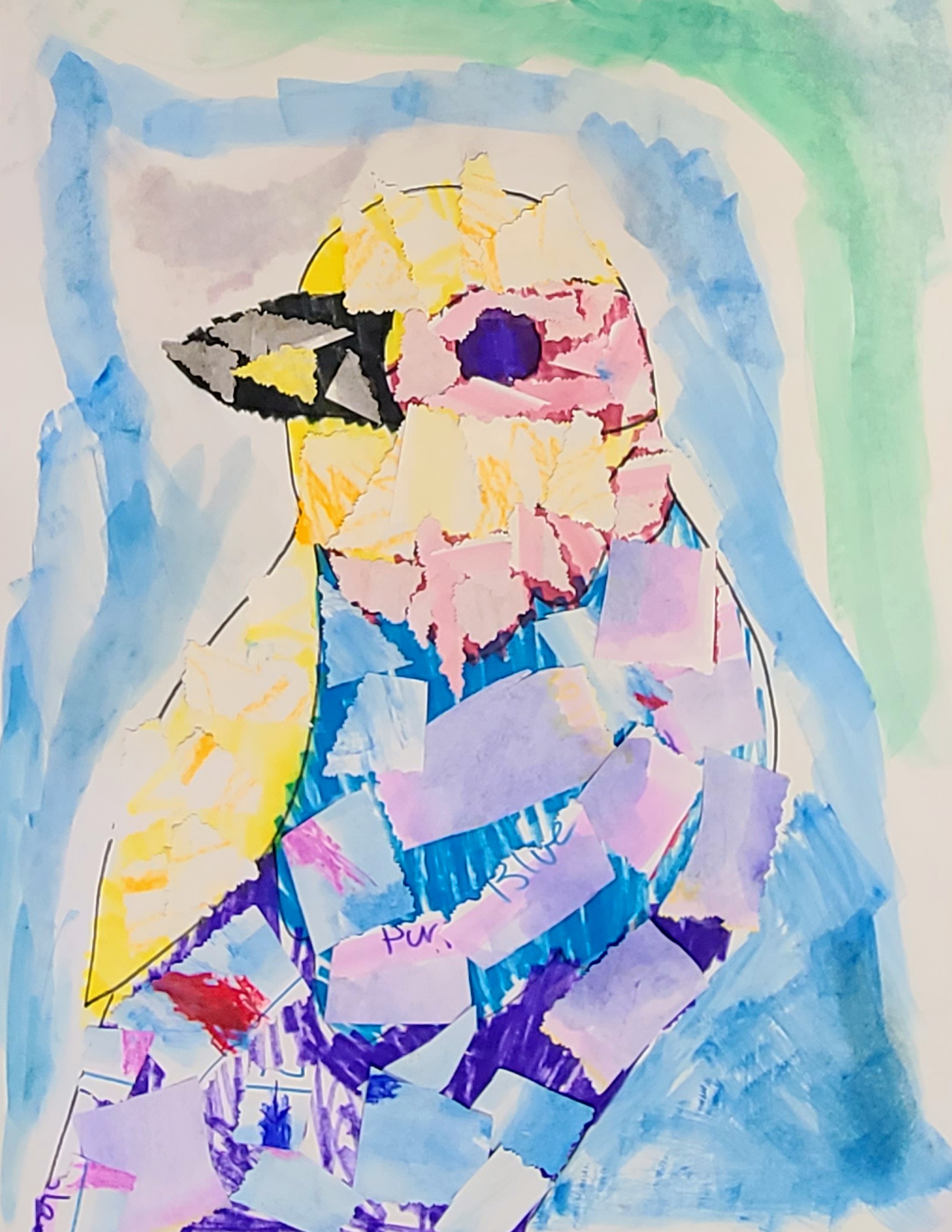
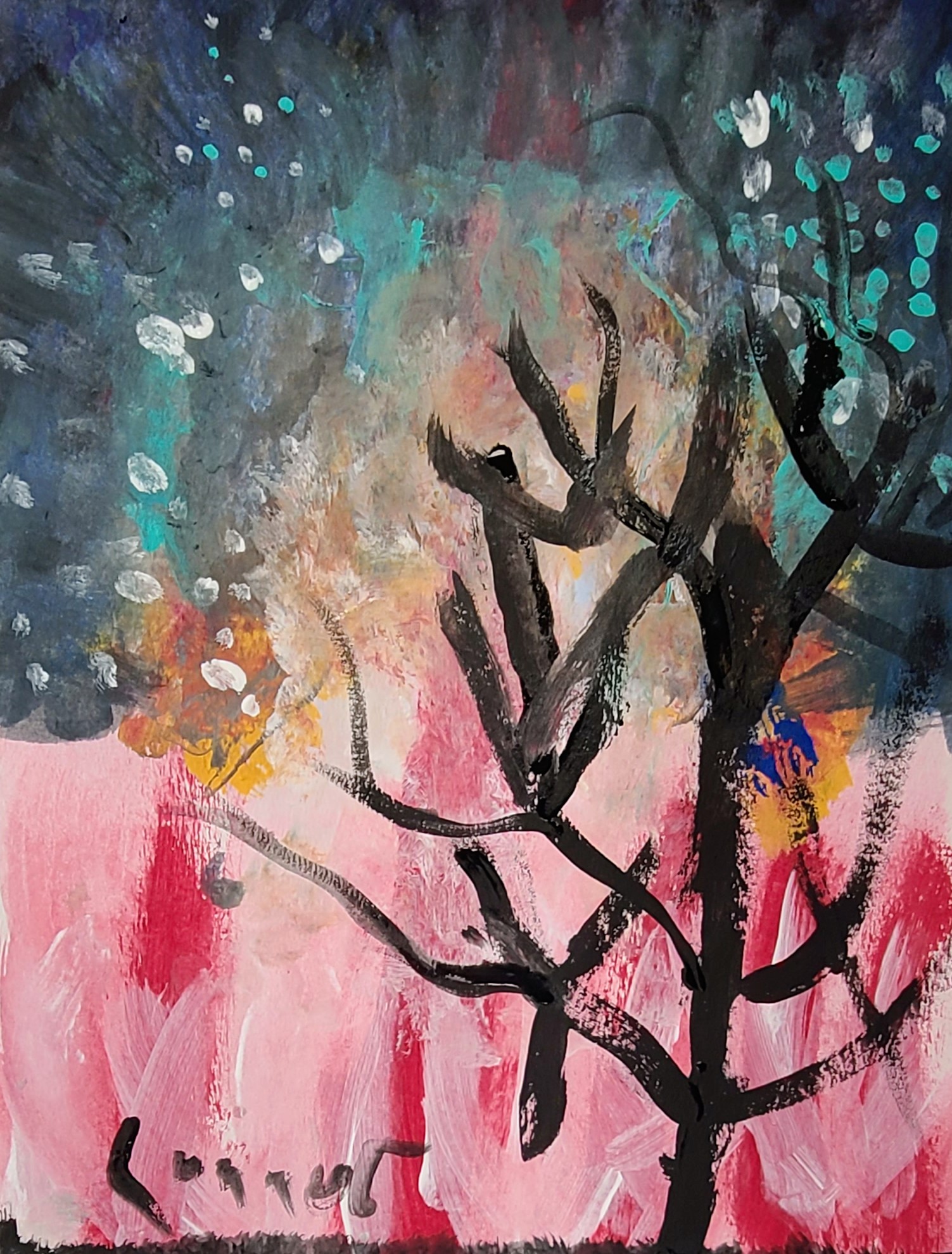
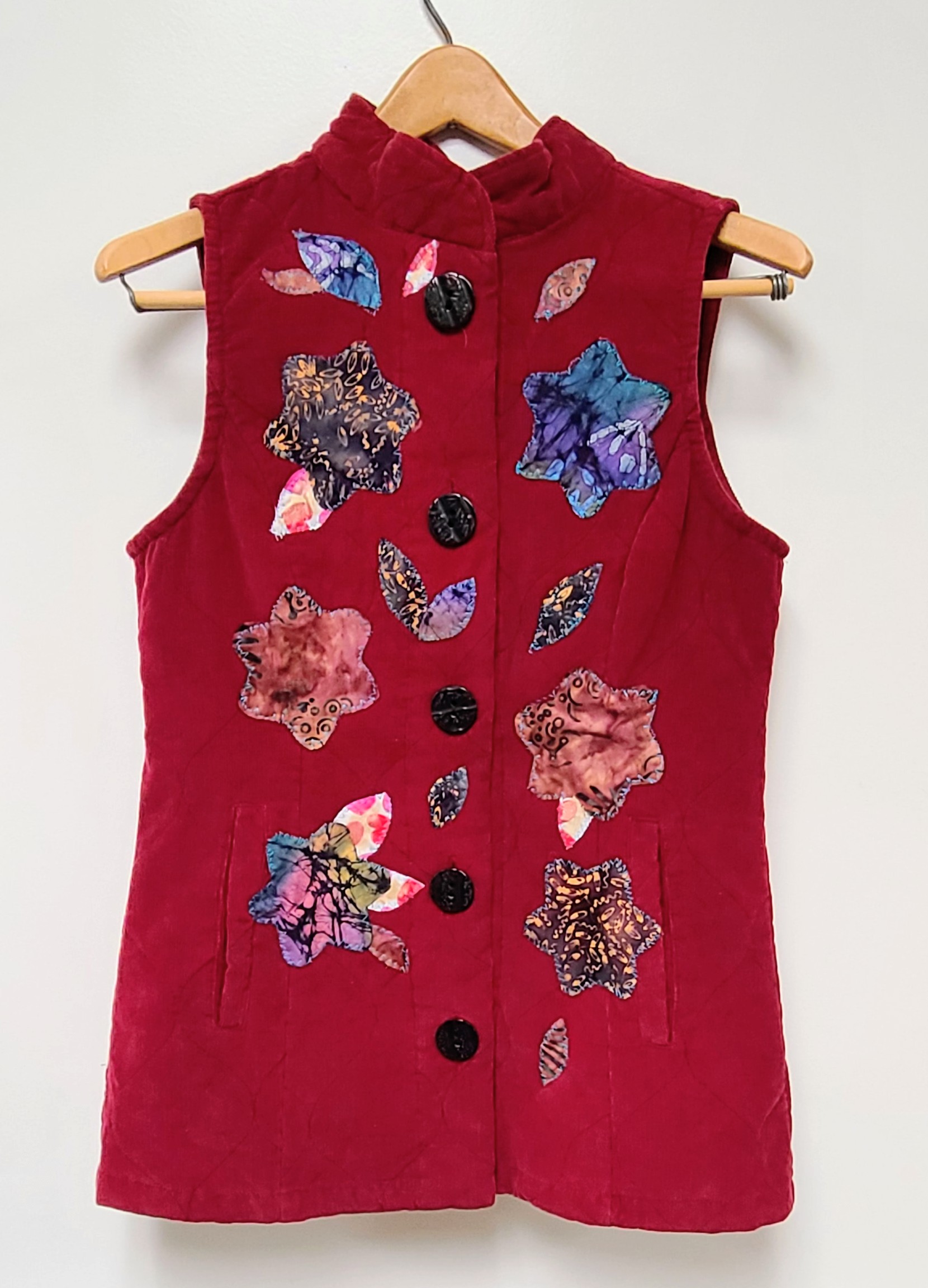
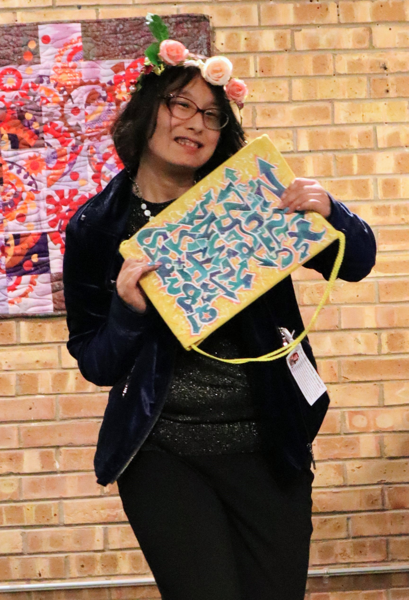
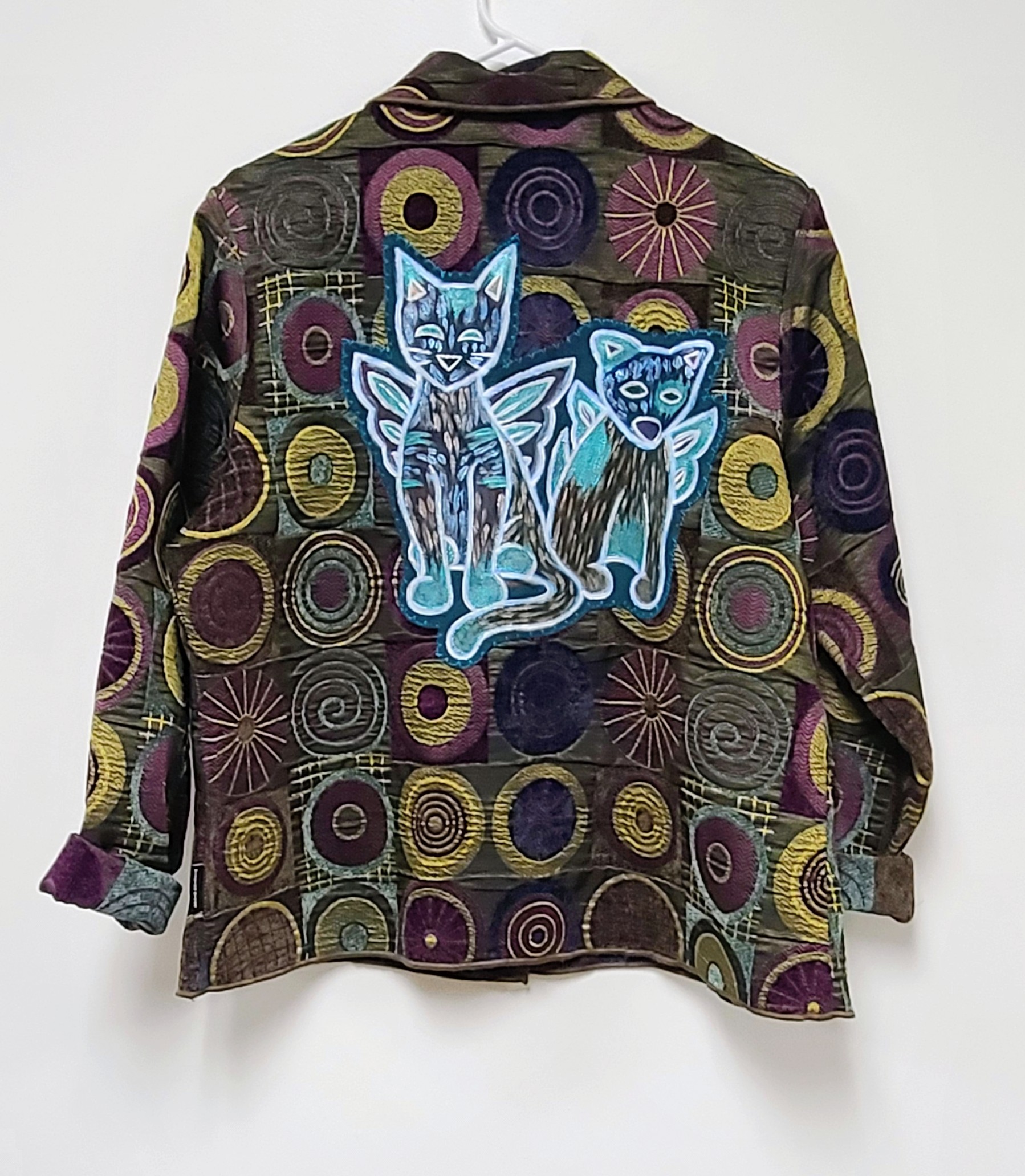
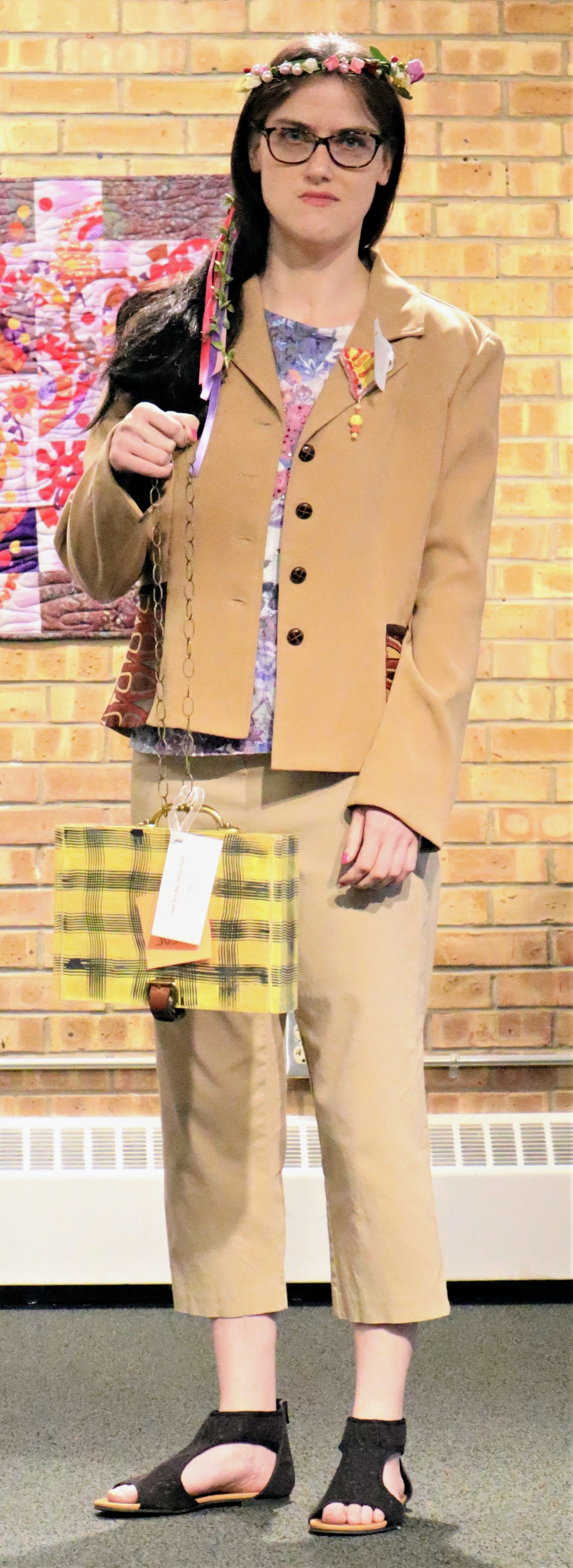
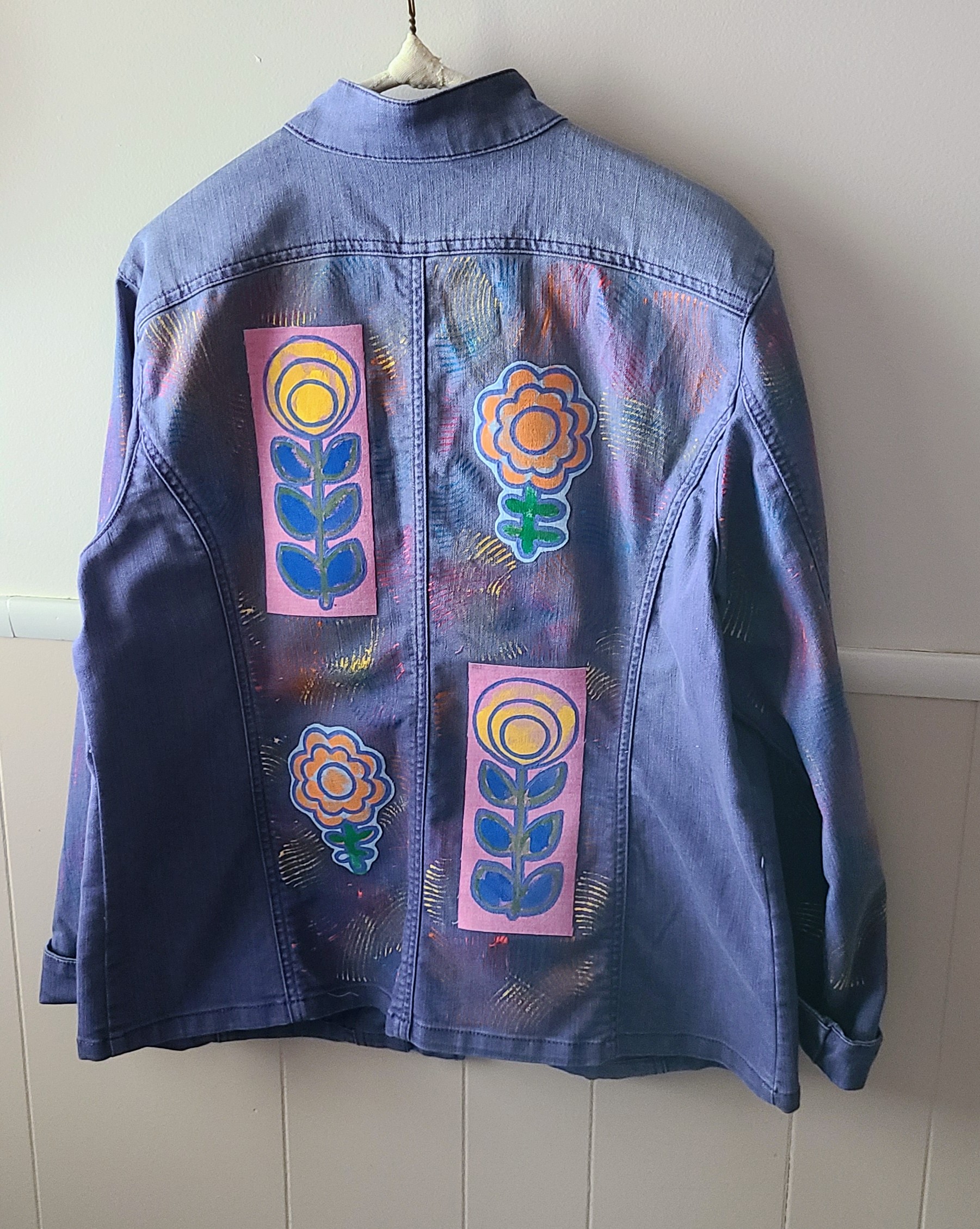
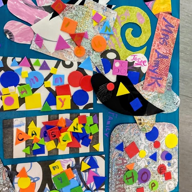
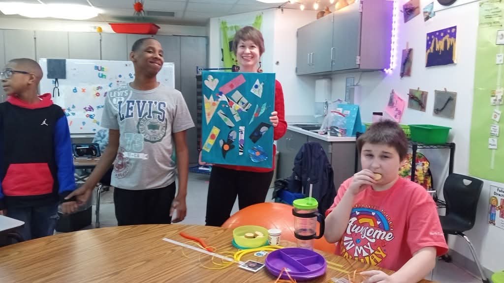
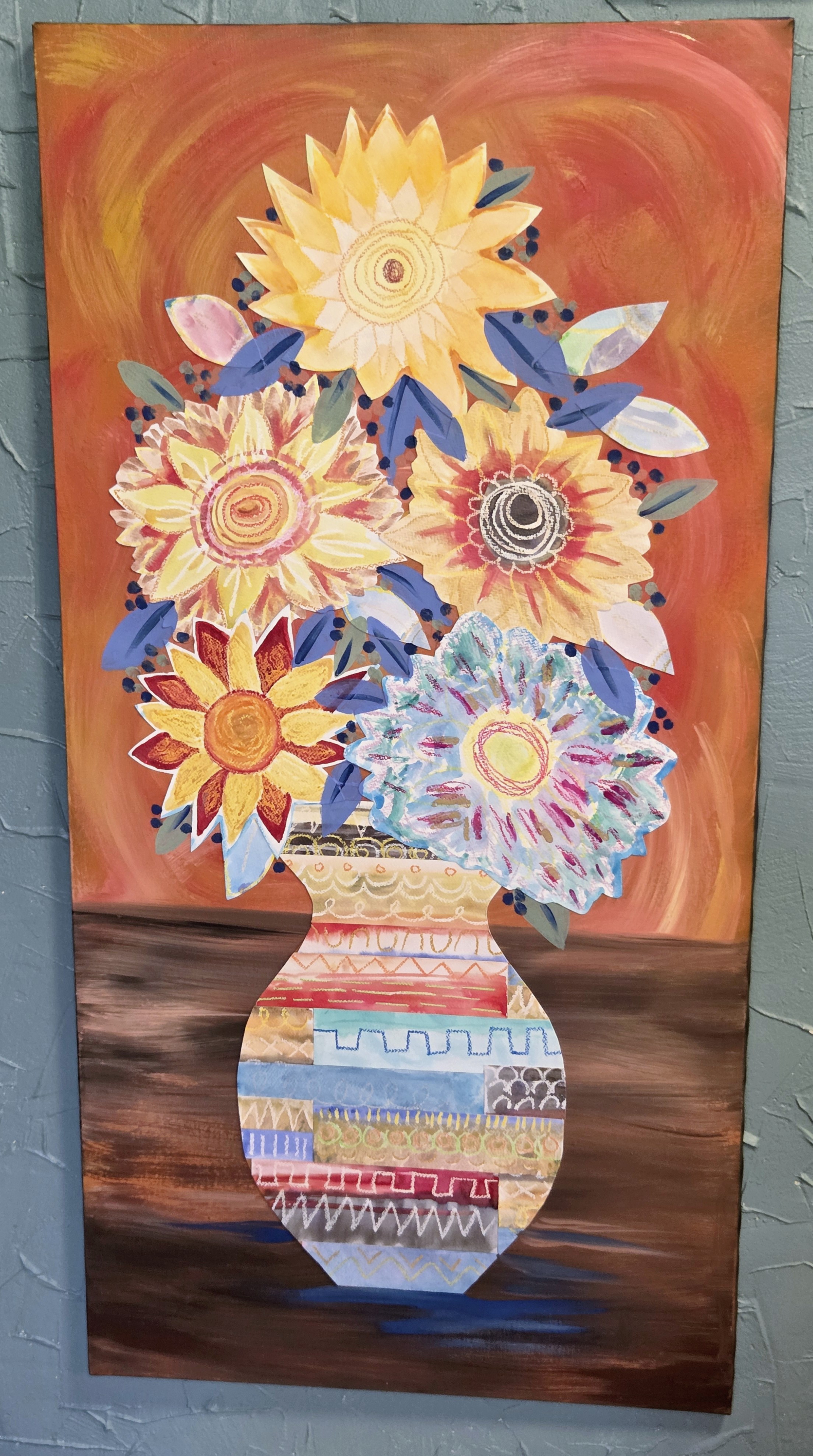
There are so many great tools for those that struggle with dexterity or sensing pressure with their hands, and mixed media art especially is a fantastic medium because it allows students to use whatever materials work best for them for each part of the project with no limitations: this includes using collage elements for things that may be hard for them to draw. Wearable art has also been a fun endeavor, and 5 years ago we even had an Arthop fashion show! Stencils and fabric collage are great ways to allow those who may not be expert painters to still come up with something amazing. I also have students do abstract painting on fabric, which I then cut up and sewed to jackets in panels. I am currently in the middle of another wearable art endeavor with a local youth program, so be sure to follow for more news and of course fun photos soon! Please view the slideshow above for examples of some pretty amazing student artwork from over the years.
Art creation eases anxiety and tension, provides opportunities for community and friendship, connects people from all walks of life, and even helps improve fine motor skills. It is a practice that has so many benefits for anyone and everyone, and I am so happy to make my life’s work making art accessible to everyone in our community. Art is for everyone!