Techniques and Tutorials

Good Omens for 2022 With Pantone’s Very Peri

It’s that time of year again! Yes, a day after New Year’s, but also the time when Pantone assigns the new Color Of The Year ;). I actually found out what the new color was going to be before Christmas, but just got around to doing my annual themed artwork after the holidays. I hope it means something that 2022’s color is one of my favorite hues!

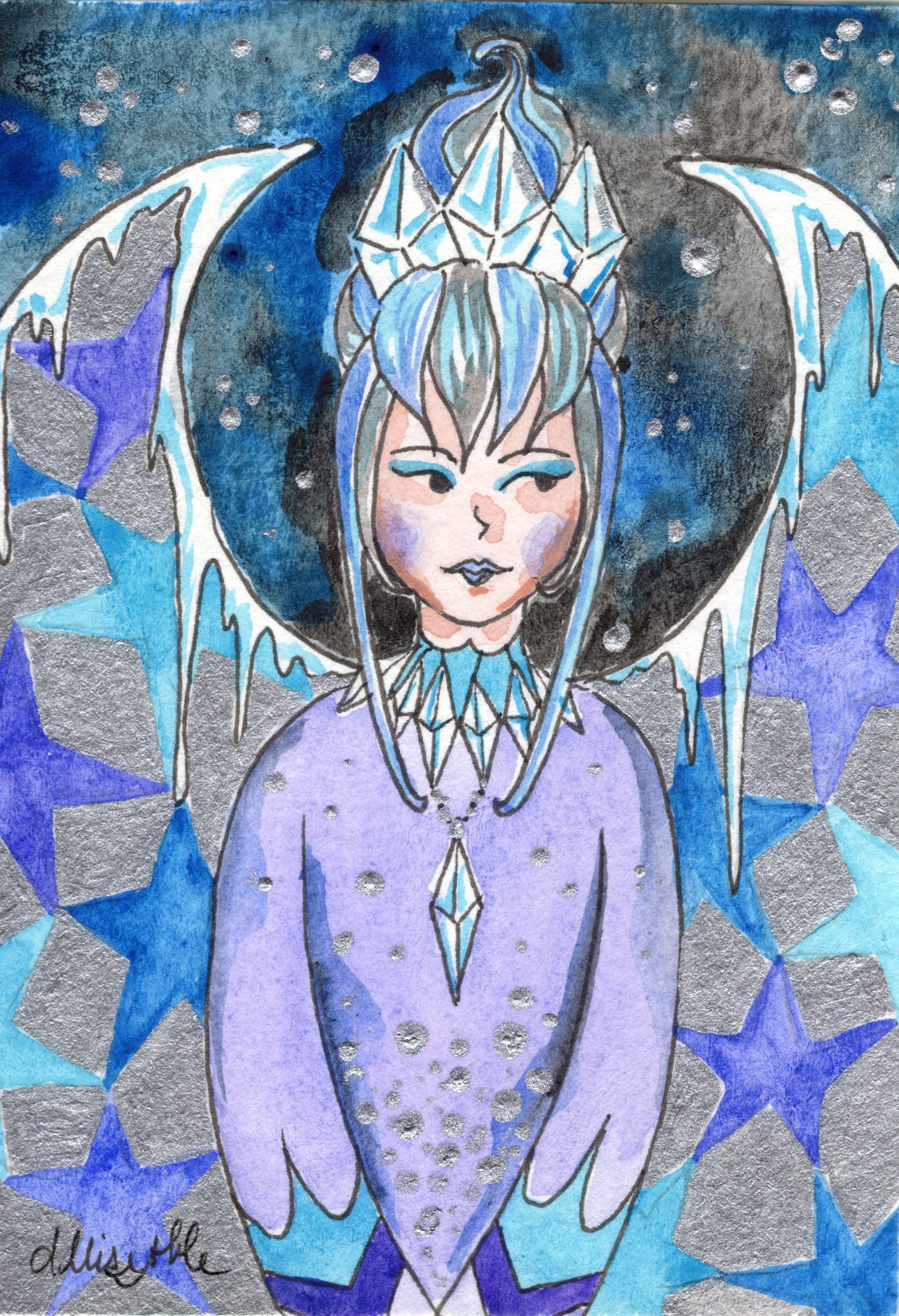
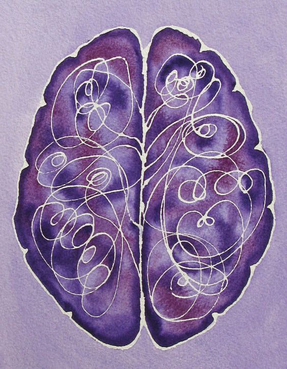
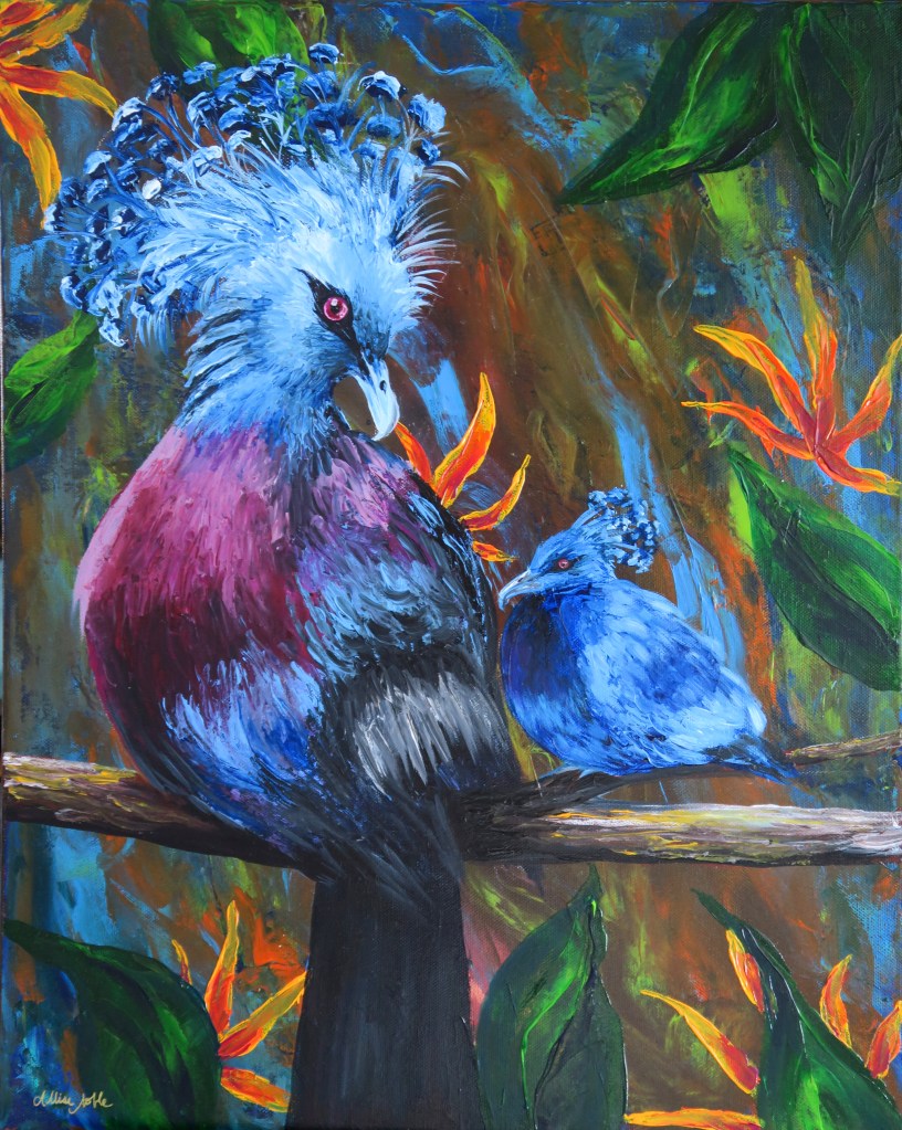
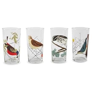
The collage of lovely Very Peri art inspiration above is by myself (including some of my recent Christmas themed ACEOs), Emiliano Vega, Bonne Idee Art, Coral REEFlections, Giacomo Carmagnola, Artologica, and beautyspock.

Happy New Year!

Advertisement
Standard
New Work

(More) Quarantine Art

Since about mid-November, my state when through a second, more mild, quarantine which put classes and activities in my Artshop program temporarily on hold and sent me back to working from home again. I will be plunging back into things as they reopen TOMORROW, so today I’d like to share some of the work I finished over the last couple months.

This first piece was a very fun commission where I was asked to do a surreal portrait in my signature mixed media, vintage inspired style but based on the song “Little Wing” by Jimi Hendrix. I was given some guidelines as to the type of figure portrayed and color scheme, but otherwise the project was completely open ended. And so, this piece was born, communicating a sense of love and positivity, openness, kindness and warmth, and creative spirit.

Little Wing Commission, Prismacolor Pencil and Mixed Media

It felt really good during this time, which to be honest though less restrictive seemed to be a hell of a lot more frustrating than the first full quarantine, to continue the trend of just working on creating some beautiful, uplifting imagery. The piece below is my largest to date at 4 entire feet high! That may not seem like a big deal to some, but everyone who knows my work knows I work small, “big” for me usually being 18×24″. Also note, no people or animals in this piece! I have another large canvas still untouched, and to really step out of my box I think I should do something architectural next.

Where The Light Is Held, Acrylic and Fabric

I also finished a full size bird palette knife painting, the rest of what I’d completed being minis. Yes, these are real birds! I’m always saving photos of exotic and interesting birds on Pinterest, and the colors and adorable yet zany plumage coming out of the top of these guys’ heads was irresistible. I found a couple of reference images, and decided I had to throw a baby in there too.

I don’t know about the rest of you, but my new year starts tomorrow. Wish me luck!

Standard
Techniques and Tutorials

Acrylic Palette Knife Painting Tutorial – Scarlet Tanager

I’ve recently been doing some experimentation with palette knife painting, though for now my forte is mainly just birds! (I tried an octopus recently with disasterous results 😉 ). As someone who was previously very skeptical about palette knifing, I wanted to share how much fun it really is! As someone who is very sharp detail oriented with art, I was worried about not having the control that I can get with a pencil or brush. In the end, I found the expressive process of smearing and marbling colors with the knife incredibly calming and meditative. This is beginner level, so anyone can try it even if you have no painting experience. Give it a go and let me know what you think!

What do you think I should try to palette knife next?

Standard
Project Ideas, Techniques and Tutorials

Charley Harper: Creative Minds Art History Project

I was first drawn to Charley Harper‘s work in the gift shop of a local museum. One of my dad’s main hobbies is birding and wildlife photography, and Harper’s Mid-Century-Modern style illustrations just screamed the perfect birthday gift.

Harper grew up on a farm in the Midwest, and was inspired by the wildlife he experienced around him. He called his style “minimal realism”, taking in the world around him and distilling the imagery he observed down to the most essential details. He said, “When I look at a wildlife or nature subject, I don’t see the feathers in the wings, I just count the wings. I see exciting shapes, color combinations, patterns, textures, fascinating behavior and endless possibilities for making interesting pictures. I regard the picture as an ecosystem in which all the elements are interrelated, interdependent, perfectly balanced, without trimming or unutilized parts; and herein lies the lure of painting; in a world of chaos, the picture is one small rectangle in which the artist can create an ordered universe.”

Inspired by images from Harper’s body of work that capture his signature style, I encouraged my students this week to create their own minimal realist birds. Though Harper’s works were painted, they bare quite the resemblance to modern day digital art and graphic design. Instead of painting, we used a collage format to create our Charley Harper Birds. We used paint chip samples for our vibrantly colored creatures, colored cardstock for the background, and paint markers to add the linework details. From working on repainting the interior and exterior of a house over the last couple years, I had an accumulation of samples but never felt right throwing away even the colors I ended up not using. Upcycling to the rescue! At an arts non-profit, we love free materials ;). We outlined our geometric shapes onto the samples with a pencil, then cut them out and adhered them to a foam core board base (any heavier paper would work as well) with a standard glue stick. I’d suggest laying out the entire design before gluing in case you want to make some changes before the final masterpiece.

I teach adults with varying physical, psychological, and intellectual disabilities but this project is perfect for all ages and abilities. It is all inspired by simple geometric shapes and blocks of color, and can be done as simple or with as much detail as the artist desires. We created our works in an easy-to-frame 5×7″ size.

I hope you are inspired to try this at home (This would also be a fun project for bored kids, hint hint 😉 )! This is a simple, whimsical project that you don’t have to be an “artist” to enjoy. Unwind after work and get crafty with some basic, easy to access materials. As always, if you end up making one of these yourself I’d love to see pictures!

Standard
Art Discussion, Exhibitions and Other News

Women’s Centennial Celebration Exhibit At Art Reach

Amidst a lot of bad news on a worldwide scale lately, I was blessed to receive some good news: One of my pieces shown in Art Reach’s Women’s Centennial Celebration Exhibit, July: She Is Free In Mind and Spirit, was awarded Best Of Show. This piece received a 2nd place award previously in 2018’s Midland Artists Guild Annual Juried Exhibition, and was a part of my Unlimited series shown in ArtPrize 9 in Grand Rapids. I wanted to use this as an opportunity to delve into this work deeper.

she is free

July: She Is Free

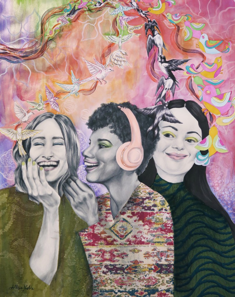
A vital part of my Unlimited series was being sure I represented a variety of ages, races, and also abilities in my portraits. Though varying abilities can mean many things and a lot of disabilities are invisible, I wanted to represent an easily recognizable visible disability that is not often seen represented in art. I chose to depict a young woman with down syndrome.

When people think of the lives of individuals with disabilities, often all they can see is the struggles. Yes, we need to be aware of the struggles and be sure that we stand up for the rights of individuals with disabilities, make sure they have access to the healthcare they need and tools to help them live as independently as possible in their communities. But, like all people, individuals with disabilities are multifaceted beings. People with disabilities are rarely seen depicted in art, and are seldom shown in any media as empowered beings with their own unique personality beyond having a disability. I wanted to depict a woman who was confident in her own skin, and believed in her own unlimited potential.

The symbolism in this piece can mean different things to different viewers, and I love the fact that art is open to interpretation. That being said, I wanted to share what I was thinking when I created this piece. But remember, even as the artist, my interpretation is by no means the only interpretation :). I drew the face in prismacolor pencil. I wanted a scene around the head(mind) that exuded peace, so I filled in the hair with a watercolor landscape scene. Along with inner peace I wanted to depict the idea of freedom, of this woman not being limited by anything despite what others may assume. Birds taking flight have always been one of the biggest symbols of freedom to me, so I used prismacolor markers to draw birds in the same colors as the landscape circling around her. I reinforced the bird imagery with metallic gold prismacolor pencil in a radial flying bird pattern on her shirt, with an empty birdcage in the center of her chest. I wanted the figure and background to be seamless and flow into each other, but also wanted something to set off the figure so that she was the main focus. I wanted her face especially with its welcoming, content, confident expression to stand out. Using a black base created contrast, and I filled in this galaxy background with stars in the same pastel colors used throughout the rest of the piece. In most of my portraits I use the background to speak to the content of the figure’s mind and soul, and a galaxy fit perfectly to me as something vast and unlimited. 

“July” is very close to my heart, and the meaning behind it signifies why I am involved in the arts to begin with. In running an arts program for adults with disabilities, I feel I have found my purpose. I am excited to continue using art to form connections between all different types of people, help others tap into their unexplored potential, give a voice to those that often go unseen, and challenge ideas of what beauty is in art.

Art prints are available in my ebay shop!

There will be virtual tours of the show available through Art Reach soon. I can’t wait to see all the other work up close!

Standard
Techniques and Tutorials

Barn Owl Watercolor Tutorial

In light of social distancing precautions, we all are ending up with some unexpected downtime. It can certainly be discouraging and frustrating, but we can also use this time to our advantage to bring something positive out of a negative situation. I will be posting some simple tutorials on a regular basis over the next couple weeks. The best thing to do when things are uncertain is to occupy your mind, especially with something creative. Let’s have some fun!

To create this owl, you will need:

  • Watercolor paper (I used a 6×6″ piece, but you can work bigger if you’d like as well)
  • 3 Paint colors: Grey (or if using black add a lot more water to lighten it), Burnt Umber (or any dark brown), and Raw Sienna (or any bright, warm brown)
  • A large (I used size 8), medium (I used size 5), and detail (I used size 0) round brush (The brushes that come to a point at the end).
  • A medium size flat brush (The brushes with rectangular bristles, flat on the end).
  • A pencil
  • Optional: Black liner pen (Like a fine point Sharpie!)

Start with a light pencil outline made from basic shapes to guide your painting. Draw a circle for the head, a teardrop shape coming diagonally out from that circle for the body, and another smaller teardrop shape sticking out from the bottom center of the body for the tail feathers.

Using your large round brush, water down your raw sienna paint – you do not want this first layer too dark. Following the shape of the body keeping all your brushstrokes in the same direction flowing downward, fill in the wings, leaving the head and the chest white for now.

Using your detail brush, make some jagged up-and-down strokes with a watered down grey along the front of the chest, underneath the head, and along the back of the neck.

Rinse off your detail brush, and using the same brush strokes go over your grey you just added to the chest and neck with water. This will help blend the grey so your transition from grey to white is more gradual, and you end up with a soft, feathery look. Next, using your detail brush and watered down grey, outline a pointed “U” shape in the center of the face. Make some radial brush strokes sticking out from the top of the U where the eyes will be using your detail brush.

Still using your detail brush, add some radial strokes along the outside edge of the head, including one ray down the center from the top pointing to the beak. Add some grey to fill in the end of the beak. Rinse off your brush, and lightly brush over what you just added with a damp brush to blend it.

Continuing to use your detail brush, add a border around the head with raw sienna using short, radial strokes pointing inwards towards the face. Don’t forget the widow’s peak up top :)! Water down your raw sienna a bit more, and add some of this pale warm brown to the area where the eyes will be, using radial brush strokes again pointing outward from the top of the U shape.

Next, we are going to start adding texture to the feathers. Dip your medium round brush in some raw sienna with a little less water so the coverage is a bit darker than the base underneath. Stamp up and down over the entire area to create blots of color (This is called stippling.).

Do the same thing overtop while the raw sienna is still wet with the burnt umber on the top section of the wings. Add a bit of water to your umber first, but you still want it to be pretty dark.

Then, use your detail brush to create some thin outlines in burnt umber. Hold your brush at a 90 degree angle to your paper and use a light touch, hardly pressing down at all as you drag your brush to create thin lines. Create a darker outline around the inner edge of the raw sienna outline around the face. Outline the wing, and add some lines to the bottom section of the wing and tail feathers following the direction of the shape.

Still using your detail brush and burnt umber, make some groupings of short, vertical brush strokes to create striping in the wing and tail feathers in between the lines. Make them jagged and uneven for a more realistic feathery look.

Next, using your flat brush add some more water to your burnt umber. Using the width of your brush, drag a diagonal line underneath the owl starting at the bottom of the chest.

Go back to your detail brush, and grab some burnt umber with a little less water mixed in so you get a darker color. Add some short streaks of this darker shade over the post while it is still wet. Then, using the very tip of your brush, lightly add some speckled dots over the chest. Less is more! You still want to see mostly white.

IMG_20200317_110314

Now for the finishing touches! Use your detail brush to create a hooked shape with the burnt umber for the talon. Use your medium round brush to add a dark burnt umber feather shape visible from behind, between the tail feathers and the post. The last step is the eyes. Create a downward slanted football shape in the area we shaded for the eyes. You may use your detail brush to fill in the eye in grey or black, but you can also use a black liner pen for a little extra control. Be sure to leave a small circle open near the top of each eye for the reflection – This is what really makes your owl look alive!

I hope you’ve enjoyed this tutorial! If it didn’t come out exactly how you expected the first time, remember it just takes practice and the goal is experimenting and fun. No matter the outcome, you know more than before you started!

You don’t have to use natural colors for this project either. I think it would be fun to try a whimsical, fantasy owl in wild colors like purples, oranges, magenta, lime green … There are no rules! If you feel like sharing, post a picture in the comments of how yours turned out and as always, if you have questions don’t hesitate to ask! Stay safe everyone!
 

Standard
Techniques and Tutorials

Mixed Media In Fine Art

Mixed media has become very popular in art over the last couple of years, and there is no question as to why … It is wonderful to be able to sit down and work on a project and not be limited to only one or two materials despite what may convey your idea best.  It is also a way to make 2D art more tactile, introducing elements of 3D art and design onto a 2D surface.

I’ve found that introducing mixed media to my drawings has given my pieces a new life. There is nothing at all wrong with using one material, and I enjoy a lot of artists’ work that create art that is all ink, or all watercolor, or all acrylic. However, for my own art working with multiple mediums has enabled me to break through the possibility of my work becoming repetitive or stagnant, and has helped me develop my own unique style.

It’s easy to be intimidated by mixed media art because it involves a lot of choices, but using multiple mediums can actually make the artistic process easier by removing the limitations of using one material at a time so that for each part of our piece we can use the medium that will lend itself best to creating the visual effect we desire. It can also allow us to be more efficient with our work; for example, yes I could find a fabric I like and copy it by hand onto the dress of a figure in my drawing, or I could add something tactile and interesting and adhere the actual fabric to my drawing as the figure’s dress.

Wondering how to incorporate mixed media into your drawings or paintings?

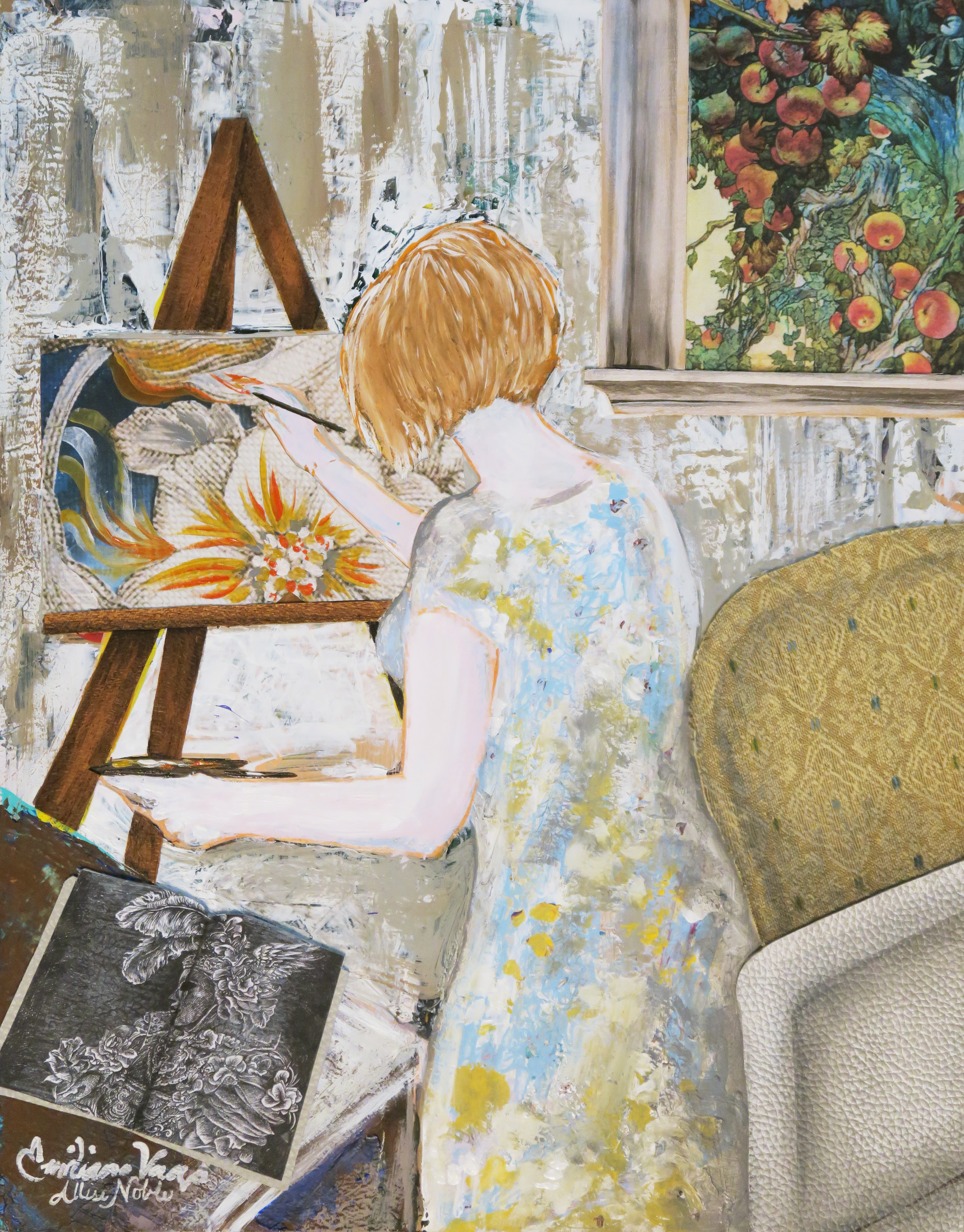
  • Start with what you know. Create a base drawing or painting first, and then assess where you could add some 3-dimensional or tactile elements. In the image below titled “Artist At Work”, fellow artist and art friend Emiliano Vega painted the scene first with acrylics and a palette knife, and then I applied mixed media accents evenly dispersed throughout the scene to finish it off. Think about what the objects depicted in your drawing or painting are actually made of be it wood, metal, fabric, leather … and try to incorporate those materials. I used thin cutouts from sheets of wood samples for the wood of the window frame and easel. Real fabric and leather samples were used for the furniture, with paint applied overtop for shading. Prints of an actual sketchbook were used for the book on the table, as well as a a closeup section of an actual painting for the work on the canvas. the artist at work
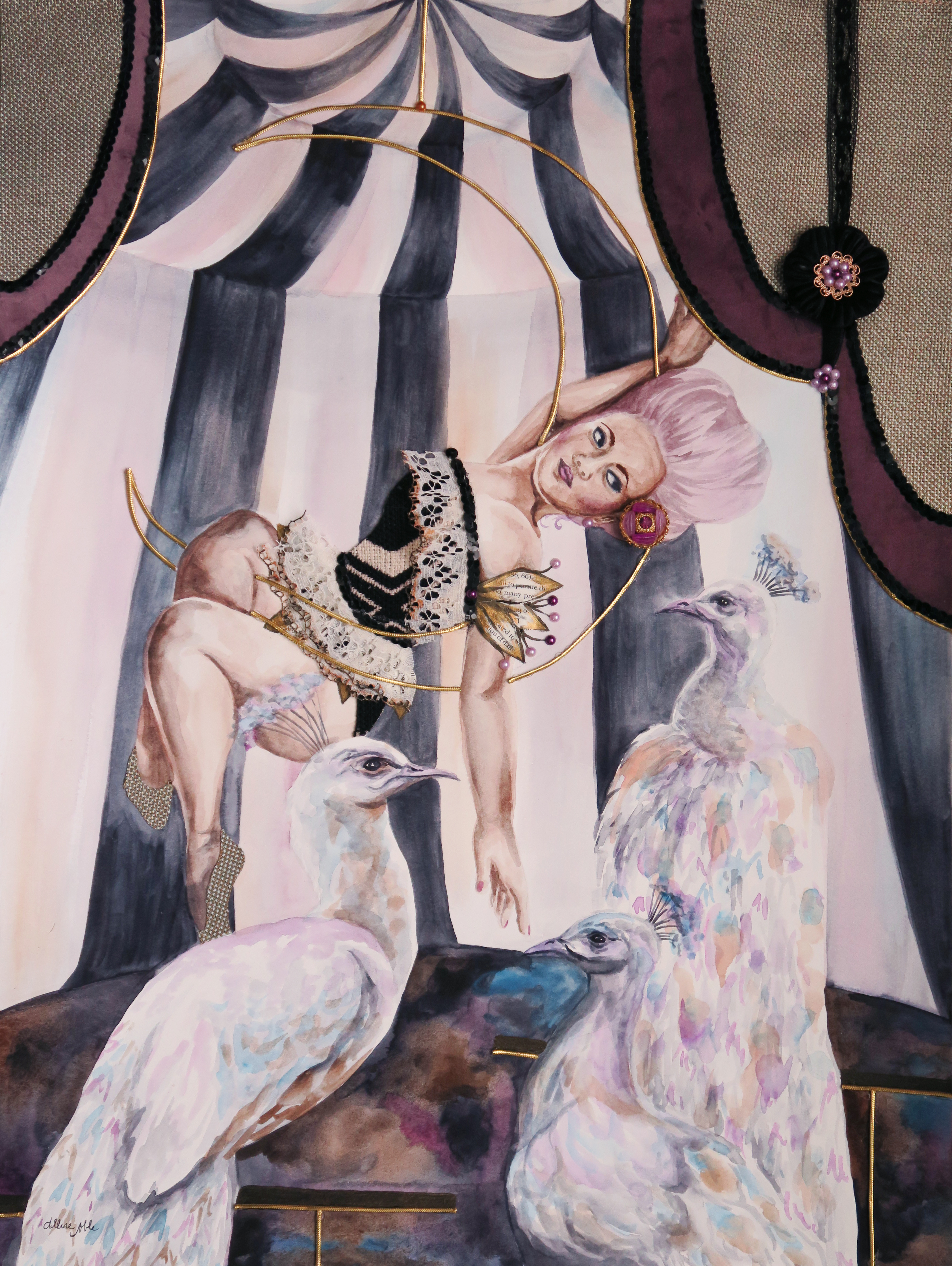
  • Go gathering and narrow down your choices! Look for materials with a similar color scheme, pattern, style, or period look to the 2D image you are creating. Once you’ve accumulated a store of like elements, it will be a lot easier to decide what you want to place where to add to your piece. For “Lunar Fantasy”, I painted everything in watercolor first and then determined what to accent in mixed materials. I gathered fabrics in dusty, muted tones of black, ivory, gray, blue, and violet. I also collected some gold metal/metallic pieces that reinforced the vintage style. Everything I collected was pretty and feminine with a definite older feel to it (think Grandma’s craft drawer) but with a whimsical, luxe element to it as well. I gave myself a couple fabric choices, a couple edging choices, and a couple metal choices and narrowed it down from there. I used actual fabric and ribbon for the top curtain and her outfit, and accented any of the metal with gold cord. I also reinforced the vintage circus look by using scavenged vintage jewelry for decoration.

lunar fantasy

  • Maintain your original style. There are literally no rules to mixed media art. When you google “mixed media art” or even watch youtube tutorials, a lot of what comes up are mixed media styles that are very “on trend” with a heavy art journaling influence. Much of it is very busy and colorful with all-over pattern and texture, visible paint strokes, and super stylized figures, flowers, or animals with a lot of elements of paper crafting and collage. If you’re a fine artist who likes sharp detail and realism you may feel like this is an area you aren’t able to dabble in but that isn’t true at all. I integrate mixed media into my pieces as an accent and an enhancement to the work I am already doing in either paint or pencil. The piece on the left is all colored pencil, and on the right colored pencil with the introduction of mixed media, both other 2D mediums as well as some 3D objects. In this piece on the right, I was able to use prismacolor pencil for the figure to achieve the sharp detail and realism that was desired, and watercolor for the background to create a softness and “fog” to the view through the window. I used prismacolor markers for the eye pattern undulating out from her line of vision because I wanted that to have a more hard-edged graphic print look with no visible pencil or paint strokes. I used actual fiber materials for the gold edging on her outfit and her dress as well as actual decorative gems for her jewelry because yes, you could imitate it by drawing, but using the real thing adds a surprise 3D element that makes viewers look twice and gives the piece depth. That is part of the fun of mixed media art – it draws viewers in encouraging them to investigate further, because it’s not just a painting or just a drawing – they are invited to try to figure out the artist’s process, and what they used for different parts of the piece. There are new discoveries the longer they take the piece in.

  • Start small. Try out different techniques and materials on a small surface. Bulk value packs of 8×10″ canvases or mixed media paper sketchbooks are great! Get out your paints, pencils, fabric, beads, odds and ends and play!

With many things being cancelled right now resulting in a lot of downtime, it’s not a bad idea to get creative and try something new! Fine art and crafting materials CAN coexist!


Standard
New Work

I’m Back With Some New Art!

This first piece in a new series was a long time coming … I am obsessed with working small, and tend to work in 11×14 or maybe 16×20 max, and wanted to start doing pieces that were at least 18×24 or larger to allow me to include more detail and further develop the background in my pieces. My new series, Dwell, really taps into my background of interior design study. These pieces will contemplate how our environment affects us, but also how we interact with and affect it. The word dwell also has a double meaning, not just the physical space where we live but the places we create inside us that we allow our mind to dwell in. How are these psychological spaces affecting us, and how much control do we have over them or they over us?

“Dwell In Possibility” was a challenge for me because it involved a lot of brown, a color I literally never use in art. I tend to create pieces that are mostly grayscale tones with pops of bright color, and gray just would not have been right for the earthy feeling I wished to evoke. The other challenge to this piece was that I was creating an interior that was not very attractive or intricate … the remains of a decaying building, dirt floor, rough wood paneled walls, weathered plaster ceiling once grand but now stripped of any color or design … The only furnishing an abandoned, sun bleached chair frame.

dwell in possibility

I did a lot of layering of different media overtop one another, and used my clear prismacolor pencil blender for the first time in my entire life. I usually use a white pencil to blend, but this time I couldn’t use an opaque blender because I wanted to be able to still see the underlayer of watercolor through the blended pencil. I left the flowers and hair purely impressionistic watercolor as opposed to the detail in the background and the model’s face. I didn’t use as much dimensional mixed media as usual, not wanting to add too much clutter, and stuck to a lace fabric overlay on her dress and clusters of beads for the centers of the poppy flowers.

dwell in possibility progress

The closer you look, you will see there is a lot more going on than just a smiling woman holding a bouquet. She is already stationed in an odd setting, an old deteriorated building. She is surrounded by decay, including uprooted, dying plants. Even some of the flowers in her hands are dead or dying, but they are slowly coming back to life as she grasps onto them, holds them and nurtures them. Behind her through the door there is a cavern of light, where a grand tree has taken hold. There are no leaves yet, hardly any soil for his roots to grasp onto, yet he is still alive somehow. Robins circle around, a bird that symbolically means rebirth. Change and growth are always possible.

As you can also see, I can’t seem to put down the metallic gold acrylic lately! At work, my students always want to cover everything they make in metallics and glitter, which often makes me shake my head, but I can understand the temptation ;). Speaking of which, I am starting a new class called Creative Minds where each week students will be learning about an accomplished artist of the past or present, and completing a small project based on that artist’s iconic style with a focus on artists with disabilities and mental health. I will be sharing my projects as well as some of the students’ interpretations, so be on the look out for a new project post each week! I am hoping some of you reading this will want to try it at home yourself. It’s always fun to play :D!

Standard
Doll Repaints

Monster High Doll Repaint – Peacock Punk

I mentioned that after my first Monster High Doll repaint, I had become addicted and immediately was flooded with ideas for future dolls. I wanted to do a doll where I altered the hair next. A lot of re-painters remove the hair entirely and use doll wigs, but for now I want to focus on using supplies I already have in my bountiful storage. This Draculara doll’s hair was a big ‘ol mess, practically beyond saving. I’d been wanting to do a doll with short hair, so she fit the bill perfectly.

After I’d taken her hair out of it’s ponytail, I took a deep breath and started chopping. I was never one to cut my dolls’ hair as a child, being very protective of them and keeping them in as pristine condition as possible, so this was a bit painful but I knew it was for art’s sake ;). Once I combed the remaining hair out, I was left with mostly the pink with spikes of black in between. I used fray check to mold the hair into the style I desired.

The perfect feather shapes were cut from the leftover fabric of a dress I made years ago (With tons of help from Mom. I am not a sewer.), using a funky vintage pattern from the 70s. I have a bit of what has always been lovingly referred to in my family as “tactile stress”, and so I never ended up wearing this dress a ton because the elastic wrists and extra fabric flopping around on the sleeves irritated the living hell out of me. I ended up eventually selling it to a very excited new owner, sans clothing neurosis.

I left the original skirt underneath for volume, and layered fabric feather shapes with synthetic feathers underneath, accenting  with tiny crystals here and there. There are also feathers embedded into her hair, on her shoes, and hanging from her ears as earrings. Her original face was removed with acetone, and her new face was painted with both metallic and matte acrylics blended with matte medium. I used a gloss medium over the eyes and lips to give them a wet look. Her eyes are also circled with crystals, and a feather pattern grows from her hair onto the side of her face. Her tiny nails and toes are painted to match her lipstick. I’m really digging the 80s rocker /slash/ anthropomorphic bird-human hybrid look this little lady has going on.

I also have one of the werewolf (Clawdeen) dolls, and I am pretty sure my next doll is going to be an Egyptian cat deity, so look out!

These dolls and other fun creative objects can be found in my ebay shop! Here’s to (literally) making new friends!

Standard