Timely as May is getting closer and closer, I recently after long last finished my mermaid painting that I started at the beginning of 2020. This poor little lady kept getting brushed aside for more urgent projects over the years. It is also the first human figure I’d ever started with acrylics when my preferred mediums are colored pencil, ink, or watercolor, so there was definitely a self education process.
I’ve described this project as really giving the proverbial finger to gatekeepers who believe certain supplies can’t be used in fine art. Working at an arts non-profit, I am a big fan of use everything, and actually one of my favorite pieces I’ve seen at a museum in awhile was a giant panther in the jungle that was composed entirely out of flatback rhinestones and pony beads!
I first sketched the basic outline of my mermaid on the canvas base. I then used gesso to apply a variety of textured materials where I wanted a 3-dimensional surface: netting from avocado bags, tissue paper, and yarn. After I acrylic painted the main imagery, I dry brushed over certain areas I wanted to have an iridescent sheen with metallic craft paints which are also perfect for highlighting the texture. I glued tiny shells to the tail and the edges of the rock, brushing over with a watered down coat of black metallic to help them fade into the rest of the design.
She certainly exceeded my expectations! This is why you see projects through to the end past that “ugly phase” in the middle.
While we are on the subject of beautiful mermaids, check out this mermaid themed merchandise created by my Artshop Students! All designs were created by artists with disabilities. Show them some support by checking out our Redbubble Shop! Happy (early) MerMay 😉 …
I am like a plant. If I don’t stand in the sun every day I wilt. Unfortunately, I also live in Michigan and I am more wimpy about the cold with each year that passes. Incidentally, I have not been outside as much as I should over the last 2 months. I am always a big fan of if you can’t be outside, bring the outside in so I recently started doing something I never thought I would do after university classes … Painting landscapes!
Though I feel most at peace during a walk in the woods, I always shied away from nature paintings because I tend to lose interest creating something that one could easily just look out their window or at a photo to see. But then I remembered Eyvind Earle, who did the breathtaking background illustrations for Disney’s Sleeping Beauty. He was able to capture a dreamlike quality in his landscapes that still showed us a world that was comforting and familiar, but that we couldn’t quite access in our waking hours.
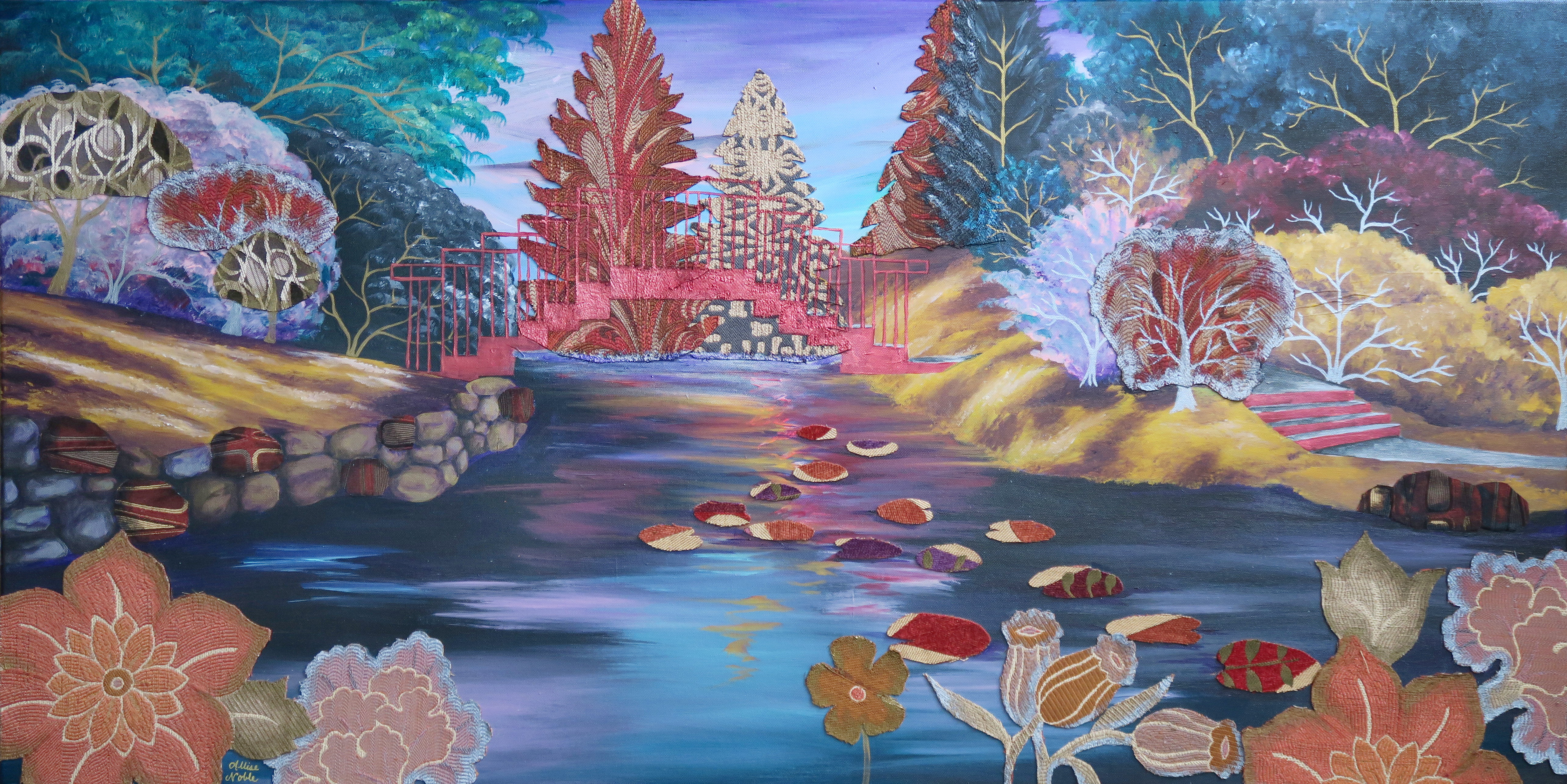
Growing up in Midland, MI one of our local landmarks is Dow Gardens, a Japanese style garden that celebrates color and geometry. I chose this place as the subject for my first largescale landscape, replacing the blues and greens with purples, yellow ochres, teal, black, and burgundy. I embellished with abstract patterned upholstery fabric for some of the trees, floral cutouts and lily pads for the foreground, and accented some of the rocks and branches with metallic acrylic.
I actually just finished the above piece this past weekend though I started it before my triptych below. Just as I was starting my landscape, I was contacted by King’s Daughters Assisted Living, also in Midland (I live only a city over now but still work in Midland!), to come up with a piece of art for a blank wall they had that would tie together their newly renovated space. I was excited to not only put my painting brain, but my interior design brain as well, to use for this project. The new upholstery and decor was all in blues and greens, but much of the carpet in this mid-century-modern building was a brilliant fire engine red, and that was staying. I immediately thought of the red bridge at Dow Gardens, and suggested this nature scene as a way to tie together the carpet and the new furnishings. Many of the residents at King’s Daughters lived in Midland for decades, and being surrounded by images of familiar places brings joy and comfort, especially for those struggling with memory.
I’m inspired to capture more locations from my own past as I continue to develop my acrylic painting, a relatively new focus for me. Maybe some architecture will be next!
Sharing this nearly a week later, but my wonderful father at least received his palette knife bird painting on time ;)! I shared earlier how I’d been doing a lot of from-afar collaboration over the last year with my dad over quarantine through using his bird photographs as inspiration for illustrations and paintings. When looking through some of his more recent photos for inspiration for a painting to gift, this little guy stuck out to me. I loved the striking black and white pattern, which meshed perfectly with the already existing abstract background. (Seriously, if you want to paint more often prep a bunch of small canvases with random color blend backgrounds so they are already primed for when inspiration strikes!)
I hope you enjoy this peek into my process. I find birds to be one of the most accessible things to palette knife paint. If you visit my channel I have other videos with step-by-step verbal instruction accompanying the footage.
Flowers more your thing? Check out my Mother’s Day demo.
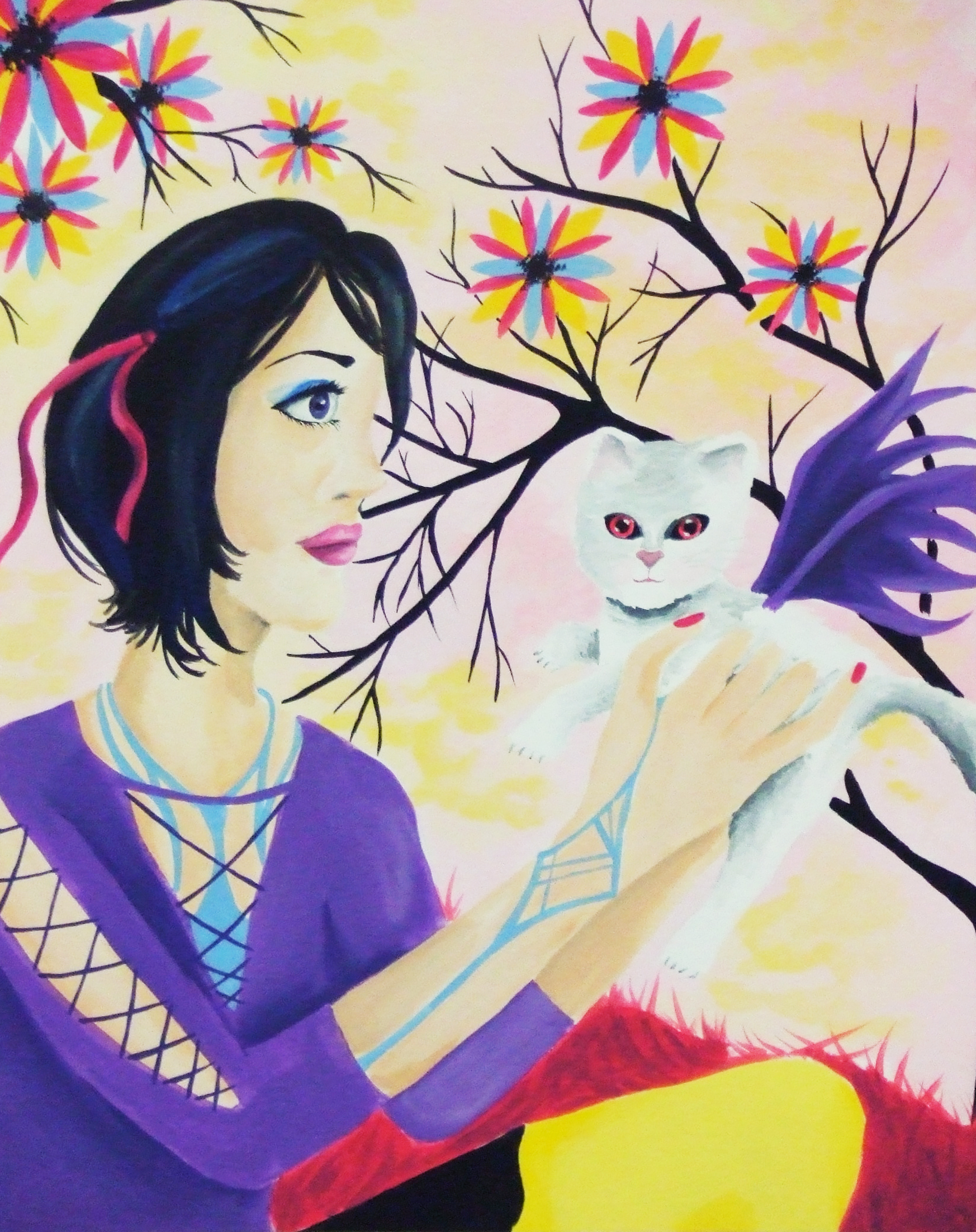
I’m going to start off by saying I used to be really bad at painting anything outside of my quite narrow areas of interest. I went through a phase where I was putting dragon wings on everything, for example, and only did fantasy or surrealism inspired art. I remember my roommate freshman year of college asking me to paint a picture of a teenage girl holding a cat surrounded by flowers after she found out I was an artist (She was the opposite of me, into all pastel cutesy stuff). Hence, this dead eyed girl and cat with guess what, dragon wings, was born. If I still had it, I’d consider submitting it to The Museum Of Bad Art.
Over the years and especially through teaching, I’ve learned to enjoy the process of creating itself and not just the end result, so that even if I’m making something that isn’t necessarily my go-to aesthetic, I can still harness the therapeutic benefits of creativity. This makes accepting commissions a lot easier, and creating art for loved ones that may not fancy surrealism and oddity as much as I do. I have literally never painted tulips in my life, but my mom loves them and while we were recently out walking remarked on the beauty of a particular variety planted at Dow Gardens. I hope you enjoy this visual walkthrough of the process!
Since about mid-November, my state when through a second, more mild, quarantine which put classes and activities in my Artshop program temporarily on hold and sent me back to working from home again. I will be plunging back into things as they reopen TOMORROW, so today I’d like to share some of the work I finished over the last couple months.
This first piece was a very fun commission where I was asked to do a surreal portrait in my signature mixed media, vintage inspired style but based on the song “Little Wing” by Jimi Hendrix. I was given some guidelines as to the type of figure portrayed and color scheme, but otherwise the project was completely open ended. And so, this piece was born, communicating a sense of love and positivity, openness, kindness and warmth, and creative spirit.
Little Wing Commission, Prismacolor Pencil and Mixed Media
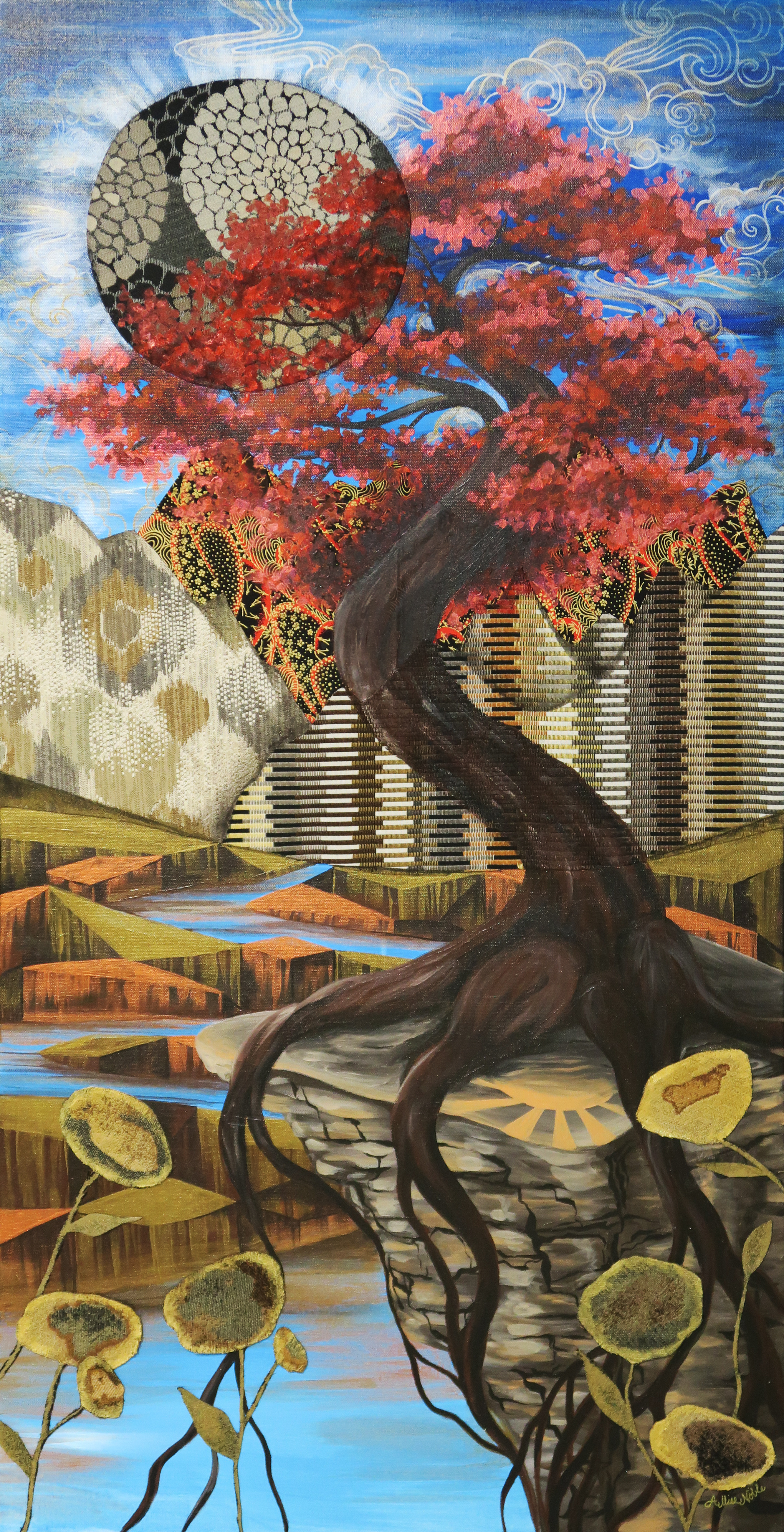
It felt really good during this time, which to be honest though less restrictive seemed to be a hell of a lot more frustrating than the first full quarantine, to continue the trend of just working on creating some beautiful, uplifting imagery. The piece below is my largest to date at 4 entire feet high! That may not seem like a big deal to some, but everyone who knows my work knows I work small, “big” for me usually being 18×24″. Also note, no people or animals in this piece! I have another large canvas still untouched, and to really step out of my box I think I should do something architectural next.
Where The Light Is Held, Acrylic and Fabric
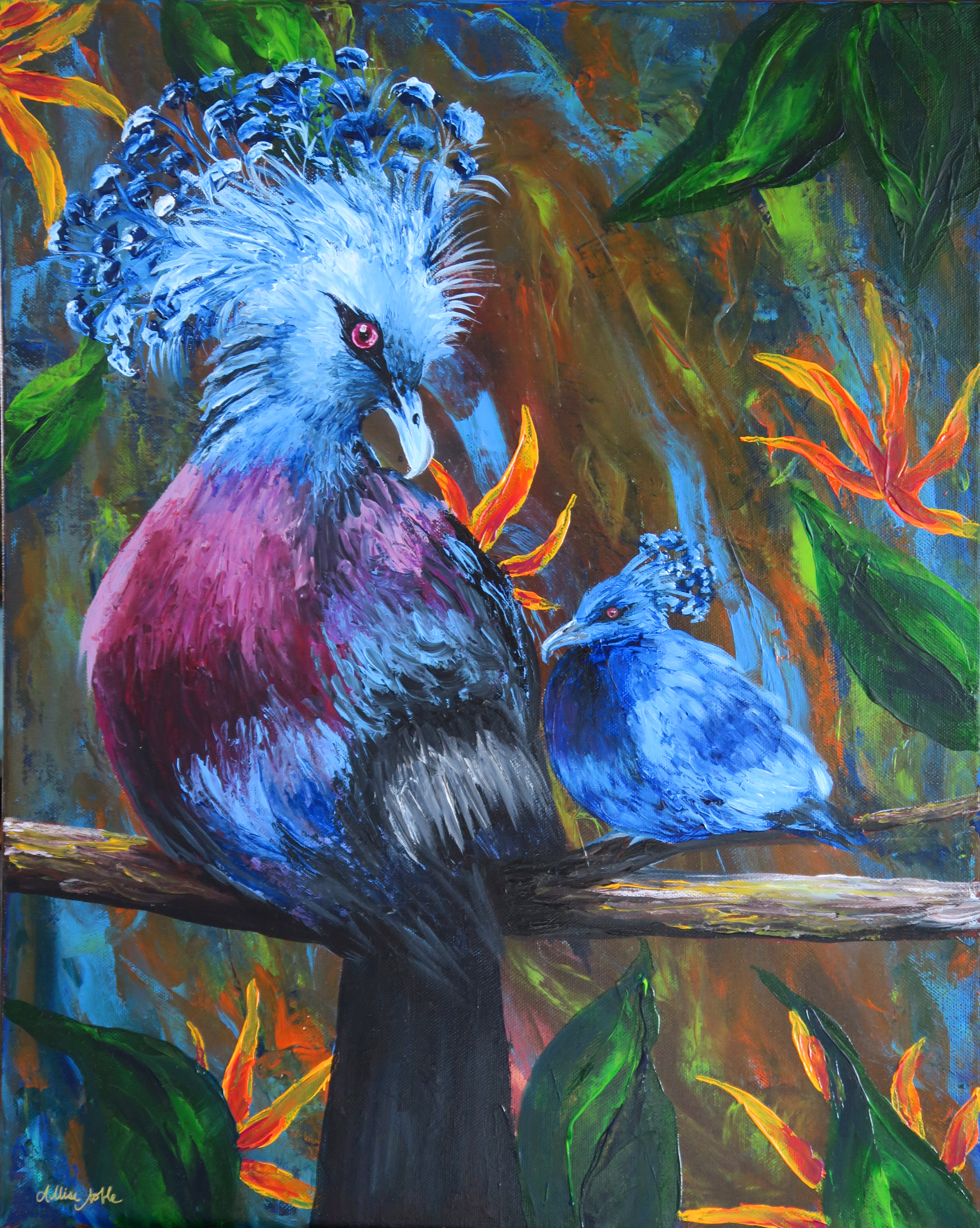
I also finished a full size bird palette knife painting, the rest of what I’d completed being minis. Yes, these are real birds! I’m always saving photos of exotic and interesting birds on Pinterest, and the colors and adorable yet zany plumage coming out of the top of these guys’ heads was irresistible. I found a couple of reference images, and decided I had to throw a baby in there too.
I don’t know about the rest of you, but my new year starts tomorrow. Wish me luck!
I’ve recently been doing some experimentation with palette knife painting, though for now my forte is mainly just birds! (I tried an octopus recently with disasterous results 😉 ). As someone who was previously very skeptical about palette knifing, I wanted to share how much fun it really is! As someone who is very sharp detail oriented with art, I was worried about not having the control that I can get with a pencil or brush. In the end, I found the expressive process of smearing and marbling colors with the knife incredibly calming and meditative. This is beginner level, so anyone can try it even if you have no painting experience. Give it a go and let me know what you think!
What do you think I should try to palette knife next?
Like many, my life has been affected by COVID-19 this month (though not as drastically as it could be, thank goodness). Here in Michigan, everything is closed but grocery stores and hospitals, and we have been urged to keep to our household until the spread slows down. I met this unexpected turn of events with a lot of anger, disappointment, and frustration at first. I had a lot of things scheduled professionally all beginning in guess when? March and April, that are now postponed until some mysterious pending date. My spring and summer last year weren’t so hot as I was dealing with a variety of personal issues, many which were out of my control. I was really planning to harness this year to its full potential to make up for what I saw in my mind as a lot of lost time in 2019.
These feelings right now are universal; we are all dealing with processing this in some form or another. One thing I came to realize though is being frustrated or feeling angry or cheated by the universe doesn’t change anything about the current situation. We all have this forced downtime right now, and we can either waste it or use it to our advantage to learn a new skill or otherwise work on personal development, relax if we’ve been overworked, and try to fill our days with simple things we enjoy.
I work primarily in drawing mediums and watercolor. I have always struggled to work with acrylic paint, especially when it comes to realism or painting portraits and figures. I decided to take this time to practice a medium I struggle in, starting with a self portrait.
There were a lot of late nights involved with this piece, and some amount of cursing. I would show you what my acrylic attempts looked like just a month ago if I still had them, but I ended up re-using the canvases for other projects. Just believe me when I say, the difference is night and day. When we take the time to practice something new and fully devote ourselves to studying a skill, magic happens!
This brings me to my second acrylic piece, “Space Is A Lonely Place To Be”. For this piece I was very inspired by silent film fantasy/outer space imagery and costumes, with a touch of art nouveau. I am certain a lot of this came out of feeling a bit isolated and as if I am floating outside of time … It’s strange out there right now.
It’s looking like things may stay strange for a couple more weeks, but in light of using this experience to a positive advantage, here’s what I’ve learned so far …
I need to be mindful of building margin into my life when at all possible. I feel so much more healthy physically and mentally right now than I did when everything was normal, despite the current uncertainty in basically all areas of life and threat of danger. This is absolutely mind boggling and should not be.
I need to learn to say no. This kind of goes with the previous statement too, as not being able to say no is how I end up with zero time to breathe. I miss my friends and students, but I did notice myself in this time of social distancing feeling a tad bit of relief that I was free from a barrage of social obligations I didn’t feel like attending because, well, all social obligations are pretty much banned right now. Life is too short to fill all your time with things you don’t want to do. Yes, as a good friend and family member there are times you need to show up for people when you don’t necessarily feel like it, but there is a balance to this, and they need to be willing to do the same for you.
Wasting time is ok. I don’t have to have something to show for every moment I’m alive, sometimes just existing is ok! It’s ok to just sit down and read a book, or lay in bed thinking, or watch a movie in the middle of the day sometimes. It’s ok to spend time playing with a new project or idea and have it not end up turning into anything. Had I not been willing to experiment or practice with the risk of ending up with nothing at the end, I never would have learned how to acrylic paint!
What have you all been up to in your downtime? What have you learned about yourself?
Happy New Year everyone! I got a couple more months of ArtSnacks for Christmas this year, so let the unboxing begin! I will be honest, I hate the art journal page I created for the Artsnacks Challenge this month, which is too bad as it revolves around one of my favorite literary quotes :-/. No judging!
Lifesaver and one of the more adorable Artsnacks logo stickers 🙂
Starting with the fineliner – So sad, but I hated this pen. It comes down to personal preference, but I felt the tip did not allow for fine details, and as you can tell from my end result below, it cannot be used with liquid media without bleeding really badly. I had to go over a lot of lines again because they had nearly disappeared after I applied paint, and the bleeding and smudging is still visible. The ink was definitely dry, as I outlined one day and came back the next to finish the journal page. I feel like it would be better suited for writing than drawing.
As for the paints, I have heard of Golden Acrylics because many of the artists I know will only use this brand exclusively. These paints lived up to their reputation for sure – smooth to work with, nice blending, bold colors that keep their rich look after drying, and great coverage. If anything, this exercise reinforced the fact that I need to sign up for that acrylic painting class I’d been debating taking next month. I mainly use acrylics on crafts or for small scale accents in my mixed media work, and my skills are pretty rusty. I kept trying to use the paints like watercolors, and ironically this line of Golden paints is a great option for acrylic painters crossing over from watercolor due to their intentional transparency.
I also had good luck with the paintbrush. I adore fine line brushes since when I do use acrylics, as mentioned previously, it is mainly just for adding subtle outlines or small details to enhance a larger project in other mediums. Taklon is the material I prefer for my acrylic brushes, and I could tell that this was a quality brush that was going to last. It was the perfect Goldilocks brush – not too soft, not too firm. I haven’t replaced my paintbrush collection since… probably about 10 years ago, so I will definitely be keeping these in mind when I need to get some new brushes.
I found the paper included very interesting as well. The surface is like watercolor paper, but the weight is like painting on a board. It’s a great option for acrylics when you don’t want to use a canvas, and I’d love to try it with watercolors as well … I feel like it wouldn’t ripple as much as traditional watercolor paper.
As I said, I really don’t like how this image turned out but, nevertheless … I apologize, Mr. Vonnegut, for besmirching your memory with this so-so art. So it goes … 😉
Watch out for another unboxing next month! I also will have some new art and project ideas in queue for posting, so keep your eyes peeled!
I first heard of the art of doll repainting when I came upon an article about Tree Change Dolls. An Australian mother, doll lover, and recycling enthusiast had begun repainting discarded dolls found at secondhand shops and giving them a new life. Word got out, and her hobby took off in a bigger way than she ever expected. She primarily works with Bratz dolls, giving them her signature make-unders to make the dolls bare a closer resemblance to the kids that likely play with them.
By the time Bratz dolls came out I was already in 7th grade and getting out of playing with fashion dolls, though I did still covet the collectible, for-display Barbies with elaborate costumes and often retro styling. Still, I always thought Bratz dolls’ over-the-top iridescent makeup and decidedly not vanilla clothing was a lot of fun. These girls were definitely not going to a yacht club or garden party. Dolls for girls do tend to either look like either teens/young adults or babies, with a curious lack of dolls that resemble the age girls that play with fashion dolls usually are, so I can definitely still get behind what this mom is doing. Also, watch the video – she is just having a blast, hoping to make people happy along the way, and her enthusiasm for her craft is contagious :).
I very recently was commissioned by a regular ebay customer and art doll collector to draw an ACEO illustration of one of her Monster High Doll repaints she purchased from another artist. Monster High Dolls by Mattel are another line that came after my childhood, but that I always wished I had been young enough to play with. Their colorful, surreal appearance coupled with the fact that they use a wide variety of facial sculpts (i.e. not just offering the same basic mold in different skin tones and eye colors) attracted me right away. The more I looked up other repaints on ebay and etsy, the more I was convinced I absolutely had to try this myself. I bought a lot of 4 previously loved dolls, and stayed up until after midnight working on the bulk of my first doll, originally a MH Operetta model, completely lost to time.
I used nail polish remover to clear off all the factory paint, and gave her hair a good brushing and a new ponytail. I used a translucent metallic copper paint first to add shading and give her the look of a fantastical creature made of a merging of metal and skin. I dry brushed more heavily over the side of her body covered in the embossed swirls to emphasize this unique design feature, using a clear matte medium along the edges of the wet paint to blend. I mixed a peachy acrylic with matte medium to add blush to her cheeks, and then used acrylic on her eyes and lips, covering both with a gloss medium to give them a moist, realistic appearance. I used a detail brush to paint her teeny tiny fingernails and toenails. I too love recycling, and used a variety of lace, ribbon, and cotton fabric scraps to craft her gown. The velvety strawberries and leaves are from a lot of vintage millinery florals I’ve acquired, some from ebay, some from antique sales. And thus, The Princess of Strawberries was born!
My style definitely leans more towards the fantasy couture, and this doll is a display-only unlike the creations of the fun mom above. Maybe for one of my others I will make a more every-day version for play, who knows!
My princess is for sale, and you can see her in more detail here.
I haven’t done an “Artists To Know” installment in quite awhile, and have bookmarks of inspiring artists piling up by the minute – The internet is wonderful ^_^! The artists I have picked today all create dreamlike worlds through their art, causing the viewer to get lost in detailed landscapes that could only exist in the artists’ imaginations, almost as if they are inviting viewers into their own inner fantasies. All are 2-dimensional works this time except the last, which is really something special, so be sure to look all the way to the end! This style of fantasy-like, surreal art is my absolute favorite. I hope you enjoy, or at least see something you’ve never seen before!
Lucy Hardie is an Australian artist who began her education at a Waldorf school built by her parents. With her parents’ encouragement, she studied art history and the Masters at an earlier age than most. This foundation was obvious to me right away in the style and subject matter of her work. Parts of it look like they are from another time… but then other parts resemble a time that has not yet existed, and this seamless meshing of the two along with the exquisite fine details are what make her work so captivating to me.
Hsaio Ron Cheng hails from Taiwan, and is a digital artist and illustrator. The bio on her website says she was born in 1986, only 2 years before me which makes me feel like I’m slacking! Her portfolio encompasses a wide range of personal and commercial work, all in her signature palette of peachy, pastel, diluted colors. The unusual color choices are actually what first drew me to her work, and made her illustrations stand out.
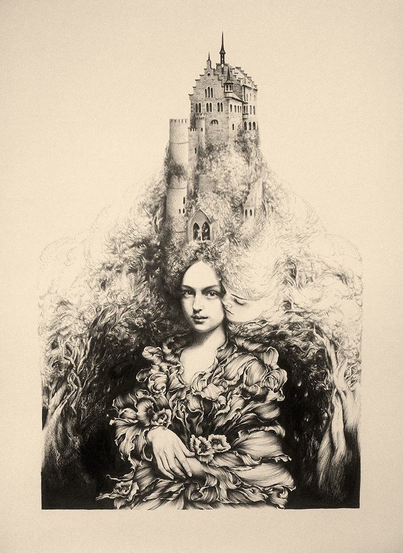
Daria Hilazatova describes herself as a “full-time artist, part-time elf” in the bio on her website, and sites her inspiration as “fairytales, theater, and nonsense”. Whimsical and fantastical theatrical elements abound in all of her drawings. Her illustrations are distinct and different from anything else I have ever seen, truly 100% from the artist’s imagination. The other element that differentiates her art from anything I’ve seen previously is the insane amount of detail! One has to squint to see all of the intricate patterns making up each image, and the longer one looks, the more they notice details they had originally missed.
The image above is what first prompted me to investigate more of Levasseur’s work, but she also has a ton of fantastic paintings in which the subjects are merging into painted landscapes which I’d encourage you to check out on her website. There is strong movement and emotion in each of her pieces, all of which are incredibly surreal. Her figures are realistic, but she mixes in a lot of more painterly or sketchy elements as well, making it look as if her subjects have jumped inside a delightful hand painted world and gotten lost there.
I told you the last one was a good one! I can’t even wrap my brain around how this works, but below is a video that shows artist Benjamin Shine in action as he creates his tulle “paintings”. Shine studied fashion design at The Surrey Institute of Art and Design and Central St Martins in London. I can’t even iron shirts properly, so conceiving of how these gorgeous, smokey portraits can be born out of an iron and some thread makes my head nearly explode. Who said there is nothing new under the sun? Shine has certainly discovered something that has never been done before.
I hope you’ve enjoyed your Sunday inspiration! Get out there and do something amazing with the rest of your weekend! 🙂


 This brings me to my second acrylic piece, “Space Is A Lonely Place To Be”. For this piece I was very inspired by silent film fantasy/outer space imagery and costumes, with a touch of art nouveau. I am certain a lot of this came out of feeling a bit isolated and as if I am floating outside of time … It’s strange out there right now.