Techniques and Tutorials

Palette Knife Tulips Demo (Dedicated to Mom!)

For Ashley

I’m going to start off by saying I used to be really bad at painting anything outside of my quite narrow areas of interest. I went through a phase where I was putting dragon wings on everything, for example, and only did fantasy or surrealism inspired art. I remember my roommate freshman year of college asking me to paint a picture of a teenage girl holding a cat surrounded by flowers after she found out I was an artist (She was the opposite of me, into all pastel cutesy stuff). Hence, this dead eyed girl and cat with guess what, dragon wings, was born. If I still had it, I’d consider submitting it to The Museum Of Bad Art.

Over the years and especially through teaching, I’ve learned to enjoy the process of creating itself and not just the end result, so that even if I’m making something that isn’t necessarily my go-to aesthetic, I can still harness the therapeutic benefits of creativity. This makes accepting commissions a lot easier, and creating art for loved ones that may not fancy surrealism and oddity as much as I do. I have literally never painted tulips in my life, but my mom loves them and while we were recently out walking remarked on the beauty of a particular variety planted at Dow Gardens. I hope you enjoy this visual walkthrough of the process!

Advertisement
Standard
New Work, Techniques and Tutorials

Hand Drawn Damask Print Demo

I am a big fan of damask print. I know the design had a big moment about half a decade ago, but I’ve always loved it, especially since under the pattern umbrella there is so much variety. I always thought a snake would lend itself well to the curving, scrolled shape of a damask print but could never quite find exactly what I was looking for. When you can’t find the print you want, it’s time to make your own!

I used metallic ink and prismacolor pencils on black pastel paper that has a visible cross hatched texture to the surface. Since this sort of print only has one element to it that is repeated in an offset pattern, this was a relatively simple one to try for someone who is newer to creating all-over print.

I’m thrilled with how my snake damask turned out, and can’t wait to order a skirt or shirt for myself. To see more of my designs, visit my Redbubble Shop. Redbubble’s products are all reasonably priced and excellent quality – these art-covered wares make perfect holiday gifts. If you enjoyed the video showing how I created my print, please give me a follow! I will be posting some fun palette knife painting tutorials in the coming weeks as the weather gets colder and we find ourselves needing more indoor forms of entertainment.

For all my American friends out there, enjoy your Thanskgiving week, and thanks for stopping by my creative little corner of the world :).

Standard
New Work

I’m Back With Some New Art!

This first piece in a new series was a long time coming … I am obsessed with working small, and tend to work in 11×14 or maybe 16×20 max, and wanted to start doing pieces that were at least 18×24 or larger to allow me to include more detail and further develop the background in my pieces. My new series, Dwell, really taps into my background of interior design study. These pieces will contemplate how our environment affects us, but also how we interact with and affect it. The word dwell also has a double meaning, not just the physical space where we live but the places we create inside us that we allow our mind to dwell in. How are these psychological spaces affecting us, and how much control do we have over them or they over us?

“Dwell In Possibility” was a challenge for me because it involved a lot of brown, a color I literally never use in art. I tend to create pieces that are mostly grayscale tones with pops of bright color, and gray just would not have been right for the earthy feeling I wished to evoke. The other challenge to this piece was that I was creating an interior that was not very attractive or intricate … the remains of a decaying building, dirt floor, rough wood paneled walls, weathered plaster ceiling once grand but now stripped of any color or design … The only furnishing an abandoned, sun bleached chair frame.

dwell in possibility

I did a lot of layering of different media overtop one another, and used my clear prismacolor pencil blender for the first time in my entire life. I usually use a white pencil to blend, but this time I couldn’t use an opaque blender because I wanted to be able to still see the underlayer of watercolor through the blended pencil. I left the flowers and hair purely impressionistic watercolor as opposed to the detail in the background and the model’s face. I didn’t use as much dimensional mixed media as usual, not wanting to add too much clutter, and stuck to a lace fabric overlay on her dress and clusters of beads for the centers of the poppy flowers.

dwell in possibility progress

The closer you look, you will see there is a lot more going on than just a smiling woman holding a bouquet. She is already stationed in an odd setting, an old deteriorated building. She is surrounded by decay, including uprooted, dying plants. Even some of the flowers in her hands are dead or dying, but they are slowly coming back to life as she grasps onto them, holds them and nurtures them. Behind her through the door there is a cavern of light, where a grand tree has taken hold. There are no leaves yet, hardly any soil for his roots to grasp onto, yet he is still alive somehow. Robins circle around, a bird that symbolically means rebirth. Change and growth are always possible.

As you can also see, I can’t seem to put down the metallic gold acrylic lately! At work, my students always want to cover everything they make in metallics and glitter, which often makes me shake my head, but I can understand the temptation ;). Speaking of which, I am starting a new class called Creative Minds where each week students will be learning about an accomplished artist of the past or present, and completing a small project based on that artist’s iconic style with a focus on artists with disabilities and mental health. I will be sharing my projects as well as some of the students’ interpretations, so be on the look out for a new project post each week! I am hoping some of you reading this will want to try it at home yourself. It’s always fun to play :D!

Standard
New Work

Doll Repaints – My Addictive New Hobby!

I first heard of the art of doll repainting when I came upon an article about Tree Change Dolls. An Australian mother, doll lover, and recycling enthusiast had begun repainting discarded dolls found at secondhand shops and giving them a new life. Word got out, and her hobby took off in a bigger way than she ever expected. She primarily works with Bratz dolls, giving them her signature make-unders to make the dolls bare a closer resemblance to the kids that likely play with them.

By the time Bratz dolls came out I was already in 7th grade and getting out of playing with fashion dolls, though I did still covet the collectible, for-display Barbies with elaborate costumes and often retro styling. Still, I always thought Bratz dolls’ over-the-top iridescent makeup and decidedly not vanilla clothing was a lot of fun. These girls were definitely not going to a yacht club or garden party. Dolls for girls do tend to either look like either teens/young adults or babies, with a curious lack of dolls that resemble the age girls that play with fashion dolls usually are, so I can definitely still get behind what this mom is doing. Also, watch the video – she is just having a blast, hoping to make people happy along the way, and her enthusiasm for her craft is contagious :).

I very recently was commissioned by a regular ebay customer and art doll collector to draw an ACEO illustration of one of her Monster High Doll repaints she purchased from another artist. Monster High Dolls by Mattel are another line that came after my childhood, but that I always wished I had been young enough to play with. Their colorful, surreal appearance coupled with the fact that they use a wide variety of facial sculpts (i.e. not just offering the same basic mold in different skin tones and eye colors) attracted me right away. The more I looked up other repaints on ebay and etsy, the more I was convinced I absolutely had to try this myself. I bought a lot of 4 previously loved dolls, and stayed up until after midnight working on the bulk of my first doll, originally a MH Operetta model, completely lost to time.

I used nail polish remover to clear off all the factory paint, and gave her hair a good brushing and a new ponytail. I used a translucent metallic copper paint first to add shading and give her the look of a fantastical creature made of a merging of metal and skin.  I dry brushed more heavily over the side of her body covered in the embossed swirls to emphasize this unique design feature, using a clear matte medium along the edges of the wet paint to blend. I mixed a peachy acrylic with matte medium to add blush to her cheeks, and then used acrylic on her eyes and lips, covering both with a gloss medium to give them a moist, realistic appearance. I used a detail brush to paint her teeny tiny fingernails and toenails. I too love recycling, and used a variety of lace, ribbon, and cotton fabric scraps to craft her gown. The velvety strawberries and leaves are from a lot of vintage millinery florals I’ve acquired, some from ebay, some from antique sales. And thus, The Princess of Strawberries was born!

My style definitely leans more towards the fantasy couture, and this doll is a display-only unlike the creations of the fun mom above. Maybe for one of my others I will make a more every-day version for play, who knows!

My princess is for sale, and you can see her in more detail here.

Standard
Artsnacks Unboxing

May Artsnacks Unboxing!

art snacks may

This month’s Artsnacks box came with something scary – a calligraphy pen! Calligraphy pens are my mortal enemy, mostly because I don’t know how to use them properly. I played around a bit, and still don’t know how to use it properly and mainly treated it like a normal liner but – hey look! – it’s a tiger!

Now for the breakdown…

In my May box, I received a:

flat800x800075f-u1So, first the scary thing which is the Copic Multiliner. I’m sure it would be a fantastic product if I knew anything about calligraphy, and that is about all I can say as I have no basis by which to judge calligraphy pens. (Appropriate image by Nathan Moore on Redbubble.)

Now onto the Tombow MONO Graph pencil … I have professed my undying love for Tombow in past unboxings. This pencil is unique because you don’t have to push a button for the lead to extend, you just shake it and then click a lock on the side when you have the amount of lead you want … Which means you still have to push a button haha. I found this feature a bit useless and gimmicky, but it is a nice pencil otherwise and claims to feature the most popular eraser in Japan. I can corroborate that this pencil has a damn fine eraser.

ddSpeaking of erasers, the next product was the KUM Correct-Stick eraser. I just now realized this product was hiding and didn’t make it into my picture, but here is what it looks like …  This eraser did work really nicely and had a comfortable ergonomic grip, but I feel like it will lose its precise, pointed shape with use. As far as fine detail erasers I think my favorite will always be Pentel’s Click Erasers.

The Faber-Castell Big Brush Pen was my favorite product in this box.  The color is smooth and bold, probably owing to the fact that the ink used is India Ink. Though it was great for filling in large areas, the brush tip made it perfect for filling in details and making thin strokes as well. I struggle with sensitivity to strong smells so for me an added bonus was that this pen didn’t stink like alcohol markers do! I will definitely be getting more of these.

Last is the Liquitex Paint Marker. Not surprisingly given the quality of Liquitex paint, this marker was excellent. Of all the paint markers I have been sent since January, this one was my favorite. I liked that it didn’t look like solid acrylic paint when applied to paper, but being water based had a degree of translucency to it, probably because I am partial to watercolors over acrylics. Overall a decent box, while not necessarily my favorite one thus far.

Now, for those of you awaiting pictures of the progress on my Painted Piano Project, wait no longer …

It’s getting there, but still more to do – Guess what I’ll be up to this weekend? 🙂


Standard
Exhibitions and Other News

Super Exciting News (No, I’m Not Engaged. But Read This Anyway.)

First, I must explain the title. It’s a bit of a joke because the last time I did a post in which I professed exciting news, like everyone thought I was engaged. When I was like ‘nope, even better, I won Best 2D at an art exhibition!’ they were like, ‘Oh well, I guess that’s pretty cool too.’ I think this face of epic disbelief from the 10th Doctor sums it up pretty well.

304_daleks_in_manhattan_2

But, back to my still super exciting news. I had mentioned earlier how thrilled I was about getting into the Greater Michigan Art Exhibition at Midland Center For The Arts because I had entered the 2 previous years as well and had yet to be chosen to exhibit. Well, first I found out that not just one but all three of my entered pieces would be hung in the show.

imag4322r

Then, I found out that one of them had actually won an award! I feel so unbelievably honored to have one of my pieces receive a Juror’s Recognition Award.

imag4325r

(I hate closeup pictures of me holding things  because I feel like I have freakishly short fingers. No wonder I could never play the piano well even after years of lessons. Well, that coupled with my total apathy towards the vocation and complete lack of practice, but thatis another sotry for another day. Despite finger length, I had to show off the snazzy brochure.)

januaryr

The fact that they chose the piece that is going to be one part of my 12 part series I am planning to enter into ArtPrize next year was a welcome sign that I am going in the right direction with this project, and creating something that will bring people joy, make them think, and spark their imagination. If you are in the general vicinity of Midland, I would suggest you make a trek over to see this show. It is a humongous exhibit, and there is so much awesome art to absorb.

Standard
New Work

New Series Re-Imagines Childhood Drawings

Now that I got all of my work finished for the upcoming Michigan all area shows I am entering, I wanted to take the opportunity to spend some time on a new project that I’d done sketches for about 2 years ago and never revisited after getting distracted by mountains of other projects. Working with kids and youth over the summer at Creative 360 while Artshop was on break,  we did lots of acrylic painting. Acrylics is a medium I’d abandoned over the last couple of years, and it made me miss it.

I had a teacher once who said you will always be who you were when you were 8. You may drift in the in-between teen years; who doesn’t go through an identity crisis at least once in high school or within early young adult age; but you will always come back to the most basic facets of personality you exhibited as child. At your core, you are who you were at eight years old and will still be at 80.

When I think about it, at 28 I do share many of the same traits with my 8 year old self. I still adore books, I still have my own distinctive and at times highly experimental fashion sense (I was wearing sun glass frames with the lenses popped out far before hipsters ever existed.), I am still always actively finding ways to meld creativity with vocation, I still am obsessed with all things design oriented (Look how pumped I am about my digital runway show I’ve put together on that snazzy Windows 95), and I still can’t sleep unless buried under 3+ layers of blankets even in summer :P.

Luckily for me, and this project, my mother is amazing and has the best of my childhood drawings from each year of my life archived in a neat, chronological little binder, so finding artwork examples was no big thing. I have chosen a drawing from each year, 2-10 (nothing for year 1, I’m not that amazing.) I will be using the same subject matter, colors, and proportions to re-imagine these childhood drawings as fine art acrylic paintings. Here is the first piece I’ve completed for age 4.

Kid drawings aren’t all the same when you really look at them, and you truly can tell a lot about someone from what they create, same as with adults. Here are some other fun projects people have done taking inspiration from kids’ drawings.

Bored Panda / Go Monster Project

Cafe Mom / Parents Turn Their Kids’ Art Into Tattoos

Huffington Post / Mom-Toddler Painting Collaborations

Busy Mockingbird / Artist Collaborates With 4-Year-Old Daughter

Doodle Your Toys / Custom Handmade Plush Toys


Standard
New Work

New Work : January

Happy 2016 Everyone!

Since I took a year off after showing at Art Prize in 2014, I have been trying to come up with another big idea to enter in 2016. For Art Prize, you kind of have to go big or your art will get lost among the crowd. The problem is, I hate working large. I’ve tried, but it’s just not as fun for me. I like the intimacy of smaller pieces that you really have to step right up to to acknowledge all the finer details. I also can’t imagine limiting myself to just one subject or image. With art, I tend to zoom around from one idea to another like a little bee who has accidentally found its way into someone’s cup of espresso. Because of this, I knew I wanted to do another series of smaller pieces hung together for impact. Another thing I have to be careful of, as with any artist, is falling prey to the “Master of None” syndrome. Master of None : Great television show, death when used to describe an artist’s body of work. After kicking around (and half starting) a variety of different ideas, I decided to stick to the conceptual portraits I have been developing over the last two years rather than trying a style that I like, but haven’t spent much time with. I will be doing a series of 12 mixed media, surreal, conceptual portraits in which the meaning is influenced by the use of pattern and color. They will depict women of all ages, races, and time periods, and each will communicate a different theme. I aim for the pieces to speak to women’s collective experiences beyond their differences.

12331546_542941222549004_280564004_n

A new piece will be released each month, with an accompanying title, “She Is ________________”.

januaryr

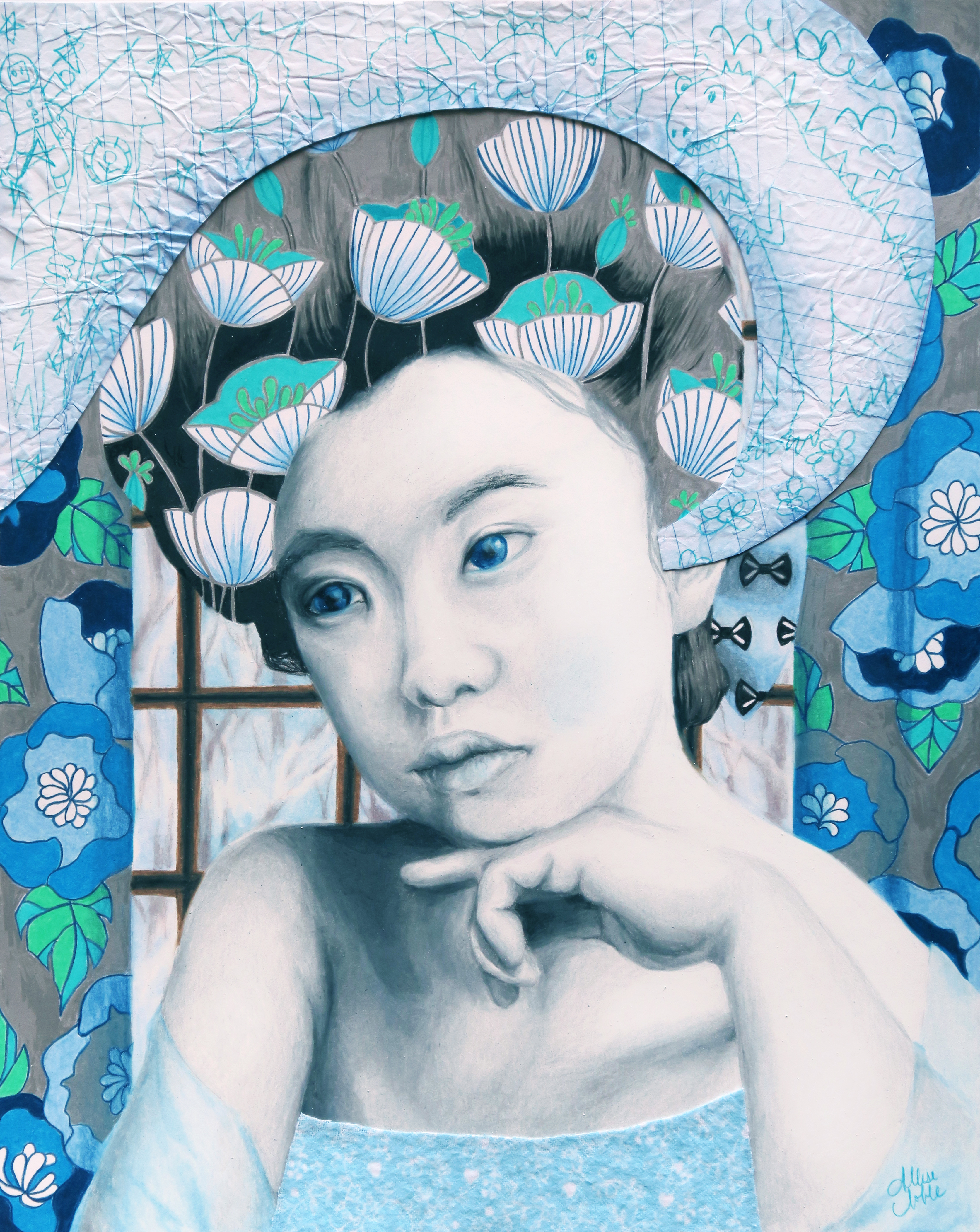
January – She Is Far Away

As with much of my other portrait work, I find my inspiration in nameless antique photographs. The simple, faded photos tell me a story, which I then bring to life in my mixed media drawings. I was drawn to a photo of a young girl, her hair piled and molded into an elaborate, fashionable sculpture, draped in a fine, silken dress an adult would surely appreciate, but that did not look like it was very conducive to play. Her eyes had a far off look to them. Her expression was a mixture of bored and melancholy, but to me it even looked like she was trying to hide these negative emotions to remain neutral and pleasant for the camera.

In “January”, her traveling thoughts are personified as children’s drawings on a crumpled piece of notebook paper, flowing from her mind. Though she has been made up to look like a miniature adult, the very model of sophisticated fashion, her imagination dreams the dreams of children: dinosaurs, astronauts, rocket ships, and animal creatures of the air and sea. These thoughts are purposefully camouflaged into the rest of the image, the colors so paled and harmonious the viewer almost doesn’t notice. What does stand out is the heavy grid work of the window behind and the bold, contrasting pattern of the adjacent curtains. She is closed in, separated from the free, bright winter landscape outdoors, hidden behind frosted windowpanes.

How often are children treated like dolls, especially young girls? I mean last week, I was at the mall and I saw sparkly high heels for babies. You heard that right, high heels for beings that haven’t even entirely learned how to walk yet. Let me know how that works out. The words we use to describe them are even descriptors we would use for dolls : pretty, cute, adorable, beautiful … Now, there is nothing wrong with compliments, nothing wrong with telling someone they look nice. However, as parent Sharon Holbrook states in her  Washington Post article Little Girls Don’t Need To Be Told They’re Beautiful, “The more I talk about beauty and looks, even in a positive way, the more I’m conveying the importance of those things.” Disproportionately young girls are complimented for their looks, while young boys are complimented for their performance. The thing is, looks change, and by emphasizing “prettiness” over all other traits, girls can be set up for poor confidence in the future. When girls feel that their value lies in how they look, it limits their perception of their own potential, and they will even start to limit the activities they engage in for fear that they will look “bad” or “ugly” while trying a new activity. I am a big fan of Amy Poehler’s Smart Girls, and think it is just about one of the coolest organizations out there right now. This concept is behind Smart Girls’ Get Your Hair Wet campaign, encouraging young girls to live life the fullest, be open to trying new things, and focus on the experience itself rather than worrying about how you look while doing it. I remember being a kid, and seeing some of my female classmates refuse to get into the pool in swim class because they “don’t look cute with wet hair”, or not wanting to play tag at recess on a hot day because they might get sweaty and “look ugly”. Do you think any 9 year old boys were out there worrying about being sweaty???

All in all, it all comes down to a vocabulary adjustment, and complimenting girls on things that they actually have control over, rather than things gifted to them in the great lottery of nature. It comes down to being mindful, complimenting a young girl (or adult woman for that matter) on the creative way she put together the awesome outfit she is wearing, or the great smile she has when she gets excited about something. It also comes down to treating kids like kids; holding them back from trying to grow up too fast, letting them get messy, letting them wear things that might look insanely goofy, and allowing them to hold onto that complete lack of self-consciousness that comes with being a kid for as long as humanly possible.


Standard
Travel

Revisiting Photography

In the last post I introduced you to some inspiring photographers with intricate, fantasy based, mind-bending designs. Little known to many, I myself enjoy photography as well. Photography is certainly more of a hobby for me than something I was ever interested in pursuing professionally. I mostly use it as a relaxing exercise for stress control :). I have not actively gone out to take photos in quite a few months now. Between working on my own pieces, working on commissions, teaching, and crafting accessories and plush toys I’ve had to pick and choose which creative pursuits to focus my time on to avoid the whole “jack of all trades, master of none” trap. When I do get out with my camera, my favorite things to photograph are street art, graveyards, and nature (though I’m not too into flowers, unless they are ridiculously colorful). Most of my street art photos are from when I had the amazing opportunity to travel to Europe with my family back in 2008. “Street art” in Midland, MI where I grew up is rather uninspired … mainly consisting of F-bombs and anarchy symbols, the actual political meaning of which is probably lost on the perpetrators anyway, sloppily scrawled in red spray paint. For some reason, it is always red, and any additional words are usually misspelled.

I was going through my photo storage drive last night, and realized that though I’ve taken a lot of photos over the last 7-ish years, I’ve never really done anything with them. I enjoyed the journey of traveling to a new place, or hiking in a wood nearby to town, dumped my camera card, and then just kind of left the images sitting there in limbo. I decided it wouldn’t take too long to put them to good use, and began uploading them to my Zazzle and Redbubble shops. If I’m going to enter a piece into a gallery or a juried exhibit, it is always going to be a drawing or painting rather than a photo print because that is where I want to focus myself and that is what I am known for, but where my watercolor paintings or pencil drawings are softer and more flowing, the bold colors and sharp graphics of a digital photo really bring a nice look to a T-shirt, skirt (I am absolutely in love with how the rose one shown below turned out!), tote bag, or phone case. I will be continuously adding more products and different photographic images over this next week (I do have 7+ years worth to sort through :)) including cards and stickers. With the nice weather, maybe on my next day off I’ll even dust off my camera and go for a good hike, see what catches my eye.

Macro Magenta and Yellow Rose Zazzle

Macro Magenta and Yellow Rose Zazzle

Diner Girls Street Art Redbubble

Diner Girls Street Art Redbubble

Pisa Notebook Journal Zazzle

Pisa Notebook Journal Zazzle

Silent Angel IPad Case Redbubble

Silent Angel IPad Case Redbubble

Standard