An artist friend recently shared with me an article they wrote titled “The ABCs of Underground Art”. I really enjoyed it, and they encouraged me to write my own ABC’s of the type of art that I do as a fun journaling prompt to use to unwind and organize your thoughts. Those that have followed me for awhile know that I don’t typically stick to just one type of art, so to open up the limits I decided to make my “alphabet” the ABC’s of Creation. I have assigned a word to each letter, along with a video of my illustrating a cool little ACEO sized letter inspired visual to go with each word. Read, listen, or both – whatever works!
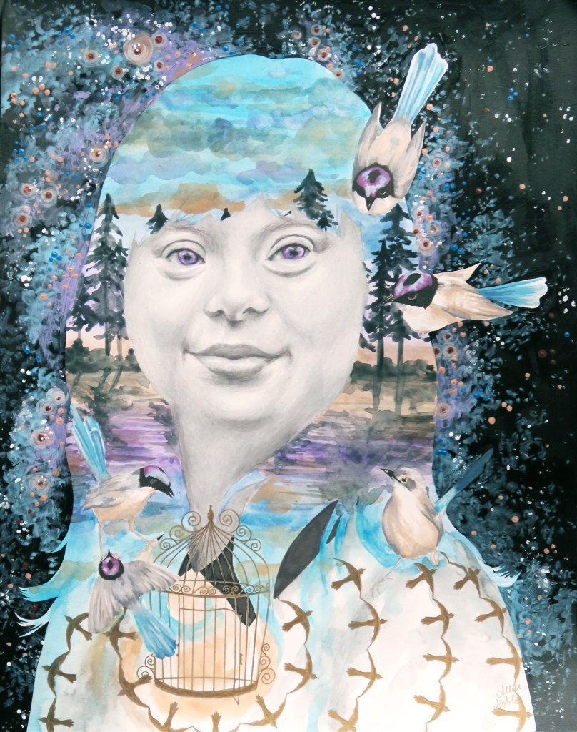
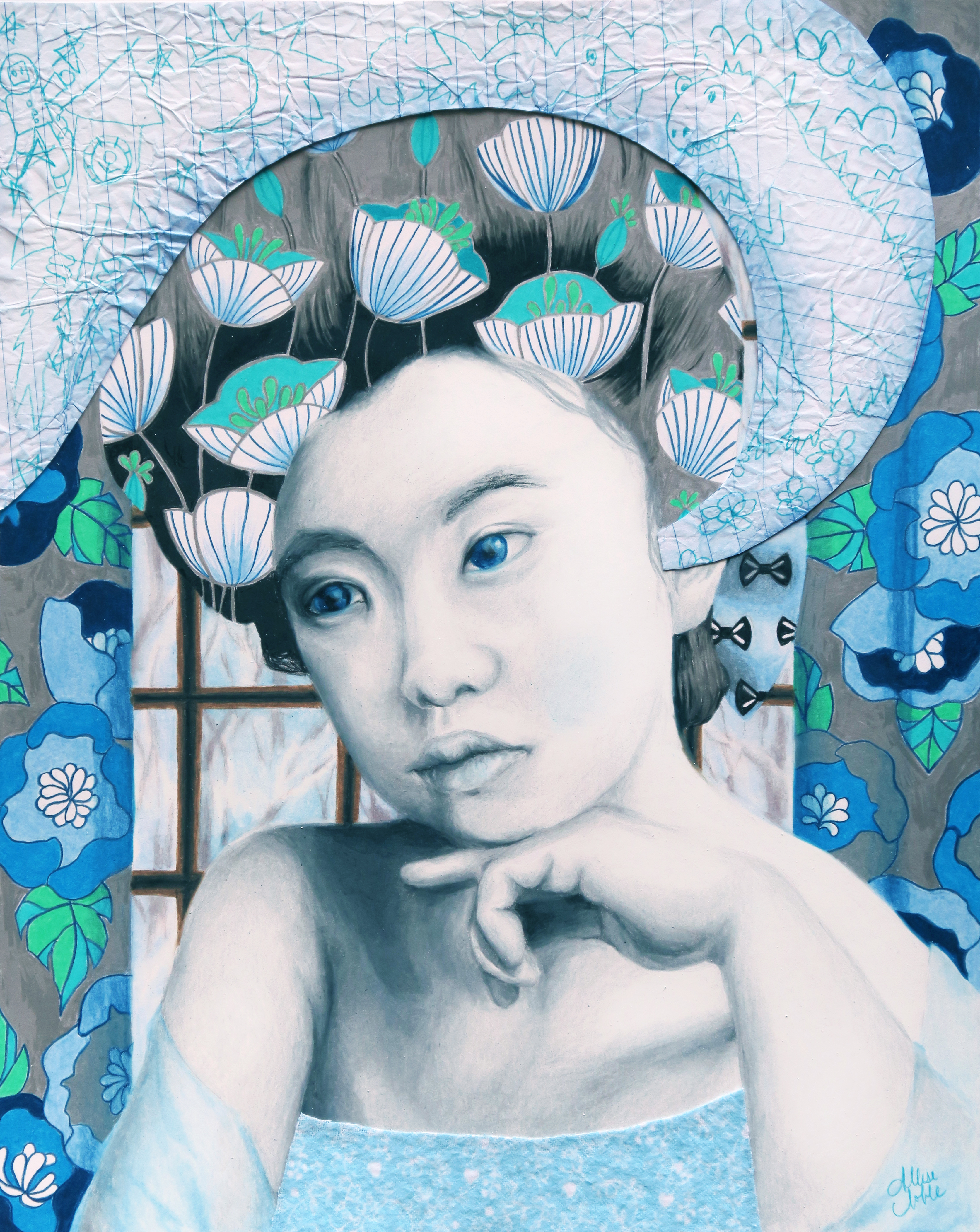
B is for Beauty. Of course, when we create something we hope others will want to look at it (or listen, or watch, or read …) Beauty means different things to everyone. The great thing about that is, there is a pretty good chance that someone out there will find your creation beautiful, even if it doesn’t fit the norm of how beauty is typically defined. 7 years ago now, I created one of my favorite pieces of a young woman with down syndrome looking joyful, confident, and gorgeous. When it was shown for the first time at an exhibit and awarded, some viewers were confused, did not approve, or were even angry. (How did I know this? I have very acute hearing and was even playfully called “elephant ears” by my parents as a kid because I heard EVERYTHING.) Though the lack of openness towards diversity in portraiture or a disdain towards people with disabilities is definitely not ok, it is ok for us to not all agree on one definition of beauty. Many more people have adored this same mixed media drawing. We each get to define what beauty is for ourselves.
If you want to see the other letters all the way to Z, be sure to subscribe!
When people ask me when I first got into art and my answer is shortly after birth, I inevitably end up mentioning my mother’s astonishing archival skills. I have drawings from every year of my life starting at 1.5 years old. After mentioning this, the response is usually that they sure wish I would share some of these older drawings on my website. As I was going through my past sketches and choosing some to post, I realized though my style over the years has changed quite a bit, there are common themes and purposes behind my work, including within my childhood scribbles. So begins the first part of a series using the past to delve into why I create what I do… I hope others find this interesting and entertaining, and I hope it helps readers reconnect with their past selves and realize how all of those different “us-es” had a part in creating who we are today, even those versions of us we don’t like to spend too much time with.
I have always been drawn to art depicting people. Portraits and figures were typically the vehicle for my art’s story from early on. Growing up I loved studying the differences in faces, how some could look so similar but no two were exactly alike. I would sit for hours studying my elementary school yearbooks as a kid, just staring at the different faces, observing. From a very young age I found beauty in that which was different and unfamiliar to me. I grew up in a very non-diverse setting, and didn’t see many people of color in my day to day life. However, I loved watching movies and television shows. As I started to see people who looked completely different from me and my family on the screen, I was fascinated by the wide range of hues and textures that could be present within these other faces – beginning to see people as truly living, breathing sculptures. I went through a period in younger elementary school where much of my figures I would draw were actually POC, much to the amusement and at times confusion of those around me. I also drew plenty of scenes from my day to day life; illustrations of my family, of my friends and neighbors playing outside; but only creating art depicting my own day to day existence just seemed so boring to me. Though a very socially anxious kid, I loved learning about other people and what their life was like, and even enjoyed when friends would show me photos and video of trips their family went on and other important life events. As you can imagine, they were quite pleased to have a not only captive but eager audience.
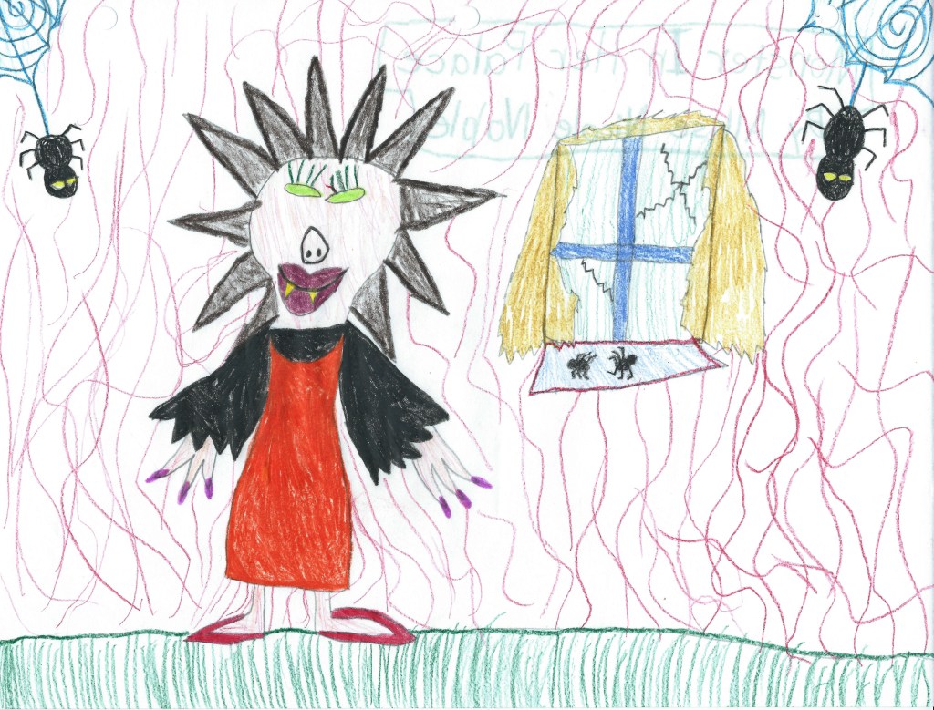
I’ve been told I was always one to stand up for the underdog, and this extended into the realm of art and fantasy. Although of course I drew princesses, I was also interested in the stories of supposed villians, witches, and other outsiders despite being quite the kind hearted soul and a bit too much of a rule-following goody-two-shoes, at least outside of the home ;).
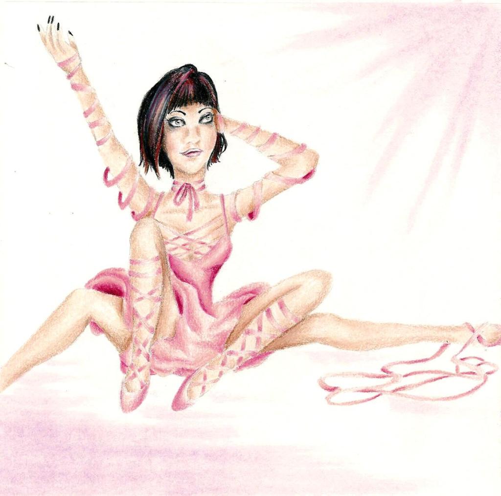
Once I got a bit older and started actually learning about art, I connected instantly with surrealism, especially as it relates to the human figure. In junior high one of my favorite shows to watch was Ripley’s Believe It Or Not. My favorite stories were the aesthetically bizarre tales of extreme body modification which are all over on youtube now, but back then such slices of life weren’t as readily available. There was the man who had turned himself into a human-tiger hybrid, the woman who got specialized dental implants so she could live out her dream of being a real life vampire, the one who got their tongue split into 3 independent forks that could all move on their own … Though I am in no way a big advocate for plastic surgery, there was something interesting to me about individuals “making the internal external”, a term I use often to describe the aim of my artwork. The idea of people crafting their external persona as a living sculpture to match who they are on the inside was captivating, and though these exact characters never made their way into my art, I did end up drawing a series of 4-legged ballerinas and people with animal heads.
As I continued to develop my surreal portraiture, I depicted facial expressions that wouldn’t typically be captured in a portrait drawing or be considered beautiful, such as negative emotions like fear, anger, or anguish. I also continued to blend human and animal physiology in some of my portrait and figure drawings under the observation that oftentimes, animals can be seen acting like people would and people can act more like we assume an animal would act and react. The lines blur more often than we’d like to think.
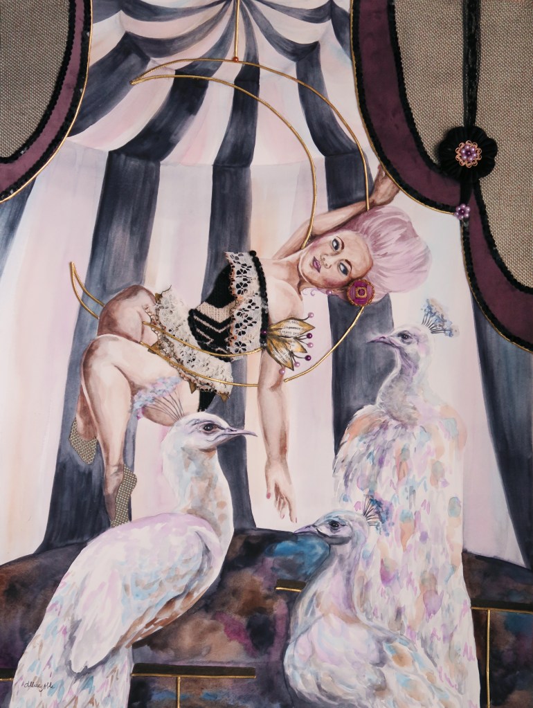
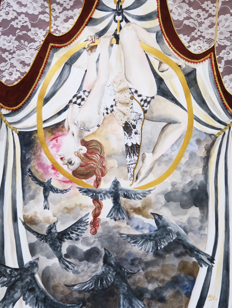
Today, uniqueness of spirit, self expression, and animal representations still play a large part in my art just in a different way. When I look at my aerialist mixed media works, I can’t help but be reminded of the dark, vintage circus aesthetic of my earlier 4-legged ladies. I have no tie to gymnastics or dance myself – I am horribly awkward and unskilled at anything requiring physical coordination and spent my time in gymnastics lessons as a kid climbing up to the highest possible spot at the recreation center and simply jumping into the foam pit over and over. I took a ballet class once as well and recall ending the day giggling with a friend as we rolled ourselves up in the dance mats and pretended to be burritos. I pretty much joined just for the outfits. But, again there is that attraction to the completely foreign, those characters that are completely different from myself. Animal imagery abounds, mainly in the form of birds, but it is no longer a bodily extension and more instead a physical representation of the figure’s soul.
I continue to celebrate beauty in all of its forms, especially that which is underrepresented. One of my favorite pieces to date that I’m sure I will cherish forever is the portrait in the center that was part of a 12 part series I created for ArtPrize on year depicting a young woman with down syndrome. She exudes joy, confidence, and freedom.
For a number of years I have worked with an inclusive arts program suited for young adult and adult artists of all abilities, including those with disabilities. I suppose looking back I was always meant to use my gifts to reach people of all abilities. I have a distinct memory from first grade. 2-3 students from special education would spend the first half of the day in the traditional classroom I was a part of, including recess and lunch though during lunch all of the kids from special education would sit at their own separate corner of the lunchroom. One of the girls who visited our class in the mornings wore a fantastic velvet dress with black and pink flower print on it one day, and though remember, I was severely socially anxious at this age and only ever spoke to my one neighborhood friend in class, I gathered my courage and told her I liked her dress because it was just too cool to not say something. From that point on we were kind of friends. She asked me to swing with her at recess, and eventually invited me to sit with her at lunch. Ridiculously enough, I accidentally caused quite a scandal by breaking social lines and sitting at (I will not repeat the name fellow classmates had for this particular table) with my new friend. Differences were never seen as anything for me to fear, but parts of another to appreciate and learn about.
Appreciation for all living beings that make up our wonderful world are a large part of the emotion that goes into my current work, and though sometimes I fail at this concept in practice as do we all, I hope the impulse to draw towards and not shrink away from diversity is a part of myself I always keep with me.
It’s been awhile since my last Artists To Know post, and today I wanted to focus on photography. I have always been interested in photography, but never took the craft further than just “playing around”, and don’t really do any artistic photography anymore today. My favorite type of photography has always been work that shows us more than what we can already see in front of us, photography that is not objective but that injects part of the artist into what it is they capture (or create, as in the case of our first artist who uses found photos for collage). I hope this post gives you some Sunday afternoon inspiration, as these artists did for me!
Catling is a graphic designer from the UK who works primarily in collage. He is known for his use of old black and white photos, especially of somber subjects such as war photography, which he gives new life through the juxtaposition of jarringly bright, cheerful patterns. As someone who loves pattern, his images just plain make me happy when I look at them, and give me quite the urging to dig out a book of old wallpaper samples and go to town making something amazing!
A self proclaimed “army brat”, Chatmon did a lot of traveling as a kid and had resided in 3 different continents by the age of 12. Once settled in the US, she turned more in the creative direction of theater. She didn’t start getting into photography until her early 20s, when she was gifted a camera at 19 and through self teaching and expirimentation saw an opportunity to make a living through the lens. After losing her father to a battle with cancer in 2010, Chatmon’s portrait photography became not only a career but a way to communicate and process emotions, an art. What first drew me to her work was the image above, part of her series titled “Deeply Embedded”. The composition and heavy use of pattern on the clothing reminded me a bit of Gustav Klimt, one of my favorites from art history. Chatmon writes about this series on her website, “Deeply Embedded was created during a time where I continued to come across negativity centered around natural black hair & styles. Anger followed by frustration and sadness forced me to refocus that energy into creating work to speak for me as our words fell upon deaf ears.” There are many different forms of beauty in our world, and photography is the perfect medium to capture that fact.
Stefan Sagmeister is an Austrian graphic designer and typographer. He currently works in the US and is known for his work in advertising and album covers, for which he has won 3 Grammy awards. Much of his personal work centers around the elusive achievement of happiness, conveyed through statistics, personal experimentation, and design. Though I myself am very skeptical that there is a magical formula or set of steps that will universally make every human happy (I am a big proponent of “If it’s not true for one, it’s not true for all”.), I do enjoy art that gets viewers into the head of the artist and visually shows their thought processes.
Aydın is a Turkish artist who combines images he captures with drones to create mind-bending multi-angle landscapes. It is evident in his portfolio that special attention is paid to the use of pattern and line as he composes his imaginary worlds. I would have never thought of using drones for art, and it is fascinating to see what can be done with this relatively new medium.
If you know an artist you’d like to be featured (or are an artist yourself!) feel free to share with me. I love discovering new creatives!
First, I must explain the title. It’s a bit of a joke because the last time I did a post in which I professed exciting news, like everyone thought I was engaged. When I was like ‘nope, even better, I won Best 2D at an art exhibition!’ they were like, ‘Oh well, I guess that’s pretty cool too.’ I think this face of epic disbelief from the 10th Doctor sums it up pretty well.
But, back to my still super exciting news. I had mentioned earlier how thrilled I was about getting into the Greater Michigan Art Exhibition at Midland Center For The Arts because I had entered the 2 previous years as well and had yet to be chosen to exhibit. Well, first I found out that not just one but all three of my entered pieces would be hung in the show.
Then, I found out that one of them had actually won an award! I feel so unbelievably honored to have one of my pieces receive a Juror’s Recognition Award.
(I hate closeup pictures of me holding things because I feel like I have freakishly short fingers. No wonder I could never play the piano well even after years of lessons. Well, that coupled with my total apathy towards the vocation and complete lack of practice, but thatis another sotry for another day. Despite finger length, I had to show off the snazzy brochure.)
The fact that they chose the piece that is going to be one part of my 12 part series I am planning to enter into ArtPrize next year was a welcome sign that I am going in the right direction with this project, and creating something that will bring people joy, make them think, and spark their imagination. If you are in the general vicinity of Midland, I would suggest you make a trek over to see this show. It is a humongous exhibit, and there is so much awesome art to absorb.
I am a big movie watcher. I am subscribed to no cable at all, not even 5 basic channels, and am always completely out of the loop as far as tv shows go. Yet, I could easily watch 4 movies a week on netflix. I swear the difference is that television shows tend to ride on dialogue, where most movies depend more heartily on visuals. Being more of a visually-thinking person in every sense, I find that many movies are truly moving pieces of art, filled with beauty and intrigue if you take the time to train your eyes to pay attention to the details. Since the time I was a child, there were certain scenes in movies that I could rewind and watch again and again simply because of the captivating details to be found in a camera angle, an interesting pattern in the background, the decoration on a costume … I’m not going to get into the plots of the films in this list too much because a) I’m focusing on sources of visual inspiration, not story-writing and b) You should go watch any of these you have not seen for yourself :). I’m starting with the films that inspired me as a kid, and working my way forward. Many of my childhood favorites have stood the test of time and I’m sure you have seen, but I think sometimes we overlook the actual artistry that goes into media aimed towards children.
Beauty and the Beast
I still have a big spot in my heart for this movie. The detail of the quaint little village Belle comes from at the beginning of the movie, as well as the intricacies of the Beast’s castle later on, and even the emotive illustration of each of the unique characters themselves is unmatched. My favorite part of the whole movie was always the ballroom scene, where the view pans up to a grand painted ceiling with fluffy clouds and little cherubs. It was like the Sistine Chapel to me at 5 years old.
The Little Mermaid
Another Disney, the brilliant colors of this fantasy undersea world captured my imagination. I could pause the film and stare into Ariel’s grotto for hours, spying at each piece of salvaged treasure she had stacked upon the tall rows of rock shelves. As odd as it may seem, another thing I always remember about this movie visually is the strong lighting. Throughout the film, sunlight streaks contrasting colors across each scene just as I imagine it would shining through the water if one did live under the sea. Each framed looked like a beautiful painting, be it a children’s cartoon or not. Though I’ve come around a bit more with some of the newer Pixar films, I’m not fully sold on solely digital animation yet, as we seem to have lost that quality.
The Princess and the Goblin
This last film from my childhood stuck out to me because it wasn’t Disney, very uncommon for fantasy children’s animated films. The style featured far more pen strokes and outlines, unrealistically pink/pale skin tones, and a constant flowy, ethereal quality to the drawing that lent itself well to fantasy. It was a lot more outright whimsical than Disney. The grandmother was just regal – unbelievably gorgeous and a bit haunting all the same. It was nice to see an older woman not portrayed as a witch, also (Thanks a lot, Disney!).
The Wizard Of Oz
This is one of those movies that back in the days of VHS, I watched again and again until the tape nearly disintegrated. Ahead of its time in the use of sepia tone to represent Dorothy’s normal, mundane day to day life and the use of brilliant super-saturated color to represent the fantasy dream-land of Oz, this film is iconic in the way it used color and pattern to communicate meaning, which is something I and many of my fellow artists and designers need to understand how to do in their own work. The kooky whimsy of Oz created a world every child (and adult) wanted to climb into through their television screen, even with all the not so pleasant bits like green-faced witches and flying monkeys.
A Trip To The Moon
Watching this film birthed my love of the “silent film” aesthetic – harsh contrast black and white, vintage hair and makeup, DIY props and backgrounds with lots of moons, stars, and ocean waves on painted pieces of wood or cardboard. I have always been a fan of creepy-beautiful, and there is something fundamentally haunting aesthetically about even the most cheerful silent film, because of the harsh blackness of the background, the heavy drawn-on makeup around the eyes and lips, and the fact that often times animated details that seemed darling back then, like old moon face up there, seem way creepier to us now (This will be confirmed if you’ve ever looked at old toys or dolls in an antique store) because the fashion of what is considered cute or pleasant has changed. The two portrait drawings I have used as my design logo, current and former, were certainly inspired by this aesthetic.
Moongirl
Moongirl II
Valerie and Her Week of Wonders
I had to include more than one shot for this film so you can fully grasp the aesthetic since it is certainly lesser known. I was perusing one of those “Weirdest movies you’ve never seen” lists online one rainy evening, and this Czechoslovakian film from 1970 was listed, along with the thumbnail of a smiling, fashionable vampire draping herself in jewels in front of an ornate little shabby-chic round mirror I have shown first above. I knew I needed to find out what this was all about. The first time I watched it I didn’t yet own a Netflix subscription, and the only version I could find on YouTube was subtitled not in English but Spanish, so I had to use my limited knowledge from grade school to try to figure out what was going on. The good news is, if any, this film is certainly more visually driven than plot driven. The plot revolving around the nightmarish oddities accompanying the protagonist, a young girl’s, first week of “womanhood” is rather bizarre and convoluted whether presented in your native tongue or not. Every still frame looks like an avant-garde fashion editorial, and the monochromatic color palette rather in whites, ivories and beiges, or blacks symbolically represents innocent purity, legalistic and puritanical piety, and corruption.
In another life where I had more patience with a sewing machine, I could totally have seen myself as a fashion designer. The first thing I thought after absorbing this movie was, “I could build a comprehensive clothing collection and smashing runaway show off of this film”. It looks like I’m not the only one who had that idea, as hand-sewn gowns inspired by Valerie can be found on etsy, and so many clothing and accessory sets assembled with this film as inspiration can be spotted on polyvore.
Brazil
In this sci-fi satire by Terry Gilliam, a government bureaucrat attempts to correct a ridiculous administrative error caused by a fly landing on a typewriter key, and in the process becomes a suspected terrorist himself. Though some of the special effects undoubtedly scream “1985!”, The sets and of course the main character’s iconic robotic flying suit are unique and surreal. Gilliam is never one to skimp on atmosphere, after all, and one can always expect in his work to see a world they have never seen before. Also, those creepy, creepy giant baby head masks in the interrogation room … I don’t know how on earth he came up with that idea, but for some reason it works.
Mirrormask
Not surprising that this movie struck me artistically as Dave McKean, a well known illustrator and comic book artist, directed the film, also written by Neil Gaiman – what a winning combination. It is almost like a modern, darker and twistier, “Wizard of Oz” actually, following one young girl’s struggle through a fantastical dream world to find her “home”. Visually, watching it is a bit like viewing a moving comic book.
The Science of Sleep
Of all the films here, along with “A Trip To The Moon”, I’d have to say this film most captures my preferred aesthetic. The story itself is at times touching, at times awkward and funny, and at times awkward and stressful – it pretty much runs the gamut of emotions present in any real-life friendship or romantic relationship. Now for the fun part – EVERYTHING IS MADE OUT OF CARDBOARD AND PAPER AND CELLOPHANE AND FELT WITH BIG, CHUNKY, APPARENT STITCHES! I hate total realism. I love work that shouts “Look! I am handmade! I am not, in fact, real!” That charming, DIY aesthetic I love in old movies that mainly occurred due to lack of budget and technology, was here done intentionally with what I’m guessing is a pretty decent budget seeing as Michel Gondry directed it. I am in love, that’s all I can say. Sir Gondry also made one of my favorite music videos ever. Enjoy.
Across The Universe
I know most hardcore Beatles fans despised this movie, arguing that the film turned the band’s culture changing music into a sort of 1960s “High School Musical”. I know many of these harsh critics personally. However, I am not hardcore and I say, pish-posh! thought this movie was just lovely. Double exposures, a surreal use of green screen, and incorporating repeated visual tropes such as “strawberries” to not only reinforce the story line but the iconic music itself, made this one a winner in my book. The visuals were crazy, but not so much so that they took away from the emotions behind the characters’ story arcs. They were unique and creative but didn’t distract, and that can be a hard balance to achieve.
The Fall
This movie makes it onto lists for “most beautiful films” or “most beautiful scenes from a film” consistently for a reason. The colors and contrast of both the scenery and wardrobe literally make the characters in the story who they are, and since this film is all about stories, that decision is pivotal. I don’t want to give too much away, just watch it if yourself if you haven’t. See that little girl right there? She’s absolutely the cutest. Just wait until she speaks, she has an accent which makes it even better.
Ghostworld
This is one of the few movies that I thought was better than the book. After watching the movie and becoming simply obsessed with it, I decided I should definitely read Daniel Clowes’s graphic novel on which it was based. I absolutely hated it. The movie itself is a quirky, aloof, slice-of-life type feature and the backdrop is a pretty normal town, nothing notable. I included this film in the list only for the main character, Enid’s, wardrobe. From 90s-tastic fuzzy headbands to leopard print pencil skirts to odd, vintage old-lady dresses to fishnets with everything to the awesome keyhole yellow and black orient-inspired number shown above, I need all of her clothes from this movie. The purple polo above looks handcrafted and has an overflowing trash can made of felt embroidered on one side with the letters spelling out “RECYCLE” crookedly affixed on the other. I have no words.
And the raptor T-shirt! Who could forget the raptor t-shirt? I want to marry Enid … Because she’s adorable, and also, then we could share clothes.
Howl’s Moving Castle
I started with animation, I figured I’d come full circle back to animation – this time, animated films that I have enjoyed as an adult. Anything Miyazaki does is gold. Studio Ghilibi is like Japan’s Disney/Pixar, only it’s kind of way better. This movie can be enjoyed by both adults and children alike. The imaginative mechanical details are what really get me. Now isn’t Howl’s bedroom a major upgrade to Ariel’s grotto?
Paprika
This film may be a cartoon, but there is nothing childish about it. See above, people are literally shedding their skin and morphing into different people, while one tries to strangle the other. His arm is also part tree branch. Yikes. At it’s core, however, this film is more a surreal, thrilling action drama tale then anything remotely horror. The premise of a device called the “DC Mini”, which allows psychiatrists to enter their patient’s dreams as a form of therapy, falling into the wrong hands allows for many magical, zany scenes to take place, both playful and beautiful as well as dark and terrifying, just as within the world of dreams. I’ve always secretly wished some technology like this actually existed even before I knew of this film or anything like it, so that is another one of the reasons I so loved this movie. Satoshi Kon was simply a brilliant artist as it is, and this film seems like it should have far too much going on for it to actually work as a story, but he has pulled it off and it is truly a masterpiece.
Mary and Max
My love for DIY as I’ve touched on a bit earlier has given me a soft spot for stop animation. I tried to make a silly, simple stop motion on paper once over a summer break from college and I threw in the towel after a couple days, lacking the patience. This film follows two pen pals; a shy, lonely little girl with a troubled family life and no friends and a middle-aged man with severe Asperger’s Syndrome, overwhelmed and bewildered by the very act of existing. The two connect by a pretty funny turn of events, and their relationship faces many ups and downs over the years, even as the young girl becomes an adult woman. Each of their somber, frustrating worlds they attempt to make sense of in their letters to each other are depicted in stunning monochromatic, hers warm sepia tones and his deep greys, both with flashes of bright red. It is one of the most adorable and also the saddest movies I’ve ever seen. By the end they are not made of clay but entirely real, flesh and blood.
Jack and the Cuckoo Clock Heart
I just watched this movie a couple months ago when it popped up on Netflix. It is a French children’s film that I was initially drawn to because the style of the figures reminded me of a merging of Tim Burton and Mark Ryden. It never stops being visually stunning, and the characters especially appear inventive and entrancing. It doesn’t hurt that the music is also awesome. Unlike the grating, overly simplistic, repetitive tunes often present in kids movies, the songs spread in between the action of the film actually sound like real songs.
Take a look at my absolute favorite…
I hope if there is even just one film on this list that sparks your interest, you go try it out! For the local folks, it looks like it’s supposed to rain all the next few days so here’s your chance :). Fellow creatives, movie buffs, anyone at all … do you have any films that have visually left you speechless? I’m always looking for suggestions of new things to watch, and like seeing what makes others’ creative wheels turn.
I discovered this artist on Behance. She is a Norwegian illustrator who works mainly in colored pencil. I wish more magazines used interesting illustrations like these; I would subscribe to all of them just to save the pictures :). I adore how focus is brought to the faces of her subjects by making their skin the only three-dimensionally rendered element of a piece, leaving the rest flat and filled in with solid color or pattern. The unusual colors she uses also catch the eye. She makes blue toned skin completely believable by placing the undertones like pinks and yellows in just the right places. The faces have a reflective quality, and make the viewer believe they can reach out and touch them. I’ve truly never seen portraits quite like these.
This artist I found on twitter via my newly created account (Look at me, getting with the times. @AlliseNoble if you’d like to follow :)), and was immediately drawn to her comprehensive range of portraits styles from photo-realistic to more stylized, in a variety of mediums. There are even three-dimensional mixed media elements in some of her pieces, like gems adhered to the surface of a subject’s jewelry rather than simply painting the ornamentation. It is rare for one artist to work in so many different styles, and they all look fantastic. On her website Malinda states, “My greatest passion is portraying a variety of natural female beauty in order to express that all women; regardless of age, size, style, or ethnicity; are beautiful in their own unique way.” – right on!
I found Arisa Nakahara on pinterest. There is way more to pinterest than just recipes and cute wedding ideas – pinterest is another fantastic place to find some truly mind-blowing, excellent art. I love how most of Arisa’s portraits are painted straight on, and look you right in the eye. It’s a bit jarring and also captivating, especially since the eyes are the most detailed part of her faces. She says her theme is “The power to live”, and I can see that thread throughout all of her colorful portraits, saturated in lush fruits and floras and insects. All of her designs transport you to that magical warmth as spring and summer are just beginning. Her entire body of work is so cohesive and timeless, and the images, quite simply, make you incredibly happy.
Another artist I discovered on Behance (seriously, even if you don’t create art yourself it’s worth having a profile simply to browse and favorite all the amazing projects to be found here!). Elsa works in a variety of mediums including drawing and illustration and even extending into 3D mixed media sculptures and jewelry design, but I first found her through her paper cutting work. It is truly a testament to patience which I can never even imagine attempting. She creates whimsical storybook universes and achieves an unbelievable depth all with layered paper.
I discovered this artist back in late high school when I still actually subscribed to magazines, and she was featured in an issue of Juxtapoz. Lucy McLauchlan is another artist whose work you can spot as hers from a mile away. The combination of heavy black and white contrast and the balanced flow of designs made entirely of undulating lines and stylized faces is hard to look away from. I would love to walk around in this place (and maybe have my bedroom painted like this, hm?)
Another artist who favors dramatic black and white contrast, Ruben’s art is one more find from pinterest. He uses the black and white to divide elements of the body and draw out or recede features into the dark. He seamlessly weaves animal and woodland/nature imagery through his portraits as well, forming almost a psychic connection between the two. His subject’s facial expressions are ambiguous and stoic, leaving you to look to other cues to imagine what is on their mind.
Ruben Ireland
Are there any other types of artists or artwork you’d like to see? Let me know! I’m always open to suggestions!