Finding out Pantone’s Color Of The Year is always one of my favorite things about New Year’s Day (dork, I know). This year is a combination of 2 colors … Ultimate Gray and Illuminating. I’m not a big yellow person on its own, but love it paired with gray or black so I’m digging this theme (See my bathroom). To celebrate, I created a fun 9×12″ mixed media artwork using ink and water on watercolor paper, and some fabric scraps and old book pages for the background.
What’s interesting is I also started a new project late this year in collaboration with a supporter of the inclusive arts program I run, Express Yourself Artshop that ended up in this same color scheme. The project celebrates the independence and unique homes and lifestyles of adults with disabilities. My friend Ric LOVES yellow. More on this to come at a later date!
What do you think of this year’s colors? What kinds of videos would you like to see me share in 2021?
So, awhile back I did a post on artist block, something I had been lucky to never really experience too much until very recently. It’s not that I didn’t have a ton of ideas, I quite simply wasn’t enthused about any of them for whatever reason and the execution just wasn’t flowing. I’m sure this had a lot to do with the crazy amount of stress I’ve been under this year for various reasons, but nevertheless I really desperately wanted to make some art I was actually excited about. I remembered how when I used to write poems and short stories back in college to unwind, if I felt the urge to write but had no clue what to write about I would put my iPod (HA, who has those anymore?) on shuffle and use the first song title that came up as inspiration for my short story, or else I’d use a random word generator and the word that came up had to be the title.
I decided to revisit this old, rather silly process of chance to see if it would jumpstart my creative but very stressed and exhausted brain. I did 4 trios of word generations, wrote them down in my sketchbook, and started drawing. It worked! I instantly came up with 4 ideas that I could easily relate to thoughts that had been jumbling around in my brain anyway, but that I just didn’t know how to access and release.
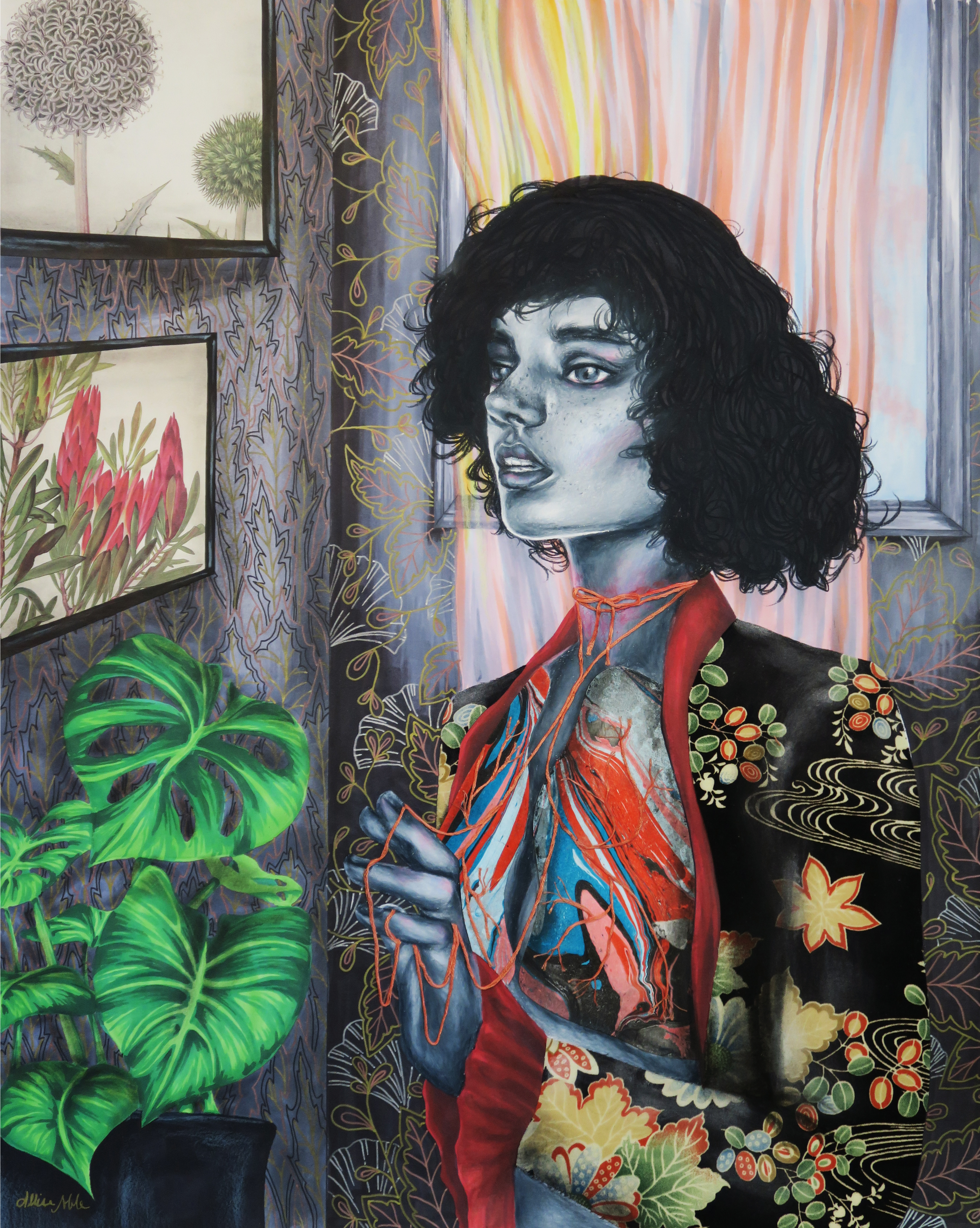
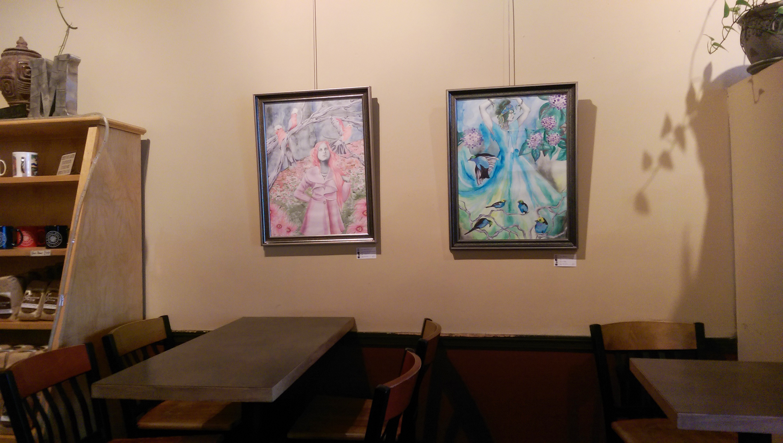
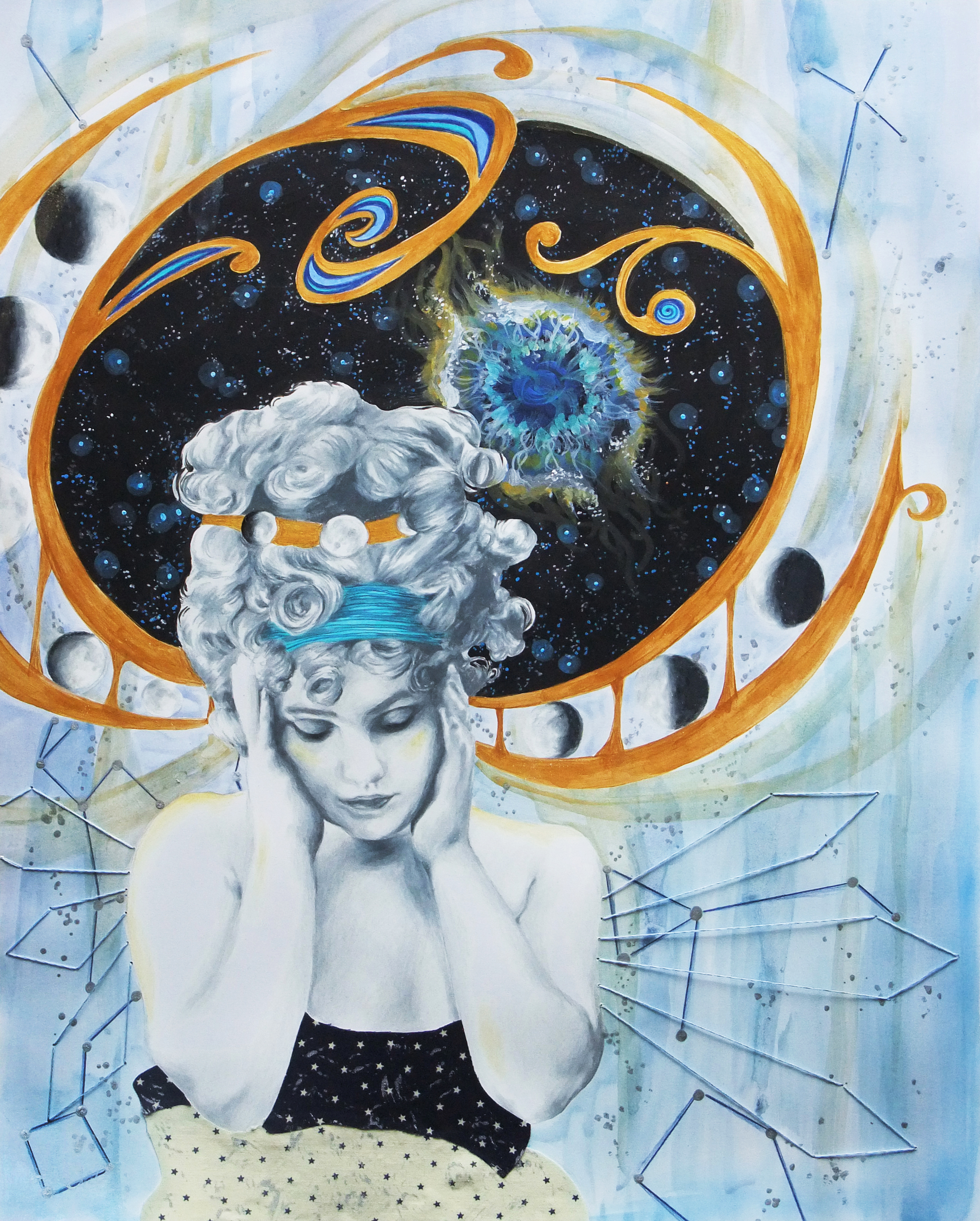
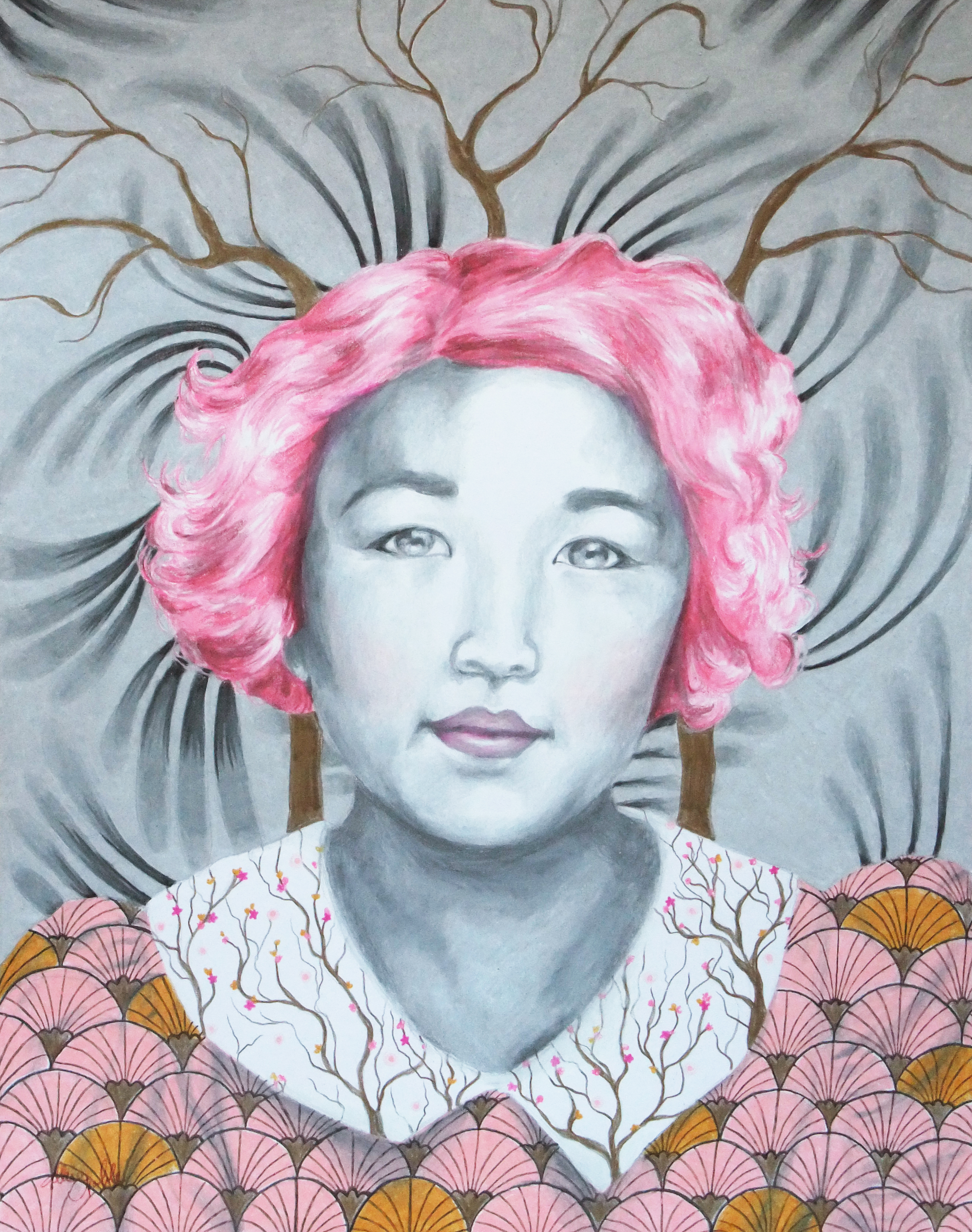
For this first one, inspiration was to be drawn from the words lung, tie, and morning.
I ended up being so happy with how it turned out that I’m keeping it! I have the perfect spot in my living room, and actually only realized after I’d hung it up that the fabric I collaged for her jacket matches a swatch on my fabric scrap pillow I made about a decade ago that is now sitting on my accent chair ^_^.
“Breathe” was drawn using prismacolor pencil for the figure, and ink for the background. I used fabric for the jacket, old book pages for the wall art, hand marbled paper for the exposed lungs, and embroidery thread for the vein detailing that trails up to her neck and tangles around her fingers. The figure is a mix of multiple references I gathered to match the image I had in my head of what I wanted her to look like.
As I mentioned before, this year has been rough. I’d been experiencing sensations of feeling trapped, confined, constricted, suffocated … Even simple acts such as breathing, eating, sleeping were in a way loaded issues, made more complicated by both external and internal factors. This was some of what was on my mind while creating this piece, but as always it is not without elements of hope and promise of a future through the oxygen giving plants and botanical imagery throughout, and sunlight pouring in through the open window.
I’m sure others may even see something totally different in the story as viewed by their own thoughts and experiences, and if anyone wants to share what they saw going on I always love to hear others’ interpretations – Feel free to send a comment or message! Love to you all, and remember, you always hear that you don’t want to force inspiration but … sometimes you have to to get anything done and that’s okay ;).
Though I’m not letting go of the original as of right now, prints will soon be available so check out my eBay shop to snag one!
I’m back again! I’ve been pretty quiet on here and have been taking a bit of a project hiatus in general as I go through some life transitions and changes in a couple of areas, but have completed a few smaller stand alone projects. I talked about some of my anxiety struggles previously, so while dealing with that at a higher intensity especially over this Spring and Summer, I really needed to focus on art that was purely therapeutic; not a job or another task to complete or something with an intense deadline or something that was going to take months to complete.
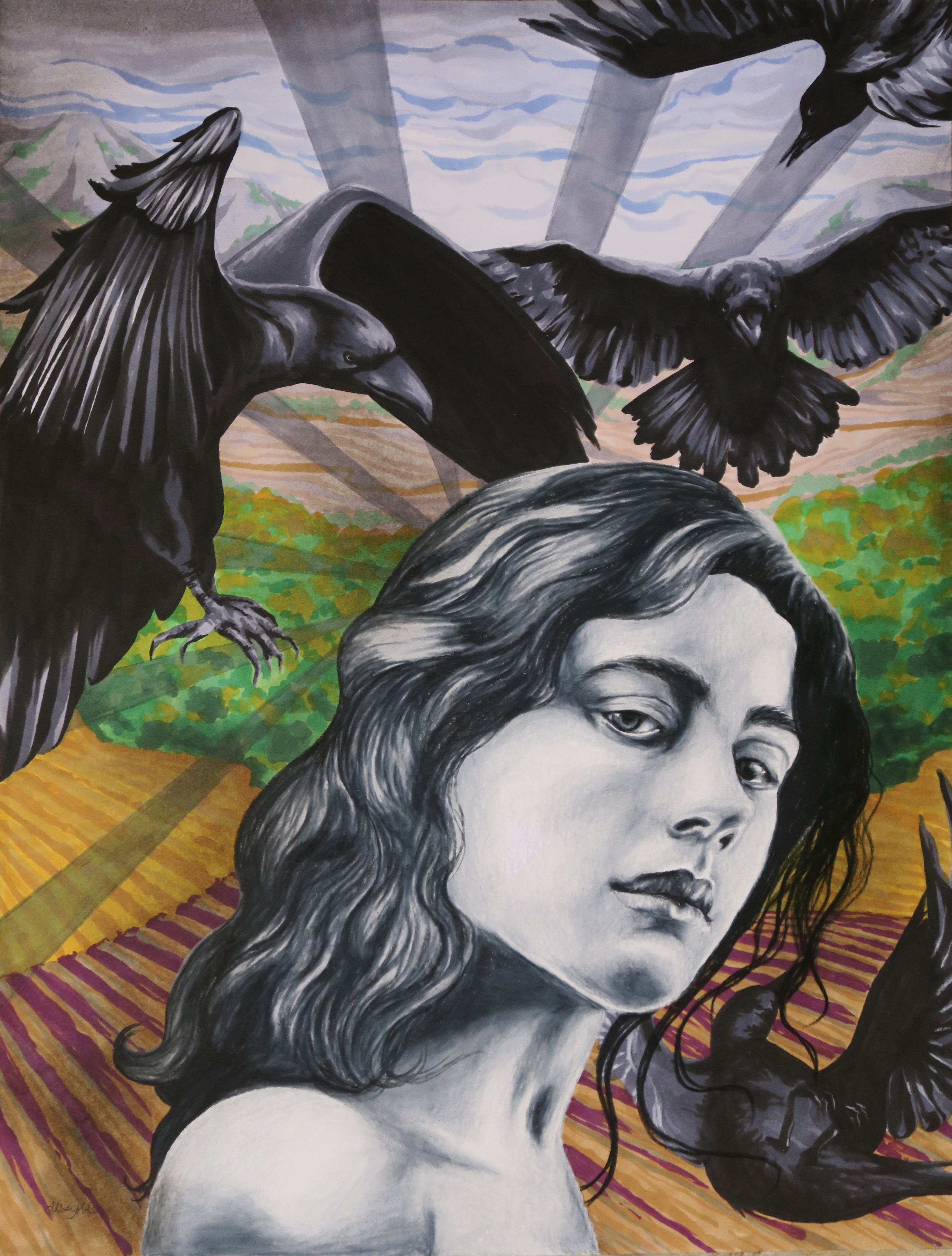
I am obsessed with raven imagery, and parted with one of my favorite pieces recently as a gift for my brother, a fellow creative who just bought a new home and is getting married this fall. I knew I wanted to do another similar piece, but with a bit more color this time. I lead an art therapy program for adults with varying disabilities, and see every day how creation can be a life saving force that reminds people that they are worthwhile if only because they have made something that day. Art can be a window in an otherwise dark room. Part of the art therapy aspect of my forcing myself to keep making art even when all I wanted to do was watch movies or go to sleep early after getting home for the day was to inject my own personal thoughts and feelings into the chosen aesthetic of what I was creating. In “Flight Response”, the subject’s face is deliberately calm and expressionless while the birds flying around her appear fast and chaotic. Both she and the birds are done entirely in high contrast black and white to appear connected as one entity. They could be physical manifestations, or projections of the woman’s psyche. The background being almost opposite the woman and birds, a more expressionistic landscape in bright, peaceful colors, is also deliberate. There is hope, and there can always be better things ahead. Though not always aware of it, she is in control.
I also wanted to take the opportunity to play around with some different techniques and combinations of materials with no pressure on achieving a specific result, another important aspect of art as therapy. In “Waiting”, I tried watercolor painting on wrinkled lace, wire wrapped with yarn, embroidery, and weaving strips of hand marbled paper along with my traditional ink and prismacolor pencil drawing. Again, there is an aspect of sadness and isolation but not without a lingering hope. I aimed to craft a story based on what I was experiencing as a way to process my thoughts, but a story that is open ended so the viewer can create their own narrative as well.
As the smoke is clearing, I’m still working on my series based around color psychology and looking forward to doing more teaching again in the Fall. Both of the above pieces are available for purchase, and I’m starting early on some small and affordable Halloween-time art that will soon be posted in my eBay shop, so keep an eye out! For a time lapse of some of the background illustration for “Flight Response”, check out my artist facebook page.
First, I must explain the title. It’s a bit of a joke because the last time I did a post in which I professed exciting news, like everyone thought I was engaged. When I was like ‘nope, even better, I won Best 2D at an art exhibition!’ they were like, ‘Oh well, I guess that’s pretty cool too.’ I think this face of epic disbelief from the 10th Doctor sums it up pretty well.
But, back to my still super exciting news. I had mentioned earlier how thrilled I was about getting into the Greater Michigan Art Exhibition at Midland Center For The Arts because I had entered the 2 previous years as well and had yet to be chosen to exhibit. Well, first I found out that not just one but all three of my entered pieces would be hung in the show.
Then, I found out that one of them had actually won an award! I feel so unbelievably honored to have one of my pieces receive a Juror’s Recognition Award.
(I hate closeup pictures of me holding things because I feel like I have freakishly short fingers. No wonder I could never play the piano well even after years of lessons. Well, that coupled with my total apathy towards the vocation and complete lack of practice, but thatis another sotry for another day. Despite finger length, I had to show off the snazzy brochure.)
The fact that they chose the piece that is going to be one part of my 12 part series I am planning to enter into ArtPrize next year was a welcome sign that I am going in the right direction with this project, and creating something that will bring people joy, make them think, and spark their imagination. If you are in the general vicinity of Midland, I would suggest you make a trek over to see this show. It is a humongous exhibit, and there is so much awesome art to absorb.
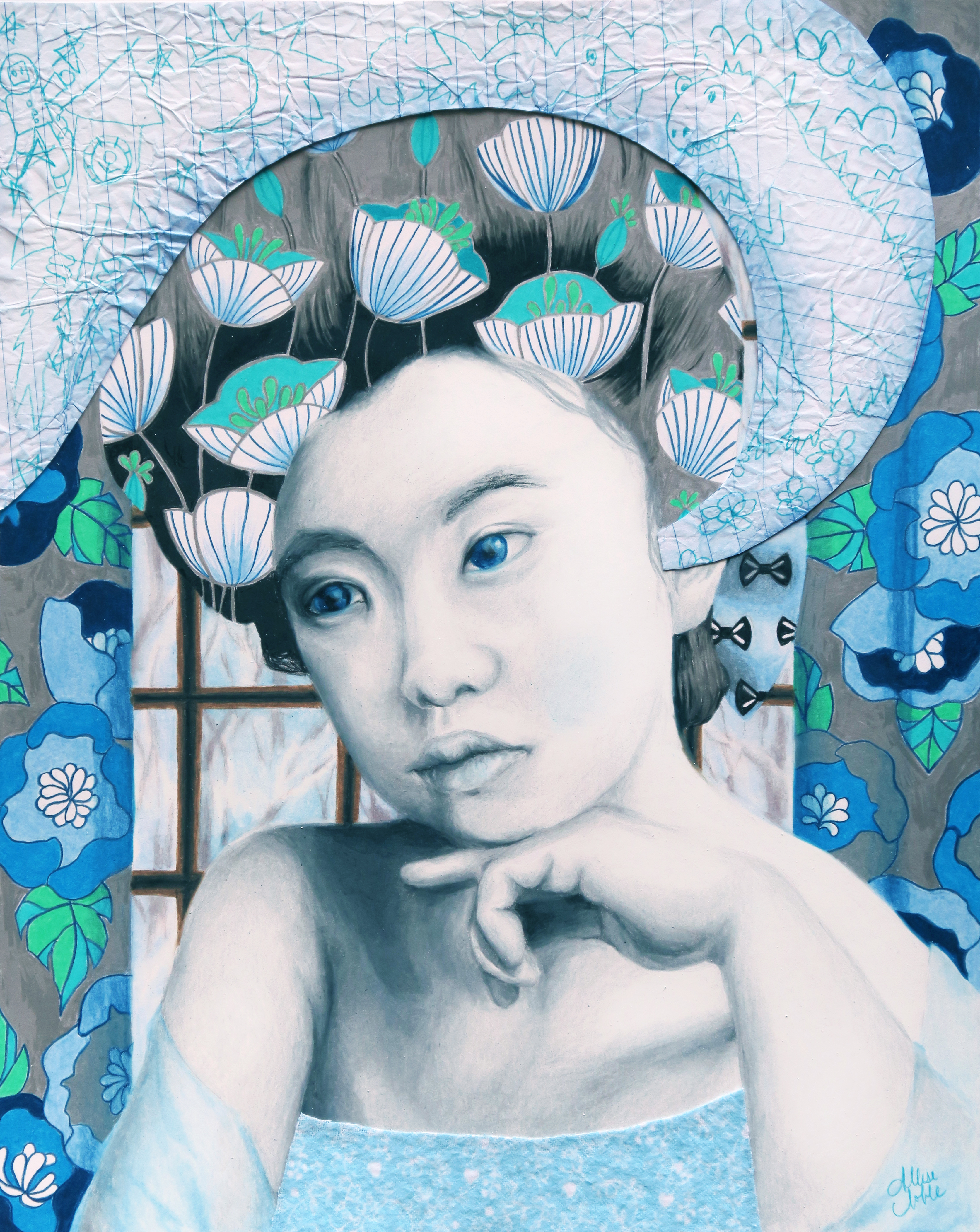
Obviously, though I had a fun idea of doing the whole “a drawing a month” reveal for my new 12 part series, that didn’t happen as I am on March and it is now almost September. I would like to enter this series into Art Prize next year, and decided if I have until next Fall, why impose such a crazy impossible deadline on myself simply for the sake of themed blog posts and risk the quality of the work? Impossible self-imposed deadlines are this thing I like to do that I really need to ease up on. For those who haven’t read my previous posts, my new series involves 12 mixed media, surreal, conceptual portraits in which the meaning is influenced by the use of pattern and color, one representing each month of the year. They will depict women of all ages, races, and time periods, and each will communicate a different theme and season. I aim for the pieces to speak to women’s collective experiences beyond their differences. I want the series to flow together in its mainly black and white scheme with pops of color, soft mixed media application, and it’s classic portrait composition. However, I wanted each month’s portrait to still be distinctly different “characters” from one to the other, achieved via aesthetic theme and accent colors. For this piece, I went with bold, dynamic primaries and a nod to pop art. You can view January and February from earlier posts.
In this piece for March, my goal was to take the commonplace negative stereotype of women being “emotional” and turn it on it’s head, marrying caring and empathy with strength, and sadness and despair with hope for a better future. A surreal merging of classic pop art, which often featured dramatic beautiful women sobbing, with realistic portraiture was the perfect fit for this concept.
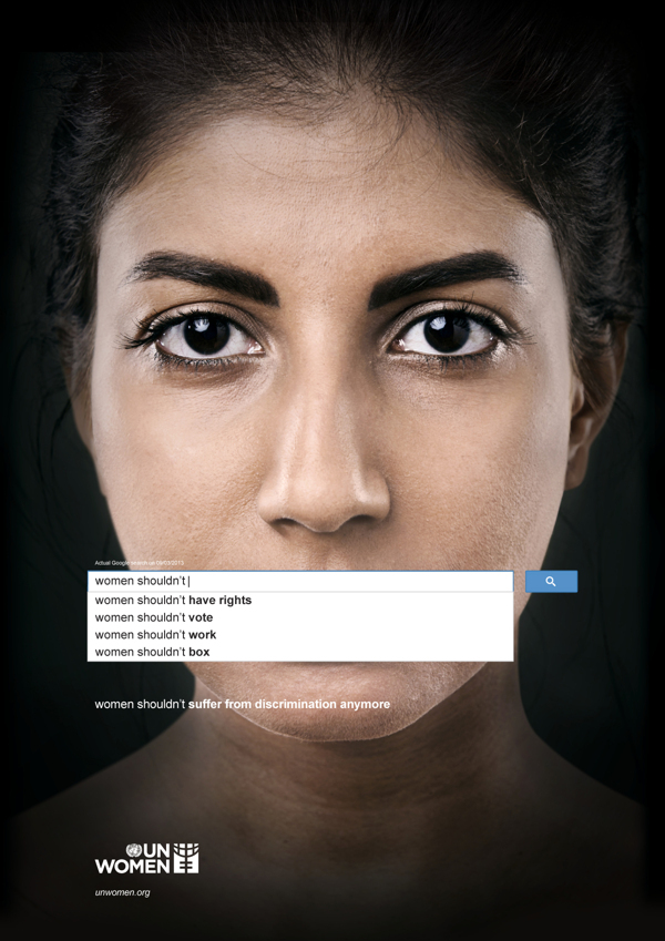
Women are constantly being told they are too much of something, despite the fact that they are often expected to wear far more different hats responsibility-wise than their male counterparts. Google searches have become an interesting way to peek into mainstream society’s views. Anyone who uses the internet knows when you begin to type something in, google will finish it with the most popular searches and subjects. A UN Women ad from 2013 was the first to make a statement using this innovative approach.
I tried the same concept, only typing in the starting phrase “women are too…” What I’ve found is that women are apparently too picky, but also too easy, too intelligent and successful to find love, yet too weak and too emotional to be leaders, the president, or involved in politics at all, but at the same time also too dominant. It looks like we’ve got a Goldilocks problem here.
As one who believes that sometimes problems we assign dominantly to one gender are still just basic human being problems, I didn’t want to negate the idea that there may be similar findings for men. However, when I tried “men are too…” I got nothing. In fact, when I simply pressed enter to see what articles would come up, the main article up top was “Monkeys turn into grumpy old men, too” about aging primates and behavioral changes. While hilarious, it is clear that this whole “Be everything at once yet also be nothing at all” contradictory expectation is something that, while maybe not entirely absent for men, is something that women face more in mainstream culture.
A descriptor routinely used to discredit women’s abilities is the fact that they are “too emotional” by default of their gender. However, when men step out of their perceived box by showing any degree of emotion aside from anger, they too are often chastised and ridiculed. This shows that our revulsion towards caring at least is a societal problem on the whole, not just a women’s issue. For some reason, people seem to view caring as weakness. This can be seen clearly in the dismissive term bleeding heart, always used with a strong air of disgust. (A note to be made here… when I talk about caring I am not including people sitting behind a laptop screen typing angry, obscene responses to random articles that they don’t agree with because they get off on being offended and telling people off. Nor am I talking about people who shut down and throw a fit every time they have to hear something that they don’t agree with. This is not true caring or passion, this is an addiction to “being right” all the time and putting people in their place, and it is unhealthy.)
I recall a conversation had with a person from my past 5-ish years ago. We were discussing some political or sociological issue. The other person, whom supposedly respected me, was nevertheless making zero effort to understand my view though I myself had stopped and listened to theirs. I remember growing frustrated and stating, “I don’t know why you are refusing to try to listen and understand where I’m coming from when this is an issue that is so important to me.” Their response was given bitingly and with a wave of the hand, “Oh, everything’s “the most important thing” to you.” Though it was meant as an insult, the more I pondered it the more I thought, I’m ok with owning that. Because everything does matter, in some way large or small.
In our culture, it’s cool not to care. You can see this fact brazenly displayed in popular entertainment (The Hangover 1,2,3,4,5? They just keep going.) People are routinely being told the answer to their feelings of isolation, depression, and anxiety is to just “let go”. But is the “ignorance is bliss” model really the one we should be following? This idea in and of itself seems to admit that caring is not weakness, but strength. Experiencing emotions of concern and empathy is an active state; not caring for anything outside of your own pleasure and needs is passive. To put it simply, caring about things is hard work. It can force us to take steps towards action that may make us uncomfortable, and take up a lot of our time and resources. It can be mentally and psychologically draining.
Caring is strength. Let’s lift up our mothers, our fathers, those taking care of an adult family member, our nurses, our teachers, our home health aides, our daycare workers, our counselors, our missionaries, our activists … No matter what societal norms tells us, they are our true heroes.
Once We Truly See Each Other / 2013 / 18×24 Watercolor, Ink, Embroidery Thread
At a young age, I began to notice the different ways in which men and women were viewed and treated. Ever since I first voiced confusion at this incongruity, I was answered with more questions such as “Why do you have such an issue with men?” “Why do you think men should be treated as less?” etc., etc., etc. These questions always left me with the disconcerting feeling that I’d somehow been shot into a parallel universe unbeknownst to me, where words that you spoke meant the opposite of what you’d said. How does equality mean one being treated as less than? The math just didn’t add up. Especially as one that tended to have an easier time talking to guys or tomboyish women than other “typical” ladies, was best friends with her younger brother, and generally thought men and women were equally awesome; how ever did someone get the impression that I wanted to bring anyone down?
As it turns out, social research is finding that when we as a society get used to seeing inequality for so long, any steps towards even partial equality are seen in an exaggerated light. An article from In These Timescritiquing the fear of a “feminized society” , an anxiety that apparently is somehow all too prevalent, hits the nail on the head as to how this phenomenon occurs.
“So how do you get from some feminism, some of the time, to a feminized society?
The heart of the problem is one of the strangest manifestations of male privilege: It actually seems to interfere with men’s ability to count women. Specifically, it creates a tendency to actually see more women—or hear more female opinions—than are actually present at any given time.
Geena Davis Institute for Gender In Media found that, in crowd scenes, women tend to comprise about 17 percent of any given crowd. She’s argued, based on outside data and her own interpretations, that this imbalance relates to and reinforces the way men perceive the actual number of women in any given room.
“If there’s 17 percent women, the men in the group think it’s 50-50,” she told NPR. “And if there’s 33 percent women, the men perceive that as there being more women in the room than men.” ” (By the way, love Geena Davis. I watched and re-watched A League of Their Own I don’t know how many times as a kid, and I hate all sports, especially baseball.)
This same phenomenon happens where speech is concerned as well. You know that whole perception of “Hoo boy, women sure like to talk, yak yak yak!” Turns out it is just that, a perception. In mixed company, and especially in a workplace setting, women may be hard pressed to fit a word in edgewise according to a PBS series on language myths.
This same thing happens when it comes to race as well. People are always in self-preservation mode, and fear that by lifting one group up the scales will be tipped so that they lose out. Or, I wonder if some don’t subconsciously fear that when we are all on an even playing field, they may sometimes get treated how they have treated the other for so long.
In reality, we are not living by the rules of the animal kingdom in this modern age. We are human beings with pretty solid cognitive and reasoning abilities when we choose to use them, and there is no rule that someone always has to be underneath the others’ foot. We need 100% of our society working together, and we need a collaboration of everyone’s ideas, not just 50% of the population’s ideas. By seeing each other for who we truly are, without the guise of archaic preconceived notions based on gender, everyone is lifted to a higher playing field.
This piece, titled “Once We Truly See Each Other”, is about support, and it involves men too. When striving for equality not just in our own backyards but across the world, it is a mistake to leave out men because they can be some of our biggest allies, and they are effected negatively by rigid gender expectations also. If you are ever in doubt of this fact, check out the completely eye opening documentary, The Mask You Live In.
In my piece, women of all ages and ethnicity are illustrated as doctors, moms, members of the corporate world, musicians … Men are depicted as businessmen, athletes, artists, stay-at-home dads… The 3 cliffs are symbolic. Sure, men have started out on a historically higher platform as far as societal advantages are concerned. But, notice that third platform, the third and best option of all. In the piece, men are partnering to pull the women up. From there, the women are also helping the men up to reach their full potential. Equality requires that we invest in the lives of our fellow human beings, men and women both.
To me, equality is about allowing every individual to reach his or her full potential, whatever that may look like. No, women are not “settling” by choosing to be stay-at-home moms if that is their dream and what is important to them. They should have that option. No, the woman who wishes to rise to the top of her company and expects to be respected the same as her male colleagues is not an angry pink Godzilla hoping to kick every man in the balls with her shiny metal foot. She should have the chance to prove herself free of prejudices. And by the way, the same goes for men.
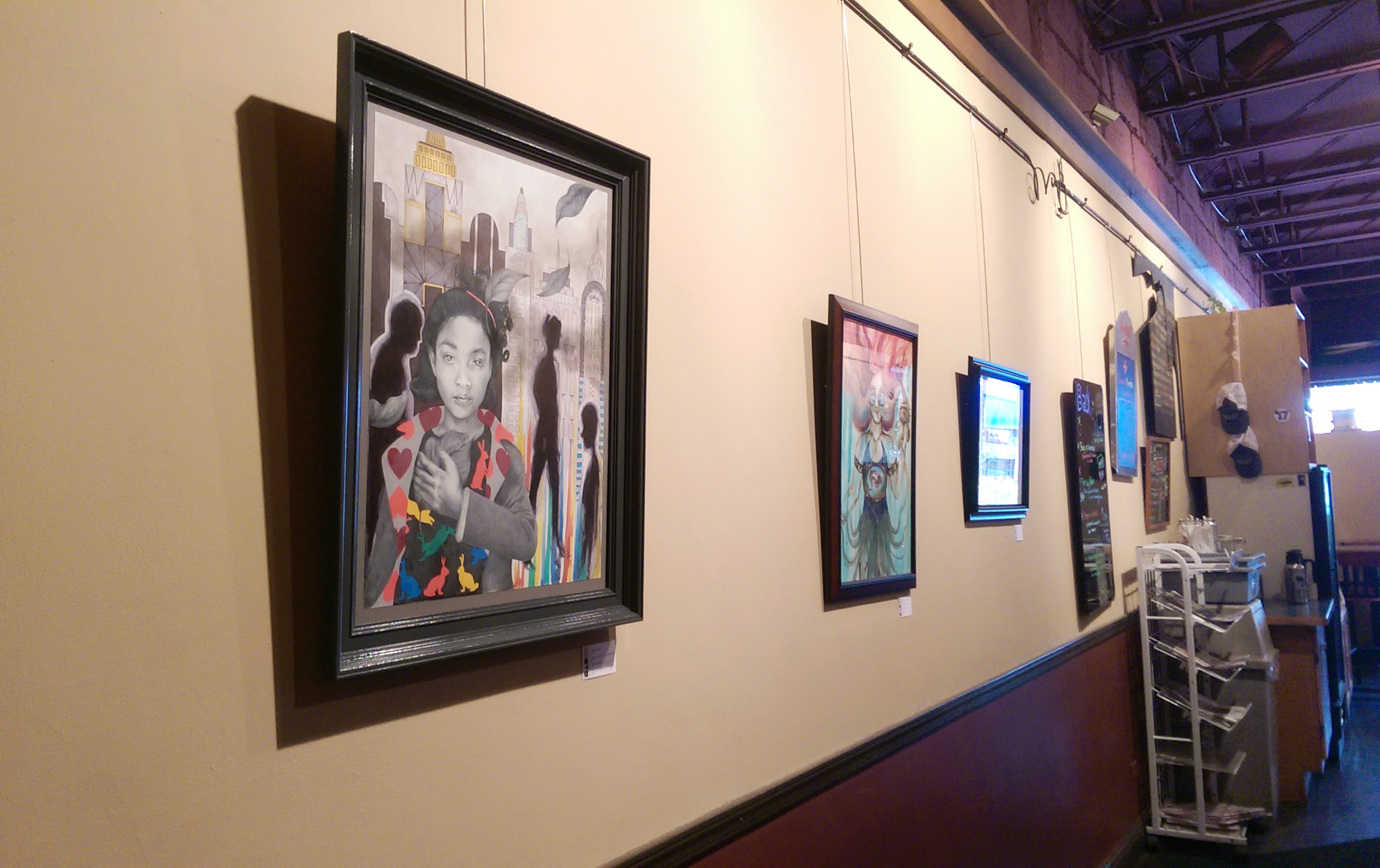
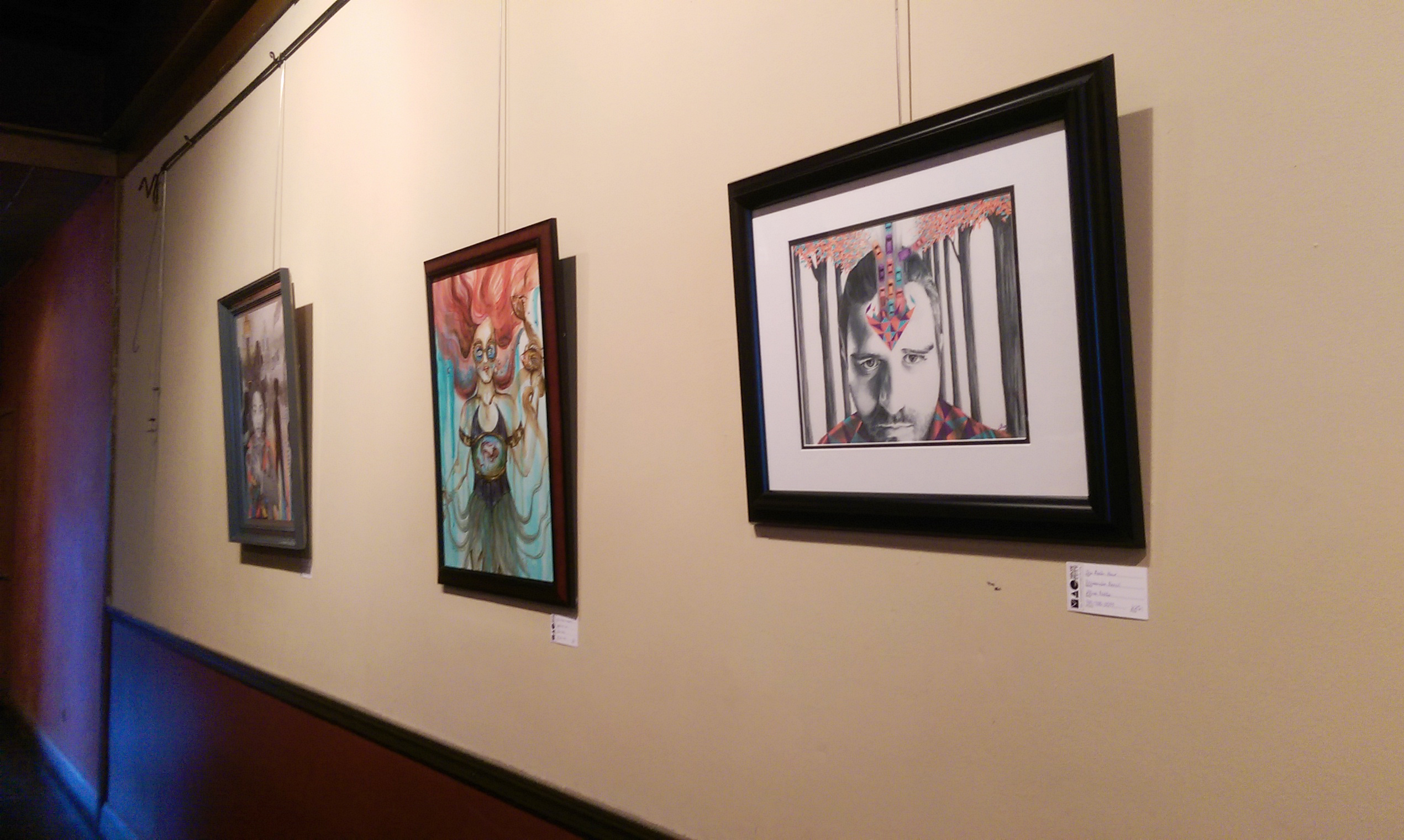
So, I put an exhibit up in Espresso Milano for Midland Artists Guild last week. This was an especially fun venue exhibit for me because I pretty much lived here when I was in high school. For those of you unfamiliar with Midland, Michigan, it’s a nice town for sure but, well … there’s not a whole lot for young people to do! Hang out with friends on Saturdays drinking coffee all day, especially frappes in the summer? Not complaining too much. It was always either that, or spend the day at the mall reading comics and music magazines in Barnes and Noble, until they started shrink-wrapping the darn things so you actually had to pay for them to read :P.
Blast from the past : Snooty Face 2007.
My P.I.C. that day, Erin – best friends since we were 2, and still going strong. We actually just had a craft day together last week!
Speaking of coffee being just the best…
(a topic of conversation that I daresay never gets old, nor loses its truth), I have some really cool illustrated mugs for sale in my ebay store right now! On discount, too … sweet right? They are dishwasher safe, top rack, and really heavy and durable. I am an accidental collector of unique mugs, and can’t seem to ever stop buying drink-ware in general, so these made me super happy.
Designs available are Retro Flowers, Queenie, I’d Have Been Happier As A Bird, and Whimsical Peacock.
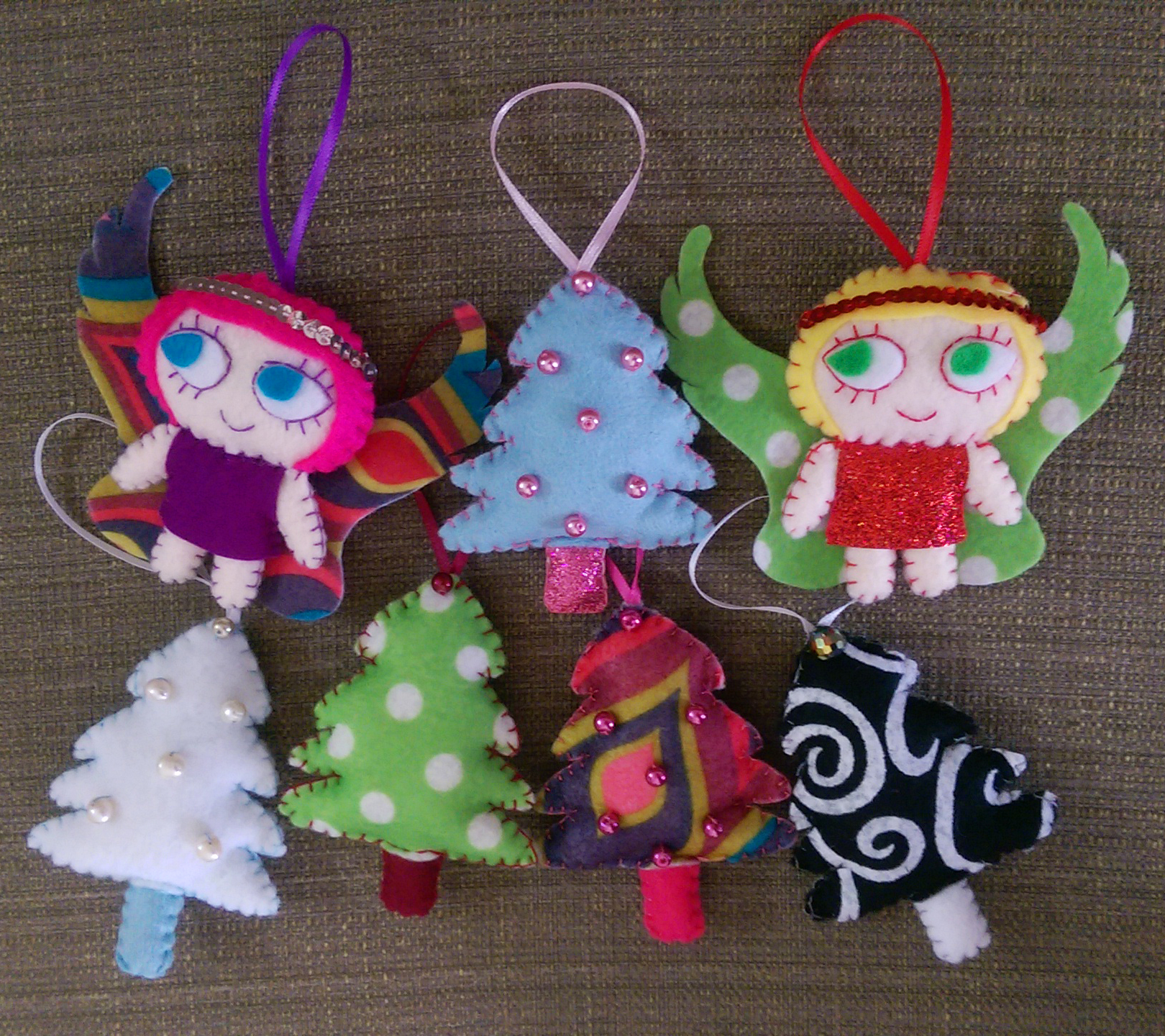
Other things I’ve been working on over this Labor Day weekend are, shockingly, Christmas plushies! I sell some of my fun creations at Imagine That!, also located in downtown Midland, and I need to have my holiday wares ready by mid-October. It’s weird to be thinking so far ahead already, but I can’t say I haven’t enjoyed getting in the holiday spirit a bit early :).
Whimsical trees and some pretty rad angels with halos made of strung sequins ❤
Midlanders (or Saginaw/Bay City dwellers nearby such as myself), if you happen to be downtown within the next 2 months don’t forget to check out the exhibit. And for those of you in the states, I hope you enjoy your Labor Day weekend as well!
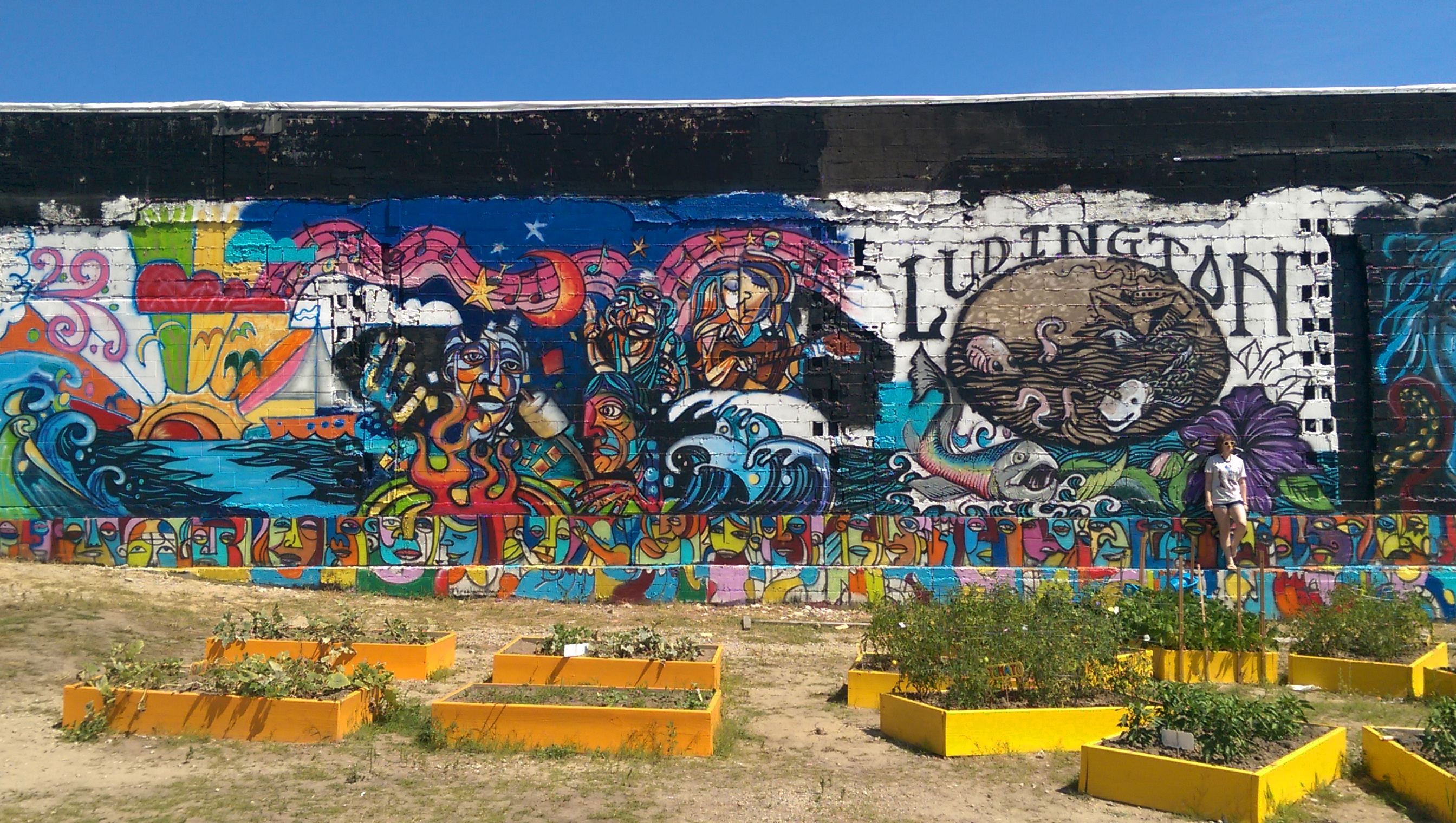
I just got back from one of the most fun trips yet to the charming and exciting land of Ludington, MI; hiking, swimming, sketching on the beach … my boyfriend and I were determined to jam in everything that epitomizes summer before it’s too late! I vowed to not check my email to make it a true reprieve, but I did peek just once in the car on the way there, and I’m glad I did because I got some awesome news. Two of my pieces were accepted into Studio 23 in Bay City’s Women’s Perspective show for September! If you’ve read my earlier post, ladies sometimes get forgotten in the gallery scene even today, so I am excited and honored to be a part of what I’m sure is going to be a wonderful show. Below are the two works that will be showing. If you’d like to learn more about the process of creating “On My Mind”, you can visit my earlier entry focusing on this piece.
On My Mind
The Peacock
Another fun surprise was the new murals up in Ludington to take touristy photos in front of! Art truly is everywhere, and it is wonderful. Murals aside, not to be cheesy, but one can’t look at the serene layers of bright blue water, warm yellow-beige sand, and bold green foliage and not see the very world we live in as one of the largest, most complex creations to ever exist, and truly the largest, most interactive art project.
Me posing oh-so-cool in front of my favorite mural of the bunch.
Behold, bright colors! Yes, that is Spider-man on my t-shirt.
I just ate it after a huge wave literally knocked me on my butt while I was wading out. There were weather warnings out all day, which of course means perfect time to go swimming! Thrill seeker for life, man.
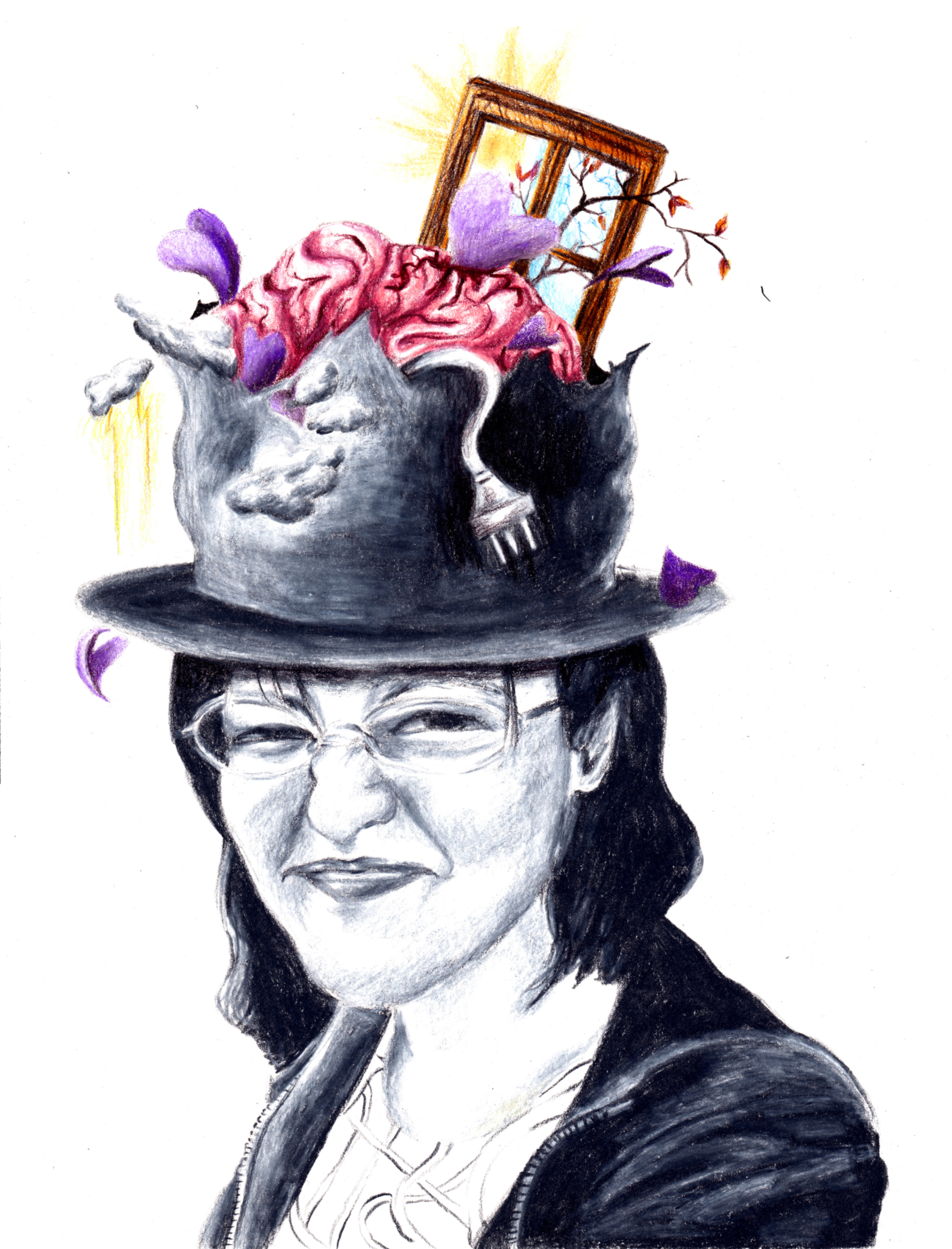
Spring seems to be the time for exhibitions, and with many deadlines coming in mid-February, I’ve been going into hyper-drive to get pieces finished and ready. This past year has been all about conceptual portraiture. My drive to expose the subject’s thoughts and emotions through visual cues outside of themselves came in part from my interior design study in college, where visual cues in the external environment are key, and part from a conversation I had with one of my best friends coupled with my overactive imagination. We were both at different colleges, and she had had a particularly stressful couple of weeks and was unloading over the phone because that’s what best friends do. One thing you have to know about me, as people talk, I get these vivid little reels of what they are describing playing in my head. It doesn’t mean I’m daydreaming and not listening, it’s just how my brain works. I immediately got this image of her overstuffed brain protruding from out of the ripped open top of her trademark top hat, with other random objects and various debris springing out everywhere. I told her, she burst out laughing, and we went on with our evenings. I made a concept sketch the moment we got off the phone, for future reference.
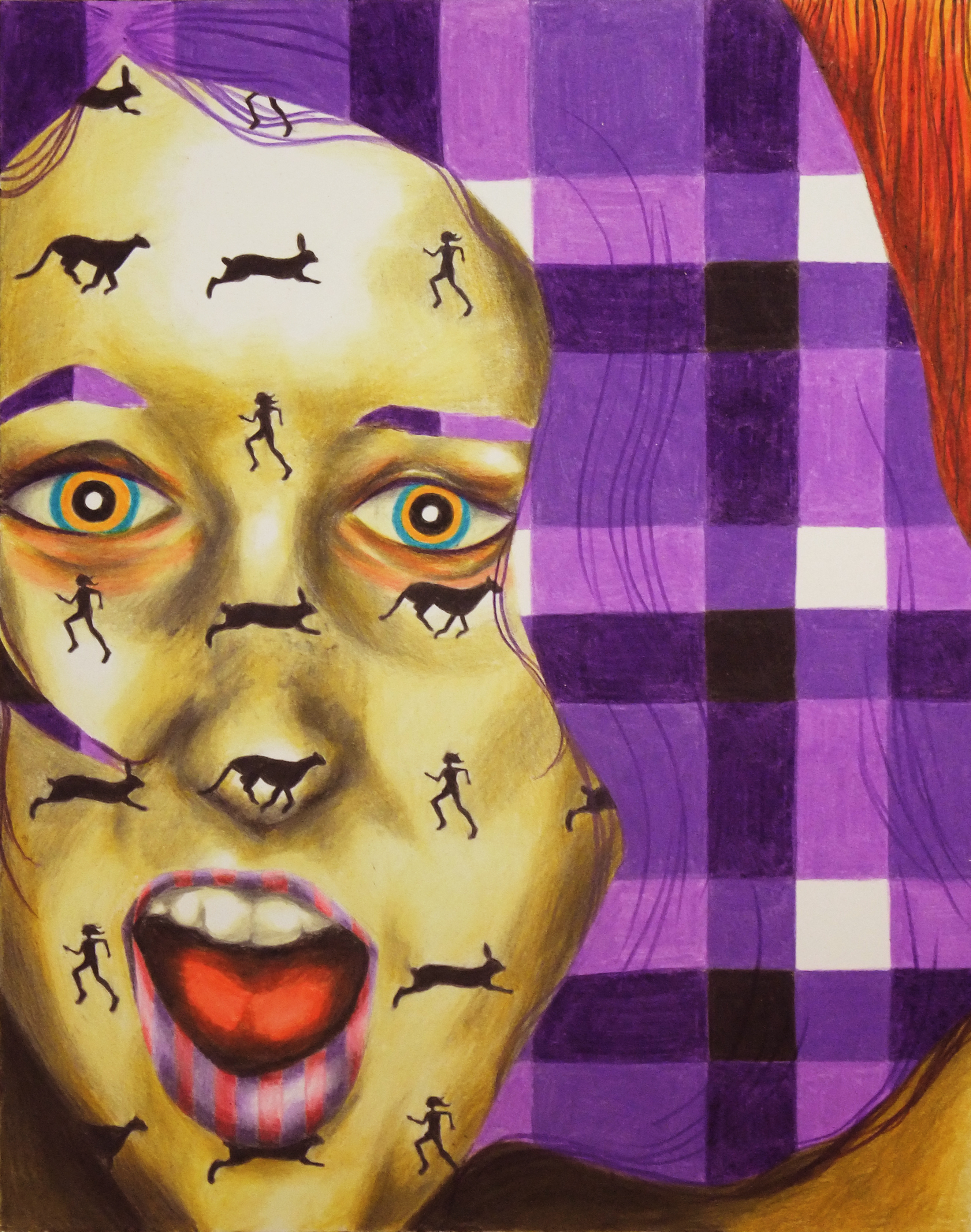
After doing a series of portraits in which visual manifestations of the subject’s emotions literally burst out of or hovered over the top of their heads (wouldn’t that make life far less more of a guessing game as far as relationships are concerned?), I began to think more about how not only literal objects but also the more subtle use of color and all over pattern could communicate about the subject’s mental state. If one’s emotions covered them like a fabric, what would it look like?
Today, my portraits are a combination of these earlier ideas. I used photos I’d taken of friends before, but now I’ve gotten really into using vintage photographs as references instead, because not knowing the people at all allows me to start with a blank slate and gives me more freedom to invent my own stories about them. Photographs of my girls are being taken, and jpegs sent or framed work dropped off to the various locations for jurying, so wish me luck in the next couple of weeks! If you’d like to see more portraits, check out my website (there is even one MAN portrait! – those of you who know me and my work know how rare this is). Prints are also for sale here!
Overaccumulation of Stimuli, Prismacolor Pencil, 2010 – The portrait that started it all.
Fight Or Flight, Prismacolor Pencil, 2011 – Through studying interior design, constructing environments for people, you learn that color and pattern SPEAK, and can affect the psychology of those who live in it (and the psychology of the viewer who looks at your art!)