New Work, Techniques and Tutorials

Happy 2021! Pantone COTY Inspo

Finding out Pantone’s Color Of The Year is always one of my favorite things about New Year’s Day (dork, I know). This year is a combination of 2 colors … Ultimate Gray and Illuminating. I’m not a big yellow person on its own, but love it paired with gray or black so I’m digging this theme (See my bathroom). To celebrate, I created a fun 9×12″ mixed media artwork using ink and water on watercolor paper, and some fabric scraps and old book pages for the background.

What’s interesting is I also started a new project late this year in collaboration with a supporter of the inclusive arts program I run, Express Yourself Artshop that ended up in this same color scheme. The project celebrates the independence and unique homes and lifestyles of adults with disabilities. My friend Ric LOVES yellow. More on this to come at a later date!

What do you think of this year’s colors? What kinds of videos would you like to see me share in 2021?

Advertisement
Standard
Art Discussion, Exhibitions and Other News

Women’s Centennial Celebration Exhibit At Art Reach

Amidst a lot of bad news on a worldwide scale lately, I was blessed to receive some good news: One of my pieces shown in Art Reach’s Women’s Centennial Celebration Exhibit, July: She Is Free In Mind and Spirit, was awarded Best Of Show. This piece received a 2nd place award previously in 2018’s Midland Artists Guild Annual Juried Exhibition, and was a part of my Unlimited series shown in ArtPrize 9 in Grand Rapids. I wanted to use this as an opportunity to delve into this work deeper.

she is free

July: She Is Free

A vital part of my Unlimited series was being sure I represented a variety of ages, races, and also abilities in my portraits. Though varying abilities can mean many things and a lot of disabilities are invisible, I wanted to represent an easily recognizable visible disability that is not often seen represented in art. I chose to depict a young woman with down syndrome.

When people think of the lives of individuals with disabilities, often all they can see is the struggles. Yes, we need to be aware of the struggles and be sure that we stand up for the rights of individuals with disabilities, make sure they have access to the healthcare they need and tools to help them live as independently as possible in their communities. But, like all people, individuals with disabilities are multifaceted beings. People with disabilities are rarely seen depicted in art, and are seldom shown in any media as empowered beings with their own unique personality beyond having a disability. I wanted to depict a woman who was confident in her own skin, and believed in her own unlimited potential.

The symbolism in this piece can mean different things to different viewers, and I love the fact that art is open to interpretation. That being said, I wanted to share what I was thinking when I created this piece. But remember, even as the artist, my interpretation is by no means the only interpretation :). I drew the face in prismacolor pencil. I wanted a scene around the head(mind) that exuded peace, so I filled in the hair with a watercolor landscape scene. Along with inner peace I wanted to depict the idea of freedom, of this woman not being limited by anything despite what others may assume. Birds taking flight have always been one of the biggest symbols of freedom to me, so I used prismacolor markers to draw birds in the same colors as the landscape circling around her. I reinforced the bird imagery with metallic gold prismacolor pencil in a radial flying bird pattern on her shirt, with an empty birdcage in the center of her chest. I wanted the figure and background to be seamless and flow into each other, but also wanted something to set off the figure so that she was the main focus. I wanted her face especially with its welcoming, content, confident expression to stand out. Using a black base created contrast, and I filled in this galaxy background with stars in the same pastel colors used throughout the rest of the piece. In most of my portraits I use the background to speak to the content of the figure’s mind and soul, and a galaxy fit perfectly to me as something vast and unlimited. 

“July” is very close to my heart, and the meaning behind it signifies why I am involved in the arts to begin with. In running an arts program for adults with disabilities, I feel I have found my purpose. I am excited to continue using art to form connections between all different types of people, help others tap into their unexplored potential, give a voice to those that often go unseen, and challenge ideas of what beauty is in art.

Art prints are available in my ebay shop!

There will be virtual tours of the show available through Art Reach soon. I can’t wait to see all the other work up close!

Standard
Art Education, Project Ideas

Caravaggio: Creative Minds Art History Project

Hello all!

I took a break from teaching my Creative Minds class with my Express Yourself Artshop crew over the summer since we had a bunch of other specialized activities going on, but am excited to be back! We started our new semester with a classic artist from the past, Michelangelo Merisi da Carravagio. Entertaining the masses through stories of epic violence before there were action movies, many of Carravagio’s paintings centered around religious and mythic themes and involved a lot of beheadings … Allegedly he also had to move around a lot to avoid getting his door knocked down due to a habit of “excessive brawling” – Life imitates art.


Though he also did the traditional commissions and practice of portraits, still life, etc., these intense and poignant scenes are what he became most well known for. One particular commission completed around the year 1597 for Cardinal Francesco Maria Del Monte, the Medici family’s agent in Rome, is what we drew inspiration from for our project. This ceremonial shield was painted with an image of Medusa just as she has been tricked into looking into a mirror, thus freezing and leaving herself open to guess what, another beheading! Students each picked a character from Greek Mythology to study images from, and drew from this to create their own image, blood and guts optional ;).


To achieve the atmosphere of strong shadows characteristic of Caravaggio’s work, we used black drawing paper as a base. Pastels show up bold and opaque on top of black, as do colored pencils if they are oil or wax based like Prismacolor colored pencils. This choice of black paper had a dual purpose; not only did it help us pay homage to Caravaggio’s high contrast style but it was a mental challenge in that students had to think about the process of shading in reverse. They had to think differently than with traditional drawing on white paper, adding shading with their colors to lighten an area and leaving spaces alone or coloring more lightly with their materials to “darken” them.

As always, feel free to share, steal, or try this at home for fun! Keep checking back as I will be posting more projects soon!

Standard
New Work

New Work Inspired By Spring (and Stress)

I’ve taken a short break from my new series to work on a stand alone project for a competition coming up. I always have a couple sketchbooks going filled with any ideas for art projects that I’ve thought up over the past 10+ years, some I’ve gotten to and some I haven’t. I think it’s the fact that I live in Michigan and the winter has been never ending that made me want to work on something inspired by plants, insects, and basically signs of life. When I began this project, I had also been having a bit of a rough patch emotionally with some minor life trials, nothing vast on their own but when all occurring at the same time… yikes. I had done a watercolor sketch way back in 2008 of a crying woman with ladybugs crawling our of her eyes, but it ended up looking way too gross which took away from the original intent. Another previous piece (Seriously, check it out if you haven’t already – it has a fun story.) from more recently incorporating butterfly designs into the human form had been well received when showed at a curated exhibit and to my surprise actually ended up selling right away. With this in the back of my mind, I decided torn butterfly wings were the perfect vehicle for melancholia – not so creepy crawly.

From this creative soup came my newest piece, Torn, on 18×24 mixed media paper.

torn

One of the biggest challenges with this piece was maintaining a balance of light and dark and achieving the bold contrast I knew I wanted without the figure looking disjointed. The white outlined pattern taken from both the background’s ginkgo leaves and butterfly designs layered overtop the black watercolor drip of her torso helped to blend the dark areas into the light and remove some of the heaviness. I included pieces of stark black scattered throughout the piece to balance everything out, from the hair and parts of the wings to the thin branches in the background.

butterfly shirtAn additional challenge – my two loves are watercolor and colored pencil, and I especially love to utilize these two vastly different mediums together. What paper to use, though? Colored pencils just cannot blend on watercolor paper with the strongly textured, bumpy surface so I tend to opt for mixed media paper when using wet and dry mediums together. However, watercolor does not  act the same way on mixed media paper as on traditional watercolor paper. Doing wet-on-wet color application leads to some really blotchy, unpleasant results so I had to be patient and do a lot more light layering to build up to the look I wanted.

All in all, I am happy with the result and enjoyed turning one of my concepts in idea purgatory into a reality :). Prints of all types are available in both my Redbubble Shop and Ebay Store.


Standard
Artsnacks Unboxing

February ArtSnacks Unboxing!

Hey guys! So, I was very candid about hating the end result of my ArtSnacks Challenge from last month, and this month threw me another curve ball with a medium I have consistently avoided when at all possible, even in high school and later college art classes: chalk pastels!

In my February box, I received a:

As I eluded to, I have never been a fan of pastels, charcoal, or any chalky medium mainly because I struggle to get the fine detail I want as someone who also likes to work small; I can’t keep it from getting where I don’t want while I’m working (messy, messy, messy!); and I have a weird thing where I just hate the feeling of it on my hands as well. Still, I did enjoy using these more than most. The quality is great even for one like me who doesn’t know what they’re doing as far as pastels, the colors were rich, and they did stay put on the paper much better than lower quality soft pastels. I’m going to skip ahead to the Kraft Paper, because this paired perfectly with the pastels. Comparing the feel and ease of blending on the swatch of Kraft Paper compared to the mixed media paper in my journal, there was no contest. It just goes to show that the right paper can do wonders! The brown tone really made my colors pop too, and lent such a finished, harmonious look especially with my earthtoned set.

I’ve mentioned before I almost exclusively use mechanical pencils, and the Zebra DelGuard is another nice one! I’ve never been disappointed by a mechanical pencil sent in my ArtSnacks box. The led was smooth and dark, and I love the fact that there is a built in mechanism to keep leds from breaking! Though I don’t usually use kneaded erasers most of the time, the eraser that came in my box was also quite nice and will come in handy when I am doing commission requests that are entirely in graphite.

Last but certainly not least, the artist pen that came in this box was my absolute favorite item! With white paint pens, oftentimes it takes 2 coats but this India Ink based pen had perfect coverage with one go-over. I was also shocked at how well it wrote over the pastel! The tip didn’t even get much discoloration … It hardly absorbed any of the pastel and just needed a little scribble on a scrap piece of paper to clean it off at the end. I could see how a lot of neat effects could be created with this in much of my mixed media work, and will definitely be getting more of these.

artsnacks feb 19

As mentioned, I am NOT a pastel artist by any stretch of the imagination, but I let the pencil outlining help me out and I do like this month’s result better than January’s! February being black history month, I chose to illustrate a portrait of Haben Girma with a powerful quote of hers that has stuck with me. Girma is a deaf-blind graduate of Harvard Law School, and a fierce advocate for disability rights which is an issue close to my heart, especially given that my day job is running an inclusive creative arts program open to adults with varying disabilities. I’d encourage you to read more about this amazing lady, and watch some of her talks.

“Fear causes people to lose so much. Lose potential knowledge, lose potential friends. I wish people would stop living in fear and start asking questions so that they can learn. “


Standard
New Work

I’m Back With Some New Art!

This first piece in a new series was a long time coming … I am obsessed with working small, and tend to work in 11×14 or maybe 16×20 max, and wanted to start doing pieces that were at least 18×24 or larger to allow me to include more detail and further develop the background in my pieces. My new series, Dwell, really taps into my background of interior design study. These pieces will contemplate how our environment affects us, but also how we interact with and affect it. The word dwell also has a double meaning, not just the physical space where we live but the places we create inside us that we allow our mind to dwell in. How are these psychological spaces affecting us, and how much control do we have over them or they over us?

“Dwell In Possibility” was a challenge for me because it involved a lot of brown, a color I literally never use in art. I tend to create pieces that are mostly grayscale tones with pops of bright color, and gray just would not have been right for the earthy feeling I wished to evoke. The other challenge to this piece was that I was creating an interior that was not very attractive or intricate … the remains of a decaying building, dirt floor, rough wood paneled walls, weathered plaster ceiling once grand but now stripped of any color or design … The only furnishing an abandoned, sun bleached chair frame.

dwell in possibility

I did a lot of layering of different media overtop one another, and used my clear prismacolor pencil blender for the first time in my entire life. I usually use a white pencil to blend, but this time I couldn’t use an opaque blender because I wanted to be able to still see the underlayer of watercolor through the blended pencil. I left the flowers and hair purely impressionistic watercolor as opposed to the detail in the background and the model’s face. I didn’t use as much dimensional mixed media as usual, not wanting to add too much clutter, and stuck to a lace fabric overlay on her dress and clusters of beads for the centers of the poppy flowers.

dwell in possibility progress

The closer you look, you will see there is a lot more going on than just a smiling woman holding a bouquet. She is already stationed in an odd setting, an old deteriorated building. She is surrounded by decay, including uprooted, dying plants. Even some of the flowers in her hands are dead or dying, but they are slowly coming back to life as she grasps onto them, holds them and nurtures them. Behind her through the door there is a cavern of light, where a grand tree has taken hold. There are no leaves yet, hardly any soil for his roots to grasp onto, yet he is still alive somehow. Robins circle around, a bird that symbolically means rebirth. Change and growth are always possible.

As you can also see, I can’t seem to put down the metallic gold acrylic lately! At work, my students always want to cover everything they make in metallics and glitter, which often makes me shake my head, but I can understand the temptation ;). Speaking of which, I am starting a new class called Creative Minds where each week students will be learning about an accomplished artist of the past or present, and completing a small project based on that artist’s iconic style with a focus on artists with disabilities and mental health. I will be sharing my projects as well as some of the students’ interpretations, so be on the look out for a new project post each week! I am hoping some of you reading this will want to try it at home yourself. It’s always fun to play :D!

Standard
Art Discussion, New Work

In A Black and White World, Be A Rainbow! New Work.

november she is entirely her own

I am still plugging along on my series that needs to be finished by mid-late Summer so that I can enter it into ArtPrize! 4 more pieces of 12 to go, wish me luck! This particular piece titled, “November: She Is Entirely Her Own” was a lot of fun, with lots of dramatic color and pattern – a true ode to creativity, independence, and expression. As it turns out, rainbow hair is as challenging to draw as it can be to create on an actual person’s head!

My series will eventually include 12 mixed media, surreal, conceptual portraits in which the meaning is influenced by the use of pattern and color. They will depict women of all ages, races, and time periods. Each will communicate a different theme, titled for each month of the year. I aim for the pieces to speak to women’s collective experiences beyond their differences. Though many of the pieces deal with difficult emotions, the overall feedback I’ve received is that viewers found the works in this series inspiring and encouraging. Over the last couple of years, I have really come into my own style as an artist. For the longest time, I thought in order for art to speak it couldn’t really be enjoyable to look at, and was so wary of my art slipping away from true art and into the category of “decoration”. However, honesty doesn’t have to mean horror and darkness, although there is certainly a time and place for that kind of art, too. You really have to just let yourself speak what naturally flows out of you as an artist, without trying to force a certain aesthetic or viewpoint just because you feel like that is what you “should” be making.

One of my all time favorite authors, David Foster Wallace, said this about creation, “In dark times, the definition of good art would seem to be art that locates and applies CPR to those elements of what’s human and magical that still live and glow despite the times’ darkness. Really good fiction (or art) could have as dark a worldview as it wished, but it’d find a way both to depict this world and to illuminate the possibilities for being alive and human in it.” If this doesn’t just sum up my definite art goals, I don’t know what does.

Lastly, I will leave you with some of my recent wedding photos. Oh, you didn’t know I got married by the most highly respected robotic priest in all of Michigan on the 30th of March, my 29th birthday?

Ok, April Fool’s. I don’t think this particular marriage ceremony held at Marvin’s Marvelous Mechanical Museum is technically legally binding, and the flimsy aluminum rings we exchanged couldn’t even fit properly on our gigantic sausage fingers. But nevertheless, spending a day at the arcade followed by delicious Italian food was a good enough birthday adventure for me. Perks, now everyone can stop asking us when we’re getting married, because we kind of already did, fools ^_^.

Continue to be the rainbow in a black and white world, dear readers. Until later …


Standard
New Work

New Work! (In Which I Present Probably The Cheeriest Art I’ve Ever Done)

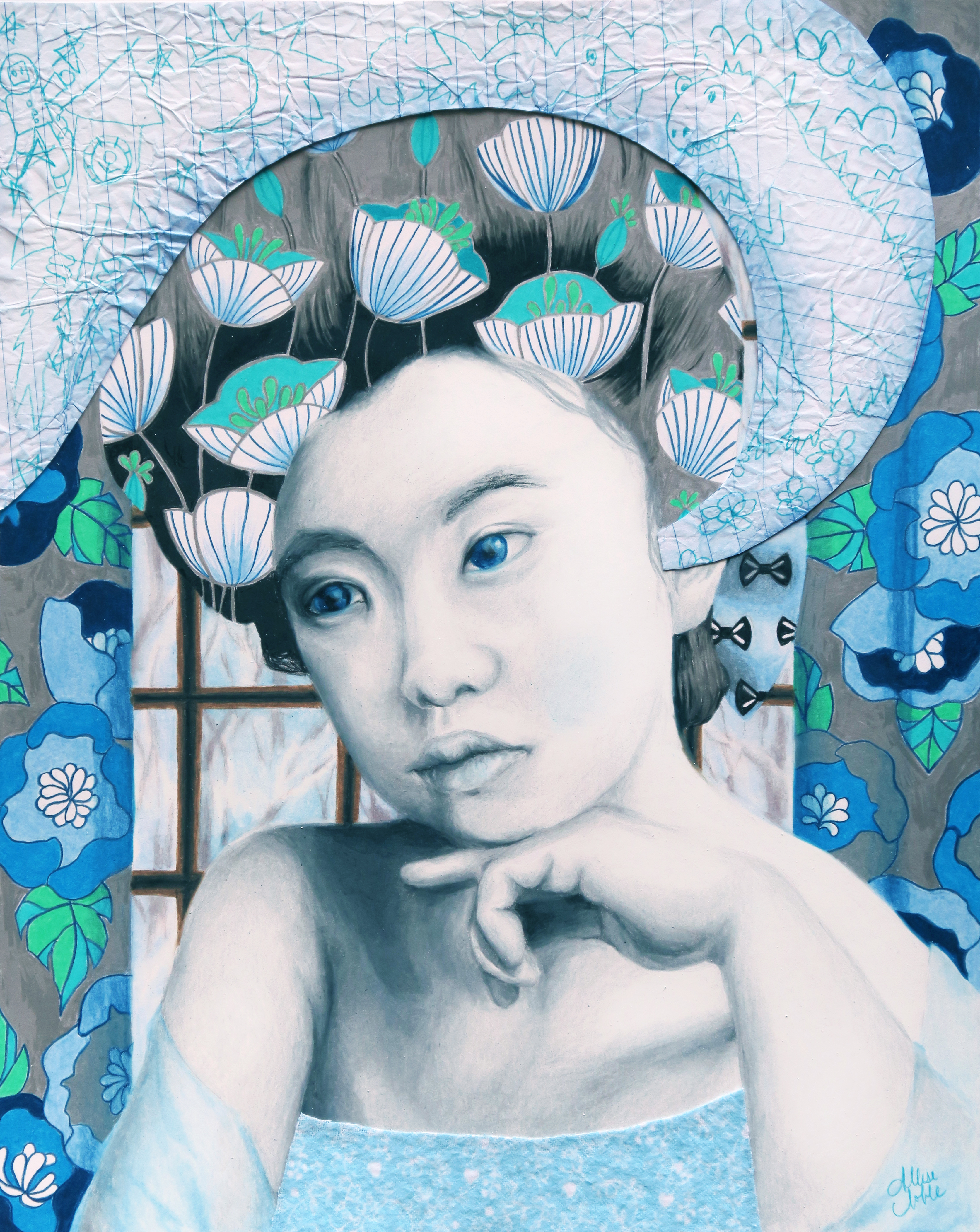
Hey all! I recently finished the 4th piece I’ve added to my current 12 part series. Each piece represents a month of the calendar, and this one is June so it would actually be installment 6 but I’ve skipped around a bit. To catch up new comers, I am working on a series of 12 mixed media, surreal, conceptual portraits in which the meaning is influenced by the use of pattern and color. They will depict women of all ages, races, and time periods, and each will communicate a different theme. I aim for the pieces to speak to women’s collective experiences beyond their differences. I give you, June: She Is Constantly Evolving.

she-is-constantly-evolving

I think this is quite literally the happiest piece I’ve ever completed – There’s even a puppy … that is unreal. I mean, a couple years ago I actually was told by the manager of a local restaurant that I had to remove a couple of pieces from a show I’d hung there because they were afraid it might send patrons spiraling into depression. You’re not a real artist if your art has never been ousted from anywhere, or so I’m told. Not that everything I make is gloom and doom, but to have butterflies, puppies, flowers, smiling with teeth, and cotton candy clouds all together in one piece is not usually my jam. All of my work centers around people’s inner worlds, and sometimes confronts difficult or uncomfortable emotions. Even my pieces that convey overt happiness usually have some sort of edge or oddity to them.

I remember meeting my blindly assigned roommate in college for the first time. Once she found out I was an artist, she wanted me to do some large paintings for the common room, but “They have to be cute! Not scary!” Apparently she thought I was some sort of dark , twisted soul, which is quite funny as I had Sanrio posters all over my bedroom and Bart Simpson print pj’s for god’s sake. (I was to find out later that until we became friends she was afraid to put out any of her Hello Kitty themed toiletries in our shared bathroom, and also only watched America’s Next Top Model in secret when I wasn’t home for fear of my scorn.) To fulfill the cute requirement, I made a painting of a girl holding her kitten surrounded by retro, colorful power flowers. But … I gave the kitten purple dragon wings.

2006_0910art0037retouchnew

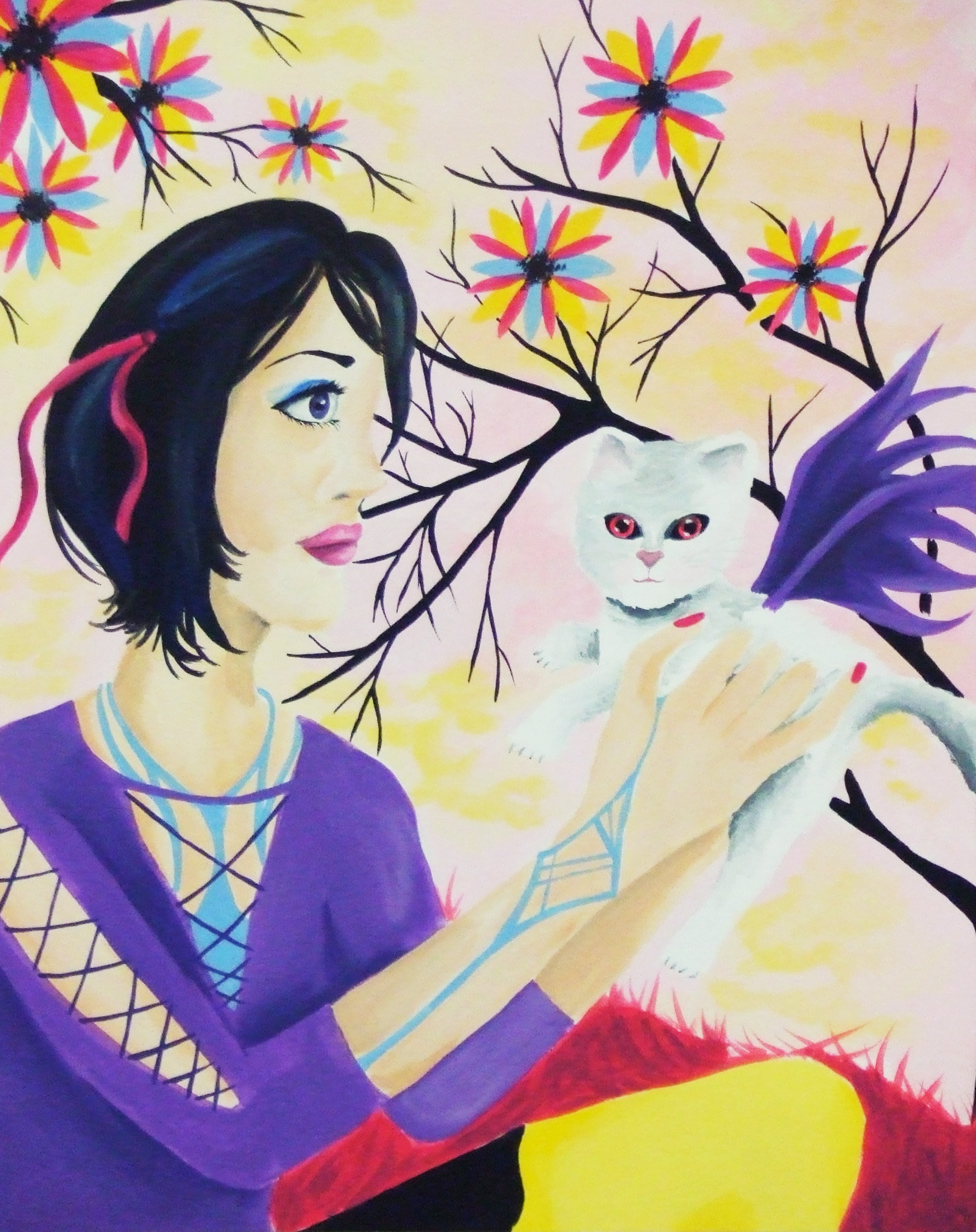
This is so Museum Of Bad Art worthy in the most hilarious way, that I’m actually saddened I tossed it. It’s one of those compositions that is so bad it goes right past bad and back to good again.

All this to say, this is a rare piece to be one that conveys nothing but pure, unadulterated joy and exhilaration. It’s ironic that I created this at a time when joy and exhilaration were about the two farthest things from my mind. As seems to be the general consensus, 2016 has been more than a little trying, and it sure decided to go out with a bang in November and December.

920x920

This piece is about transformation, as symbolized by the presence of butterflies, and maybe it was the idea that change is certainly most appealing during the most wearing of times, mixed with a bit of my love of holidays that makes it impossible for me to stay cranky around Christmastime. Either way, this piece speaks not to who we are right now but who we wish to be, and reminds us that nothing is permanent, and that sometimes that isn’t a bad thing.

See this design and more in my Redbubble Shop.


Standard
Exhibitions and Other News

Super Exciting News (No, I’m Not Engaged. But Read This Anyway.)

First, I must explain the title. It’s a bit of a joke because the last time I did a post in which I professed exciting news, like everyone thought I was engaged. When I was like ‘nope, even better, I won Best 2D at an art exhibition!’ they were like, ‘Oh well, I guess that’s pretty cool too.’ I think this face of epic disbelief from the 10th Doctor sums it up pretty well.

304_daleks_in_manhattan_2

But, back to my still super exciting news. I had mentioned earlier how thrilled I was about getting into the Greater Michigan Art Exhibition at Midland Center For The Arts because I had entered the 2 previous years as well and had yet to be chosen to exhibit. Well, first I found out that not just one but all three of my entered pieces would be hung in the show.

imag4322r

Then, I found out that one of them had actually won an award! I feel so unbelievably honored to have one of my pieces receive a Juror’s Recognition Award.

imag4325r

(I hate closeup pictures of me holding things  because I feel like I have freakishly short fingers. No wonder I could never play the piano well even after years of lessons. Well, that coupled with my total apathy towards the vocation and complete lack of practice, but thatis another sotry for another day. Despite finger length, I had to show off the snazzy brochure.)

januaryr

The fact that they chose the piece that is going to be one part of my 12 part series I am planning to enter into ArtPrize next year was a welcome sign that I am going in the right direction with this project, and creating something that will bring people joy, make them think, and spark their imagination. If you are in the general vicinity of Midland, I would suggest you make a trek over to see this show. It is a humongous exhibit, and there is so much awesome art to absorb.

Standard
Exhibitions and Other News

Work Featured Today In “Found On Redbubble” Front Page!

I got a big surprise this morning, one of my conceptual portraits “I’d Have Been Happier As A Bird” was featured on the found by redbubble front page!

It's the grey-scale portrait second row, 3 over!

It’s the grey-scale portrait second row, 3 over!

Redbubble in general is amazing, and I can’t believe I have waited this long to set one up. Not everyone is interested in hanging something on their wall, and this site splashes your designs over all kinds of objects you can use in day to day life like T-shirts and tank tops, mugs, phone or tablet cases, stylish tote bags, decorative pillows … Given my interior design background, having my designs printed onto custom pillows makes me way too excited. The prices are very reasonable as well, not much different than what you’d pay for the same items in a “regular” store, and those with boring stock designs decorating them rather than unique artist-made work! Please check out my shop; I am working on some new designs specifically for RedBubble, and will also be adding some more of my more popular fine art work as well. I may just have to feed my coffee addiction and get a travel mug in the “I’d Have Been Happier As A Bird” design for myself :). I’ve always been attached to that piece, and it makes me so happy that others are appreciating it as well. Thank you, world!

Standard