New Work

New Series and The Symbolism of Color

I’ve always been interested in the social significance of color, both in cultural symbolism and in the psychology of how color can affect our emotions. Showing solidarity for a specific cause through a group of people all wearing the same color on a certain day or for the attendance of a specific event has become a common practice. My partner has a viscerally negative reaction to the color yellow, and will be caused agitation if surrounded by a bright yellow environment (so basically he just loves the bright yellow flower print wallpaper that was complimentary with the bathroom in our home upon move-in). I have received shocked reactions even from people in my own young-adult age bracket at the mention that if I ever get married at some point, I probably wouldn’t choose a white wedding dress. These are just a couple of examples of the strong reactions people have to color as a form of communication, tradition, and emotional influence in both our exterior environment and more personally in how we choose to adorn ourselves and present our bodies to the world.

Of course, I will be working on other separate projects in between but my main focus going forward will be on a new series exploring the symbolism of different colors worldwide, taking the significance of specific colors from regions all over the world and integrating these often opposing meanings into a single story about that color. I will be focusing on 5 main colors, the 3 primaries of red, yellow, and blue and then black and white. The first color I have represented is white.

Depending where you are, white can symbolize new beginnings and a clean slate, or endings and mourning making it very much a bookend sort of color. It symbolizes traits that are considered more docile like purity, innocence and virtue, but also more courageous sentiments like protection and sacrifice. White is also a color that across cultures is often associated with femininity.

white final

For “The End Is Also The Beginning” I used a mixed media approach, choosing the mediums that would lend themselves best to the look I wanted to achieve for different parts of the piece. I used watercolor for the ice figures, snow, clouds, and water. I used prismacolor pencil (including metallic silver accents) for the figure, rabbit, and areas of fine detail like the blossom trees and patterns in the sky. I used scrap fabric for the pattern on the dress (actually left over from the hemmed curtains hanging in my art room. This is why you never toss scraps!), and flat-back acrylic pearls and beads for the decoration on the neckline of her gown, and her earrings.

I have a couple of juried shows coming up, and this will be one of the pieces getting sent off, so wish me luck!

Advertisement
Standard
Gifting, New Work

One More Series Reveal + More On Redbubble!

december she is connected to everything

Say hello to December – She Is Connected To Everything. What can I say, I’ve been on a roll lately. I don’t think I’ve ever finished so many different pieces 2 days at a time in my life … Granted, I haven’t been doing much of anything else in my free time, as the pile of dishes in the sink will tell onlookers ;). Though all the pieces in my current series I’ve been working on are similar in style and use of medium, I wanted to keep them different enough that each could stand alone as well. I went a lot softer and less graphic, high contrast with this piece. I even used some leftover dried moss I had purchased for a felt floral arrangement commission earlier this year in the girl’s woodland crown. There is something I never thought in a million years I’d ever use in one of my drawings!

rbpromounlimited

I have been getting all my series posted to my Redbubble Shop as well, available for print on a variety of gorgeous items. My series also finally has a name … Unlimited. Each individual piece has it’s own title and the works cover a variety of different themes, so coming up with one title to encompass the whole was a struggle. At it’s heart though, this series is about the best of humanity, and about the strength, curiosity, compassion, and vibrancy of women across time, nationality, and ability. It is about the common ground that unites us, and when people come together, they truly become unlimited.

Standard
Art Discussion, New Work

In A Black and White World, Be A Rainbow! New Work.

november she is entirely her own

I am still plugging along on my series that needs to be finished by mid-late Summer so that I can enter it into ArtPrize! 4 more pieces of 12 to go, wish me luck! This particular piece titled, “November: She Is Entirely Her Own” was a lot of fun, with lots of dramatic color and pattern – a true ode to creativity, independence, and expression. As it turns out, rainbow hair is as challenging to draw as it can be to create on an actual person’s head!

My series will eventually include 12 mixed media, surreal, conceptual portraits in which the meaning is influenced by the use of pattern and color. They will depict women of all ages, races, and time periods. Each will communicate a different theme, titled for each month of the year. I aim for the pieces to speak to women’s collective experiences beyond their differences. Though many of the pieces deal with difficult emotions, the overall feedback I’ve received is that viewers found the works in this series inspiring and encouraging. Over the last couple of years, I have really come into my own style as an artist. For the longest time, I thought in order for art to speak it couldn’t really be enjoyable to look at, and was so wary of my art slipping away from true art and into the category of “decoration”. However, honesty doesn’t have to mean horror and darkness, although there is certainly a time and place for that kind of art, too. You really have to just let yourself speak what naturally flows out of you as an artist, without trying to force a certain aesthetic or viewpoint just because you feel like that is what you “should” be making.

One of my all time favorite authors, David Foster Wallace, said this about creation, “In dark times, the definition of good art would seem to be art that locates and applies CPR to those elements of what’s human and magical that still live and glow despite the times’ darkness. Really good fiction (or art) could have as dark a worldview as it wished, but it’d find a way both to depict this world and to illuminate the possibilities for being alive and human in it.” If this doesn’t just sum up my definite art goals, I don’t know what does.

Lastly, I will leave you with some of my recent wedding photos. Oh, you didn’t know I got married by the most highly respected robotic priest in all of Michigan on the 30th of March, my 29th birthday?

Ok, April Fool’s. I don’t think this particular marriage ceremony held at Marvin’s Marvelous Mechanical Museum is technically legally binding, and the flimsy aluminum rings we exchanged couldn’t even fit properly on our gigantic sausage fingers. But nevertheless, spending a day at the arcade followed by delicious Italian food was a good enough birthday adventure for me. Perks, now everyone can stop asking us when we’re getting married, because we kind of already did, fools ^_^.

Continue to be the rainbow in a black and white world, dear readers. Until later …


Standard
Art Discussion, New Work

New Work – September: She Is An Atlas

This was one of the most challenging pieces in my series thus far, because I was working with multiple layers of meaning and thoughts. It also is the most “mixed media” of all my series installments, utilizing not just mixed fine art mediums but fabric, metal chain, tiny rhinestones, and torn book pages. I have been so into metallic accents since the collaboration with my friend and student, Heather. I also blame her for the inclusion of rhinestones – she encourages me to be sparkly.

she is an atlas

I’ve mentioned in previous posts that when I feel, I feel BIG or not at all. There is no other way. The sketch that inspired this piece started as a way for me to process the weight of my own emotions and feelings of powerlessness. As  I began further conceptualizing this current series, I realized the idea could fit as one of the 12 pieces. For new readers, here’s my blurb briefly explaining the series (If you are already in the know, feel free to skip ahead 😉 ): I am creating 12 mixed media, surreal, conceptual portraits in which the meaning is influenced by the use of pattern and color. They will depict women of all ages, races, and time periods, and each will communicate a different theme. I aim for the pieces to speak to women’s collective experiences beyond their differences. Each of the 12 will represent a month of the year. We tend to think of time and events in terms of our own personal history or the history of the nation in which we reside. But of course, there are women everywhere living out their day to day life all over the world, with hopes, dreams, fears , relationships. Our situations and struggles are very different, but were we in some alternate reality all given a chance to meet, I suspect we would find some surprising similarities, maybe more than we ever expected. The title of each piece starts with the month it represents, followed by “She Is _______”. The figure in this piece quite literally has “the world on her shoulders” through the pattern on her clothing, much like the mythic Atlas. Atlas the physical object is also defined as a book of maps or charts, and can signify one feeling that they alone must have all the directions and answers to all of the world’s problems, a grand and impossible responsibility.

The exposed heart necklace represents empathy, an open heart waiting to be wounded , left unprotected and raw. She leans against a bulls-eye wall, surrounded by an outline of thrown knives, a target girl like in the well known circus act. With each act of injustice and malice directed at others, she feels as if she is standing in their place, each offense a knife thrown at her, just missing. Though fearful, her face is strong and even. I’ve written before about how compassion and empathy does not equal weakness. To stick one’s head in the sand and be ignorant of the world’s ills is weakness; foolish, avoidant, and selfish.

Another way the subject can be viewed is not as the empathizer but as the victim. Some people are born into situations that are so difficult, living day to day is much like standing against a target with knives being thrown at them. It can be their geographic location, their income, the people that surround them or lack thereof, and the list goes on. Though yes, our personal choices certainly can influence outcomes, isn’t so much of life like a gigantic, living lottery when you think about it? Yet we shake our heads and wag our fingers when we see people who are struggling both around us and abroad, because certainly they must have done something wrong or things would look different? This way of thinking frees us of the responsibility to help others, and gives us a false sense of power that by doing certain things we can be 100% sure we attain the exact sort of life that we want. It all goes back to empathy and control.

One of the things I love about art is the way people can discern completely different meanings from a piece based on their own thoughts and experiences. Did something different strike you as you looked at this piece, did it remind you of something? Please share, don’t be shy!


Standard
Uncategorized

Exciting News From the MAG Annual Exhibition!

Friday was the opening reception for the Midland Artists Guild’s Annual Juried Exhibition. What’s awesome about this year is that the show actually took place at the gallery I work at as Coordinator for one of their major programs, Creative 360. The piece that was accepted into the show was “She Is Everything At Once“, the 3rd installment in my new series I’ve been working on since late 2015. There was so much amazing work this year, I truly was just excited to get into the show and did not go in expecting any further recognition… and then my name got called for an Award of Excellence. No matter how many years I spend involved in art, I don’t think I will ever lose that factor of complete surprise when something like this happens.


For those of you who may have missed previous posts on my new series, I will be creating 12 mixed media, surreal, conceptual portraits in which the meaning is influenced by the use of pattern and color. They will depict women of all ages, races, and time periods, and each will communicate a different theme. I aim for the pieces to speak to women’s collective experiences beyond their differences. Each of the 12 will represent a month of the year, the one featured in the MAG show being March. We tend to think of time and events in terms of our own personal history or the history of the nation in which we reside. But of course, there are women everywhere living out their day to day life all over the world, with hopes, dreams, fears , relationships. Our situations and struggles are very different, but were we in some alternate reality all given a chance to meet, I suspect we would find some surprising similarities, maybe more than we ever expected.

My goal is to get this series into this year’s ArtPrize in Grand Rapids. With the positive responses I’ve been seeing to images from this series thus far including an award for my January piece at the Greater Michigan Art Exhibition last Fall, I’m certainly feeling hopeful!

Standard
New Work

New Work! (In Which I Present Probably The Cheeriest Art I’ve Ever Done)

Hey all! I recently finished the 4th piece I’ve added to my current 12 part series. Each piece represents a month of the calendar, and this one is June so it would actually be installment 6 but I’ve skipped around a bit. To catch up new comers, I am working on a series of 12 mixed media, surreal, conceptual portraits in which the meaning is influenced by the use of pattern and color. They will depict women of all ages, races, and time periods, and each will communicate a different theme. I aim for the pieces to speak to women’s collective experiences beyond their differences. I give you, June: She Is Constantly Evolving.

she-is-constantly-evolving

I think this is quite literally the happiest piece I’ve ever completed – There’s even a puppy … that is unreal. I mean, a couple years ago I actually was told by the manager of a local restaurant that I had to remove a couple of pieces from a show I’d hung there because they were afraid it might send patrons spiraling into depression. You’re not a real artist if your art has never been ousted from anywhere, or so I’m told. Not that everything I make is gloom and doom, but to have butterflies, puppies, flowers, smiling with teeth, and cotton candy clouds all together in one piece is not usually my jam. All of my work centers around people’s inner worlds, and sometimes confronts difficult or uncomfortable emotions. Even my pieces that convey overt happiness usually have some sort of edge or oddity to them.

I remember meeting my blindly assigned roommate in college for the first time. Once she found out I was an artist, she wanted me to do some large paintings for the common room, but “They have to be cute! Not scary!” Apparently she thought I was some sort of dark , twisted soul, which is quite funny as I had Sanrio posters all over my bedroom and Bart Simpson print pj’s for god’s sake. (I was to find out later that until we became friends she was afraid to put out any of her Hello Kitty themed toiletries in our shared bathroom, and also only watched America’s Next Top Model in secret when I wasn’t home for fear of my scorn.) To fulfill the cute requirement, I made a painting of a girl holding her kitten surrounded by retro, colorful power flowers. But … I gave the kitten purple dragon wings.

2006_0910art0037retouchnew

This is so Museum Of Bad Art worthy in the most hilarious way, that I’m actually saddened I tossed it. It’s one of those compositions that is so bad it goes right past bad and back to good again.

All this to say, this is a rare piece to be one that conveys nothing but pure, unadulterated joy and exhilaration. It’s ironic that I created this at a time when joy and exhilaration were about the two farthest things from my mind. As seems to be the general consensus, 2016 has been more than a little trying, and it sure decided to go out with a bang in November and December.

920x920

This piece is about transformation, as symbolized by the presence of butterflies, and maybe it was the idea that change is certainly most appealing during the most wearing of times, mixed with a bit of my love of holidays that makes it impossible for me to stay cranky around Christmastime. Either way, this piece speaks not to who we are right now but who we wish to be, and reminds us that nothing is permanent, and that sometimes that isn’t a bad thing.

See this design and more in my Redbubble Shop.


Standard
Interior Design

Retro Tile Bathrooms Before and After

Even though I studied interior design in college and ended up going in a different direction afterward, I still love it. From time to time, I do still assist friends/family/acquaintances with their designing woes, and I’ve had a couple of fun opportunities over the last year or two to work with my parents in updating my childhood home. I worked with them to choose fixtures, finishes, and furnishings for the home’s guest and master bath, and they used a kitchen and bath design business and a remodeling contractor from the local Midland area to bring the project to completion.

My parents and I have pretty different design styles. They can be a little uneasy at times about bold colors, and favor timelessness. My mother definitely has a traditional style, and is not one of those people who wants to change a design up every other year (or even every 5). She especially wants more “permanent” aspects such as tile and cabinetry to be something neutral so that the space can be updated in the future if need be with not much more than a different color of paint on the walls.

The house’s original bathrooms were done up in (now vintage) tile, as were many in the neighborhood when originally built. My best friend down the street actually had an identical guest bathroom to ours, only accented in white instead of grey and sans crazy wallpaper. We decided to pay homage to the origins and stay with the idea of retro, bold, fun tile, but this time in black and white.

wp-1472597936784.jpg

Before: I may have mentioned the original guest bathroom was pink. In fact, this bathroom was just so into being pink that even the door and the window molding is pink. This is basically Dolores Umbridge‘s dream bathroom. It’s so odd and distinctly vintage, however, that it did have a certain charm and I was a little bummed to see it go. Yes, the ceiling is wallpapered – pretty trippy.

blue-bath-montage.jpg.jpg

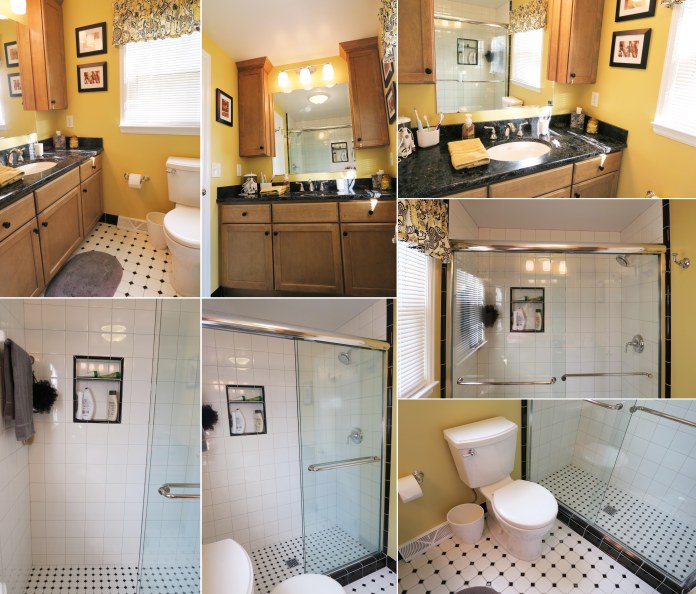
After: Saying bye-bye to the original vintage was so worth it, however, for the end result. Since we didn’t have to worry about the guest bathroom transitioning into a bedroom like we did for the master bath, we could go with a fun color not present anywhere else in the house, and chose a cheerful pool blue. Being the only color present that isn’t a neutral, the room is pleasant even for those who don’t like to be surrounded by rainbows 24/7. The white is broken up by pops of black in the striping and the textile accents. The ceiling is still kind of fun, though certainly not wallpapered! I chose a paler shade of blue rather than just going with a stark white to balance the already ever present, high contrast, bold blue- to – bright white transitions. My parents also love antiques, and there is a variety of vintage glassware and decor scattered throughout. We also chose some unique vintage inspired hardware that further adds to the little air of whimsy in this room. The artwork on the wall is a print of one of my watercolor and ink pieces, The Idealist.

wp-1472597943538.jpg

Before: The master bath had already been through one soft redo in the 90s due to some cabinetry that was not faring too well. It had mainly been done for utilitarian reasons, and had pretty much the opposite problem of the guest bathroom … it was very, very bland.

gold-bath-montage.jpg.jpg

After: Hello, gold! Black and gold play off of each other so well, so a lot more black was incorporated into this bathroom. The cabinetry and shower are opposite each other, so to balance all the white tile with the dark counters we outlined the shower itself and the inset shelf in black tile, and used a more concentrated floor tile. The photography on the walls are photos of birds my dad took, one of his hobbies being hiking and “collecting” birds on his journeys via snapshots. And, of course, more vintage glassware (I have an addiction! Luckily, they love it too).

Another fun project completed! Next, my parents will be picking my brain about the living room. Maybe I can talk them into more brightly colored walls … maybe even purple! Only time will tell ;). (Mom, if you are reading this, I promise I’m joking).

Standard
New Work

Happy Staycation! + New Work Reveal

be my wings

I’ve been working on this new mixed media drawing for awhile, and with my decision to take a little staycation, I’ve finally had the time to finish it! It is titled, “Be My Wings”, and measures 18×24″. I used prismacolor pencil for the face, prismacolor markers for the ravens, watercolor for both the hair and the background with grey, black, and white chalk overlay, and fabric for the clothing covering the neck and shoulders.

Of course, I have added this design to my Redbubble collection, as well as some new designs inspired by a couple of fun, newly finished ACEO illustrations.

I love buying from all kinds of artists on Redbubble, and have a design of almost every type of product in one form or another except the throw pillows! I’m dying to get one, but it is impossible to decide which design to choose, especially since I feel like changing around all the colors and decor in my apartment yet again. It’s a yearly thing :P.

I know this is a brief post after not writing for so long, but I’ve actually been aiming to spend minimal time online over this week-long break as it is simply gorgeous outside! Lately, I’d been feeling like there was a gloomy bad-luck cloud looming over my head, skulking around and following me just about everywhere I went. However, something seems to have turned a bit in my favor, because I sure picked the right week to take off! Every day has been nothing but perfect warmth and blue skies.

IMAG3175[1]

Can’t beat swimming and a view! Now, onward to more adventures…

Standard
Exhibitions and Other News

Exciting News From Midland Artists Guild Exhibition 2016

Time has been flying, and I can’t believe the Midland Artists Guild annual juried exhibition has already came and went as of last night. There was such a diverse collection of amazing work. I think the shows get better every year, and if you are in the Midland area it is worth stopping by the Grace A Dow Memorial Library mezzanine to check it out. I was beyond excited to find out my piece “On My Mind” won one of the Merit Awards!

IMG_0440r

spaceedit3


This art nouveau inspired mixed media was so much fun to work on, and you can visit one of my previous posts to view the  step by step process .

My two other pieces that made it into the show were “Wonderland” and “January: She Is Far Away“.

All of these designs are available as art and ACEO prints in my ebay store, and prints on mugs, bags, pillows, notebooks, and all kinds of fun stuff in my redbubble shop. Next up, the Express Yourself Artshop fundraiser show and the Saginaw Township annual juried exhibition! Of course there will be many, many pictures :). Follow to stay in the loop!

Enjoy the rest of your weekend. I know I will be enjoying the rest of mine by drinking copious amounts of tea and not leaving the house.It may be Spring everywhere else, but not in Michigan! In fact, we’ve had four snow days in the last two weeks :P. So long for now!

Standard
Artists To Know, Uncategorized

Artists To Know! Installment 7 : Seeing The Unseen

I have always been the type of artist and art appreciator who tires of complete realism. I abhorred the same old make-it-look-like-the-photo landscape assignments in school growing up. I liked portraiture a bit better, but only if I made it my own, whether desired in the class assignment or not.

adrian brody goes punk

Circa 2005 – Oh noes! The punk’s left eyeball has cracked and now little rainbow glass shards are floating out into the universe towards the viewers eyeballs, surely meaning to skewer them!

I always believed art should only show us what we cannot see in reality, or else what was the point? However, how much of reality do we really see, and how much simply slips from our view unnoticed? Human perception is a funny thing. You could have two people walk down the same stretch of sidewalk in a park, and if in the end you asked them to describe the scene they just participated in, I am 99.9% certain that they would each describe it completely differently. We notice what draws us, and ignore what repels us. That idea is the basis of the following artists’ work, work that shows us the marginalized and disenfranchised; the very people who often slip to the periphery of our awareness either consciously or unconsciously. Viewing these works, we are shown a reality that seems like a completely different world.

Aaron Draper

homeless2

For his “Underexposed” series, Aaron Draper captures lit photos of the homeless, aiming to portray them in the most pleasant, visually appealing way possible. Draper sites author John Steinbeck as an inspiration, and admires how he used his craft to highlight the plight of the poor, and expose social issues and inequities.  With this series, Draper is using lighting to draw viewers towards the person shown, causing the subject to be viewed with humanity and compassion. Draper says, “When it comes to social activism, you achieve greater public awareness by communicating hope as opposed to hopelessness”.

Diane Arbus

diane

Famed photographer Diane Arbus takes almost the complete opposite approach to the previous artist. The black and white photographs of her subjects seem to be developed in such a way as to accentuate each imperfection, every wrinkle, blemish, and flaw. Her work turns its lens on society’s outsiders : those with physical abnormalities, nudists, transgender individuals, those with extreme tattooing or body modification, and rarities such as twins. Unlike Draper’s work, there is a darkness to it and a definite surreal quality (One of her photographs of twins actually inspired Stanley Kubrick’s iconic “The Shining twins”.).  She is certainly a disputed artist. Some argue she was voyeuristic and exploitative , her photos no better than the circus “freak shows” that thankfully no longer exist in this day and age. Her motives and connection to her subjects have been called into question since her photographs were not necessarily being used to communicate a social purpose or to inspire a change in the treatment of the individuals, but more for striking visual interest. Additionally, her series in which she photographed individuals living in group homes for those with mental challenges, of which the above is a part, brings up a consent issue. Since the photographs were taken between 1969 and 1971, a time when individuals at such institutions were given little to no rights, the permission to photograph the residents was not given by the individuals themselves but the institution. Such a project would not be allowed publication by today’s standards. Others argue she is possibly one of the most misunderstood artists of the 20th century. Consent between photographer and subject is important, and I cannot speak to the validity of the permission she received. However, to me, Arbus wasn’t looking at her subjects with revulsion and disgust. They don’t appear isolated or lonely but confident, happy and uninhibited. They are comfortable in their own skin and are completely unaware of how they appear to others. Arbus had a great respect for her unusual subjects she sought out, saying “Most people go through life dreading they’ll have a traumatic experience. Freaks were born with their trauma. They’ve already passed their test in life. They’re aristocrats.” (though I do flinch at the way she throws around the “f-word”.) If anything, it was the so called “normal people” Arbus portrayed as lonely and disconnected and silly.
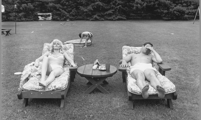
dianearbus

Asa Johannessen

looking_out_looking20in_4

The subjects of Johannessen’s “Looking Out, Looking In” series are individuals who don’t identify with any gender, male or female. An article in Independent about her show describes the portraits as “challenging the onlooker defiantly to try and categorize them”. All photographs are untitled, the subjects unnamed. The goal is to draw the viewers in to whom each individual is as a person, rather than the viewers obsessing over the single facet of “Are they male or female?” This is an interesting concept to me as someone who has always felt gender is about the last thing I notice about someone. This has led to some interesting social kerfuffles in the form of myself ending up on dates I never knew I was on. I pretty much am this comic below anyway, only with brown hair and zero barista skills.

12189140_1042431189142860_184550205222405098_n

All that aside, the point is once again using art to bring humanity to those who are often misunderstood or ignored. Everyone struggles with identity crises from time to time, but most of us can’t even imagine feeling that such a basic component of our personhood is alien to us. Many of us can’t imagine the feelings of confusion, isolation, and despair such a conflict would bring. Individuals like the ones in Johannesson’s photographs often get treated like unicorns, an interesting idea, but they don’t really exist. This series confronts those misconceptions head on. No matter what we each individually believe, empathy and above all love is possible, and I daresay required.

Debbie Rasiel
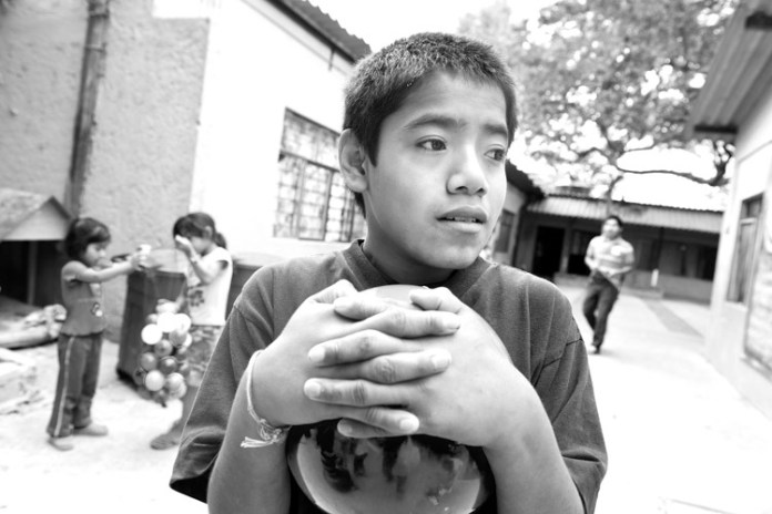
dsc67311

The goal of photographer Debbie Rasiel’s “Picturing Autism” series is to explore what autism looks like across language and cultural barriers. The series spans New York, Mexico, Peru, Indonesia and Iceland.”I wanted to offer those not familiar with autism an opportunity to see what autism looks like, a safe space where social mores would not prevent them from staring,” Rasiel stated in an article for The Huffington Post. Again, art has urged people to lock eyes with and confront images of individuals from whom they normally may avert their gaze due to unfamiliarity or uncertainty.

Art not only has the ability to show us things we can’t see in real life, but it has the ability to force us to see the unseen, and that is a wonderful and magical thing.


Standard