One of my favorite things about working with Express Yourself Artshop is seeing all of the creative ideas our students come up with. A few of them create abstract work, some of them just now delving into it for the first time. I myself work most closely to a surreal, whimsical, dreamlike aesthetic, but I have never been able to go pure abstract. For all those out there who say “abstract art is so easy, it’s just splatters and shapes, anyone can do it!”, I challenge you to go home and try making a piece. Of course it’s easy to make crappy, half-assed abstract art, just as it is easy to do anything that you don’t put effort or thought into. Making good abstract art that actually looks dynamic and interesting and makes people stop in their tracks is not simple at all. I had dabbled in attempts in the past, and grew so frustrated I gave up on the whole idea of even trying.
Heather Deogracia is a fellow whimsy-addict when it comes to art, and has been in many of my Artshop classes at Creative 360. She has begun creating pen and ink abstracts within the last couple of years, and her illustrations have a ton of movement and always stand out in bold, contrasting colors.

Find this design by Heather Deogracia on Redbubble!
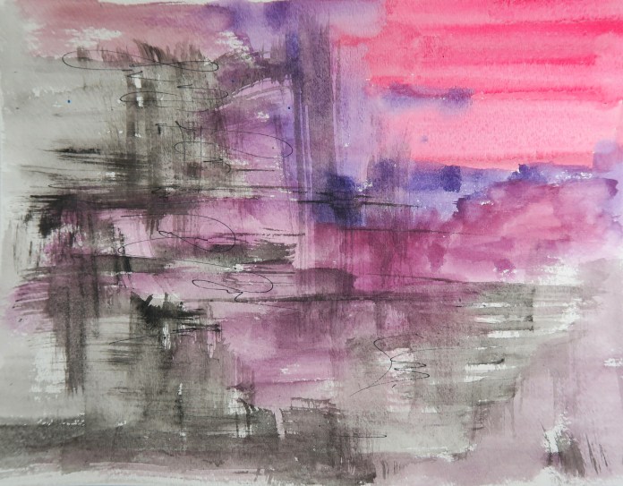
Another student who is in the Artshop classroom nearly as often as I am, Colleen, has always had a great sense of color when painting with watercolors. Our painting instructor this semester prompted her to try an abstract piece and see how she liked the process. She reacted much like I did the first time I tried to create something nonrepresentational; quite apprehensive and not sure where to even begin. It’s hard to wrap your mind around creating texture, colors, and pattern without the “anchor” of a specific end goal, a plan that your picture will end up looking like a, b, or c when you are finished. With the instructor’s guidance, she ended up with this beautifully balanced, interesting piece.

In fact, I liked the design so much, I couldn’t resist buying a travel mug from Artshop’s Redbubble Store. It’s so nice to be able to stare at 3 of my favorite colors while enjoying my morning coffee.
I use watercolors a lot, and after seeing how much fun it was for the students to play with bright colors, letting their paints blend and bleed and drip into each other, I had to try it at home despite my misgivings.
I ended up with two pieces that lo and behold, I am actually pretty happy with. The first is inspired by caves, gemstones, and geodes. I had a pretty well curated rock collection as a child, so maybe that is where the inspiration came from :). The second is a female figure fading into the dark background. I wanted to use a lot more contrast in both lights and darks and color for this one. In both pieces, I started with a basic background first, and then added the details over that under layer based on what I saw in the design, sort of like when you were a kid and used to lie on the ground staring up at cloud shapes, finding pictures in them.
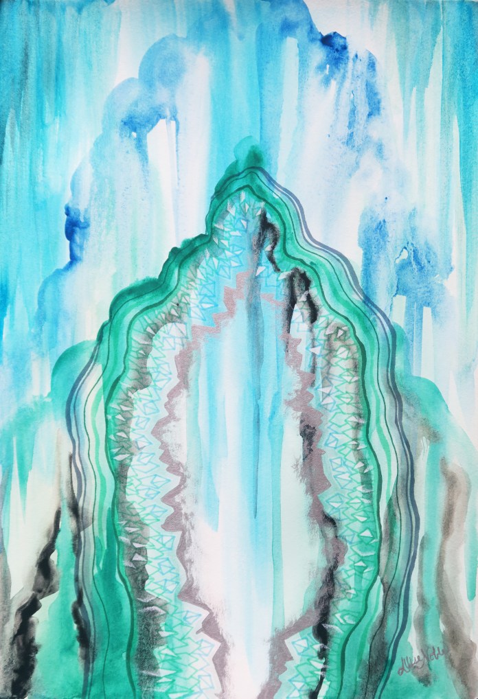
Cave of Wonders, 12×18 Watercolor, Ink, White Prismacolor Pencil, and Metallic Acrylic. Design available on Redbubble!
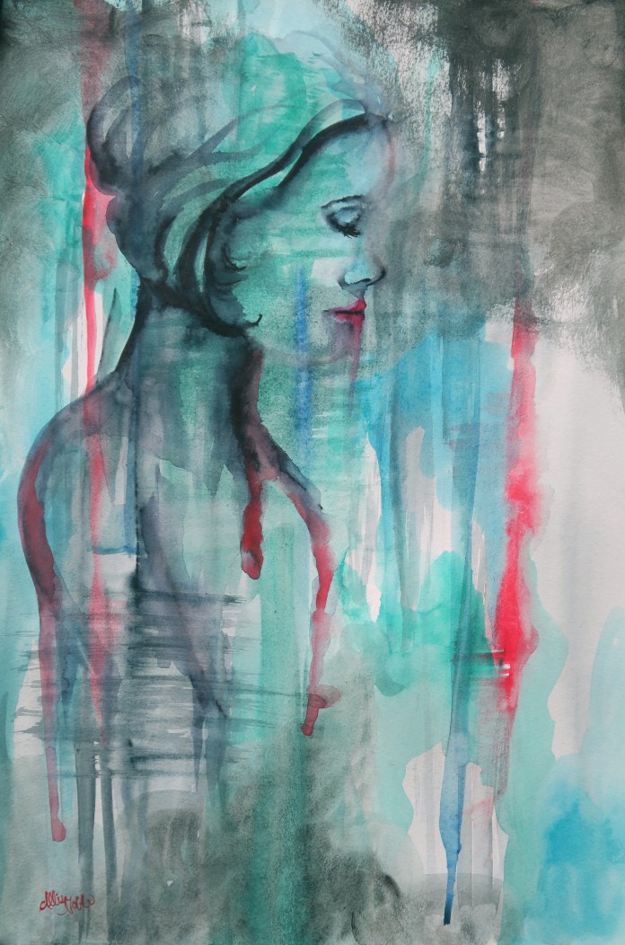
The Power of Invisibility, 12×18 Watercolor and Ink. Design available on Redbubble!
A last bit of Artshop news, our fundraiser last weekend was a success! Quite a few students sold some of their work, and we also received over $170 worth of donated art supplies – woohoo! Check out Express Yourself Artshop on instagram to see more photos of students’ artwork and what we are up to :).


")
")

![IMAG3175[1]](https://artistallisenicole.com/wp-content/uploads/2016/07/imag31751.jpg?w=496&h=496)