New Work

New Series and The Symbolism of Color

I’ve always been interested in the social significance of color, both in cultural symbolism and in the psychology of how color can affect our emotions. Showing solidarity for a specific cause through a group of people all wearing the same color on a certain day or for the attendance of a specific event has become a common practice. My partner has a viscerally negative reaction to the color yellow, and will be caused agitation if surrounded by a bright yellow environment (so basically he just loves the bright yellow flower print wallpaper that was complimentary with the bathroom in our home upon move-in). I have received shocked reactions even from people in my own young-adult age bracket at the mention that if I ever get married at some point, I probably wouldn’t choose a white wedding dress. These are just a couple of examples of the strong reactions people have to color as a form of communication, tradition, and emotional influence in both our exterior environment and more personally in how we choose to adorn ourselves and present our bodies to the world.

Of course, I will be working on other separate projects in between but my main focus going forward will be on a new series exploring the symbolism of different colors worldwide, taking the significance of specific colors from regions all over the world and integrating these often opposing meanings into a single story about that color. I will be focusing on 5 main colors, the 3 primaries of red, yellow, and blue and then black and white. The first color I have represented is white.

Depending where you are, white can symbolize new beginnings and a clean slate, or endings and mourning making it very much a bookend sort of color. It symbolizes traits that are considered more docile like purity, innocence and virtue, but also more courageous sentiments like protection and sacrifice. White is also a color that across cultures is often associated with femininity.

white final

For “The End Is Also The Beginning” I used a mixed media approach, choosing the mediums that would lend themselves best to the look I wanted to achieve for different parts of the piece. I used watercolor for the ice figures, snow, clouds, and water. I used prismacolor pencil (including metallic silver accents) for the figure, rabbit, and areas of fine detail like the blossom trees and patterns in the sky. I used scrap fabric for the pattern on the dress (actually left over from the hemmed curtains hanging in my art room. This is why you never toss scraps!), and flat-back acrylic pearls and beads for the decoration on the neckline of her gown, and her earrings.

I have a couple of juried shows coming up, and this will be one of the pieces getting sent off, so wish me luck!

Advertisement
Standard
New Work

New Art! 2 Down 2 To Go!

Struck by both some luckily timed inspiration and ever looming deadlines, I have buckled down on my series and completed 2 more pieces, which means only 2 more to go! I actually think these 2 new ones are among my favorites so far. Series-explanation-blurb time for those new readers! “Unlimited” is composed of 12 mixed media portraits in which the meaning is influenced by the use of pattern and color. Women of all ages, races, and time periods are depicted, each communicating a different theme. I aim for the pieces to speak to women’s collective experiences beyond their differences. We tend to think of time and events in terms of our own personal history or the history of the nation in which we reside. But of course, there are women everywhere living out their day to day life all over the world, with hopes, dreams, fears , relationships. Our situations and struggles are very different, but were we in some alternate reality all given a chance to meet, I suspect we would find some surprising similarities, maybe more than we ever expected. Pieces are primarily drawing and painting, accented with mixed media elements and metallic details.

october she is full of curiosity

For the above, titled “October: She Is Full of Curiosity”, I incorporated a lot more mixed media elements which I felt meshed well with the “vintage study” atmosphere of the background. I used quilting fabric for the wallpaper, leather upholstery samples for the book cover, decoupaged book pages for the inside pages and title, an art book clipping for the picture on the wall, ink for the woodwork, watercolor for the outdoor scene, lace overlay for the girl’s collar, metallic acrylic for her hair, and prismacolor pencil for most of the figure and clothing.

she is free

In this next piece, titled “July: She Is Free In Mind and Spirit”, I took almost the opposite approach, not using any fabric or found object materials and sticking solely to the traditional art materials of prismacolor pencil, watercolor, and acrylic paint. I’d had all the pieces for my series pre-planned as far as composition and subject matter since late 2015. However, this one took flight (haha, bad pun) on its own quite recently after I realized that I had a variety of ages and races represented in my planned artworks, but not a variety of abilities. Given that I work with an art program that serves individuals with disabilities, this oversight stopped me in my tracks. I’m always harping on inclusion and the lack of representation of people with disabilities in the public and entertainment sphere to anyone who will listen (and even those who don’t want to sometimes), and yet I realized they were not included in my project that was all about inclusion, unity, and representation. I was thus tasked with coming up with a visible disability that could be seen in just a head and shoulders portrait rather than a full body rendering. This lively young woman with down syndrome who exudes confidence, energy, and life evolved over the incredibly short course of two interrupted days with no pre-planning or sketching beforehand which is very uncommon for me. I don’t know that anyone else will see it, but this piece definitely holds the most emotional connection for me.

For more deeply personal and unconventional portraits, check out self-taught contemporary artist Stephen Martyn Welch’s “Everyone Deserves A Portrait” series inspired by his son who was born with Kabuki Syndrome. Keep checking for the last two! I’m on a roll ;)!

Standard
New Work

New Series Re-Imagines Childhood Drawings

Now that I got all of my work finished for the upcoming Michigan all area shows I am entering, I wanted to take the opportunity to spend some time on a new project that I’d done sketches for about 2 years ago and never revisited after getting distracted by mountains of other projects. Working with kids and youth over the summer at Creative 360 while Artshop was on break,  we did lots of acrylic painting. Acrylics is a medium I’d abandoned over the last couple of years, and it made me miss it.

I had a teacher once who said you will always be who you were when you were 8. You may drift in the in-between teen years; who doesn’t go through an identity crisis at least once in high school or within early young adult age; but you will always come back to the most basic facets of personality you exhibited as child. At your core, you are who you were at eight years old and will still be at 80.

When I think about it, at 28 I do share many of the same traits with my 8 year old self. I still adore books, I still have my own distinctive and at times highly experimental fashion sense (I was wearing sun glass frames with the lenses popped out far before hipsters ever existed.), I am still always actively finding ways to meld creativity with vocation, I still am obsessed with all things design oriented (Look how pumped I am about my digital runway show I’ve put together on that snazzy Windows 95), and I still can’t sleep unless buried under 3+ layers of blankets even in summer :P.

Luckily for me, and this project, my mother is amazing and has the best of my childhood drawings from each year of my life archived in a neat, chronological little binder, so finding artwork examples was no big thing. I have chosen a drawing from each year, 2-10 (nothing for year 1, I’m not that amazing.) I will be using the same subject matter, colors, and proportions to re-imagine these childhood drawings as fine art acrylic paintings. Here is the first piece I’ve completed for age 4.

Kid drawings aren’t all the same when you really look at them, and you truly can tell a lot about someone from what they create, same as with adults. Here are some other fun projects people have done taking inspiration from kids’ drawings.

Bored Panda / Go Monster Project

Cafe Mom / Parents Turn Their Kids’ Art Into Tattoos

Huffington Post / Mom-Toddler Painting Collaborations

Busy Mockingbird / Artist Collaborates With 4-Year-Old Daughter

Doodle Your Toys / Custom Handmade Plush Toys


Standard
New Work

Happy Staycation! + New Work Reveal

be my wings

I’ve been working on this new mixed media drawing for awhile, and with my decision to take a little staycation, I’ve finally had the time to finish it! It is titled, “Be My Wings”, and measures 18×24″. I used prismacolor pencil for the face, prismacolor markers for the ravens, watercolor for both the hair and the background with grey, black, and white chalk overlay, and fabric for the clothing covering the neck and shoulders.

Of course, I have added this design to my Redbubble collection, as well as some new designs inspired by a couple of fun, newly finished ACEO illustrations.

I love buying from all kinds of artists on Redbubble, and have a design of almost every type of product in one form or another except the throw pillows! I’m dying to get one, but it is impossible to decide which design to choose, especially since I feel like changing around all the colors and decor in my apartment yet again. It’s a yearly thing :P.

I know this is a brief post after not writing for so long, but I’ve actually been aiming to spend minimal time online over this week-long break as it is simply gorgeous outside! Lately, I’d been feeling like there was a gloomy bad-luck cloud looming over my head, skulking around and following me just about everywhere I went. However, something seems to have turned a bit in my favor, because I sure picked the right week to take off! Every day has been nothing but perfect warmth and blue skies.

IMAG3175[1]

Can’t beat swimming and a view! Now, onward to more adventures…

Standard
New Work

Who’s Really Teaching Whom? Allise Tries Abstract!

One of my favorite things about working with Express Yourself Artshop is seeing all of the creative ideas our students come up with. A few of them create abstract work, some of them just now delving into it for the first time. I myself work most closely to a surreal, whimsical, dreamlike aesthetic, but I have never been able to go pure abstract. For all those out there who say “abstract art is so easy, it’s just splatters and shapes, anyone can do it!”, I challenge you to go home and try making a piece. Of course it’s easy to make crappy, half-assed abstract art, just as it is easy to do anything that you don’t put effort or thought into. Making good abstract art that actually looks dynamic and interesting and makes people stop in their tracks is not simple at all. I had dabbled in attempts in the past, and grew so frustrated I gave up on the whole idea of even trying.

Heather Deogracia is a fellow whimsy-addict when it comes to art, and has been in many of my Artshop classes at Creative 360. She has begun creating pen and ink abstracts within the last couple of years, and her illustrations have a ton of movement and always stand out in bold, contrasting colors.

heather7

Find this design by Heather Deogracia on Redbubble!

Another student who is in the Artshop classroom nearly as often as I am, Colleen, has always had a great sense of color when painting with watercolors. Our painting instructor this semester prompted her to try an abstract piece and see how she liked the process. She reacted much like I did the first time I tried to create something nonrepresentational; quite apprehensive and not sure where to even begin. It’s hard to wrap your mind around creating texture, colors, and pattern without the “anchor” of a specific end goal, a plan that your picture will end up looking like a, b, or c when you are finished. With the instructor’s guidance, she ended up with this beautifully balanced, interesting piece.

colleen34

Find Colleen’s design on Redbubble!

12677691_790238767786941_1618605374_n

In fact, I liked the design so much, I couldn’t resist buying a travel mug from Artshop’s Redbubble Store. It’s so nice to be able to stare at 3 of my favorite colors while enjoying my morning coffee.

I use watercolors a lot, and after seeing how much fun it was for the students to play with bright colors, letting their paints blend and bleed and drip into each other, I had to try it at home despite my misgivings.

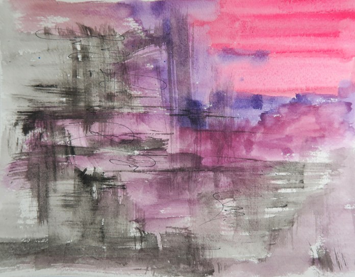
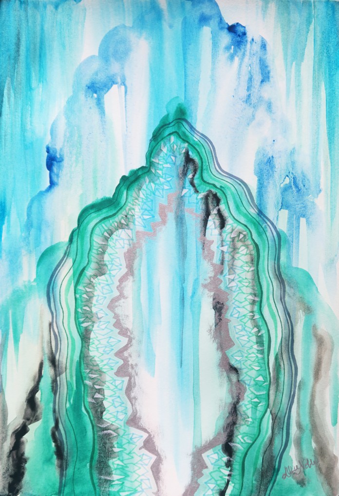
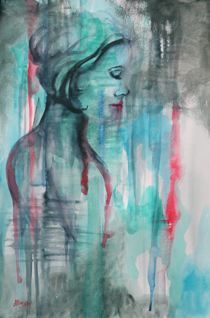
I ended up with two pieces that lo and behold, I am actually pretty happy with. The first is inspired by caves, gemstones, and geodes. I had a pretty well curated rock collection as a child, so maybe that is where the inspiration came from :). The second is a female figure fading into the dark background. I wanted to use a lot more contrast in both lights and darks and color for this one. In both pieces, I started with a basic background first, and then added the details over that under layer based on what I saw in the design, sort of like when you were a kid and used to lie on the ground staring up at cloud shapes, finding pictures in them.

cave of wonderslt

Cave of Wonders, 12×18 Watercolor, Ink, White Prismacolor Pencil, and Metallic Acrylic. Design available on Redbubble!

the power of invisibility

The Power of Invisibility, 12×18 Watercolor and Ink. Design available on Redbubble!

A last bit of Artshop news, our fundraiser last weekend was a success! Quite a few students sold some of their work, and we also received over $170 worth of donated art supplies – woohoo! Check out Express Yourself Artshop on instagram to see more photos of students’ artwork and what we are up to :).

12424924_1027228804019301_48805503_n


Standard