My last post being about the misgivings of AI art, and this one now being a trip down memory lane to the beginnings of social media, it should be no surprise to readers that I am about to be closer to 40 than 30 with my birthday end of this month. As a socially anxious teen just starting to be proactive about actually sharing my art with the wider world, I may have a bit more warm nostalgia about these early platforms than most. Everyone back then had their own Angelfire website, even those who had absolutely nothing to showcase other than an “All About Me” page with random facts about favorite colors, animals, and food with little dancing cartoons GIFs in the margins. The fact that you could have your own special place out there on the internet was just so novel at the time.

My first social was a xanga blog, which was mostly young people but didn’t have as many kids on it as livejournal, had more interactive capabilities, and seemed to attract more of the artsy, alternative crowd overall. In junior high, I was emailing friends if I wanted to virtually communicate. A combination of xanga and AIM was a social life game changer. Everyday people from all over the world essentially created a completely public diary, which may seem like a horrible idea but back then it was great. At least at my school, it was as common as facebook is now and it allowed you to get to know people on a deeper level that you may not get to interact with for more than 10 minutes during school. Despite widespread parental concern that instant messaging and blogs were going to turn kids into antisocial aliens, for me it actually helped me find people with similar interests and aided me in launching the whole “making friends” bit.
People weren’t turning themselves into a brand yet. Nowadays (a very old person word to start a sentence with), if you use your social media accounts like an actual diary people think you’re weird and need therapy. Full disclosure, I don’t really let this deter me. People would share photos from their day, mostly blurry and with bad lighting. Nothing was curated or planned out, no one knew what an aesthetic was. There was to my knowledge no privacy settings. It was made to be public. Complete strangers would comment on your everyday thoughts, passionate infodumps, and photography and they weren’t bots, and they weren’t trying to sell you something. I made close bonds with people across the US and some outside of it for about a year or two. We shared things we’d never told anyone, even friends or family, because at the end of the day sometimes it’s just easier to open up to someone you don’t see all the time. One online friend didn’t know how to tell their very traditional immigrant parents that they were gay. Another had been in love with this person in their class since 6th grade, and now as a high school junior it looked like a relationship might finally happen but their strict, closed minded parents were against interracial dating and they were afraid of the consequences at home. Another was severely depressed and didn’t understand why as nothing in particular was going wrong, and they wondered if others had gone through anything similar and how they broke out of it. Another was being bullied a lot at their school, and just wanted to see if they were actually a cool person capable of making friends outside of that weird bubble where everyone had already made up their mind about them. I became friends randomly with an entire Canadian indie black metal band. We critiqued each other’s bad poetry, posting stanzas back and forth.
This is magic that I don’t think could happen today. Were these lifelong friendships? Of course not. Even early on I knew not to hand out my phone number to assorted people on the internet so our time only lasted for the couple of years I continued using the platform. I don’t see this as mattering, though. So many people are only part of our life for a season. At that time, these conversations filled a void, inspired, and made people in their teens and early 20s feel heard. No one, at least in our age group, had yet figured out how to use social media to manipulate. People generally remembered that there was a real human behind each funny little blog and acted accordingly. There were minimal facades – We just didn’t see the point. Now, every post must be calculated – Is this ‘on brand’ for me, does this make me look happy/successful/competent? Is this opinion too abrasive, this musing too controversial? 75% of the time we just let memes speak for us. We are all products, and it kind of makes me sad. Social media is pressure. Everyone expects instant responses to their comments or messages. It’s work, not relief, not belonging. Maybe it’s because I’m older now, maybe it’s because I finally have a larger network of people IRL who do want to socialize with me regularly, maybe it’s because I no longer feel surrounded by people that oppose my every social or political stance like I once did, and the lack of alienation has made something like xanga obsolete for me – but the internet just isn’t fun anymore. Not like it used to be.

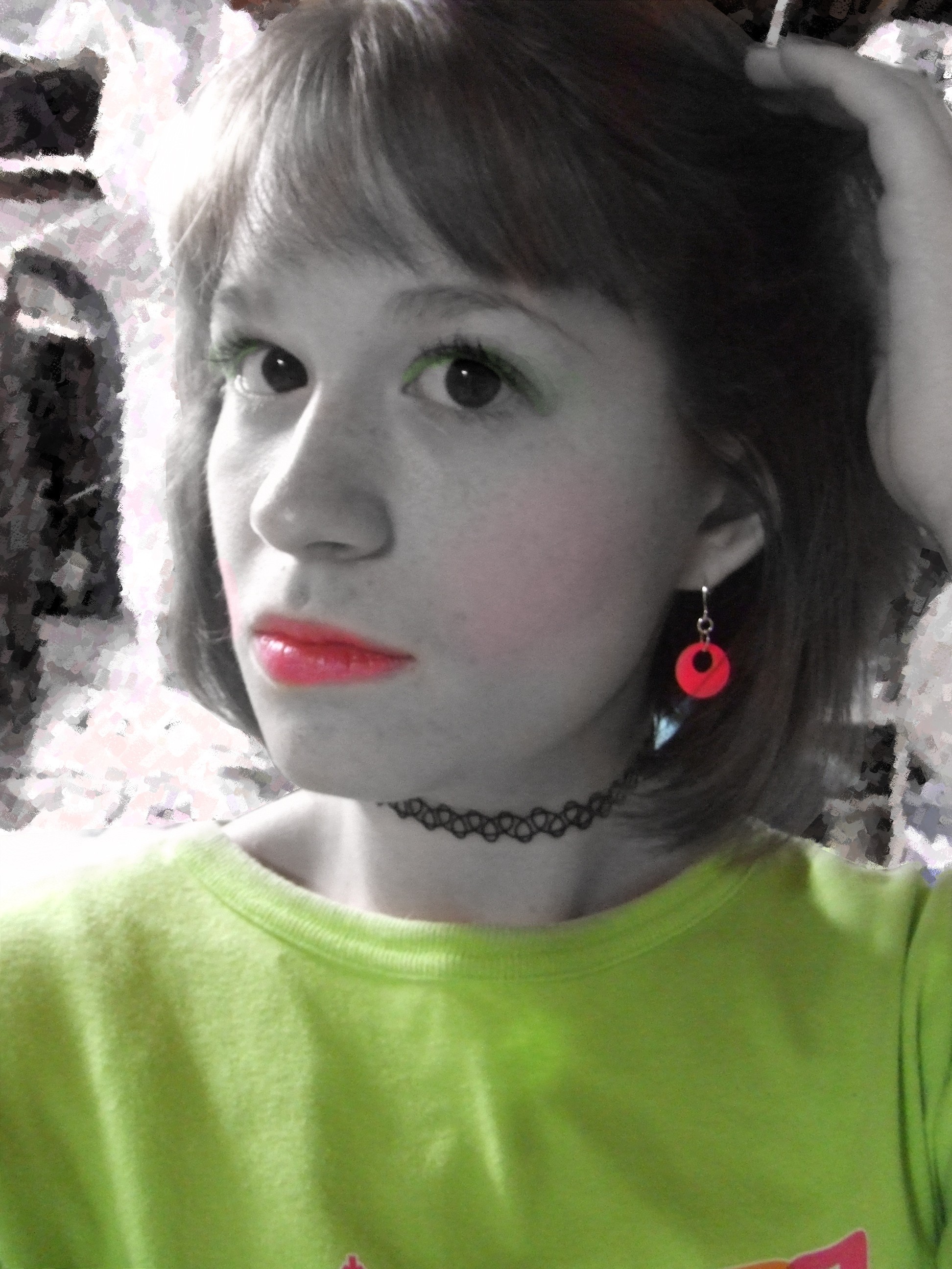
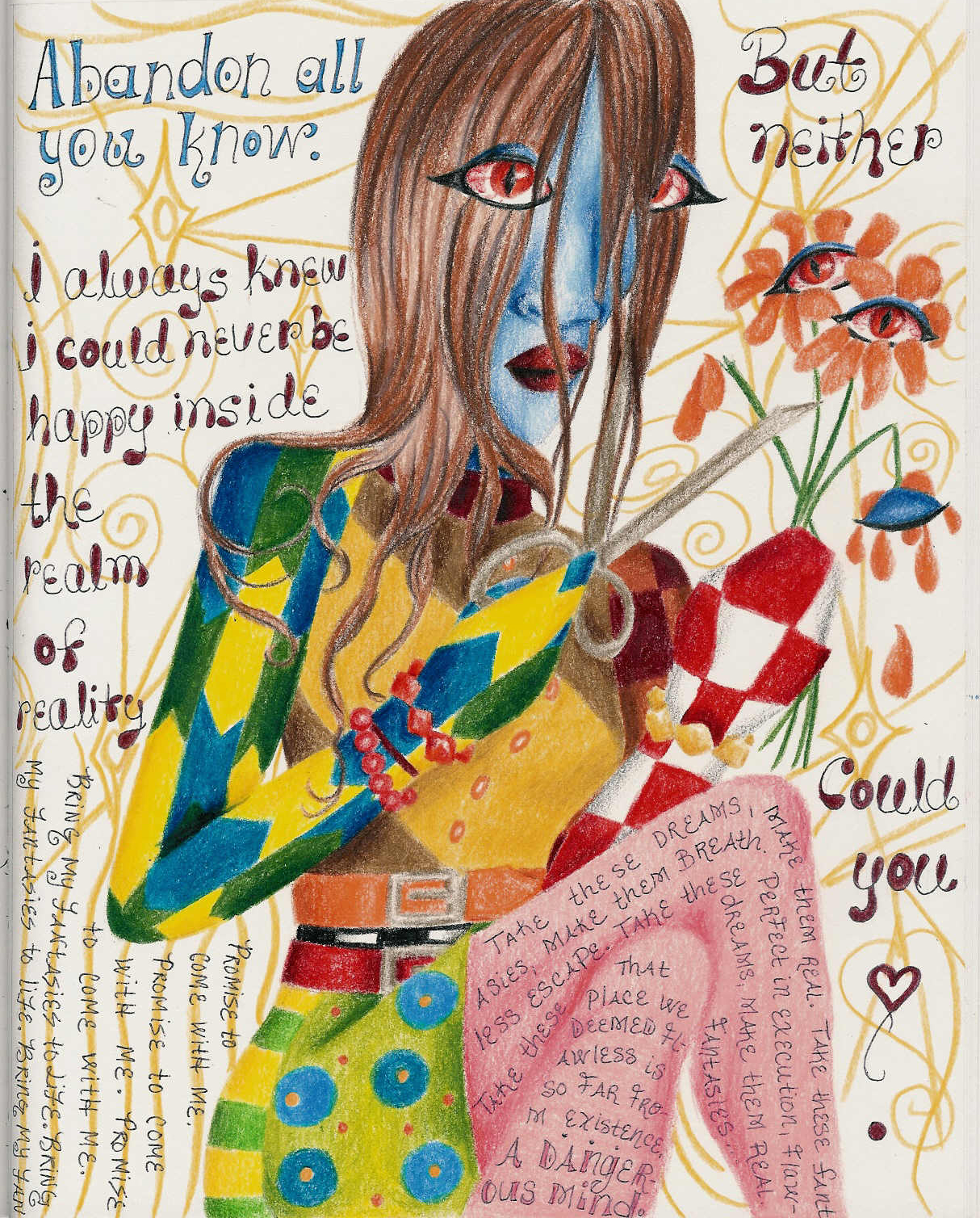
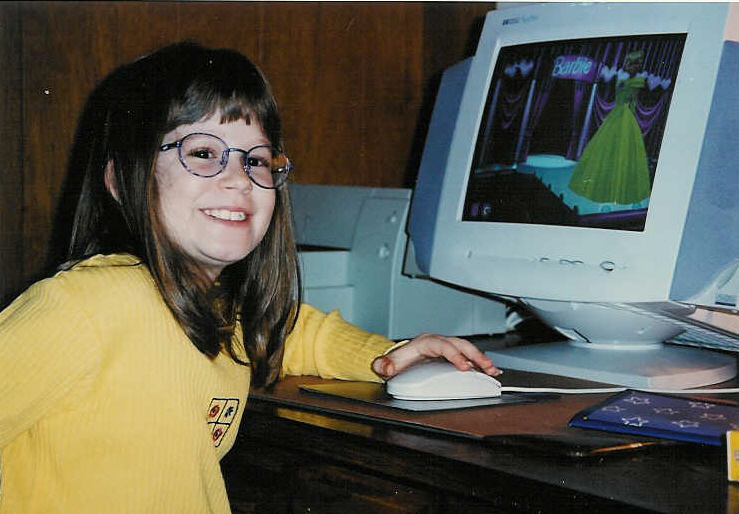
I’ll leave you with some of my early profile pics. The bad editing you now witness actually took a lot more work back then than simply clicking a few buttons. What a time to be alive ^_^. Retro emoji is intentional.


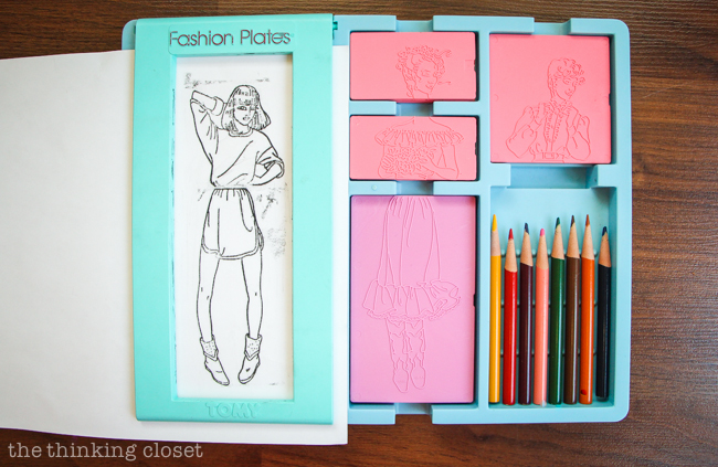


 I never had this, but one of my friends did – The 90s kid version of all that