Techniques and Tutorials

Mid-Century Modern Tea Party – Butterflies

I’m back with another mid-century modern spring illustrations tutorial! Moving on to my next teacup, today I’m doing butterflies. Similar to my last tutorial, you can create any of these designs the same way on paper with any drawing or painting materials you may have on hand. If painting on glass, keep in mind you will need multiple coats if you want solid coverage, but you may also like the transparency – it’s up to you. To keep your designs permanent, they need to be heated in a conventional oven. Put glass pieces in a cold oven, then set to 350 degrees for 30 minutes. Turn off the heat and LEAVE the glass in the oven until completely cooled down.

For this design, you are going to start with 4 teardrop shapes for your butterfly wings. The top 2 should be tilted at a downward diagonal, and the bottom 2 at an upward diagonal. Try to smooth out your paint as flat and even as possible, spreading out any “globs”. I used a flat brush rather than a round, pointed brush to achieve more even coverage. For the flowers, add some upward facing bell or “cup” shapes at different heights. Once the orange dried on my butterfly wings, I chose to streak some yellow over as well with a smaller round brush.

Next, I added some accents over my solid shapes in white. I painted a smaller identical teardrop shape inside each of my wings. I also added an elongated almond shape to the top of each of my bells which will be the opening of each flower.

I also added the leaves by painting green teardrop shapes tilting diagonally upward centered under each of my flower heads. I dipped the opposite end of my paintbrush in paint and stamped dots down the center of each leaf as an added decoration.

The last addition after the leaves was a small orange diamond in between the bottom butterfly wings. This will start the body. The rest of the body will be added with line work.

Next, I added one more set of teardrop shapes inside the white on the wings in yellow. I also used a fine detail brush to add yellow stripes across the small diamond shape in between my wings.

Last is the line work that brings everything together and makes it pop. For this part, you can either use a black paint marker or a small detail brush with a pointed tip. Outline Your outer bell shape, white flower opening, and leaves.  Add a line connecting the flower head to the leaves. To finish the flower, I then used the tip of my brush and a light touch, hardly pressing on the surface, to add 4 streaks radiating up from the base of the flower head. I also added 5-6 short lines inside each flower opening, and then used the opposite end of my brush to stamp tiny dots on the end of each of these lines on the inside of the flower.  For the butterfly, I outlined each teardrop shape that make up the wings, as well as the small diamond shape.

The last detail was adding a line down the center of the wings, with two curved antennae branching off at the top. 

It’s amazing what you can do with simple shapes! I will be doing 4 designs in all with different flowers and insects, check back for more! The final set will be available for sale in Express Yourself Artshop’s Virtual Gallery, an ongoing fundraiser for the arts and wellness program I direct.

Advertisement
Standard
Techniques and Tutorials

Mid-Century Modern Tea Party – Ladybug

The Mid-Century modern design style has been having a moment for awhile now, and while I’m not usually one to latch onto trends I have always liked the geometric, retro aesthetic of this period.

Illustrations from this period are colorful and based on combinations of simple shapes and lines, which make them accessible to even those who don’t consider themselves “artists”. In this series, I am going to show you how to create some cute mid-century modern inspired bugs and flowers in honor of Spring. I will be painting on glassware (I’ve been dying to do something with these clear tea mugs!), but you can create any of these designs the same way on paper with any drawing or painting materials you may have on hand.

Start with a red vertical oval for your ladybug, and scatter some different large polka dots around it for our flower heads. Paint goes onto glass differently than on paper because it can’t absorb into the surface, so you will need to let your shapes dry and add another coat or two for solid coverage. Try to smooth out your paint as flat and even as possible, spreading out any “globs”.

Once we have our red oval, we are done with our ladybug for awhile. Focusing on the flowers, I added two sets of concentric circles to the bottom of my large dots in different colors, letting the paint dry in between each addition.

After that, it’s time for the leaves! Our leaves will just be simple teardrop shapes, placed next to each other at an angle centered underneath our flower heads. Once the green was dry, I added some white dots down the center of my leaves for some extra decoration. You can add a dotted pattern by dipping the end of your paint brush in paint, and touching it to your glass (or paper) using the paint brush end like a stamp.

Last is the line work that brings everything together and makes it pop. For this part, you can either use a black paint marker or a small detail brush with a pointed tip. Outline all of the shapes that make up your flower in black. I added a teardrop shape to the very center of my flower, but you can also just outline the concentric circles and leave the center alone. I added a line connecting the head to the leaves to finish our flowers. For the ladybug, I put a line down the center of my oval and outlined around the entire shape. I then added a half circle in black sticking up from the top, with two short lines for antennae. I used the end of my paintbrush to add a dot to the end of each antennae. If you have some larger paintbrushes, you can also use the end to stamp the larger dots on the ladybug’s body. Otherwise, just use a round brush with a pointed tip to outline a circle shape in the size you want and then fill it in.

Voila! See, that wasn’t so hard :). You can make some beautiful Spring designs to cover anything your heart desires once you learn the basics of how to build forms with simple shapes. I will be doing 4 designs in all with different flowers and insects, check back for more!


Standard
Techniques and Tutorials

Barn Owl Watercolor Tutorial

In light of social distancing precautions, we all are ending up with some unexpected downtime. It can certainly be discouraging and frustrating, but we can also use this time to our advantage to bring something positive out of a negative situation. I will be posting some simple tutorials on a regular basis over the next couple weeks. The best thing to do when things are uncertain is to occupy your mind, especially with something creative. Let’s have some fun!

To create this owl, you will need:

  • Watercolor paper (I used a 6×6″ piece, but you can work bigger if you’d like as well)
  • 3 Paint colors: Grey (or if using black add a lot more water to lighten it), Burnt Umber (or any dark brown), and Raw Sienna (or any bright, warm brown)
  • A large (I used size 8), medium (I used size 5), and detail (I used size 0) round brush (The brushes that come to a point at the end).
  • A medium size flat brush (The brushes with rectangular bristles, flat on the end).
  • A pencil
  • Optional: Black liner pen (Like a fine point Sharpie!)

Start with a light pencil outline made from basic shapes to guide your painting. Draw a circle for the head, a teardrop shape coming diagonally out from that circle for the body, and another smaller teardrop shape sticking out from the bottom center of the body for the tail feathers.

Using your large round brush, water down your raw sienna paint – you do not want this first layer too dark. Following the shape of the body keeping all your brushstrokes in the same direction flowing downward, fill in the wings, leaving the head and the chest white for now.

Using your detail brush, make some jagged up-and-down strokes with a watered down grey along the front of the chest, underneath the head, and along the back of the neck.

Rinse off your detail brush, and using the same brush strokes go over your grey you just added to the chest and neck with water. This will help blend the grey so your transition from grey to white is more gradual, and you end up with a soft, feathery look. Next, using your detail brush and watered down grey, outline a pointed “U” shape in the center of the face. Make some radial brush strokes sticking out from the top of the U where the eyes will be using your detail brush.

Still using your detail brush, add some radial strokes along the outside edge of the head, including one ray down the center from the top pointing to the beak. Add some grey to fill in the end of the beak. Rinse off your brush, and lightly brush over what you just added with a damp brush to blend it.

Continuing to use your detail brush, add a border around the head with raw sienna using short, radial strokes pointing inwards towards the face. Don’t forget the widow’s peak up top :)! Water down your raw sienna a bit more, and add some of this pale warm brown to the area where the eyes will be, using radial brush strokes again pointing outward from the top of the U shape.

Next, we are going to start adding texture to the feathers. Dip your medium round brush in some raw sienna with a little less water so the coverage is a bit darker than the base underneath. Stamp up and down over the entire area to create blots of color (This is called stippling.).

Do the same thing overtop while the raw sienna is still wet with the burnt umber on the top section of the wings. Add a bit of water to your umber first, but you still want it to be pretty dark.

Then, use your detail brush to create some thin outlines in burnt umber. Hold your brush at a 90 degree angle to your paper and use a light touch, hardly pressing down at all as you drag your brush to create thin lines. Create a darker outline around the inner edge of the raw sienna outline around the face. Outline the wing, and add some lines to the bottom section of the wing and tail feathers following the direction of the shape.

Still using your detail brush and burnt umber, make some groupings of short, vertical brush strokes to create striping in the wing and tail feathers in between the lines. Make them jagged and uneven for a more realistic feathery look.

Next, using your flat brush add some more water to your burnt umber. Using the width of your brush, drag a diagonal line underneath the owl starting at the bottom of the chest.

Go back to your detail brush, and grab some burnt umber with a little less water mixed in so you get a darker color. Add some short streaks of this darker shade over the post while it is still wet. Then, using the very tip of your brush, lightly add some speckled dots over the chest. Less is more! You still want to see mostly white.

IMG_20200317_110314

Now for the finishing touches! Use your detail brush to create a hooked shape with the burnt umber for the talon. Use your medium round brush to add a dark burnt umber feather shape visible from behind, between the tail feathers and the post. The last step is the eyes. Create a downward slanted football shape in the area we shaded for the eyes. You may use your detail brush to fill in the eye in grey or black, but you can also use a black liner pen for a little extra control. Be sure to leave a small circle open near the top of each eye for the reflection – This is what really makes your owl look alive!

I hope you’ve enjoyed this tutorial! If it didn’t come out exactly how you expected the first time, remember it just takes practice and the goal is experimenting and fun. No matter the outcome, you know more than before you started!

You don’t have to use natural colors for this project either. I think it would be fun to try a whimsical, fantasy owl in wild colors like purples, oranges, magenta, lime green … There are no rules! If you feel like sharing, post a picture in the comments of how yours turned out and as always, if you have questions don’t hesitate to ask! Stay safe everyone!


Standard
Art Education, Techniques and Tutorials

Colors Aren’t Scary! Understanding The Color Wheel.

A new Artshop semester has started at Creative 360.  One of the biggest concerns my students bring to my attention in classes is “How do  I know which colors to use?” What colors can they mix together, and what colors basically turn to poo the moment they touch each other? Everyone probably has some vague memory of the color wheel from way back when in elementary school art class, but few remember what it actually is aside from a pretty rainbow circle.

printable-color-wheel-tertiary-colors2

Primary colors are like the color gods and goddesses. They are colors you don’t mix anything to get, they just are, and they are used to create all other color life. See the starred sections above, red yellow and blue. In between the primary colors, the color wheel shows you what will happen if you mix two of them together. For example, in between the red and blue space are various shades of purple, depending on if you mix in more red or more blue. If you mix all 3 primaries together, you get a neutral color (brown or grey/black depending whether there is more warm red or yellow, or more cool blue present).

Contrasting colors are colors that are opposite each other on the color wheel, note the black connecting line. Contrasting colors as a rule look amazing together due to how boldly they play off of each other (There are a lot of sports teams I can think of whose colors are blue and orange for example, and I don’t even follow sports!). However, if you mix them to try to make a new color, they will completely neutralize each other into a grayish or brownish color. Remember how all 3 primaries mixed together make a neutral? Well, think of why this would happen when you mix orange and blue, contrasting colors, together… Orange is made with red and yellow, add the blue, and you have all 3 primaries mixing.

Complementary colors are colors that are right next to each other on the color wheel. Because they are very similar, these colors always look pleasing together as well.

Look familar? The artwork on the left uses a contrasting color scheme of red and seafoam green. On the right a complementary color scheme is used with all different shades of purple, and some pink and dark red accents.

These color pairings aren’t just for artwork, they work well in interiors and clothing as well. Below is an interior idea based on my watercolor painting “If The Ocean Dreamed” that I mocked up on Polyvore, which is a really fun interior and style designing website to play around on. All items you can add to your “set” include links where they can be purchased as well.

47120f53515b0118a06ceaa705a7ea3b

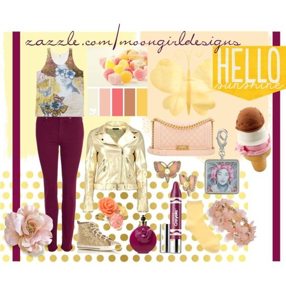
Once you’ve got the gist of it, you can become a C O L O R  M A S T E R and even get tricky and combine both contrasting AND complementary color schemes in one, like below. This is another fun set I put together on Polyvore using clothing I am selling on zazzle covered in my original artwork. This tank top features my piece, “Be My Eyes”. In styling this outfit, I used the contrasting color scheme of yellow and purple with the gold and plum apparel, but also added in some pink with the accessories as pink is a reddish hue that would be next to purple on the color wheel.

dfd8dc78bad5b070db0f0489b770551e1

The last type of basic color scheme is triadic. A triadic color scheme uses three colors that are equidistant from each other on the color wheel. Using only the primary colors red, yellow, and blue would be a triadic scheme as they are spaced equally apart on the color wheel. Another triadic scheme is green, orange, and purple, which I’ve used in the interior below.

344a8aa27feebce0011ec12180c5868d1

Appropriate that I will be going on an adventure to Lowe’s to collect paint chips shortly after I post this as my boyfriend and I will be moving from an apartment into a new home by mid June, and this means …. I can paint the walls! 

I have to end this post like a proud art-parent with a selection of my Artshop students’ work from my watercolor class last semester. Looking forward to teaching another great class!


Standard
Techniques and Tutorials

Start Drawing Amazing Eyes!

Eyes have always been my absolute favorite thing to draw, and I tend to accentuate them in all of my artwork. They can also be one of the most difficult things to draw, and it takes a lot of practice to get them right. There are a lot of picky little details to pay attention to. When we begin drawing an eye how we “think” we should, without really observing an actual eye’s appearance as if we have never seen one before, we tend to end up with a drawing like below. Generic football shape, outlined individual eyelashes, harshly contrasting pupil and highlights, and those pesky little lines jutting out all around the center like a kid’s drawing of the sun. In reality, an eye’s darks and lights are much more subtle and blended, each person’s eye is a completely different shape, and unless we are drawing a huge zoomed-in eye filling an entire 18×24″ piece of paper, you wouldn’t actually see individual eyelashes. I’d like to share my tricks of the trade with you. Grab a piece of paper and follow along. It will be fun, I promise! Don’t worry about doing everything “perfect”, just enjoy sketching. Every artist does things slightly different, and the more you practice you may discover some of your own “tricks” that work for you.

eyenono

  1. Lightly outline the contour of the eye. Don’t just draw an oval with half circles above and below it. Pay attention to the exact curvature of the unique eye you are trying to draw (photo references are always good.) Is it wider on one side than the other? Does the eyelid dip down drastically or does it curve more gradually? Are the curves of the eye and eyelid soft and smooth, or more angular? Is the eyelid rounded or more flat on top? Is the fold under the eye parallel to the bottom eyelid, or does it droop diagonally? Sketch lightly, as you don’t want to see harsh outlines through your shading.
  2. Shade the outside perimeter of the eyeball. The darkest shading is always at the two corners of the eye, and gradually fades as you get closer to the iris. There will also be a deeper shadow underneath the eyelid since the lid overlaps our eyeball, blocking the light from reflecting as much up top.
  3. Shade around the iris, again with slightly deeper shading closer to the top eyelid. Even if you don’t explicitly see shadows near the iris in your photo reference, the white of our eyes are never really pure white, and you will get a much more realistic look if there is a gradual transition between the iris and the white of the eye, rather than going from fully colored in iris to stark, clean paper in the white of the eye. This step helps the iris look “settled” into the eyeball rather than looking as if it is “hovering” on top if it.
  4. Add your darkest shading on the top of the iris. This should be a shade darker than your darkest value that you used previously underneath the eyelid when you shaded the white of the eye. Think of a crescent moon facing downward, with the thickest shading up top, getting thinner and then altogether disappearing as it trails down around the edges of your circle shape.
  5. Add in your pupil and reflections. The reason we do this next is because we want to have the reflection areas mapped out before you get to shading the rest of your iris. You can go in with an eraser and add highlights by removing shading afterward, but this can be messy and end up smudging work you don’t wish to be smudged. I find it easier to just leave the highlights white to begin with. The location varies by light source if you are using a photo reference. Without a specific reference, it is safe to add two highlights, one on top and one on bottom at a diagonal to each other. Fill the pupil in dark black. This will be your darkest value.
  6. Shade around the pupil using the same value you used to shade your crescent moon around the top of the iris, one step lighter than black. Again, this anchors the pupil inside the iris so it doesn’t seem as if it is floating on top. This gradual gradation from dark to light makes the separate parts appear as a whole.
  7. Fill the remainder of the iris with a medium value. Again, we want all our value transitions to be gradual, so get a little lighter when you begin shading around the edges of your highlight areas.
  8. While we don’t want radial stripes circling the inside or our iris, we don’t want to smooth all the visual texture out of it either, as the striations of dark and light we see are part of the deep beauty of eyes. Literally “scribble” some slightly darker shading shooting out from the pupil in the two areas between our highlights. Again, please scribble though it may seem odd and scary; we don’t want neat, individual lines extending from the pupil.
  9. Add the tear duct by simply finishing the shading around your eyeball, cutting off the little teardrop shaped dip in the inner corner.
  10. Shade your eyelid! Shade the darkest in a thin line over the crease you originally outlined. Don’t just trace your line darker, shade by moving your pencil back and forth swiftly in short strokes over this line. Above this, shade a touch lighter to again make a gradual transition from dark shadow to white paper. Shade darkly also over the curved line directly above your eyeball, the edge of the eyelid. This will provide a foundation for the eyelashes, which we will add later. Shade along the bottom eyelid like this also.
  11. Shade the bottom crease under your eye. This is not a direct “fold” so it should be lighter than the shading for the eyelid since it is less in shadow. Shade deepest along the line you originally sketched, and shade lighter around this line on top and bottom. Extend the shading up to the outer corner of the eye to really show the skin curving. Add some light shading under the dark crease of the upper eyelid.
  12. We’re going to scribble again! Add some jagged shading pointing out from the top and bottom eyelid where the eyelashes will go, more so on top than on bottom. Do this in a medium value.
  13. Now, you can go over and add some individual curved darker lines sticking out to add some detail to your eyelash area. Don’t make them all the same length, and try to curve them – no straight lines poking out! Add a bunch overlapping each other using swift, light strokes with your pencil. They should be dense and close together.

These are not hard and fast “rules”, and once you’ve practiced the basic guidelines you can twist them to create entrancing eyes in your own unique artistic style, both realistic and more comic or stylized.

Speaking of eyes, I just designed a new pattern for Redbubble covered in glamorous eyeballs for your enjoyment. Check out all the cool new products featuring my digitally drawn pattern Mascara Tears here!

Feel free to throw a comment my way if you have any other drawing questions, I’m always open for giving tips. Any best practices other illustrators out there have found helpful? Don’t hesitate to share!

Standard
Project Ideas

Book Pages and Metallic Paint = Instant Classy.

Every so often I get bored and dissatisfied with the state of my walls and need a change. I’d had some Alice In Wonderland etching coloring book pages framed above my couch since I’d moved into the apartment. I’d filled them in with markers, giving Alice hot pink hair, and my boyfriend was even starting to comment, “So… are you ever going to take those down?” Apparently the appeal of pink haired punker Alice was lost on him, and he also couldn’t fathom why I would hang up coloring book pages when I have so much of my own art at my disposal. I do decorate my home with some of my own work obviously, but you have to understand, I get real tired of staring at my own art. I’m staring at it the whole time I’m working on it, and when it comes to my walls, I want to give my eyes something new to get excited over. The coloring pages had overstayed their welcome a bit, and the magic marker was getting ridiculously sun-faded. But, I didn’t want to spend the time making 3 new fine art pieces just to hang above my couch when I knew I had exhibits coming up to get ready for.

I don’t know if anyone uses those 12×12 paper flip calendars anymore … They are a bit of a relic nowadays, but I always insist on getting one from those giant kiosks in the middle of the mall set up around Christmas simply for the cool pictures. Art Deco is one of my absolute favorite design periods, so for the past 2 years I’ve gotten the Erte calendar. This fashion artist is responsible for the loveliness below – so yes, he completely rocks.

You can buy 12×12 scrapbook frames at any craft store and hang calendar page art as is (the cheapest prints you will ever find), but I decided to take it a step further to create the trio below.

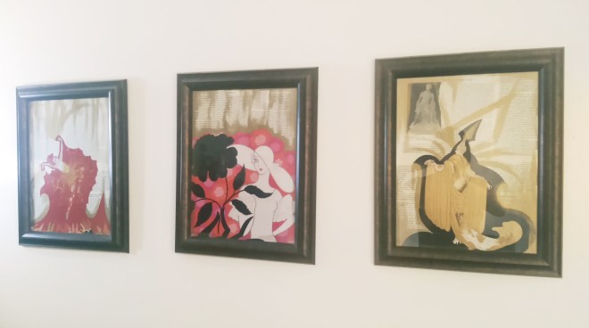
trioThese pieces only took an afternoon to create. First off, a background made of book pages makes anything look instantly classy. If you are like me and love books, tearing one to pieces could take a lot of soul-searching. Therefore, I picked up the most dull, dry, uninspiring book I could possibly find from the red dot $1 bin at Barnes and Noble so that I wouldn’t feel I was doing any disservice. The opposite, I felt I was improving upon the provided material by turning it into art. I first tore out about 6 pages per picture, then adhered 3 pages layered on top and 3 on bottom to the cardboard backer that always comes with frames. I found brushing tacky glue onto the back with a combination of a cheap throwaway paintbrush and one’s finger worked best. I then flattened the bookpage-covered-cardboards under a pile of magazines to dry. While the glue was drying on those, I found 3 calendar pictures I liked and cut out the main subject from each page. You could do this with any calendar theme, cutting out a large central image be it a flower, an animal, a boat, your favorite entertainer, whatever makes you happy to look at. I then brushed tacky glue onto the back of each of my calendar cutouts. I pressed them on, smoothing them out with my fingers, making sure there were no bubbles, and then put the pieces back under the magazines to dry flat. Next, out comes the metallic paint! Metallic acrylic paints are just magic and make every single thing look way better. You don’t have to be an artist at all to accent your new decoupage calendar pictures with paint. The “distressed” look goes awesome with the torn out book pages, and for this technique the messier the better. Grab a large flat brush, and make sure you keep it dry – don’t dip it in water until you are finished. Dip some paint on your brush and simply swipe across your piece. The paint will naturally catch where the pages layer and overlap lending a cool texture. If you don’t feel intuitive with the paint, an easy out is to simply paint along the edge of the image you glued down to emphasize it, and also brush along the corners or all the edges of the actual rectangular piece to “frame” your collage. You’ll be surprised at how amazing these turn out. You’ll have people asking where you bought them, when all it was was less than $5 of supplies and a couple of hours.

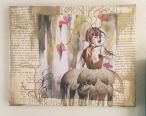
Doing more rearranging later due to visiting the Midland Antique Festival and buying yet more wall art, I decided to make a wall collage above my dining table which is something I’ve always wanted to do. My framed original portrait drawing, collaborative mixed media canvas piece I’d made with my boyfriend, and my crazy little 60s-big-eyed-circus-child all had a vintage, weathered look to them with lots of beige and ivory amongst the pops of color. I needed some super small pieces to tuck in between the gaps in the arrangement, but 5×7-8×10 frames are usually meant for table tops and just don’t look right on the wall, and the frames’ heavy, dark edges were taking away from my more focal pieces. I needed something on a small canvas, but once again, was pressed for time. Though I wanted my collage to look good, I did not want to make 2 miniature acrylic paintings with all the other projects I had going. I had a value pack of 8×10 canvases I’d gotten at Michaels that calculated out to $1 per frame at the end, and decided, what the heck? When in doubt, cover them in book pages. Once I had the entire front and sides of the canvases covered in tacky-glued pages, I went to Staples and got 2 of my original works printed small on standard printer paper, tore the edges to make them uneven, and glued them to the relative center of my canvas. If you don’t make art yourself, you could still do the same thing with magazine pictures, digital photos you’ve taken, or works by famous artists copied from art history books. Antique or vintage-inspired images look best with the book page background. Of course, I had to metallic up the edges with some gold paint, and once again I had put in an hour or two of work for a really cool end product.

I fell off a chair and dented the entire right half of myself trying to hang this up, so it better look kickass!

I fell off a chair and dented the entire right half of my body trying to hang this up, so it better look damn good!

I hope some of you will try this out. Even not-so-great looking decor can be super expensive, and these projects are FUN even for non-artists (promise!) and will add a ton of personality to your abode. Collaging is even suggested as a relaxation technique when under extreme stress, so this project could be just what your day off needs. I’ll be taking a break from art and heading off to Ludington tomorrow for a mid-week weekend of hiking, swimming, and generally being outdoors from morning till the wee hours of the night. Hopefully I come back refreshed and inspired ^_^.

21

Standard
Techniques and Tutorials

Drawing Profiles and Roaring 20s Twisted Damsels

In both portrait drawing and portrait photography, the most dynamic of compositions often involve partial or full profiles, because profiles by nature create more interestingly shaped negative space around a figure. Profiles are also THE most dreaded type of portrait to draw. For years I shunned them after far too many failed attempts, my lovely subjects coming down with the dreaded gorilla-lips curse; that tragic moment when you end up with either too much or not enough space between the nose and chin to squeeze the lips into, and then there is the question of how far should the lips actually stick out anyway? Hence, we end up with the look of a monkey trying to blow a patron a kiss at the zoo… not good. I forced myself to peruse tutorials after finding far too many wonderful 1920s flapper photographs of kickass ladies I wanted to include in my compositions, all taken in profile! Coupling this with my own experimentation, I believe I have come up with some pretty solid methods to make drawing profiles easier. What works for one artist may not necessarily work for another and there are many different approaches, but I hope this gets you started.

*Some of the angled guidelines appear to be a bit different in the photo versus the drawing, but don’t be confused! The images got put into my scanner and they simply weren’t all lined up *perfectly* straight since the paper I used was too big and hung off the edges of the scanner to begin with. So, ignore any of these visual discrepancies as scanner error :)*

*The reason I don’t start with the classic “oval head shape* is because a profile tends to deviate from that roundness eventually anyway, and you will inevitably run out of room in the end and wind up trying to squash the mouth into that restricting beginning oval size and shape. Doing this, you will either not have enough room between the nose and mouth, or have a nonexistent chin. It’s much easier for me to get the features down first, and then use a measuring tool (I always go with the eye) to inform you in how high the forehead should rise, how far back the rest of the skull should extend, etc; everything kept in proportion to everything else.

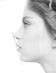
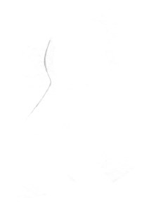
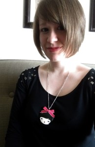
This is the image we will be working from. You will notice the line running diagonally from nose to chin - this is a lifesaver! On every single face, no matter what the proportions, the end of the nose, lips, and chin will all touch a diagonal line drawn from nose to chin, the exact angle of this line may just vary. This will be a HUGE help to us later.

This is the image we will be working from. You will notice the line running diagonally from nose to chin – this is a lifesaver! On every single face, no matter what the proportions, the end of the nose, lips, and chin will all touch a diagonal line drawn from nose to chin, though the exact angle of this line will vary. This will be a HUGE help to us later.

Have you ever seen artists when drawing a still life or model lifting their pencil up, squinting at it, and then laying it against their paper? They are using their pencil as a guide to gauge the correct angle, and we can do that with a photo reference as well.  Lay your pencil against the angle of the forehead to gauge the angle start, and then move the pencil over to your paper and create that same angle.

Have you ever seen artists when drawing a still life or model lifting their pencil up, squinting at it, and then laying it back down against their paper? They are using their pencil as a guide to gauge the correct angle, and we can do that with a photo reference as well. Lay your pencil against the angle of the forehead, and then move the pencil over to your paper and create that same angle in a light pencil line.

Use the same pencil technique to gauge the under slope of the forehead as well as the angle of the nose. Round out the intersections of these 3 lines. Don't worry about the length of the nose yet, just make the line.

Use the same pencil technique to gauge the under slope of the forehead, as well as the angle of the nose. Round out the intersections of these 3 lines. Don’t worry about the length of the nose yet, just make the line.

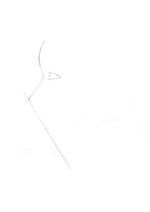
Next, outline the eye relative to the size of the slope between the forehead and nose. This is important because the eye will be used as a handy measuring tool in the future. Don't worry about the unique shape of the model's eye right now, just make a rounded off triangle of proportionate size to the bridge of the nose.

Next, outline the eye relative to the size of the slope between the forehead and nose. This is important because the eye will be used as a handy measuring tool in the future. Don’t worry about the unique shape of the model’s eye right now, just make a rounded off triangle of proportionate size to the bridge of the nose.

Now, use the eye height to measure the length the nose should be. How many eye heights fit down the length of the nose? In this case it was 3. Mark off that end point. From that point, draw your diagonal line that will be a guide for the mouth and chin as well, using your pencil to gauge the angle from the photo.

Now, use the eye height to measure the length the nose should be. How many eye heights fit down the length of the nose? In this case it was 3. Mark off that end point. From that point, draw your diagonal line that will be a guide for the mouth and chin as well, using your pencil to gauge the angle from the photo.

There are many different techniques for this step, just check out pinterest. What I've found easiest is concentrating on the shape of the negative space created between the diagonal line and the facial features rather than the facial features themselves.

There are many different techniques for correctly outlining the shape of a portrait’s features in profile, just check out pinterest. What I’ve found easiest is almost ignoring the features and concentrating on the shape of the negative space created between the diagonal line and the facial features rather than the facial features themselves.

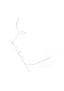
Concentrate on the 3 shapes of negative space created, between the nose and top lip, between the top and bottom lip, and between the bottom lip and chin, and draw them in. Definitely use your pencil to gauge the angles. Then, step back and compare what you have to the photo, note if anything doesn't look quite right, and touch up where need be.

Concentrate on the 3 shapes of negative space created, between the nose and top lip, between the top and bottom lip, and between the bottom lip and chin, and draw them in. Definitely use your pencil to gauge the angles. Then, step back and compare what you have to the photo, note if anything doesn’t look quite right, and touch up where need be. Also, use your pencil to gauge the angle of the chin. Draw the line on your paper, and round off where this new line intersects with the already existing diagonal.

Go ahead and add the iris, and the eylid and the arch of the eyebrow. Don't just draw a generic, upside down smile eyelid on top. Pay particular attention to the reference's unique eyelid shape. Also, add some detail to the nose. Note that the nostril ends at about where the lip curves out. Also, gauge the angle with your pencil of the front edge of the eye to the curve of the side of the nose. Draw that angle lightly on your paper. This will indicate where the curve should fall. Once again, don't just draw a parentheses - note the distinct shape of the reference's curve around the nostril - it's a little more straight. As you draw more potraits, you will find that noses (and eyes, and mouths for that matter) are literally like snowflakes - absolutely no two exactly alike.

Go ahead and add the iris, and the eyelid and the arch of the eyebrow. Don’t just draw a generic, upside down smile eyelid on top. Pay particular attention to the reference’s unique eyelid shape. Also, add some detail to the nose. Note that the nostril ends at about where the lip curves out. Also, gauge the angle with your pencil of the front edge of the eye to the curve of the side of the nose. Draw that angle lightly on your paper. This will indicate where the curve should fall. Once again, don’t just draw a parentheses – note the distinct shape of the reference’s curve around the nostril – it’s a little more straight. As you draw more portraits, you will find that noses (and eyes and mouths for that matter) are literally like snowflakes – absolutely no two exactly alike.

Measure how many eye lengths are between the top of the eye and the hairline. Make a mark for the hairline. Use your pencil to gauge the angle between the corner of the eye and where the chin line ends. Make a mark on your paper where the jaw line should end, and curve it up.  Now also know where to properly add the bottom of the ear. It should line up with the angle off the end of the jaw line. The bottom of the ear should always line up with the height of the mouth on a face.

Now measure how many eye lengths are between the top of the eye and the hairline. Make a mark for the hairline. Use your pencil to gauge the angle between the corner of the eye and where the chin line ends. Make a mark on your paper where the jaw line should end, and curve it up. Now you also know where to properly add the bottom of the ear. It should line up with the angle off the end of the jaw line. The bottom of the ear should always fall height wise lined up with the height of the mouth on a face.

Gauge the angle of the hairline with your pencil, and draw that diagonal in where you had your mark at the top of the forehead. Gauge the angle between where the hair drops down and the mouth. Mark that line lightly, and create the second curve for the hair.

Gauge the angle of the hairline with your pencil, and draw that diagonal in where you had your mark at the top of the forehead. Gauge the angle between where the hair drops down and the mouth. Mark that line lightly, and create the second curve for the hair.

Voila! You have a pretty good start to a profile. It still is going to take a TON of practice, but hopefully this advice will make the practice considerably less painful :).

Voila! You have a pretty good start to a profile. It still is going to take a TON of practice, but hopefully this advice will make the practice considerably less painful :).

I took on profiles in this new design for redbubble, the classic flapper with a twist. Check out those eyes! I am having fun designing more bizarre vintage characters, though I'm eventually going to have to go back to my large piece I'm trying to finish. But... not yet ;).

I took on profiles in this new design for redbubble, the classic flapper with a twist. Check out those eyes! I am having fun designing more bizarre vintage characters, though I’m eventually going to have to go back to my large piece I’m trying to finish. But… not yet ;). This snazzy lady’s available on bags, phone cases, even a duvet cover!

Standard
Project Ideas

Creating Mixed Media Work Inspired By Photography

I love mixed media work that layers and collages varying elements into one piece, but still creates a cohesive universe, a dreamworld with the same depth and breadth as the natural world around us. I’ve found the best way to create mixed media work that maintains perspective and three-dimensionality is to base your piece off of photos you’ve taken. I usually build a concept first, then find photos that support the design I’ve constructed in my head. Those that don’t know where to start can begin with a photo that has meaning to them, one they find inspiring, or one that just plain looks pretty and build from there. I’m going to take you through my process for creating mixed media pieces inspired by photography, but each person may approach their own process a little differently once they get started.

The Dance, Awarded Best 2D; prismacolor pencil, ink, watercolor, fabric, book pages, embroidery thread

The Dance, Awarded Best 2D “Piece By Piece” at Creative 360 Gallery; prismacolor pencil, ink, watercolor, fabric, book pages, embroidery thread

Quite literally, frolicking in the woods. I knew these poses wood come in handy for something one day ...

Quite literally, frolicking in the woods. I knew these poses would come in handy for something one day …

An outtake from playtime :)

An outtake from playtime 🙂

Once you have your concept and your photo(s), the first thing you want to do is break your image down into components, and decide what material will be used for which component. A sketchbook comes in real handy for jotting down notes during this part of the *adventure*.

For “The Dance”, I first thought of what needed texture, and what didn’t. The ground covered in fallen leaves was certainly full of visual texture, as was the bark on the trees. The figures and the path could be left flat – you don’t want to overdo the texture or a piece can get confusing. Framed by the raised texture, this would also help the figures stand out as the focus. Only a handful of the trees in the woods were actually birch, but I knew I wanted a lot of light colors so the girl’s gowns would be in stark contrast to the background, similar to in the black and white photograph. Therefore, I decided to make all the trees in my mixed media birch bark. FYI, book pages are fantastic as birch bark. The color is already spot on, and the all over text compliments the black circles and rings that tattoo its surface. I twisted the paper into thin tendrils for the roots and branches to bring the trees off the page. As for the ground, I used torn muslin fabric. The white color allowed me to use the fabric similar to plain paper once applied, and layer watercolor paint over it until it reached the desired color. Torn fabric is great for ground cover because it frays, creating a believable texture all on its own. I knew I wanted the dresses to be done in ink because ink appears lighter in weight and airier, and would communicate the translucent flow of the skirt. Colored pencil works well for tiny, precise detail and I also am far better at drawing the human body than painting it, which is why I used pencil for the head and hands. Ink was used for the path as well, because once again I wanted a “light” feel to the path to help it stand out and so I could better capture the strong light source hitting it from the sun. The ink also transitions well into watercolor. Transitions are still important even in more “assemblage” type projects. When creating mixed media scenes, though you are in essence collaging, you don’t want to completely have that seamed together, cut and paste look.

The choices I made for “The Dance” were based on two things; first, what look do I want to achieve but also second, what is practical based on my strengths and weaknesses with the various materials? This second deciding factor will be different for each artist. I have learned from teaching that many, many other artists do not enjoy drawing people as much as I do, and quite a few even flat out despise it. If this is you, for a piece with people in it you may choose to have the figures printed and cut them out, pasting them into the scene rather than drawing them. A way to work photography into the piece so it doesn’t look separate from the rest of the environment would be to perhaps print them in black and white or sepia and then “colorize” the photos by lightly shading over the eyes, hair, cheeks, etc. with a colored pencil. You can also add three dimensional elements over the photo such as some fabric leaves blowing across the body, a small paper flower on the person’s jacket or in their hair, or gluing actual fabric over their clothing. This “anchors” the photo of the person/people within the environment to become part of the entire piece rather than a separate cutout element.

"Actually, It Is This World That's Too Small", Mixed Media

“Actually, It Is This World That’s Too Small”, Mixed Media

My 10 year reunion is coming up next year, and the clothes I used to wear are officially beginning to look silly. Short sleeved turtleneck sweaters for the win! And always striped tights, because The Dresden Dolls (would still rock those!)

My 10 year reunion is coming up next year, and the clothes I used to wear in high school are officially beginning to look silly. Cap sleeved turtleneck sweaters and pre-worn jean skirts for the win! And always striped tights, because Amy Brown fairies and The Dresden Dolls (I would still rock those!)

“Actually, It Is This World That’s Too Small” is a mixed media piece I based on a photo a friend took in high school while we were hanging out, playing around with cameras in my basement. I never felt that I shared much in common with “typical” teenage girls, but a desire to constantly take photos of each other was one stereotypical trait my friends and I all did share – just sometimes my photos involved face painting or cardboard masks rather than manicures and false eyelashes. I found it interesting how the angle of the photograph made it look like the door behind me was miniature, like the door the white rabbit escapes through in Alice In Wonderland. You can see how the photo serves as a guide and an inspiration, but by no means dictates what your final piece has to look like. Creative alterations are always an option, and encouraged.
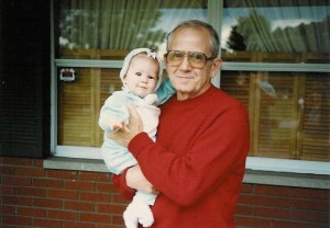
Old family photo with Grandpa (I can't believe I'm posting this, but for the sake of art ... I will publicly expose baby photos - at least the non-embarassing ones).

Old family photo with Grandpa (I can’t believe I’m posting this, but for the sake of art … I will publicly expose baby photos to the online universe – at least the non-embarassing ones).

What’s really awesome is that beyond conceptual art, you can apply this same technique to family photos, and make a truly meaningful piece of work that is entirely personal. I’m going to talk you through how I would approach this photograph above if I were going to turn it into a mixed media piece. This will give you another example that will hopefully help you solidify how to proceed on a project of your own. I would probably draw the people since I adore portraits and figures, but once again if figures are not your thing, you could print yours from an enlarged photo and collage them in – it’s totally allowed :). There is really no reason to just color in a solid red shirt, so I would probably trace a pattern to get the right shape, and then cut the sweater out of fabric and paste it over my grandpa like I did with the purple dress in the staircase piece shown previously. Remember, always look for places to add interest with different materials. Due to the light, reflective nature of the window glass, I would use a mix of ink and watercolor for that part. The bricks are definitely the most textural element in this particular photo, so for those I would mix a gritty element like sand into acrylic paint, and create a rough, uneven texture in dark red on the wall. Once dry, I would then paint the grey cement lines over with a thin brush. For the sake of my sanity and also to make it more interesting and less institutional looking, I would probably change the brick to an uneven pattern of varying size and shape as opposed to the uniformity that was there in real life. How else can we add interest? In the photo, there are no flower boxes on the windowsill, but why can’t there be? You can cut flowers out of paper or white fabric and color them with ink or watercolor, or you can glue on small ribbon rosettes available in the floral or wedding aisle of most craft stores.

I hope this post has given you some ideas, and I’d like to end with a simple (though not set in stone) guide as to when certain materials are most beneficial when creating your own mixed media wonderland.

Watercolor: overall background coverage, light or translucent forms, florals, glass, water

Ink: flowers and plants, light or translucent forms, fabric, glass, water, figures/faces/skin/hair

Colored Pencil: small details, figures/faces/skin/hair, birds or furry animals, stone or bark

Fabric: clothing, flowers and plants, ground cover (soil, grass, leaves, etc), interior wallpaper

Book Pages: trees and bark, interior wallpaper, flowers

Sand Mixed With Paint: brick, stone, dirt

Other Accoutrements: embroidery thread sewn through the paper as anything composed of thin lines: tree branches, eyelashes, veins, flower stems …; small ribbon flowers, tiny prints on photo paper as interior wall art, strung seed beads or glued on flatback rhinestones as jewelry, use your imagination and don’t be afraid to try something new!

Feel free to comment or message if you need any advice on a project you’re working on or a new one you are beginning. I’m happy to help!

Standard
Project Ideas

Creating Beautiful Decoupaged Beads and Pendants

Necklace and bracelet made with decoupaged origami paper beads - These would look amazing in a monochromatic color scheme, too, but I made this set specifically for myself and I love colors so...

Necklace and bracelet made with decoupaged origami paper beads – These would look amazing in a monochromatic color scheme, too, but I made this set specifically for myself, and I love colors so… 🙂

This is a simple undertaking with beautiful results. I’ve done this wearable art project with my Artshop students and they loved it (For those new to the blog, I work with an art program for adults with special needs, and my students are the coolest).

A student's decoupaged pendant necklace (accented by fabric beads she rolled herself, too!) We share a love of all things rainbow.

A student’s decoupaged pendant necklace (accented by fabric beads she rolled herself, too!) We share a love of all things rainbow.

Any jewelry created with these handmade beads and pendants has an artsy, unique look that draws constant oohs, ahhs, and inquiries. What’s also great is you can completely customize the style based solely upon the paper you choose. You can use magazine pages (see faces on my cameo necklace) but for most beads I prefer using lightweight origami paper. This thinner paper bends and forms to the shape of the bead much easier, and once the sealer dries the wrinkles lay much flatter. Besides the paper, you will also need wooden beads (These can be bought in almost any craft section or hobby store in a bulk mixed container), mod podge for paper or any other decoupage sealer in any sheen, a large-ish cheap paint brush, wooden discs in the desired size (found amongst the other unfinished wood pieces like plaques, boxes, letters, etc. in most craft or hobby stores), and a small crafting drill (or any drill that offers smaller bit sizes) to drill a hole in your pendant. If you don’t own a drill or just don’t want to bother, you can buy pendant backs to glue on at the end. I don’t live in an area with a large array of art and jewelry supply stores, so I ordered mine online – they’re cheap.

An overview of materials needed

An overview of materials needed

The process is the same for both the pendants and beads. Once you choose your paper or combination of different papers (mixing and matching can look cool for the pendants, but the beads are so small I recommend sticking to one design only.), tear them into pieces between 1 and 3 cm in size. You can paint the sealer on the back of the paper at this point, or just dip the paper in the goo and then smooth it onto the surface of the bead/pendant with your fingers to make sure all wrinkles are flattened down, and there are no air bubbles. The more soaked the paper is, the more malleable it will become, allowing you to form it flat to the surface. Your fingers WILL get messy. It’s ok, just roll with it. A bowl of water nearby to rinse off every so often will stop them from getting too sticky as you work. With both the beads and pendants, don’t worry about the hole. Once the entire surface is covered with paper you can use a toothpick to poke the hole back through before it dries. Set the beads and pendants on wax paper to dry so they won’t stick. Once they are dry, coat them 1-2 more times with mod podge using the paint brush. Once again, mod podge or any thick sealer is really hard on brushes so I recommend a cheap brush. Voila! Making these beads can be surprisingly therapeutic after a long day. Turn on the television or your favorite music and get cracking!

Look! She even has a hair bow. What could be better?

Look! She even has a hair bow. What could be better?

Part 2 : Since I enjoy sharing other creators I am in love with, I wanted to show another option of what to do with those blank, unimposing little wooden discs. This artist I discovered on etsy turns these wooden circles into a unique cast of adorable characters with a little acrylic paint, gloss sealer, and mad detailing skills. Her shop even has some recognizable femmes like Katniss and Cinderella, but I like her original characters best myself.

I hope some of you try this out when you have a day off. Who knows, you may even come up with some of your own unique tricks for turning these wooden blank canvases into awesome wearable art!

Standard
Project Ideas

Textured Painting With Mixed Media (Or, The Upside of Hoarding)

Express Yourself Artshop, the art program I work with focusing on providing art instruction for adults with disabilities, runs mostly on donations. Because of this, I’ve gotten used to brainstorming how to transform materials not commonly used in art into something awesome. Though I appreciate sculpture, my passion definitely lies in creating 2D art. However, 2D doesn’t always have to mean “flat” – and that’s where mixed media comes in. Mixed media literally means “the combined use of 2 or more media”. Many times, it involves assembling multiple non-flat elements to a drawing or painting, working them into the overall composition. Knowing how to add all these extra elements in an effective manner, as well as recognizing when to stop so that the piece doesn’t become a massive junk pile, can be intimidating on the first go. An easy way for an artist who has never worked in mixed media before to dip their toe into the genre is by simply creating texture on their work surface, and then drawing or painting over it as they would were they using a flat canvas. The effect is something far more extraordinary that draws the viewer to come closer and really examine the finished piece, touch it even (if you allow it).

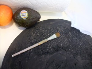
The main component you will need is a bottle of gesso; a white, thick, paste-like paint that can also be used to cover over used canvases. It can be pricey, but lasts a long time. This is the only thing you will need to purchase. Everything else used to create texture can be common household materials. Paper towel, especially if it has a pattern imprinted on it (you can use that!), is great as well as tissue paper. Are you an avocado or citrus fruit enthusiast? You know those net bags they come in at the grocery? Those are simply fantastic. Once you have your materials, lay them out on your canvas and pile on the gesso. It will act as a glue, but takes awhile to dry so don’t hesitate to manipulate, move, crinkle, your materials as you are covering them. After a few coats, you will have a paintable surface. For the octopus painting shown below, I used liquid watercolor. Watercolor is great because it will show darker on the textured areas and lighter on the flat areas, accentuating the visual texture. This next piece I’m trying with the black background I’m doing in acrylic this time. Play around, make some samples on cardboard until you find something you like (old cereal boxes work great to experiment on), and keep on the lookout for interesting textures in your everyday environment – they could come in handy for your next masterpiece!

New textured work, in progress.

New textured work, in progress.

Closeup, texture achieved using a net fruit bag and wrinkled tissue paper.

Closeup, texture achieved using a net fruit bag and wrinkled tissue paper.

Gilded Creatures, 16x20 mixed media - Behold, the wonders of gesso!

Gilded Creatures, 16×20 mixed media, and one of my more popular pieces – Behold, the wonders of gesso!

Standard