Project Ideas

Gustav Klimt – Creative Minds Art History Project

I got a bit behind on sharing my projects, but have now caught the awful Fall cold that is going around, so no better time than the present to sit and type with a hot cup of tea at my side. Gustav Klimt’s work, like that of the earlier covered Van Gogh, is one of those bodies of historical work that is recognizable even by non-artists because of his unique style that has been made readily available in print form to this day, and is appropriated and referenced constantly in new art. Though I’ve never experienced an emotional connection to his work, I love the use of metallics and vivid, overwhelming detail of his pieces as well as the merging of both realistic and painterly elements.

gustav-klimt-klimts-collages-images-via-principlegallerycom

Klimt began as a decorative painter under the belief that art’s true purpose was to show viewers something beautiful, and got his start painting murals on the walls and stairways of lavish, wealthy homes. His personal work was charged with an eroticism that was not present in art at that time, and it earned him a good deal of disdain but he remained committed to depicting the beauty of the world as he saw it. His pieces have resonated and stood the test of time, enough that virtual immersive experiences of his work were made available this year in Paris and Austria.

Not all of his work is sensual in nature or contains nudity, and there are plenty of other examples to show as inspiration if you are doing this project with younger audiences.

The-Tree-Of-Life

Klimt’s work incorporated figures and portraits, but learning how to draw faces and the human body properly is a whole semester of lessons within itself! To make a Klimt project that was accessible to all skill levels, fun, experimental, and stress free, we used collage. Some of Klimt’s portrait work does remind me of a very early form of fashion editorials, so we cut out models and celebrities from Elle and Vogue magazines to become the subjects in our Klimt inspired artworks.

Students were then encouraged to place their magazine cutout where they wanted it on the page, and trace around it with pencil to save the space. I recommend gluing the magazine cutout on last so it doesn’t accidentally get smeared with paint. After outlining, students could add on and sketch the outfit of their dreams with pencil. Once the basic outline was complete, students filled in the background and clothing in different shades of metallic paint first, and then could add detail overtop with pattern. As I’ve mentioned before, I work with a lot of adults with disabilities and seniors in my art program. Painting small patterns with a brush can be hard for some depending on their dexterity level so we made this project more accessible by also introducing the use of ink stamps for those who were struggling with fine motor skill. Innovation can lead to some simply amazing results, as can be seen by the work-in-progress above! Be sure to check back soon for more artist-inspired project ideas!

Advertisement
Standard
New Work

I’m Back With Some New Art!

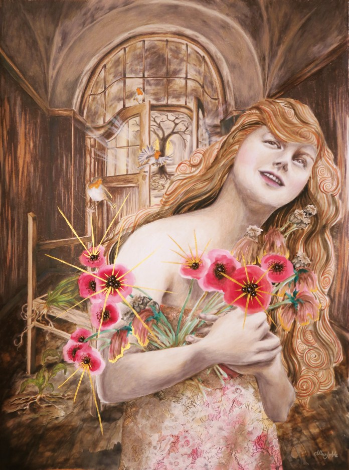
This first piece in a new series was a long time coming … I am obsessed with working small, and tend to work in 11×14 or maybe 16×20 max, and wanted to start doing pieces that were at least 18×24 or larger to allow me to include more detail and further develop the background in my pieces. My new series, Dwell, really taps into my background of interior design study. These pieces will contemplate how our environment affects us, but also how we interact with and affect it. The word dwell also has a double meaning, not just the physical space where we live but the places we create inside us that we allow our mind to dwell in. How are these psychological spaces affecting us, and how much control do we have over them or they over us?

“Dwell In Possibility” was a challenge for me because it involved a lot of brown, a color I literally never use in art. I tend to create pieces that are mostly grayscale tones with pops of bright color, and gray just would not have been right for the earthy feeling I wished to evoke. The other challenge to this piece was that I was creating an interior that was not very attractive or intricate … the remains of a decaying building, dirt floor, rough wood paneled walls, weathered plaster ceiling once grand but now stripped of any color or design … The only furnishing an abandoned, sun bleached chair frame.

dwell in possibility

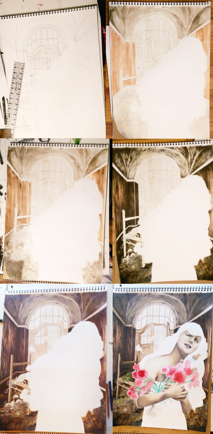
I did a lot of layering of different media overtop one another, and used my clear prismacolor pencil blender for the first time in my entire life. I usually use a white pencil to blend, but this time I couldn’t use an opaque blender because I wanted to be able to still see the underlayer of watercolor through the blended pencil. I left the flowers and hair purely impressionistic watercolor as opposed to the detail in the background and the model’s face. I didn’t use as much dimensional mixed media as usual, not wanting to add too much clutter, and stuck to a lace fabric overlay on her dress and clusters of beads for the centers of the poppy flowers.

dwell in possibility progress

The closer you look, you will see there is a lot more going on than just a smiling woman holding a bouquet. She is already stationed in an odd setting, an old deteriorated building. She is surrounded by decay, including uprooted, dying plants. Even some of the flowers in her hands are dead or dying, but they are slowly coming back to life as she grasps onto them, holds them and nurtures them. Behind her through the door there is a cavern of light, where a grand tree has taken hold. There are no leaves yet, hardly any soil for his roots to grasp onto, yet he is still alive somehow. Robins circle around, a bird that symbolically means rebirth. Change and growth are always possible.

As you can also see, I can’t seem to put down the metallic gold acrylic lately! At work, my students always want to cover everything they make in metallics and glitter, which often makes me shake my head, but I can understand the temptation ;). Speaking of which, I am starting a new class called Creative Minds where each week students will be learning about an accomplished artist of the past or present, and completing a small project based on that artist’s iconic style with a focus on artists with disabilities and mental health. I will be sharing my projects as well as some of the students’ interpretations, so be on the look out for a new project post each week! I am hoping some of you reading this will want to try it at home yourself. It’s always fun to play :D!

Standard
Art Discussion, New Work

New Work: She is Sheltered By Faith

Organized religion has always had an interesting relationship with women. While many of the ways in which various religions are practiced (notice I say practiced, because often how one chooses to express their religion and how they are kind of supposed to practice it based on the basic tenants of their religion’s teachings can be quite different) have not been too kind to the ladies, even in this day and age, women on the whole are practicing their faith in greater numbers than their male counterparts. This is especially true in Christianity, the faith I will be discussing as it is the one I practice, and the one I am most familiar with.

Interested in this dichotomy, I knew I had to do a piece on women and faith for my current series surrounding women and the various themes that intertwine their lives. Thus, this art nouveau inspired piece was born, titled “April: She Is Sheltered By Faith”. The lush flowers and vines radiate in growth around the central figure, sheltering her from the rains of darkness. She is surrounded by a metallic gold halo of light, and smiling calmly and assuredly through the storm.

april she is sheltered by faith

As one who strives for equality for all, including between different genders, I often find myself in an awkward space where it comes to my Christian faith. Though Jesus himself surely stood for equality, churches don’t always do the best job carrying this message through in our everyday life today. One need look no further than the recent trending hashtag on twitter, #ThingsOnlyChristianWomenHear, to read statements that range from laughable in their utter lunacy to those that are absolutely heart wrenching.

https://twitter.com/angelamorrismua/status/855881078627852288

…And, there are many, many more. These are not made up stories or exaggerations. As thankful as I am that I grew up in the same church I attend now that I feel comfortable in for the most part, many of these messages are familiar through the stories of friends of mine and through articles and advice in Christian teen books or magazines I remember from my youth. We need to do better, and it starts with listening to others’ stories, speaking up when you do hear any of these toxic messages spoken, and knowing the truth. I used to feel so uncomfortable about being the very antithesis of what both mainstream and religious conservative media would have you believe a practicing Christian is “supposed to” be, but nowadays I kind of embrace it. I feel like I’ve finally found a lot of my purpose in life, and besides, aren’t we supposed to stay true to what’s right and not worry about “fitting in” with everyone else? Maybe, this sometimes even means not fitting in with those within our own little group.

So what draws women to faith based lives despite the challenges of organized religion? I’d say it is because the Person they follow advocated for equality way ahead of His time, and that in the stories of His teachings and examples of how He treated others, justice and love have always been at the forefront.

I didn’t want this post to turn into a theology lesson so I kept the background brief, but here are some resources concerning women and Christianity that I think are worth a read, and that definitely challenge the status quo of what Christian women are hearing from society:

On Being A Christian and Being A Feminist … and Belonging Nowhere / Sarah Bessey / (Pst! This cool lady actually started the #ThingsOnlyChristianWomenHear thread.)

15 Christian Women Get Real About The Role Of Women In The Church / Huffington Post

Women’s Faith and Power / ReThinkChurch / “We believe advocacy for the equality between women and men results in positive change that improves the world.” – Yeah!

Jesus and Women / Christianity Today / “In His treatment of women, as in many other areas, Jesus of Nazareth was a radical contrast to the standards of His times”

The Case For Women In Ministry / ReKnew

On Being ‘Divisive’ / Rachel Held Evans

10 Ways Male Privilege Shows Up In The Church / The Junia Project


Standard
New Work

Be My Eyes

be-my-eyes.jpg.jpg

This newly finished mixed media piece, titled “Be My Eyes”, continues along a similar theme to my last piece. I love how it turned out, but I must admit this is one of the first works in awhile that was not buckets of fun throughout the entire process. I’m lucky in that I don’t get incredibly angry with my art much anymore. Like any relationship, if things aren’t working, I can say hey, I think we need to give each other some personal space, and leave it alone for awhile and work on something else. However, this one had a quickly approaching deadline for an all-area Michigan show I wanted to enter it into, so I didn’t have that luxury. It may be freaking gorgeous, but filling in all those detailed little butterflies was a chore. Like, I almost considered taking a break from working on art at one point to go clean my kitchen – that’s how bad it was. Cleaning my kitchen was a reprieve. What’s that about blood, sweat, and tears?

img_20160713_162405.jpg

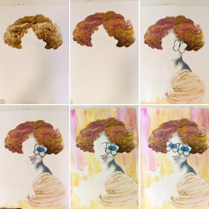
After doing the basic outline lightly in pencil, I started filling in the figure from the top down. I broke my own guideline that I always give my students about starting with the background first, mainly because to be absolutely honest, I had no clue what to do with the background yet. The hair was so swirly, and fun, and free, and so the opposite of those technical, detailed little insects. I used prismacolor pencil for the face and skin, watercolor for everything else. I made some commitment to a background by dripping orange, gold, and magenta watercolor over it – similar colors to what were used in the hair. After this, my work of art temporarily looked like a 70s album cover. The photos don’t do it justice, the colors were BRIGHT.

img_20160722_193236.jpg

After that, I went back to ignoring the background because I still had no idea what to do with it, and finished the central figure. Rules in art really are just suggestions ;). I had known from the beginning that this piece required metallic gold somewhere, and the background now seemed just the place to put it. Huzzah to dulling all those bright Barbie Dreamhouse colors! I needed to break it up with some texture, so I used a crumpled paper towel to apply the first layer of gold, but it just didn’t do it. It was reminding me of a faux finish accent wall circa 1995. In a surprisingly impulsive move (Even in art, I am so not an impulsive person.), I squirted gobs of paint right on the background, and used a toothpick to marble the colors together. I have the technique down because of how many times I’ve made these nutella brownies. Seriously, same technique to marble the nutella and peanut butter. To lighten this now very dark background (Art is always such a Goldilocks situation.), I used white watercolor and added designs of blown up butterfly wing patterns over top. The finishing touch was the gluing the bunched lace over the dress, and voila!

The reason I’ve included this 100% honest rendition of this piece’s birthing process (including the part about my background being inspired by delicious baked goods) is because I’ve learned one thing from all the different students I work with, and it is this: They think artists always know what they are doing, have an exact plan in their head, and that their piece turns out just precisely how they imagined it in the end, and that real artists never get stuck or doubt what they are doing. This is absolutely not true. Everyone’s art looks completely wonky until it is all the way finished. It’s part of the process. When art is in progress, it’s awkward looking, we don’t always know what we are going to do next, and we don’t always enjoy every single step of the process. And that’s ok. If your art is easy, you probably aren’t pushing yourself enough, or being as creative as you could be.

I haven’t talked much about the meaning behind this piece, because I want to hear what you think. This image could definitely be open to innumerable interpretations, and that is one of the most fun things. What does it say to you?

Standard
Project Ideas

Book Pages and Metallic Paint = Instant Classy.

Every so often I get bored and dissatisfied with the state of my walls and need a change. I’d had some Alice In Wonderland etching coloring book pages framed above my couch since I’d moved into the apartment. I’d filled them in with markers, giving Alice hot pink hair, and my boyfriend was even starting to comment, “So… are you ever going to take those down?” Apparently the appeal of pink haired punker Alice was lost on him, and he also couldn’t fathom why I would hang up coloring book pages when I have so much of my own art at my disposal. I do decorate my home with some of my own work obviously, but you have to understand, I get real tired of staring at my own art. I’m staring at it the whole time I’m working on it, and when it comes to my walls, I want to give my eyes something new to get excited over. The coloring pages had overstayed their welcome a bit, and the magic marker was getting ridiculously sun-faded. But, I didn’t want to spend the time making 3 new fine art pieces just to hang above my couch when I knew I had exhibits coming up to get ready for.

I don’t know if anyone uses those 12×12 paper flip calendars anymore … They are a bit of a relic nowadays, but I always insist on getting one from those giant kiosks in the middle of the mall set up around Christmas simply for the cool pictures. Art Deco is one of my absolute favorite design periods, so for the past 2 years I’ve gotten the Erte calendar. This fashion artist is responsible for the loveliness below – so yes, he completely rocks.

You can buy 12×12 scrapbook frames at any craft store and hang calendar page art as is (the cheapest prints you will ever find), but I decided to take it a step further to create the trio below.

trioThese pieces only took an afternoon to create. First off, a background made of book pages makes anything look instantly classy. If you are like me and love books, tearing one to pieces could take a lot of soul-searching. Therefore, I picked up the most dull, dry, uninspiring book I could possibly find from the red dot $1 bin at Barnes and Noble so that I wouldn’t feel I was doing any disservice. The opposite, I felt I was improving upon the provided material by turning it into art. I first tore out about 6 pages per picture, then adhered 3 pages layered on top and 3 on bottom to the cardboard backer that always comes with frames. I found brushing tacky glue onto the back with a combination of a cheap throwaway paintbrush and one’s finger worked best. I then flattened the bookpage-covered-cardboards under a pile of magazines to dry. While the glue was drying on those, I found 3 calendar pictures I liked and cut out the main subject from each page. You could do this with any calendar theme, cutting out a large central image be it a flower, an animal, a boat, your favorite entertainer, whatever makes you happy to look at. I then brushed tacky glue onto the back of each of my calendar cutouts. I pressed them on, smoothing them out with my fingers, making sure there were no bubbles, and then put the pieces back under the magazines to dry flat. Next, out comes the metallic paint! Metallic acrylic paints are just magic and make every single thing look way better. You don’t have to be an artist at all to accent your new decoupage calendar pictures with paint. The “distressed” look goes awesome with the torn out book pages, and for this technique the messier the better. Grab a large flat brush, and make sure you keep it dry – don’t dip it in water until you are finished. Dip some paint on your brush and simply swipe across your piece. The paint will naturally catch where the pages layer and overlap lending a cool texture. If you don’t feel intuitive with the paint, an easy out is to simply paint along the edge of the image you glued down to emphasize it, and also brush along the corners or all the edges of the actual rectangular piece to “frame” your collage. You’ll be surprised at how amazing these turn out. You’ll have people asking where you bought them, when all it was was less than $5 of supplies and a couple of hours.

Doing more rearranging later due to visiting the Midland Antique Festival and buying yet more wall art, I decided to make a wall collage above my dining table which is something I’ve always wanted to do. My framed original portrait drawing, collaborative mixed media canvas piece I’d made with my boyfriend, and my crazy little 60s-big-eyed-circus-child all had a vintage, weathered look to them with lots of beige and ivory amongst the pops of color. I needed some super small pieces to tuck in between the gaps in the arrangement, but 5×7-8×10 frames are usually meant for table tops and just don’t look right on the wall, and the frames’ heavy, dark edges were taking away from my more focal pieces. I needed something on a small canvas, but once again, was pressed for time. Though I wanted my collage to look good, I did not want to make 2 miniature acrylic paintings with all the other projects I had going. I had a value pack of 8×10 canvases I’d gotten at Michaels that calculated out to $1 per frame at the end, and decided, what the heck? When in doubt, cover them in book pages. Once I had the entire front and sides of the canvases covered in tacky-glued pages, I went to Staples and got 2 of my original works printed small on standard printer paper, tore the edges to make them uneven, and glued them to the relative center of my canvas. If you don’t make art yourself, you could still do the same thing with magazine pictures, digital photos you’ve taken, or works by famous artists copied from art history books. Antique or vintage-inspired images look best with the book page background. Of course, I had to metallic up the edges with some gold paint, and once again I had put in an hour or two of work for a really cool end product.

I fell off a chair and dented the entire right half of myself trying to hang this up, so it better look kickass!

I fell off a chair and dented the entire right half of my body trying to hang this up, so it better look damn good!

I hope some of you will try this out. Even not-so-great looking decor can be super expensive, and these projects are FUN even for non-artists (promise!) and will add a ton of personality to your abode. Collaging is even suggested as a relaxation technique when under extreme stress, so this project could be just what your day off needs. I’ll be taking a break from art and heading off to Ludington tomorrow for a mid-week weekend of hiking, swimming, and generally being outdoors from morning till the wee hours of the night. Hopefully I come back refreshed and inspired ^_^.

21

Standard