I became a first time home buyer as of this summer, falling in love with a house that had great bones, a lot of potential, but some wacky aesthetic choices. The home had a single owner which was great … except that owner looked to have not made any design changes since she first moved in.
My boyfriend and I are both young-ish and not super rich, but there was no way we could live in this. So began a journey of creativity, (some blood while ripping out tack strips and carpet staples), sweat, and tears.
Bathrooms can be hands down the most expensive rooms to renovate. We really had to scrimp in some areas since we were trying to renovate an entire house in a little under 6 months. If you have a bathroom you hate that at least has fixtures that are in working order, it is completely possible to get creative and change the look without having to replace major features such as the toilet, tub, vanity, or even lighting.


This is what we started with. You can’t tell as much in the photos, but NOTHING matched! The stain on the door was different than on the paneling which was different than on the vanity. Mixing wood tones can be cool, but in a room this small … yikes! There was also silver in the (actually pretty nice) foil wallpaper as well as chrome hardware in the room but the mirror and lighting fixture were a brushed brass. The window was painted white as was the trim and the door to a small cabinet set into the wall, which was a bit odd, and the window had a scalloped decorative molding around it that just wasn’t doing anything for the overall look. The floor was just unfinished cement which we took as a blessing since we figured if there had been floor, we just would have been ripping it out :P. To me, the vanity and the lighting fixture were the biggest eyesores. However, we ended up spending over our predetermined lighting budget on new lighting fixtures for the rest of the house. Also, after many agonizing trips to every hardware and “everything” store in the area as well as many online perusals, we learned that it was going to be more costly than expected to have a vanity at least as big as the one we already had in the room. We were going to have to end up sacrificing either size or quality or both, and it just didn’t make sense to replace our current vanity with something smaller and less functional or with less longevity just to have a more modern look.
Just like The Rolling Stones said, Paint it black!


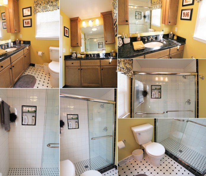
People seriously underestimate the difference a coat of paint can make. They always say you aren’t supposed to paint small rooms in dark colors, but rules were made to be broken. I have always loved black and golden yellow together, and I knew I wanted to keep the wallpaper in this room as the one thing original to the house. Keeping the room from being broken up into a bunch of smaller sections by having the half paneling flow right into the floor by using a deep black on both helps make the room feel less closed in. Painting the paneling a modern gloss black turns it from grandma’s house to vintage chic. I used the same gloss black on the vanity, which downplayed some of the carving and details on it I’d felt were too old-fashioned for my taste. All the molding and window trim in the house is white, so we wanted to keep that still. To tie that in as well as the white and cream swirl finish on the counter and the white tile in the shower, I spray painted the hardware with white lacquer spray. I used Rustoleum black gloss enamel on the mirror and lighting fixture. We used stick-on floor tiles in a black marble for the floor, which are super inexpensive but look way nicer than just putting in linoleum. They are not at all complicated to install oneself as they are literally like giant stickers and you just keep building around the first tile you put in, keeping one flush to the other.


I made the funny (yet super convenient) little closet just a part of the woodwork by painting it in the same black as well, and following the design of the vanity by keeping the hardware gloss white. The bathroom window is very large, and people tend to be nude in the bathroom so we definitely needed a curtain. I didn’t want to add in another pattern with the wallpaper being so wild already but didn’t want it to look like we just had a big black sheet over the window either. So, I opted for a matte-on-shiny subtle pattern, in black again for consistency. You can’t see it, but FYI, we removed the scalloped edge on the window! The fun black and white artwork is actually a matted and framed page from an art magazine. Magazines are some of the best sources for inexpensive artwork if you need something in a smaller size.
I am well aware that not everyone would want to make friends with this wallpaper, but the same techniques I used can be adopted to fit any style. There were so many different simple choices that could have been made to lend vastly different results in this room. If someone wanted to keep the wallpaper but give the room a more cute, shabby chic, cottage look they could have painted all the woodwork white instead of black. A soft grey would have also been an option. The mirror and vanity lighting could have been painted white or grey to compliment the paneling color choice, or just finished in chrome to match with the sink and shower hardware. The wallpaper could have been ripped down and any color paint imaginable could have been put in its place for a more simple, traditional look without the retro nods. Or, it could have been painted and wall stamps, decals, or stencils could have been used over-top to add some pattern. The ideas could go on and on, and all without having to do any major construction or buy a bunch of new stuff. Remember, something like this can also be a great intermediary step so you can still be comfortable while you wait and save up for a complete overhaul. You don’t have to wait to win the lottery before you can love your home! 🙂