Exhibitions and Other News, Travel

Adventure and Inspiration

Sometimes things get tough. Sometimes it seems to take every modicum of energy to perform the most minute of daily tasks, from getting dressed in the morning to remembering that you’re supposed to say hello to people as you walk into work at 9 am. Sometimes you can’t even detect why everything suddenly seems so hard.

September has been a tumultuous month, but it has also been a month filled with excitement and events, travel and possibility. These little adventures, no matter how minor, are most needed when you are tired, ready to give up, and just want to stay at home sitting on your couch playing Sims.

Creative 360 had been preparing for its Artshop, Do-Art, and VSA Exhibition and Showcase for over a year, and it finally came together in the beginning of this month. It was so amazing to see the students I, as Program Coordinator, along with our many gifted instructors, had worked with finally get to perform their music, dances, and monologues as well as display their beautiful artwork in a gallery setting. For many, it was their first time showing their art to anyone other than friends and family.

I had to “entertain” guests in between performances, a challenge because I don’t think I am an overly entertaining person except for when I am not meaning to be. However, I lived to tell the tale, and was told I said many wonderful things although after the fact I could not for the life of me remember what they were :P. When having to speak publicly I tend to enter a sort of fugue state. Luckily, it is a brilliant one. There were a few kerfuffles along the way, but the whole show really came together in the end. (Kerfuffle is one of my favorite words, as it can be used to describe such a wide variety of daily societal occurrences.)

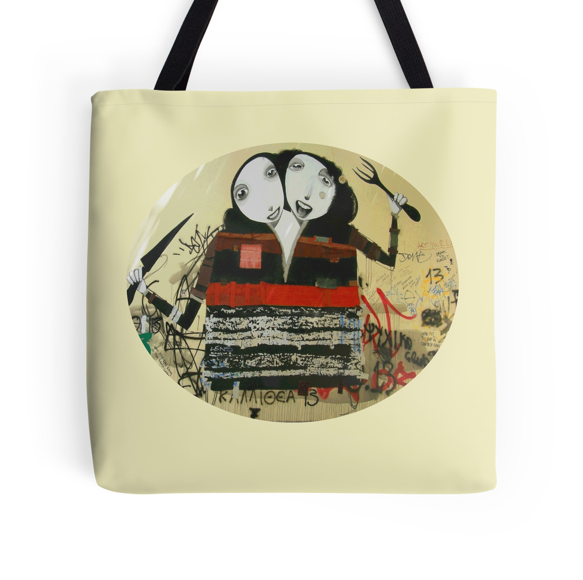
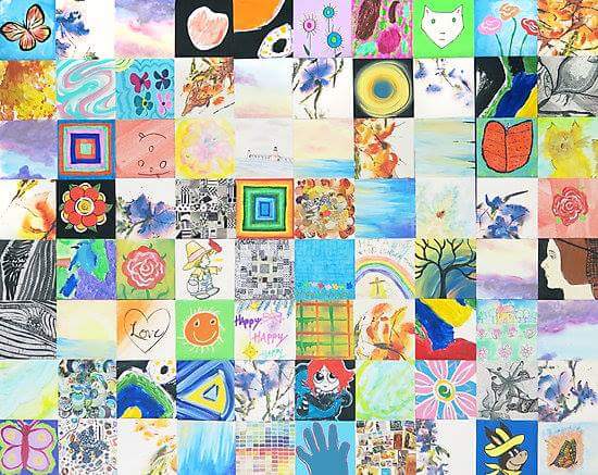
Our special highlighted projects made a splash as well. We had a 3’x4′ canvas composed of 80 squares in which each student filled in a square or 2 with the media and subject matter of their choosing to create an expressive patchwork. If you like what you see, it’s available in print form in Artshop’s Redbubble Shop.

wp-1473636565223.jpg

Another project by artist Heather-Dawn Deogracia was another that expressed the unique personalities of the students taking part in our show. Heather-Dawn asked students to write down their favorite colors and something about themselves. She used this information to create blind contour drawings for each, resulting in a series of vibrant abstract portraits.

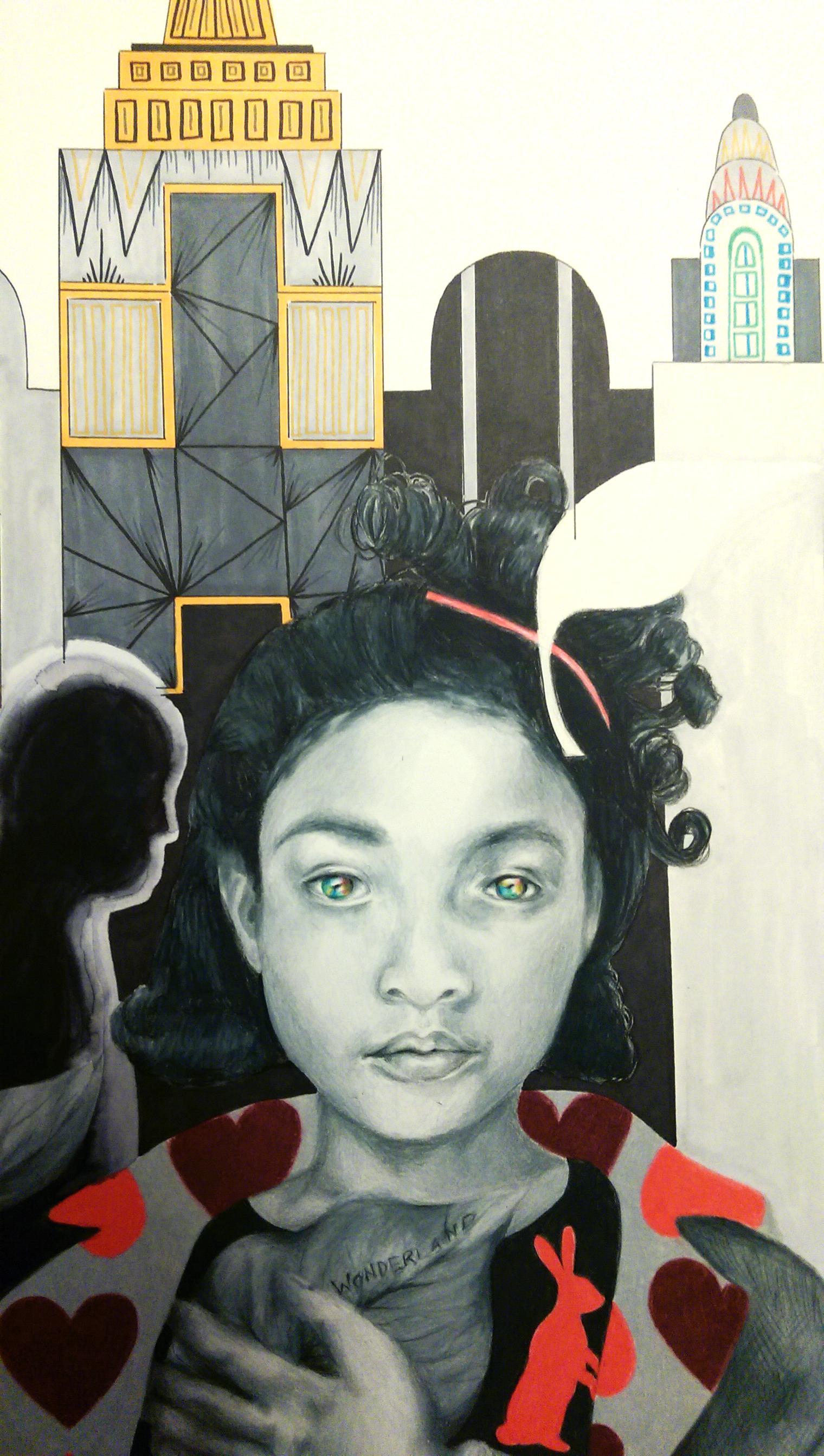
There was another opening shortly thereafter at Studio 23 in Bay City, MI for their All Area Michigan show. I got 3 of my pieces in; Be My Eyes, I’d Have Been Happier As A Bird, and Be My Wings; which needless to say was ridiculously exciting. I also got into the Midland Center For The Arts Greater Michigan Art Exhibition which I applied to the last 2 years and didn’t get in. I almost didn’t apply this year but last minute decided, what the heck. That just goes to show … never give up and all that good stuff ;).

wp-1473636570890.jpg

My last recent adventure was a trip to New Orleans with my boyfriend. The first adventurous moment of this trip was traveling with nothing but a “personal bag” and a carry on between the 2 of us. I like to be prepared for any possible occurrence (or “kerfuffle” if you will, there’s that word again!), so this was a struggle. I’m so type A I made an excel spreadsheet listing everything I needed to pack with accompanying check boxes.

imag3756rimg_20160921_150104656

Literally everything was rainbow colored, and everywhere we went there was music playing. It was like having your own theme music as if you were a fictional TV character, so basically amazing. It was so weird to return at the end of the week to shades of brown and grey, and peace and quiet.

imag3766rimag3810r

There was this great band that played Sinatra and Louie Armstrong covers  we discovered on the first night that we revisited every night afterward until we left.

imag3925r

I also got to see a Warhol painting in person. Even though he seems like he was kind of an ass and didn’t actually do his own work, I must admit it still felt awesome.

Next up, Art Prize 2016! Check back for my “Artists To Know” Art Prize 2016 Edition post, where I will share my top picks from the art I was able to see over the weekend.


Advertisement
Standard
Travel

Revisiting Photography

In the last post I introduced you to some inspiring photographers with intricate, fantasy based, mind-bending designs. Little known to many, I myself enjoy photography as well. Photography is certainly more of a hobby for me than something I was ever interested in pursuing professionally. I mostly use it as a relaxing exercise for stress control :). I have not actively gone out to take photos in quite a few months now. Between working on my own pieces, working on commissions, teaching, and crafting accessories and plush toys I’ve had to pick and choose which creative pursuits to focus my time on to avoid the whole “jack of all trades, master of none” trap. When I do get out with my camera, my favorite things to photograph are street art, graveyards, and nature (though I’m not too into flowers, unless they are ridiculously colorful). Most of my street art photos are from when I had the amazing opportunity to travel to Europe with my family back in 2008. “Street art” in Midland, MI where I grew up is rather uninspired … mainly consisting of F-bombs and anarchy symbols, the actual political meaning of which is probably lost on the perpetrators anyway, sloppily scrawled in red spray paint. For some reason, it is always red, and any additional words are usually misspelled.

I was going through my photo storage drive last night, and realized that though I’ve taken a lot of photos over the last 7-ish years, I’ve never really done anything with them. I enjoyed the journey of traveling to a new place, or hiking in a wood nearby to town, dumped my camera card, and then just kind of left the images sitting there in limbo. I decided it wouldn’t take too long to put them to good use, and began uploading them to my Zazzle and Redbubble shops. If I’m going to enter a piece into a gallery or a juried exhibit, it is always going to be a drawing or painting rather than a photo print because that is where I want to focus myself and that is what I am known for, but where my watercolor paintings or pencil drawings are softer and more flowing, the bold colors and sharp graphics of a digital photo really bring a nice look to a T-shirt, skirt (I am absolutely in love with how the rose one shown below turned out!), tote bag, or phone case. I will be continuously adding more products and different photographic images over this next week (I do have 7+ years worth to sort through :)) including cards and stickers. With the nice weather, maybe on my next day off I’ll even dust off my camera and go for a good hike, see what catches my eye.

Macro Magenta and Yellow Rose Zazzle

Macro Magenta and Yellow Rose Zazzle

Diner Girls Street Art Redbubble

Diner Girls Street Art Redbubble

Pisa Notebook Journal Zazzle

Pisa Notebook Journal Zazzle

Silent Angel IPad Case Redbubble

Silent Angel IPad Case Redbubble

Standard
New Work

New Work Reveal – Wonderland

I have been slowly adding to this piece over the last couple months. It went through some stages where I wasn’t really sure if I even liked it, but lo and behold, in the end I think it all turned out just fine :). I usually use only one or two shocking, bright colors in a piece at a time (with the exception of illustration/graphic design stuff when it calls for it) and never primaries like this, so I must admit the color scheme did freak me out a bit and I was sure for a moment that I’d made a terrible mistake. However, adding the dripping watercolor from the bottom to blend into the blurred figures in the background really tied it together. I wanted to use these “childlike” colors to reinforce the idea that we are seeing the environment through the eyes of the girl. This is also the reason why I made the drawn on windows on some of the buildings in the back simplified, and more “sketchy” and didn’t use a straight edge. This decision also greatly freaked me out at first. Apparently I don’t do a whole lot of “childlike” illustration. This was definitely something new, and it’s been a wild ride and I am pumped to move on to the next thing :). I really don’t know how some artists work on one piece for years, I’m always anxious to finish up and get on to the next big idea! I took in-progress photos this time, a first, and really must remember to do this more often.

WONDERLAND – 18×24 – COLORED PENCIL, INK, AND WATERCOLOR

Starting with the midtone shading of the skin ... I know I have mentioned before it's usually best to start with the background first. However, since I knew I wanted to do the background in ink, I reversed the process. Since primsacolor pencils are oil based, they provide a barrier so that the ink mess doesn't get all over the area where I want the figure. Sometimes you have to alter your process to best suit the materials, learned mostly through trial and error.

Starting with the midtone shading of the skin … I know I have mentioned before it’s usually best to start with the background first. However, since I knew I wanted to do the background in ink, I reversed the process. Since primsacolor pencils are oil based, they provide a barrier so that the ink mess doesn’t get all over the area where I want the figure. Sometimes you have to alter your process to best suit the materials. I’ve learned this mostly through trial and error.

Next on to the hair, and I did a little trial filling in the rabbits in color on her shirt ... still scared of the bright color!

Next on to the hair, and I also did a little trial of the color idea by filling in the rabbits on her shirt … still scared of the bright colors!

Decided to fill in black behind the pattern on her shirt to balance the dark areas in the composition, and also to "anchor" those darn rabbits to something! I also inked in the blurred figures rushing by in the background, softened the edges with water, bleeding the ink.

I decided to fill in black behind the pattern on her shirt to balance the dark areas in the composition, and also to “anchor” those darn rabbits to something! I also inked in the blurred figures rushing by in the background, softening the edges with water, bleeding the ink.

Added more color by putting a pattern on the lapel of her jacket, and began rendering the cityscape in the background in ink.

I added more color by putting a pattern on the lapel of her jacket, and began rendering the cityscape in the background in ink.

Buildings inked in!

Buildings inked in!

Further developed shading on the skin where needed to have harmony with the values of the background, dripped colorful watercolor up from the bottom of the composition, and chalked dark clouds over the background to recede it further back, and draw the eye to the figure. I believe it is now finished :).

Last, I further developed the shading on the skin where needed to have harmony with the values of the background, dripped colorful watercolor up from the bottom of the composition, and chalked dark clouds over the background to recede it further back, and draw the eye to the figure. I believe it is now finished :).

Standard