Project Ideas

Henri Matisse – Creative Minds Art History Project

Another week, another artist! I shared my Van Gogh project last week. In week 2 we covered Henri Matisse. His personal story really resonated with the students, being a group of adults with varying disabilities.

Matisse spent the majority of his artistic career as a painter, being one of the leaders of the Fauvism movement in the early 1900s. Fauvism is characterized by a painterly, non-realistic representation of people and objects and a strong use of bold “crayola crayon” colors. Unblended strokes of pure color divide objects from their background rather than shading. He wanted his art to be calming and cheerful, an escape from the world’s troubles. In 1941, everything changed when Matisse was diagnosed with cancer and had to have surgery. His life was saved, but from that point forward he required the use of a wheelchair for mobility, and struggled with dexterity. Matisse famously said, “Creativity takes courage“, and at the age of 72 no matter how he had changed physically, he refused to give up on creating. He shifted gears to a cut paper collage format for his work as painting was harder to manage with his dexterity changes, creating yet another influential body of work. He ended up liking this new, modern style even better than what he had been working on before, and you can still see similar shapes, styles, and color schemes taken from his paintings and applied to his collage works, such as the organic leaf shapes. His final project was stained glass windows for the Chapelle du Rosaire de Vence as seen pictured above, designed in his iconic collage style.

Though the term disability pride wasn’t part of our vocabulary at the time Matisse was alive, I think his legacy perfectly embodies this concept. He did not look at disability as a barrier, but an opportunity to innovate.

matisse bowls 2

For our project, we created beautiful decoupage bowls inspired by Matisse’s paper cut works. I chose to focus specifically on shapes present in his chapel design, though if you do an image search of his collage work you could find many other ideas. I cut patterns out of some scrap matte board for the students to trace. We used colored printer paper for the cutouts – It is thin enough to be able to bend along the round shape of the bowl without popping back up or creating massive wrinkles, but thick enough that the color of the bowl won’t show through. We used matte Mod Podge to apply and seal the shapes onto the bowl, and the bowls themselves were picked up at the dollar store, making this a ridiculously inexpensive project with beautiful results.

This would be a fun project to do with all ages from kids to seniors, and makes for a great gift idea if planned closer to the holidays or Mother’s Day. Since Mod Podge is not food safe, obviously you do not want to try to eat cereal out of these or something ;), but they are a perfect catch all for jewelry, keys, pens pencils and paperclips, or change. Also a cute decoration when filled with decorative orbs, glass marbles, or stones. I love color, and may just have to make one of these for myself at home!

Standard
New Work

I’m Back With Some New Art!

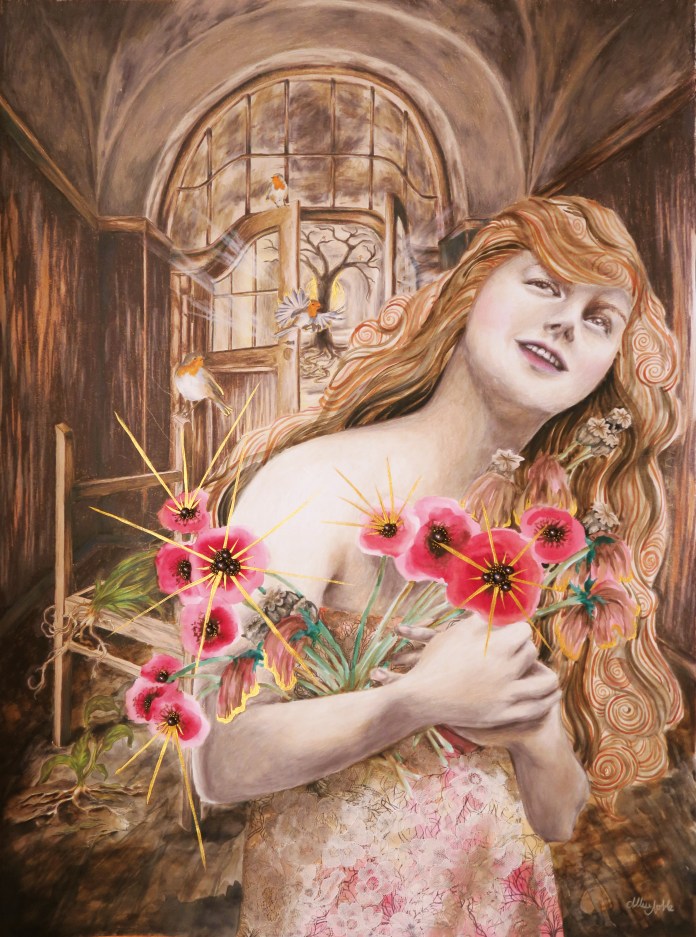
This first piece in a new series was a long time coming … I am obsessed with working small, and tend to work in 11×14 or maybe 16×20 max, and wanted to start doing pieces that were at least 18×24 or larger to allow me to include more detail and further develop the background in my pieces. My new series, Dwell, really taps into my background of interior design study. These pieces will contemplate how our environment affects us, but also how we interact with and affect it. The word dwell also has a double meaning, not just the physical space where we live but the places we create inside us that we allow our mind to dwell in. How are these psychological spaces affecting us, and how much control do we have over them or they over us?

“Dwell In Possibility” was a challenge for me because it involved a lot of brown, a color I literally never use in art. I tend to create pieces that are mostly grayscale tones with pops of bright color, and gray just would not have been right for the earthy feeling I wished to evoke. The other challenge to this piece was that I was creating an interior that was not very attractive or intricate … the remains of a decaying building, dirt floor, rough wood paneled walls, weathered plaster ceiling once grand but now stripped of any color or design … The only furnishing an abandoned, sun bleached chair frame.

dwell in possibility

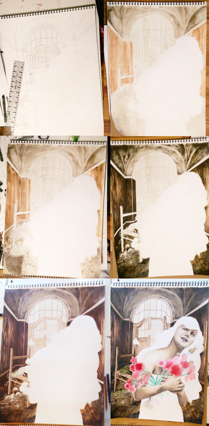
I did a lot of layering of different media overtop one another, and used my clear prismacolor pencil blender for the first time in my entire life. I usually use a white pencil to blend, but this time I couldn’t use an opaque blender because I wanted to be able to still see the underlayer of watercolor through the blended pencil. I left the flowers and hair purely impressionistic watercolor as opposed to the detail in the background and the model’s face. I didn’t use as much dimensional mixed media as usual, not wanting to add too much clutter, and stuck to a lace fabric overlay on her dress and clusters of beads for the centers of the poppy flowers.

dwell in possibility progress

The closer you look, you will see there is a lot more going on than just a smiling woman holding a bouquet. She is already stationed in an odd setting, an old deteriorated building. She is surrounded by decay, including uprooted, dying plants. Even some of the flowers in her hands are dead or dying, but they are slowly coming back to life as she grasps onto them, holds them and nurtures them. Behind her through the door there is a cavern of light, where a grand tree has taken hold. There are no leaves yet, hardly any soil for his roots to grasp onto, yet he is still alive somehow. Robins circle around, a bird that symbolically means rebirth. Change and growth are always possible.

As you can also see, I can’t seem to put down the metallic gold acrylic lately! At work, my students always want to cover everything they make in metallics and glitter, which often makes me shake my head, but I can understand the temptation ;). Speaking of which, I am starting a new class called Creative Minds where each week students will be learning about an accomplished artist of the past or present, and completing a small project based on that artist’s iconic style with a focus on artists with disabilities and mental health. I will be sharing my projects as well as some of the students’ interpretations, so be on the look out for a new project post each week! I am hoping some of you reading this will want to try it at home yourself. It’s always fun to play :D!

Standard
Exhibitions and Other News

A Month In The Life of An (Almost) 30 Year Old Artist

Well, I missed posting this month’s Artsnacks unboxing, which is unfortunate as March is Artsnack’s birthday month as well as my own! I still did a very late Artsnacks challenge art journal entry (this morning, actually ;)), and I swear I had good reason! This month has been a busy one, and just kind of flew by in a blur.

Since the end of last year, I’ve had trouble getting any art really going. I started a handful of things, but then got stumped and had to put them away until who knows when. Artist’s block is common, but I have not experienced such a thing for a long time. It’s weird, and I don’t like it.

Since I don’t have any big personal projects that are going anywhere, I figured this was the perfect time to go out on a limb and try something new. When I saw a call for proposals on my local city, Saginaw MI’s Art and About facebook page for their Painted Piano Project, I knew I had to enter just to have a new art goal to work towards. Only 12 entries would be selected, so I didn’t go into this with any expectation of being chosen, and figured it would just be fun to give it a try. I was shocked to not only find out I was chosen, but that my entry won 3rd place for People’s Choice while they were displayed at the Saginaw Art Museum! Guys, I have never won people’s choice anything since the time I tried to run for student council secretary in 5th grade and got the least number of votes, despite my very impressive posters. Generally, popular opinion and I are not friends or even distant acquaintances, so, I will consider my life experience padded.

The project is exactly what it sounds like … I will be covering a piano with my artwork very soon! I may live to regret the level of detail I have committed myself to, but I don’t do simple. My instrument has yet to be delivered, but I will definitely keep everyone updated as I begin the process! The pianos will be scattered throughout the city all summer, available for people to play.

Some other adventures this month are the Midland Artists Guild Annual Juried Exhibition, which I look forward to every year.

This time around, I am so grateful to have been awarded 2nd place overall for my piece, “July: She Is Free”, one from my “Unlimited” series that is very close to my heart. I hope to continue to open minds and push the bounds of what beauty and empowerment look like through my art.

Another highlight of this month, my boyfriend and I finally got to see our favorite play live! This after going to a whimsical arcade bar and overdosing on 90s nostalgia with the X-Men Arcade game and some N64 Mario Kart, so basically the perfect early-birthday trip.

I know traditionally a lot of mourning goes on leading up to one’s 30th birthday, but I have to say this has been a pretty epic month so far, so bring it on!


Standard
Artsnacks Unboxing

Artsnacks February Unboxing!

art snacks box febTime for another Artsnacks unboxing!

This month I received:

art snacks febI used these materials to create a journal page I’d been planning to create in the future anyway, featuring a movie still of Maria from the classic film Metropolis and one of my favorite lines. Now for the reviews!

I was really excited to see watercolor supplies in this box. I thought I was being all fancy shmancy when I upgraded from Artist Loft liquid watercolors to Loew-Cornell, but OHMYGOD I can’t really explain the experience of using the Sennelier watercolors in any other way than PAINTGASM. No wonder it was marked as a staff favorite! The colors flowed from the brush like a dream, and I am now addicted and will have to budget for some of these $11.75 per tube watercolors “Formulated with honey from the Alps”. The watercolor paper was very nice as well. The quality was telltale as the paints soaked right in without laying on top of the paper, and it could hold up to a lot of layering without my having to let it dry in between – no paper pilling!

The Micron pen, a brand new product, was also phenomenal. The plastic nib drew far better on the watercolor paper than other pens I’ve used for lining watercolor art. It produced a smooth, even line and didn’t get “caught” in the bumps on the paper. It also dried significantly quicker, allowing me to get right to the painting.

The precision brush was another win! It worked great for washes, but also made perfect thin lines when fine detail was called for. The bristles didn’t fan out and the paint stayed in the brush until pressure was applied no matter how wet I had it – no unwelcome sploshes spreading out across the page. I will keep these in mind when I need to refresh my watercolor brush supply.

Rounding off this review with only gushing joy and zero complaints, we have the sketching pencil. I love how light this pencil draws, perfect for sketching an outline in watercolor artwork where you don’t want the lines to show through the paint. I also love the extra durability and break-resistant feature in its construction that was noted on my menu, as I am always breaking my freaking pencils!!! I must go into hulk mode when I get inspired or something, because it is just crazy.

I have adored this second box even more than the first, and am looking forward to more fun mail in march!


Standard
Techniques and Tutorials

First Art Snacks Box, First Art Journal Entry!

artsnacks boxSo, I was having a really rough week y’all … and then I got this in the mail.

I had gotten an artsnacks subscription for Christmas, and being a virgin to subscription boxes in general, was excited to see what it was all about and hopefully discover some awesome new products for art making!

art snacks janThe January box came with:

  • A Uni-Posca PCF-350 Brush Tip Paint Marker
  • 2 Maribu Graphix Aqua Pens
  • A Tombow Fudenosuke Soft Tip Brush Pen
  • A Sakura SumoGrip Mechanical Pencil
  • And a cat joke: What do you call a painting by a cat?
  • A green Lifesaver

art journal artsnacks janI decided to do what a lot of artsnacks subscribers do after receiving their box, and join the fun of challenging myself to create a little picture using only the products in my box for the month. This is also a great way to test out the materials, especially if they are unfamiliar to you. Another fun thing about artnsnacks is the fact that the colors of the products you receive are totally random … The royal blue was lovely, but that olivey/sage green and bright orange? – maybe ok separate but kind of yikes together. So, here is my unique green penguin, swimming beneath the chilly arctic waters.

All in all I thought this was an interesting first box, especially for someone like me who is primarily a drawing based artist but also holds a lot of love for watercolor. I’ll start with my favorite products, which were hands down the mechanical pencil and Tombow pen. I own a lot of black liner pens in a huge range of line weights, but I had never owned a pen whose line weight is dependent on the pressure you apply. This is a fantastic feature for adding more depth to outlines, and it is pretty intuitive. The brush tip is firm, and it is easy to control the weight you want. I.e. – it doesn’t suddenly “blob” out a big fat black line with the slightest pressure. The mechanical pencil has a fantastic eraser which is a huge plus – The quality of your eraser sometimes matters even more than the quality of the pencils you are using! The rubber grip, besides having a cute name, practically gives your fingers a massage as you are drawing – even for someone like me who holds their pencil wrong ;)!

Next, onto the Aqua Pens … The colors are super saturated and these are obviously artist grade. These were marked as a staff favorite. I have to say though, as far as pens that can be used with watercolors I still prefer Tombow’s Dual Brush Pens. The Aqua Pens seemed to not blend as well as with water as the Tombow ones I am used to – you could still see the original sketch marks though the color did spread with water. I noticed they washed better when I worked on smaller areas at a time without letting the ink dry as much in between. When you want more of an illustrative look with super BOLD color that doesn’t fade with the water, however, these would be perfect.

Lastly, the brush tip paint marker – marked on the product list as brand new to the market … I experienced a bit of sticker shock reading the retail price of these – 10 bucks for a SINGLE marker! But, they are unlike any paint pen I have ever seen given the fact that the brush tip is an actual bristled nylon brush. It is more rigid than a traditional painting brush and maintains it’s shape even when pressure is applied, so it is a true hybrid between marker and paint brush. I can see these being fantastic for the classes I manage with Express Yourself Artshop at Creative 360. The added control of using a paintbrush in pen form like this would be great for painters who have mild to severe dexterity issues or shaky hands due to age, injury, or disability, or anyone who struggles with fine motor skills but loves to paint. If it weren’t for that darn price tag … we are a non-profit after all. Donations, anyone? 😉

My assistant at work /slash/ really cool art friend /slash/ art educator teaches an art journaling class and has been trying to get me into starting an art journal. Another surprise Christmas gift I received was lo and behold, a mixed media art journal! It’s a sign. I’m a big reader, so, in addition to my monthly artsnacks challenges, I am going to play around with journaling some of my favorite quotes from books I’ve compiled. With my first two, I kept them mainly illustrative with a lot of white space but I am going to do more with texture/mixed media backgrounds for my next one, whatever that may be.

Be sure to check back for more unboxings! ❤

P.S. The answer to the joke was a paw-trait.

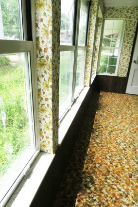
P.P.S. I may be so opposed to the orange and green color combo due to new home renovation trauma. This was what our mud room looked like when we moved in.

porch2

Standard
Artists To Know, Exhibitions and Other News

Artists To Know: ArtPrize 9 Edition!

Hello all! I visit ArtPrize in Grand Rapids every year, and always look forward to being able to share some of the favorite works I have seen. This year, I was involved as an artist as well, showing my series at Founder’s Brewing Co.

I enjoyed visiting my series with my significant other, drinking excellent beer, and even getting to pretend to drive a Tardis! Though we tried to stuff as much art inhalation into our day as possible, I was only up at ArtPrize for approximately 10 hours so only saw a cross section. However, I’d love to share with you my favorites from what I witnessed that day.

Empowered Women by Florencia Clement De Grandprey

This collection was hands down my favorite. Not only are the portraits themselves diverse, emotive, and detailed to perfection, but upcycled mixed media elements such as wallpaper and fabric samples were used along with the paint.  A woman after my own heart!

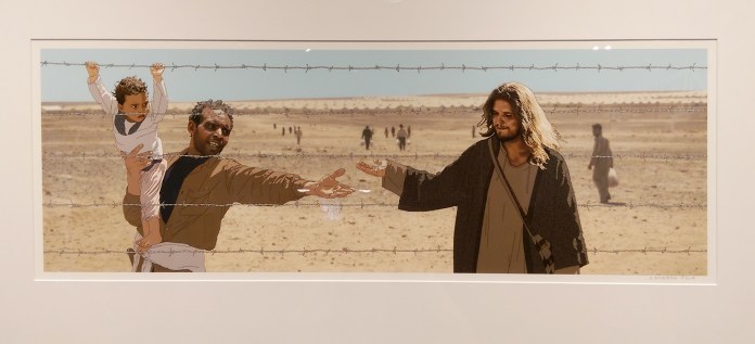
Companions by Deborah Rockman
IMAG7577

These digital drawings have an interesting style to them as the backgrounds are more photographic, but the images of people are more illustrative making them stand out. This is the image that particularly stopped me in my tracks. The entire series explores inequity in our world by placing side by side images of people that mirror similar situations visually, but reflect a glaring difference in circumstance.

Time Marches On by Sue Laage

IMAG7562

I love antique assemblages, and this collection was a little Alice In Wonderland which made me adore it all the more. Each piece has it’s own distinctive style, yet similar colors and forms unify them as one.

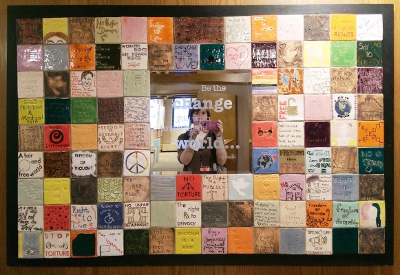
Be The Change For Human Rights by Hazel Park High School Ceramics Students
IMAG7575

First off, I am so jealous of these kids! Secondly, this is an amazing project. Each student picked a human right to represent on their tile. Assembling it into a mirror where the viewer can literally see themselves behind the well-known quote asking them to be the change really drives the impact home.

Kirsten by Carolyn Zinn

Portratiure is challenging enough when using pencils or paints, let alone joining together hexagons of printed fabric. The 3 dimensionality of the shading and highlights that is achieved is mindblowing, and the image completely transforms as you look at it closely and then far away. This was an ambitious, out-of-the-box, and very successful design that I kept wandering back to.

The Resistance of Hybrid Cacti by Salvador Jimenez Flores

IMAG7550

I love love love surrealism, and the fact that this piece wasn’t just a sculpture but almost a mini created universe was especially entrancing. It turns out, a new universe is just what the artist aimed to create. In Flores’s ArtPrize bio, he says that his inspiration comes from sci-fi and re-imagining what the future may look like as opposed to what is presented in mainstream media. He states that in most sci-fi content, the majority of the future’s inhabitants are depicted as white. He aims to resist labels and create a future where the protagonist can be a minority, understand his experience, and also be relateable to others.

Struggle by Kyle Orr
IMAG7510 (1)

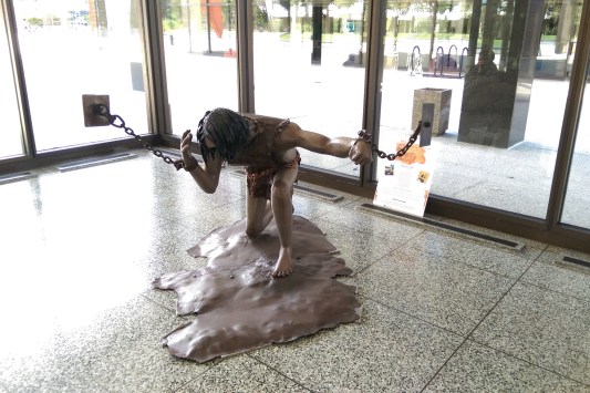
What drew me into this sculpture was the strong sense of illusion that was created by the floating chains. This piece at first glance can seem very dark, but then you realize the walls aren’t really there … Orr’s concept statement reads, “Life can be a struggle. Sometimes life feels like it has you chained down in imaginary walls that keep you from achieving your inner most desires conquering the fear that causes you to hide your face in shame. We’ve all been here at one point or another in our lives. These are the moments in time that we make the decision to look at the chains as something to be broken or something to enslave us. The struggle is what grows courage and strength. Decide to thank the chains and imaginary walls, for they have grown strength and courage, but break them, indeed!”

Reflections of A Quilted Iso-Cube In Primary Colors by Diane Rabb and Julius Cassani
IMAG7514 (1)

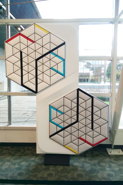
I found this piece ridiculously calming to look at. I find geometric designs relaxing for my brain, which is probably why I am including them all over as I continue to renovate my new house. I also loved how modern this piece was as opposed to what traditionally comes to mind when people think of “quilting”.

We Are One by Melissa Machnee

For this piece, the title really says it all … Its impact is in its simplicity. Too often, works of art have these detailed, lofty concept statements hanging next to them that you have to actually read in their entirety to even understand the piece you are looking at. With this work of art, the meaning in the dynamic composition is clear immediately.

Suspension by Sarupa Sidaarth

Sidaarth states in her ArtPrize bio that she likes to use unique raw materials that are usually rejected in traditional paintings such as crystals and even GOOGLY EYES. Now, I’ve been known to throw some bling on my mixed media drawings and paintings more than once, and am all for using non-traditional materials. However, as an art educator, I have a very complicated relationship with googly eyes. At the art studio where I work, I oftentimes go so far as to hide them or fib that we don’t have any right now when students ask for those goofy little eyes, because I had always thought of them as a surefire way to ruin what was formerly a decent creation, making it look like a daycare craft project. These amazing paintings have completely changed my mind about googly eyes (and yes, they are in there!) – not an easy feat.

Atomic Reaction by Susan Supper

IMAG20170929

Supper wrote in her artist statement for this piece that growing up in the age of television, cartoons and pop culture not only entertained but also provided a moral compass for children. She was particularly interested in Astroboy, who harnessed atomic powers for good rather than their traditional destructive nature. In this series, she depicts social issues and moral dilemmas through the lens of popular media. As a pop surrealism fanatic, I am in love. Her mix of familiar pop culture/advertising imagery with a Japanese aesthetic reminds me a lot of one of my favorite artists, Alex Gross.

It was hard to narrow everything down to just these pieces, as there were so many talented artists on display this year. Until 2018, goodbye ArtPrize! I’ll miss you!


Standard
Exhibitions and Other News

Art Prize 9 At Founders Brewing Co.

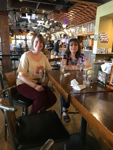
IMG_0372 (1)This past weekend I trekked to Grand Rapids to hang up my installation for this year’s ArtPrize, my Unlimited series. My parents came along for the ride to both help lug my 12 pieces to Founder’s Brewing Co. and ensure I didn’t get lost and miss my installation appointment all together, as I cannot do directions. I think this may also be the only time my mom has been in a bar, so we had to capture a photo for posterity.

If you can’t make it to ArtPrize this year, you can still see the whole series up close in my online portfolio. Prints are also available on eBay and Redbubble. I’ll be going to soak in all the amazing art next weekend. Life has been a little ball of stress lately, and with all the house renovation stuff going on I haven’t left town all summer, nor even donned on a bathing suit once so I need this. Counting down the days!

IMG_0375


Standard
Exhibitions and Other News

Final Artprize 2017 Series: “Unlimited”

Last week I finally finished the last piece in my 12 part series for this year’s ArtPrize, titled “Unlimited”. For this series, I created 12 mixed media portraits in which the meaning is influenced by the use of pattern and color, one representing each month of the year. Women of all ages, races, and time periods are depicted, each communicating a different theme. I aim for the pieces to speak to women’s collective experiences beyond their differences. We tend to think of time and events in terms of our own personal history or the history of the nation in which we reside. But of course, there are women everywhere living out their day to day life all over the world, with hopes, dreams, fears , relationships. Our situations and struggles are very different, but were we in some alternate reality all given a chance to meet, I suspect we would find some surprising similarities, maybe more than we ever expected. I was able to connect with Founder’s Brewing Co. as a venue for my series. I love art, and I love beer so I must say it is sort of a match made in heaven ;).

she is a dreamer

May: She Is A Dreamer

I really learned a lot from working on this project. I got experience in drawing portraits of a variety of ages and ethnicity, and with that different bone structures and proportions of features. I also furthered the skill of not choosing an arbitrary medium just because “this is what I want to use”, but choosing the medium that makes the most sense both aesthetically and functionally for a given part of a piece. All 12 in order can be seen below.

In the midst of all this Artprize excitement, life has been filled with a variety of other creative endeavors such as an art trade with former student turned instructor at the arts program I run, some fun summer painting workshops I’ve been teaching, and the purchase of a home which my boyfriend and I are aiming to completely renovate in one month with a combination of hopes, dreams, and elbow-grease ;). I knew that bachelor’s in interior design would come in handy one day!

But seriously, though I adore the unexpected job I found nearly by accident, I also love design. I have assisted friends and family with projects here and there, but I’ve never done something on this large of a scale, and best of all, the project is not for a client but for ME, so I get to tailor everything exactly to my tastes (Well, mine and my partner’s. My other half is so not one of those “whatever you say, honey” kind of guys when it comes to design, and actually wants to be a part of the process. This is equal parts amazing and frustrating depending on the moment ;).).

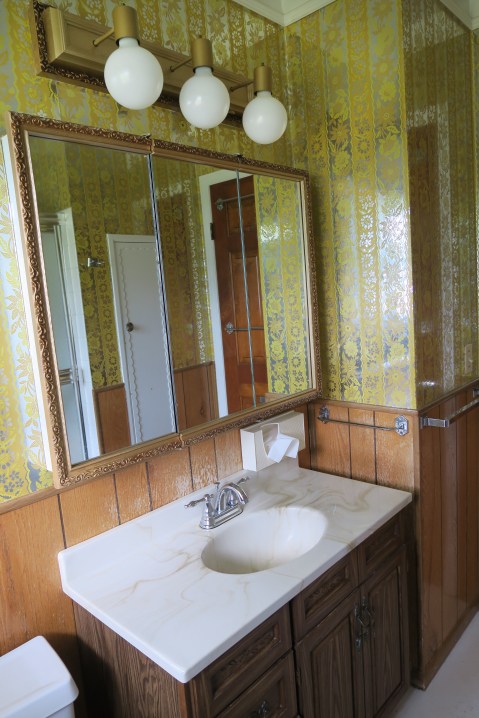
He didn’t put up a fight about keeping this trippy metallic wallpaper in the bathroom, so I guess we’re alright <3. Now, back to ripping down all the other wallpaper that is not so rad. See you in 10 million years -_-.

bath3


Standard
Art Education, Techniques and Tutorials

Colors Aren’t Scary! Understanding The Color Wheel.

A new Artshop semester has started at Creative 360.  One of the biggest concerns my students bring to my attention in classes is “How do  I know which colors to use?” What colors can they mix together, and what colors basically turn to poo the moment they touch each other? Everyone probably has some vague memory of the color wheel from way back when in elementary school art class, but few remember what it actually is aside from a pretty rainbow circle.

printable-color-wheel-tertiary-colors2

Primary colors are like the color gods and goddesses. They are colors you don’t mix anything to get, they just are, and they are used to create all other color life. See the starred sections above, red yellow and blue. In between the primary colors, the color wheel shows you what will happen if you mix two of them together. For example, in between the red and blue space are various shades of purple, depending on if you mix in more red or more blue. If you mix all 3 primaries together, you get a neutral color (brown or grey/black depending whether there is more warm red or yellow, or more cool blue present).

Contrasting colors are colors that are opposite each other on the color wheel, note the black connecting line. Contrasting colors as a rule look amazing together due to how boldly they play off of each other (There are a lot of sports teams I can think of whose colors are blue and orange for example, and I don’t even follow sports!). However, if you mix them to try to make a new color, they will completely neutralize each other into a grayish or brownish color. Remember how all 3 primaries mixed together make a neutral? Well, think of why this would happen when you mix orange and blue, contrasting colors, together… Orange is made with red and yellow, add the blue, and you have all 3 primaries mixing.

Complementary colors are colors that are right next to each other on the color wheel. Because they are very similar, these colors always look pleasing together as well.

Look familar? The artwork on the left uses a contrasting color scheme of red and seafoam green. On the right a complementary color scheme is used with all different shades of purple, and some pink and dark red accents.

These color pairings aren’t just for artwork, they work well in interiors and clothing as well. Below is an interior idea based on my watercolor painting “If The Ocean Dreamed” that I mocked up on Polyvore, which is a really fun interior and style designing website to play around on. All items you can add to your “set” include links where they can be purchased as well.

47120f53515b0118a06ceaa705a7ea3b

Once you’ve got the gist of it, you can become a C O L O R  M A S T E R and even get tricky and combine both contrasting AND complementary color schemes in one, like below. This is another fun set I put together on Polyvore using clothing I am selling on zazzle covered in my original artwork. This tank top features my piece, “Be My Eyes”. In styling this outfit, I used the contrasting color scheme of yellow and purple with the gold and plum apparel, but also added in some pink with the accessories as pink is a reddish hue that would be next to purple on the color wheel.

dfd8dc78bad5b070db0f0489b770551e1

The last type of basic color scheme is triadic. A triadic color scheme uses three colors that are equidistant from each other on the color wheel. Using only the primary colors red, yellow, and blue would be a triadic scheme as they are spaced equally apart on the color wheel. Another triadic scheme is green, orange, and purple, which I’ve used in the interior below.

344a8aa27feebce0011ec12180c5868d1

Appropriate that I will be going on an adventure to Lowe’s to collect paint chips shortly after I post this as my boyfriend and I will be moving from an apartment into a new home by mid June, and this means …. I can paint the walls! 

I have to end this post like a proud art-parent with a selection of my Artshop students’ work from my watercolor class last semester. Looking forward to teaching another great class!


Standard
Gifting, New Work

One More Series Reveal + More On Redbubble!

december she is connected to everything

Say hello to December – She Is Connected To Everything. What can I say, I’ve been on a roll lately. I don’t think I’ve ever finished so many different pieces 2 days at a time in my life … Granted, I haven’t been doing much of anything else in my free time, as the pile of dishes in the sink will tell onlookers ;). Though all the pieces in my current series I’ve been working on are similar in style and use of medium, I wanted to keep them different enough that each could stand alone as well. I went a lot softer and less graphic, high contrast with this piece. I even used some leftover dried moss I had purchased for a felt floral arrangement commission earlier this year in the girl’s woodland crown. There is something I never thought in a million years I’d ever use in one of my drawings!

rbpromounlimited

I have been getting all my series posted to my Redbubble Shop as well, available for print on a variety of gorgeous items. My series also finally has a name … Unlimited. Each individual piece has it’s own title and the works cover a variety of different themes, so coming up with one title to encompass the whole was a struggle. At it’s heart though, this series is about the best of humanity, and about the strength, curiosity, compassion, and vibrancy of women across time, nationality, and ability. It is about the common ground that unites us, and when people come together, they truly become unlimited.

Standard