Art Discussion, Artist Bio

Year End Reflections And A New Project

As I mentioned earlier, after the completion of my “Unlimited”series I’d been experiencing a bit of artist’s block. I tried playing around with a couple new ideas, but nothing seemed to stick.

Design is pretty much my constant state of existence similar to, you know, breathing, so I stayed busy with commissions, crafting, my day job, and involvement in the Creative Team at my church. It was one of my projects for the team that would be the inspiration for my next piece. Upon the usual late December reflection, I discovered the themes explored in this piece really parallel what I’ve learned in this last year.

The series this image was designed for was titled Whole Heart, and though I hate being videotaped, I was somehow coerced into it so you can view this video explaining the concepts and thought behind the design. For a medium I chose a simplistic watercolor illustration with bold colors and sharp outlines. This would make the image clear and easy to read on a small app icon as well as in larger print form. The style would also appeal to any age from kids to older adults. I was surprised how even with a “story” that seemed so basic, people could strongly relate to it on multiple levels. Hearing how touched many were by image made me want to develop the concept into a more detailed piece in my usual surreal, mixed media style. Right now I just have the pencil outline, but keep checking back for in-progress shots!

whole heart orig brighten

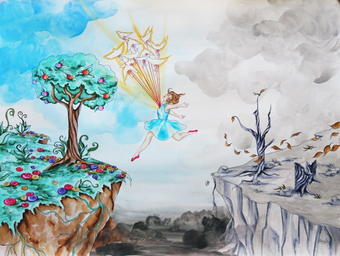
The girl in this piece is doing something absolutely terrifying, and in no way should she be smiling or feeling any positive emotions such as liberation or elation, and yet …

I’ve always read things or heard speakers in inspirational youtube videos talk about the difference between joy and happiness, but for the most part it just sounded like a bunch of nonsense to me until this year. Suddenly – I get it. Happiness is about things that make you feel excited and content in the moment – it’s situational. Joy is about a balance of fulfilling what you need to be content, doing what you can to fulfill the needs of others or even the world or society as a whole, and learning how to deal with and process those desires that are not yet fulfilled, or those instances in your surroundings that are unjust, upsetting, or draining. Joy is about being your best self not just personally but in how you affect others.

Self care has been a huge buzz word this year, from making being comfortable into an art with lists of specific tenants required to reach maximum coziness level such as in the Danish hygge trend, to the increased conversation around kids needing “personal days” or “mental health days” in school just as adults get personal days off from work to reach their optimum ability and stay healthy. Articles about self care tend to revolve around taking it easy and giving yourself permission to indulge guilt free for the most part, but I read a really great article recently that discussed a far less popular part of self care. I suggest you read the entire thing for yourself, but the main highlighted, bold font point from this article reads as follows …

“True self-care is not salt baths and chocolate cake, it is making the choice to build a life you don’t need to regularly escape from. And that often takes doing the thing you least want to do.”

Self care could mean finally making that counseling appointment you’ve been putting off. It could mean finally seeking help for your alcohol or drug addiction you’ve been struggling with. It could mean having an uncomfortable, challenging conversation with a friend or family member. It could mean either temporarily or permanently cutting a toxic person out of your life. Doing the hard things will give you not the temporary happiness that comes from giving yourself a free day relaxing in front of Netflix with a fuzzy blanket and a bottle of wine (Because you’re still going to have to go back to that job you hate after the sun sets on your mental health day … I speak from direct experience.), but the joy of a life you don’t need to regularly escape from.

I have felt the most content and fulfilled this year than any to date in my adult life, despite the fact that I still experience bouts of anxiety from time to time, I still experience periodic stressers in both work and personal life at pretty regular intervals, and the fact that the news cycle and goings on in my home country of America have really, really done a fantastic job in 2017 of pushing the exact buttons that make my blood boil.

And that is definitely an awesome thing, but it is not even all about my own or your own personal well being or fulfillment. More and more, I don’t think the point in life is necessarily to be happy all the time; I don’t think happiness is the endgame.

Most moral people tend to think that the reason we shouldn’t do bad things is because though we may think those things will make us happy, there will be some deep, dark void inside of us that will eventually eat us alive or something. Unfortunately, I don’t think that is always the case. I think there are plenty of people who are perfectly happy celebrating greed, lying, assaulting and bullying, and causing great harm to others … until they get caught. Just turn on the news. That is why the level of our happiness does not always correlate to a good life lived. We may feel happier and more internally at peace living with our heads under the sand, ignoring all the problems and injustices going on in our world, accepting the unacceptable because “I can’t do anything about it, so why should I worry?” But … if every single one of us did that, how would anything ever change? Not that every person is called to be a world changer that will end up in the history books, but plenty throughout history have put themselves in some pretty miserable conditions in order to speak up for what is right – certainly not the road to happiness and internal zen – because the purpose of life is not simply achieving momentary happiness over and over and over again.

My hope for this new year is that we all continue to grow into our best selves, and continue to flourish in awareness, in empathy, in bravery, and yes, in joy.

Come at us 2018, we’ve got this :).

Standard
Interior Design, Project Ideas

Back After Design Overload!

Ok, so I have not posted at all really in the last 2 months. Shown below is the reason why…

I mentioned in my long ago previous post that my boyfriend and I had just purchased our first home. Well, as you can see the interior is pretty retro, though sadly not in the cute, hip, etsy sort of way. We have been doing a lot of DIY renovations, and though stressful and time consuming, it has also been such a rewarding experience to put my design skills to the test and recreate a whole house interior to my own specific tastes (Well, almost my own. There was my boyfriend to consider as well, and yes, there were fights, but we still love each other <3.). It’s hard to believe it was only a year ago I was working with my parents on their bathroom renovations. Granted, my budget as a just starting out 20-something was quite different ;), but that’s where creativity comes in! Our home hardly resembles these before pictures now, and we are nearing the home stretch. I don’t want to post any photos until everything is completely transformed, so be sure to check back later for the big reveal.

I am a person who fancies many different aesthetics, so the hardest part was deciding exactly what way we wanted to go with our renovation. Here are some of my favorite DIY renovations I’ve spotted for each major room.

Living Room

modern-white-blowing-font-b-tree-b-font-font-b-wall-b-font-font-b-decal

Trees and other nature forms are one of my favorite accents for interiors because their shapes and sizes are limitless, and at least for me, bringing the outdoors in has calming qualities. Decals including the one shown above are available everywhere online, but can be pricey (This one would end up totaling $150 for all 3 pieces.). Simple branch forms are something even a non-drawer can put on their wall if they make a pattern or outline on the wall before painting. When you do it yourself, not only do you save money but you have more control over the color and shape of your design. A wall design should fill blank space to make a room look more balanced, and compliment the arrangement and flow of the furniture placement, as seen above.

Kitchen

If you spend any time on Pinterest, you will know that Scrapbooking paper has become as all purpose as duct tape. You can even use it to create a unique, artsy looking backsplash. Tile can be ultra expensive, but you can still get a fun tiled look using squares of scrapbooking paper, affixed and sealed with mod podge or any other clear sealer. From my experience, mod podge can sometimes still have a slightly “sticky” feel even after cured. There are a variety of other slightly more expensive sealers available at any local craft store that provide a better finish. It is key to use a gloss finish so any food splatters can be easily wiped off, and to remember that if your surface your are affixing the decoupage to is bumpy or rough, your finished design will be bumpy and rough. Sanding is your friend when affixing any sort of backsplash :).

Bathroom 

1420874190735

What’s great about this superhero themed bathroom from DIY Network is that once you repaint the shelving, change the accents, and switch out the comic book style artwork it can be re-themed at the home owner’s whim. I am a big fan of leaving the bones neutral so that you are not locked into a certain theme or style forever. Though this design was themed as a “little boy’s” bathroom, I personally believe it could also be a fantastic adult woman’s bathroom ;), and was actually planning on doing a superhero themed bathroom in our house until we happened to find a home with dreamy vintage floral wallpaper that we wanted to save.

Bedroom

our-humble-abode-blog-guest-bedroom

For whatever reason, I hate headboards. However, I am obsessed with finding ways to add extra shelving and storage in general. My boyfriend and I are both bibliophiles, so I thought this unique setup from Better Homes and Gardens was a great way to provide adequate shelving for books while staying space efficient, and giving a finished headboard look by bordering the top of the bed with blank wall. The sconces for extra reading light are a great functional idea as well.

Office

If you love color but don’t actually want to commit to rainbow walls, taping up paint swatches is an easily changeable idea. I love the creative genius vibe from the picture on the left, and can easily imagine notes and project ideas scribbled on each of the swatches as well, using the decoration as a kind of living idea board. If you find that look too chaotic, there is the more contained, orderly version on the right.

The final step in any interior re-do, which I will be starting on soon, is filling in with finishing touches such as artwork and other decor. These small final details often make the biggest impact in your space. Don’t just buy canvas prints from Bed Bath and Beyond, it is worth searching the online marketplace for original designs by working artists that are oftentimes more affordable and so much higher quality than mass produced, big box store pictures. Some wonderful sites include Redbubble, Society6, Zazzle, Ebay, and DeviantArt. It’s also worth checking out the Facebook marketplace if you use Facebook. I sell original artwork and prints on many of these sites, and have included links below. I also work with my art students, who are primarily adult artists with disabilities, in empowering them to market and sell their artwork in both our organization’s Ebay Store and Redbubble Shop. Besides art prints, many of the students enjoy glass and ceramics painting which make for great one-of-a-kind accent pieces.

Happy designing!

My Moongirl Designs Redbubble Shop

Moongirl Designs Ebay Store

Moongirl Designs Zazzle Store

Moongirl Designs Society6

Standard
Exhibitions and Other News

Final Artprize 2017 Series: “Unlimited”

Last week I finally finished the last piece in my 12 part series for this year’s ArtPrize, titled “Unlimited”. For this series, I created 12 mixed media portraits in which the meaning is influenced by the use of pattern and color, one representing each month of the year. Women of all ages, races, and time periods are depicted, each communicating a different theme. I aim for the pieces to speak to women’s collective experiences beyond their differences. We tend to think of time and events in terms of our own personal history or the history of the nation in which we reside. But of course, there are women everywhere living out their day to day life all over the world, with hopes, dreams, fears , relationships. Our situations and struggles are very different, but were we in some alternate reality all given a chance to meet, I suspect we would find some surprising similarities, maybe more than we ever expected. I was able to connect with Founder’s Brewing Co. as a venue for my series. I love art, and I love beer so I must say it is sort of a match made in heaven ;).

she is a dreamer

May: She Is A Dreamer

I really learned a lot from working on this project. I got experience in drawing portraits of a variety of ages and ethnicity, and with that different bone structures and proportions of features. I also furthered the skill of not choosing an arbitrary medium just because “this is what I want to use”, but choosing the medium that makes the most sense both aesthetically and functionally for a given part of a piece. All 12 in order can be seen below.

In the midst of all this Artprize excitement, life has been filled with a variety of other creative endeavors such as an art trade with former student turned instructor at the arts program I run, some fun summer painting workshops I’ve been teaching, and the purchase of a home which my boyfriend and I are aiming to completely renovate in one month with a combination of hopes, dreams, and elbow-grease ;). I knew that bachelor’s in interior design would come in handy one day!

But seriously, though I adore the unexpected job I found nearly by accident, I also love design. I have assisted friends and family with projects here and there, but I’ve never done something on this large of a scale, and best of all, the project is not for a client but for ME, so I get to tailor everything exactly to my tastes (Well, mine and my partner’s. My other half is so not one of those “whatever you say, honey” kind of guys when it comes to design, and actually wants to be a part of the process. This is equal parts amazing and frustrating depending on the moment ;).).

He didn’t put up a fight about keeping this trippy metallic wallpaper in the bathroom, so I guess we’re alright <3. Now, back to ripping down all the other wallpaper that is not so rad. See you in 10 million years -_-.

bath3


Standard
Gifting

No More Boring Gifts!

One of the great things about the internet is that artist made products are literally EVERYWHERE, both original items and printed or graphically designed wares. I actually have a couple shirts I ordered from Threadless in college that I’ve kept for 8 years and can’t part with, though they are now either disintegrating or have super attractive sweat stained armpits. I’m planning to do fabric wrap canvases with them and use them for cool wall art because the designs are so gorgeous, I just can’t abide by throwing them in the trash.

Plenty of artists are out there on ebay and etsy and multitudes of similar platforms willing to customize their work to that special someone you may have in mind. I myself have just finished up an eclectic variety of custom requests, from hand drawn pendants to dolls to an artsy floral arrangement, which was definitely a first.

Basically, there is no excuse for giving a boring gift.

My day job (a pretty cool day job, if I do say so myself :)) is working as Program Coordinator for Express Yourself Artshop, an inclusive arts program geared towards serving all adult students, including those with disabilities. Many of the students are learning how to sell and market their work, and with Spring here we are beginning to prepare for multiple art and craft fairs.

With Mother’s and Father’s day coming up, it’s always best to start early. Creative gift guides are awesome, but oftentimes everything listed is in the 3 figure range …  I’ve put together some affordable guides that are a little bit of what I have to offer, a little bit from some of my amazingly artsy aquaintances, and a little bit from artisans I admire throughout the web.

Mother’s Day

Original Watercolor Seascapes $20 / Stained Glass Jewelry $47  / Artist Designed Mugs $15 / Artist Designed Hardcover Journals $20 / Hand Painted Votive Decor $6 / Hand Painted Wine Glasses $6 / Artist Designed Tote Bags $20 / Artsy Personality Dolls $15 / Handpainted Personalized Wooden Peg Family $116 / Hand Crocheted Pendant Necklaces $20

Ok, so the personalized wooden family is kind of pricey, but it’s just so darn cute!!!

Father’s Day

Artist Designed T-Shirts $25 / Steampunk Assemblage Desk Sculpture $15 / Superhero Bow-Ties $24 / Retro Sci-Fi Decor $20 / Artisan Wooden Boxes $30 / Artist Designed Tech Cases $45 / Artist Designed Travel Mugs $25 / Artist Designed Coffee Mugs $15

There are plenty of regular neckties to be found on etsy as well, but as the 11th Doctor says…

I hope you’ve enjoyed perusing. Now, hop to it! Time waits for no one ;).


Standard
New Work

New Work! (In Which I Present Probably The Cheeriest Art I’ve Ever Done)

Hey all! I recently finished the 4th piece I’ve added to my current 12 part series. Each piece represents a month of the calendar, and this one is June so it would actually be installment 6 but I’ve skipped around a bit. To catch up new comers, I am working on a series of 12 mixed media, surreal, conceptual portraits in which the meaning is influenced by the use of pattern and color. They will depict women of all ages, races, and time periods, and each will communicate a different theme. I aim for the pieces to speak to women’s collective experiences beyond their differences. I give you, June: She Is Constantly Evolving.

she-is-constantly-evolving

I think this is quite literally the happiest piece I’ve ever completed – There’s even a puppy … that is unreal. I mean, a couple years ago I actually was told by the manager of a local restaurant that I had to remove a couple of pieces from a show I’d hung there because they were afraid it might send patrons spiraling into depression. You’re not a real artist if your art has never been ousted from anywhere, or so I’m told. Not that everything I make is gloom and doom, but to have butterflies, puppies, flowers, smiling with teeth, and cotton candy clouds all together in one piece is not usually my jam. All of my work centers around people’s inner worlds, and sometimes confronts difficult or uncomfortable emotions. Even my pieces that convey overt happiness usually have some sort of edge or oddity to them.

I remember meeting my blindly assigned roommate in college for the first time. Once she found out I was an artist, she wanted me to do some large paintings for the common room, but “They have to be cute! Not scary!” Apparently she thought I was some sort of dark , twisted soul, which is quite funny as I had Sanrio posters all over my bedroom and Bart Simpson print pj’s for god’s sake. (I was to find out later that until we became friends she was afraid to put out any of her Hello Kitty themed toiletries in our shared bathroom, and also only watched America’s Next Top Model in secret when I wasn’t home for fear of my scorn.) To fulfill the cute requirement, I made a painting of a girl holding her kitten surrounded by retro, colorful power flowers. But … I gave the kitten purple dragon wings.

2006_0910art0037retouchnew

This is so Museum Of Bad Art worthy in the most hilarious way, that I’m actually saddened I tossed it. It’s one of those compositions that is so bad it goes right past bad and back to good again.

All this to say, this is a rare piece to be one that conveys nothing but pure, unadulterated joy and exhilaration. It’s ironic that I created this at a time when joy and exhilaration were about the two farthest things from my mind. As seems to be the general consensus, 2016 has been more than a little trying, and it sure decided to go out with a bang in November and December.

920x920

This piece is about transformation, as symbolized by the presence of butterflies, and maybe it was the idea that change is certainly most appealing during the most wearing of times, mixed with a bit of my love of holidays that makes it impossible for me to stay cranky around Christmastime. Either way, this piece speaks not to who we are right now but who we wish to be, and reminds us that nothing is permanent, and that sometimes that isn’t a bad thing.

See this design and more in my Redbubble Shop.


Standard
Exhibitions and Other News

Updates On Art and Life – Babies, Cake Homicide, and The Fear Of Yellow

I know I’ve been terrible at keeping up this blog lately. I promise to do better! Honestly though, I’ve been working on a plethora of fun projects which is the main reason for my lapse (Also, it’s the holidays. No one has any spare time right now, do they???). This post will be kind of a hodgepodge of everything that’s been going down in the past couple weeks while my blog has been silent.

First and most importantly, a new year coming up can only mean one thing … The grand reveal of Pantone’s new Color of the Year! I’m a huge dork, and honestly do look forward to finding out what the new color is each year … I hate not knowing things!

pantone-color-of-the-year-2017-greenery-15-0343-leaves-2732x2048-1200x900

In my opinion, it’s ok. I was kind of scared while watching the reveal video where they add one by one the different pigments to stir together for the big reveal, because they were dumping a WHOLE LOT of freaking yellow onto the palette first off. I’m so glad it’s not yellow – I am not a fan of yellow. Gold, ochre, fine – but crayola crayon yellow? Yikes. I read an article awhile ago that featured a test gauging how many colors in the spectrum your eyes could detect. People who could detect the largest amount of colors possible tended to be irritated by yellow. I did decide I wanted a bright yellow sports car in 8th grade, but that was just because I wanted people to think I was cool and glaring, eye-offending color seemed the proper type of vehicle for a devil-may-care attitude. I ended up with a silver used car with sparkly blue “gothic flame” decals on the side and a hello kitty license plate holder once I got to high school, so I was still kind of a badass at least in my own mind. This pondering over the color reveal sent me down the internet rabbit hole, and of course I had to go back and check what year the Pantone Color had in fact been a yellow. It seems there was a shade of yellow in 2009. 2009 was quite a strange and tumultuous year filled with all manner of general awkwardness and unpleasantry now that I think about it. Perhaps the color was to blame.

I have also been working on a new piece for my ongoing series I hope to show in ArtPrize next Fall.

wp-1481763379522.jpg

I must have been crazy to do another piece with more damn butterflies. Detailing the wing patterns is all great fun … until it’s not. The process can get a bit tedious, though the end result is worth it.

My other butterfly piece that was shown at Studio 23 sold after the show! I’ve never had a piece go the first time it was exhibited. I was of course over the moon excited, but also felt a bit of sadness since I’d just finished it only just a month before. We were just getting to know each other … I suppose this is how parents must feel when their kids go off to college or something.

be-my-eyes.jpg.jpg

I also did something I never ever do … I worked all November on a collaboration with former art student and all around cool girl Heather-Dawn Deogracia. We got into the upcoming “Dynamic Duos” exhibition also at Studio 23. Look what happens when we put our minds together. We didn’t end up killing each other or getting into a fistfight, and we  didn’t even yell and rip our project in half, so I’d say it was a successful venture. How would you interpret the story in this piece? Feel free to comment! I’d honestly love to know everyone’s thoughts. This is a fun one for hearing others’ interpretations.

wp-1481763373920.jpg

I’d also been doing a lot of crafting for a holiday art fair I attended 2 weekends ago. I went crazy with inventory and have a ton of cool stuff still left, so be sure to visit my ebay store for last minute gifts! Everything is 20% off this week through Sunday at 12 am, so check it out.

I wasn’t kidding when I said a lot has been going on … in addition to all the art stuff, I had the pleasure of meeting the new baby of one of my best friends from high school last weekend! She is the first of my core group of friends to reproduce, so it’s still super surreal at this point. I never know what to do around kids. At my boyfriend’s family Thanksgiving, I was sitting next to him in the living room and his niece kept hovering around me, backing up against my knee. I hissed to him, “Why does she keep rubbing her butt on my leg?” He responded, “She’s trying to get onto your lap, pick her up.” I responded back in whispers, “How do I do that, will I break her?” I tend to be clumsy with inanimate objects like dishes, so I’m always scared of picking up tiny adorable children, though I’ve heard they’re far more resilient. When my friend passed her daughter, Darshini (Isn’t that an awesome name?), to me to hold she of course immediately started howling. She was hungry and had  a dirty diaper allegedly, so totally not my fault. I held her later and she was calm and didn’t think I was scary.

I hope you’ve all been well! I have a couple more projects to share, but some are Christmas gifts so they must remain a secret for now :). So long! Now that the craziness has died down, I solemnly swear I will be writing more often again.


Standard
Exhibitions and Other News

Material Girl – Artsy Gifts For All

… Just kidding, I actually can’t stand Madonna’s music, but it seemed an apt title to use when talking about all the fun artsy things I have for sale.

This past weekend the program I direct at Creative 360, Express Yourself Artshop, hosted an art and craft fair. A number of our students participated, and a fun time was had by all. I was having so much fun making stuff that as usual I went a bit overboard so I have a lot of surplus stock, which I have posted in my ebay store and will continue to add to.

I have two kinds of plushes, both incorporating unique upholstery fabrics and hand-sewn and hand-painted details along with vintage embellishments.

I also have hand-painted wooden art dolls that range from adorable, girly fashionably dressed characters to holiday themed and even some mermaids thrown in.

wp-1476225825598.jpg

In addition, you will find affordable art prints (including wallet size ACEO prints for $2.99!) and original pieces for sale, as well as a wide range of paper dolls. I’m up to over 10 different designs, and all the clothing is interchangeable which is super fun.

I also have two print-on-demand shops through Redbubble and Zazzle. I own a selection of products myself from both sites, and have been so impressed with the quality for a really affordable price. Both sites offer slightly different products and designs including jewelry pendants, clothing, mugs, tote bags, stickers and cards, notebooks and journals, phone and laptop cases, pillows and other home accessories, and more.

Moongirl Designs Redbubble Shop

Moongirl Designs Zazzle Store

It gets so tedious to shop anywhere the later into Fall it gets with the holidays coming up. With stores filled with grouchy, hurried people running into each other like bumper cars, I am a huge fan of online shopping. Plus, giving something people have never before in their journeys through big box stores will make you the coolest of gift givers for sure :).

I love supporting others’ art as well. Are there any shops on etsy, ebay, or print-on-demand websites that are your go-to for gifts?


Standard
Interior Design

Retro Tile Bathrooms Before and After

Even though I studied interior design in college and ended up going in a different direction afterward, I still love it. From time to time, I do still assist friends/family/acquaintances with their designing woes, and I’ve had a couple of fun opportunities over the last year or two to work with my parents in updating my childhood home. I worked with them to choose fixtures, finishes, and furnishings for the home’s guest and master bath, and they used a kitchen and bath design business and a remodeling contractor from the local Midland area to bring the project to completion.

My parents and I have pretty different design styles. They can be a little uneasy at times about bold colors, and favor timelessness. My mother definitely has a traditional style, and is not one of those people who wants to change a design up every other year (or even every 5). She especially wants more “permanent” aspects such as tile and cabinetry to be something neutral so that the space can be updated in the future if need be with not much more than a different color of paint on the walls.

The house’s original bathrooms were done up in (now vintage) tile, as were many in the neighborhood when originally built. My best friend down the street actually had an identical guest bathroom to ours, only accented in white instead of grey and sans crazy wallpaper. We decided to pay homage to the origins and stay with the idea of retro, bold, fun tile, but this time in black and white.

wp-1472597936784.jpg

Before: I may have mentioned the original guest bathroom was pink. In fact, this bathroom was just so into being pink that even the door and the window molding is pink. This is basically Dolores Umbridge‘s dream bathroom. It’s so odd and distinctly vintage, however, that it did have a certain charm and I was a little bummed to see it go. Yes, the ceiling is wallpapered – pretty trippy.

blue-bath-montage.jpg.jpg

After: Saying bye-bye to the original vintage was so worth it, however, for the end result. Since we didn’t have to worry about the guest bathroom transitioning into a bedroom like we did for the master bath, we could go with a fun color not present anywhere else in the house, and chose a cheerful pool blue. Being the only color present that isn’t a neutral, the room is pleasant even for those who don’t like to be surrounded by rainbows 24/7. The white is broken up by pops of black in the striping and the textile accents. The ceiling is still kind of fun, though certainly not wallpapered! I chose a paler shade of blue rather than just going with a stark white to balance the already ever present, high contrast, bold blue- to – bright white transitions. My parents also love antiques, and there is a variety of vintage glassware and decor scattered throughout. We also chose some unique vintage inspired hardware that further adds to the little air of whimsy in this room. The artwork on the wall is a print of one of my watercolor and ink pieces, The Idealist.

wp-1472597943538.jpg

Before: The master bath had already been through one soft redo in the 90s due to some cabinetry that was not faring too well. It had mainly been done for utilitarian reasons, and had pretty much the opposite problem of the guest bathroom … it was very, very bland.

gold-bath-montage.jpg.jpg

After: Hello, gold! Black and gold play off of each other so well, so a lot more black was incorporated into this bathroom. The cabinetry and shower are opposite each other, so to balance all the white tile with the dark counters we outlined the shower itself and the inset shelf in black tile, and used a more concentrated floor tile. The photography on the walls are photos of birds my dad took, one of his hobbies being hiking and “collecting” birds on his journeys via snapshots. And, of course, more vintage glassware (I have an addiction! Luckily, they love it too).

Another fun project completed! Next, my parents will be picking my brain about the living room. Maybe I can talk them into more brightly colored walls … maybe even purple! Only time will tell ;). (Mom, if you are reading this, I promise I’m joking).

Standard
Artists To Know

Artists To Know: Amazing Sculptures From The FIA

My boyfriend and I visited an interesting sculpture exhibit at the Flint Institute of Art this summer titled Form, Function, and Fantasy. The exhibit was divided into 3 rooms, each embodying one of the aforementioned themes. I captured my absolute favorite pieces from the exhibit, and wanted to share them with you. I know I discovered many new favorite artists in the process. I think all of the pictures I took were from the “fantasy” section, which for me is honestly not surprising. We accidentally went through the exhibit backwards, viewing fantasy first which may also have had something to do with it. Let’s be real, in art as in life, everything’s a letdown after that ;).

Irina Zaytceva – Twins

fffsculpture1

I was actually drawn to make a trip out to this exhibit based on this image I saw on the FIA website. I love the melding of old world artistry with fairy tale mermaids. The bold red coral shapes growing off of it give this piece add an element of abstract and modernity to the piece as well, bringing one more dimension to the mix. I am personally so much more of a drawing and painting person than a sculpture person, so I think I loved the fact that the surface of this 3D form was used as a canvas for 2D art as well, incorporating both types of design.

Richard Notkin – Heart Teapot: Ironclad Hostage II

fffsculpture2

As a tea enthusiast, I absolutely adore looking at uniquely designed teapots. My absolute favorite thing about days off is my cup of tea right after I wake up in the morning, no joke, usually accompanied by doing some sketching, reading a book or the news. I am such an old person at heart at a mere 28 years on this earth. In all seriousness though, the design of this teapot inspired sculpture is flawless. Combining industrial elements with anatomy and figuring out how to transform the shape of a human heart into a vessel for tea somehow could not have been an easy task. You don’t even notice it’s a teapot at first, it just looks like an interesting sculpture. The fact that it hides its more mundane function is rather interesting.

Sergei Isupov – Zombie Fish

fffsculpture3

I love the tall, thin forms, the monochromatic color scheme, and the detail that makes this piece look like a pen and ink illustration from a children’s scary story picture book come to life in 3-dimensional form. Very fun and inventive.

Krisaya Luenganantakul – Happy House #1

fffsculpture4

As I read more about this artist, I discovered she has a whole series of these lovely, whimsical houses in vibrant colors and with floating, dreamlike, organic detail. The project is titled “Homemade – a project where the womb, the home, and the female are interpreted under a new light.” This project discusses the idea that oftentimes feminine traits are associated with weakness and fragility. However, patience, tenderness, forgiveness, and love are strengths that have made them universal protectors and caretakers for every family over time. And, important nurturing that determines the growth  and well-being of all humans takes place in both the womb and the home, centered around the female. It is interesting and different to see a project about female empowerment that is based on the value of women’s more traditional roles. I was originally drawn by the visuals, but found the idea behind the design very thought provoking as well.  

Michael Lucero – Hunter (Reclamation Series)

fffsculpture5

There is no way I could not be drawn to this piece by color alone. I absolutely love pops of bold red amongst neutral tones, and use this color scheme in my own work often as well. There are a lot of interesting details the longer you look at it, and the contrast between the style of the head and body is staggering. Yet, when you look at the piece as a whole it is unified. I myself was working on sketches for a series incorporating faces being covered in various winged things, so of course I was first drawn to the most noticeable visual element of the moth over the figure’s face.

Akio Takamori – Karako With Striped Kimono

fffsculpture6

I found this sculpture to be so incredibly calming to look at. The soft, round forms, harmonious pale colors, and flowing watercolor-like drips along with the neutral, solemn face were very peaceful to me. I think if this was in my house and I could just look at it whenever I got tense, I would never lose my temper.

Sunkoo Yuh – Horn Blower

fffsculpture7

I loved the dripping glaze application in this piece because again, it reminded me of watercolor. I also loved the totem quality it had to it,the many figures and faces stacking atop one another. Each is such a distinctive, unique character in the composition.

Sara Lisch – Lion’s Journey

fffsculpture8

This was another piece that reminded me of a children’s book illustration come to life. I love the muted color scheme, and the stylized features of the human and animals. There is definitely a story here, and it is left to the viewer to imagine where they are all headed to.

I’d encourage you to visit the links to see more of these artists’ work. All of their pieces are just as fantastic as these. I am forever in awe of 3D artists. The best sculpture I ever made was this cardboard, modeling clay, and found object punk-diorama time-based piece pictured below.

p4281321.jpg

It was a final project for my intro to 3D class in college, a time-based assignment meaning a piece that would somehow change over time as part of it’s presentation, not lasting in its original form. Basically, the so-so sculpted clay girl in the center was all white and pristine at the beginning, and then everyone in the class got to take turns sticking the different objects to her, dumping paint on her, and otherwise altering her form. It dealt with how perceptions shape identity, and was all anti-conformity, anti-media, and all that good stuff – very much what I was thinking about at that time of my life. Of course, my best sculpture would be ephemeral. What rotten luck. At least I’ll always have the pictures.

Standard
Interior Design

8 Interior Essentials For A Happy, Interesting Space

When I finally got a dependable, non-commission-based-or-freelancing-big-person-job last year, my boyfriend and I talked and decided after 4 years it was a good time to pull our resources and find a place together. Unfortunately, fall and winter got super busy and then it was the holidays and then it was march and we had visited ZERO houses. So, in order to not make a hasty decision about something super important, we decided I could chill in my one bedroom apartment a little longer and keep saving money until we found somewhere awesome to live. I have to say, the place has its benefits. Though extra space is not one of them, it is:

A) Within walking distance of Mooney’s Ice Cream. I don’t need to explain what an asset this is. In a list of cohabiting concerns, not being close enough to 30+ delicious varieties of ice cream  cones at whim was right up there with having stinky socks piled on top of my reading chair. So basically, a pretty big deal.

B) I’m on the second floor and have a fun little balcony that is just excellent for drinking wine upon at night on summer evenings. We call it the veranda … what are delusions of grandeur again?

I am very much a visual person, and can tend towards being as much of a perfectionist in the decoration of my living space as the creation of my art. I always worried with a space that was not-so-much-space, and with the fun apartment restriction of being stuck with stark white stucco walls, always stucco, I wouldn’t be able to truly express myself with my home, or get it to look as awesome as I pictured in my head. Add to that the fact that I studied Interior Design in college, and I place pretty fierce expectations upon myself. However, I found there are plenty of easy things you can do to bring together a small area and make your space stand out. The essentials are …

A teapot with personality. 

a26619af3f34baa449f4746ce6f6c1e2

Going back to the apartment thing; in a one or two bedroom apartment, it can be hard for your kitchen to really feel like a kitchen when it’s about 15 square feet. Oftentimes this space gets ignored. A brightly colored or fun patterned teapot sitting out on the stove top can wake it up a bit and make it a little more inviting, which is a good thing when you have just had the longest day ever and know you have to go home and cook ;).

Art from different times and cultures.

Another simple way to add interest is to mix in some vintage here and there, and add elements inspired by cultures different from your own. The collection above are all pieces I have up in my apartment. I have always loved retro 1960s illustration and art nouveau, and have been interested in asian culture since junior high. Your inspiration may be different, but either way including vintage and multicultural design will make any space more intriguing and inspiring to live in.

Glam lamps.

Especially in an apartment, you don’t get to choose your major lighting fixtures, and the ones that are up are usually pretty bland and unassuming. So, you have to express yourself with your lamps. You can’t always have a chandelier or some other eye catching fixture on your ceiling, but you can have it on your end table :). I had to include that unicorn one on the end just for fun.

Fun rugs.

When you have a small space with an open floor plan, rugs are awesome for visually dividing your space into “rooms”, different areas of function so that your space doesn’t just look like a jumbled sea of furniture. They can also add a bold design element, like art on your floor!

Neutral Pattern.

For someone like me who likes to change things up every other month, it’s a good idea to keep your main staple pieces a neutral color. Plenty of fun contrasting patterns keeps it from being boring. My houndstooth and zebra print accented sofa purchased at an employee discount makes my full year of misery working in sales totally worth it.

Colorful Vintage Glassware.

a2a25c729228cf5010070f242e8fa7c0

I love vintage glassware. I’m an antique store addict, and swear I have accumulated enough retro goblets and wine glasses to open my own bar.Everyone needs a contingency plan, right? My favorite antique glass is LE Smith’s Moon and Stars design, shown above. Glass from the 20s through 80s comes in nearly every color under the rainbow so there’s something to match everyone’s favorite color.

Kids Stuff (Whether You Have Kids Or Not).

When we’re a kid, we dream about the day we will have our own place. We envision building a slide that takes us from one floor to the other, and an entire room that’s just a gigantic ball pit. Then we grow up and become boring. I am a big believer in injecting a bit of fun into the place you’re going to go to sleep in at night, and have no problem paying homage to a favorite cartoon character here or there. I have a spider-man plaque hung up in my bathroom, and for awhile even had his and hers matching spider-man loofahs (I was Spider-man, he was Venom.). Finally, he complained that they were too small and made for children and can he please have a normal cleaning apparatus for when he stays over! They shot water out of their mouths when you squeezed the vinyl character sitting atop the fluffy cleaning part, that is an important point to be made. His loss.

Attractive Storage.

I don’t know if these fun little patterned boxes have an official name, but all I know is they make having piles of crap look chic as hell – enough said.

What are some of your go-to’s for an intriguing living space?

Standard