Art Education, Exhibitions and Other News

Closing Up 2019: A Year In Art

I have been pretty transparent in both my face-to-face public life and my online life about 2019 being one of the toughest years I’ve had in quite some time for a variety of reasons. Though I am more than ready to let go and look forward to 2020, and though “blessed” is definitely not the first word that would come to mind when I think of this past year (the word I’m thinking of starts with an f, guys …) … I am blessed that my ‘day job’ was many times my anchor through a tumultuous 2019. How many people can really say that???

For those new to the blog, I direct an inclusive arts and wellness program called Express Yourself Artshop that is open to students of all abilities, largely serving adults with physical, intellectual, and psychological disabilities. I have worked with Artshop in some capacity since it’s inception a little over 6 years ago, and have had the opportunity to see it grow and transform just as the program helps its participants grow and transform on a personal level. Looking back, 2019 was full of positive experiences and new adventures in creativity in our corner of the world.

The focus this year was definitely getting the students’ art out into the community. Creative expression is invaluable for the peace, joy, and confidence it can give an artist while creating. People really should do art primarily for themselves, but still, getting an artist’s work out of their own home and into the world allows that creation to further make an impact on the public that views it. Especially when it comes to artists with disabilities, society makes a lot of assumptions about what they can and can’t do. Educating through art is another part of what we aim to do.

Our Artshop crew was chosen to participate in the community’s Downtown Summer Sculpture Series. We made a proposal as to how we would transform the default mold, and once accepted proceeded to work as a group to create “Let Your Light Shine”. Not only does the positive message reflect our goal for anyone who participates in our program, but the idea of piecing together different shapes, sizes, and colors of glass to create something that would not be as beautiful were it covered in identical decorations is also symbolic of neurodiversity and the celebration of differences.

2019 was also a year of collaboration. In addition to the sculpture above, students worked on many 2D mixed media group works in a larger scale. Collaborating allows students to play off of each other’s strengths, support each other’s weaknesses, and push themselves to come up with new ideas and creative solutions as they work towards a unified vision.

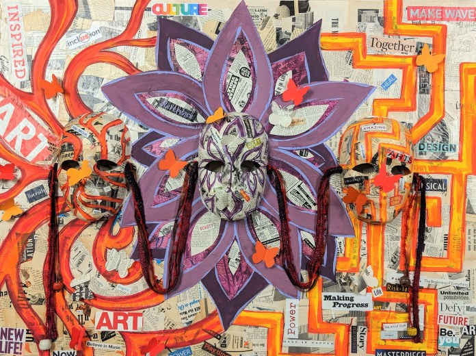
Two of the collaborations were featured in Creative 360‘s annual fundraiser for auction, both highlighting a creative practice 360 offers. One themed around theater was a collaboration between two of my students, Melanie and Colleen, under my guidance. They collaged the background of a large canvas and a set of masks with old newspapers and magazines, and then chose colorful words that embodied what Creative 360 meant to them to include. We worked together on an overall design and pattern for the painting, and they came up with the idea to place butterfly cutouts flying across and did the layout on their own. I asked questions to prompt ideas, but the vision was theirs and it was truly amazing to see them get excited about what they were doing and bounce ideas back and forth, supporting and encouraging each other along the way.

69717832_2870013613069260_7953038513060970496_o

flat,1000x1000,075,f.u1 (2)

The second piece was worked on slowly over the year with a couple of different class groups, starting with a colorful abstract background over which they applied stamping, texture, and doodling with paint markers. Afterwards, smaller silhouettes of figures doing yoga poses were stenciled on (including a shout out to wheelchair yoga on the far right). Last, larger cutouts were layered overtop to provide a main focus. It was amazing how completely different groups were able to come up with ideas to continue the evolution of this piece for a unified final masterpiece.

Another successful collaboration was Creative 360’s performance of scenes from Alice In Wonderland over the summer. Students this year took part in every step of the process of putting on a small production, from deciding costumes to hand creating some whimsical and summery nature inspired backdrops. One of our Acting Class “regulars” even stepped up to fill the role of stage manager, and helped facilitate practices and organize the final show.

Videos of our different performances, events, and open mics throughout the year, including those at our most recent holiday gathering, can be found on Artshop’s Facebook Page. If you want to support our students and also snag some very cool original art, visit our Virtual Gallery, Ebay Shop, and Redbubble Shop. Happy holidays!


Advertisement
Standard
Exhibitions and Other News

Collaborative Art, Or, I Guess I Do Work

A couple of months ago, something of a milestone in my artistic journey happened, and I cannot believe it has taken me this long to get around to sharing it. I completed a collaborative piece with another artist. Whoa, am I right?

I don’t always like working closely with others. I was the kid that dreaded group projects growing up. In college, for my huge final project I actually chose to do 4x the work of everyone else simply to avoid working with a group (Let’s be real, I always ended up doing all of the work anyway.). I like control, I like all the responsibility for either my own success or failure falling entirely on me. I have distinct memories of 5th grade in which we were tasked, in groups of 3, to build this big house out of cardboard, decorate it inside, and wire in actual working lighting with those fun little battery circuit kits you get to play around with in grade school.One of my group members was dancing around the room singing “Oops, I Did It Again” using her pencil as a fake microphone, I do not jest. The other group member  was insisting on wiring everything in such a way that none of our little ceiling bulbs would light up, and she would not take instruction. I finally couldn’t take it, and quiet mouse me who never made a peep all day told her bluntly that all her ideas were stupid. A temper tantrum by the accused ensued. I actually didn’t get into trouble because I was such a quiet kid, I think the teacher was just glad I finally spoke up and said something, anything, even if it was to berate a fellow student’s ineptitude.

Art is so personal too, to alter your vision, to compromise to allow room for someone else’s vision as well is super hard.

I first met my artist-in-crime, Heather, about 3 years ago when she took one of my Artshop classes at Creative 360. We felt a connection right away due to our similar artistic leanings and interests, and have been sharing our art and our journeys with each other ever since. There were certainly some rough patches along the way, but we’re still friends and have this adorable, girly, sad, disturbing masterpiece to show for it. So much metallic watercolor was used in the making of this art, that my sink is still sparkly.

This piece explores the idea of being taken advantage of, and seeing the best parts of you ripped away by the other’s abuse. It also conveys the idea of the sympathetic but complicit observer, who is silent as they witness harm and injustice.

Our styles meshed super well, which I honestly wasn’t expecting. Though we favor similar subject matter at times, we have totally different approaches to drawing. Who did what, can you guess?

icing-on-the-cake

Icing On The Cake, by Allise Noble (left) and Heather Deogracia (right).

Without the urging of a “Dynamic Duos” curated show at Studio 23 Gallery in which you were required to submit only art made in tandem with a fellow artist, I don’t think Heather or I would have attempted such a harrowing feat. Now that we’ve done it once, we may just try a second go around in the future… only time will tell.

15936560_10154401298489895_2831040619909993195_o

Standard
Exhibitions and Other News

Updates On Art and Life – Babies, Cake Homicide, and The Fear Of Yellow

I know I’ve been terrible at keeping up this blog lately. I promise to do better! Honestly though, I’ve been working on a plethora of fun projects which is the main reason for my lapse (Also, it’s the holidays. No one has any spare time right now, do they???). This post will be kind of a hodgepodge of everything that’s been going down in the past couple weeks while my blog has been silent.

First and most importantly, a new year coming up can only mean one thing … The grand reveal of Pantone’s new Color of the Year! I’m a huge dork, and honestly do look forward to finding out what the new color is each year … I hate not knowing things!

pantone-color-of-the-year-2017-greenery-15-0343-leaves-2732x2048-1200x900

In my opinion, it’s ok. I was kind of scared while watching the reveal video where they add one by one the different pigments to stir together for the big reveal, because they were dumping a WHOLE LOT of freaking yellow onto the palette first off. I’m so glad it’s not yellow – I am not a fan of yellow. Gold, ochre, fine – but crayola crayon yellow? Yikes. I read an article awhile ago that featured a test gauging how many colors in the spectrum your eyes could detect. People who could detect the largest amount of colors possible tended to be irritated by yellow. I did decide I wanted a bright yellow sports car in 8th grade, but that was just because I wanted people to think I was cool and glaring, eye-offending color seemed the proper type of vehicle for a devil-may-care attitude. I ended up with a silver used car with sparkly blue “gothic flame” decals on the side and a hello kitty license plate holder once I got to high school, so I was still kind of a badass at least in my own mind. This pondering over the color reveal sent me down the internet rabbit hole, and of course I had to go back and check what year the Pantone Color had in fact been a yellow. It seems there was a shade of yellow in 2009. 2009 was quite a strange and tumultuous year filled with all manner of general awkwardness and unpleasantry now that I think about it. Perhaps the color was to blame.

I have also been working on a new piece for my ongoing series I hope to show in ArtPrize next Fall.

wp-1481763379522.jpg

I must have been crazy to do another piece with more damn butterflies. Detailing the wing patterns is all great fun … until it’s not. The process can get a bit tedious, though the end result is worth it.

My other butterfly piece that was shown at Studio 23 sold after the show! I’ve never had a piece go the first time it was exhibited. I was of course over the moon excited, but also felt a bit of sadness since I’d just finished it only just a month before. We were just getting to know each other … I suppose this is how parents must feel when their kids go off to college or something.

be-my-eyes.jpg.jpg

I also did something I never ever do … I worked all November on a collaboration with former art student and all around cool girl Heather-Dawn Deogracia. We got into the upcoming “Dynamic Duos” exhibition also at Studio 23. Look what happens when we put our minds together. We didn’t end up killing each other or getting into a fistfight, and we  didn’t even yell and rip our project in half, so I’d say it was a successful venture. How would you interpret the story in this piece? Feel free to comment! I’d honestly love to know everyone’s thoughts. This is a fun one for hearing others’ interpretations.

wp-1481763373920.jpg

I’d also been doing a lot of crafting for a holiday art fair I attended 2 weekends ago. I went crazy with inventory and have a ton of cool stuff still left, so be sure to visit my ebay store for last minute gifts! Everything is 20% off this week through Sunday at 12 am, so check it out.

I wasn’t kidding when I said a lot has been going on … in addition to all the art stuff, I had the pleasure of meeting the new baby of one of my best friends from high school last weekend! She is the first of my core group of friends to reproduce, so it’s still super surreal at this point. I never know what to do around kids. At my boyfriend’s family Thanksgiving, I was sitting next to him in the living room and his niece kept hovering around me, backing up against my knee. I hissed to him, “Why does she keep rubbing her butt on my leg?” He responded, “She’s trying to get onto your lap, pick her up.” I responded back in whispers, “How do I do that, will I break her?” I tend to be clumsy with inanimate objects like dishes, so I’m always scared of picking up tiny adorable children, though I’ve heard they’re far more resilient. When my friend passed her daughter, Darshini (Isn’t that an awesome name?), to me to hold she of course immediately started howling. She was hungry and had  a dirty diaper allegedly, so totally not my fault. I held her later and she was calm and didn’t think I was scary.

I hope you’ve all been well! I have a couple more projects to share, but some are Christmas gifts so they must remain a secret for now :). So long! Now that the craziness has died down, I solemnly swear I will be writing more often again.


Standard
Techniques and Tutorials

10 Ways to Make Your 2D Art More Interesting

I have always been a 2D based artist, not for lack of trying to branch out. I can make a 2-dimensional plane on paper look 3-dimensional, but when it comes to actually constructing a 3-dimensional object … my brain just does not work that way.

vernacularvillageroofI studied interior design in college, and I remember dreading the 3D model portion of each semester-long project. This is the one and only photograph I have of any of my models, and it is taken in aerial view because that was literally the only acceptable angle I could manage. At least this one wasn’t cut out of a Lucky Charms cereal box. Yes, I really turned in a model covered in pictures of colorful, Leprechaun themed marshmallows. Yes, it was sad. Now they have 3D printers for this crap.

For other artists out there who only travel in the world of 2D, it can be easy to feel stuck in a rut materials-wise. After all, you can make sculptures out of anything. 

0fb57244bef63cbbd90a127239d15868

No, really, I mean ANYTHING …


If you think outside the box, “flat” art on paper or canvas doesn’t have to be limiting. Here are 10 ways I’ve found that can spice up your current drawings or paintings, no matter what style you enjoy working in.


1. Add Text
transformation

Transformation, 18×24 Mixed Media, Do-All of Bay City’s Annual Art Clash Award Winner

Adding pattern based text, small print from books, magazines, or the newspaper, automatically adds not physical but visual texture to a piece. It is a simple, intriguing way to add the appearance of greater detail to your piece, whether it is ripped and layered in the background or cut into shapes to fill in focal objects in the foreground.730a10c1435c579f6052846f164896a9

The meaning of the words don’t have to be important. Or, you can choose theme appropriate text and emphasize certain words to add to your piece’s meaning. This is a popular technique borrowed from art journaling and found text poetry.


2. Include Texture
the dance

The Dance, Awarded Best 2D in Creative 360’s Piece By Piece Exhibition 2015; 18x 24 prismacolor pencil, ink, watercolor, fabric, book pages, embroidery thread

2D doesn’t have to mean completely smooth and flat. Oftentimes painters paint with a palette knife, slathering on thick layers of paint to create an uneven surface that raises and dips to create visual interest. Gesso can also be used to build up an uneven surface on canvas. Another option is applying mixed media elements to paper to create a textured surface. In the piece above, I crumpled white fabric and dipped it in glue, applying it to the surface for the ground. I crinkled and rolled strips of book pages for the raised texture in the tree trunks and branches.

3. Accent With Metallics
the peacock

The Peacock, Awarded Best 2D in The Midland Artists Guild 2015 Juried Exhibition, 11×14 prismacolor pencil

Varying the surface sheen in a piece is a way to once again increase the visual interest, thus drawing viewer’s eyes and keeping their attention. Metallics are definitely something you want to use with restraint, but when not overdone they can really elevate a piece. It is harder to tell in a photo but in the drawing above, I used silver prismacolor for both the sleeves on her dress and the streaks in the pattern on the brim of her hat.

4. Include Pops of Color
hopeful

Hopeful, Award of Merit in The Midland Artists Guild 2015 Juried Exhibition. 11×14 Prismacolor Pencil 

Adding elements of color amongst an image of mostly black and white is a technique inspired by photo-manipulation. Photographers have been tinting black and white photos since long before Photoshop was ever conceived.

902fa847868c397eded214cf4c8fee5f

Our eyes are naturally drawn to contrast, and including a bright color or two within a sea of black and white provides a “surprise” for the viewer.

5. Draw Viewers To The Eyes

I may be a bit biased because eyes are my favorite part of the face to draw or paint, but then there is that famous saying, “eyes are the windows to the soul”. There are quite a few articles floating around online about a scientific study that found that staring into someone’s eyes for 10 minutes straight can even cause hallucinations. All this suggests that eyes themselves are something of an intense element. Whether depicting people or animals, using visual elements in your piece that guide the viewer’s eye to meet the eyes of your subject is sure to keep viewers locked on your piece longer, and to create a more dynamic composition.

6. Don’t Ignore The Background.

I used to be guilty of being a huge background-ignorer. Now, you don’t want a fully fleshed out, detailed, photo-realistic background all the time, and in some pieces there is a lot to be said for white space. But, there is a difference between a background looking purposefully understated to emphasize the main focus and a background looking incomplete, like the artist just ran out of ideas and didn’t want to bother. There are two pieces shown above, one from 5 years ago on the left and one from 2 years ago on the right. Notice the difference something as simple as some softly outlined trees makes. The background is still mostly white, but it looks complete.

7. Collaborate With Other Artists

This is a hard one for me, because I honestly hate collaborating. I’m the kid in school who dreaded partner assignments. I always wanted to work on projects alone, even if it meant I had to do triple the work. I have a hard time letting go of control and not getting to make all the creative decisions myself. However, you learn so much from working with other artists, especially if their style is the complete opposite of yours as was the case in the two collaborations above. Do I necessarily like the collaborative pieces above better than the work I traditionally do on my own? To be honest, nope, but that’s not the point. I practiced techniques and styles I never would have attempted otherwise, which has given me ideas in other pieces I’ve done on my own.

8. Carry Around A Sketch Journal
devotional gag reflex

Devotional Gag Reflex, 2011, Ink

Not only is keeping a sketch journal super stress relieving (the above was me relieving some of my fun relational stress by comically depicting how I felt in the moment), but it provides an arsenal of recorded ideas and references to use and combine in future pieces. Life is busy, and I strongly believe we forget most of our best ideas because they happen spontaneously when we are in the middle of doing something, and we think oh I’ll remember it later and of course that never happens. Making yourself carve out a specific time to sit down and sketch may be good practice, but it isn’t when you’ll get your best ideas.

9. Draw From A Collage
collagepen_0001

Oceans Away, 9×12 Ink

One of my assignments in Drawing 101 way back in freshman year of college was to create a collage, and then draw straight from it. This technique is a great way to organize the elements in a piece, and visually construct your conceptual vision. You end up with juxtapositions of disparate elements that you may never have placed together otherwise.

10. Be Purposefully Imperfect
wonderlandlt

Wonderland, 18×24 Mixed Media

This comes back to one of those things I learned through reluctant artist collaboration. I am a clean edged, smooth lines kind of person and I always used to look at smudges and drips as mistakes, not a tool an artist could use on purpose. Now, I am in love with it and every piece I create that includes watercolor has dripping or bleeding somewhere in it. For the longest time throughout art history, the purpose of creating a drawing or painting was to fool the eye into thinking what it was looking at was real, especially before photographs. The informality of declaring to the world, “Look! This is made out of paint, see the brushstrokes, see the dripping?” shakes up a piece, and the viewer’s expectation. In this particular piece above, the surrounding world was supposed to look as it would through the eyes of the subject, a child. The sketchy, imperfect outline of the colorful buildings behind help emphasize that.

Step out of that artistic rut and try something new. Other 2D artists out there, what do you do to add interest to your own work? What draws you to a piece when looking at a 2D work?

Standard