Artist Bio

My Daily Routine As An Independent Artist

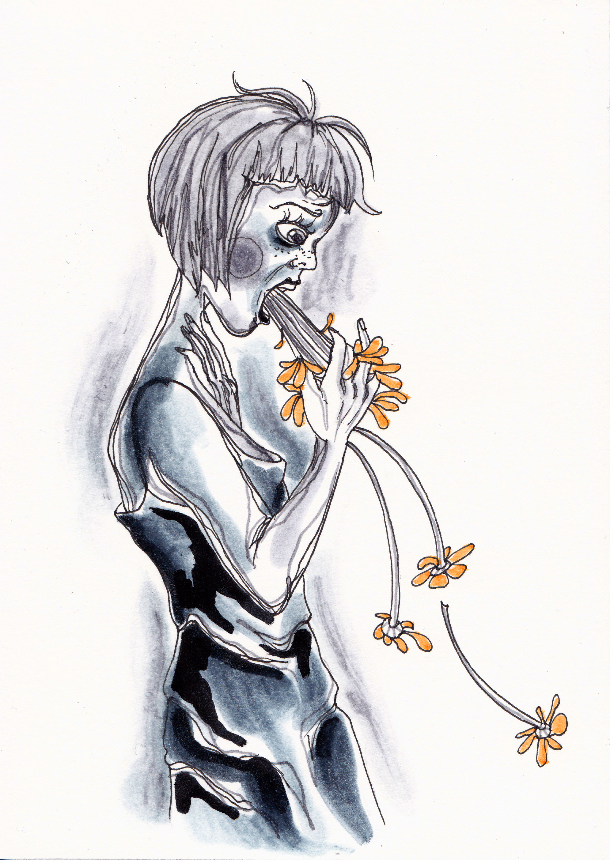
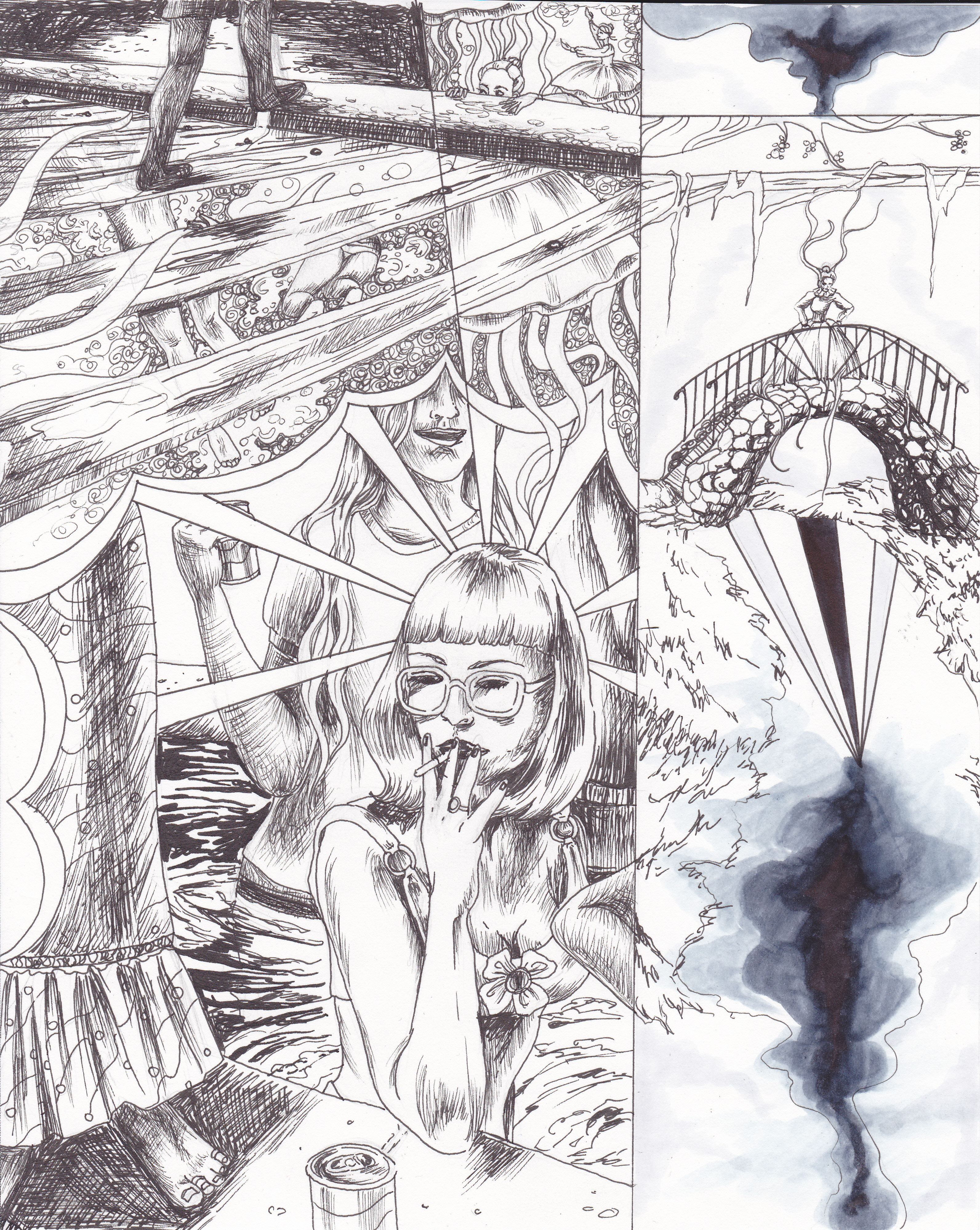
Quite awhile ago, I discovered this fun article with the daily routines of some well-known women artists, and thought it would be interesting to share my own average day.

I am lucky to have an art related day job teaching at local nonprofits where I am able to inspire people of all ages and abilities to create, especially those who don’t know they’re artists yet.

My basic routine on days I work right away in the morning is, to be honest, getting up roughly 20-30 minutes before I have to be out the door. I value sleep, mainly because I seem to just need my exact recommended 8-9 hours or else I am either a werewolf (in temperament, not amount of hair luckily) or a zombie … either way something monstrous and not ideal.

At work, my job often involves hopping from one focus to another all under the larger umbrella of art making, but this works for me. At home I find I’m always more productive and efficient when I have several project stations going that I rotate between. Typically I’ll travel to 2-3 different cities within a 20-30 minute radius within the day, completing chunks of classes at different centers with maybe a private lesson in between. I used to hate driving, but most of that is rooted in not liking the unfamiliarity of a route and a fear of getting lost (hello Developmental Topographical Disorientation). I have some favorite youtube podcasts I listen to about psychology and sociology (Psychology In Seattle, Bryony Claire, Meg) and nostalgic 90s toys (I most recently discovered the self proclaimed Mr. American Girl) and actually enjoy this little break to have some alone time and recharge.

I currently work with 6 different programs at 5 locations that include adults with disabilities, children with disabilities, alternative high school, traditional elementary school, and beginning and intermediate adult artists. I am also currently working on a series of murals for a pediatric physician’s office, commissions, and handmade wares for my online shop.

Why freelance? Having an uncontrollable and unpredictable schedule was a huge anxiety trigger for me, one that I’d tried very hard to overcome but in the end I figured out it’s just how I’m wired. I have no problem working evenings and weekends or long days – when I consciously schedule them ahead of time for myself and know what to expect. My longest stint in the arts being a Program Coordinator (before that, a bunch of short term disaster things if you know what I mean), I also found that while I love working with my students, I did not enjoy managing other employees. I am most content being responsible only for myself, and while some people really enjoy telling others what to do, I found it incredibly taxing and uncomfortable. I also just have too many options that I am excited to be involved in! I love having my hands in so many different things, because there is equal value in each and every pursuit, and I don’t know how I could limit myself to just one. I’ve been able to say “yes!” to so many more opportunities since I transitioned into independent/contracted work. As I mentioned earlier as well, I like the variety. If I start experiencing burnout or job dissatisfaction, it is more accessible to make some tweaks since I have the opportunity to “reset” basically every quarter and make positive changes based on what I observed in previous quarters. Margin is also something I’ve really struggled with as someone whose job and hobby/passion/therapeutic activity is one and the same. Some days, I am able to build in ‘breaks’ between programs if I see that is needed.

As with any choice, there are benefits and drawbacks. Struggles have been with all the traveling, I do lose paid time. When I first started and didn’t know what to consider when scheduling everything, I was basically out of the house ‘at work’ for 12 hours but only getting paid for 6. That was NOT going to work and I had to re-evaluate when and where I was placing certain things so that I wasn’t doing as much jumping around and backtracking. You have to be ok, especially in the current US economy, with not being rich. I experience a lot of job satisfaction and this year have actually looked forward to going to work each day, which I know is rare in our society. However, there are no job provided insurance benefits, no PTO, no 401K. Doing taxes each February is super complicated. There is a lot to remember with so many different plates spinning. There will be great months and disappointing months. Also, things aren’t going to just ‘work’ instantly – I went through a period of close to 3 years where it was very hard to discern why the heck I was doing what I was doing. Each individual person is going to have to decide whether it’s worth it or not based on their own personality traits, needs, and goals.

Do I do anything at all with my time that isn’t art related is a common question … Well, when I’m not engaging creatively I enjoy puzzles, watching movies (I watch close to a movie per night … not kidding), hiking, reading, and playing Sims. I love quiet evenings at home or with one or two friends.

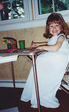
I always wondered if ‘little me’ would be happy if they’d have been able to look into a crystal ball and see what life looks like 30+ years in the future. I finally think the answer would be mostly YES!

The artist is always more productive while wearing her designer red carpet attire, which may or may not also be an old nightgown.

Standard
Techniques and Tutorials

Jellyfish Watercolor Tutorial

Another day, another tutorial! I’m making my way through my favorite animals first, with yesterday’s owl and now today a colorful jellyfish. Let’s paint!

You will need:

  • Watercolor paper (I used a 6×6″ piece, but you can work bigger if you’d like as well)
  • 3 Paint colors: A blue of your choice, and 2 accent colors. I chose magenta and lime green. You could also use 3 different shades of blue if you want. Jellyfish come in many colors!
  • A large (I used size 8), medium (I used size 5), and detail (I used size 0) round brush (The brushes that come to a point at the end).
  • A large flat brush (The brushes with rectangular bristles, flat on the end).

Start by adding a good amount of water to your main blue color choice to dilute it down to a light wash. Use your large flat brush to fill in the entire paper pale blue. Use long back and forth strokes, brushing in the same direction horizontally across your paper. There may be some streaks and this is ok as we are trying to create our water :). If you want to even anything out a bit more, you can brush over darker areas with plain water using the same brush to blend. Let this dry. Once the background is dry, grab your medium round brush. Dip the brush in some of the same blue color, but with less water so it goes on a bit darker. Outline a shape that looks like the top of a cupcake in the upper right corner.

Rinse off your brush, and with just water run your brush along the inside edge of that outline to blend it inward. Grab some more blue, and make 3 squiggly lines coming down from your cupcake shape. Curving them on the end makes it look more natural, like how they would be flowing as the jellyfish swims through the water. Using the same brush, grab some more of that same blue and add a paint streak along each side of your jellyfish top, and make some short strokes also along the bottom edge.

Rinse off your brush, then go over these blue streaks you just added with water to blend. Using the same brush, take your chosen accent color and make some squiggly lines over your blue ones in that new color. Next, we are going to use our small detail brush. Take your other accent color and make a curved bridge shape near the top of your jellyfish body. Streak some lines coming down from that bridge. Use your detail brush to make some thin tentacles flowing out from the body as well. Use the tip of your brush and drag it across with a light touch, hardly putting any pressure on the paper to get thin, flowing lines. If you are having trouble making a continuous stroke, just add more water. Your tentacles can flow in all different directions as they float through the water.

Rinse off your detail brush, and grab some of your first accent color that you used on the squiggly center tentacles. Make a broken scalloped outline along the bottom of the jellyfish body. You can also add an oval up top with some short, radial streaks coming down from the circle, like a simple sun shape. For a finishing touch, take your large round brush now and dip it in some watered down paint in the original color you used for the background – You don’t want this to be too dark. Make some bubbly, cloud-like texture in a portion of the blank space around your jellyfish by filling in the areas using a circular motion with your brush. Your brush should be laying at an angle as you do this.

These are so fun to make in different colors – You could create a whole jellyfish army!

Be sure to follow for more art fun to keep your mind and hands busy :).

Standard
Techniques and Tutorials

10 Ways to Make Your 2D Art More Interesting

I have always been a 2D based artist, not for lack of trying to branch out. I can make a 2-dimensional plane on paper look 3-dimensional, but when it comes to actually constructing a 3-dimensional object … my brain just does not work that way.

vernacularvillageroofI studied interior design in college, and I remember dreading the 3D model portion of each semester-long project. This is the one and only photograph I have of any of my models, and it is taken in aerial view because that was literally the only acceptable angle I could manage. At least this one wasn’t cut out of a Lucky Charms cereal box. Yes, I really turned in a model covered in pictures of colorful, Leprechaun themed marshmallows. Yes, it was sad. Now they have 3D printers for this crap.

For other artists out there who only travel in the world of 2D, it can be easy to feel stuck in a rut materials-wise. After all, you can make sculptures out of anything. 

0fb57244bef63cbbd90a127239d15868

No, really, I mean ANYTHING …


If you think outside the box, “flat” art on paper or canvas doesn’t have to be limiting. Here are 10 ways I’ve found that can spice up your current drawings or paintings, no matter what style you enjoy working in.


1. Add Text

transformation

Transformation, 18×24 Mixed Media, Do-All of Bay City’s Annual Art Clash Award Winner

Adding pattern based text, small print from books, magazines, or the newspaper, automatically adds not physical but visual texture to a piece. It is a simple, intriguing way to add the appearance of greater detail to your piece, whether it is ripped and layered in the background or cut into shapes to fill in focal objects in the foreground.730a10c1435c579f6052846f164896a9

The meaning of the words don’t have to be important. Or, you can choose theme appropriate text and emphasize certain words to add to your piece’s meaning. This is a popular technique borrowed from art journaling and found text poetry.


2. Include Texture

the dance

The Dance, Awarded Best 2D in Creative 360’s Piece By Piece Exhibition 2015; 18x 24 prismacolor pencil, ink, watercolor, fabric, book pages, embroidery thread

2D doesn’t have to mean completely smooth and flat. Oftentimes painters paint with a palette knife, slathering on thick layers of paint to create an uneven surface that raises and dips to create visual interest. Gesso can also be used to build up an uneven surface on canvas. Another option is applying mixed media elements to paper to create a textured surface. In the piece above, I crumpled white fabric and dipped it in glue, applying it to the surface for the ground. I crinkled and rolled strips of book pages for the raised texture in the tree trunks and branches.

3. Accent With Metallics

the peacock

The Peacock, Awarded Best 2D in The Midland Artists Guild 2015 Juried Exhibition, 11×14 prismacolor pencil

Varying the surface sheen in a piece is a way to once again increase the visual interest, thus drawing viewer’s eyes and keeping their attention. Metallics are definitely something you want to use with restraint, but when not overdone they can really elevate a piece. It is harder to tell in a photo but in the drawing above, I used silver prismacolor for both the sleeves on her dress and the streaks in the pattern on the brim of her hat.

4. Include Pops of Color

hopeful

Hopeful, Award of Merit in The Midland Artists Guild 2015 Juried Exhibition. 11×14 Prismacolor Pencil 

Adding elements of color amongst an image of mostly black and white is a technique inspired by photo-manipulation. Photographers have been tinting black and white photos since long before Photoshop was ever conceived.

902fa847868c397eded214cf4c8fee5f

Our eyes are naturally drawn to contrast, and including a bright color or two within a sea of black and white provides a “surprise” for the viewer.

5. Draw Viewers To The Eyes

I may be a bit biased because eyes are my favorite part of the face to draw or paint, but then there is that famous saying, “eyes are the windows to the soul”. There are quite a few articles floating around online about a scientific study that found that staring into someone’s eyes for 10 minutes straight can even cause hallucinations. All this suggests that eyes themselves are something of an intense element. Whether depicting people or animals, using visual elements in your piece that guide the viewer’s eye to meet the eyes of your subject is sure to keep viewers locked on your piece longer, and to create a more dynamic composition.

6. Don’t Ignore The Background.

I used to be guilty of being a huge background-ignorer. Now, you don’t want a fully fleshed out, detailed, photo-realistic background all the time, and in some pieces there is a lot to be said for white space. But, there is a difference between a background looking purposefully understated to emphasize the main focus and a background looking incomplete, like the artist just ran out of ideas and didn’t want to bother. There are two pieces shown above, one from 5 years ago on the left and one from 2 years ago on the right. Notice the difference something as simple as some softly outlined trees makes. The background is still mostly white, but it looks complete.

7. Collaborate With Other Artists

This is a hard one for me, because I honestly hate collaborating. I’m the kid in school who dreaded partner assignments. I always wanted to work on projects alone, even if it meant I had to do triple the work. I have a hard time letting go of control and not getting to make all the creative decisions myself. However, you learn so much from working with other artists, especially if their style is the complete opposite of yours as was the case in the two collaborations above. Do I necessarily like the collaborative pieces above better than the work I traditionally do on my own? To be honest, nope, but that’s not the point. I practiced techniques and styles I never would have attempted otherwise, which has given me ideas in other pieces I’ve done on my own.

8. Carry Around A Sketch Journal

devotional gag reflex

Devotional Gag Reflex, 2011, Ink

Not only is keeping a sketch journal super stress relieving (the above was me relieving some of my fun relational stress by comically depicting how I felt in the moment), but it provides an arsenal of recorded ideas and references to use and combine in future pieces. Life is busy, and I strongly believe we forget most of our best ideas because they happen spontaneously when we are in the middle of doing something, and we think oh I’ll remember it later and of course that never happens. Making yourself carve out a specific time to sit down and sketch may be good practice, but it isn’t when you’ll get your best ideas.

9. Draw From A Collage

collagepen_0001

Oceans Away, 9×12 Ink

One of my assignments in Drawing 101 way back in freshman year of college was to create a collage, and then draw straight from it. This technique is a great way to organize the elements in a piece, and visually construct your conceptual vision. You end up with juxtapositions of disparate elements that you may never have placed together otherwise.

10. Be Purposefully Imperfect

wonderlandlt

Wonderland, 18×24 Mixed Media

This comes back to one of those things I learned through reluctant artist collaboration. I am a clean edged, smooth lines kind of person and I always used to look at smudges and drips as mistakes, not a tool an artist could use on purpose. Now, I am in love with it and every piece I create that includes watercolor has dripping or bleeding somewhere in it. For the longest time throughout art history, the purpose of creating a drawing or painting was to fool the eye into thinking what it was looking at was real, especially before photographs. The informality of declaring to the world, “Look! This is made out of paint, see the brushstrokes, see the dripping?” shakes up a piece, and the viewer’s expectation. In this particular piece above, the surrounding world was supposed to look as it would through the eyes of the subject, a child. The sketchy, imperfect outline of the colorful buildings behind help emphasize that.

Step out of that artistic rut and try something new. Other 2D artists out there, what do you do to add interest to your own work? What draws you to a piece when looking at a 2D work?

Standard