One of the most exciting things about the changing over of a new year is finding out what Pantone’s new Color Of The Year will be.No, I’m not kidding – I am a dork. Purple being my favorite color, I knew 2018’s Ultra Violet hue was going to be hard to beat.
2019’s Living Coral is by no means an unpleasant color, but it isn’t a color I wear a lot or use in my art or design. I think it’s a little too pastel and preppy for me, but I’ve found I like it infinitely better when paired with black or grey, because black makes everything better. This was my philosophy with making some original-to-the-house bright yellow and silver foil wallpaper work in my bathroom update last year, and this personal rule of mine has held up!
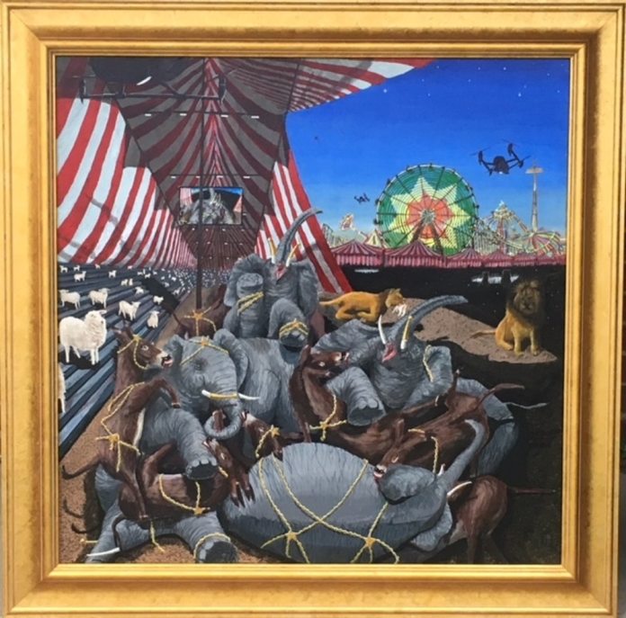
I was hard pressed to even find any art I have done over the last 10 years that included this coral hue aside from “The Rush Hour”. This piece of art can be seen below, along with some of my favorite interiors, wallpaper, fabric, clothing, and flowers that pay homage to our 2019 Color Of The Year.
I am going to make it my goal now to create some coral colored artwork for the new year! I’m excited to see what comes from working with unexpected colors.
Enjoy the last wee bits of 2018 everyone! I hope it’s been a good one!
Yikes, it’s been a whole month since posting last! My blog isn’t the only thing I’ve neglected … I must tattle on myself and admit that I gave up on Inktober after week 15! A half marathon if you will … perhaps I should have only committed to every other day! I have kept up with doing art every day though, which was the entire goal of Inktober to begin with. I was finding myself in the sticky situation of having to de-prioritize commissions and actual projects with deadlines in order to get my Inktober illustration finished for each day, which seemed counterproductive in the end. I do have a lot of fun art history based projects queuing up to share with you, and today our inspiration is an artist from my favorite genre of art: surrealism … Salvador Dali!
Dali is best known as “that melting clock guy” from his famous piece “The Persistence of Memory” that has now become a part of popular culture, parodied regularly. However, he also had a thing for tall and spindly creatures as evidenced from two more of his more well known works, “The Elephants” and “The Eye of Surrealist Time”.
My students in the Artshop Program love drawing animals, and the idea of depicting real things in a distorted way by stretching out their features was a concept that would be easy for everyone to grasp, so this seemed like a great jumping off point for making Dali’s work accessible.
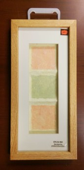
Every work of art looks better behind glass, from works created by a master to works created by someone who specializes in stick figures. Though not every drawing or painting has to be framed especially in a classroom/learning setting, it’s nice every once in awhile. Pro-tip! Frames are expensive, but often times nice frames with ugly artwork in them can be snagged for cheaper than so-so frames that are empty at your local art supply store. These long, framed pastel-dyed crinkly paper guys were clearanced out, because this dentist-office-esque art is really bland and kind of hideous, not something that people would be racing to put on their wall at home. So, we got some custom dimension frames perfect for this tall animals project for super cheap, and just discarded the mass produced “art” inside! This project could be executed with any drawing or painting materials, but I had my students use watercolor markers because it was a medium not all of them had the opportunity to try before, and the markers would allow us to get bright, saturated, unnatural colors like the deep reds and golds behind Dali’s elephants.
They found a photographic reference of an animal they liked for their subject, and then were encouraged to sketch on scrap paper and brainstorm how they could distort the image. They then made a pencil drawing on watercolor paper pre-cut to size, and used a sharpie pen to outline over the pencil so they wouldn’t lose their guide as they added the ink. The images were filled in with color and water, and there you have it! A simple, yet beautiful and intriguing end result where students had to challenge themselves to distort reality in an effective way. All ages and abilities could take this project in their own direction.
Happy creating! Remember, you are the artist, so you get to determine how you portray your world. Don’t be afraid to play with reality a bit ;).
I just made the last weekend of ArtPrize this year, and though to me it seemed like the venues had less art in them than usual, there were still some standout projects! Keep in mind I was only able to be in Grand Rapids for a day this year, so I by no means saw near everything. Of what I did see, the following were my favorites.
In approaching this piece, I experienced firsthand why I always tell people that when visiting a gallery or museum you absolutely should not just breeze by the artwork, but actually take the time to stop in front of each piece for at least 3 minutes. Looking at this series from way across the room, I thought it was just a set of typical boudoir photos. I am tattling on myself right now and admitting I assumed they were photos taken by a man, probably with some cringey artist statement about “appreciating female beauty”, and proceeded to internally rolled my eyes a bit. Then I actually walked right up to it and looked, and realized that first of all these are NOT photos! These were drawings with a story. Shepherd has a rare condition called Arthrogryposis which causes her to have limited mobility in her arms and legs. Because of this, she uses her mouth to draw. All of the women in these portraits have the same condition. Shepherd says, that society expects so little of people with disabilities, and that, “We are completely discredited as sexy, capable women by society due to our physical differences. We have the same hopes, dreams, and desires. We are every woman.” What a powerful statement, as this artist places the unseen right in our faces, and smashes stereotypes about disability!
I remember this artist’s work from the 2 previous years he was featured at ArtPrize due to his trademark effect of having his images trail off into wisps of smoke and vapor. I’d encourage you to visit his artist profile and look at last year’s tribute to 9/11. Everyone remembers those paintings of a Jesus looking wistfully to the sky, with long eyelashes and glossy auburn hair that every Grandma had hanging in her dining room at one point … This is not that. Khachatryan is from Armenia though he now lives in the US, and wrote lovingly in his artist bio about being able to see one of the first churches ever built in his home country. I can actually see the emotional, spiritual, and cultural connection the artist had to this subject as I look at this piece. The light, airy, glowing feel he has achieved using oil paints and mainly dark black at that is no small feat. I saw many viewers stop and audibly gasp in wonder as they approached this large scale painting. For your art to have that kind of power is a beautiful thing.
I adore mixed media, and this series stopped me dead in my tracks. Each piece individually is intriguing and beautiful, but hung together the viewer feels immersed and transported. This series uses monoprints to commemorate each of the 49 people massacred at PULSE nightclub in Orlando, Florida in the summer of 2016. The series is rife with symbolism encompassing the themes of grief in the wake of a tragedy, and violence against LGBTQ individuals and people of color.
I appreciate so many things about this piece, and would encourage you to click on the link to the artist’s ArtPrize profile to read all he has to say about it. This surreal allegory feels like such a release from the built up tension I know I have been experiencing in our current political environment. It is bipartisan, and Robert has made a piece rich with symbolism though even in his bio he will not divulge everything that was going through his mind, preferring to let the viewer think for themselves – a truly American sentiment. Robert said that “This particular piece has haunted me years”, and it does make a startling picture of our society, one that is not to be desired. However, if we can recognize it and call it what it is, then we can change it.
In this piece, Wolz created a ton of small, square pieces of art featuring quilled paper animals and plant life arranged in color order using Fibonacci’s golden ratio. It is meant to represent harmony, and I have heard that the paper quilling process itself can be quite calming, meditative, and harmonious. The detail is exquisite, especially to someone like me who couldn’t even make a paper crane during an origami craft lesson as a kid!
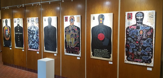
This collaborative series confronts the psychological affects of using human targets. seven pieces exploring the dehumanizing qualities of human targets. The artists believe that using human shaped targets desensitizes the shooter towards real violence, and go as far to say practicing on human targets is premeditation for murder – In weapons training and competitions using these targets, more points are awarded for shots that would “kill” a real human in the area the competitors are aiming to hit. I am so far removed from recreational or even protective gun use that I honestly hadn’t a clue that these were the targets most commonly used at shooting ranges … No one in my family hunts, and growing up no one in my household was ever the least bit interested in owning a firearm even for protective use. I have never been to a shooting range, and always pictured targets as the little red and white concentric circles like Katniss Everdeen may use to practice her bow and arrow. It’s a lot to think about, and this artwork starts an important conversation. The artists produced over 50 target artworks, and chose 7 for the final display. I do a lot of series myself, and am impressed by their commitment to put their strongest work forward for this important and relevant issue.
This post comes a bit late, but I hope you all enjoyed learning about some new art and artists. Have an inspiring evening!
I got a bit behind on sharing my projects, but have now caught the awful Fall cold that is going around, so no better time than the present to sit and type with a hot cup of tea at my side. Gustav Klimt’s work, like that of the earlier covered Van Gogh, is one of those bodies of historical work that is recognizable even by non-artists because of his unique style that has been made readily available in print form to this day, and is appropriated and referenced constantly in new art. Though I’ve never experienced an emotional connection to his work, I love the use of metallics and vivid, overwhelming detail of his pieces as well as the merging of both realistic and painterly elements.
Klimt began as a decorative painter under the belief that art’s true purpose was to show viewers something beautiful, and got his start painting murals on the walls and stairways of lavish, wealthy homes. His personal work was charged with an eroticism that was not present in art at that time, and it earned him a good deal of disdain but he remained committed to depicting the beauty of the world as he saw it. His pieces have resonated and stood the test of time, enough that virtual immersive experiences of his work were made available this year in Paris and Austria.
Not all of his work is sensual in nature or contains nudity, and there are plenty of other examples to show as inspiration if you are doing this project with younger audiences.
Klimt’s work incorporated figures and portraits, but learning how to draw faces and the human body properly is a whole semester of lessons within itself! To make a Klimt project that was accessible to all skill levels, fun, experimental, and stress free, we used collage. Some of Klimt’s portrait work does remind me of a very early form of fashion editorials, so we cut out models and celebrities from Elle and Vogue magazines to become the subjects in our Klimt inspired artworks.
Students were then encouraged to place their magazine cutout where they wanted it on the page, and trace around it with pencil to save the space. I recommend gluing the magazine cutout on last so it doesn’t accidentally get smeared with paint. After outlining, students could add on and sketch the outfit of their dreams with pencil. Once the basic outline was complete, students filled in the background and clothing in different shades of metallic paint first, and then could add detail overtop with pattern. As I’ve mentioned before, I work with a lot of adults with disabilities and seniors in my art program. Painting small patterns with a brush can be hard for some depending on their dexterity level so we made this project more accessible by also introducing the use of ink stamps for those who were struggling with fine motor skill. Innovation can lead to some simply amazing results, as can be seen by the work-in-progress above! Be sure to check back soon for more artist-inspired project ideas!
Another week, another artist! I shared my Van Gogh project last week. In week 2 we covered Henri Matisse. His personal story really resonated with the students, being a group of adults with varying disabilities.
Matisse spent the majority of his artistic career as a painter, being one of the leaders of the Fauvism movement in the early 1900s. Fauvism is characterized by a painterly, non-realistic representation of people and objects and a strong use of bold “crayola crayon” colors. Unblended strokes of pure color divide objects from their background rather than shading. He wanted his art to be calming and cheerful, an escape from the world’s troubles. In 1941, everything changed when Matisse was diagnosed with cancer and had to have surgery. His life was saved, but from that point forward he required the use of a wheelchair for mobility, and struggled with dexterity. Matisse famously said, “Creativity takes courage“, and at the age of 72 no matter how he had changed physically, he refused to give up on creating. He shifted gears to a cut paper collage format for his work as painting was harder to manage with his dexterity changes, creating yet another influential body of work. He ended up liking this new, modern style even better than what he had been working on before, and you can still see similar shapes, styles, and color schemes taken from his paintings and applied to his collage works, such as the organic leaf shapes. His final project was stained glass windows for the Chapelle du Rosaire de Vence as seen pictured above, designed in his iconic collage style.
Though the term disability pride wasn’t part of our vocabulary at the time Matisse was alive, I think his legacy perfectly embodies this concept. He did not look at disability as a barrier, but an opportunity to innovate.
For our project, we created beautiful decoupage bowls inspired by Matisse’s paper cut works. I chose to focus specifically on shapes present in his chapel design, though if you do an image search of his collage work you could find many other ideas. I cut patterns out of some scrap matte board for the students to trace. We used colored printer paper for the cutouts – It is thin enough to be able to bend along the round shape of the bowl without popping back up or creating massive wrinkles, but thick enough that the color of the bowl won’t show through. We used matte Mod Podge to apply and seal the shapes onto the bowl, and the bowls themselves were picked up at the dollar store, making this a ridiculously inexpensive project with beautiful results.
This would be a fun project to do with all ages from kids to seniors, and makes for a great gift idea if planned closer to the holidays or Mother’s Day. Since Mod Podge is not food safe, obviously you do not want to try to eat cereal out of these or something ;), but they are a perfect catch all for jewelry, keys, pens pencils and paperclips, or change. Also a cute decoration when filled with decorative orbs, glass marbles, or stones. I love color, and may just have to make one of these for myself at home!
Hello all! This is my first post I’ll be doing on my Creative Minds class projects I am leading with my program this semester. Each week we will be learning about a well known artist from the past or present, and completing a project based on their process and style. I work primarily with adults with disabilities or mental health issues, and though we will not only study artists with disabilities, mental health issues, addiction, or chronic illness, these individuals will be a special focus.
Today I’ll be walking you through an enjoyable and easy project inspired by the art of Vincent Van Gogh. Being the Coordinator as well as an instructor for an inclusive recreational arts program, there is always a wide range of abilities and experience levels in each class. I am excited to make art history accessible and fun for all ages and abilities. Vincent Van Gogh has always been one of my favorite historical artists, so of course he had to be the artist I chose for week 1. I know that he’s a lot of people’s favorite, but I have always felt a special kinship with him as we also happen to share the same birthday!
His use of light, color, and movement through swirling, visible brushstrokes has become iconic and easily recognizable even to those with no knowledge of art. Also common knowledge are Van Gogh’s struggles with mental health throughout his life. He was blessed with a supportive and loving family member, his brother Theo, who financially supported him so that he could continue painting despite being unable to hold a job or make an income for himself. It seems his brother saw firsthand the transformative power of art, giving Van Gogh at least a few more days, months, years, or sometimes just moments of peace and joy than he would have experienced otherwise.
Oil paints are pricey, require copious amounts of time to complete a piece, need adequate ventilation that may not be available in all classrooms, and can be frustrating for beginning artists. So, we ditched the oil paints for oil pastels!
The first step in our project was to make a simple outline in pencil first. Students were encouraged to be inspired by the provided images of Van Gogh’s most famous works, but not necessarily to copy. They could make a scene, a still life, a person or animal, or anything else that came to mind. They could then use the pastels to trace over their pencil outline, and add more lines in between to mimic Van Gogh’s iconic style. Students could fill their paper with as many swirls, stripes, or dashes as they wanted as long as they still left white space behind, because next the magic happens!
After their pastel outline was completed, students could fill in their different areas with watercolor washes, and watch the oil pastel repel the water. Though not a requirement, this technique is especially amazing to watch when washing darker watercolors over bright or light pastel. One of the students even commented that it was “like magic”. This process is simple enough to be enjoyed by students of all abilities with minimal frustration, but also fun for more advanced students. Pro tip: make sure you have enough water in your paints! If your watercolors are brushed on too dry, they won’t repel as strongly. Also, be sure to use paint brushes with soft bristles. Stiff, scratchy brushes are harder on the oil pastel and will not give as neat of a result.
There is a common narrative that Van Gogh suffered so much because while he was alive his art never became famous and people wouldn’t buy his paintings. I don’t know about that … I am a Doctor Who fan, and for those of you unfamiliar with the show it’s about time travel. Who would have thought, but this whimsical sci-fi TV show ended up moving me emotionally more than any work of cinema I’ve ever seen, and I watch a lot of movies! In my favorite episode, our adventurers go back in time to pay a visit to Vincent Van Gogh. They end up whisking him away to the future, where he can see all his paintings on display in a museum, and hear his fame being lauded. It is hoped that after seeing this, Van Gogh’s spirit will be renewed, and once he is returned to his own time he will not end his life as he did in history. They hope that when they visit that same museum again after their adventure, there will be walls of new Van Gogh paintings, having altered the past by showing Van Gogh his future. That does not end up being the case.
We put so much emphasis in our culture on fame, money, talent, and popularity that it is hard to accept that these things are not a magical panacea to fix all of our problems, and that sometimes these things are not enough to make us happy.
We need to keep reaching out to each other. As this episode concludes,
“The way I see it, every life is a pile of good things and bad things. The good things don’t always soften the bad things, but vice versa, the bad things don’t always spoil the good things and make them unimportant.”
Make it your goal to add to the pile of good things for the people you encounter each day.
A student that had been reluctant about this project at first because they don’t draw or paint ended up having a blast, saying they felt like they were getting to play and be a kid again. A lot of times, that is exactly what art is about! As Van Gogh himself said, If you hear a voice within you say ‘you cannot paint,’ then by all means paint, and that voice will be silenced. I hope some of you will decide to play and try this project yourself at home! Be sure to check back in the following weeks for more fun project inspiration.
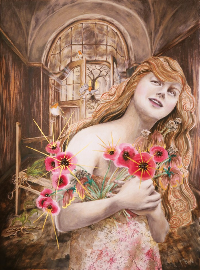
This first piece in a new series was a long time coming … I am obsessed with working small, and tend to work in 11×14 or maybe 16×20 max, and wanted to start doing pieces that were at least 18×24 or larger to allow me to include more detail and further develop the background in my pieces. My new series, Dwell, really taps into my background of interior design study. These pieces will contemplate how our environment affects us, but also how we interact with and affect it. The word dwell also has a double meaning, not just the physical space where we live but the places we create inside us that we allow our mind to dwell in. How are these psychological spaces affecting us, and how much control do we have over them or they over us?
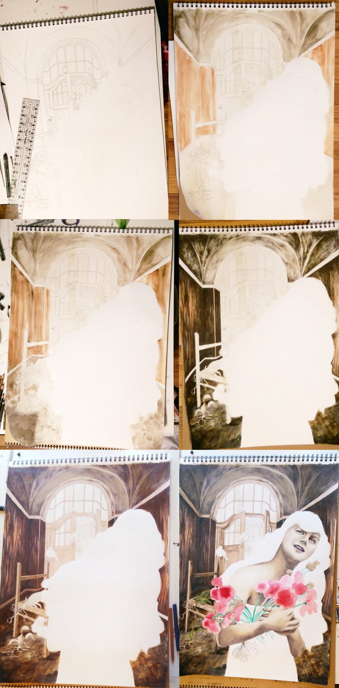
“Dwell In Possibility” was a challenge for me because it involved a lot of brown, a color I literally never use in art. I tend to create pieces that are mostly grayscale tones with pops of bright color, and gray just would not have been right for the earthy feeling I wished to evoke. The other challenge to this piece was that I was creating an interior that was not very attractive or intricate … the remains of a decaying building, dirt floor, rough wood paneled walls, weathered plaster ceiling once grand but now stripped of any color or design … The only furnishing an abandoned, sun bleached chair frame.
I did a lot of layering of different media overtop one another, and used my clear prismacolor pencil blender for the first time in my entire life. I usually use a white pencil to blend, but this time I couldn’t use an opaque blender because I wanted to be able to still see the underlayer of watercolor through the blended pencil. I left the flowers and hair purely impressionistic watercolor as opposed to the detail in the background and the model’s face. I didn’t use as much dimensional mixed media as usual, not wanting to add too much clutter, and stuck to a lace fabric overlay on her dress and clusters of beads for the centers of the poppy flowers.
The closer you look, you will see there is a lot more going on than just a smiling woman holding a bouquet. She is already stationed in an odd setting, an old deteriorated building. She is surrounded by decay, including uprooted, dying plants. Even some of the flowers in her hands are dead or dying, but they are slowly coming back to life as she grasps onto them, holds them and nurtures them. Behind her through the door there is a cavern of light, where a grand tree has taken hold. There are no leaves yet, hardly any soil for his roots to grasp onto, yet he is still alive somehow. Robins circle around, a bird that symbolically means rebirth. Change and growth are always possible.
As you can also see, I can’t seem to put down the metallic gold acrylic lately! At work, my students always want to cover everything they make in metallics and glitter, which often makes me shake my head, but I can understand the temptation ;). Speaking of which, I am starting a new class called Creative Minds where each week students will be learning about an accomplished artist of the past or present, and completing a small project based on that artist’s iconic style with a focus on artists with disabilities and mental health. I will be sharing my projects as well as some of the students’ interpretations, so be on the look out for a new project post each week! I am hoping some of you reading this will want to try it at home yourself. It’s always fun to play :D!
I mentioned that after my first Monster High Doll repaint, I had become addicted and immediately was flooded with ideas for future dolls. I wanted to do a doll where I altered the hair next. A lot of re-painters remove the hair entirely and use doll wigs, but for now I want to focus on using supplies I already have in my bountiful storage. This Draculara doll’s hair was a big ‘ol mess, practically beyond saving. I’d been wanting to do a doll with short hair, so she fit the bill perfectly.
After I’d taken her hair out of it’s ponytail, I took a deep breath and started chopping. I was never one to cut my dolls’ hair as a child, being very protective of them and keeping them in as pristine condition as possible, so this was a bit painful but I knew it was for art’s sake ;). Once I combed the remaining hair out, I was left with mostly the pink with spikes of black in between. I used fray check to mold the hair into the style I desired.
The perfect feather shapes were cut from the leftover fabric of a dress I made years ago (With tons of help from Mom. I am not a sewer.), using a funky vintage pattern from the 70s. I have a bit of what has always been lovingly referred to in my family as “tactile stress”, and so I never ended up wearing this dress a ton because the elastic wrists and extra fabric flopping around on the sleeves irritated the living hell out of me. I ended up eventually selling it to a very excited new owner, sans clothing neurosis.
I left the original skirt underneath for volume, and layered fabric feather shapes with synthetic feathers underneath, accenting with tiny crystals here and there. There are also feathers embedded into her hair, on her shoes, and hanging from her ears as earrings. Her original face was removed with acetone, and her new face was painted with both metallic and matte acrylics blended with matte medium. I used a gloss medium over the eyes and lips to give them a wet look. Her eyes are also circled with crystals, and a feather pattern grows from her hair onto the side of her face. Her tiny nails and toes are painted to match her lipstick. I’m really digging the 80s rocker /slash/ anthropomorphic bird-human hybrid look this little lady has going on.
I also have one of the werewolf (Clawdeen) dolls, and I am pretty sure my next doll is going to be an Egyptian cat deity, so look out!
These dolls and other fun creative objects can be found in my ebay shop! Here’s to (literally) making new friends!
It’s been awhile since my last Artists To Know post, and today I wanted to focus on photography. I have always been interested in photography, but never took the craft further than just “playing around”, and don’t really do any artistic photography anymore today. My favorite type of photography has always been work that shows us more than what we can already see in front of us, photography that is not objective but that injects part of the artist into what it is they capture (or create, as in the case of our first artist who uses found photos for collage). I hope this post gives you some Sunday afternoon inspiration, as these artists did for me!
Catling is a graphic designer from the UK who works primarily in collage. He is known for his use of old black and white photos, especially of somber subjects such as war photography, which he gives new life through the juxtaposition of jarringly bright, cheerful patterns. As someone who loves pattern, his images just plain make me happy when I look at them, and give me quite the urging to dig out a book of old wallpaper samples and go to town making something amazing!
A self proclaimed “army brat”, Chatmon did a lot of traveling as a kid and had resided in 3 different continents by the age of 12. Once settled in the US, she turned more in the creative direction of theater. She didn’t start getting into photography until her early 20s, when she was gifted a camera at 19 and through self teaching and expirimentation saw an opportunity to make a living through the lens. After losing her father to a battle with cancer in 2010, Chatmon’s portrait photography became not only a career but a way to communicate and process emotions, an art. What first drew me to her work was the image above, part of her series titled “Deeply Embedded”. The composition and heavy use of pattern on the clothing reminded me a bit of Gustav Klimt, one of my favorites from art history. Chatmon writes about this series on her website, “Deeply Embedded was created during a time where I continued to come across negativity centered around natural black hair & styles. Anger followed by frustration and sadness forced me to refocus that energy into creating work to speak for me as our words fell upon deaf ears.” There are many different forms of beauty in our world, and photography is the perfect medium to capture that fact.
Stefan Sagmeister is an Austrian graphic designer and typographer. He currently works in the US and is known for his work in advertising and album covers, for which he has won 3 Grammy awards. Much of his personal work centers around the elusive achievement of happiness, conveyed through statistics, personal experimentation, and design. Though I myself am very skeptical that there is a magical formula or set of steps that will universally make every human happy (I am a big proponent of “If it’s not true for one, it’s not true for all”.), I do enjoy art that gets viewers into the head of the artist and visually shows their thought processes.
Aydın is a Turkish artist who combines images he captures with drones to create mind-bending multi-angle landscapes. It is evident in his portfolio that special attention is paid to the use of pattern and line as he composes his imaginary worlds. I would have never thought of using drones for art, and it is fascinating to see what can be done with this relatively new medium.
If you know an artist you’d like to be featured (or are an artist yourself!) feel free to share with me. I love discovering new creatives!
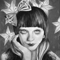
My ArtSnacks Challenge illustration this month was created using past profile pictures as a reference, an homage to my love of eccentric fashion and costumes year-round, and my lifelong fascination with what creates identity.
I mentioned in a previous post how art has been an important tool of expression for me throughout my life. Turning myself into the things I wanted to be at the moment as if I was just another blank sheet of paper was another part of this. It always boggled even my own mind how in school I was too embarrassed to even stand up and go throw something away in the trash in the middle of a class lest I draw attention to myself, but I’d wander about town on the weekends in full zombie makeup in the middle of July and not feel a bit of trepidation. When people would talk about identity, or “groups” both in grade school and now, I have never known what to say for myself. I’ve never felt that I strongly identify with one certain label or category in any area of my life, but am instead either nothing or everything all at once. Most likely, I am the latter. It was fun doing something that was more of an actual, personal “art journal” page, and also reliving many fun memories through fashion of years past! As an adult at work all day, for the most part now I either wear meeting clothes or messy-art-class-clothes :-/.
Cry Baby Extra Sour Gumball (This brought me way back to childhood …)
I appreciated the sharpener not only because of the snazzy ArtSnacks exclusive color that is very close to what I’ve just painted the front door on my house, but also because I had previously only had cheapie sharpeners akin to what kids bring in their elementary school pencil case. This is admittedly odd for someone who works so much with colored pencils! They had me at their automatic stop function as I tend to be rough on pencils and am always breaking the leads. The fact that you can sharpen the wood and lead separately for the perfect point is also a very unique feature. I like it!
The SumoGrip eraser was another favorite. I’ve mentioned before how nothing beats Pentel Click Erasers in my mind, but I think my old friend may have finally met its match! I was freaked out at first by the black color, expecting it to leave dark smudges on the paper but it left no traces behind, and did not require a lot of pressure or abrasion to lift graphite from the paper. I’m impressed.
The pencil was also nice, and I can’t say I have any complaints but I will always be a mechanical pencil girl overall. Still, if I ever need to reach for a traditional pencil this will not be a poor choice.
I love brush markers, and the one that came with this box was no exception. What I noticed right away is the lack of bleeding for an alcohol marker. Another bonus is the fact that you can replace nibs and refill the ink in each marker base rather than having to replace the entire body when it runs out. Excellent performance – I will definitely be looking into buying some more of these.
Lastly, the Millennium pen. Longevity was a big focus of these pens which is very important to me as I don’t just sketch with pens, but incorporate ink drawing into many of my finished fine art pieces as well. It made a nice line, and did dry far quicker than the other pens I usually use which helped avoid smudging, and it did not bleed at all when the marker was applied. Another win!
This is my last unboxing for a bit since I only got a 6 month subscription at first to try it out. (I also need to get a chance to really explore these supplies in more than just my art journal and see if I want to get a full set of any of them to use in my large scale art!) All in all I have enjoyed having ArtSnacks as my first experience with subscription boxes, and have felt there was great value in the supplies that were sent each month. I’d definitely recommend.


 My students in the