Artists To Know

Artists To Know: My Personal Influences

People are constantly asking and being asked the question, Who are your influences? Who do you consider your hero? Who are your role models? giphy
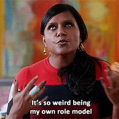
I never know how to answer and end up feeling like I’m having some sort of Mindy Lahiri moment. It sounds totally pompous and terrible to be like … Hm, well I’d say myself probably? but that is how I feel sometimes! I love art, and have seen many pieces that have spoken to me in some way, but I’ve never had that “master artist” whom I felt informed my whole artistic style and way of doing things. I’ve always had this strong aversion to even remotely copying or being influenced by anything at all. I remember growing up in school, my parents would ask me what I was working on in class at the dinner table. I’d go on about some paper I had to write, and one of my parents (usually my dad) would pipe up with, “Oh, I know! You can write about _________!”. I’d get so mad and exclaim, “Great, now I can’t write about that even if I was going to because you said it first so it’s not my idea anymore!”A lot of times it truly was the idea I’d had in my head already, which was super problematic.

I am a very visually based person, and images have always stuck with me more than individual people anyway. As a way to maybe untangle some of my artistic influences, I have shared individual images that have struck me in my artistic journey, inspired me to create, and made me excited about being an artist. You may see similarities between some of these images and the work I aim to create, and some may be as different from my own work as night and day. You will not see any flowers or landscapes. Enjoy!

One of the first pieces of art that really impacted me once I was in high school and actually started developing an artistic style of my own wasn’t actually traditional art, but a fashion editorial from Elle Girl magazine. Elle Girl was infinitely better than it’s preppy, air-headed sister Cosmo Girl, or so I believed at the time – Elle Girl had Emma Watson on the cover (in a marching band themed shoot of all things), and also first introduced me to the band Tegan and Sara via a short article featuring lots of photos of them leaning against walls in cool clothes and an answer to the all important question, what IS that weird sauce that Canadians put on their french fries? Its slogan was “Dare to be Different”, and it did tend to feature more unique, out-of-the-box photo shoots than other magazines geared towards teens. I was super into photography at the time as well as drawing, and though I had never thought of myself as a super confident person, I loved dressing up in fun outfits and makeup and crazy jewelry with my friends and taking photos. I loved doing this because it allowed me to be far more bold and outgoing than my social anxiousness normally allowed me to be. All the outlandish clothes and hair and bright makeup is like a protective mask where you feel more like you are playing a character than anything else, and you don’t have to feel awkward or embarrassed about anything.

I came across these H.R. Geiger pieces at Barnes and Noble of all places, while looking at calendars for my new dorm my first year away at college. I was most struck by his more figurative work. His pieces are super creepy but they tell a story, and I was so impressed by the striking monochromatic contrast and seamless, almost obsessive detail. It was unlike anything I’d ever seen before. I didn’t end up buying the calendar because I had many more purchases to make and it was like 25 bucks. However, I took down his name to look up more of his work, and have been a fan ever since. Funny enough, I wouldn’t watch Alien, for which he did a significant amount of visuals, until about 3 years ago.

I discovered these works from CC Askew and Camille Rose Garcia respectively in the art magazines I started to devour in late high and school early college. I hadn’t seen a lot of art from current working artists at that time, because art classes in school tend to be overly focused on the past. I understand the whole learn your foundations thing, and appreciating the history of art is important, but I remember being somewhat surprised to discover that there were actually well known artists that existed past the 19th century ;). These solidified my affinity towards pop surrealism, and I fell in love with their heavy use of twisted-storybook-esque illustration, a mix of imagery that can be both childlike and nostalgic yet also deeply dark.

Two works I also discovered in glorious outsider art, street art, and pop surrealism magazines are these by Lori Earley and Sylvia Ji. Both were artists who focus heavily on portraiture, as do I in my work. They used contrasting, unusual colors and their pieces were delicate and feminine but not without a dark, surreal edge.

These pieces by Ray Caesar and Ruben Ireland were the first digital art that ever peaked my interest. For the longest time, I had harbored such a grudge against digital artists (those bunch of cheaters!), mainly because the only digital art I’d seen was poorly executed fan art or digital manipulations that could be done in about 5 minutes with the right mouse clicks on Photoshop.  These artists, however, utilize the medium to do things that you can’t do traditionally. For example, Caesar actually creates entire 3D worlds which he then rotates the camera view within and crops to create his final pieces.  I have recently done some experimenting with digital art myself, and it is challenging, let me tell you!

Another one of my inspirations is always, always my students! One of my students who comes to Express Yourself Artshop from an area assisted living home just taught me last week how to make crochet necklaces!

img_20170212_144208_773

Fellow creatives out there, be it artists, designers, musicians, writers, actors, any part of the spectrum: who (or what works) inspire(s) you to create?


Standard
Techniques and Tutorials

Start Drawing Amazing Eyes!

Eyes have always been my absolute favorite thing to draw, and I tend to accentuate them in all of my artwork. They can also be one of the most difficult things to draw, and it takes a lot of practice to get them right. There are a lot of picky little details to pay attention to. When we begin drawing an eye how we “think” we should, without really observing an actual eye’s appearance as if we have never seen one before, we tend to end up with a drawing like below. Generic football shape, outlined individual eyelashes, harshly contrasting pupil and highlights, and those pesky little lines jutting out all around the center like a kid’s drawing of the sun. In reality, an eye’s darks and lights are much more subtle and blended, each person’s eye is a completely different shape, and unless we are drawing a huge zoomed-in eye filling an entire 18×24″ piece of paper, you wouldn’t actually see individual eyelashes. I’d like to share my tricks of the trade with you. Grab a piece of paper and follow along. It will be fun, I promise! Don’t worry about doing everything “perfect”, just enjoy sketching. Every artist does things slightly different, and the more you practice you may discover some of your own “tricks” that work for you.

eyenono

  1. Lightly outline the contour of the eye. Don’t just draw an oval with half circles above and below it. Pay attention to the exact curvature of the unique eye you are trying to draw (photo references are always good.) Is it wider on one side than the other? Does the eyelid dip down drastically or does it curve more gradually? Are the curves of the eye and eyelid soft and smooth, or more angular? Is the eyelid rounded or more flat on top? Is the fold under the eye parallel to the bottom eyelid, or does it droop diagonally? Sketch lightly, as you don’t want to see harsh outlines through your shading.
  2. Shade the outside perimeter of the eyeball. The darkest shading is always at the two corners of the eye, and gradually fades as you get closer to the iris. There will also be a deeper shadow underneath the eyelid since the lid overlaps our eyeball, blocking the light from reflecting as much up top.
  3. Shade around the iris, again with slightly deeper shading closer to the top eyelid. Even if you don’t explicitly see shadows near the iris in your photo reference, the white of our eyes are never really pure white, and you will get a much more realistic look if there is a gradual transition between the iris and the white of the eye, rather than going from fully colored in iris to stark, clean paper in the white of the eye. This step helps the iris look “settled” into the eyeball rather than looking as if it is “hovering” on top if it.
  4. Add your darkest shading on the top of the iris. This should be a shade darker than your darkest value that you used previously underneath the eyelid when you shaded the white of the eye. Think of a crescent moon facing downward, with the thickest shading up top, getting thinner and then altogether disappearing as it trails down around the edges of your circle shape.
  5. Add in your pupil and reflections. The reason we do this next is because we want to have the reflection areas mapped out before you get to shading the rest of your iris. You can go in with an eraser and add highlights by removing shading afterward, but this can be messy and end up smudging work you don’t wish to be smudged. I find it easier to just leave the highlights white to begin with. The location varies by light source if you are using a photo reference. Without a specific reference, it is safe to add two highlights, one on top and one on bottom at a diagonal to each other. Fill the pupil in dark black. This will be your darkest value.
  6. Shade around the pupil using the same value you used to shade your crescent moon around the top of the iris, one step lighter than black. Again, this anchors the pupil inside the iris so it doesn’t seem as if it is floating on top. This gradual gradation from dark to light makes the separate parts appear as a whole.
  7. Fill the remainder of the iris with a medium value. Again, we want all our value transitions to be gradual, so get a little lighter when you begin shading around the edges of your highlight areas.
  8. While we don’t want radial stripes circling the inside or our iris, we don’t want to smooth all the visual texture out of it either, as the striations of dark and light we see are part of the deep beauty of eyes. Literally “scribble” some slightly darker shading shooting out from the pupil in the two areas between our highlights. Again, please scribble though it may seem odd and scary; we don’t want neat, individual lines extending from the pupil.
  9. Add the tear duct by simply finishing the shading around your eyeball, cutting off the little teardrop shaped dip in the inner corner.
  10. Shade your eyelid! Shade the darkest in a thin line over the crease you originally outlined. Don’t just trace your line darker, shade by moving your pencil back and forth swiftly in short strokes over this line. Above this, shade a touch lighter to again make a gradual transition from dark shadow to white paper. Shade darkly also over the curved line directly above your eyeball, the edge of the eyelid. This will provide a foundation for the eyelashes, which we will add later. Shade along the bottom eyelid like this also.
  11. Shade the bottom crease under your eye. This is not a direct “fold” so it should be lighter than the shading for the eyelid since it is less in shadow. Shade deepest along the line you originally sketched, and shade lighter around this line on top and bottom. Extend the shading up to the outer corner of the eye to really show the skin curving. Add some light shading under the dark crease of the upper eyelid.
  12. We’re going to scribble again! Add some jagged shading pointing out from the top and bottom eyelid where the eyelashes will go, more so on top than on bottom. Do this in a medium value.
  13. Now, you can go over and add some individual curved darker lines sticking out to add some detail to your eyelash area. Don’t make them all the same length, and try to curve them – no straight lines poking out! Add a bunch overlapping each other using swift, light strokes with your pencil. They should be dense and close together.

These are not hard and fast “rules”, and once you’ve practiced the basic guidelines you can twist them to create entrancing eyes in your own unique artistic style, both realistic and more comic or stylized.

Speaking of eyes, I just designed a new pattern for Redbubble covered in glamorous eyeballs for your enjoyment. Check out all the cool new products featuring my digitally drawn pattern Mascara Tears here!

Feel free to throw a comment my way if you have any other drawing questions, I’m always open for giving tips. Any best practices other illustrators out there have found helpful? Don’t hesitate to share!

Standard
Exhibitions and Other News

Super Exciting News (No, I’m Not Engaged. But Read This Anyway.)

First, I must explain the title. It’s a bit of a joke because the last time I did a post in which I professed exciting news, like everyone thought I was engaged. When I was like ‘nope, even better, I won Best 2D at an art exhibition!’ they were like, ‘Oh well, I guess that’s pretty cool too.’ I think this face of epic disbelief from the 10th Doctor sums it up pretty well.

304_daleks_in_manhattan_2

But, back to my still super exciting news. I had mentioned earlier how thrilled I was about getting into the Greater Michigan Art Exhibition at Midland Center For The Arts because I had entered the 2 previous years as well and had yet to be chosen to exhibit. Well, first I found out that not just one but all three of my entered pieces would be hung in the show.

imag4322r

Then, I found out that one of them had actually won an award! I feel so unbelievably honored to have one of my pieces receive a Juror’s Recognition Award.

imag4325r

(I hate closeup pictures of me holding things  because I feel like I have freakishly short fingers. No wonder I could never play the piano well even after years of lessons. Well, that coupled with my total apathy towards the vocation and complete lack of practice, but thatis another sotry for another day. Despite finger length, I had to show off the snazzy brochure.)

januaryr

The fact that they chose the piece that is going to be one part of my 12 part series I am planning to enter into ArtPrize next year was a welcome sign that I am going in the right direction with this project, and creating something that will bring people joy, make them think, and spark their imagination. If you are in the general vicinity of Midland, I would suggest you make a trek over to see this show. It is a humongous exhibit, and there is so much awesome art to absorb.

Standard
Art Discussion, New Work

March: She Is Everything At Once

Obviously, though I had a fun idea of doing the whole “a drawing a month” reveal for my new 12 part series, that didn’t happen as I am on March and it is now almost September. I would like to enter this series into Art Prize next year, and decided if I have until next Fall, why impose such a crazy impossible deadline on myself simply for the sake of themed blog posts and risk the quality of the work? Impossible self-imposed deadlines are this thing I like to do that I really need to ease up on. For those who haven’t read my previous posts, my new series involves 12 mixed media, surreal, conceptual portraits in which the meaning is influenced by the use of pattern and color, one representing each month of the year. They will depict women of all ages, races, and time periods, and each will communicate a different theme and season. I aim for the pieces to speak to women’s collective experiences beyond their differences. I want the series to flow together in its mainly black and white scheme with pops of color, soft mixed media application, and it’s classic portrait composition. However, I wanted each month’s portrait to still be distinctly different “characters” from one to the other, achieved via aesthetic theme and accent colors. For this piece, I went with bold, dynamic primaries and a nod to pop art. You can view January and February from earlier posts.

In this piece for March, my goal was to take the commonplace negative stereotype of women being “emotional” and turn it on it’s head, marrying caring and empathy with strength, and sadness and despair with hope for a better future. A surreal merging of classic pop art, which often featured dramatic beautiful women sobbing,  with realistic portraiture was the perfect fit for this concept.

march.jpg

Women are constantly being told they are too much of something, despite the fact that they are often expected to wear far more different hats responsibility-wise than their male counterparts. Google searches have become an interesting way to peek into mainstream society’s views. Anyone who uses the internet knows when you begin to type something in, google will finish it with the most popular searches and subjects. A UN Women ad from 2013 was the first to make a statement using this innovative approach.

un-women-search-engine-campaign-1

I tried the same concept, only typing in the starting phrase “women are too…” What I’ve found is that women are apparently too picky, but also too easy, too intelligent and successful to find love, yet too weak and too emotional to be leaders, the president, or involved in politics at all, but at the same time also too dominant. It looks like we’ve got a Goldilocks problem here.

As one who believes that sometimes problems we assign dominantly to one gender are still just basic human being problems, I didn’t want to negate the idea that there may be similar findings for men. However, when I tried “men are too…” I got nothing. In fact, when I simply pressed enter to see what articles would come up, the main article up top was “Monkeys turn into grumpy old men, too” about aging primates and behavioral changes. While hilarious, it is clear that this whole “Be everything at once yet also be nothing at all” contradictory expectation is something that, while maybe not entirely absent for men, is something that women face more in mainstream culture.

A descriptor routinely used to discredit women’s abilities is the fact that they are “too emotional” by default of their gender. However, when men step out of their perceived box by showing any degree of emotion aside from anger, they too are often chastised and ridiculed. This shows that our revulsion towards caring at least is a societal problem on the whole, not just a women’s issue. For some reason, people seem to view caring as weakness. This can be seen clearly in the dismissive term bleeding heart, always used with a strong air of disgust. (A note to be made here… when I talk about caring I am not including people sitting behind a laptop screen typing angry, obscene responses to random articles that they don’t agree with because they get off on being offended and telling people off. Nor am I talking about people who shut down and throw a fit every time they have to hear something that they don’t agree with. This is not true caring or passion, this is an addiction to “being right” all the time and putting people in their place, and it is unhealthy.)

I recall a conversation had with a person from my past 5-ish years ago. We were discussing some political or sociological issue. The other person, whom supposedly respected me, was nevertheless making zero effort to understand my view though I myself had stopped and listened to theirs. I remember growing frustrated and stating, “I don’t know why you are refusing to try to listen and understand where I’m coming from when this is an issue that is so important to me.” Their response was given bitingly and with a wave of the hand, “Oh, everything’s “the most important thing” to you.” Though it was meant as an insult, the more I pondered it the more I thought, I’m ok with owning that. Because everything does matter, in some way large or small.

In our culture, it’s cool not to care. You can see this fact brazenly displayed in popular entertainment (The Hangover 1,2,3,4,5? They just keep going.) People are routinely being told the answer to their feelings of isolation, depression, and anxiety is to just “let go”. But is the “ignorance is bliss” model really the one we should be following? This idea in and of itself seems to admit that caring is not weakness, but strength. Experiencing emotions of concern and empathy is an active state; not caring for anything outside of your own pleasure and needs is passive. To put it simply, caring about things is hard work. It can force us to take steps towards action that may make us uncomfortable, and take up a lot of our time and resources. It can be mentally and psychologically draining.

Caring is strength. Let’s lift up our mothers, our fathers, those taking care of an adult family member, our nurses, our teachers, our home health aides, our daycare workers, our counselors, our missionaries, our activists … No matter what societal norms tells us, they are our true heroes.


Standard
New Work

New Series Re-Imagines Childhood Drawings

Now that I got all of my work finished for the upcoming Michigan all area shows I am entering, I wanted to take the opportunity to spend some time on a new project that I’d done sketches for about 2 years ago and never revisited after getting distracted by mountains of other projects. Working with kids and youth over the summer at Creative 360 while Artshop was on break,  we did lots of acrylic painting. Acrylics is a medium I’d abandoned over the last couple of years, and it made me miss it.

I had a teacher once who said you will always be who you were when you were 8. You may drift in the in-between teen years; who doesn’t go through an identity crisis at least once in high school or within early young adult age; but you will always come back to the most basic facets of personality you exhibited as child. At your core, you are who you were at eight years old and will still be at 80.

When I think about it, at 28 I do share many of the same traits with my 8 year old self. I still adore books, I still have my own distinctive and at times highly experimental fashion sense (I was wearing sun glass frames with the lenses popped out far before hipsters ever existed.), I am still always actively finding ways to meld creativity with vocation, I still am obsessed with all things design oriented (Look how pumped I am about my digital runway show I’ve put together on that snazzy Windows 95), and I still can’t sleep unless buried under 3+ layers of blankets even in summer :P.

Luckily for me, and this project, my mother is amazing and has the best of my childhood drawings from each year of my life archived in a neat, chronological little binder, so finding artwork examples was no big thing. I have chosen a drawing from each year, 2-10 (nothing for year 1, I’m not that amazing.) I will be using the same subject matter, colors, and proportions to re-imagine these childhood drawings as fine art acrylic paintings. Here is the first piece I’ve completed for age 4.

Kid drawings aren’t all the same when you really look at them, and you truly can tell a lot about someone from what they create, same as with adults. Here are some other fun projects people have done taking inspiration from kids’ drawings.

Bored Panda / Go Monster Project

Cafe Mom / Parents Turn Their Kids’ Art Into Tattoos

Huffington Post / Mom-Toddler Painting Collaborations

Busy Mockingbird / Artist Collaborates With 4-Year-Old Daughter

Doodle Your Toys / Custom Handmade Plush Toys


Standard
New Work

Be My Eyes

be-my-eyes.jpg.jpg

This newly finished mixed media piece, titled “Be My Eyes”, continues along a similar theme to my last piece. I love how it turned out, but I must admit this is one of the first works in awhile that was not buckets of fun throughout the entire process. I’m lucky in that I don’t get incredibly angry with my art much anymore. Like any relationship, if things aren’t working, I can say hey, I think we need to give each other some personal space, and leave it alone for awhile and work on something else. However, this one had a quickly approaching deadline for an all-area Michigan show I wanted to enter it into, so I didn’t have that luxury. It may be freaking gorgeous, but filling in all those detailed little butterflies was a chore. Like, I almost considered taking a break from working on art at one point to go clean my kitchen – that’s how bad it was. Cleaning my kitchen was a reprieve. What’s that about blood, sweat, and tears?

img_20160713_162405.jpg

After doing the basic outline lightly in pencil, I started filling in the figure from the top down. I broke my own guideline that I always give my students about starting with the background first, mainly because to be absolutely honest, I had no clue what to do with the background yet. The hair was so swirly, and fun, and free, and so the opposite of those technical, detailed little insects. I used prismacolor pencil for the face and skin, watercolor for everything else. I made some commitment to a background by dripping orange, gold, and magenta watercolor over it – similar colors to what were used in the hair. After this, my work of art temporarily looked like a 70s album cover. The photos don’t do it justice, the colors were BRIGHT.

img_20160722_193236.jpg

After that, I went back to ignoring the background because I still had no idea what to do with it, and finished the central figure. Rules in art really are just suggestions ;). I had known from the beginning that this piece required metallic gold somewhere, and the background now seemed just the place to put it. Huzzah to dulling all those bright Barbie Dreamhouse colors! I needed to break it up with some texture, so I used a crumpled paper towel to apply the first layer of gold, but it just didn’t do it. It was reminding me of a faux finish accent wall circa 1995. In a surprisingly impulsive move (Even in art, I am so not an impulsive person.), I squirted gobs of paint right on the background, and used a toothpick to marble the colors together. I have the technique down because of how many times I’ve made these nutella brownies. Seriously, same technique to marble the nutella and peanut butter. To lighten this now very dark background (Art is always such a Goldilocks situation.), I used white watercolor and added designs of blown up butterfly wing patterns over top. The finishing touch was the gluing the bunched lace over the dress, and voila!

The reason I’ve included this 100% honest rendition of this piece’s birthing process (including the part about my background being inspired by delicious baked goods) is because I’ve learned one thing from all the different students I work with, and it is this: They think artists always know what they are doing, have an exact plan in their head, and that their piece turns out just precisely how they imagined it in the end, and that real artists never get stuck or doubt what they are doing. This is absolutely not true. Everyone’s art looks completely wonky until it is all the way finished. It’s part of the process. When art is in progress, it’s awkward looking, we don’t always know what we are going to do next, and we don’t always enjoy every single step of the process. And that’s ok. If your art is easy, you probably aren’t pushing yourself enough, or being as creative as you could be.

I haven’t talked much about the meaning behind this piece, because I want to hear what you think. This image could definitely be open to innumerable interpretations, and that is one of the most fun things. What does it say to you?

Standard
Exhibitions and Other News

Tall Ships Show

This weekend was the opening of the annual Tall Ships exhibit at Studio 23 in Bay City. This was my first year entering, and I was excited to have both of my pieces accepted. The elements of nature in my artwork tend to be way more enchanted forest than nautical or aquatic, but I decided to challenge myself to work outside of my usual themes. The piece on the left, “Underwater Dreaming”, may be the most colorful piece I’ve ever created. It’s very tropical which is out of my norm, but maintains the elements of fashion and surrealism that I so love. The piece on the right, “An Existence Aquatic”, was created two years ago when I was in a watercolor and ink illustration phase, and has a steampunk-mermaid feel to it.

For a step-by-step look at how “Underwater Dreaming” was created, please visit my previous post. These pieces are available in print form in both my eBay Store and Redbubble Shop.

Standard
New Work

Happy Staycation! + New Work Reveal

be my wings

I’ve been working on this new mixed media drawing for awhile, and with my decision to take a little staycation, I’ve finally had the time to finish it! It is titled, “Be My Wings”, and measures 18×24″. I used prismacolor pencil for the face, prismacolor markers for the ravens, watercolor for both the hair and the background with grey, black, and white chalk overlay, and fabric for the clothing covering the neck and shoulders.

Of course, I have added this design to my Redbubble collection, as well as some new designs inspired by a couple of fun, newly finished ACEO illustrations.

I love buying from all kinds of artists on Redbubble, and have a design of almost every type of product in one form or another except the throw pillows! I’m dying to get one, but it is impossible to decide which design to choose, especially since I feel like changing around all the colors and decor in my apartment yet again. It’s a yearly thing :P.

I know this is a brief post after not writing for so long, but I’ve actually been aiming to spend minimal time online over this week-long break as it is simply gorgeous outside! Lately, I’d been feeling like there was a gloomy bad-luck cloud looming over my head, skulking around and following me just about everywhere I went. However, something seems to have turned a bit in my favor, because I sure picked the right week to take off! Every day has been nothing but perfect warmth and blue skies.

IMAG3175[1]

Can’t beat swimming and a view! Now, onward to more adventures…

Standard
Artist Bio

Alice-In-Wonderland-Style Crocodile Tears

This is me these past 4 weeks.

the war

“The War” 2010, Prismacolor Pencil

You remember that scene in the Disney version of Alice In Wonderland where she cries and cries until her tears fill the whole room and she floats away and almost drowns?

635927272809257803-307861984_alice_crying_so_hard

Yeah, it’s kind of like that.

I have been busy, stressed beyond belief, and not wanting to do anything remotely mentally or emotionally taxing once I finally do get a spare moment. Incidentally, I’ve been playing a lot of Civ V, planning world domination. Honestly, becoming a ruthless dictator seems like it would entail less strain sometimes than my day to day existence as of late.

I took a break from my ongoing series I’d been working on to finish a piece for a summer gallery show coming up in June, and must admit that I have no further updates since then. To once again recap my free-time allotment over the last month, gaming>drawing.

It’s been a crazy ride, but there have been some bright spots amongst all the weeping and gnashing of teeth – like one of my best friends from junior high and high school’s wedding reception! She got married in India back in December, and her and her sister picked out these beautiful dresses for us to wear to the spring reception. I love my shocking pink and silver, Barbie Dreamhouse number ;). IMAG2772[1]

I also continue to be blown away by my Express Yourself Artshop students. Check this out!

I have no room in my apartment for a fantasy creature sculpture (a bummer, since I used to collect dragon stuff – no joke.), but I couldn’t resist buying a cool box! Each one is so unique. Here is mine in its happy little home.

IMAG2827

Now that so many of the students are selling their artwork, I swear they are going to be getting half my paycheck. I have no self control. Our current Virtual Gallery is for local purchasers only, so I’ve added a couple of paintings and jewelry pieces to my ebay shop under the category “Artshop” to give others outside of the Saginaw/Midland/Bay City area a chance to own some awesome art. Go check it out!

My next post will be a lot more informative, and filled with some new in-progress shots of the continuation of my series, PINKY-SWEAR! ❤ you all, signing off.

Standard
New Work

New Work – Underwater Dreaming

I had some time yesterday morning before I had to leave for the Art Clash (more about that in a soon-to-come post), and I was determined to get this piece finished. There is nothing more daunting than smearing dark blue chalk all over a pretty much finalized piece you’ve been working on for months, but it was necessary to make the scene look like it was truly underwater, and also to balance out the areas of dark that were screaming out from a sea of pastel colors. For a progression of in-progress photos, check out my previous post.

Underwater Dreaming

I had originally intended to go with all blues, grays, and purples. I normally stick to a very limited palette in my pieces, but those crazy little plants in the background are in reality shockingly colorful, and I felt I had to do them justice. After I added the pink hair, it was color explosion time. It really makes the piece feel tropical, and I like that it’s way different from what I usually do. I have posted the design for sale in my Redbubble Shop on a variety of products, and it is also for sale in print form in my Ebay Store.

Redbubble recently added these new flowy chiffon tops to their available products that are just too cool.

ctr,x1350,front,white-c,65,0,789,730-bg,f8f8f8.4u3

As promised, more about Art Clash later, with pictures! I have another art event to attend this afternoon (this one conveniently 5 minutes from home 🙂 ), so time to get out of my PJs! This weekend spent absorbed in art has been so wonderful, and necessary after many a stressful day this month. So long, April! You were great, but here’s to hoping things calm down from here on out.

Standard