Techniques and Tutorials

Start Drawing Amazing Eyes!

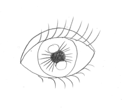
Eyes have always been my absolute favorite thing to draw, and I tend to accentuate them in all of my artwork. They can also be one of the most difficult things to draw, and it takes a lot of practice to get them right. There are a lot of picky little details to pay attention to. When we begin drawing an eye how we “think” we should, without really observing an actual eye’s appearance as if we have never seen one before, we tend to end up with a drawing like below. Generic football shape, outlined individual eyelashes, harshly contrasting pupil and highlights, and those pesky little lines jutting out all around the center like a kid’s drawing of the sun. In reality, an eye’s darks and lights are much more subtle and blended, each person’s eye is a completely different shape, and unless we are drawing a huge zoomed-in eye filling an entire 18×24″ piece of paper, you wouldn’t actually see individual eyelashes. I’d like to share my tricks of the trade with you. Grab a piece of paper and follow along. It will be fun, I promise! Don’t worry about doing everything “perfect”, just enjoy sketching. Every artist does things slightly different, and the more you practice you may discover some of your own “tricks” that work for you.

eyenono

  1. Lightly outline the contour of the eye. Don’t just draw an oval with half circles above and below it. Pay attention to the exact curvature of the unique eye you are trying to draw (photo references are always good.) Is it wider on one side than the other? Does the eyelid dip down drastically or does it curve more gradually? Are the curves of the eye and eyelid soft and smooth, or more angular? Is the eyelid rounded or more flat on top? Is the fold under the eye parallel to the bottom eyelid, or does it droop diagonally? Sketch lightly, as you don’t want to see harsh outlines through your shading.
  2. Shade the outside perimeter of the eyeball. The darkest shading is always at the two corners of the eye, and gradually fadesĀ as you get closer to the iris. There will also be a deeper shadow underneath the eyelid since the lid overlaps our eyeball, blocking the light from reflecting as much up top.
  3. Shade around the iris, again with slightly deeper shading closer to the top eyelid. Even if you don’t explicitly see shadows near the iris in your photo reference, the white of our eyes are never really pure white, and you will get a much more realistic look if there is a gradual transition between the iris and the white of the eye, rather than going from fully colored in iris to stark, clean paper in the white of the eye. This step helps the iris look “settled” into the eyeball rather than looking as if it is “hovering” on top if it.
  4. Add your darkest shading on the top of the iris. This should be a shade darker than your darkest value that you used previously underneath the eyelid when you shaded the white of the eye. Think of a crescent moon facing downward, with the thickest shading up top, getting thinner and then altogether disappearing as it trails down around the edges of your circle shape.
  5. Add in your pupil and reflections. The reason we do this next is because we want to have the reflection areas mapped out before you get to shading the rest of your iris. You can go in with an eraser and add highlights by removing shading afterward, but this can be messy and end up smudging work you don’t wish to be smudged. I find it easier to just leave the highlights white to begin with. The location varies by light source if you are using a photo reference. Without a specific reference, it is safe to add two highlights, one on top and one on bottom at a diagonal to each other. Fill the pupil in dark black. This will be your darkest value.
  6. Shade around the pupil using the same value you used to shade your crescent moon around the top of the iris, one step lighter than black. Again, this anchors the pupil inside the iris so it doesn’t seem as if it is floating on top. This gradual gradation from dark to light makes the separate parts appear as a whole.
  7. Fill the remainder of the iris with a medium value. Again, we want all our value transitions to be gradual, so get a little lighter when you begin shading around the edges of your highlight areas.
  8. While we don’t want radial stripes circling the inside or our iris, we don’t want to smooth all the visual texture out of it either, as the striations of dark and light we see are part of the deep beauty of eyes. Literally “scribble” some slightly darker shading shooting out from the pupil in the two areas between our highlights. Again, please scribble though it may seem odd and scary; we don’t want neat, individual lines extending from the pupil.
  9. Add the tear duct by simply finishing the shading around your eyeball, cutting off the little teardrop shaped dip in the inner corner.
  10. Shade your eyelid! Shade the darkest in a thin line over the crease you originally outlined. Don’t just trace your line darker, shade by moving your pencil back and forth swiftly in short strokes over this line. Above this, shade a touch lighter to again make a gradual transition from dark shadow to white paper. Shade darkly also over the curved line directly above your eyeball, the edge of the eyelid. This will provide a foundation for the eyelashes, which we will add later. Shade along the bottom eyelid like this also.
  11. Shade the bottom crease under your eye. This is not a direct “fold” so it should be lighter than the shading for the eyelid since it is less in shadow. Shade deepest along the line you originally sketched, and shade lighter around this line on top and bottom. Extend the shading up to the outer corner of the eye to really show the skin curving. Add some light shading under the dark crease of the upper eyelid.
  12. We’re going to scribble again! Add some jagged shading pointing out from the top and bottom eyelid where the eyelashes will go, more so on top than on bottom. Do this in a medium value.
  13. Now, you can go over and add some individual curved darker lines sticking out to add some detail to your eyelash area. Don’t make them all the same length, and try to curve them – no straight lines poking out! Add a bunch overlapping each other using swift, light strokes with your pencil. They should be dense and close together.

These are not hard and fast “rules”, and once you’ve practiced the basic guidelines you can twist them to create entrancing eyes in your own unique artistic style, both realistic and more comic or stylized.

Speaking of eyes, I just designed a new pattern for Redbubble covered in glamorous eyeballs for your enjoyment. Check out all the cool new products featuring my digitally drawn patternĀ Mascara Tears here!

Feel free to throw a comment my way if you have any other drawing questions, I’m always open for giving tips. Any best practices other illustrators out there have found helpful? Don’t hesitate toĀ share!

Standard
Exhibitions and Other News

Super Exciting News (No, I’m Not Engaged. But Read This Anyway.)

First, I must explain the title. It’s a bit of a joke because the last time I did a post in which I professed exciting news, like everyone thought I was engaged. When I was like ‘nope, even better, I won Best 2D at an art exhibition!’ they were like, ‘Oh well, I guess that’s pretty cool too.’ I think this face of epic disbelief from the 10th Doctor sums it up pretty well.

304_daleks_in_manhattan_2

But, back to my still super exciting news. I had mentioned earlier how thrilledĀ I was about getting into the Greater Michigan Art Exhibition at Midland Center For The Arts because I had entered the 2 previous years as well and had yet to be chosen to exhibit. Well, first I found out that not just one but all three of my entered pieces would be hung in the show.

imag4322r

Then, I found out that one of them had actually won an award! I feel so unbelievably honored to have one of my pieces receive a Juror’s Recognition Award.

imag4325r

(I hate closeup pictures of me holding things Ā because I feel like I have freakishly short fingers. No wonder I could never play the piano well even after years of lessons. Well, that coupled with my total apathy towards the vocation and complete lack of practice, but thatis another sotry for another day. Despite finger length, I had to show off the snazzy brochure.)

januaryr

The fact that they chose the piece that is going to be one part of my 12 part series I am planning to enter into ArtPrize next year was a welcome sign that I am going in the right direction with this project, and creating something that will bring people joy, make them think, and spark their imagination. If you are in the general vicinity of Midland, I would suggest you make a trek over to see this show. It is a humongous exhibit, and there is so much awesome art to absorb.

Standard
Art Discussion, New Work

March: She Is Everything At Once

Obviously, though I had a fun idea of doing the whole “a drawing a month” reveal for my new 12 part series, that didn’t happen as I am on March and it is now almost September. I would like to enter this series into Art Prize next year, and decided if I have until next Fall, why impose such a crazy impossible deadline on myself simply for the sake of themed blog posts and risk the quality of the work? Impossible self-imposed deadlines are this thing I like to do that I really need to ease up on. For those who haven’t read my previous posts,Ā my new series involvesĀ 12Ā mixed media, surreal, conceptual portraits in whichĀ the meaning is influenced by the use of pattern and color, one representing each month of the year. They will depict women of all ages, races, and time periods, and each will communicate a different theme and season. I aim for the pieces toĀ speak to women’s collective experiences beyond their differences.Ā I want the series to flow together in its mainly black and white scheme with pops of color, soft mixed media application, and it’s classic portrait composition. However, I wanted each month’s portrait to still be distinctly different “characters” from one to the other, achieved via aesthetic theme and accent colors. For this piece, I went with bold, dynamic primaries and a nod to pop art. You can view January and February from earlier posts.

In this piece for March, my goal was to take the commonplace negative stereotype of women being “emotional” and turn it on it’s head, marrying caring and empathy with strength, and sadness and despair with hope for a better future. A surreal merging of classic pop art, which often featured dramatic beautiful women sobbing, Ā with realistic portraiture was the perfect fit for this concept.

march.jpg

Women are constantly being told they are too much of something, despite the fact that they are often expected to wear far more different hatsĀ responsibility-wise than their male counterparts. Google searches have become an interesting way to peek into mainstream society’s views. Anyone who uses the internet knows when you begin to type something in, google willĀ finish it with the most popular searches and subjects. A UN Women ad from 2013 was the first to make a statement using this innovative approach.

un-women-search-engine-campaign-1

I tried the same concept, only typing in the starting phrase “women are too…” What I’ve found is that women are apparently too picky, but also too easy, too intelligent and successful to find love, yet too weak and too emotional to be leaders, the president, or involved in politics at all, but at the same time also too dominant.Ā It looks like we’ve got a Goldilocks problem here.

As one who believesĀ that sometimes problems we assign dominantly to one gender are still just basic human being problems, I didn’t want to negateĀ the idea that there may be similar findings for men.Ā However, when I tried “men are too…” I got nothing. In fact, when I simply pressed enter to see what articles would come up, the main article up top was “Monkeys turn into grumpy old men, too” about aging primates and behavioral changes. While hilarious, it is clear that this whole “Be everything at once yet also be nothing at all” contradictory expectation is something that, while maybe not entirely absent for men, is something that women face more in mainstream culture.

A descriptor routinely used to discredit women’s abilities is the fact that they are “too emotional” by default of their gender. However, when men step out of their perceived box by showing any degree of emotion aside from anger, they too are often chastised and ridiculed. This shows that ourĀ revulsion towards caring at least is a societal problem on the whole, not just a women’s issue. For some reason, people seem to view caring as weakness. This can be seen clearly in the dismissive termĀ bleeding heart, always used with a strong air of disgust. (A note to be made here… when I talk about caring I am not including people sitting behind a laptop screen typing angry, obscene responses to random articles that they don’t agree with because they get off on being offended and telling people off. Nor am I talking about people who shut down and throw a fit every time they have to hear something that they don’t agree with. This is not true caring or passion, this is an addiction to “being right” all the time and putting people in their place, and it is unhealthy.)

I recall a conversation had with a person from my past 5-ish years ago. We were discussing some political or sociological issue.Ā The other person, whom supposedly respected me, was nevertheless making zero effort to understand my view though I myself had stopped and listened to theirs. I remember growing frustrated and stating, “I don’t know why you are refusing to try to listen and understand where I’m coming from when this is an issue that is so important to me.” Their response was given bitingly and with a wave of the hand, “Oh, everything’sĀ “the most important thing” to you.” Though it was meant as an insult, the more I ponderedĀ it the more I thought, I’m ok with owning that. Because everything does matter, in some way large or small.

In our culture, it’sĀ cool not to care. You can see this fact brazenly displayed in popular entertainment (The HangoverĀ 1,2,3,4,5? They just keep going.)Ā People are routinely being told the answer to their feelings of isolation, depression, and anxiety is to just “let go”. But is the “ignorance is bliss” model really the one we should be following? This idea in and of itself seems to admit that caring is not weakness, but strength. Experiencing emotions of concern and empathy is an active state; not caring for anything outside of your own pleasure and needs is passive. To put it simply, caring about things is hard work. It can force us to take steps towards action that may make us uncomfortable, and take up a lot of our time and resources. It can be mentallyĀ and psychologically draining.

Caring is strength. Let’s lift up our mothers, our fathers, those taking care of an adult family member, our nurses, our teachers, our home health aides, our daycare workers, our counselors, our missionaries, our activists … No matter what societal normsĀ tells us, they are our true heroes.


Standard
New Work

Happy Staycation! + New Work Reveal

be my wings

I’ve been working on this new mixed media drawing for awhile, and with my decision to take a little staycation, I’ve finally had the time to finish it! It is titled, “Be My Wings”, and measures 18×24″. I used prismacolor pencil for the face, prismacolor markers for the ravens, watercolor for both the hair and the background with grey, black, and white chalk overlay, and fabric for the clothing covering the neck and shoulders.

Of course, I have added this design to my Redbubble collection, as well as some new designs inspired by a couple of fun, newly finished ACEO illustrations.

I love buying from all kinds of artists on Redbubble, and have a design of almost every type of product in one form or another except the throw pillows! I’m dying to get one, but it is impossible to decide which design to choose, especially since I feel like changing around all the colors and decor in my apartment yet again. It’s a yearly thing :P.

I know this is a brief post after not writing for so long, but I’ve actually been aiming to spend minimal time online over this week-long break as it is simplyĀ gorgeous outside! Lately, I’d been feeling like there was a gloomy bad-luck cloud looming over my head, skulking around and following me just about everywhere I went. However, something seems to have turned a bit in my favor, because I sure picked the right week to take off! Every day has been nothing but perfect warmth and blue skies.

IMAG3175[1]

Can’t beat swimming and a view! Now, onward to more adventures…

Standard
New Work

New Work – Underwater Dreaming

I had some time yesterdayĀ morning before I had to leave for the Art Clash (more about that in a soon-to-come post), and I was determined to get this piece finished. There is nothing more daunting than smearing dark blue chalk all over a pretty much finalized piece you’ve been working on for months, but it was necessary to make the scene look like it was truly underwater, and also to balance out the areas of dark that were screaming out fromĀ a sea of pastel colors. For a progression of in-progress photos, check out my previous post.

Underwater Dreaming

I had originally intended to go with all blues, grays, and purples. I normally stick to a very limited palette in my pieces, but those crazy little plants in the background are in reality shockingly colorful, and I felt I had to do them justice. After I added the pink hair, it was color explosion time. It really makes the piece feel tropical, and I like that it’s way different from what I usually do. I have posted the design for saleĀ in my Redbubble Shop on a variety of products, and it is also for sale in print form in my Ebay Store.

Redbubble recently addedĀ these newĀ flowy chiffon tops to their available products that are just too cool.

ctr,x1350,front,white-c,65,0,789,730-bg,f8f8f8.4u3

As promised, more about Art Clash later, with pictures! I have another art event to attend this afternoon (this one conveniently 5 minutes from home šŸ™‚ ), so time to get out of my PJs! This weekend spent absorbed in art has been so wonderful, and necessary after many a stressful day this month. So long, April! You were great, but here’s to hoping things calm down from here on out.

Standard
Art Discussion

Art As A Tool For Expression

I had the first good night’s sleep I’ve had in awhile last night, so I thought it was a good time to reconnect with everyone. My lack of continuous rest can usually be attributed to one of three things:

A. Keeping myself awake having imaginary conversations with people in my day to day existence that will never happen in real life.

B. Making lists on various topics that I will never remember in the morning anyway.

C. Being kept awake by the sound of air molecules gently bumping into each other, even through my earplugs. Seriously, I am the auditory equivalent of “The Princess And The Pea”.

It was also the first week of a new semester at Express Yourself Artshop,Ā which brings a lot to do and think about, so item B in particularĀ was happening a lot ;).

It will be my first full semester as program coordinator after being involved as an instructor for a little over 2 years, and the fascinating idea of art as a tool for self expression is something that one is immediately confronted with the moment they enter the classroom.

kurt-vonnegut-arts

Many great thinkers and creators of all types have spoken on the importance of creatively expressing oneself, but rather than posting a list of 20 quotes or articles, I’d rather share with you through personal experience.Ā Yes, I am an artist, but no, you don’t have to be to use something musical or visual or written to release whateverĀ you are holding back. Often times, through written words or sketches is the only time anyone is afforded the opportunity to see our true selves, the selves we know we are on the inside that look so much different from others’ perceptions of us. It is why I panic whenever anyone I don’t know too well asks if they can look at my sketchbook. It’s not some temperamental artist thing where I am like “No, but it’s notĀ beautiful yet! I can’t possibly reveal my rough beginnings!” It is because it reveals a 100% transparent view of my every thought and emotion, and that can be a bit embarrassing.

transparency  bright

Transparency, 2012, Watercolor and Ink

I had a lot ofĀ social anxiety growing up. Even through early high school, I would often go through an entire day without speaking a single word. I’d go home after schoolĀ and my mouth would have that yucky stale, dry feeling like when you wake up in the morning, because I had literally not used my vocal chords forĀ around 7+ hours. Then of course, lovely acquaintancesĀ would ask the oh-so-helpful question,”Why are you quiet all the time? Is there something wrong with you?” which made me want to clam up even more. If people already thought I was odd, God forbid I should open my mouth! Then they’d really have something to talk about. I knew that the person I was presenting to the world wasn’t the real me. I was actually pretty damn opinionated and strong-willed from a young age (I think in one of our garage sales I saw that my mom actually had a parenting book called something like “The Strong Willed Child”, meant to advise parents in coping with this particular sort of, ahem, “gift”). I had ideas and interests and things to say, and I hated the fact that others may see me as dull or demure, but I couldn’t break through this seemingly invisible force that held me captive. That is where I turned to art, my sketches being anything but safe, quiet, or boring.

When I look back, my frustration with the self imposed isolation that I didn’t know how to navigate aroundĀ is encapsulated in these visual expressions. Figures are often shown bound, missing one of their senses with eyes hidden or mouths literally sewn shut, or rendered immobile in an isolated environment.

blogexpressionwithopenedeyes

With Opened Eyes, Prismacolor Pencil, 2005

blogexpressionpatchestearsandloudnoises

Patches, Tears, and Loud Noises ; Prismacolor Pencil, 2005

blogexpressionofthesea

Of The Sea, Prismacolor Pencil, 2005


blogexpressiontimebound

Timebound, Prismacolor Pencil, 2006

blogexpressionsburied

Frozen, Prismacolor Pencil, 2006


Though emotionally painful at the time, I luckily connected with a few good friends junior and senior year who struggled similarly and could understand what I was going through, something that I couldn’t explain since it was all internal. This, coupled with going off to college and being forced into uncomfortable and unknown situations in which I would have to communicate out of necessity, helped me adapt and change, growing away from this extreme anxiety. Did it completely disappear? No, but it greatly lessened. Within the last couple of years I have also found that when I have a purpose to my communication and am passionate about what I am sharing, such as with art instruction, no matter how large the group of strangers may be my fears disintegrate (Ask me to talk about menial conversation fillers like the weather or how my day is going, and we may have a problem. I always say I prefer “big talk” šŸ˜‰ ). Not all are so lucky. Some individuals are permanently nonverbal due to developmental disorders or injury. For them, finding alternate means of communication is not just therapeutic but necessary.

I am going to close with another KurtĀ Vonnegut quote that I’ve probably shared before, because it’s that good:

many_people_need-95908

By expressing ourselves creatively whether the result is a masterpiece or not, we are not only helping ourselves, but areĀ touching others positively as well. Through making oneself vulnerable, we “give permission” toĀ others to do the same. We all think we’re the only one; the only one who thinks _________, the only one who feels _______, the only one who has experienced ________, when the truth is most likely we are not, everyone else is just too scared to say how they really feel.Ā I can’t count how many people have looked at the piece below and simply said, “Yeah, I know the feeling …”

The Rush Hour

The Rush Hour, Prismacolor Pencil, 2014

Of this next piece, viewers have commented that looking at the work was actually uncomfortable because they couldĀ feel her claustrophobia. They understoodĀ the feeling of being confined and held back, of feeling like you have outgrown your current life or situation, of wanting to move and change while everything and everyone around you is staying the same.Ā Everyone experiences feelings like this, there is just this unspoken rule that you don’tĀ talk about it.

actually it is this world thats too small

Actually, It Is This World That’s Too Small; Mixed Media, 2014

You don’t always have to be expressing negative emotions, either. A student in Express Yourself Artshop’s Painting Exploration class this week wanted to tell a story aboutĀ bright colors, music, and dance withĀ her piece, and made a modern art version of a dancer playing theĀ flute, referenced from an old painting from an art history book that she had found and connected with right away. Another tried painting for the first time, and chose to celebrate her favorite colors and the things that make her happy, like gardens. Besides aiding in dealing with difficult emotions, de-stressingĀ and joy are two other side effects of self expression through art.

colleendancer

Artist : Colleen D.

michelle3

Artist : Michelle D.


Just pick up a pencil and play … you may be surprised what comes out, or whom you connect with and inspire along the way.


Standard
Exhibitions and Other News

Coffee Is Love.

em6em5em4em3em2em1

So, I put an exhibit up in Espresso Milano for Midland Artists Guild last week. This was an especially fun venue exhibit for me because I pretty much lived here when I was in high school. For those of you unfamiliar with Midland, Michigan, it’s a nice town for sure but, well … there’s not a whole lot for young people to do! Hang out with friends on Saturdays drinking coffee all day, especially frappes in the summer? Not complaining too much. It was always either that, or spend the day at the mall reading comics and music magazines in Barnes and Noble, until they started shrink-wrapping the darn things so you actually had to pay for them to read :P.

Snooty face 2007.

Blast from the past : Snooty Face 2007.

My P.I.C., Erin - best friends since we were 2 and actually just had a craft day together last week!

My P.I.C. that day, Erin – best friends since we were 2, and still going strong. We actually just had a craft day together last week!

Speaking of coffee being just the best…

(a topic of conversation that I daresay never gets old, nor loses its truth), I have some really cool illustrated mugs for sale in my ebay store right now! On discount, too … sweet right? They are dishwasher safe, top rack, and really heavy and durable. I am an accidental collector of unique mugs, and can’t seem to ever stop buying drink-ware in general, so these made me super happy.

Designs available are Retro Flowers, Queenie, I'd Have Been Happier As A Bird, and Whimsical Peacock.

Designs available are Retro Flowers, Queenie, I’d Have Been Happier As A Bird, and Whimsical Peacock.

Other things I’ve been working on over this Labor Day weekend are, shockingly, Christmas plushies! I sell some of my fun creations at Imagine That!, also located in downtown Midland, and I need to have my holiday wares ready by mid-October. It’s weird to be thinking so far ahead already, but I can’t say I haven’t enjoyed getting in the holiday spirit a bit early :).

Whimsical trees and some pretty rad angels with halos made of strung sequins <3

Whimsical trees and some pretty rad angels with halos made of strung sequins ā¤

Midlanders (or Saginaw/Bay City dwellers nearby such as myself), if you happen to be downtown within the next 2 months don’t forget to check out the exhibit. And for those of you in the states, I hope you enjoy your Labor Day weekend as well!

Standard
New Work

This Is Why You Should Keep Old Work Forever.

The Beauty Of It All

The Beauty Of It All, 11×14 prismacolor pencil and watercolor

For about 2 years, I had an 11×14 piece of bristol board with this woman’s face covered in flowers on it, and a metallic silver world map view behind her. She was surrounded by nothing else but white space. I was convinced it looked absolutely horrible, and I had no idea what to do with the rest of the background. I chocked it up to a loss and tossed the drawing in my storage portfolio case. A couple times I ran out of paper and thought about just using the back of it when I had a new idea and didn’t want to delay inspiration with a drive to Michaels for more bristol board. Other times I almost chopped it up into pieces for scrap paper to sketch ideas onto. I thought of posting it on my artist facebook page as a giveaway for whoever wanted it, and letting them color all over it like crazy to see what happened; an impromptu collaboration over vast distances.

Luckily, I never did any of these things. I’ve been doing a lot with watercolor lately, and was wishing I had one more piece to hang in my upcoming exhibit. I didn’t have the time to start anything else from scratch, but when I found this I decided to play around with the background and see what happened. I spontaneously dripped blues and greens and metallic silvers over the entire background, throwing the paper this way and that to guide the drips. Once I stopped over-analyzing and worrying over how terrible I thought my piece looked and just started enjoying the process again, everything came together. Sometimes even something as subtle as a bold color splashed into the backdrop can turn an entire piece around. Mine went from a drawing of a girl who looked like she had a strange, alien, flower-shaped skin disease to a pretty nice finished piece.

This is why I cannot emphasize enough, don’t toss out old, unfinished work! Paper is flat, it keeps pretty easily. I’ve my seen students do some really cool things with incomplete projects they could have tossed away. In this piece below, a student cut out elements she liked from a “practice” acrylic painting from the semester before that didn’t really turn out. These made for some great smaller blooms popping out around the central focus of the pumpkin. Even if you don’t end up turning the leftover physical piece into anything, something half-finished could at the very least provide an idea or concept for a project you do later.

And again, I have the best students ever. Unique floral mixed media for autumn.

Nancy’s autumnal mixed media, salvaging cutouts from an old acrylic practice lesson the semester before.

I’m actually constantly revisiting old work, even from as far back as high school. Most of that is also unfinished because I, like any teen, had a real short attention span. This painting, which my mom fell in love with and now has hanging over the sofa in my parents’ living room, was created from scratch in 2012. But, it was based on an old colored pencil drawing from 2005 that I never finished shading in. The particular sketchbook the original drawing was in is still in the closet of my old bedroom in my parents’ house or I would post it here, but it was a color scheme of entirely red and black and the parasol people were dressed in old-timey but super goth attire, and the faces on the parasols looked like they could all be members of a My Chemical Romance copycat band. Trust me, it was something else. Behold, the reboot.

"Wait Out The Storm", 18x24 Watercolor and Ink

“Wait Out The Storm”, 18×24 Watercolor and Ink

Now that I’ve turned you all into hoarders, I have one more all-together new piece I’d like to share. I have always been deeply interested in the steampunk aesthetic, but never created any steampunk-esque art myself. This is my first, and I’m pretty excited about how it turned out.

"Dreams Of Gold", 11x14 Prismacolor Pencil and Chalk

“Dreams Of Gold”, 11×14 Prismacolor Pencil and Chalk

The deep gold is metallic, though you can’t tell in the digital image. I was heavily inspired by the Victorian aspect of Steampunk, even turning the classic Victorian lace pattern into something metallic and industrial. I am finally going to be hanging all of these pieces up tomorrow in Espresso Milano, and will be sure to take pictures. Have any cool steampunk art you yourself have created or that you’ve seen by other artists? Throw me a link! I am a long time appreciator, but creation-wise, a novice. As I’ve promised, photos soon!

Standard
Exhibitions and Other News

Back to Real Life, But Excited For What’s To Come.

I just got back from one of the most fun trips yet to the charming and exciting land of Ludington, MI; hiking, swimming, sketching on the beach … my boyfriend and I were determined to jam in everything that epitomizes summer before it’s too late! I vowed to not check my email to make it a true reprieve, but I did peek just once in the car on the way there, and I’m glad I did because I got some awesome news. Two of my pieces were accepted into Studio 23 in Bay City’s Women’s Perspective show for September! If you’ve read my earlier post, ladies sometimes get forgotten in the gallery scene even today, so I am excited and honored to be a part of what I’m sure is going to be a wonderful show. Below are the two works that will be showing. If you’d like to learn more about the process of creating “On My Mind”, you can visit my earlier entry focusing on this piece.

On My Mind

On My Mind

The Peacock

The Peacock

Another fun surprise was the new murals up in Ludington to take touristy photos in front of! Art truly is everywhere, and it is wonderful. Murals aside, not to be cheesy, but one can’t look at the serene layers of bright blue water, warm yellow-beige sand, and bold green foliage and not see the very world we live in as one of the largest, most complex creations to ever exist, and truly the largest, most interactive art project.

Me posing oh-so-cool in front of my favorite mural of the bunch.

Me posing oh-so-cool in front of my favorite mural of the bunch.

Behold!

Behold, bright colors! Yes, that is Spider-man on my t-shirt.

I just ate it after a wave literally knocked me on my butt while I was wading out. There were weather warnings out all day, which of course means perfect day to go swimming! Thrill seeker 4 life.

I just ate it after a huge wave literally knocked me on my butt while I was wading out. There were weather warnings out all day, which of course means perfect time to go swimming! Thrill seeker for life, man.

Standard
New Work

New WIP, and Building An Army

I started a new conceptual portrait, this time involving stars and space imagery which I haven’t used a lot in the past – time to retire the flowers and forests for a bit. I am also going to be adding touches of art nouveau, one of my absolute favorite design periods. I’m not certain what main accent colors I will be using with the black and white as of yet, but I’m leaning towards navy and gold, we shall see. The tilted downward angle of the face is certainly more challenging then the classical head and shoulders portrait, but after much erasing, success! Even practiced artists are in love with erasers.

wip

When I need a break from the more technical, detailed work, I’ve been having fun growing my little army of wooden dolls – currently two strong. Who am I kidding, painting those tiny little clothing patterns and facial features on wood with a couple-hairs wide paint brush is still technical and detailed :P. I have always loved the simple cuteness of Japanese kokeshi dolls, and I wanted to try my hand at designing my own take on them. I figured wood would be easiest to paint with acrylics, so I perused the wood crafts aisle at Michaels after teaching a class one day and found 2 bags of shapes, one conveniently labeled “heads”, the other “bodies”. What luck! It doesn’t get much easier than that. Along with glue, I ran a heavy toothpick through the partial hole in the bottom of the head and the top of the body for extra support. This would be a really fun project to do with kids as well. You could even glue on small googly eyes, and some yarn for 3-dimensional hair, cut pieces of fabric or patterned paper to glue over the body, some small buttons down the front … the possibilities are endless. I will post pictures of their friends once I finish some more, promise! I will also keep you updated on the new portrait. Have a great start to the week everyone!

Pretty simple supplies ... it's all in how you decorate them!

Pretty simple supplies … it’s all in how you decorate them!

Two of my non-handmade modern kokeshi dolls

Two of my non-handmade modern kokeshi dolls

Each of them just has to have SOMETHING on her head. Yes, that is a real acorn on the left, brushed gold and sealed. I was on a hike and quite literally exclaimed to my boyfriend, "They look like mini hats!!!" and started frantically collecting as many as possible. I knew they would come to good use one day!

Each of them just has to have SOMETHING on her head. Yes, that is a real acorn on the left, brushed gold and sealed. I was on a hike and quite literally exclaimed to my boyfriend, “They look like mini hats!!!” and started frantically collecting as many as possible. I knew they would come to good use one day!

Standard