Throwback Art

Throwback Art Part 1: Beauty In The Unfamiliar

When people ask me when I first got into art and my answer is shortly after birth, I inevitably end up mentioning my mother’s astonishing archival skills. I have drawings from every year of my life starting at 1.5 years old. After mentioning this, the response is usually that they sure wish I would share some of these older drawings on my website. As I was going through my past sketches and choosing some to post, I realized though my style over the years has changed quite a bit, there are common themes and purposes behind my work, including within my childhood scribbles. So begins the first part of a series using the past to delve into why I create what I do… I hope others find this interesting and entertaining, and I hope it helps readers reconnect with their past selves and realize how all of those different “us-es” had a part in creating who we are today, even those versions of us we don’t like to spend too much time with.

I have always been drawn to art depicting people. Portraits and figures were typically the vehicle for my art’s story from early on. Growing up I loved studying the differences in faces, how some could look so similar but no two were exactly alike. I would sit for hours studying my elementary school yearbooks as a kid, just staring at the different faces, observing. From a very young age I found beauty in that which was different and unfamiliar to me. I grew up in a very non-diverse setting, and didn’t see many people of color in my day to day life. However, I loved watching movies and television shows. As I started to see people who looked completely different from me and my family on the screen, I was fascinated by the wide range of hues and textures that could be present within these other faces – beginning to see people as truly living, breathing sculptures. I went through a period in younger elementary school where much of my figures I would draw were actually POC, much to the amusement and at times confusion of those around me. I also drew plenty of scenes from my day to day life; illustrations of my family, of my friends and neighbors playing outside; but only creating art depicting my own day to day existence just seemed so boring to me. Though a very socially anxious kid, I loved learning about other people and what their life was like, and even enjoyed when friends would show me photos and video of trips their family went on and other important life events. As you can imagine, they were quite pleased to have a not only captive but eager audience.

I’ve been told I was always one to stand up for the underdog, and this extended into the realm of art and fantasy. Although of course I drew princesses, I was also interested in the stories of supposed villians, witches, and other outsiders despite being quite the kind hearted soul and a bit too much of a rule-following goody-two-shoes, at least outside of the home ;).
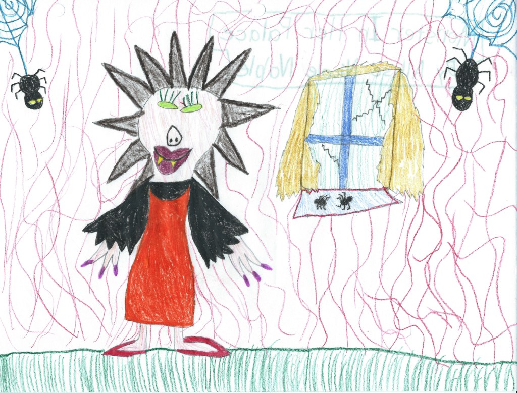
Once I got a bit older and started actually learning about art, I connected instantly with surrealism, especially as it relates to the human figure. In junior high one of my favorite shows to watch was Ripley’s Believe It Or Not. My favorite stories were the aesthetically bizarre tales of extreme body modification which are all over on youtube now, but back then such slices of life weren’t as readily available. There was the man who had turned himself into a human-tiger hybrid, the woman who got specialized dental implants so she could live out her dream of being a real life vampire, the one who got their tongue split into 3 independent forks that could all move on their own … Though I am in no way a big advocate for plastic surgery, there was something interesting to me about individuals “making the internal external”, a term I use often to describe the aim of my artwork. The idea of people crafting their external persona as a living sculpture to match who they are on the inside was captivating, and though these exact characters never made their way into my art, I did end up drawing a series of 4-legged ballerinas and people with animal heads.

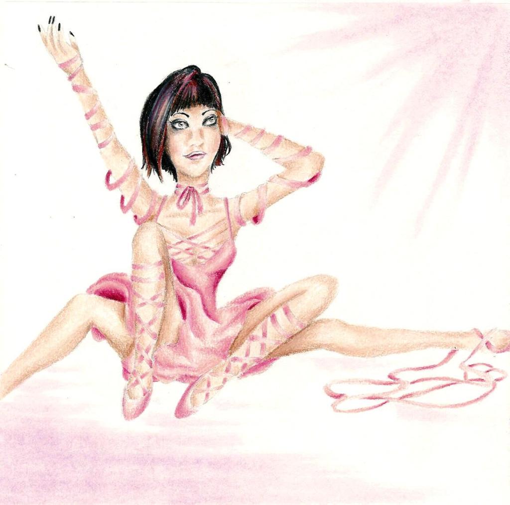
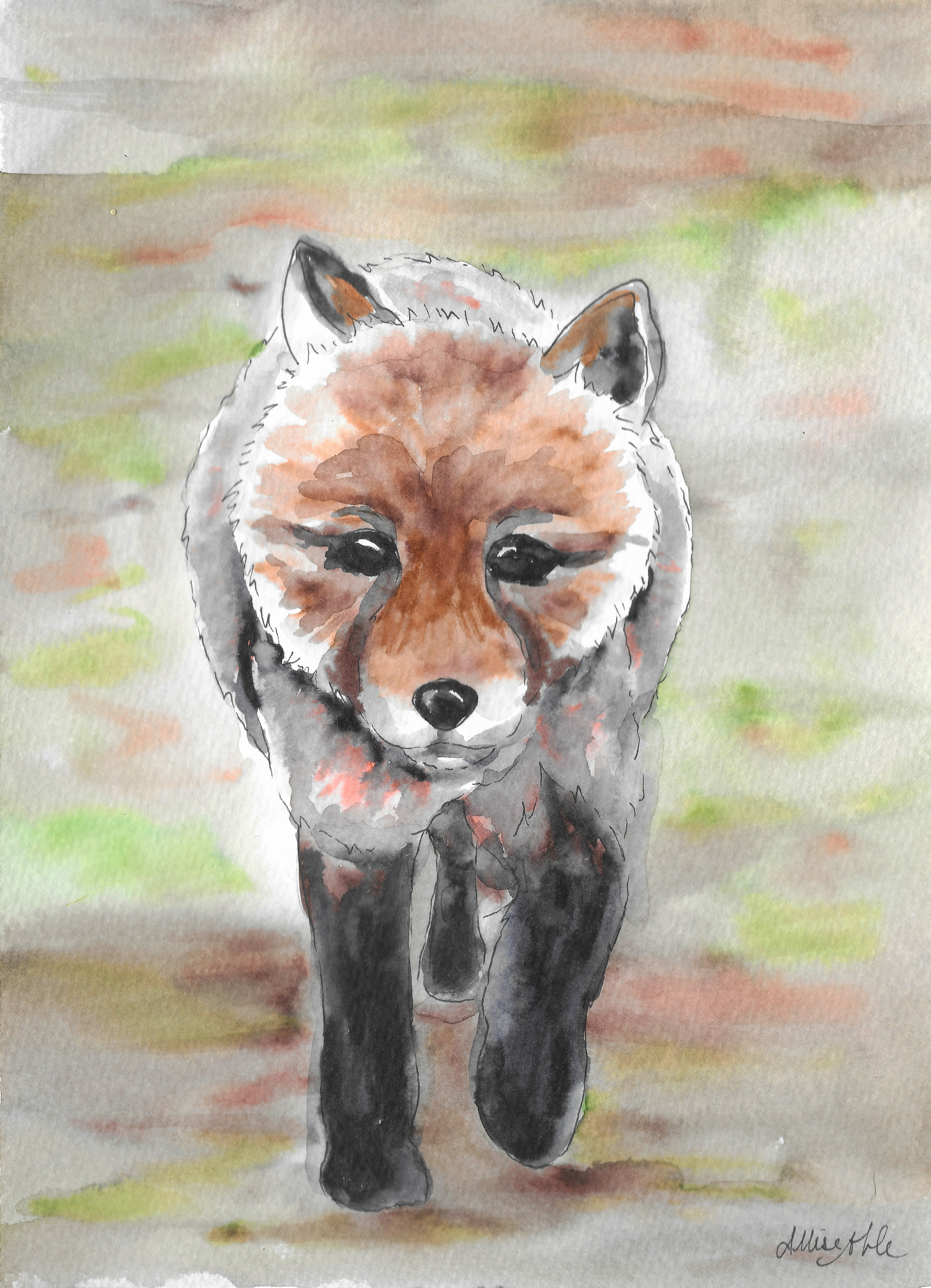
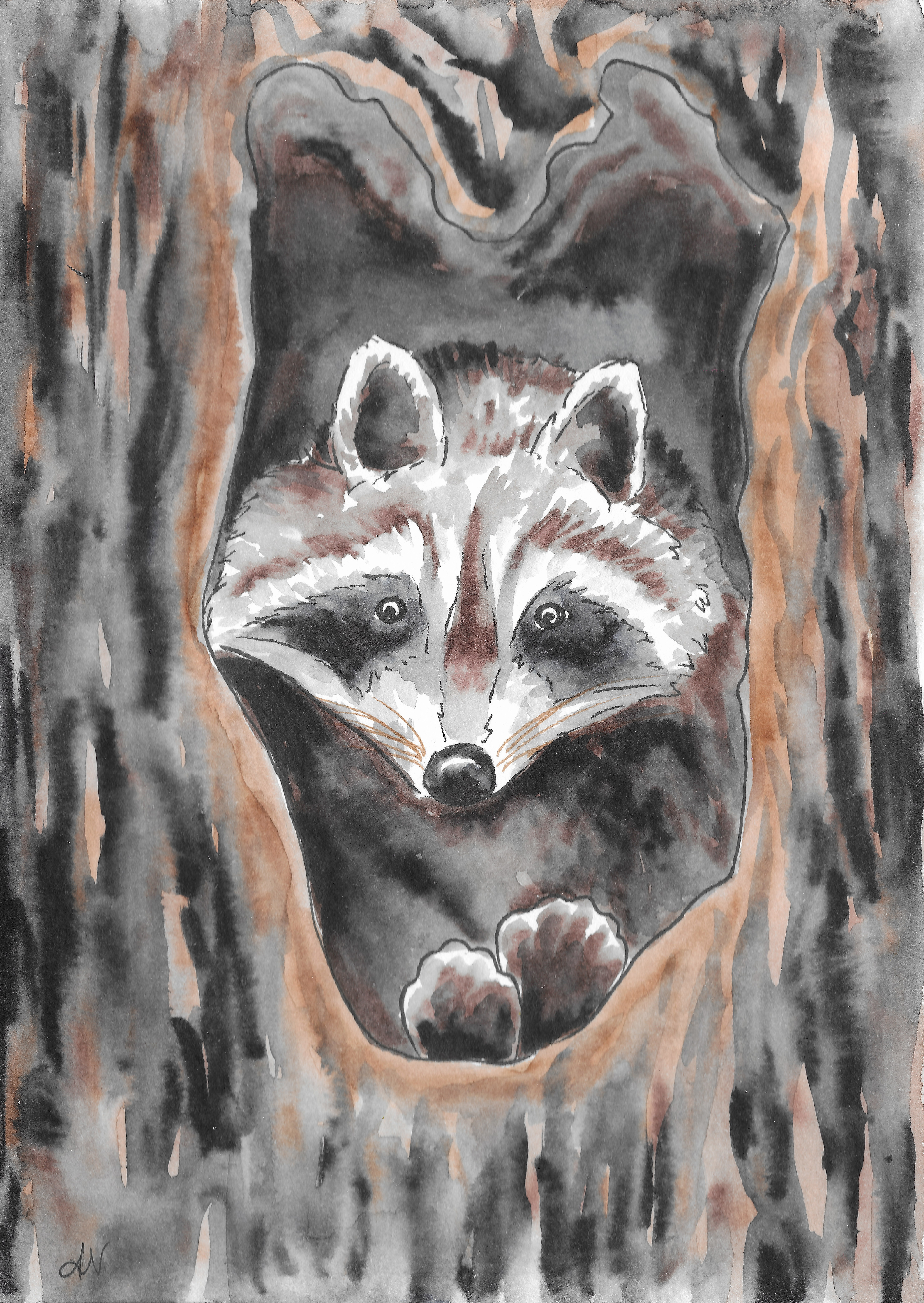
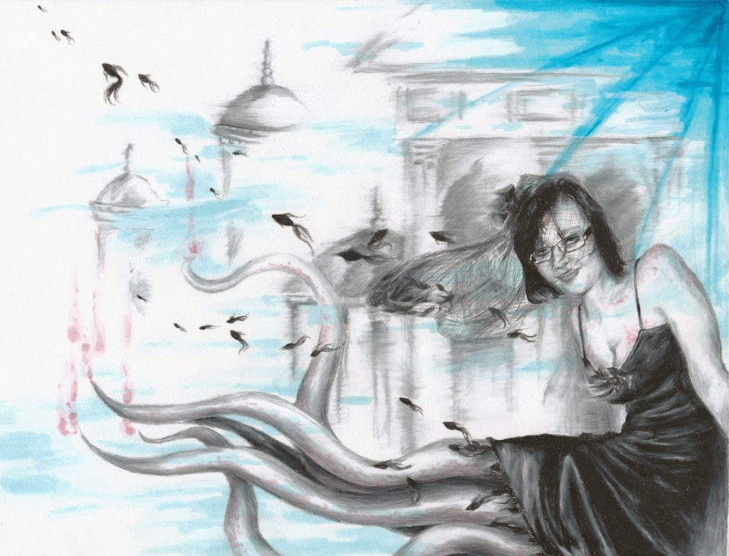
As I continued to develop my surreal portraiture, I depicted facial expressions that wouldn’t typically be captured in a portrait drawing or be considered beautiful, such as negative emotions like fear, anger, or anguish. I also continued to blend human and animal physiology in some of my portrait and figure drawings under the observation that oftentimes, animals can be seen acting like people would and people can act more like we assume an animal would act and react. The lines blur more often than we’d like to think.
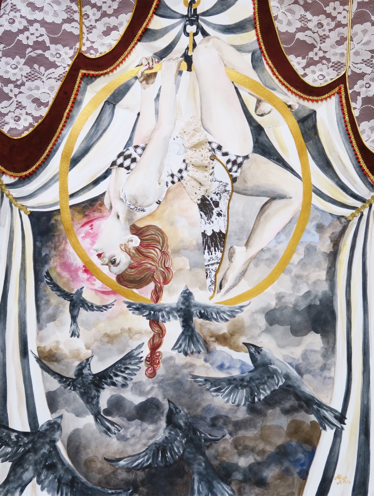
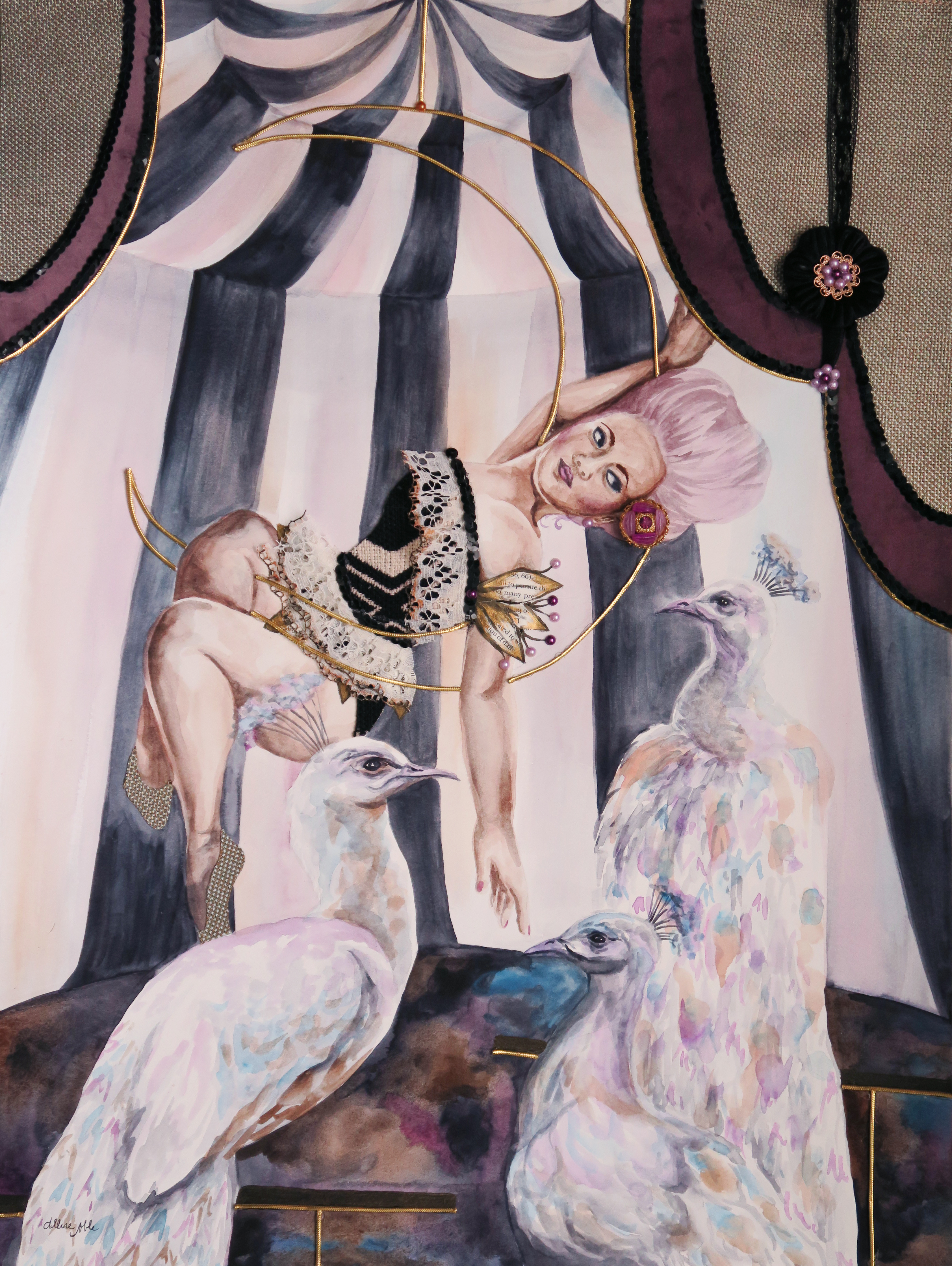
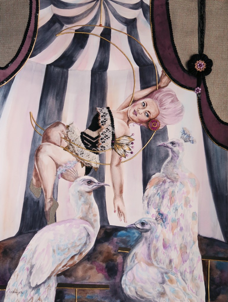
Today, uniqueness of spirit, self expression, and animal representations still play a large part in my art just in a different way. When I look at my aerialist mixed media works, I can’t help but be reminded of the dark, vintage circus aesthetic of my earlier 4-legged ladies. I have no tie to gymnastics or dance myself – I am horribly awkward and unskilled at anything requiring physical coordination and spent my time in gymnastics lessons as a kid climbing up to the highest possible spot at the recreation center and simply jumping into the foam pit over and over. I took a ballet class once as well and recall ending the day giggling with a friend as we rolled ourselves up in the dance mats and pretended to be burritos. I pretty much joined just for the outfits. But, again there is that attraction to the completely foreign, those characters that are completely different from myself. Animal imagery abounds, mainly in the form of birds, but it is no longer a bodily extension and more instead a physical representation of the figure’s soul.
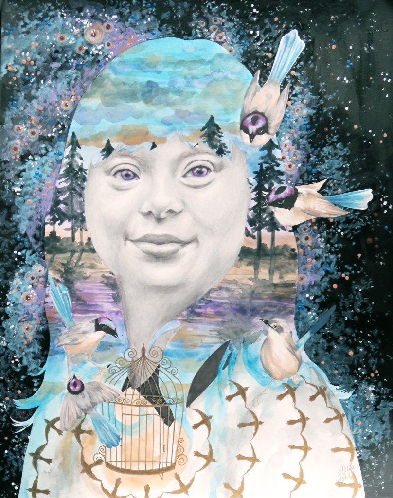
I continue to celebrate beauty in all of its forms, especially that which is underrepresented. One of my favorite pieces to date that I’m sure I will cherish forever is the portrait in the center that was part of a 12 part series I created for ArtPrize on year depicting a young woman with down syndrome. She exudes joy, confidence, and freedom.

For a number of years I have worked with an inclusive arts program suited for young adult and adult artists of all abilities, including those with disabilities. I suppose looking back I was always meant to use my gifts to reach people of all abilities. I have a distinct memory from first grade. 2-3 students from special education would spend the first half of the day in the traditional classroom I was a part of, including recess and lunch though during lunch all of the kids from special education would sit at their own separate corner of the lunchroom. One of the girls who visited our class in the mornings wore a fantastic velvet dress with black and pink flower print on it one day, and though remember, I was severely socially anxious at this age and only ever spoke to my one neighborhood friend in class, I gathered my courage and told her I liked her dress because it was just too cool to not say something. From that point on we were kind of friends. She asked me to swing with her at recess, and eventually invited me to sit with her at lunch. Ridiculously enough, I accidentally caused quite a scandal by breaking social lines and sitting at (I will not repeat the name fellow classmates had for this particular table) with my new friend. Differences were never seen as anything for me to fear, but parts of another to appreciate and learn about.

Appreciation for all living beings that make up our wonderful world are a large part of the emotion that goes into my current work, and though sometimes I fail at this concept in practice as do we all, I hope the impulse to draw towards and not shrink away from diversity is a part of myself I always keep with me.

Standard
Art Education

Surprise Box Challenge! (Like ‘Chopped’, But For Art) – Week 1

Those who have visited before may have noticed my affinity for art subscription boxes. Whenever I receive a new box, I always challenge myself to create a small piece of art using only the materials that came in my monthly box as a way to try new techniques and get to know the materials. I am also quite the fan of the cooking show “Chopped”, in which contestants are give a basket of mystery ingredients, some delicious and some just plain odd, from which they must make a cohesive dish. My “day job” is running a program for artists of all abilities, and this new Fall semester I decided to run a class based on this concept. Each week my group will get a surprise box filled with 3-4 different types of materials and be challenged to use only those to make a work of art. Everyone gets the same supplies each week, just different colors or designs. I will be sharing what people came up with, as well as some tips for those who want to try the materials featured at home.

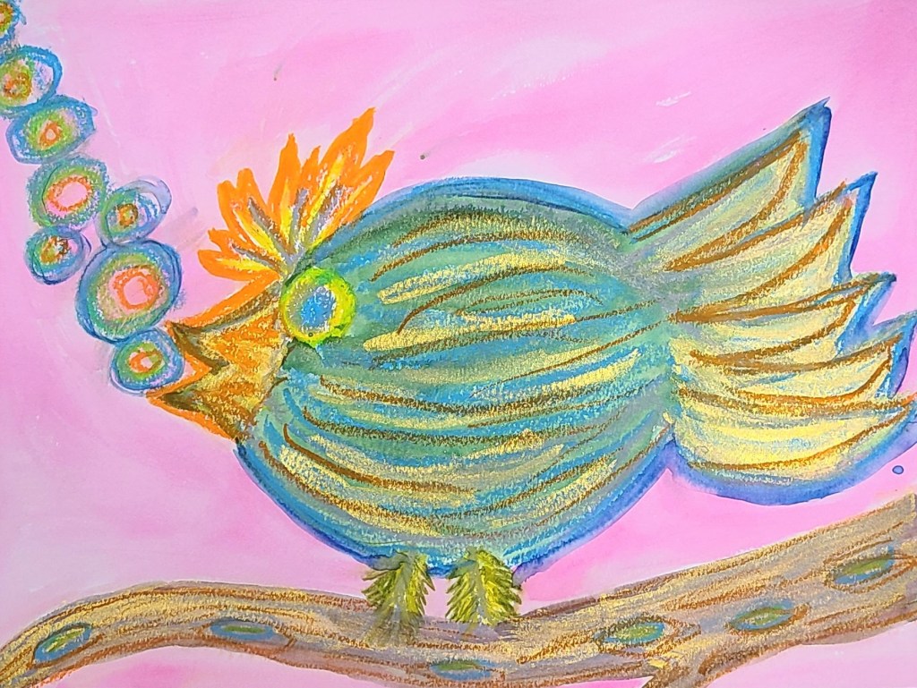
I started the first week without anything too crazy. This week, our materials were: Tombo brush markers, Crayola Portfolio Series oil pastels, Lumineart Twinkling H2Os metallic watercolors, and a watercolor paper base.

Tombo is my absolute favorite brand for brush markers, and while these are often used for illustration and come with a colorless blender for drawing, they are also water soluble. This means they additionally work great as watercolor markers. I have yet to find another brand of watercolor markers that have such brilliant colors and blend as seamlessly. I’ve been a fan since I started using them for interior design project assignments and architectural drawings back in college.

When it comes to oil pastels, quality does matter. With cheaper brands, you will often end up with nothing but glorified crayons as you can see in my latest YouTube video where I reviewed art supplies from Dollar Tree (The oil pastels were actually the ONLY supply to get a poor review – Seriously, you should check this out especially if you have kids who love art.). However, we are also a non-profit with a tight budget. Though the Portfolio Series pastels are an art student spinoff of Crayola which is known for making “kid grade” products, these are decent for students and budget friendly. These particular pastels, staying with the kid friendly theme, are also water soluble. This makes for easy cleanup (yay!) but also allows for blending with watercolors for some cool mixed media art. Despite this, if you leave your watercolors more “painty” and don’t add a ton of water the pastels will still repel the color you are layering over for some great resist effects.

Last but certainly not least, I cannot say enough about the metallic watercolors we used. I’ve tried metallic watercolor sets in the past myself and they were underwhelming … Very translucent, hard and chalky texture that didn’t blend well, and only able to get a pastel hue when applied no matter how little water I added. This brand is absolutely fantastic. The metallic sheen is so intense it almost looks like a high quality acrylic, but it blends like watercolors. It also had plenty of bright electric hues and intense darks. I will definitely be getting a set of these for myself.

In my class with a variety of ages and abilities, including some students with intellectual/developmental disabilities and mental health struggles, here is what everyone came up with:

Some tips when using these materials together:

  • Metallic watercolors don’t look very metallic until they are dry, so have patience :).
  • If you draw with a light colored oil pastel first and layer a dark watercolor over, the light pastel will resist the watercolor and show through.
  • Tombo brush markers run with water, but can also be used for drawing just like regular markers. They can be brushed over with water for a paint like effect, but will not draw over a wet surface. They have two ends, including a fine tip that is perfect for adding details to watercolor paintings that beginning artists or those struggling with dexterity would have a stressful time adding with a brush.
  • Using multiple mediums works best when you layer layer layer! Pastels can be added right over the watercolor and ink. Often it’s easiest to create a light wash of background color over your whole surface first, and build up your design from there.

I hope as I continue to share, it will spark some ideas for your creativity at home. Stay tuned for next week’s challenge!

Standard
Gifting, New Work

Support Artists With Disabilities! – Happy Disability Pride Month

As Disability Pride month comes to a close, I wanted to take a moment to celebrate the vibrant artists with disabilities I am priviledged to share my life with, and also remind you that we definitely shouldn’t confine our recognition of the talent and worth of those with disabilities to just one month. In fact, I never even knew there was a Disability Pride Month OR that disability rights had been part of the other early civil rights movements until I started working with individuals with disabilities and a disability rights activist informed me of all this.

For a fantastic, concise video on why there may be this disconnect and why it doesn’t make sense since we will all experience disability at least temporarily at some point in our life, check out Sitting Pretty.

I have never met a more innovative, unconditionally loving and accepting, open and expressive group of people than the neurodiverse artists I work with in the Express Yourself Artshop Program.

One of the hardest parts of supporting artists with disabilities is finding their work in the first place. We have an online store where you can purchase original art and handmade wares, as well as a print-on-demand Redbubble Shop that offers all our unique student designs covering wearables, bags, mugs, home decor, and a variety of other high quality products. I absolutely adore Redbubble and own many products from them myself. I feel they are the best value in a POD site. Myself and my team are passionate about discovering our students’ untapped potential, getting their art out into the world, and helping them support themselves through what they love to do.

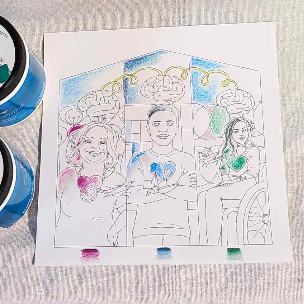
This idea of inclusion and celebrating difference as something that makes our community better ties right in to my current largescale project: a “mini mural” for Midland’s Neighboring Week. I have 3 vastly different individuals represented: a middle aged white woman with down syndrome, a young black male, and a mid-late 20s-aged Latino woman using a wheelchair. Heart, Mind, and Spirit are represented by graphic elements connected to each individual. This symbolizes the importance of opening our hearts to others’ stories, and the fact that we need all different types of brains working together in order to be the best community we can be. 

Every person on earth has value, and every person’s story is important.

Standard
Techniques and Tutorials

Happy (Late) Father’s Day Palette Knife Painting Demo

Sharing this nearly a week later, but my wonderful father at least received his palette knife bird painting on time ;)! I shared earlier how I’d been doing a lot of from-afar collaboration over the last year with my dad over quarantine through using his bird photographs as inspiration for illustrations and paintings. When looking through some of his more recent photos for inspiration for a painting to gift, this little guy stuck out to me. I loved the striking black and white pattern, which meshed perfectly with the already existing abstract background. (Seriously, if you want to paint more often prep a bunch of small canvases with random color blend backgrounds so they are already primed for when inspiration strikes!)

I hope you enjoy this peek into my process. I find birds to be one of the most accessible things to palette knife paint. If you visit my channel I have other videos with step-by-step verbal instruction accompanying the footage.

Flowers more your thing? Check out my Mother’s Day demo.

Standard
Techniques and Tutorials

Palette Knife Tulips Demo (Dedicated to Mom!)

For Ashley

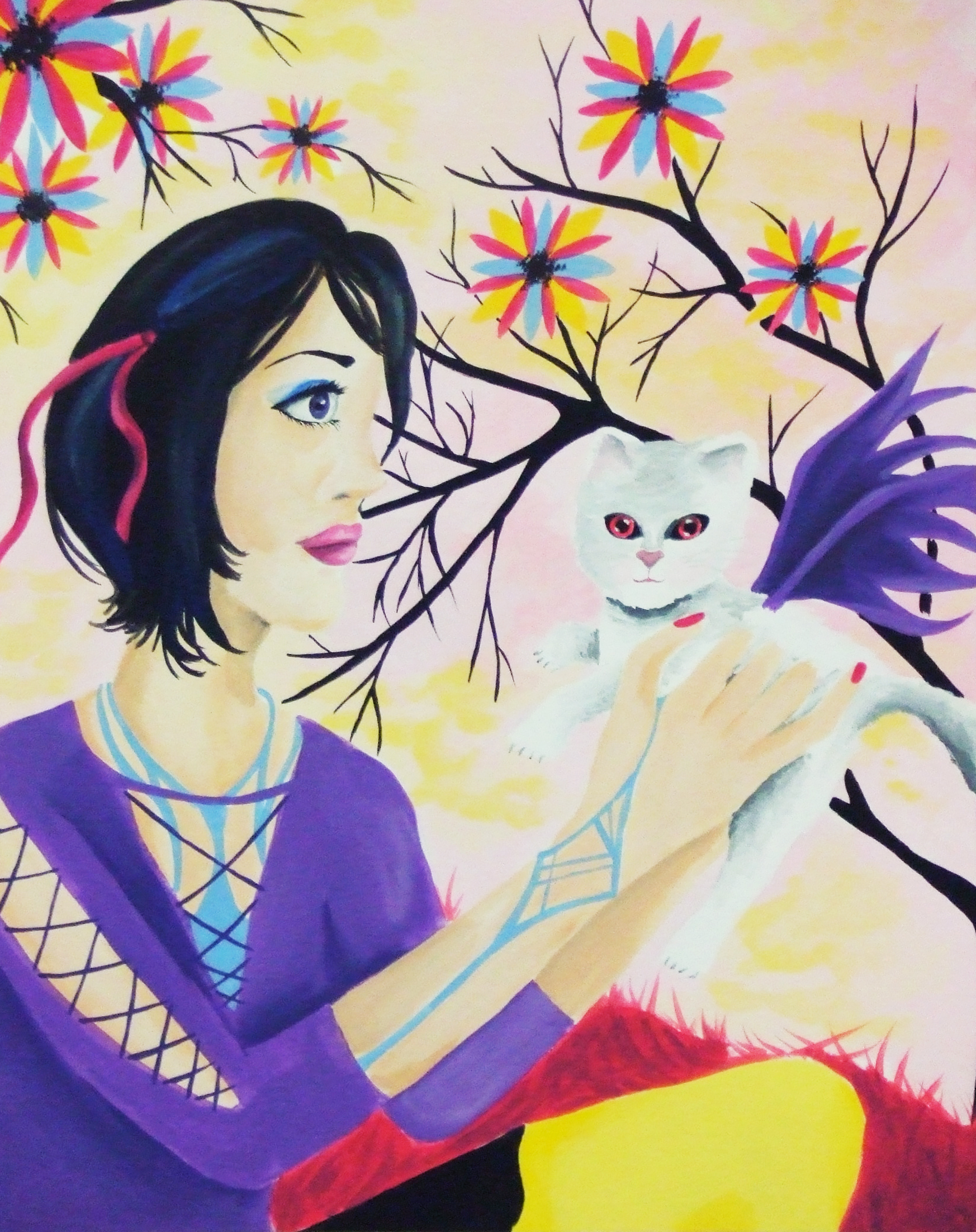
I’m going to start off by saying I used to be really bad at painting anything outside of my quite narrow areas of interest. I went through a phase where I was putting dragon wings on everything, for example, and only did fantasy or surrealism inspired art. I remember my roommate freshman year of college asking me to paint a picture of a teenage girl holding a cat surrounded by flowers after she found out I was an artist (She was the opposite of me, into all pastel cutesy stuff). Hence, this dead eyed girl and cat with guess what, dragon wings, was born. If I still had it, I’d consider submitting it to The Museum Of Bad Art.

Over the years and especially through teaching, I’ve learned to enjoy the process of creating itself and not just the end result, so that even if I’m making something that isn’t necessarily my go-to aesthetic, I can still harness the therapeutic benefits of creativity. This makes accepting commissions a lot easier, and creating art for loved ones that may not fancy surrealism and oddity as much as I do. I have literally never painted tulips in my life, but my mom loves them and while we were recently out walking remarked on the beauty of a particular variety planted at Dow Gardens. I hope you enjoy this visual walkthrough of the process!

Standard
Techniques and Tutorials

10 Minute Winter Watercolors

Happy Winter! I know I am already getting sick of the cold, but there has been some beautiful snow and bright blue skies lately which have been nice to admire out my window 😉 … Winter can be one of the most attractive seasons if not always the most comfortable, and winter scenes are so fun to create with watercolors.

These quick tutorials are an easy way to take a bit of time out of your day no matter how busy you are to do something for yourself, relax, and get creative. They are also great practice at blending color and working with white space for beginners to the medium. If you have kids, these simple projects would be fun to do together. Grab a watercolor palette, 3 different sizes of round brushes, and let’s paint!

As always, if you run into any problems or have questions feel free to shoot me a comment or message. I’m always happy to help with troubleshooting! Have fun!

Standard
New Work

(More) Quarantine Art

Since about mid-November, my state when through a second, more mild, quarantine which put classes and activities in my Artshop program temporarily on hold and sent me back to working from home again. I will be plunging back into things as they reopen TOMORROW, so today I’d like to share some of the work I finished over the last couple months.

This first piece was a very fun commission where I was asked to do a surreal portrait in my signature mixed media, vintage inspired style but based on the song “Little Wing” by Jimi Hendrix. I was given some guidelines as to the type of figure portrayed and color scheme, but otherwise the project was completely open ended. And so, this piece was born, communicating a sense of love and positivity, openness, kindness and warmth, and creative spirit.

Little Wing Commission, Prismacolor Pencil and Mixed Media

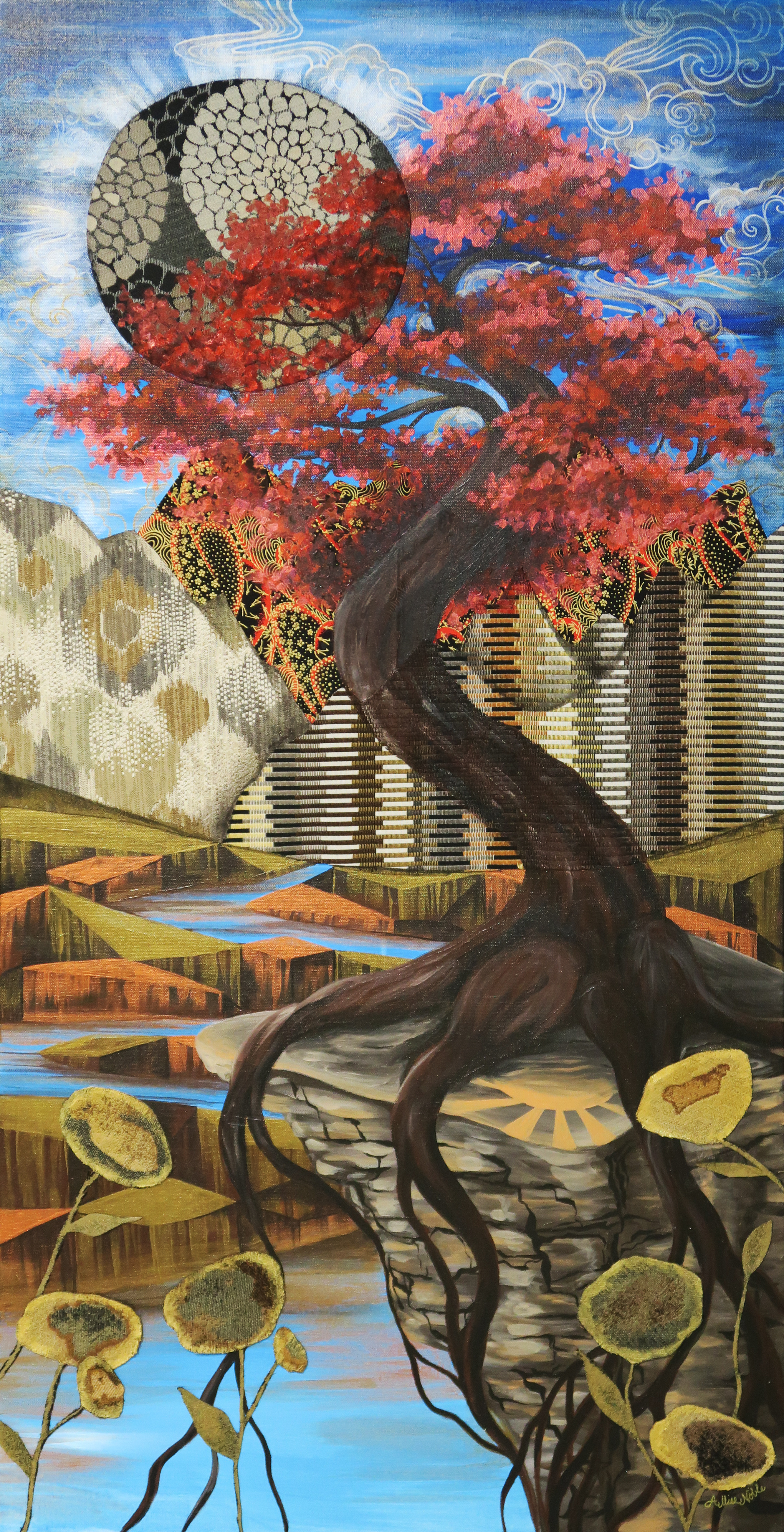
It felt really good during this time, which to be honest though less restrictive seemed to be a hell of a lot more frustrating than the first full quarantine, to continue the trend of just working on creating some beautiful, uplifting imagery. The piece below is my largest to date at 4 entire feet high! That may not seem like a big deal to some, but everyone who knows my work knows I work small, “big” for me usually being 18×24″. Also note, no people or animals in this piece! I have another large canvas still untouched, and to really step out of my box I think I should do something architectural next.

Where The Light Is Held, Acrylic and Fabric

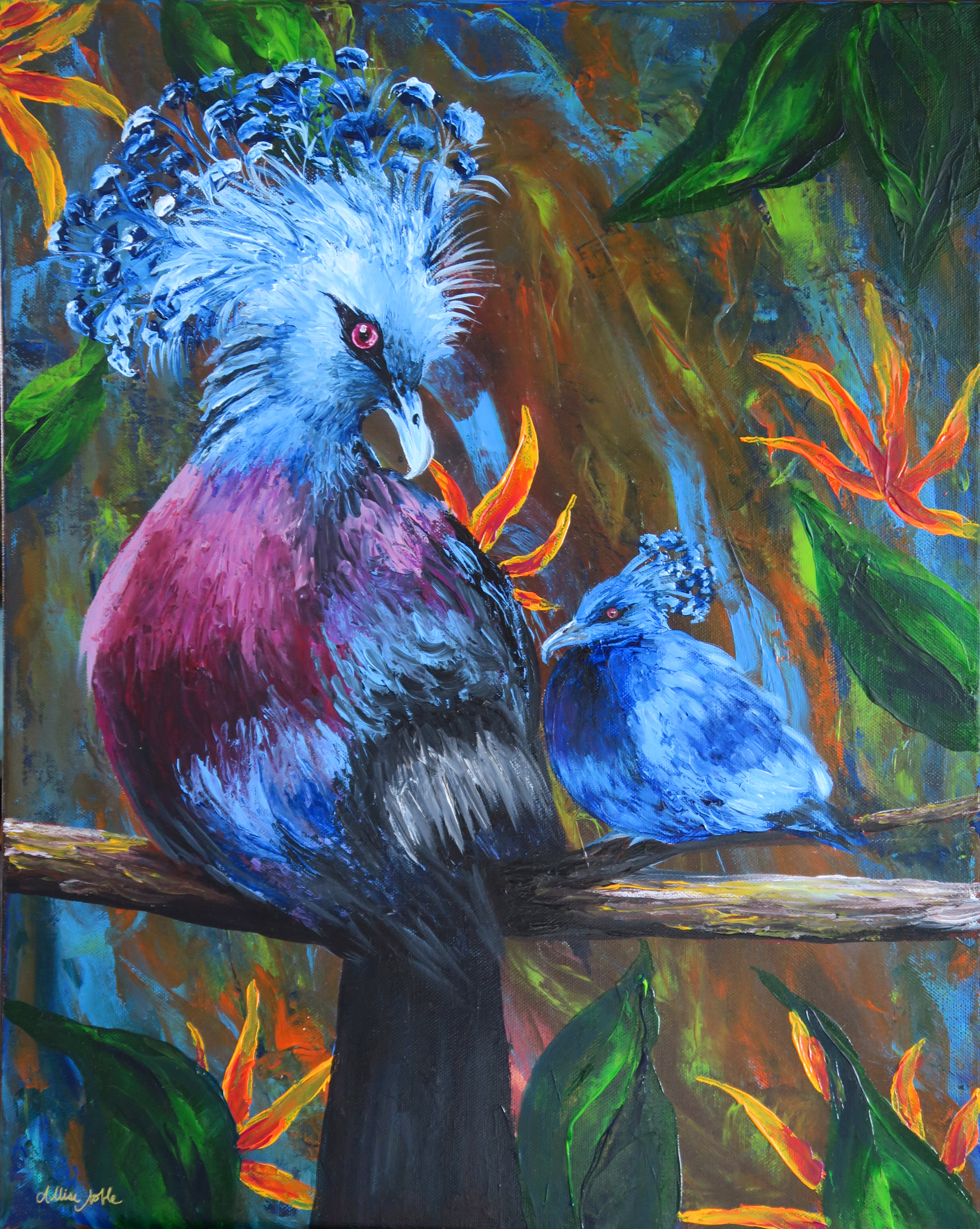
I also finished a full size bird palette knife painting, the rest of what I’d completed being minis. Yes, these are real birds! I’m always saving photos of exotic and interesting birds on Pinterest, and the colors and adorable yet zany plumage coming out of the top of these guys’ heads was irresistible. I found a couple of reference images, and decided I had to throw a baby in there too.

I don’t know about the rest of you, but my new year starts tomorrow. Wish me luck!

Standard
New Work

Creativity In Seclusion

This very odd year is getting nearer to a close. Everyone has been affected both personally and professionally in some way, and many of our ways of thinking about and performing even the most mundane daily tasks have been drastically altered.

Art comes from the psyche, and I know oftentimes I can look at a piece of art from my past and remember exactly what was going on at that time in my life. The colors, the style, the motifs all relate to what was reverberating inside my mind at that time even if it is not obvious to an outside viewer. This got me thinking, how has this year, and specifically quarantine, affected my art? I have had the most uninterrupted creation time at my disposal than I’ve had in years; life has taken a much slower pace. At the same time, there is the permeating sense of distance and anxiety that has overtaken all of life.

The art I completed over the first half of this year during quarantine deviated from the style I’d been focusing on over the last couple years. Now that I look at it all together, I can see the focus was more on developing techniques and creating something visually stimulating than my usual conceptual, symbolism heavy work. I credit both having more time to develop and hone different skills such as acrylic palette knife painting and realistic watercolor, and also the fact that with all the uncertainty and isolation; two things that I don’t always handle the best even in normal circumstances; I wasn’t doing art so much to communicate as for therapy for myself. I was painting whatever made me feel good in that moment.

I also did a lot more with animals and nature over quarantine, specifically my almost daily live ink wash animal demos. Nature was vital over this time as the only form of release and entertainment, and the appreciation I already had for the outdoors further deepened. I also had the opportunity to collaborate with my dad from afar as I used many of his wildlife photos as inspiration references for my ink washes.

The gallery where I work, Creative 360 in Midland, currently has an exhibit going titled “Art In Isolation” which can be visited in person or viewed virtually. I’d encourage you to visit the link and check it out!

What are some of the things that kept you going during quarantine this year?

Standard
Techniques and Tutorials

Acrylic Palette Knife Painting Tutorial – Scarlet Tanager

I’ve recently been doing some experimentation with palette knife painting, though for now my forte is mainly just birds! (I tried an octopus recently with disasterous results 😉 ). As someone who was previously very skeptical about palette knifing, I wanted to share how much fun it really is! As someone who is very sharp detail oriented with art, I was worried about not having the control that I can get with a pencil or brush. In the end, I found the expressive process of smearing and marbling colors with the knife incredibly calming and meditative. This is beginner level, so anyone can try it even if you have no painting experience. Give it a go and let me know what you think!

What do you think I should try to palette knife next?

Standard