Those who have visited before may have noticed my affinity for art subscription boxes. Whenever I receive a new box, I always challenge myself to create a small piece of art using only the materials that came in my monthly box as a way to try new techniques and get to know the materials. I am also quite the fan of the cooking show “Chopped”, in which contestants are give a basket of mystery ingredients, some delicious and some just plain odd, from which they must make a cohesive dish. My “day job” is running a program for artists of all abilities, and this new Fall semester I decided to run a class based on this concept. Each week my group will get a surprise box filled with 3-4 different types of materials and be challenged to use only those to make a work of art. Everyone gets the same supplies each week, just different colors or designs. I will be sharing what people came up with, as well as some tips for those who want to try the materials featured at home.
I started the first week without anything too crazy. This week, our materials were: Tombo brush markers, Crayola Portfolio Series oil pastels, Lumineart Twinkling H2Os metallic watercolors, and a watercolor paper base.
Tombo is my absolute favorite brand for brush markers, and while these are often used for illustration and come with a colorless blender for drawing, they are also water soluble. This means they additionally work great as watercolor markers. I have yet to find another brand of watercolor markers that have such brilliant colors and blend as seamlessly. I’ve been a fan since I started using them for interior design project assignments and architectural drawings back in college.
When it comes to oil pastels, quality does matter. With cheaper brands, you will often end up with nothing but glorified crayons as you can see in my latest YouTube video where I reviewed art supplies from Dollar Tree (The oil pastels were actually the ONLY supply to get a poor review – Seriously, you should check this out especially if you have kids who love art.). However, we are also a non-profit with a tight budget. Though the Portfolio Series pastels are an art student spinoff of Crayola which is known for making “kid grade” products, these are decent for students and budget friendly. These particular pastels, staying with the kid friendly theme, are also water soluble. This makes for easy cleanup (yay!) but also allows for blending with watercolors for some cool mixed media art. Despite this, if you leave your watercolors more “painty” and don’t add a ton of water the pastels will still repel the color you are layering over for some great resist effects.
Last but certainly not least, I cannot say enough about the metallic watercolors we used. I’ve tried metallic watercolor sets in the past myself and they were underwhelming … Very translucent, hard and chalky texture that didn’t blend well, and only able to get a pastel hue when applied no matter how little water I added. This brand is absolutely fantastic. The metallic sheen is so intense it almost looks like a high quality acrylic, but it blends like watercolors. It also had plenty of bright electric hues and intense darks. I will definitely be getting a set of these for myself.
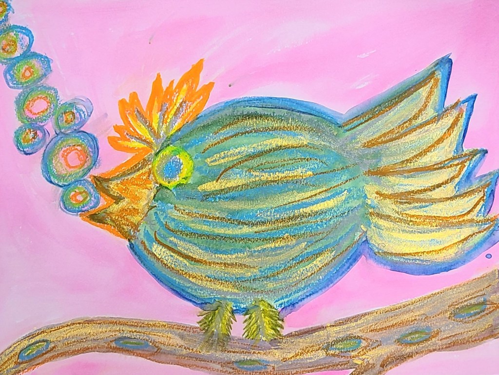
In my class with a variety of ages and abilities, including some students with intellectual/developmental disabilities and mental health struggles, here is what everyone came up with:


Some tips when using these materials together:
- Metallic watercolors don’t look very metallic until they are dry, so have patience :).
- If you draw with a light colored oil pastel first and layer a dark watercolor over, the light pastel will resist the watercolor and show through.
- Tombo brush markers run with water, but can also be used for drawing just like regular markers. They can be brushed over with water for a paint like effect, but will not draw over a wet surface. They have two ends, including a fine tip that is perfect for adding details to watercolor paintings that beginning artists or those struggling with dexterity would have a stressful time adding with a brush.
- Using multiple mediums works best when you layer layer layer! Pastels can be added right over the watercolor and ink. Often it’s easiest to create a light wash of background color over your whole surface first, and build up your design from there.
I hope as I continue to share, it will spark some ideas for your creativity at home. Stay tuned for next week’s challenge!
