New Work

New Art! 2 Down 2 To Go!

Struck by both some luckily timed inspiration and ever looming deadlines, I have buckled down on my series and completed 2 more pieces, which means only 2 more to go! I actually think these 2 new ones are among my favorites so far. Series-explanation-blurb time for those new readers! “Unlimited” is composed of 12 mixed media portraits in which the meaning is influenced by the use of pattern and color. Women of all ages, races, and time periods are depicted, each communicating a different theme. I aim for the pieces to speak to women’s collective experiences beyond their differences. We tend to think of time and events in terms of our own personal history or the history of the nation in which we reside. But of course, there are women everywhere living out their day to day life all over the world, with hopes, dreams, fears , relationships. Our situations and struggles are very different, but were we in some alternate reality all given a chance to meet, I suspect we would find some surprising similarities, maybe more than we ever expected. Pieces are primarily drawing and painting, accented with mixed media elements and metallic details.

october she is full of curiosity

For the above, titled “October: She Is Full of Curiosity”, I incorporated a lot more mixed media elements which I felt meshed well with the “vintage study” atmosphere of the background. I used quilting fabric for the wallpaper, leather upholstery samples for the book cover, decoupaged book pages for the inside pages and title, an art book clipping for the picture on the wall, ink for the woodwork, watercolor for the outdoor scene, lace overlay for the girl’s collar, metallic acrylic for her hair, and prismacolor pencil for most of the figure and clothing.

she is free

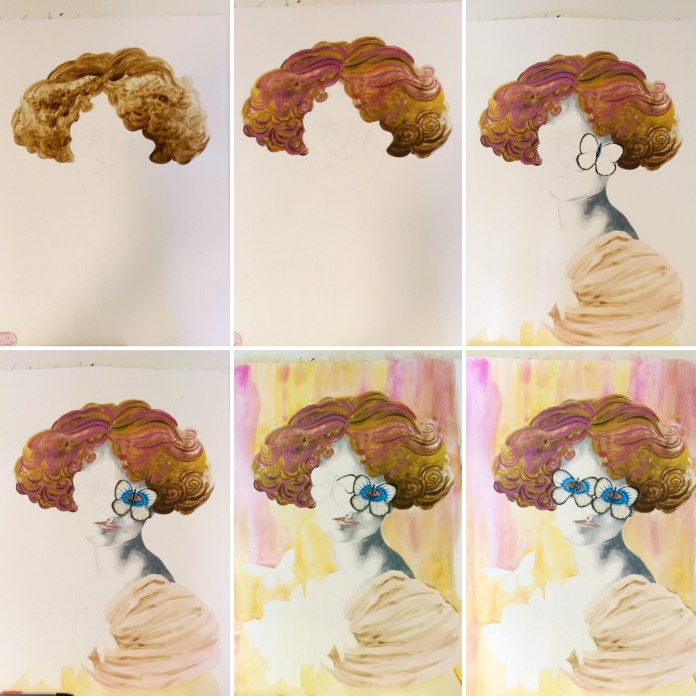
In this next piece, titled “July: She Is Free In Mind and Spirit”, I took almost the opposite approach, not using any fabric or found object materials and sticking solely to the traditional art materials of prismacolor pencil, watercolor, and acrylic paint. I’d had all the pieces for my series pre-planned as far as composition and subject matter since late 2015. However, this one took flight (haha, bad pun) on its own quite recently after I realized that I had a variety of ages and races represented in my planned artworks, but not a variety of abilities. Given that I work with an art program that serves individuals with disabilities, this oversight stopped me in my tracks. I’m always harping on inclusion and the lack of representation of people with disabilities in the public and entertainment sphere to anyone who will listen (and even those who don’t want to sometimes), and yet I realized they were not included in my project that was all about inclusion, unity, and representation. I was thus tasked with coming up with a visible disability that could be seen in just a head and shoulders portrait rather than a full body rendering. This lively young woman with down syndrome who exudes confidence, energy, and life evolved over the incredibly short course of two interrupted days with no pre-planning or sketching beforehand which is very uncommon for me. I don’t know that anyone else will see it, but this piece definitely holds the most emotional connection for me.

For more deeply personal and unconventional portraits, check out self-taught contemporary artist Stephen Martyn Welch’s “Everyone Deserves A Portrait” series inspired by his son who was born with Kabuki Syndrome. Keep checking for the last two! I’m on a roll ;)!

Standard
Art Discussion, New Work

In A Black and White World, Be A Rainbow! New Work.

november she is entirely her own

I am still plugging along on my series that needs to be finished by mid-late Summer so that I can enter it into ArtPrize! 4 more pieces of 12 to go, wish me luck! This particular piece titled, “November: She Is Entirely Her Own” was a lot of fun, with lots of dramatic color and pattern – a true ode to creativity, independence, and expression. As it turns out, rainbow hair is as challenging to draw as it can be to create on an actual person’s head!

My series will eventually include 12 mixed media, surreal, conceptual portraits in which the meaning is influenced by the use of pattern and color. They will depict women of all ages, races, and time periods. Each will communicate a different theme, titled for each month of the year. I aim for the pieces to speak to women’s collective experiences beyond their differences. Though many of the pieces deal with difficult emotions, the overall feedback I’ve received is that viewers found the works in this series inspiring and encouraging. Over the last couple of years, I have really come into my own style as an artist. For the longest time, I thought in order for art to speak it couldn’t really be enjoyable to look at, and was so wary of my art slipping away from true art and into the category of “decoration”. However, honesty doesn’t have to mean horror and darkness, although there is certainly a time and place for that kind of art, too. You really have to just let yourself speak what naturally flows out of you as an artist, without trying to force a certain aesthetic or viewpoint just because you feel like that is what you “should” be making.

One of my all time favorite authors, David Foster Wallace, said this about creation, “In dark times, the definition of good art would seem to be art that locates and applies CPR to those elements of what’s human and magical that still live and glow despite the times’ darkness. Really good fiction (or art) could have as dark a worldview as it wished, but it’d find a way both to depict this world and to illuminate the possibilities for being alive and human in it.” If this doesn’t just sum up my definite art goals, I don’t know what does.

Lastly, I will leave you with some of my recent wedding photos. Oh, you didn’t know I got married by the most highly respected robotic priest in all of Michigan on the 30th of March, my 29th birthday?

Ok, April Fool’s. I don’t think this particular marriage ceremony held at Marvin’s Marvelous Mechanical Museum is technically legally binding, and the flimsy aluminum rings we exchanged couldn’t even fit properly on our gigantic sausage fingers. But nevertheless, spending a day at the arcade followed by delicious Italian food was a good enough birthday adventure for me. Perks, now everyone can stop asking us when we’re getting married, because we kind of already did, fools ^_^.

Continue to be the rainbow in a black and white world, dear readers. Until later …


Standard
Art Discussion, New Work

New Work – September: She Is An Atlas

This was one of the most challenging pieces in my series thus far, because I was working with multiple layers of meaning and thoughts. It also is the most “mixed media” of all my series installments, utilizing not just mixed fine art mediums but fabric, metal chain, tiny rhinestones, and torn book pages. I have been so into metallic accents since the collaboration with my friend and student, Heather. I also blame her for the inclusion of rhinestones – she encourages me to be sparkly.

she is an atlas

I’ve mentioned in previous posts that when I feel, I feel BIG or not at all. There is no other way. The sketch that inspired this piece started as a way for me to process the weight of my own emotions and feelings of powerlessness. As  I began further conceptualizing this current series, I realized the idea could fit as one of the 12 pieces. For new readers, here’s my blurb briefly explaining the series (If you are already in the know, feel free to skip ahead 😉 ): I am creating 12 mixed media, surreal, conceptual portraits in which the meaning is influenced by the use of pattern and color. They will depict women of all ages, races, and time periods, and each will communicate a different theme. I aim for the pieces to speak to women’s collective experiences beyond their differences. Each of the 12 will represent a month of the year. We tend to think of time and events in terms of our own personal history or the history of the nation in which we reside. But of course, there are women everywhere living out their day to day life all over the world, with hopes, dreams, fears , relationships. Our situations and struggles are very different, but were we in some alternate reality all given a chance to meet, I suspect we would find some surprising similarities, maybe more than we ever expected. The title of each piece starts with the month it represents, followed by “She Is _______”. The figure in this piece quite literally has “the world on her shoulders” through the pattern on her clothing, much like the mythic Atlas. Atlas the physical object is also defined as a book of maps or charts, and can signify one feeling that they alone must have all the directions and answers to all of the world’s problems, a grand and impossible responsibility.

The exposed heart necklace represents empathy, an open heart waiting to be wounded , left unprotected and raw. She leans against a bulls-eye wall, surrounded by an outline of thrown knives, a target girl like in the well known circus act. With each act of injustice and malice directed at others, she feels as if she is standing in their place, each offense a knife thrown at her, just missing. Though fearful, her face is strong and even. I’ve written before about how compassion and empathy does not equal weakness. To stick one’s head in the sand and be ignorant of the world’s ills is weakness; foolish, avoidant, and selfish.

Another way the subject can be viewed is not as the empathizer but as the victim. Some people are born into situations that are so difficult, living day to day is much like standing against a target with knives being thrown at them. It can be their geographic location, their income, the people that surround them or lack thereof, and the list goes on. Though yes, our personal choices certainly can influence outcomes, isn’t so much of life like a gigantic, living lottery when you think about it? Yet we shake our heads and wag our fingers when we see people who are struggling both around us and abroad, because certainly they must have done something wrong or things would look different? This way of thinking frees us of the responsibility to help others, and gives us a false sense of power that by doing certain things we can be 100% sure we attain the exact sort of life that we want. It all goes back to empathy and control.

One of the things I love about art is the way people can discern completely different meanings from a piece based on their own thoughts and experiences. Did something different strike you as you looked at this piece, did it remind you of something? Please share, don’t be shy!


Standard
New Work

New Progress On My Current Series!

august-she-is-an-earthshaker-blgr

Hello all! I recently finished another addition to my 12 part series I’ve been working on since late 2015. For new readers, here’s my blurb briefly explaining the series (If you are already in the know, feel free to skip ahead 😉 ): I am creating 12 mixed media, surreal, conceptual portraits in which the meaning is influenced by the use of pattern and color. They will depict women of all ages, races, and time periods, and each will communicate a different theme. I aim for the pieces to speak to women’s collective experiences beyond their differences. Each of the 12 will represent a month of the year. We tend to think of time and events in terms of our own personal history or the history of the nation in which we reside. But of course, there are women everywhere living out their day to day life all over the world, with hopes, dreams, fears , relationships. Our situations and struggles are very different, but were we in some alternate reality all given a chance to meet, I suspect we would find some surprising similarities, maybe more than we ever expected. The title of each piece starts with the month it represents, followed by “She Is _______”.

This piece is titled July: She Is An Earthshaker. I love mermaids, and really got into aquatic art after following the required theme for the Tall Ships curated exhibition at Studio 23 last summer. This was a fun piece to create, and perhaps my favorite in the series thus far. As a child I don’t know how many times I watched The Little Mermaid, and was absolutely transfixed by King Tritan’s trident (Which of course I later learned came from the myth of Poseidon). I became inspired to make a powerful Lady Poseidon if you will. Earthshaker is another way Poseidon has been referenced, but the name can also apply to those of us in the real world, ordinary people who create waves to change what needs to be changed. She wears a pretty seashell and floral crown, and her facial expression is not one of anger or even one that would imply intense power. Her strength is a quiet strength. If in her head, she can see herself like this, the waves and lightening crashing behind her as she stands firm, perhaps she can believe that she can do anything even if others may doubt her.

img_20170226_161143_661

This design is available for print on a variety of cool items in my Redbubble Shop, and art prints on matte photo paper may also be purchased from me Ebay Store.

Check out the other pieces I’ve finished so far! January February March June 


Standard
Uncategorized

Exciting News From the MAG Annual Exhibition!

Friday was the opening reception for the Midland Artists Guild’s Annual Juried Exhibition. What’s awesome about this year is that the show actually took place at the gallery I work at as Coordinator for one of their major programs, Creative 360. The piece that was accepted into the show was “She Is Everything At Once“, the 3rd installment in my new series I’ve been working on since late 2015. There was so much amazing work this year, I truly was just excited to get into the show and did not go in expecting any further recognition… and then my name got called for an Award of Excellence. No matter how many years I spend involved in art, I don’t think I will ever lose that factor of complete surprise when something like this happens.


For those of you who may have missed previous posts on my new series, I will be creating 12 mixed media, surreal, conceptual portraits in which the meaning is influenced by the use of pattern and color. They will depict women of all ages, races, and time periods, and each will communicate a different theme. I aim for the pieces to speak to women’s collective experiences beyond their differences. Each of the 12 will represent a month of the year, the one featured in the MAG show being March. We tend to think of time and events in terms of our own personal history or the history of the nation in which we reside. But of course, there are women everywhere living out their day to day life all over the world, with hopes, dreams, fears , relationships. Our situations and struggles are very different, but were we in some alternate reality all given a chance to meet, I suspect we would find some surprising similarities, maybe more than we ever expected.

My goal is to get this series into this year’s ArtPrize in Grand Rapids. With the positive responses I’ve been seeing to images from this series thus far including an award for my January piece at the Greater Michigan Art Exhibition last Fall, I’m certainly feeling hopeful!

Standard
Techniques and Tutorials

Start Drawing Amazing Eyes!

Eyes have always been my absolute favorite thing to draw, and I tend to accentuate them in all of my artwork. They can also be one of the most difficult things to draw, and it takes a lot of practice to get them right. There are a lot of picky little details to pay attention to. When we begin drawing an eye how we “think” we should, without really observing an actual eye’s appearance as if we have never seen one before, we tend to end up with a drawing like below. Generic football shape, outlined individual eyelashes, harshly contrasting pupil and highlights, and those pesky little lines jutting out all around the center like a kid’s drawing of the sun. In reality, an eye’s darks and lights are much more subtle and blended, each person’s eye is a completely different shape, and unless we are drawing a huge zoomed-in eye filling an entire 18×24″ piece of paper, you wouldn’t actually see individual eyelashes. I’d like to share my tricks of the trade with you. Grab a piece of paper and follow along. It will be fun, I promise! Don’t worry about doing everything “perfect”, just enjoy sketching. Every artist does things slightly different, and the more you practice you may discover some of your own “tricks” that work for you.

eyenono

  1. Lightly outline the contour of the eye. Don’t just draw an oval with half circles above and below it. Pay attention to the exact curvature of the unique eye you are trying to draw (photo references are always good.) Is it wider on one side than the other? Does the eyelid dip down drastically or does it curve more gradually? Are the curves of the eye and eyelid soft and smooth, or more angular? Is the eyelid rounded or more flat on top? Is the fold under the eye parallel to the bottom eyelid, or does it droop diagonally? Sketch lightly, as you don’t want to see harsh outlines through your shading.
  2. Shade the outside perimeter of the eyeball. The darkest shading is always at the two corners of the eye, and gradually fades as you get closer to the iris. There will also be a deeper shadow underneath the eyelid since the lid overlaps our eyeball, blocking the light from reflecting as much up top.
  3. Shade around the iris, again with slightly deeper shading closer to the top eyelid. Even if you don’t explicitly see shadows near the iris in your photo reference, the white of our eyes are never really pure white, and you will get a much more realistic look if there is a gradual transition between the iris and the white of the eye, rather than going from fully colored in iris to stark, clean paper in the white of the eye. This step helps the iris look “settled” into the eyeball rather than looking as if it is “hovering” on top if it.
  4. Add your darkest shading on the top of the iris. This should be a shade darker than your darkest value that you used previously underneath the eyelid when you shaded the white of the eye. Think of a crescent moon facing downward, with the thickest shading up top, getting thinner and then altogether disappearing as it trails down around the edges of your circle shape.
  5. Add in your pupil and reflections. The reason we do this next is because we want to have the reflection areas mapped out before you get to shading the rest of your iris. You can go in with an eraser and add highlights by removing shading afterward, but this can be messy and end up smudging work you don’t wish to be smudged. I find it easier to just leave the highlights white to begin with. The location varies by light source if you are using a photo reference. Without a specific reference, it is safe to add two highlights, one on top and one on bottom at a diagonal to each other. Fill the pupil in dark black. This will be your darkest value.
  6. Shade around the pupil using the same value you used to shade your crescent moon around the top of the iris, one step lighter than black. Again, this anchors the pupil inside the iris so it doesn’t seem as if it is floating on top. This gradual gradation from dark to light makes the separate parts appear as a whole.
  7. Fill the remainder of the iris with a medium value. Again, we want all our value transitions to be gradual, so get a little lighter when you begin shading around the edges of your highlight areas.
  8. While we don’t want radial stripes circling the inside or our iris, we don’t want to smooth all the visual texture out of it either, as the striations of dark and light we see are part of the deep beauty of eyes. Literally “scribble” some slightly darker shading shooting out from the pupil in the two areas between our highlights. Again, please scribble though it may seem odd and scary; we don’t want neat, individual lines extending from the pupil.
  9. Add the tear duct by simply finishing the shading around your eyeball, cutting off the little teardrop shaped dip in the inner corner.
  10. Shade your eyelid! Shade the darkest in a thin line over the crease you originally outlined. Don’t just trace your line darker, shade by moving your pencil back and forth swiftly in short strokes over this line. Above this, shade a touch lighter to again make a gradual transition from dark shadow to white paper. Shade darkly also over the curved line directly above your eyeball, the edge of the eyelid. This will provide a foundation for the eyelashes, which we will add later. Shade along the bottom eyelid like this also.
  11. Shade the bottom crease under your eye. This is not a direct “fold” so it should be lighter than the shading for the eyelid since it is less in shadow. Shade deepest along the line you originally sketched, and shade lighter around this line on top and bottom. Extend the shading up to the outer corner of the eye to really show the skin curving. Add some light shading under the dark crease of the upper eyelid.
  12. We’re going to scribble again! Add some jagged shading pointing out from the top and bottom eyelid where the eyelashes will go, more so on top than on bottom. Do this in a medium value.
  13. Now, you can go over and add some individual curved darker lines sticking out to add some detail to your eyelash area. Don’t make them all the same length, and try to curve them – no straight lines poking out! Add a bunch overlapping each other using swift, light strokes with your pencil. They should be dense and close together.

These are not hard and fast “rules”, and once you’ve practiced the basic guidelines you can twist them to create entrancing eyes in your own unique artistic style, both realistic and more comic or stylized.

Speaking of eyes, I just designed a new pattern for Redbubble covered in glamorous eyeballs for your enjoyment. Check out all the cool new products featuring my digitally drawn pattern Mascara Tears here!

Feel free to throw a comment my way if you have any other drawing questions, I’m always open for giving tips. Any best practices other illustrators out there have found helpful? Don’t hesitate to share!

Standard
New Work

Be My Eyes

be-my-eyes.jpg.jpg

This newly finished mixed media piece, titled “Be My Eyes”, continues along a similar theme to my last piece. I love how it turned out, but I must admit this is one of the first works in awhile that was not buckets of fun throughout the entire process. I’m lucky in that I don’t get incredibly angry with my art much anymore. Like any relationship, if things aren’t working, I can say hey, I think we need to give each other some personal space, and leave it alone for awhile and work on something else. However, this one had a quickly approaching deadline for an all-area Michigan show I wanted to enter it into, so I didn’t have that luxury. It may be freaking gorgeous, but filling in all those detailed little butterflies was a chore. Like, I almost considered taking a break from working on art at one point to go clean my kitchen – that’s how bad it was. Cleaning my kitchen was a reprieve. What’s that about blood, sweat, and tears?

img_20160713_162405.jpg

After doing the basic outline lightly in pencil, I started filling in the figure from the top down. I broke my own guideline that I always give my students about starting with the background first, mainly because to be absolutely honest, I had no clue what to do with the background yet. The hair was so swirly, and fun, and free, and so the opposite of those technical, detailed little insects. I used prismacolor pencil for the face and skin, watercolor for everything else. I made some commitment to a background by dripping orange, gold, and magenta watercolor over it – similar colors to what were used in the hair. After this, my work of art temporarily looked like a 70s album cover. The photos don’t do it justice, the colors were BRIGHT.

img_20160722_193236.jpg

After that, I went back to ignoring the background because I still had no idea what to do with it, and finished the central figure. Rules in art really are just suggestions ;). I had known from the beginning that this piece required metallic gold somewhere, and the background now seemed just the place to put it. Huzzah to dulling all those bright Barbie Dreamhouse colors! I needed to break it up with some texture, so I used a crumpled paper towel to apply the first layer of gold, but it just didn’t do it. It was reminding me of a faux finish accent wall circa 1995. In a surprisingly impulsive move (Even in art, I am so not an impulsive person.), I squirted gobs of paint right on the background, and used a toothpick to marble the colors together. I have the technique down because of how many times I’ve made these nutella brownies. Seriously, same technique to marble the nutella and peanut butter. To lighten this now very dark background (Art is always such a Goldilocks situation.), I used white watercolor and added designs of blown up butterfly wing patterns over top. The finishing touch was the gluing the bunched lace over the dress, and voila!

The reason I’ve included this 100% honest rendition of this piece’s birthing process (including the part about my background being inspired by delicious baked goods) is because I’ve learned one thing from all the different students I work with, and it is this: They think artists always know what they are doing, have an exact plan in their head, and that their piece turns out just precisely how they imagined it in the end, and that real artists never get stuck or doubt what they are doing. This is absolutely not true. Everyone’s art looks completely wonky until it is all the way finished. It’s part of the process. When art is in progress, it’s awkward looking, we don’t always know what we are going to do next, and we don’t always enjoy every single step of the process. And that’s ok. If your art is easy, you probably aren’t pushing yourself enough, or being as creative as you could be.

I haven’t talked much about the meaning behind this piece, because I want to hear what you think. This image could definitely be open to innumerable interpretations, and that is one of the most fun things. What does it say to you?

Standard
New Work

New Work – Underwater Dreaming

I had some time yesterday morning before I had to leave for the Art Clash (more about that in a soon-to-come post), and I was determined to get this piece finished. There is nothing more daunting than smearing dark blue chalk all over a pretty much finalized piece you’ve been working on for months, but it was necessary to make the scene look like it was truly underwater, and also to balance out the areas of dark that were screaming out from a sea of pastel colors. For a progression of in-progress photos, check out my previous post.

Underwater Dreaming

I had originally intended to go with all blues, grays, and purples. I normally stick to a very limited palette in my pieces, but those crazy little plants in the background are in reality shockingly colorful, and I felt I had to do them justice. After I added the pink hair, it was color explosion time. It really makes the piece feel tropical, and I like that it’s way different from what I usually do. I have posted the design for sale in my Redbubble Shop on a variety of products, and it is also for sale in print form in my Ebay Store.

Redbubble recently added these new flowy chiffon tops to their available products that are just too cool.

ctr,x1350,front,white-c,65,0,789,730-bg,f8f8f8.4u3

As promised, more about Art Clash later, with pictures! I have another art event to attend this afternoon (this one conveniently 5 minutes from home 🙂 ), so time to get out of my PJs! This weekend spent absorbed in art has been so wonderful, and necessary after many a stressful day this month. So long, April! You were great, but here’s to hoping things calm down from here on out.

Standard
New Work

There Is An Aquarium In My Brain – New Work Preview!

So, this new piece is as of yet untitled (hence the goofy title of this post). But in all seriousness, I have drawn so many colorful fishies and detailed aquatic plants that I do indeed feel like there is an aquarium inside my brain. Not finished yet, but getting there! I still have to further detail the fish, complete the run of aquatic plants over to the right side of the scene, and add some shading with chalk over top to give the piece a truly “underwater” feel.

I think my favorite part so far is her jellyfish inspired hair-do … I’m jealous. On another interesting side note, my boyfriend fell down the internet rabbit hole one evening as we are all apt to do from time to time, and discovered that there is an actual fear of tiny holes, or even images that look like tiny holes such as patterns of contrasting circles within circles, called trypophobia. Oh-oh! My colorful little sea plants definitely fall into that category. Apparently it is quite common, and thought to be an innate protective mechanism since many dangerous animals are covered in such patterns. If my whimsical little plants horrify and disgust you, I suppose I will apologize in advance ;). I do not share this phobia in the least and actually love small, brightly colored circular patterns, and therefore am grateful I live in 2016 Michigan rather than a primitive hunter-gatherer society hundreds of years ago in the Amazon, or I would have had a rather short and sad life. Mainly because I would have tried to pet one of these …

In other news, Art Clash tomorrow! You know I’ll have pictures, so be sure to check back :).

Standard
Exhibitions and Other News

Exciting News From Midland Artists Guild Exhibition 2016

Time has been flying, and I can’t believe the Midland Artists Guild annual juried exhibition has already came and went as of last night. There was such a diverse collection of amazing work. I think the shows get better every year, and if you are in the Midland area it is worth stopping by the Grace A Dow Memorial Library mezzanine to check it out. I was beyond excited to find out my piece “On My Mind” won one of the Merit Awards!

IMG_0440r

spaceedit3


This art nouveau inspired mixed media was so much fun to work on, and you can visit one of my previous posts to view the  step by step process .

My two other pieces that made it into the show were “Wonderland” and “January: She Is Far Away“.

All of these designs are available as art and ACEO prints in my ebay store, and prints on mugs, bags, pillows, notebooks, and all kinds of fun stuff in my redbubble shop. Next up, the Express Yourself Artshop fundraiser show and the Saginaw Township annual juried exhibition! Of course there will be many, many pictures :). Follow to stay in the loop!

Enjoy the rest of your weekend. I know I will be enjoying the rest of mine by drinking copious amounts of tea and not leaving the house.It may be Spring everywhere else, but not in Michigan! In fact, we’ve had four snow days in the last two weeks :P. So long for now!

Standard