Many of you who have read my blog before have probably heard me talk about Express Yourself Artshop, an art and wellness program open for adult students of varying abilities, especially those with disabilities. Artshop is one of the programs I have taught with since its beginning a little over 2 years ago. Our Program Coordinator moved out of town last month, and being that Artshop has always been my favorite out of all the programs I teach with, I applied for the position. This week it is official, from now on I will be with Artshop full time. I have a lot of ideas, a ton of brilliant people helping me, and I cannot wait to see how the program grows and evolves. I dare you to watch the video below and be in a bad mood.
Life is funny, and I never ended up actually working “officially” in the field that I went to college for, but am now doing something I never would have imagined. I’m not one for cliches but the old saying “Knowledge is never wasted” certainly rings true, and I see my interior design background creeping in in little ways throughout my current work. In my new DIY Decor class this semester, I’ve been exploring creating classy, elegant and beautiful decorations for the home using cheap, everyday materials. My students and I have combined my two loves; stylish and artistic decor, and recycling, or up-cycling in this case (basically never wasting anything). They have blown me away with their fantastic vision and their own unique style that they bring to the projects. There is a lot going on, and I’m excited to share more with you in the coming weeks and months.
Coasters by Lori : Wood Samples (It pays to have a boyfriend who works at a furniture store ;)) covered in book pages and magazine cutouts, accented in metallic acrylic. Felt is applied to the bottom to prevent scratching. Sealed with mod podge aka my lifeblood.
Salt and Pepper Shakers by Amber : Empty glass spice jars with holes punched in the lids. The tops are painted with enamel and the jars are wrapped with fabric and a ribbon accent, sealed, again, with mod podge.
Abstract Wall Art by Lori : Modern art using Sharpie pens and cutouts from transparent file folders
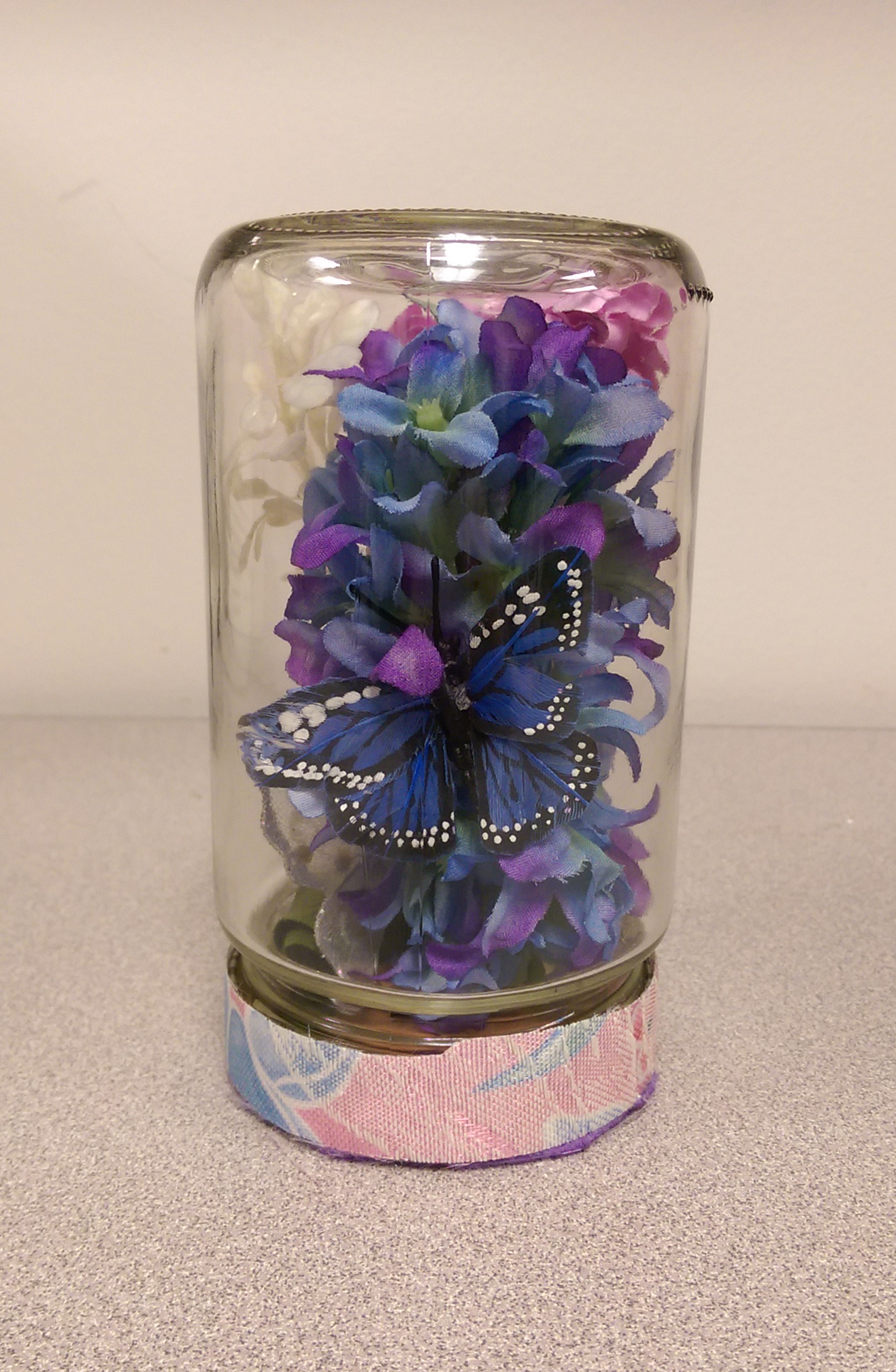
Decorative Terrarium by Colleen : It’s amazing what you can do with an olive jar, some fake plants , ribbon, and raffia.
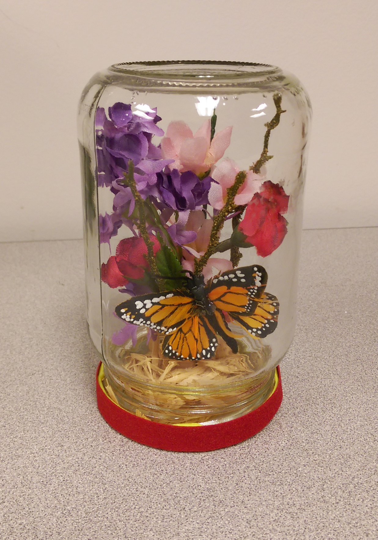
Decorative Terrarium by Michelle : All you need is an empty salsa jar, some fabric flowers on stems, ribbon to wrap around the lid base, and a little bit of creativity.
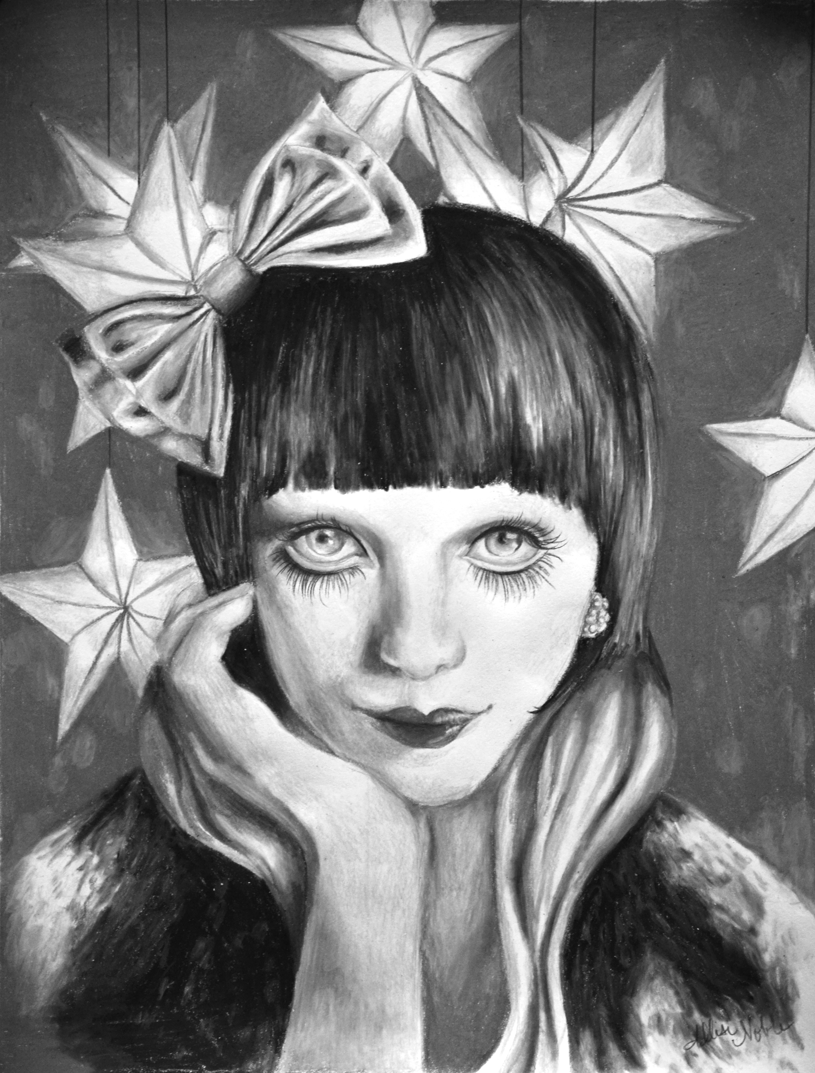
In honor of Halloween, I thought an Artists To Know featuring the spookiest of artworks would be quite fun. Though I won’t be getting any trick-or-treaters due to the very non-festive large wooden sign out in front of my apartment complex reading “NO TRICK-OR-TREATERS!!!”, I do have a costume party to get to later tonight which I am quite antsy for. I’m going as a flapper this year, which I know is an “every girl ever” kind of costume, but … not every girl will have a snazzy vintage 1920s style beaded fringe dress from an antique store ;). Now, without further ado …
Ana was born in Armenia in 1983, and earned a BFA at Art Center College in California. Her work is inspired by aliens, spirits, and ghosts and she has coined the term “Futurealism” to describe her aesthetic. She believes that whatever we can imagine can also be manifested into our physical reality.
Gus Fink is a self-taught artist who has been making a living off of his work full time since 2000. His medium and subject matter varies, but each work maintains his signature creepy yet somehow endearing vibe. His “Antique Horror” collection that spans over a decade was featured in a clothing collection for select Hot Topic stores over the summer.
Michele Lynch is a multi-talented artist excelling in painting, mixed media, and sculpture. The characters she brings to life are all a little bit retro monster movie, a little bit steampunk, balanced out with a lot of sass and personality.
Japanese illustrator Mizna Wada has just mastered the cute-creepy, pastel goth world. I have always been quite a fan of the adorably eerie universe, so her art certainly struck a chord with me. Wada is another artist who brings her characters painted on canvas to life in 3D form, this time as fun plush dolls and vinyl figures. I must own one someday, when I am not on such a strict budget ;).
Leslie Ann O’Dell combines fine art, photography, and digital design to create her haunting works. SHK Magazine summed it up nicely when they said of her work, “O’Dell’s work is comprised of haunting imagery… Ranging from dark imposing landscapes to mystifying portraitures, that evoke sensations of vulnerability, demise and the fear associated with such sentiments”. Of course, being a portrait girl myself, I am most drawn to her depictions of figures. They are truly different from anything I have ever seen.
Happy Halloween everyone! Have fun being someone new for a day, and a lovely evening to all.
Have you ever wondered what monsters dress up as for Halloween? 🙂
Remember what I said about myself and movies … I haven’t had even basic cable in years, and television shows generally don’t hold my interest, but I can’t get enough of books and movies. When I last talked about films, I was discussing movies that had visually inspired me as an artist. Those I chose to include in the list were chosen for visuals only, having nothing to do with the story line.
Awhile ago, I happened upon an article online as I traveled down the rabbit hole that is the internet … you know how it goes. The article was something like “10 Questions To Ask Yourself In Your 20s”, meant to help us young adults find ourselves and figure out what the heck we’re doing by percolating on the answers we came up with (I use the word “percolate” rather than “meditate” intentionally, because I have far too active an inner thought life to ever even attempt tranquil inner peace. I’ve come to terms with this fact.). One of the questions was, “What are your favorite stories, what do they say to you, and what does this say about you?” It’s an interesting thing to think about, especially for creative people since stories whether in film or print are an art of their own. I’ve shared my list here. These books and movies are not all necessarily the most mind-blowing, best written, or most awarded in their genre – that isn’t the point. These are the stories that my mind has continued to wander to from time to time since I first experienced them, or that I’ve found myself watching/reading over and over for whatever reason. The fun part after you make your own list is to figure out why that is.
What are my favorite stories?
Benny and Joon (film) – I swear I did not pick this because it has Johnny Depp in it, though that is what first prompted me to rent it back in the day ;).
No one is unlovable. We all have difficulties that we deal with, it is just that some come with a label and some don’t.
People are capable of becoming so much more than we’d ever imagine when given the chance.
Wristcutters: A Love Story (novel, later film) – Don’t let the title turn you off, this is actually a whimsical, heartwarming story (with some dark bits) that I remain glad a friend recommended.
Don’t despise where you are at in your life right now, or wish it away; there will come a time when you will miss it.
Sometimes what you are chasing after, what you think you need and want, will distract you from the opportunity for true happiness right in front of you.
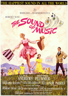
The Sound of Music (film) – I was listening to this soundtrack on my parents record player and dancing to it in the basement playroom as a little kid long before I saw the movie for the first time. I’m sure many of you have seen it at least once as well, because Julie Andrews is basically the Queen of Everything.
Don’t try to force yourself into a life plan that doesn’t fit you; it never will. You have a right to change your mind at any moment.
People don’t change by having anger or reproach directed at them, being insulted or accused. They change when someone is willing to love them where they’re at, but also respectfully challenges their ideals and pushes them out of their comfort zone in a kind but spirited way.
The Picture of Dorian Gray (novel) -This book made me an Oscar Wilde fan for life.
Don’t discount small choices, each decision we make shapes who we will become.
Be aware of who you allow influence over what you believe and what is important to you.
The Curious Incident of the Dog In the Night-time (novel) – I heard this book has become a play now, and I hope to see it someday. This story is told from the point of view of a young boy with autism, and for perspective alone I would recommend you give it a try.
Again, people are so much more than we let them be. Don’t box someone in and limit your view of their capabilities simply because of a label they’ve been given, or because their struggles are different from yours.
Middlesex (novel) – Certainly one of the most complex and interesting character-driven stories I’ve ever read, by one of my favorite authors.
Don’t be so quick to judge who someone is or what has made them the way that they are. Everyone has a rest of the story.
Oftentimes, the most courageous and subversive thing one can be is who they already are.
Howl’s Moving Castle (film) –
Again, always remember that everyone has a story, you only see a part.
I was actually surprised that many of the core takeaways from each very different story often overlapped (Though I shouldn’t have been – it makes sense I’d be attracted to the same theme that I value again and again represented in different ways). I can see my draw towards the celebration of idiosyncrasies, and the affirmation of individual human lives as intricate and full of possibility, in my surreal portraits that I’ve fallen in love with creating. I can even see evidence of living out the themes found in these stories in my career choice, not only opening up people’s capabilities through teaching art, but in working with people with disabilities, a group that is often unjustly marginalized and discounted. Stories are important. For creators of all types, our stories come out in what we create. But, even those who view themselves as the least creative individuals on the planet still tell a story in how they interact day to day with other people and with the world around them. So, what are some of your favorite stories?
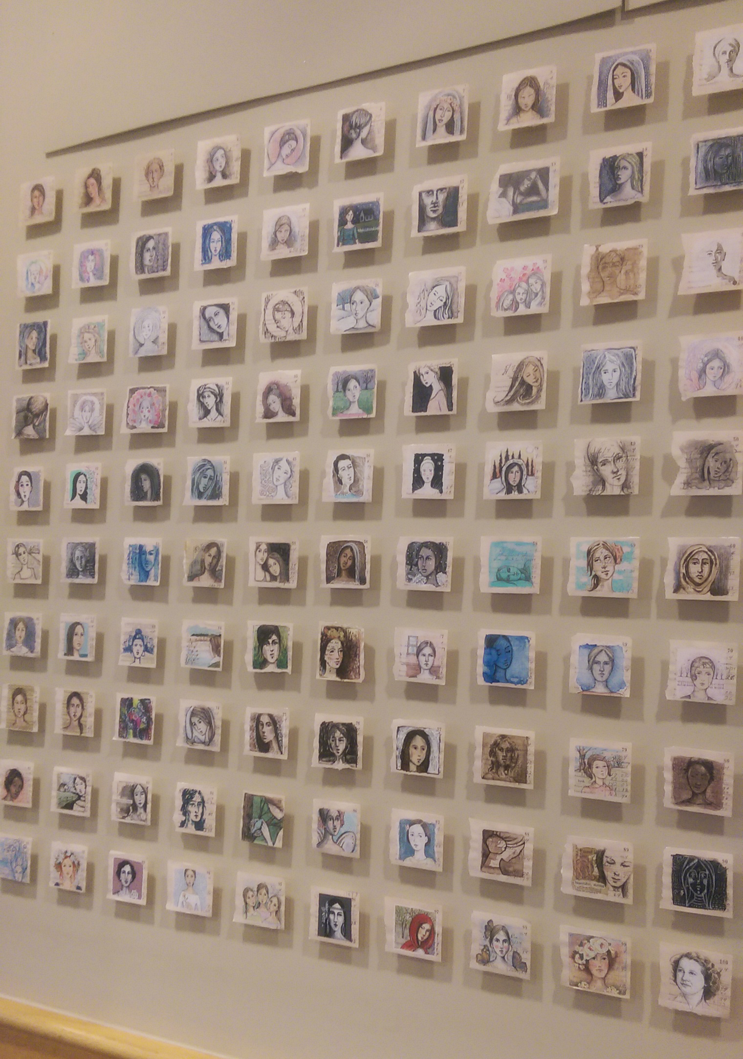
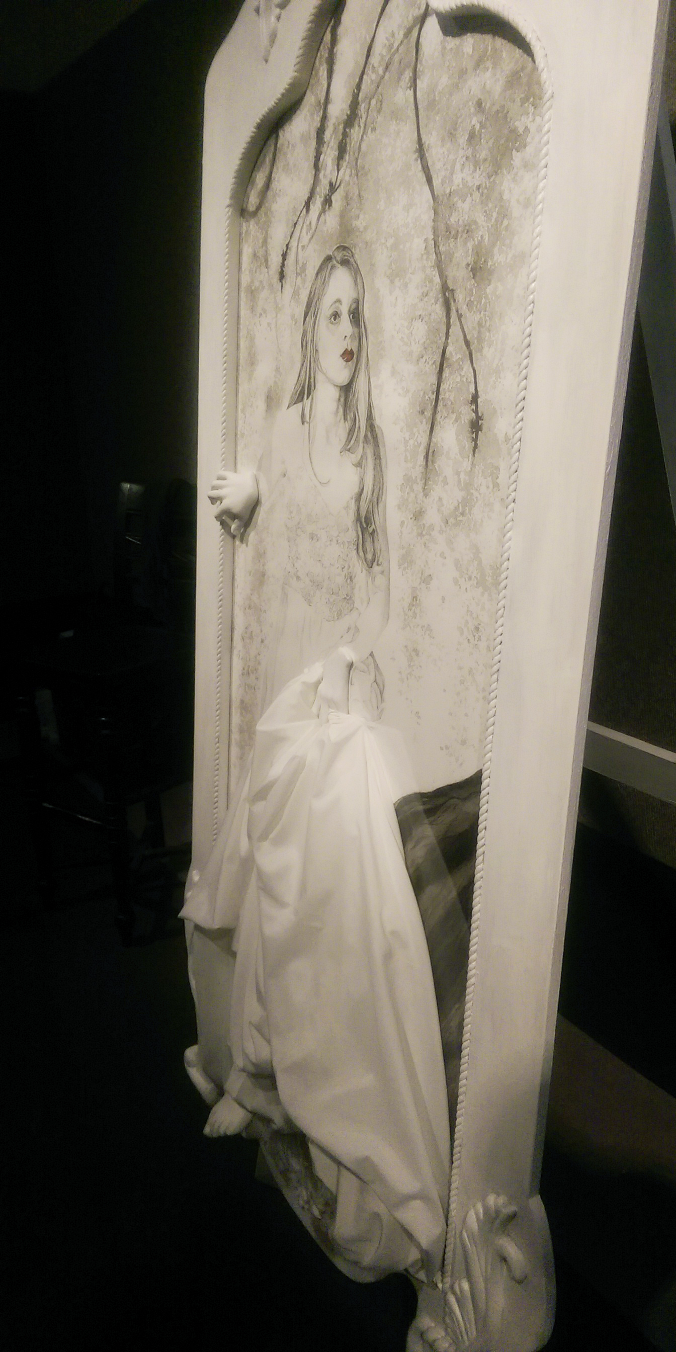
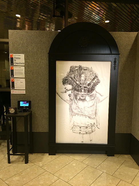
My boyfriend and I visited ArtPrize in Grand Rapids this past Friday. Though I had a piece in it last year, I didn’t have a *big* project ready this year that I wanted to enter so I decided to attend simply as an art appreciator. With inspiration quite literally around every corner, I came back impressed and invigorated, as always. I wanted to share some of the pieces that really stopped me in my tracks. Keep in mind, I was only in Grand Rapids perusing for a day, and as any of you who have attended in the past know, this gave me but a small cross section of ArtPrize 2015. If any of you have been over to ArtPrize, feel free to share other artists/pieces you saw that I may have missed! I definitely left wanting more, but am glad I got to make it to the event this year, even if just for a day. I encourage you to visit these artists’ personal websites I’ve linked to and learn more about their work and the story behind why they create what they do. They explore a variety of poignant themes in a unique and engaging way.
Little did I know until visiting her website myself, her piece in ArtPrize last year, “A Plea, Remember Me”, was also one of my favorites. Miss Kate has a new fan!
Each bird represents one of the over 200 school girls that remain missing after they were kidnapped from their school in Nigeria by the terrorist group Boka Haram.
Jacqueline Baerwald – Melondy, Issues of Adolescence (You can read her like a book, or can you?)
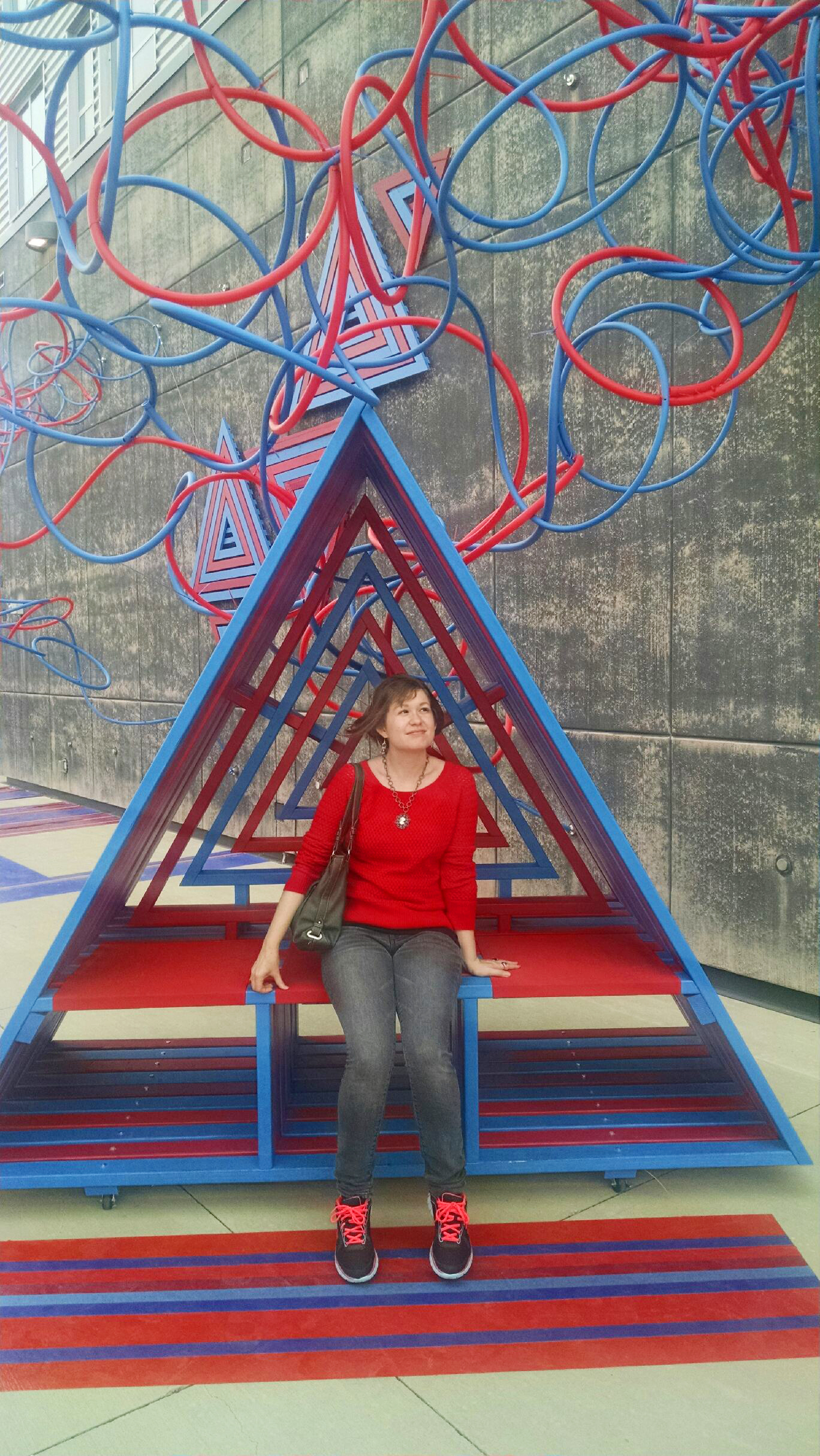
Another thing about ArtPrize I always look forward to is the installation art and large scale outdoor sculpture. Red seems to be a popular color, and so by happenstance I matched all the art.
Dream home?
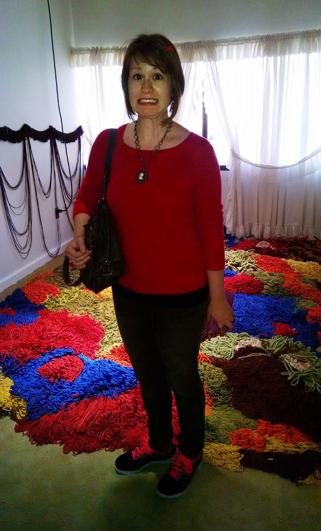
This yarn room reminded me of one of those nightmares where something about your surroundings is not quite right, but you can’t seem to figure it out…
I love the contrast between my giggling face and that none too pleased look in the eyes of my fierce dragon companion.
Eating delicious food is almost (or maybe equally as?) as exciting as looking at amazing art, and my boyfriend and I enjoyed dinner and Violin Monster at The Green Well, as well as vegan gelato from Love’s Ice Cream which is so amazing it haunts my dreams.
Thursday night was the opening for the show I was included in at Studio 23, their yearly “Women’s Perspective” exhibition. It was a great night, and I even successfully mingled and talked about my work with a gaggle of guests without my face turning green or passing out – yay! My boyfriend, who accompanied me, was literally poking me in the back with his finger saying “Get up there, go stand over by your work and talk to people!” After much hissing back and forth, I cautiously made my way over and ended up having a fantastic time once I got into the swing of talking to a ton of random people I had never met all at once. It’s funny because being an instructor, I talk all day, but it’s all very planned and orderly and I know what I need to say. It’s the spontaneous small talk I fear, but I’ve found that despite the gigantic nerves, once I get going it’s easy to talk about my work with others and answer questions because honestly what on this earth can I possibly know more about, or love sharing with people more? I think most creatives be they artists, writers, musicians, tow a line between crippling self consciousness and an almost nauseating level of confidence ;).
Ready to go! I’d been dying for an outfit to wear that Betsey Johnson purse with – half off baby! (Which is the only way I’d ever bother with a designer purse – The retro barbie look got me.)
It’s the little things … I was over the moon excited when I saw the cool graphic detail they added to my display wall – just amazing, thanks Studio 23!
Standing like a proud parent next to my creations :).
They included information about myself and my two pieces next to the work, which I’ve included below for some additional insight:
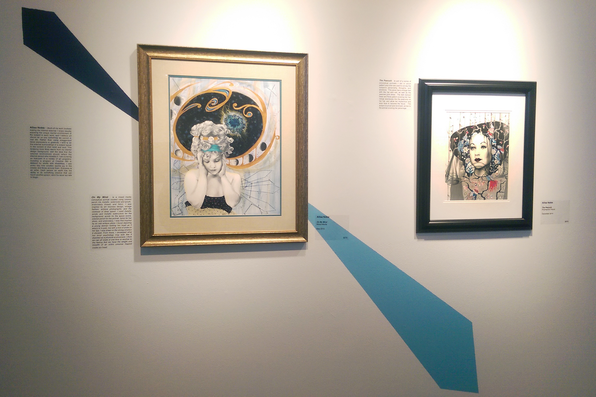
Much of my work involves making the internal external. I enjoy visually exposing the unique mental environment of the subject in each work, and I believe art should let us see something we cannot in real life. Rather than using exaggerated facial expressions or gestures, I tend to let the external surroundings of a subject speak to the content of their mind and soul. This tendency most likely stems from my interior design background, and the idea that the external environment should reflect the internal person who inhabits it. I am currently an instructor in a variety of art programs, including a program at Creative 360 in Midland for adults with disabilities. I see every day how creation sparks joy in the creator and those around them. Everyone is an artist. Each person on earth has the ability to do something creative that can touch another person, and it is never too late to begin.
The Peacock
On My Mind
“The Peacock” is part of a series of conceptual portraits I did in which pattern and color are used to convey the subject’s personality, thoughts and emotions. This piece has a vintage feel with the hat and veil and peacock print dress. The dark stylized trees and floral pattern covering her hair merge seamlessly into the peacocks on her hat, and allow her mysterious and stoic face to become the focus. The subject is proud and dominant, similar to the animal covering her personage.
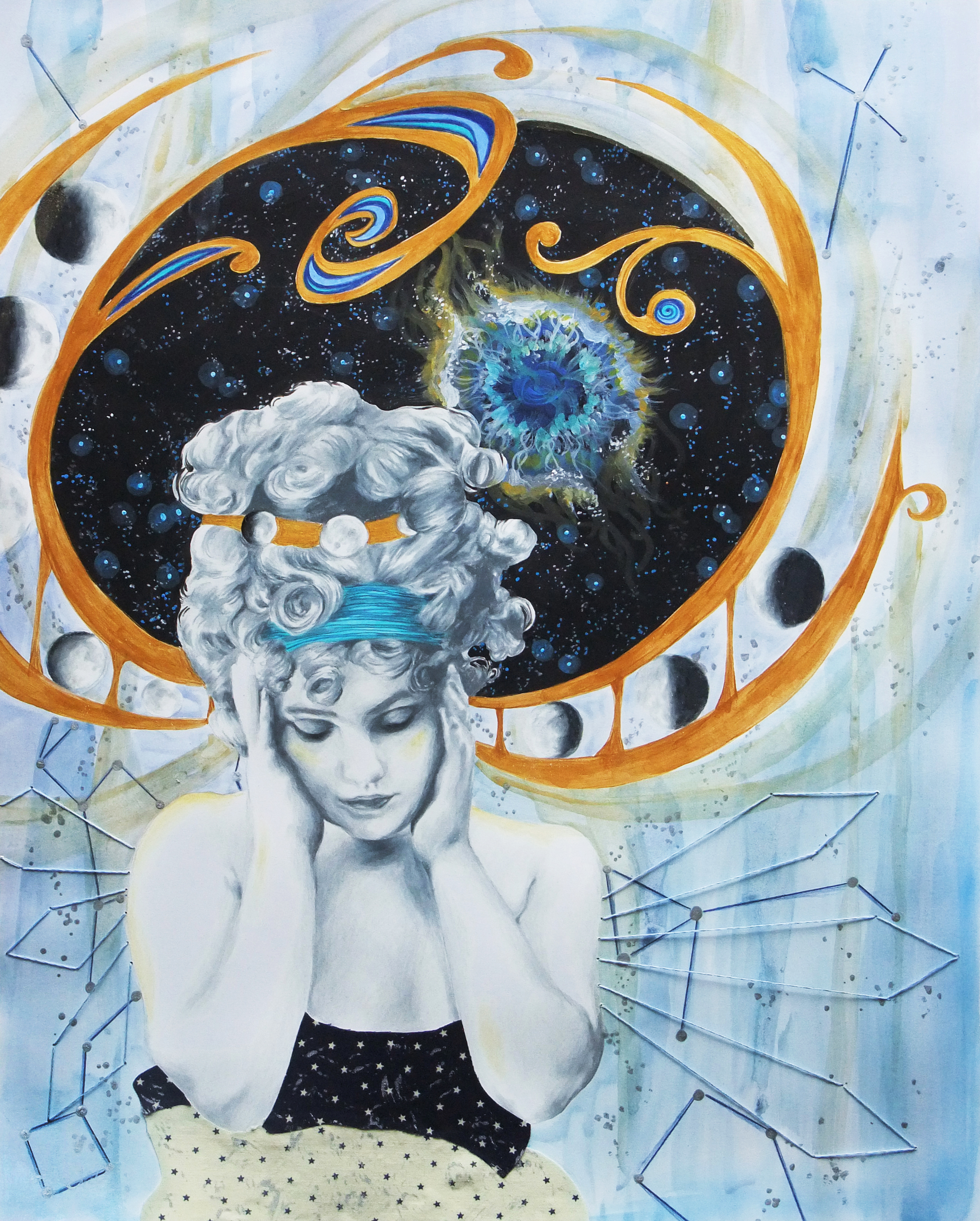
“On My Mind” is a mixed media conceptual portrait created using colored pencil, ink, metallic watercolor and acrylic, embroidery thread, and fabric. I was inspired by art nouveau design, vintage fashion, antique photographs, and the vastness of deep space. I used metallic acrylic and metallic watercolors for the background, acrylic for the space scene, colored pencil for the portrait, fabric for her dress, and embroidery. I was first inspired by an odd antique photo I found depicting a young woman holding her head as if weary or in pain, but with a hint of smile on her lips. I was drawn to the strong emotion it showed. From there, I developed what her inner psychology may look like if depicted as a physical environment. I think we can all relate at one time or another to the feeling that we have the weight and breadth of an entire universe trapped inside our head.
If you are in the area around Bay City Michigan, I’d love it if you’d check out the show! It’s running through October 23. If the travel is not feasible, at the very least you got your own (VERY)miniature “virtual tour” here. But truly, there is much more fascinating work besides just my own that I have shared, if you can it is worth a visit.
I am a big movie watcher. I am subscribed to no cable at all, not even 5 basic channels, and am always completely out of the loop as far as tv shows go. Yet, I could easily watch 4 movies a week on netflix. I swear the difference is that television shows tend to ride on dialogue, where most movies depend more heartily on visuals. Being more of a visually-thinking person in every sense, I find that many movies are truly moving pieces of art, filled with beauty and intrigue if you take the time to train your eyes to pay attention to the details. Since the time I was a child, there were certain scenes in movies that I could rewind and watch again and again simply because of the captivating details to be found in a camera angle, an interesting pattern in the background, the decoration on a costume … I’m not going to get into the plots of the films in this list too much because a) I’m focusing on sources of visual inspiration, not story-writing and b) You should go watch any of these you have not seen for yourself :). I’m starting with the films that inspired me as a kid, and working my way forward. Many of my childhood favorites have stood the test of time and I’m sure you have seen, but I think sometimes we overlook the actual artistry that goes into media aimed towards children.
Beauty and the Beast
I still have a big spot in my heart for this movie. The detail of the quaint little village Belle comes from at the beginning of the movie, as well as the intricacies of the Beast’s castle later on, and even the emotive illustration of each of the unique characters themselves is unmatched. My favorite part of the whole movie was always the ballroom scene, where the view pans up to a grand painted ceiling with fluffy clouds and little cherubs. It was like the Sistine Chapel to me at 5 years old.
The Little Mermaid
Another Disney, the brilliant colors of this fantasy undersea world captured my imagination. I could pause the film and stare into Ariel’s grotto for hours, spying at each piece of salvaged treasure she had stacked upon the tall rows of rock shelves. As odd as it may seem, another thing I always remember about this movie visually is the strong lighting. Throughout the film, sunlight streaks contrasting colors across each scene just as I imagine it would shining through the water if one did live under the sea. Each framed looked like a beautiful painting, be it a children’s cartoon or not. Though I’ve come around a bit more with some of the newer Pixar films, I’m not fully sold on solely digital animation yet, as we seem to have lost that quality.
The Princess and the Goblin
This last film from my childhood stuck out to me because it wasn’t Disney, very uncommon for fantasy children’s animated films. The style featured far more pen strokes and outlines, unrealistically pink/pale skin tones, and a constant flowy, ethereal quality to the drawing that lent itself well to fantasy. It was a lot more outright whimsical than Disney. The grandmother was just regal – unbelievably gorgeous and a bit haunting all the same. It was nice to see an older woman not portrayed as a witch, also (Thanks a lot, Disney!).
The Wizard Of Oz
This is one of those movies that back in the days of VHS, I watched again and again until the tape nearly disintegrated. Ahead of its time in the use of sepia tone to represent Dorothy’s normal, mundane day to day life and the use of brilliant super-saturated color to represent the fantasy dream-land of Oz, this film is iconic in the way it used color and pattern to communicate meaning, which is something I and many of my fellow artists and designers need to understand how to do in their own work. The kooky whimsy of Oz created a world every child (and adult) wanted to climb into through their television screen, even with all the not so pleasant bits like green-faced witches and flying monkeys.
A Trip To The Moon
Watching this film birthed my love of the “silent film” aesthetic – harsh contrast black and white, vintage hair and makeup, DIY props and backgrounds with lots of moons, stars, and ocean waves on painted pieces of wood or cardboard. I have always been a fan of creepy-beautiful, and there is something fundamentally haunting aesthetically about even the most cheerful silent film, because of the harsh blackness of the background, the heavy drawn-on makeup around the eyes and lips, and the fact that often times animated details that seemed darling back then, like old moon face up there, seem way creepier to us now (This will be confirmed if you’ve ever looked at old toys or dolls in an antique store) because the fashion of what is considered cute or pleasant has changed. The two portrait drawings I have used as my design logo, current and former, were certainly inspired by this aesthetic.
Moongirl
Moongirl II
Valerie and Her Week of Wonders
I had to include more than one shot for this film so you can fully grasp the aesthetic since it is certainly lesser known. I was perusing one of those “Weirdest movies you’ve never seen” lists online one rainy evening, and this Czechoslovakian film from 1970 was listed, along with the thumbnail of a smiling, fashionable vampire draping herself in jewels in front of an ornate little shabby-chic round mirror I have shown first above. I knew I needed to find out what this was all about. The first time I watched it I didn’t yet own a Netflix subscription, and the only version I could find on YouTube was subtitled not in English but Spanish, so I had to use my limited knowledge from grade school to try to figure out what was going on. The good news is, if any, this film is certainly more visually driven than plot driven. The plot revolving around the nightmarish oddities accompanying the protagonist, a young girl’s, first week of “womanhood” is rather bizarre and convoluted whether presented in your native tongue or not. Every still frame looks like an avant-garde fashion editorial, and the monochromatic color palette rather in whites, ivories and beiges, or blacks symbolically represents innocent purity, legalistic and puritanical piety, and corruption.
In another life where I had more patience with a sewing machine, I could totally have seen myself as a fashion designer. The first thing I thought after absorbing this movie was, “I could build a comprehensive clothing collection and smashing runaway show off of this film”. It looks like I’m not the only one who had that idea, as hand-sewn gowns inspired by Valerie can be found on etsy, and so many clothing and accessory sets assembled with this film as inspiration can be spotted on polyvore.
Brazil
In this sci-fi satire by Terry Gilliam, a government bureaucrat attempts to correct a ridiculous administrative error caused by a fly landing on a typewriter key, and in the process becomes a suspected terrorist himself. Though some of the special effects undoubtedly scream “1985!”, The sets and of course the main character’s iconic robotic flying suit are unique and surreal. Gilliam is never one to skimp on atmosphere, after all, and one can always expect in his work to see a world they have never seen before. Also, those creepy, creepy giant baby head masks in the interrogation room … I don’t know how on earth he came up with that idea, but for some reason it works.
Mirrormask
Not surprising that this movie struck me artistically as Dave McKean, a well known illustrator and comic book artist, directed the film, also written by Neil Gaiman – what a winning combination. It is almost like a modern, darker and twistier, “Wizard of Oz” actually, following one young girl’s struggle through a fantastical dream world to find her “home”. Visually, watching it is a bit like viewing a moving comic book.
The Science of Sleep
Of all the films here, along with “A Trip To The Moon”, I’d have to say this film most captures my preferred aesthetic. The story itself is at times touching, at times awkward and funny, and at times awkward and stressful – it pretty much runs the gamut of emotions present in any real-life friendship or romantic relationship. Now for the fun part – EVERYTHING IS MADE OUT OF CARDBOARD AND PAPER AND CELLOPHANE AND FELT WITH BIG, CHUNKY, APPARENT STITCHES! I hate total realism. I love work that shouts “Look! I am handmade! I am not, in fact, real!” That charming, DIY aesthetic I love in old movies that mainly occurred due to lack of budget and technology, was here done intentionally with what I’m guessing is a pretty decent budget seeing as Michel Gondry directed it. I am in love, that’s all I can say. Sir Gondry also made one of my favorite music videos ever. Enjoy.
Across The Universe
I know most hardcore Beatles fans despised this movie, arguing that the film turned the band’s culture changing music into a sort of 1960s “High School Musical”. I know many of these harsh critics personally. However, I am not hardcore and I say, pish-posh! thought this movie was just lovely. Double exposures, a surreal use of green screen, and incorporating repeated visual tropes such as “strawberries” to not only reinforce the story line but the iconic music itself, made this one a winner in my book. The visuals were crazy, but not so much so that they took away from the emotions behind the characters’ story arcs. They were unique and creative but didn’t distract, and that can be a hard balance to achieve.
The Fall
This movie makes it onto lists for “most beautiful films” or “most beautiful scenes from a film” consistently for a reason. The colors and contrast of both the scenery and wardrobe literally make the characters in the story who they are, and since this film is all about stories, that decision is pivotal. I don’t want to give too much away, just watch it if yourself if you haven’t. See that little girl right there? She’s absolutely the cutest. Just wait until she speaks, she has an accent which makes it even better.
Ghostworld
This is one of the few movies that I thought was better than the book. After watching the movie and becoming simply obsessed with it, I decided I should definitely read Daniel Clowes’s graphic novel on which it was based. I absolutely hated it. The movie itself is a quirky, aloof, slice-of-life type feature and the backdrop is a pretty normal town, nothing notable. I included this film in the list only for the main character, Enid’s, wardrobe. From 90s-tastic fuzzy headbands to leopard print pencil skirts to odd, vintage old-lady dresses to fishnets with everything to the awesome keyhole yellow and black orient-inspired number shown above, I need all of her clothes from this movie. The purple polo above looks handcrafted and has an overflowing trash can made of felt embroidered on one side with the letters spelling out “RECYCLE” crookedly affixed on the other. I have no words.
And the raptor T-shirt! Who could forget the raptor t-shirt? I want to marry Enid … Because she’s adorable, and also, then we could share clothes.
Howl’s Moving Castle
I started with animation, I figured I’d come full circle back to animation – this time, animated films that I have enjoyed as an adult. Anything Miyazaki does is gold. Studio Ghilibi is like Japan’s Disney/Pixar, only it’s kind of way better. This movie can be enjoyed by both adults and children alike. The imaginative mechanical details are what really get me. Now isn’t Howl’s bedroom a major upgrade to Ariel’s grotto?
Paprika
This film may be a cartoon, but there is nothing childish about it. See above, people are literally shedding their skin and morphing into different people, while one tries to strangle the other. His arm is also part tree branch. Yikes. At it’s core, however, this film is more a surreal, thrilling action drama tale then anything remotely horror. The premise of a device called the “DC Mini”, which allows psychiatrists to enter their patient’s dreams as a form of therapy, falling into the wrong hands allows for many magical, zany scenes to take place, both playful and beautiful as well as dark and terrifying, just as within the world of dreams. I’ve always secretly wished some technology like this actually existed even before I knew of this film or anything like it, so that is another one of the reasons I so loved this movie. Satoshi Kon was simply a brilliant artist as it is, and this film seems like it should have far too much going on for it to actually work as a story, but he has pulled it off and it is truly a masterpiece.
Mary and Max
My love for DIY as I’ve touched on a bit earlier has given me a soft spot for stop animation. I tried to make a silly, simple stop motion on paper once over a summer break from college and I threw in the towel after a couple days, lacking the patience. This film follows two pen pals; a shy, lonely little girl with a troubled family life and no friends and a middle-aged man with severe Asperger’s Syndrome, overwhelmed and bewildered by the very act of existing. The two connect by a pretty funny turn of events, and their relationship faces many ups and downs over the years, even as the young girl becomes an adult woman. Each of their somber, frustrating worlds they attempt to make sense of in their letters to each other are depicted in stunning monochromatic, hers warm sepia tones and his deep greys, both with flashes of bright red. It is one of the most adorable and also the saddest movies I’ve ever seen. By the end they are not made of clay but entirely real, flesh and blood.
Jack and the Cuckoo Clock Heart
I just watched this movie a couple months ago when it popped up on Netflix. It is a French children’s film that I was initially drawn to because the style of the figures reminded me of a merging of Tim Burton and Mark Ryden. It never stops being visually stunning, and the characters especially appear inventive and entrancing. It doesn’t hurt that the music is also awesome. Unlike the grating, overly simplistic, repetitive tunes often present in kids movies, the songs spread in between the action of the film actually sound like real songs.
Take a look at my absolute favorite…
I hope if there is even just one film on this list that sparks your interest, you go try it out! For the local folks, it looks like it’s supposed to rain all the next few days so here’s your chance :). Fellow creatives, movie buffs, anyone at all … do you have any films that have visually left you speechless? I’m always looking for suggestions of new things to watch, and like seeing what makes others’ creative wheels turn.
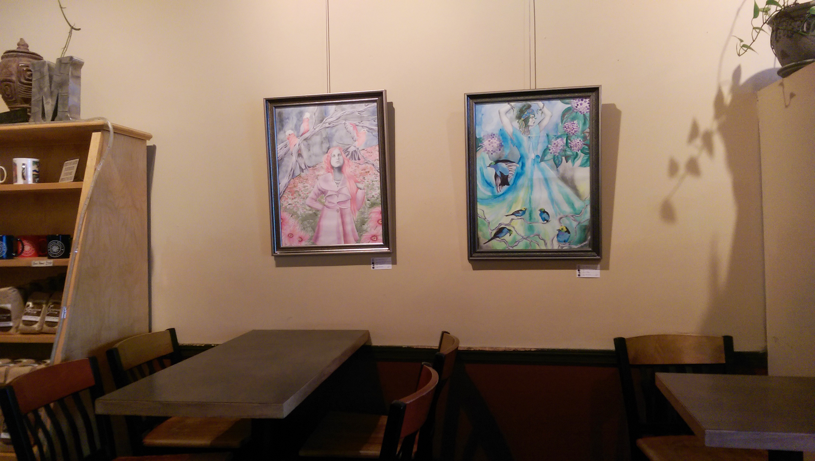
So, I put an exhibit up in Espresso Milano for Midland Artists Guild last week. This was an especially fun venue exhibit for me because I pretty much lived here when I was in high school. For those of you unfamiliar with Midland, Michigan, it’s a nice town for sure but, well … there’s not a whole lot for young people to do! Hang out with friends on Saturdays drinking coffee all day, especially frappes in the summer? Not complaining too much. It was always either that, or spend the day at the mall reading comics and music magazines in Barnes and Noble, until they started shrink-wrapping the darn things so you actually had to pay for them to read :P.
Blast from the past : Snooty Face 2007.
My P.I.C. that day, Erin – best friends since we were 2, and still going strong. We actually just had a craft day together last week!
Speaking of coffee being just the best…
(a topic of conversation that I daresay never gets old, nor loses its truth), I have some really cool illustrated mugs for sale in my ebay store right now! On discount, too … sweet right? They are dishwasher safe, top rack, and really heavy and durable. I am an accidental collector of unique mugs, and can’t seem to ever stop buying drink-ware in general, so these made me super happy.
Designs available are Retro Flowers, Queenie, I’d Have Been Happier As A Bird, and Whimsical Peacock.
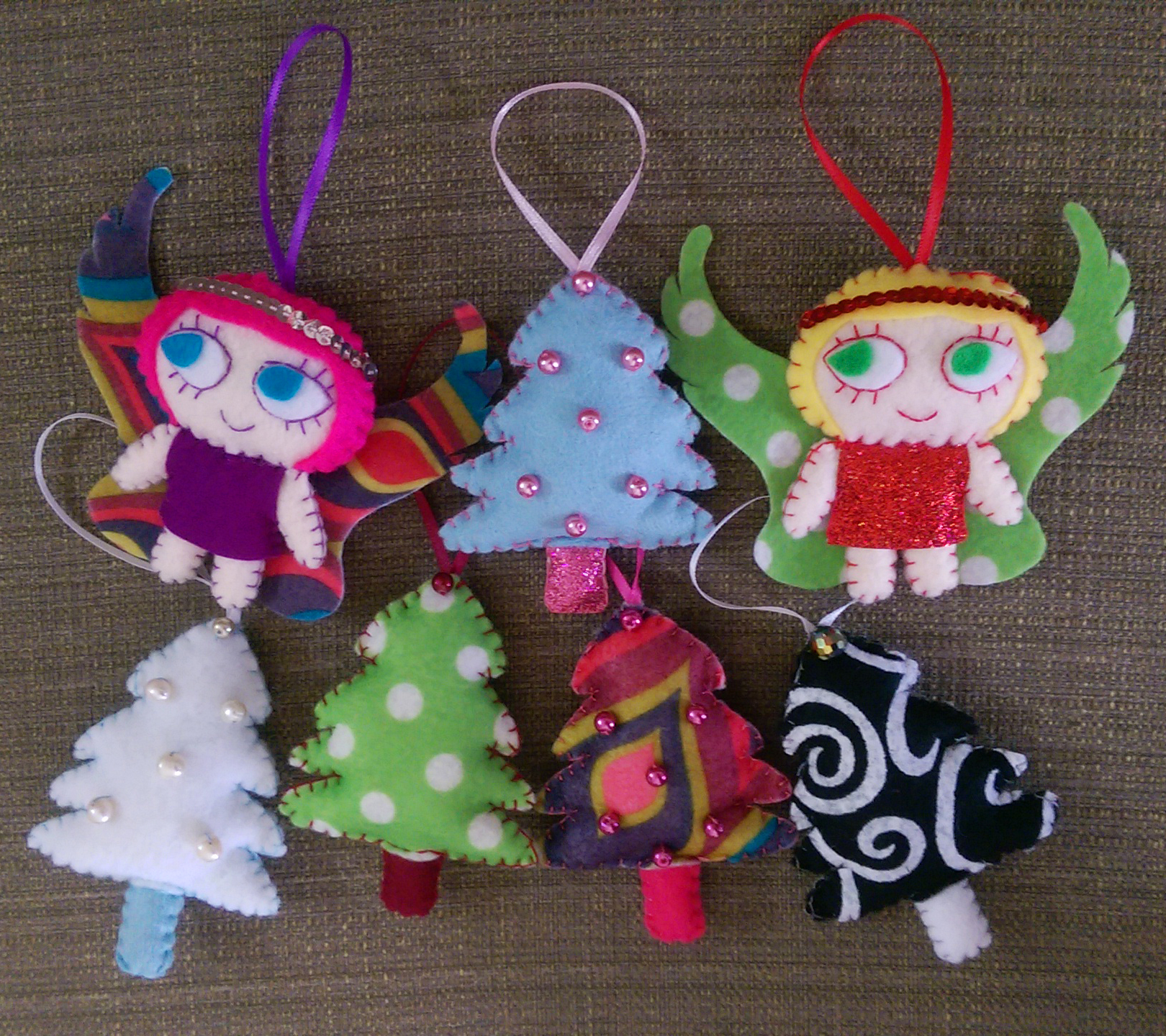
Other things I’ve been working on over this Labor Day weekend are, shockingly, Christmas plushies! I sell some of my fun creations at Imagine That!, also located in downtown Midland, and I need to have my holiday wares ready by mid-October. It’s weird to be thinking so far ahead already, but I can’t say I haven’t enjoyed getting in the holiday spirit a bit early :).
Whimsical trees and some pretty rad angels with halos made of strung sequins ❤
Midlanders (or Saginaw/Bay City dwellers nearby such as myself), if you happen to be downtown within the next 2 months don’t forget to check out the exhibit. And for those of you in the states, I hope you enjoy your Labor Day weekend as well!
The Beauty Of It All, 11×14 prismacolor pencil and watercolor
For about 2 years, I had an 11×14 piece of bristol board with this woman’s face covered in flowers on it, and a metallic silver world map view behind her. She was surrounded by nothing else but white space. I was convinced it looked absolutely horrible, and I had no idea what to do with the rest of the background. I chocked it up to a loss and tossed the drawing in my storage portfolio case. A couple times I ran out of paper and thought about just using the back of it when I had a new idea and didn’t want to delay inspiration with a drive to Michaels for more bristol board. Other times I almost chopped it up into pieces for scrap paper to sketch ideas onto. I thought of posting it on my artist facebook page as a giveaway for whoever wanted it, and letting them color all over it like crazy to see what happened; an impromptu collaboration over vast distances.
Luckily, I never did any of these things. I’ve been doing a lot with watercolor lately, and was wishing I had one more piece to hang in my upcoming exhibit. I didn’t have the time to start anything else from scratch, but when I found this I decided to play around with the background and see what happened. I spontaneously dripped blues and greens and metallic silvers over the entire background, throwing the paper this way and that to guide the drips. Once I stopped over-analyzing and worrying over how terrible I thought my piece looked and just started enjoying the process again, everything came together. Sometimes even something as subtle as a bold color splashed into the backdrop can turn an entire piece around. Mine went from a drawing of a girl who looked like she had a strange, alien, flower-shaped skin disease to a pretty nice finished piece.
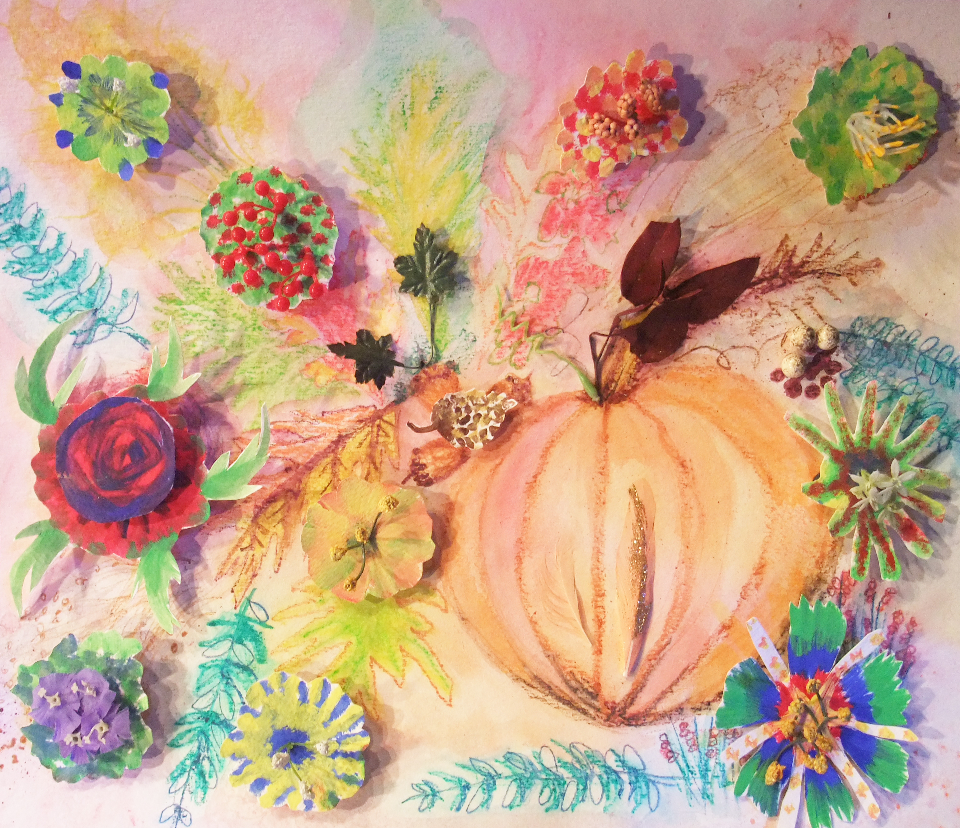
This is why I cannot emphasize enough, don’t toss out old, unfinished work! Paper is flat, it keeps pretty easily. I’ve my seen students do some really cool things with incomplete projects they could have tossed away. In this piece below, a student cut out elements she liked from a “practice” acrylic painting from the semester before that didn’t really turn out. These made for some great smaller blooms popping out around the central focus of the pumpkin. Even if you don’t end up turning the leftover physical piece into anything, something half-finished could at the very least provide an idea or concept for a project you do later.
Nancy’s autumnal mixed media, salvaging cutouts from an old acrylic practice lesson the semester before.
I’m actually constantly revisiting old work, even from as far back as high school. Most of that is also unfinished because I, like any teen, had a real short attention span. This painting, which my mom fell in love with and now has hanging over the sofa in my parents’ living room, was created from scratch in 2012. But, it was based on an old colored pencil drawing from 2005 that I never finished shading in. The particular sketchbook the original drawing was in is still in the closet of my old bedroom in my parents’ house or I would post it here, but it was a color scheme of entirely red and black and the parasol people were dressed in old-timey but super goth attire, and the faces on the parasols looked like they could all be members of a My Chemical Romance copycat band. Trust me, it was something else. Behold, the reboot.
“Wait Out The Storm”, 18×24 Watercolor and Ink
Now that I’ve turned you all into hoarders, I have one more all-together new piece I’d like to share. I have always been deeply interested in the steampunk aesthetic, but never created any steampunk-esque art myself. This is my first, and I’m pretty excited about how it turned out.
“Dreams Of Gold”, 11×14 Prismacolor Pencil and Chalk
The deep gold is metallic, though you can’t tell in the digital image. I was heavily inspired by the Victorian aspect of Steampunk, even turning the classic Victorian lace pattern into something metallic and industrial. I am finally going to be hanging all of these pieces up tomorrow in Espresso Milano, and will be sure to take pictures. Have any cool steampunk art you yourself have created or that you’ve seen by other artists? Throw me a link! I am a long time appreciator, but creation-wise, a novice. As I’ve promised, photos soon!
The summer flew by, and while I think this summer for me has been the most productive yet as far as art making, I am not the only one who has been hard at work. My Express Yourself Artshop students really applied themselves creatively, and pumped out a lot of amazing art over this past semester. Hard to believe what one can accomplish in only 6 weeks! I’ve shared some of the highlights here.
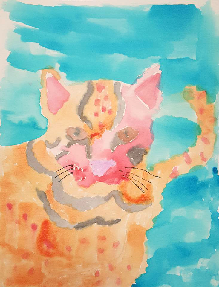
Grace, Watercolor
Nancy, Ink Drawing
Brenda, Handmade Tote Bag
Lacey, Acrylic
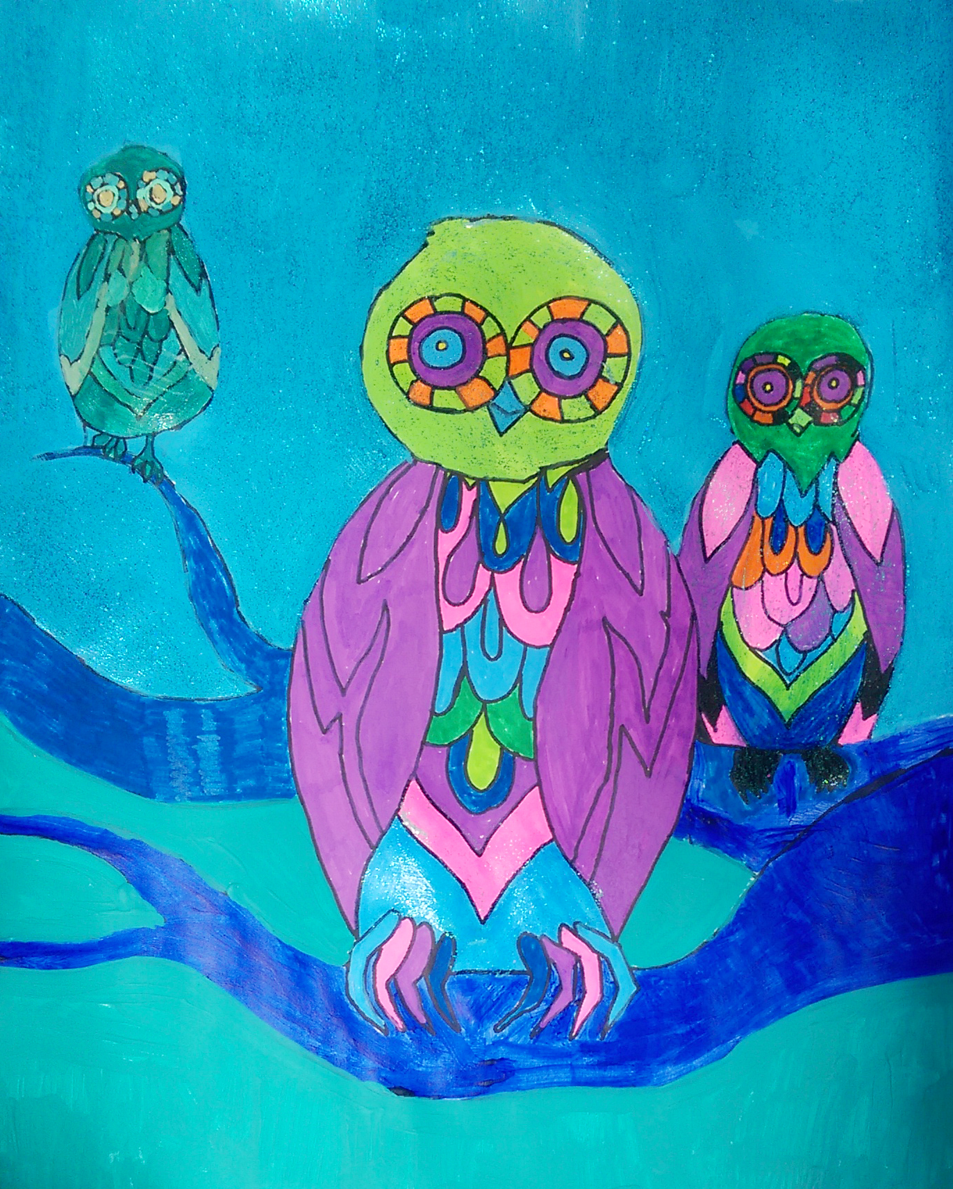
For those who haven’t read my blog before, Express Yourself Artshop is an art program I work with that is open to those of all abilities, and is an accepting, friendly and safe environment to artists with physical and mental disabilities. I know myself how important creating can be as a tool for expressing what you feel like you can’t with words, and how it has the ability to calm the mind and soul out of tumult and provide a reprieve from the stress and sometimes heavy weight of everyday life. One of my students loves owls, and so we collaborated on some trippy, colorful owls done in my go-to style for these birds (shown below). I drew in pencil, she outlined and painted. Along with an affinity for owls, we also share a love of Deco Art’s Glamour Dust craft paints – a win-win.
Look familiar? So glad to share my enthusiasm for quirky, surrealist owls!
Anne Marie, Ink and Acrylic With Glamor Dust
I love these people, and the unfamiliar environment of being in a truly judgement-free space … Everyone simply accepts and embraces each other as they are. I feel so loved in return while I am there, and it is one of the few places I don’t feel pressured to put on an act (Convenient, as I’ve never quite mastered the art of situationally adjusting my personality. For better or for worse, I just can’t seem to grasp that particular life skill.). I can’t wait for next semester. I’m going to be channeling my inner Mark Montano and doing a really cool DIY decor class, so hopefully that gets some interest. I am right on the cusp of finishing two new projects that will be going up with a selection of other pieces at Espresso Milano coffee shop in Midland in September, so I will be sharing that soon.
Every so often I get bored and dissatisfied with the state of my walls and need a change. I’d had some Alice In Wonderland etching coloring book pages framed above my couch since I’d moved into the apartment. I’d filled them in with markers, giving Alice hot pink hair, and my boyfriend was even starting to comment, “So… are you ever going to take those down?” Apparently the appeal of pink haired punker Alice was lost on him, and he also couldn’t fathom why I would hang up coloring book pages when I have so much of my own art at my disposal. I do decorate my home with some of my own work obviously, but you have to understand, I get real tired of staring at my own art. I’m staring at it the whole time I’m working on it, and when it comes to my walls, I want to give my eyes something new to get excited over. The coloring pages had overstayed their welcome a bit, and the magic marker was getting ridiculously sun-faded. But, I didn’t want to spend the time making 3 new fine art pieces just to hang above my couch when I knew I had exhibits coming up to get ready for.
I don’t know if anyone uses those 12×12 paper flip calendars anymore … They are a bit of a relic nowadays, but I always insist on getting one from those giant kiosks in the middle of the mall set up around Christmas simply for the cool pictures. Art Deco is one of my absolute favorite design periods, so for the past 2 years I’ve gotten the Erte calendar. This fashion artist is responsible for the loveliness below – so yes, he completely rocks.
You can buy 12×12 scrapbook frames at any craft store and hang calendar page art as is (the cheapest prints you will ever find), but I decided to take it a step further to create the trio below.
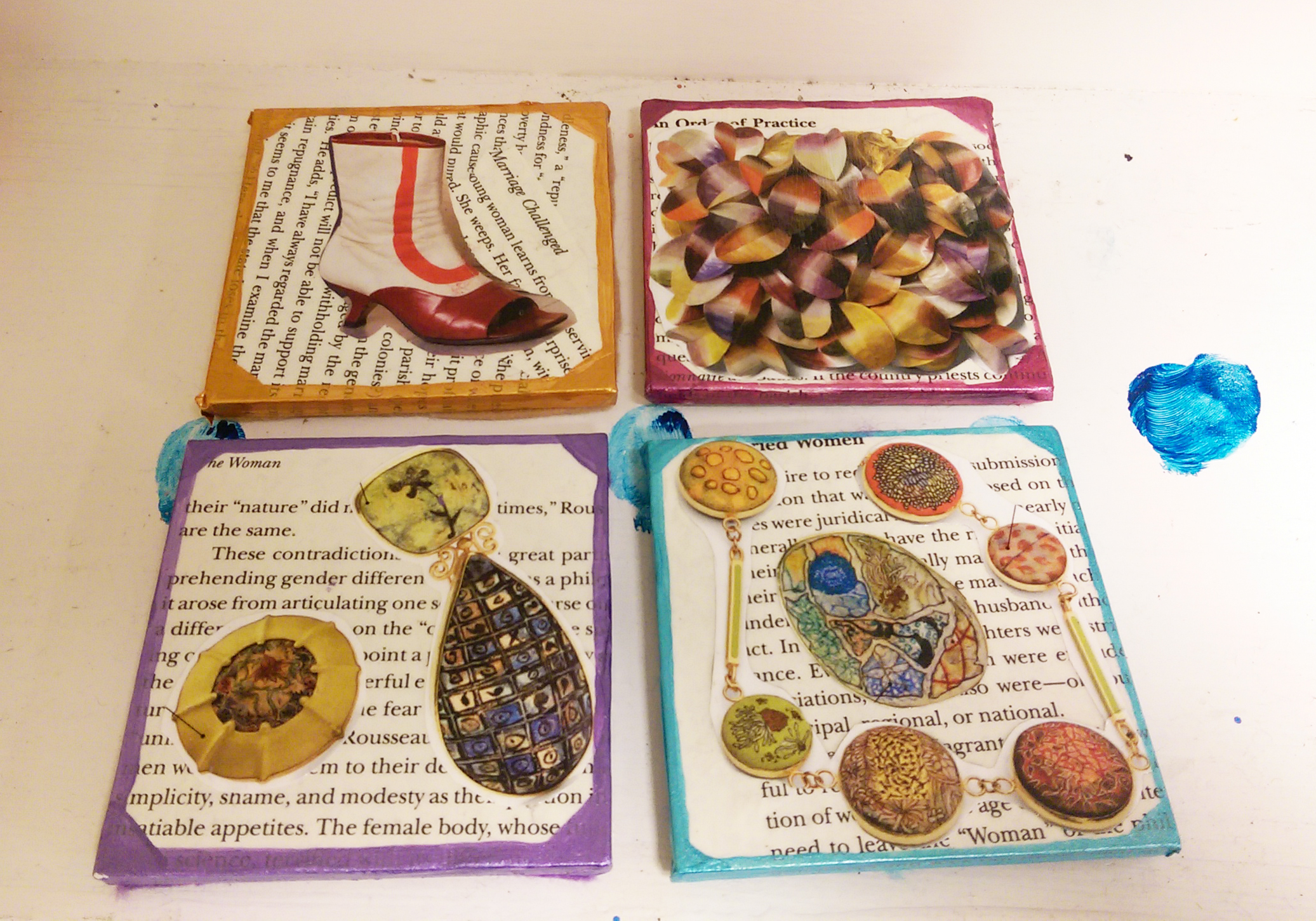
These pieces only took an afternoon to create. First off, a background made of book pages makes anything look instantly classy. If you are like me and love books, tearing one to pieces could take a lot of soul-searching. Therefore, I picked up the most dull, dry, uninspiring book I could possibly find from the red dot $1 bin at Barnes and Noble so that I wouldn’t feel I was doing any disservice. The opposite, I felt I was improving upon the provided material by turning it into art. I first tore out about 6 pages per picture, then adhered 3 pages layered on top and 3 on bottom to the cardboard backer that always comes with frames. I found brushing tacky glue onto the back with a combination of a cheap throwaway paintbrush and one’s finger worked best. I then flattened the bookpage-covered-cardboards under a pile of magazines to dry. While the glue was drying on those, I found 3 calendar pictures I liked and cut out the main subject from each page. You could do this with any calendar theme, cutting out a large central image be it a flower, an animal, a boat, your favorite entertainer, whatever makes you happy to look at. I then brushed tacky glue onto the back of each of my calendar cutouts. I pressed them on, smoothing them out with my fingers, making sure there were no bubbles, and then put the pieces back under the magazines to dry flat. Next, out comes the metallic paint! Metallic acrylic paints are just magic and make every single thing look way better. You don’t have to be an artist at all to accent your new decoupage calendar pictures with paint. The “distressed” look goes awesome with the torn out book pages, and for this technique the messier the better. Grab a large flat brush, and make sure you keep it dry – don’t dip it in water until you are finished. Dip some paint on your brush and simply swipe across your piece. The paint will naturally catch where the pages layer and overlap lending a cool texture. If you don’t feel intuitive with the paint, an easy out is to simply paint along the edge of the image you glued down to emphasize it, and also brush along the corners or all the edges of the actual rectangular piece to “frame” your collage. You’ll be surprised at how amazing these turn out. You’ll have people asking where you bought them, when all it was was less than $5 of supplies and a couple of hours.
Doing more rearranging later due to visiting the Midland Antique Festival and buying yet more wall art, I decided to make a wall collage above my dining table which is something I’ve always wanted to do. My framed original portrait drawing, collaborative mixed media canvas piece I’d made with my boyfriend, and my crazy little 60s-big-eyed-circus-child all had a vintage, weathered look to them with lots of beige and ivory amongst the pops of color. I needed some super small pieces to tuck in between the gaps in the arrangement, but 5×7-8×10 frames are usually meant for table tops and just don’t look right on the wall, and the frames’ heavy, dark edges were taking away from my more focal pieces. I needed something on a small canvas, but once again, was pressed for time. Though I wanted my collage to look good, I did not want to make 2 miniature acrylic paintings with all the other projects I had going. I had a value pack of 8×10 canvases I’d gotten at Michaels that calculated out to $1 per frame at the end, and decided, what the heck? When in doubt, cover them in book pages. Once I had the entire front and sides of the canvases covered in tacky-glued pages, I went to Staples and got 2 of my original works printed small on standard printer paper, tore the edges to make them uneven, and glued them to the relative center of my canvas. If you don’t make art yourself, you could still do the same thing with magazine pictures, digital photos you’ve taken, or works by famous artists copied from art history books. Antique or vintage-inspired images look best with the book page background. Of course, I had to metallic up the edges with some gold paint, and once again I had put in an hour or two of work for a really cool end product.
I fell off a chair and dented the entire right half of my body trying to hang this up, so it better look damn good!
I hope some of you will try this out. Even not-so-great looking decor can be super expensive, and these projects are FUN even for non-artists (promise!) and will add a ton of personality to your abode. Collaging is even suggested as a relaxation technique when under extreme stress, so this project could be just what your day off needs. I’ll be taking a break from art and heading off to Ludington tomorrow for a mid-week weekend of hiking, swimming, and generally being outdoors from morning till the wee hours of the night. Hopefully I come back refreshed and inspired ^_^.


 Montano, seriously, what a snazzy guy.


