Now that I got all of my work finished for the upcoming Michigan all area shows I am entering, I wanted to take the opportunity to spend some time on a new project that I’d done sketches for about 2 years ago and never revisited after getting distracted by mountains of other projects. Working with kids and youth over the summer at Creative 360 while Artshop was on break, we did lots of acrylic painting. Acrylics is a medium I’d abandoned over the last couple of years, and it made me miss it.
I had a teacher once who said you will always be who you were when you were 8. You may drift in the in-between teen years; who doesn’t go through an identity crisis at least once in high school or within early young adult age; but you will always come back to the most basic facets of personality you exhibited as child. At your core, you are who you were at eight years old and will still be at 80.
When I think about it, at 28 I do share many of the same traits with my 8 year old self. I still adore books, I still have my own distinctive and at times highly experimental fashion sense (I was wearing sun glass frames with the lenses popped out far before hipsters ever existed.), I am still always actively finding ways to meld creativity with vocation, I still am obsessed with all things design oriented (Look how pumped I am about my digital runway show I’ve put together on that snazzy Windows 95), and I still can’t sleep unless buried under 3+ layers of blankets even in summer :P.
Luckily for me, and this project, my mother is amazing and has the best of my childhood drawings from each year of my life archived in a neat, chronological little binder, so finding artwork examples was no big thing. I have chosen a drawing from each year, 2-10 (nothing for year 1, I’m not that amazing.) I will be using the same subject matter, colors, and proportions to re-imagine these childhood drawings as fine art acrylic paintings. Here is the first piece I’ve completed for age 4.
Kid drawings aren’t all the same when you really look at them, and you truly can tell a lot about someone from what they create, same as with adults. Here are some other fun projects people have done taking inspiration from kids’ drawings.
I’m sure there are a couple out there, but I don’t know any artist who creates to complete silence. The music we listen to can definitely have an effect on how we create. Earlier this year I worked with a group of kids and helped them paint while listening to an orchestral score, the kids painting what they envisioned as they listened to the music. I know as a highly visual person, whenever a song comes on I automatically see flashes of images in my head while I listen, even if it is just colors or patterns that the music brings to mind.When it comes to good art-making music, most people seem to swear by classical. I certainly don’t mind classical music, but I tend to prefer songs with lyrics to solely instrumental. I have a wide range that gets me going. Some days I love painting to Minor Threat and The Misfits, but I have found that for fine detail work calmer is better. I love accompanying art with coffee as well, so if the music is too energetic and I am too caffeinated, I will literally just pace and dance around and get about 1/2 as much work done. Also, when I’ve worked all day and been around lots of noise and chaos aka students (gotta love ’em) for the past 8 hours, it’s nice to listen to something tranquil. For your perusal, I’ve assembled a list of calm and creative music that is my muse while working, at least for right now.
Broadcast
Aside from the fact that the lead of Broadcast had one of the most soothing voices I’ve ever heard, the title of this album is called “Future Crayon” so you know it has to be good art-making-music.
San Fermin
I had the pleasure of seeing San Fermin live last fall, and it was one of the best shows I’ve ever been to in my life. I’ve never seen a group of people play so many instruments at once, and play them all like masters.
Michael Nyman
I’ve actually never watched the film this song is from, but a yoga class I took in college used this song in a playlist that would be on repeat during every session. All of his music is equally stunning and tranquil, though this song has remained my favorite.
Elliot Smith
What can I say, I love sad songs.
The Entire Old Boy Soundtrack
Ok, so this movie is far from peaceful as you can see from the featured movie poster above – so brutal – but the soundtrack is ahhhmazing. The music varies in style, but most of it is mainly instrumental and it’s very creative and fun, a perfect backdrop for art. This song I’ve featured is my absolute favorite. The movie is pretty visually amazing as well, if you have a strong stomach (or a blanket to peek through intermittently ;)). Watch the original, do not watch the shitty American version, please and thank you.
Beach House
Again, amazingly soothing vocals and creative melodies. I feel like I’m entering a mythical dreamland when I listen to this band.
Morrissey
I may get accused of being a fangirl, but I seriously do make the best things while listening to Morrissey. Both his solo lyrics and those from his songs with The Smiths also tend to have an eerie way of stating what I’m always thinking.
80s music videos … oy.
So, what do you listen to when you need to concentrate but can’t stand the quiet?
My boyfriend and I visited an interesting sculpture exhibit at the Flint Institute of Art this summer titled Form, Function, and Fantasy. The exhibit was divided into 3 rooms, each embodying one of the aforementioned themes. I captured my absolute favorite pieces from the exhibit, and wanted to share them with you. I know I discovered many new favorite artists in the process. I think all of the pictures I took were from the “fantasy” section, which for me is honestly not surprising. We accidentally went through the exhibit backwards, viewing fantasy first which may also have had something to do with it. Let’s be real, in art as in life, everything’s a letdown after that ;).
I was actually drawn to make a trip out to this exhibit based on this image I saw on the FIA website. I love the melding of old world artistry with fairy tale mermaids. The bold red coral shapes growing off of it give this piece add an element of abstract and modernity to the piece as well, bringing one more dimension to the mix. I am personally so much more of a drawing and painting person than a sculpture person, so I think I loved the fact that the surface of this 3D form was used as a canvas for 2D art as well, incorporating both types of design.
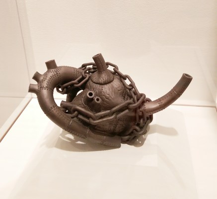
As a tea enthusiast, I absolutely adore looking at uniquely designed teapots. My absolute favorite thing about days off is my cup of tea right after I wake up in the morning, no joke, usually accompanied by doing some sketching, reading a book or the news. I am such an old person at heart at a mere 28 years on this earth. In all seriousness though, the design of this teapot inspired sculpture is flawless. Combining industrial elements with anatomy and figuring out how to transform the shape of a human heart into a vessel for tea somehow could not have been an easy task. You don’t even notice it’s a teapot at first, it just looks like an interesting sculpture. The fact that it hides its more mundane function is rather interesting.
I love the tall, thin forms, the monochromatic color scheme, and the detail that makes this piece look like a pen and ink illustration from a children’s scary story picture book come to life in 3-dimensional form. Very fun and inventive.
As I read more about this artist, I discovered she has a whole series of these lovely, whimsical houses in vibrant colors and with floating, dreamlike, organic detail. The project is titled “Homemade – a project where the womb, the home, and the female are interpreted under a new light.” This project discusses the idea that oftentimes feminine traits are associated with weakness and fragility. However, patience, tenderness, forgiveness, and love are strengths that have made them universal protectors and caretakers for every family over time. And, important nurturing that determines the growth and well-being of all humans takes place in both the womb and the home, centered around the female. It is interesting and different to see a project about female empowerment that is based on the value of women’s more traditional roles. I was originally drawn by the visuals, but found the idea behind the design very thought provoking as well.
There is no way I could not be drawn to this piece by color alone. I absolutely love pops of bold red amongst neutral tones, and use this color scheme in my own work often as well. There are a lot of interesting details the longer you look at it, and the contrast between the style of the head and body is staggering. Yet, when you look at the piece as a whole it is unified. I myself was working on sketches for a series incorporating faces being covered in various winged things, so of course I was first drawn to the most noticeable visual element of the moth over the figure’s face.
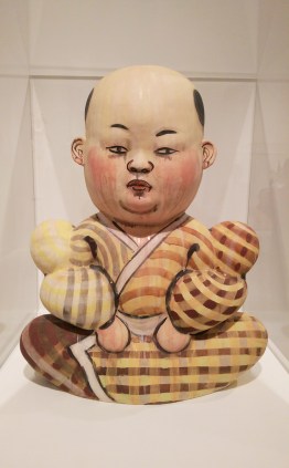
I found this sculpture to be so incredibly calming to look at. The soft, round forms, harmonious pale colors, and flowing watercolor-like drips along with the neutral, solemn face were very peaceful to me. I think if this was in my house and I could just look at it whenever I got tense, I would never lose my temper.
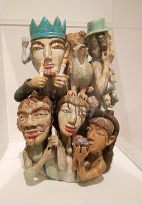
I loved the dripping glaze application in this piece because again, it reminded me of watercolor. I also loved the totem quality it had to it,the many figures and faces stacking atop one another. Each is such a distinctive, unique character in the composition.
This was another piece that reminded me of a children’s book illustration come to life. I love the muted color scheme, and the stylized features of the human and animals. There is definitely a story here, and it is left to the viewer to imagine where they are all headed to.
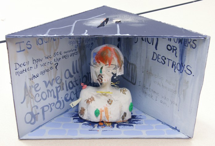
I’d encourage you to visit the links to see more of these artists’ work. All of their pieces are just as fantastic as these. I am forever in awe of 3D artists. The best sculpture I ever made was this cardboard, modeling clay, and found object punk-diorama time-based piece pictured below.
It was a final project for my intro to 3D class in college, a time-based assignment meaning a piece that would somehow change over time as part of it’s presentation, not lasting in its original form. Basically, the so-so sculpted clay girl in the center was all white and pristine at the beginning, and then everyone in the class got to take turns sticking the different objects to her, dumping paint on her, and otherwise altering her form. It dealt with how perceptions shape identity, and was all anti-conformity, anti-media, and all that good stuff – very much what I was thinking about at that time of my life. Of course, my best sculpture would be ephemeral. What rotten luck. At least I’ll always have the pictures.
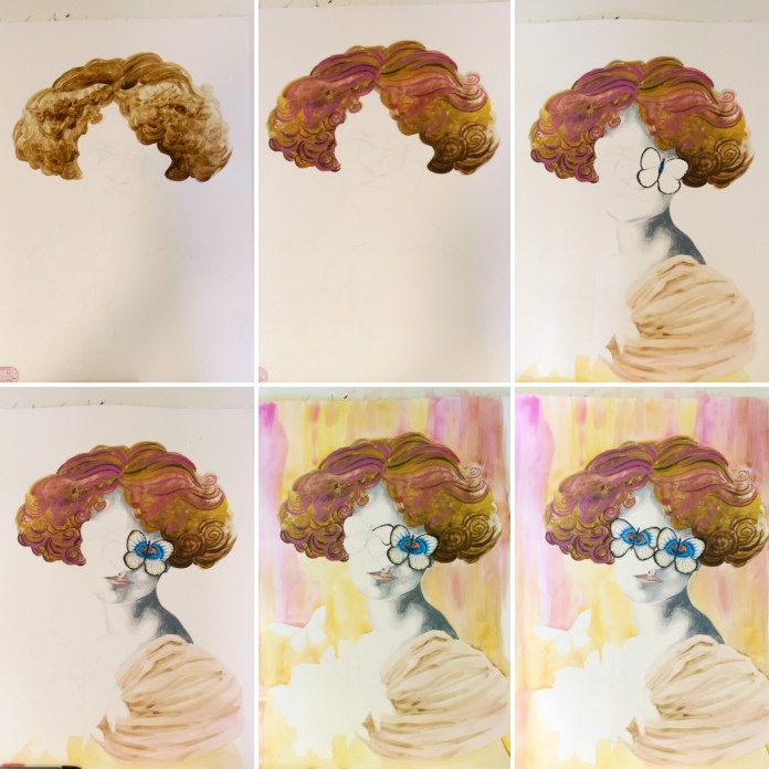
This newly finished mixed media piece, titled “Be My Eyes”, continues along a similar theme to my last piece. I love how it turned out, but I must admit this is one of the first works in awhile that was not buckets of fun throughout the entire process. I’m lucky in that I don’t get incredibly angry with my art much anymore. Like any relationship, if things aren’t working, I can say hey, I think we need to give each other some personal space, and leave it alone for awhile and work on something else. However, this one had a quickly approaching deadline for an all-area Michigan show I wanted to enter it into, so I didn’t have that luxury. It may be freaking gorgeous, but filling in all those detailed little butterflies was a chore. Like, I almost considered taking a break from working on art at one point to go clean my kitchen – that’s how bad it was. Cleaning my kitchen was a reprieve. What’s that about blood, sweat, and tears?
After doing the basic outline lightly in pencil, I started filling in the figure from the top down. I broke my own guideline that I always give my students about starting with the background first, mainly because to be absolutely honest, I had no clue what to do with the background yet. The hair was so swirly, and fun, and free, and so the opposite of those technical, detailed little insects. I used prismacolor pencil for the face and skin, watercolor for everything else. I made some commitment to a background by dripping orange, gold, and magenta watercolor over it – similar colors to what were used in the hair. After this, my work of art temporarily looked like a 70s album cover. The photos don’t do it justice, the colors were BRIGHT.
After that, I went back to ignoring the background because I still had no idea what to do with it, and finished the central figure. Rules in art really are just suggestions ;). I had known from the beginning that this piece required metallic gold somewhere, and the background now seemed just the place to put it. Huzzah to dulling all those bright Barbie Dreamhouse colors! I needed to break it up with some texture, so I used a crumpled paper towel to apply the first layer of gold, but it just didn’t do it. It was reminding me of a faux finish accent wall circa 1995. In a surprisingly impulsive move (Even in art, I am so not an impulsive person.), I squirted gobs of paint right on the background, and used a toothpick to marble the colors together. I have the technique down because of how many times I’ve made these nutella brownies. Seriously, same technique to marble the nutella and peanut butter. To lighten this now very dark background (Art is always such a Goldilocks situation.), I used white watercolor and added designs of blown up butterfly wing patterns over top. The finishing touch was the gluing the bunched lace over the dress, and voila!
The reason I’ve included this 100% honest rendition of this piece’s birthing process (including the part about my background being inspired by delicious baked goods) is because I’ve learned one thing from all the different students I work with, and it is this: They think artists always know what they are doing, have an exact plan in their head, and that their piece turns out just precisely how they imagined it in the end, and that real artists never get stuck or doubt what they are doing. This is absolutely not true. Everyone’s art looks completely wonky until it is all the way finished. It’s part of the process. When art is in progress, it’s awkward looking, we don’t always know what we are going to do next, and we don’t always enjoy every single step of the process. And that’s ok. If your art is easy, you probably aren’t pushing yourself enough, or being as creative as you could be.
I haven’t talked much about the meaning behind this piece, because I want to hear what you think. This image could definitely be open to innumerable interpretations, and that is one of the most fun things. What does it say to you?
This weekend was the opening of the annual Tall Ships exhibit at Studio 23 in Bay City. This was my first year entering, and I was excited to have both of my pieces accepted. The elements of nature in my artwork tend to be way more enchanted forest than nautical or aquatic, but I decided to challenge myself to work outside of my usual themes. The piece on the left, “Underwater Dreaming”, may be the most colorful piece I’ve ever created. It’s very tropical which is out of my norm, but maintains the elements of fashion and surrealism that I so love. The piece on the right, “An Existence Aquatic”, was created two years ago when I was in a watercolor and ink illustration phase, and has a steampunk-mermaid feel to it.
18×24″ Prismacolor Pencil and Mixed Media
For a step-by-step look at how “Underwater Dreaming” was created, please visit my previous post. These pieces are available in print form in both my eBay Store and Redbubble Shop.
To all of my American readers out there, happy 4th of July! The above is the most patriotic image in my art archives that I could find. But really, the colors are spot-on and what says summer fun like a shark costume?
After basically sleeping all day yesterday after partying like a rockstar at a 4th of July pool party on Saturday, staying up until 4 am when I usually turn into a pumpkin before midnight, today I plan to make the most of the last day of my glorious week off. At 28 years old, I spent my first night ever sleeping in a tent, so that’s something, right?
I was lucky enough a couple of days ago to chance across this retro 4th of July picture I had scanned onto my laptop at some point, circa 1997. Is it any wonder my favorite American Girl doll growing up was Molly? Besides her stories being set in the WWII era which I find to be a fascinating time, we were pretty much twins. My dad is cropped out of the picture not because I don’t love him, but because something else I really love just as much is being alive :P. Still, you can get the idea that we all wore coordinating apparel for the occasion.
I hope everyone else out there enjoys their 4th! And seriously, you should spend nearly the entire day outdoors, but in the occasion that you spend a couple of moments peeking around online at some point, there are awesome sales going on for the holiday on redbubble and zazzle!
I’ve been working on this new mixed media drawing for awhile, and with my decision to take a little staycation, I’ve finally had the time to finish it! It is titled, “Be My Wings”, and measures 18×24″. I used prismacolor pencil for the face, prismacolor markers for the ravens, watercolor for both the hair and the background with grey, black, and white chalk overlay, and fabric for the clothing covering the neck and shoulders.
Of course, I have added this design to my Redbubble collection, as well as some new designs inspired by a couple of fun, newly finished ACEO illustrations.
I love buying from all kinds of artists on Redbubble, and have a design of almost every type of product in one form or another except the throw pillows! I’m dying to get one, but it is impossible to decide which design to choose, especially since I feel like changing around all the colors and decor in my apartment yet again. It’s a yearly thing :P.
I know this is a brief post after not writing for so long, but I’ve actually been aiming to spend minimal time online over this week-long break as it is simply gorgeous outside! Lately, I’d been feeling like there was a gloomy bad-luck cloud looming over my head, skulking around and following me just about everywhere I went. However, something seems to have turned a bit in my favor, because I sure picked the right week to take off! Every day has been nothing but perfect warmth and blue skies.
Can’t beat swimming and a view! Now, onward to more adventures…
Once We Truly See Each Other / 2013 / 18×24 Watercolor, Ink, Embroidery Thread
At a young age, I began to notice the different ways in which men and women were viewed and treated. Ever since I first voiced confusion at this incongruity, I was answered with more questions such as “Why do you have such an issue with men?” “Why do you think men should be treated as less?” etc., etc., etc. These questions always left me with the disconcerting feeling that I’d somehow been shot into a parallel universe unbeknownst to me, where words that you spoke meant the opposite of what you’d said. How does equality mean one being treated as less than? The math just didn’t add up. Especially as one that tended to have an easier time talking to guys or tomboyish women than other “typical” ladies, was best friends with her younger brother, and generally thought men and women were equally awesome; how ever did someone get the impression that I wanted to bring anyone down?
As it turns out, social research is finding that when we as a society get used to seeing inequality for so long, any steps towards even partial equality are seen in an exaggerated light. An article from In These Timescritiquing the fear of a “feminized society” , an anxiety that apparently is somehow all too prevalent, hits the nail on the head as to how this phenomenon occurs.
“So how do you get from some feminism, some of the time, to a feminized society?
The heart of the problem is one of the strangest manifestations of male privilege: It actually seems to interfere with men’s ability to count women. Specifically, it creates a tendency to actually see more women—or hear more female opinions—than are actually present at any given time.
Geena Davis Institute for Gender In Media found that, in crowd scenes, women tend to comprise about 17 percent of any given crowd. She’s argued, based on outside data and her own interpretations, that this imbalance relates to and reinforces the way men perceive the actual number of women in any given room.
“If there’s 17 percent women, the men in the group think it’s 50-50,” she told NPR. “And if there’s 33 percent women, the men perceive that as there being more women in the room than men.” ” (By the way, love Geena Davis. I watched and re-watched A League of Their Own I don’t know how many times as a kid, and I hate all sports, especially baseball.)
This same phenomenon happens where speech is concerned as well. You know that whole perception of “Hoo boy, women sure like to talk, yak yak yak!” Turns out it is just that, a perception. In mixed company, and especially in a workplace setting, women may be hard pressed to fit a word in edgewise according to a PBS series on language myths.
This same thing happens when it comes to race as well. People are always in self-preservation mode, and fear that by lifting one group up the scales will be tipped so that they lose out. Or, I wonder if some don’t subconsciously fear that when we are all on an even playing field, they may sometimes get treated how they have treated the other for so long.
In reality, we are not living by the rules of the animal kingdom in this modern age. We are human beings with pretty solid cognitive and reasoning abilities when we choose to use them, and there is no rule that someone always has to be underneath the others’ foot. We need 100% of our society working together, and we need a collaboration of everyone’s ideas, not just 50% of the population’s ideas. By seeing each other for who we truly are, without the guise of archaic preconceived notions based on gender, everyone is lifted to a higher playing field.
This piece, titled “Once We Truly See Each Other”, is about support, and it involves men too. When striving for equality not just in our own backyards but across the world, it is a mistake to leave out men because they can be some of our biggest allies, and they are effected negatively by rigid gender expectations also. If you are ever in doubt of this fact, check out the completely eye opening documentary, The Mask You Live In.
In my piece, women of all ages and ethnicity are illustrated as doctors, moms, members of the corporate world, musicians … Men are depicted as businessmen, athletes, artists, stay-at-home dads… The 3 cliffs are symbolic. Sure, men have started out on a historically higher platform as far as societal advantages are concerned. But, notice that third platform, the third and best option of all. In the piece, men are partnering to pull the women up. From there, the women are also helping the men up to reach their full potential. Equality requires that we invest in the lives of our fellow human beings, men and women both.
To me, equality is about allowing every individual to reach his or her full potential, whatever that may look like. No, women are not “settling” by choosing to be stay-at-home moms if that is their dream and what is important to them. They should have that option. No, the woman who wishes to rise to the top of her company and expects to be respected the same as her male colleagues is not an angry pink Godzilla hoping to kick every man in the balls with her shiny metal foot. She should have the chance to prove herself free of prejudices. And by the way, the same goes for men.
You remember that scene in the Disney version of Alice In Wonderland where she cries and cries until her tears fill the whole room and she floats away and almost drowns?
Yeah, it’s kind of like that.
I have been busy, stressed beyond belief, and not wanting to do anything remotely mentally or emotionally taxing once I finally do get a spare moment. Incidentally, I’ve been playing a lot of Civ V, planning world domination. Honestly, becoming a ruthless dictator seems like it would entail less strain sometimes than my day to day existence as of late.
I took a break from my ongoing series I’d been working on to finish a piece for a summer gallery show coming up in June, and must admit that I have no further updates since then. To once again recap my free-time allotment over the last month, gaming>drawing.
It’s been a crazy ride, but there have been some bright spots amongst all the weeping and gnashing of teeth – like one of my best friends from junior high and high school’s wedding reception! She got married in India back in December, and her and her sister picked out these beautiful dresses for us to wear to the spring reception. I love my shocking pink and silver, Barbie Dreamhouse number ;).
I have no room in my apartment for a fantasy creature sculpture (a bummer, since I used to collect dragon stuff – no joke.), but I couldn’t resist buying a cool box! Each one is so unique. Here is mine in its happy little home.
Now that so many of the students are selling their artwork, I swear they are going to be getting half my paycheck. I have no self control. Our current Virtual Gallery is for local purchasers only, so I’ve added a couple of paintings and jewelry pieces to my ebay shop under the category “Artshop” to give others outside of the Saginaw/Midland/Bay City area a chance to own some awesome art. Go check it out!
My next post will be a lot more informative, and filled with some new in-progress shots of the continuation of my series, PINKY-SWEAR! ❤ you all, signing off.
This past weekend I once again participated in Do-All‘s Art Clash with my PIC of 3 years Heather Deogracia. Art Clashes/Art Battles are getting increasingly popular. They are live art competitions where artists are given a limited time (usually 3 hours) to complete a work of art from start to finish. As you can imagine, it’s super nerve-wracking. We didn’t even take any photos together until after the relief of the competition’s end, because we were so nervous that we were white as ghosts! (Or, ok, we’re both pretty pale. Whiter than usual I guess 😉 ).
(In the second picture above, we were supposed to be making snooty faces but I still innately smiled the minute the photo timer got to 1 second … Damn you, social conditioning!)
In addition to being my forever Art Clash companion, Heather is also in my Studio Art class at Artshop! This awesome lady came into class on the first day of spring semester and said, “I know what I want my project to be. I want to make a mermaid tale”. This is why she is one of my favorite people. I have not had my body traced on giant paper since elementary school. It was hilarious.
Back to the Art Clash, I really thought I was simplifying this year by doing a happy watercolor tree instead of trying to do something with people or portraits, my usual subject matter of choice. BUT THOSE BIRDS! The detailing was so much more time consuming than I expected, even using prismacolor markers rather than colored pencil. I truly thought I wasn’t going to finish, was cursing myself for drawing so many of them to begin with, and found myself chanting louder and louder inside my own head “The birds, the BIRDS, THE BIRDS!”
I should have learned by now, it all works out in the end.
I present to you, “Color The World”, 18×24 Watercolor and Ink.
I’ve posted this design to my Redbubble Shop, which offers the print on a variety of fun products. Traditional photographic prints are also for sale in my Ebay Store. Wondering what I’ll do next year … one thing is for certain – no more birds.


")
")

![IMAG3175[1]](https://artistallisenicole.com/wp-content/uploads/2016/07/imag31751.jpg?w=496&h=496)


![IMAG2772[1]](https://artistallisenicole.com/wp-content/uploads/2016/05/imag27721.jpg?w=618&h=412)


")


")
