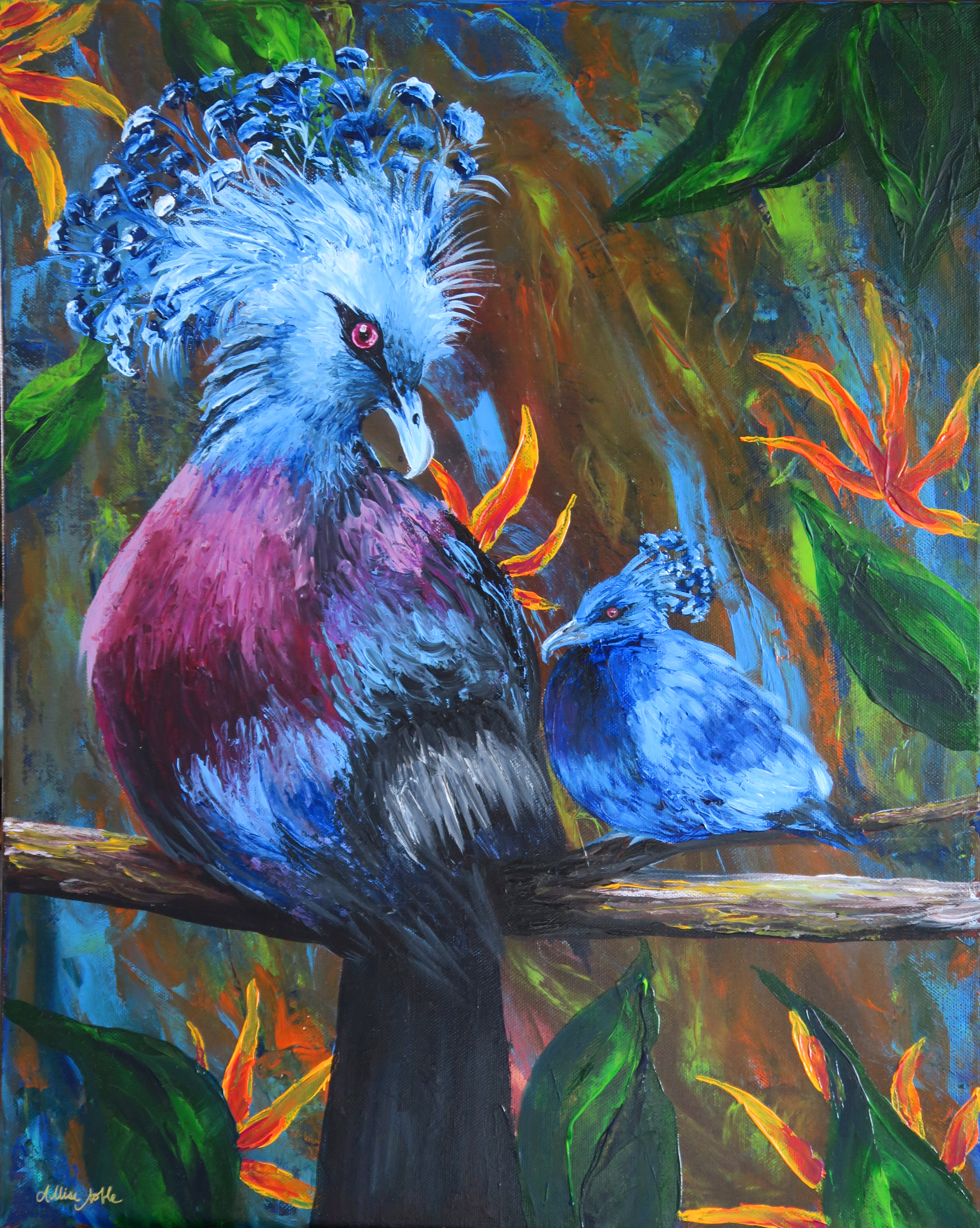
It’s been awhile since I’ve done a series … since Unlimited from way back in 2017 to be exact. This new one is going to be on 22×28″ canvases and will be completely multimedia. I love mixed media because it allows the artist to use the best tool for each component of their composition. I draw people better than I paint them still at this point, so figures will be in colored pencil. Interesting silhouettes or clothing … fabric it is! Skies and birds? Acrylics of course, and why not palette knife paint the birds ;).
This series is going to be a way different theme than I’ve explored before. I always like to include deeper messages in my work, but have never done an explicitly spiritual message because it is important to me that my art is able to speak to viewers coming from all different places. Each work in this series will represent one of the fruit of the spirit, and though this idea comes from the Christian tradition, these principles are positive to cultivate in everyone’s life.

I started with Peace, maybe because this is something I have been desperately needing to grow in my own life over the last couple of years.
Peace is active. Peace is a verb, it is not simply the absence of noise. Peace takes work, and it involves risk and often involves stepping out and becoming uncomfortable. Making the changes necessary to grow peace are often painful. To truly be at peace our view of life’s value cannot be determined solely by circumstance, because external circumstances will undulate up and down completely out of our control, leaving us to be in emotional chaos, completely sucked beneath the waves.
Being a bringer of peace in others’ lives and in society as a whole is equally difficult. It means listening when we would rather shout over someone, it means sticking your neck out to protect or defend someone else even at personal risk of how others may view you or treat you afterwards, it means setting strong boundaries.
In this image, a woman is guarding a crowd of people that are behind her, blocking them from the shadows of chaos. These shadows have tried to grab her and drag her down, her arm is marked. However, the shadows cannot penetrate. Doves circle around her head which symbolize an inner strength and calm within her spirit, and can also symbolize her halo of protection that shields her just as she is protecting others.
The source from which we draw our peace protects us. The source can be sturdy and formidable, or … not so much. I am reminded of a speech one of my favorite authors, David Foster Wallace (who was actually an atheist), gave that really had an impact on me when I was floundering in the waves. “Everybody worships. The only choice we get is what to worship”. I’d encourage you to check out the entire speech discussed here. Another author that probably has about as opposite a personality from me as you can get but has really made me think, Mark Manson, writes in his self help book perfect for people who hate self help books, “True happiness occurs only when you find the problems you enjoy having and enjoy solving”. Much of life is composed of struggle, which is why if we wait for the perfect external circumstances to be at peace, we will never have it. Similarly, he discusses the importance of choosing the right metrics to determine what makes us and our life “good”. Faulty metrics used to define our life’s success and value are anything we don’t have control over, such as money, social standing, etc. which DFW also cited in his speech as destructive forces to worship. He calls worshiping these forces slipping into our “default mode”. They are the things we chase after and value when we are living without reflection, consideration, or deeper evaluation. They represent our base human nature, so to speak, and we all slip into this mode from time to time especially when under considerable strain.
Where does your peace spring from? What creates your circle of protection as you brave life’s trials? Are you more often a bringer of peace or of chaos to the people whose paths you cross in your day to day life? These are all questions I considered while creating this work. I strongly believe this series is going to be true art therapy for me as I work, and that my eyes will be opened throughout the process. I truly hope I am able to impart something of value to viewers as well.
There are layers of meaning, as I am a big believer in the fact that art should make people think. I’d love to hear what others see in this image, so please share if you are so inclined!

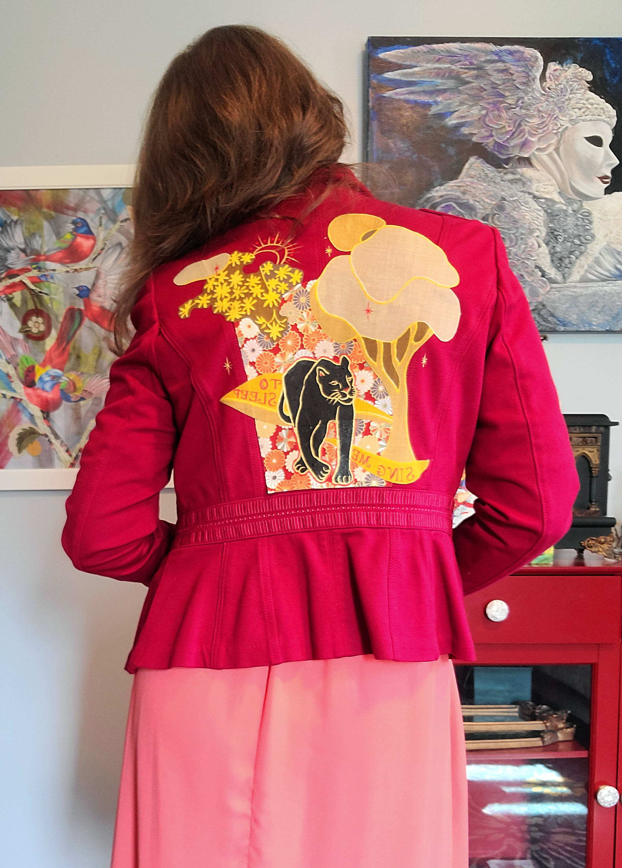
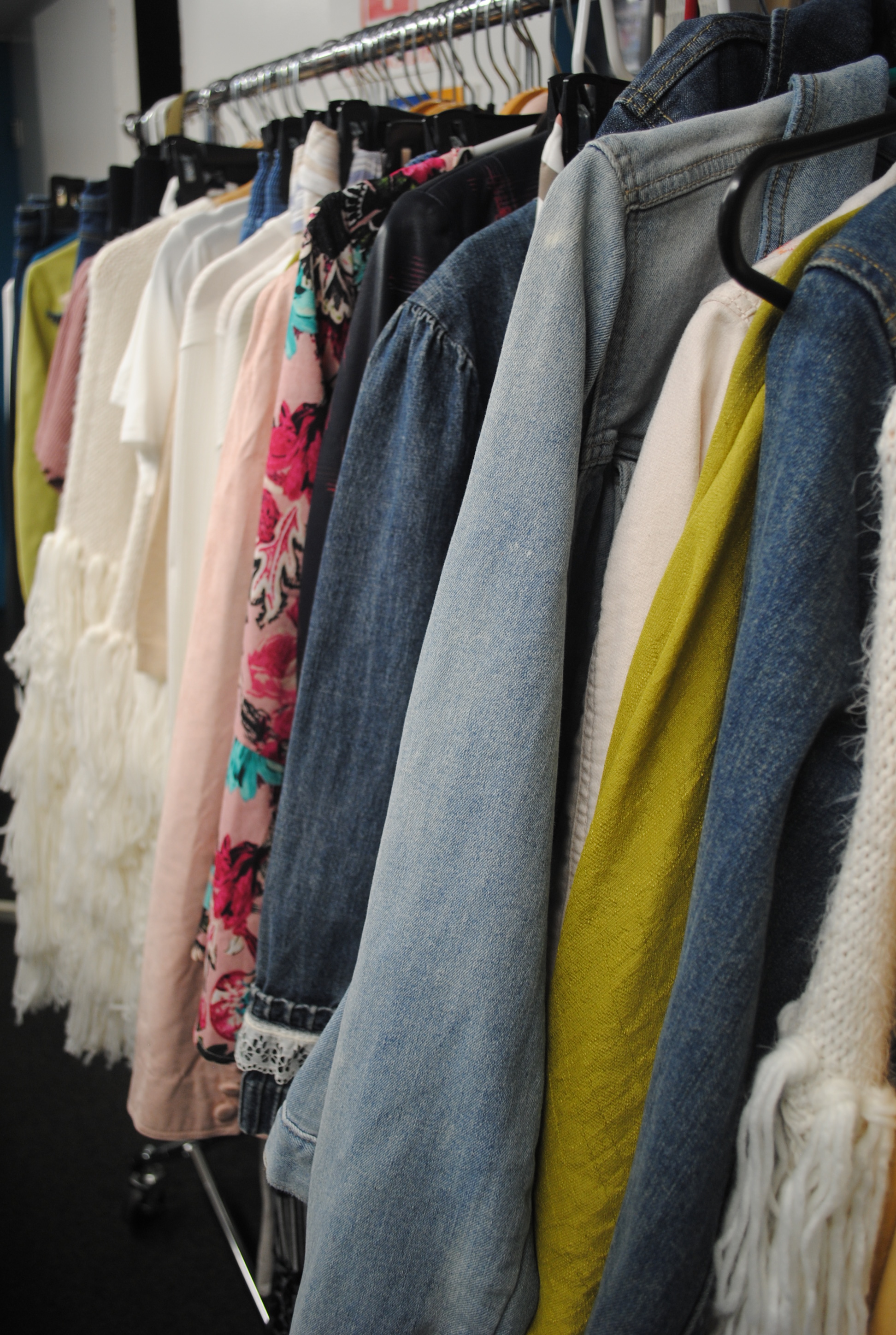
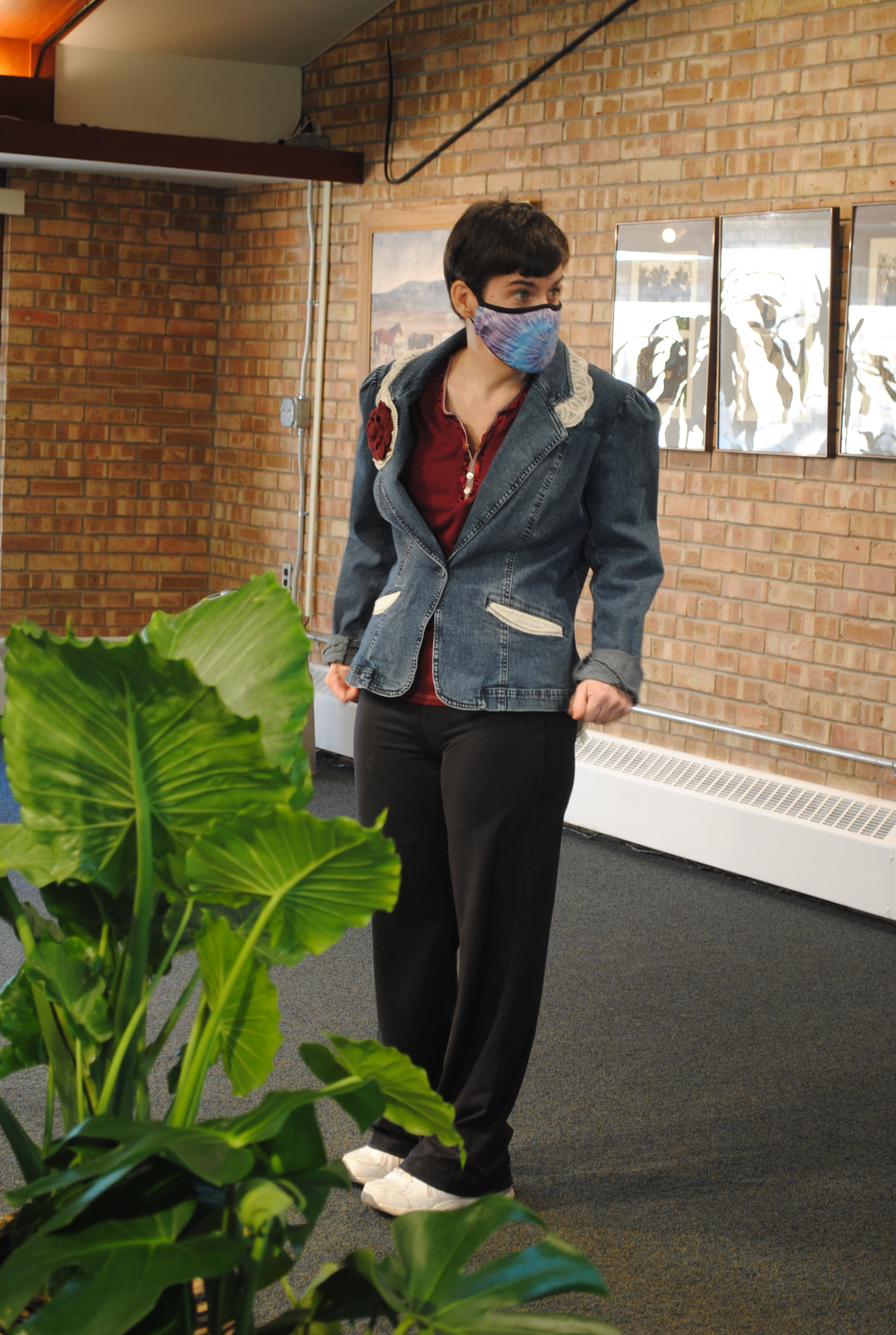
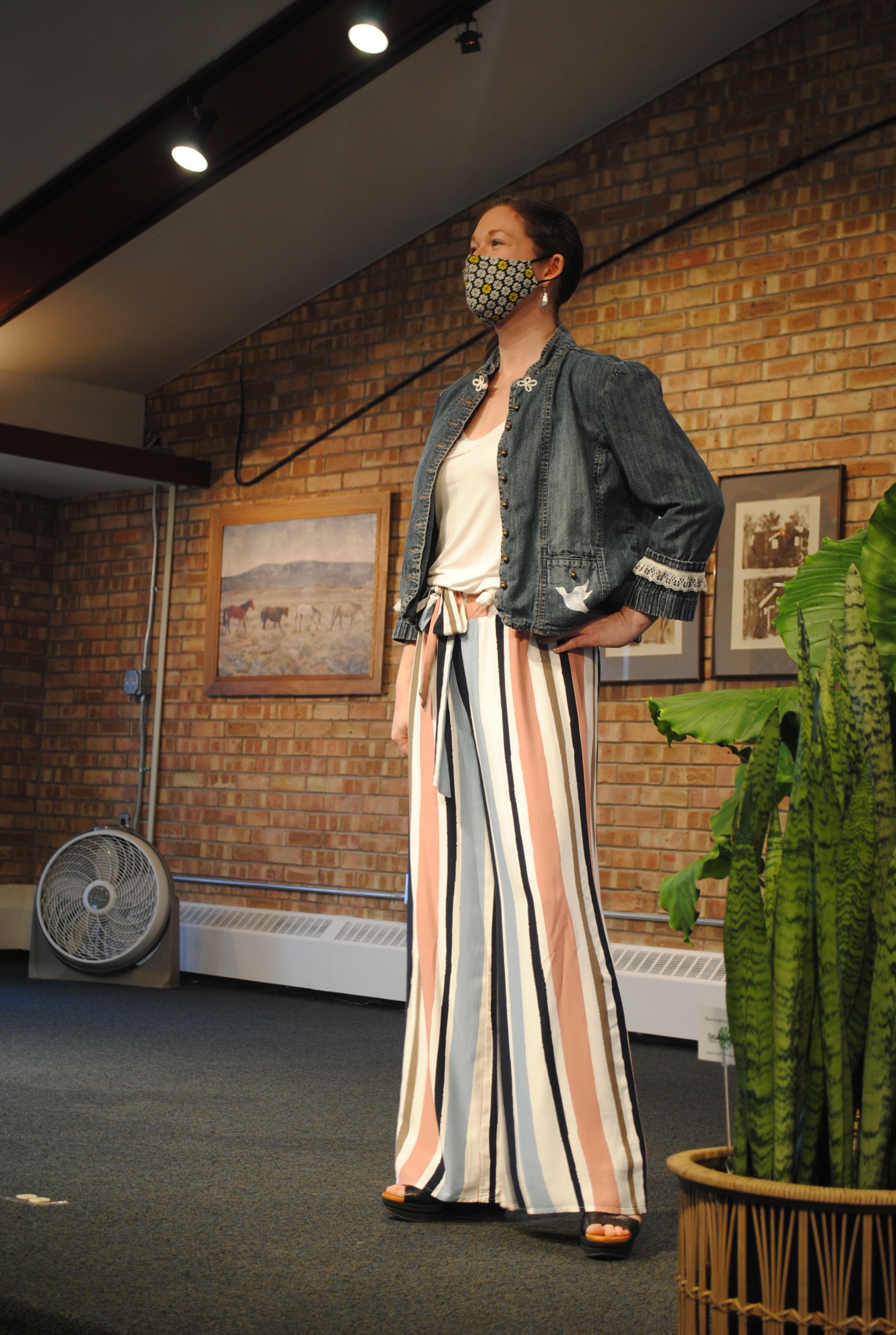
PS … I am so honored this first installment won an Award of Excellence at the Midland Artists Guild’s Annual Juried Exhibition last night, especially amongst such a fabulous collection works! Click here to view the entire show virtually. And yes, I made my jacket and paintbrush necklace! More on the inspiration for my wearable art creating spree soon.


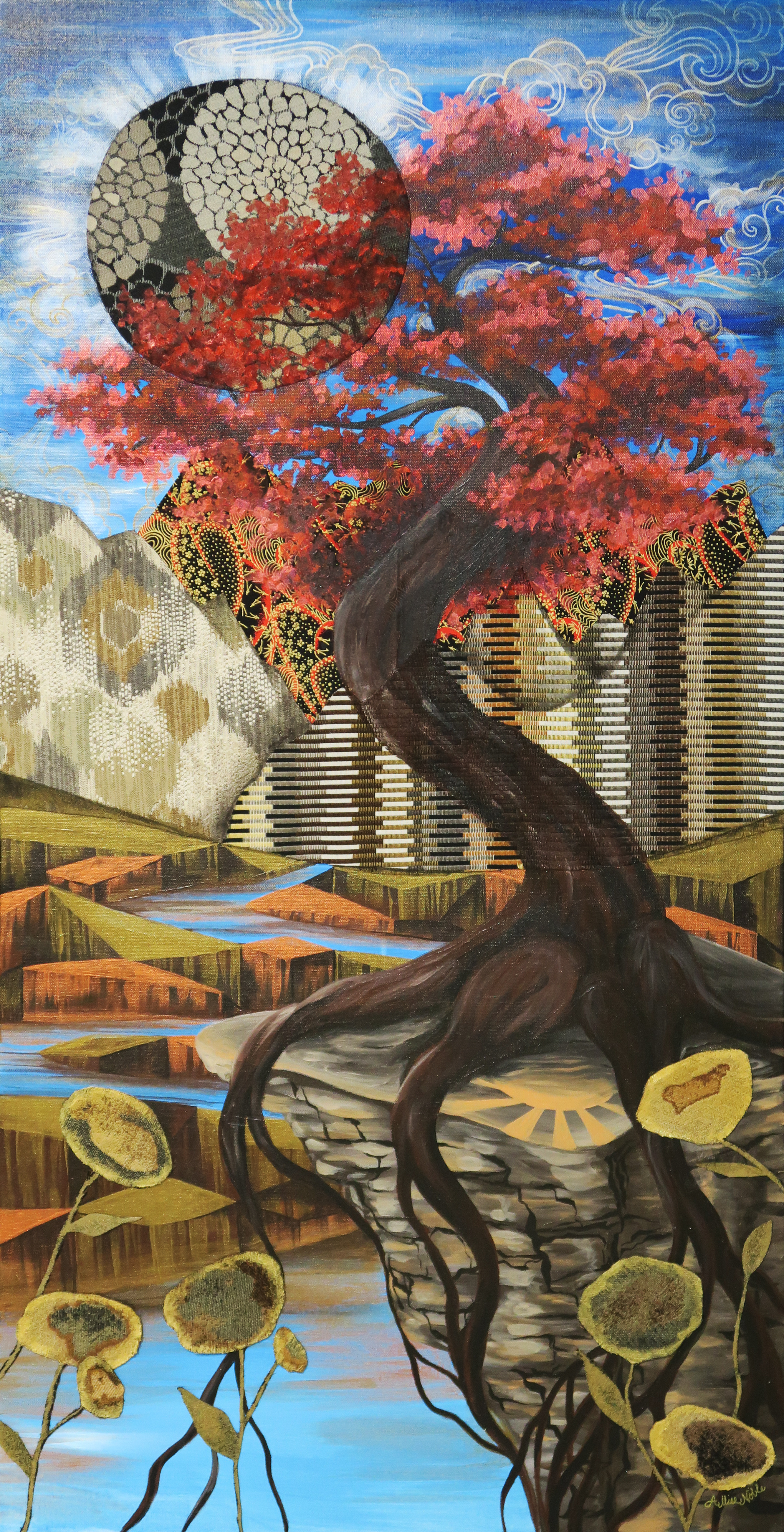


 This brings me to my second acrylic piece, “Space Is A Lonely Place To Be”. For this piece I was very inspired by silent film fantasy/outer space imagery and costumes, with a touch of art nouveau. I am certain a lot of this came out of feeling a bit isolated and as if I am floating outside of time … It’s strange out there right now.