Tag Archives: illustration
Happy Inktober 2021!
One thing about me is, I always at least show up for Inktober even if I don’t necessarily do all that stellar. It’s very reminiscent of when they’d make us do the 1 mile run once a quarter in junior high school gym class – at least I did something, even if I walked the whole way ;D.
I did a bit more than once a week at 6 Inktober illustrations, all available as original ACEOS in my ebay shop. The whole point of Inktober is to get in the habit of daily art practice, and I can say in full confidence I am doing art every day even if it wasn’t all Inktober sketches ;). I think my favorite is the little clowngirl. Which is yours???
Surprise Box Challenge! (Like ‘Chopped’, But For Art) – Week 1
Those who have visited before may have noticed my affinity for art subscription boxes. Whenever I receive a new box, I always challenge myself to create a small piece of art using only the materials that came in my monthly box as a way to try new techniques and get to know the materials. I am also quite the fan of the cooking show “Chopped”, in which contestants are give a basket of mystery ingredients, some delicious and some just plain odd, from which they must make a cohesive dish. My “day job” is running a program for artists of all abilities, and this new Fall semester I decided to run a class based on this concept. Each week my group will get a surprise box filled with 3-4 different types of materials and be challenged to use only those to make a work of art. Everyone gets the same supplies each week, just different colors or designs. I will be sharing what people came up with, as well as some tips for those who want to try the materials featured at home.
I started the first week without anything too crazy. This week, our materials were: Tombo brush markers, Crayola Portfolio Series oil pastels, Lumineart Twinkling H2Os metallic watercolors, and a watercolor paper base.
Tombo is my absolute favorite brand for brush markers, and while these are often used for illustration and come with a colorless blender for drawing, they are also water soluble. This means they additionally work great as watercolor markers. I have yet to find another brand of watercolor markers that have such brilliant colors and blend as seamlessly. I’ve been a fan since I started using them for interior design project assignments and architectural drawings back in college.
When it comes to oil pastels, quality does matter. With cheaper brands, you will often end up with nothing but glorified crayons as you can see in my latest YouTube video where I reviewed art supplies from Dollar Tree (The oil pastels were actually the ONLY supply to get a poor review – Seriously, you should check this out especially if you have kids who love art.). However, we are also a non-profit with a tight budget. Though the Portfolio Series pastels are an art student spinoff of Crayola which is known for making “kid grade” products, these are decent for students and budget friendly. These particular pastels, staying with the kid friendly theme, are also water soluble. This makes for easy cleanup (yay!) but also allows for blending with watercolors for some cool mixed media art. Despite this, if you leave your watercolors more “painty” and don’t add a ton of water the pastels will still repel the color you are layering over for some great resist effects.
Last but certainly not least, I cannot say enough about the metallic watercolors we used. I’ve tried metallic watercolor sets in the past myself and they were underwhelming … Very translucent, hard and chalky texture that didn’t blend well, and only able to get a pastel hue when applied no matter how little water I added. This brand is absolutely fantastic. The metallic sheen is so intense it almost looks like a high quality acrylic, but it blends like watercolors. It also had plenty of bright electric hues and intense darks. I will definitely be getting a set of these for myself.
In my class with a variety of ages and abilities, including some students with intellectual/developmental disabilities and mental health struggles, here is what everyone came up with:


Some tips when using these materials together:
- Metallic watercolors don’t look very metallic until they are dry, so have patience :).
- If you draw with a light colored oil pastel first and layer a dark watercolor over, the light pastel will resist the watercolor and show through.
- Tombo brush markers run with water, but can also be used for drawing just like regular markers. They can be brushed over with water for a paint like effect, but will not draw over a wet surface. They have two ends, including a fine tip that is perfect for adding details to watercolor paintings that beginning artists or those struggling with dexterity would have a stressful time adding with a brush.
- Using multiple mediums works best when you layer layer layer! Pastels can be added right over the watercolor and ink. Often it’s easiest to create a light wash of background color over your whole surface first, and build up your design from there.
I hope as I continue to share, it will spark some ideas for your creativity at home. Stay tuned for next week’s challenge!

(More) Quarantine Art
Since about mid-November, my state when through a second, more mild, quarantine which put classes and activities in my Artshop program temporarily on hold and sent me back to working from home again. I will be plunging back into things as they reopen TOMORROW, so today I’d like to share some of the work I finished over the last couple months.
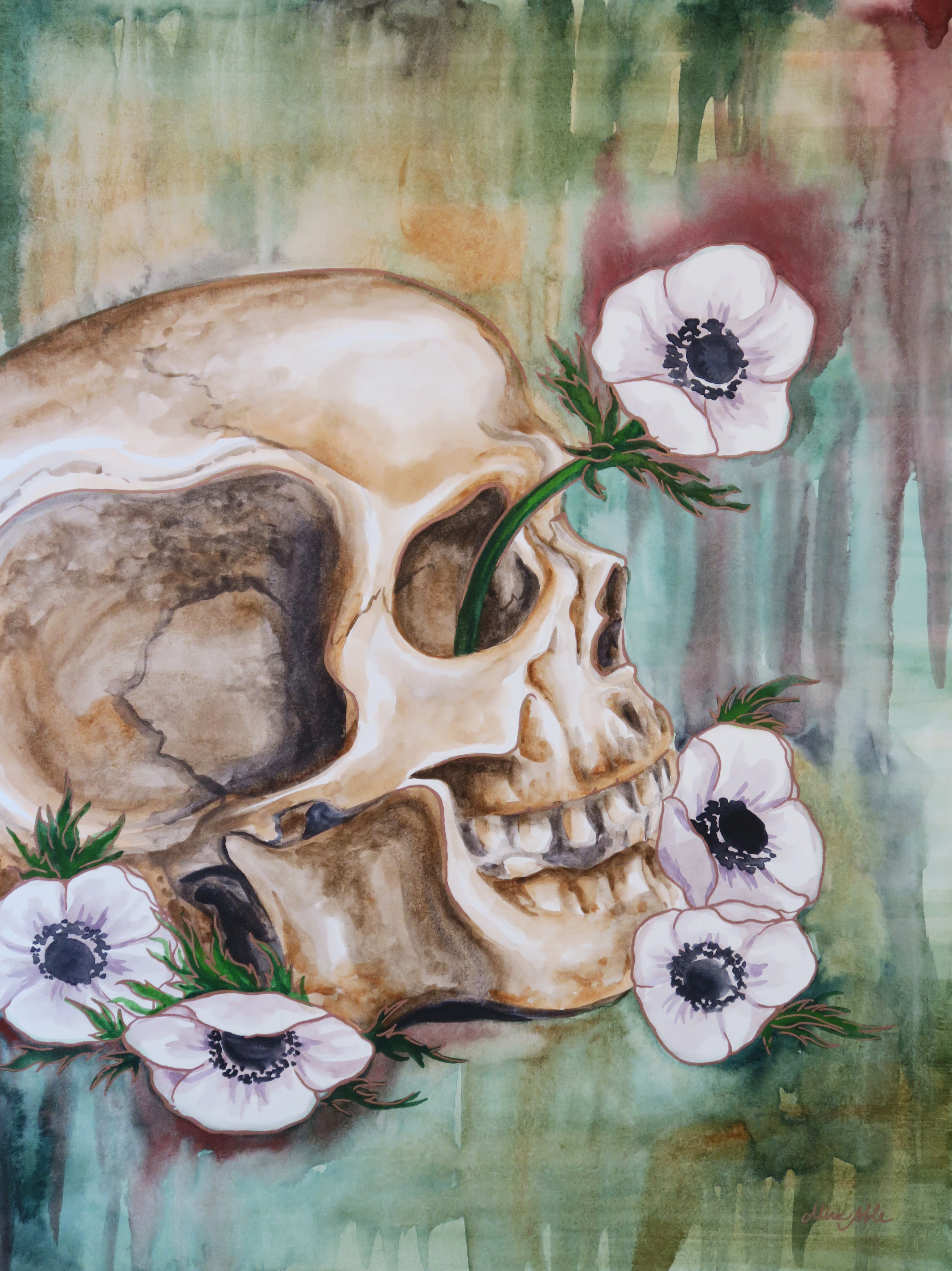
This first piece was a very fun commission where I was asked to do a surreal portrait in my signature mixed media, vintage inspired style but based on the song “Little Wing” by Jimi Hendrix. I was given some guidelines as to the type of figure portrayed and color scheme, but otherwise the project was completely open ended. And so, this piece was born, communicating a sense of love and positivity, openness, kindness and warmth, and creative spirit.

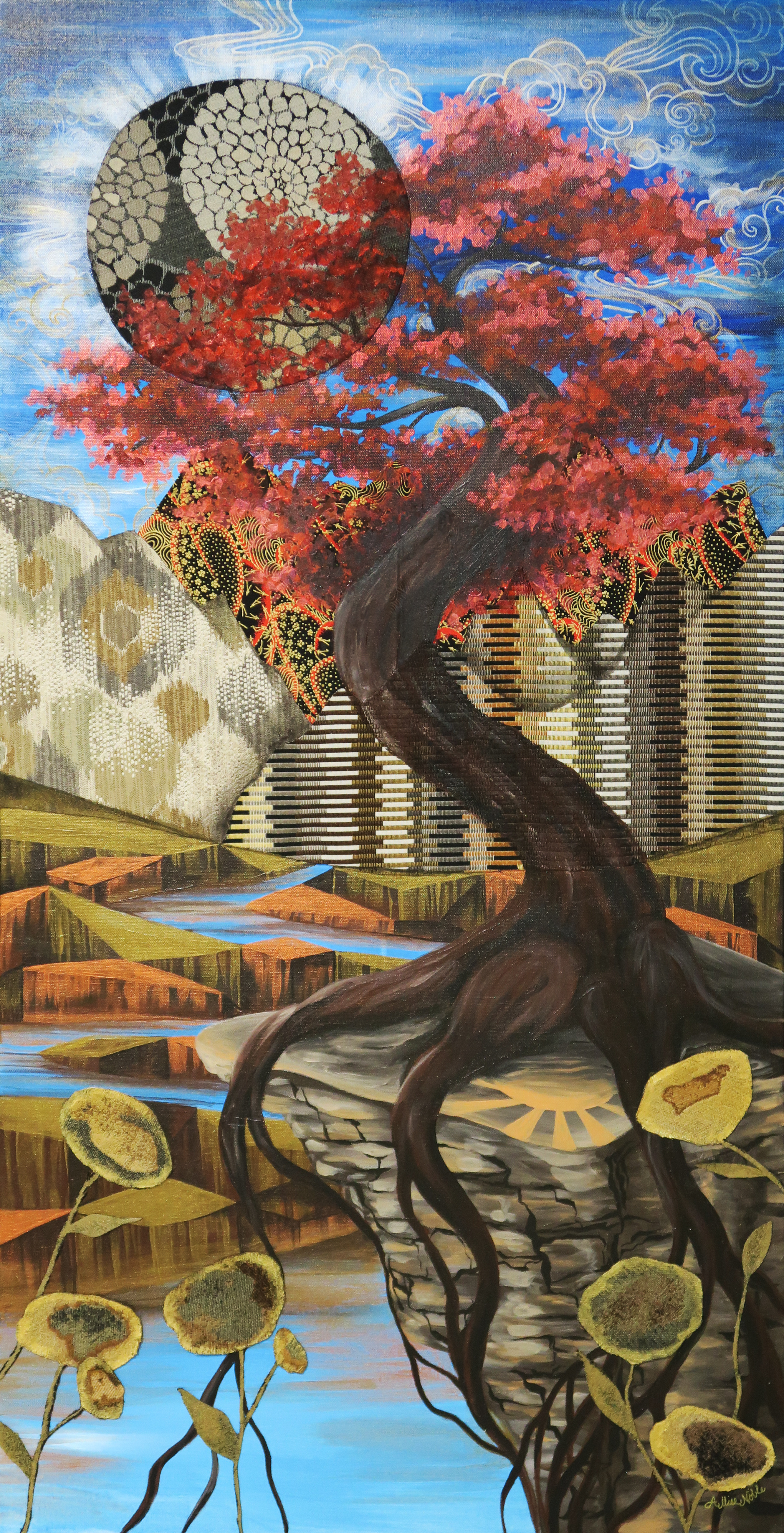
It felt really good during this time, which to be honest though less restrictive seemed to be a hell of a lot more frustrating than the first full quarantine, to continue the trend of just working on creating some beautiful, uplifting imagery. The piece below is my largest to date at 4 entire feet high! That may not seem like a big deal to some, but everyone who knows my work knows I work small, “big” for me usually being 18×24″. Also note, no people or animals in this piece! I have another large canvas still untouched, and to really step out of my box I think I should do something architectural next.
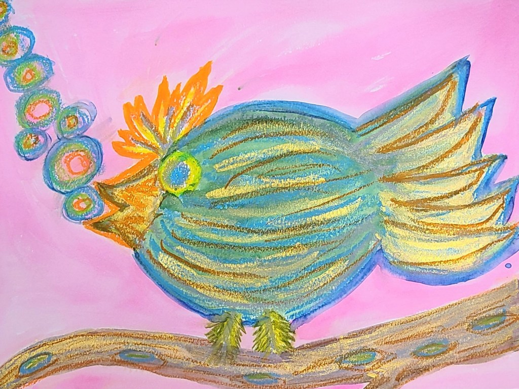
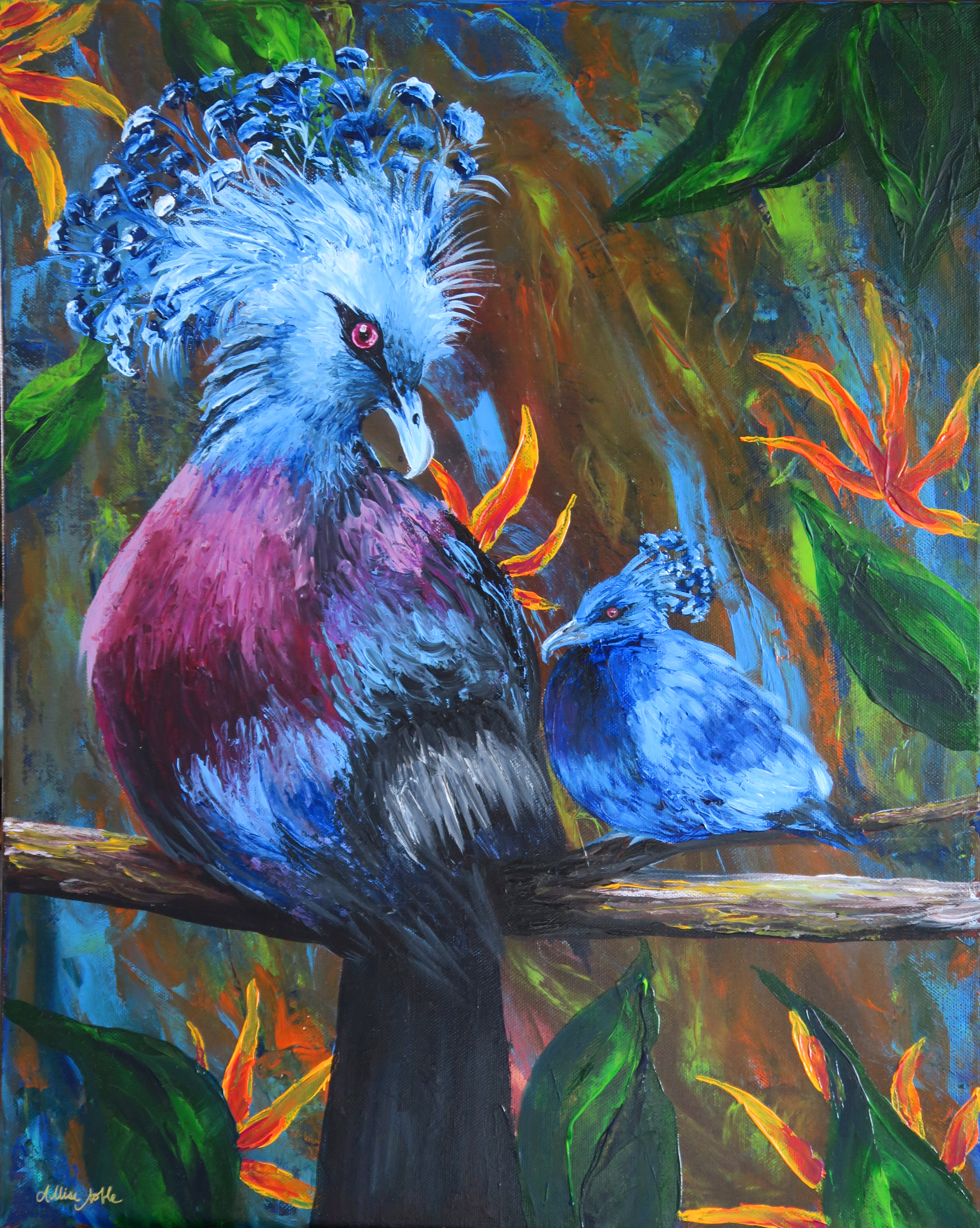
I also finished a full size bird palette knife painting, the rest of what I’d completed being minis. Yes, these are real birds! I’m always saving photos of exotic and interesting birds on Pinterest, and the colors and adorable yet zany plumage coming out of the top of these guys’ heads was irresistible. I found a couple of reference images, and decided I had to throw a baby in there too.
I don’t know about the rest of you, but my new year starts tomorrow. Wish me luck!
Happy 2021! Pantone COTY Inspo
Finding out Pantone’s Color Of The Year is always one of my favorite things about New Year’s Day (dork, I know). This year is a combination of 2 colors … Ultimate Gray and Illuminating. I’m not a big yellow person on its own, but love it paired with gray or black so I’m digging this theme (See my bathroom). To celebrate, I created a fun 9×12″ mixed media artwork using ink and water on watercolor paper, and some fabric scraps and old book pages for the background.
What’s interesting is I also started a new project late this year in collaboration with a supporter of the inclusive arts program I run, Express Yourself Artshop that ended up in this same color scheme. The project celebrates the independence and unique homes and lifestyles of adults with disabilities. My friend Ric LOVES yellow. More on this to come at a later date!

What do you think of this year’s colors? What kinds of videos would you like to see me share in 2021?
Hand Drawn Damask Print Demo
I am a big fan of damask print. I know the design had a big moment about half a decade ago, but I’ve always loved it, especially since under the pattern umbrella there is so much variety. I always thought a snake would lend itself well to the curving, scrolled shape of a damask print but could never quite find exactly what I was looking for. When you can’t find the print you want, it’s time to make your own!
I used metallic ink and prismacolor pencils on black pastel paper that has a visible cross hatched texture to the surface. Since this sort of print only has one element to it that is repeated in an offset pattern, this was a relatively simple one to try for someone who is newer to creating all-over print.


I’m thrilled with how my snake damask turned out, and can’t wait to order a skirt or shirt for myself. To see more of my designs, visit my Redbubble Shop. Redbubble’s products are all reasonably priced and excellent quality – these art-covered wares make perfect holiday gifts. If you enjoyed the video showing how I created my print, please give me a follow! I will be posting some fun palette knife painting tutorials in the coming weeks as the weather gets colder and we find ourselves needing more indoor forms of entertainment.
For all my American friends out there, enjoy your Thanskgiving week, and thanks for stopping by my creative little corner of the world :).

Creativity In Seclusion
This very odd year is getting nearer to a close. Everyone has been affected both personally and professionally in some way, and many of our ways of thinking about and performing even the most mundane daily tasks have been drastically altered.
Art comes from the psyche, and I know oftentimes I can look at a piece of art from my past and remember exactly what was going on at that time in my life. The colors, the style, the motifs all relate to what was reverberating inside my mind at that time even if it is not obvious to an outside viewer. This got me thinking, how has this year, and specifically quarantine, affected my art? I have had the most uninterrupted creation time at my disposal than I’ve had in years; life has taken a much slower pace. At the same time, there is the permeating sense of distance and anxiety that has overtaken all of life.


The art I completed over the first half of this year during quarantine deviated from the style I’d been focusing on over the last couple years. Now that I look at it all together, I can see the focus was more on developing techniques and creating something visually stimulating than my usual conceptual, symbolism heavy work. I credit both having more time to develop and hone different skills such as acrylic palette knife painting and realistic watercolor, and also the fact that with all the uncertainty and isolation; two things that I don’t always handle the best even in normal circumstances; I wasn’t doing art so much to communicate as for therapy for myself. I was painting whatever made me feel good in that moment.


I also did a lot more with animals and nature over quarantine, specifically my almost daily live ink wash animal demos. Nature was vital over this time as the only form of release and entertainment, and the appreciation I already had for the outdoors further deepened. I also had the opportunity to collaborate with my dad from afar as I used many of his wildlife photos as inspiration references for my ink washes.
The gallery where I work, Creative 360 in Midland, currently has an exhibit going titled “Art In Isolation” which can be visited in person or viewed virtually. I’d encourage you to visit the link and check it out!
What are some of the things that kept you going during quarantine this year?
