Artists To Know

My Top 10 Favorite Shops On Etsy

I love Etsy. Though I myself have found far more success selling my own art on ebay, I do a lot of buying from Etsy ;). Around the holidays and birthdays, I try to get a lot of my gifts from places like Etsy or Ten Thousand Villages, or any local handmade shops because handmade items are always going to be unique, made well, and your purchase will actually brighten someone’s day and be an encouragement to the actual artist behind the product. Without further ado, here are my personal 10 favorite Etsy shops.

Nuptse

il_570xn-699369956_2bpc

This shop features beautiful, detailed bead-work all handmade in Kathmandu, Nepal as a way for the women there to be able to support themselves and make an income. This handmade business has also recently made an alliance with Hoste Hainse, a non-profit thatĀ focuses on women empowerment and sound working conditions for women, as well as education and daycare for their children.

PixieColdArt

il_570xn-560066372_l9j3

This shop offers super affordable prints of gorgeous artwork in the artist’s bold, colorful, high contrast style. These often surreal female and animal portraits are captivating, and definitely represent my personal favorite style of art.

SparkleBeastDesign

il_570xn-588914090_kfz0

Can you tell I like bright colors yet? The jewelry found at Sparkle Beast is like an elementary school art room closet collided with anotherĀ closet full of “night at the opera” evening wear. I mean that in the best way possible. It’s like an upscale version of let’s-play-dress-up, and it is amazing.

nashpop

il_570xn-409615821_mvsm

Again with the bright colors, this shop takes old chipped, damaged, or otherwise hideous figures from secondhand stores and spray paints them in brilliant colors to turn them into fun, modern, pop art decorations. I am the proud owner of one of the most epic nativity scenes I’ve ever seen, shown above, and it is my favorite Christmas decoration I own.

CrimsonEtClover

bearearsDSCF4590

Crimson Et Clover is the wonderful inventor of the modern marvel called “bEARwarmers”, which I am rocking in the above picture. I’m a big fan of how they keep your head warm without messing up your hair. Also, the whole bear ears part.

MarisolSpoon

il_570xn-217266807

This artist’s paintings just make me happy when I look at them, simple as that. She incorporates a lot of nature and vintage-style imagery into her pieces, which are two things I cannot get enough of.

berkleyillustration

il_570xn-196303180

And the same to you, Sir Cheetah with an eye patch. Berkley illustration is one of the most fun shops around. Their personified animals aren’t just hilarious, butĀ so detailed, realistic, and well done. I own the above bottle opener myself, because who would pass up the opportunity to toast with a swift jungle cat?

ohgoshcindy

il_570xn-836697027_mgoq

This shops features spot-on watercolor illustrations of pop culture icons, coupled with their well-known quotes and catch phrases – a dream for any tv or movie lover.

CartBeforeTheHorse

il_570xn-933747095_ivez

This shop’s contemporary folk art has such a distinctive and unique style, I’d recognize it anywhere. I think it’s the faces that first drew me in. The designs are whimsical and fun without looking childish, and incorporateĀ a vintage touch.

JooSweetie

il_570xn-798162992_638p

joosweetienecklace

Look! She even has a hair bow. What could be better?


This shop stylesĀ lovely jewelry pieces around the artist’s adorable hand-painted faces.Ā I raved about her artistry in anĀ earlier post, and as of right now own one of her pieces (notice I said as of right now šŸ™‚ … more to come!).

There you have it. It was unbelievably hard to narrow my list down to just 10. If you want to see more of my favorites and collections, you can follow me on Etsy.Ā If any readers out there have Etsy shops of your own, feel free to leave a link in the comments and I will check it out! I am always looking for more shops to peruse.

Standard
Exhibitions and Other News

Exciting News From Midland Artists Guild Exhibition 2016

Time has been flying, and I can’t believe the Midland Artists Guild annual juried exhibition has already came and went as of last night.Ā There was such a diverse collection of amazing work. I think the shows get better every year, and if you are in the Midland area it is worth stopping by the Grace A Dow Memorial Library mezzanine to check it out. I was beyond excited to find out my piece “On My Mind” won one of the Merit Awards!

IMG_0440r

spaceedit3


This art nouveau inspired mixed media was so much fun to work on, and you can visit one of my previous posts to view theĀ Ā step by step processĀ .

My two other pieces that made it into the show were “Wonderland” and “January: She Is Far Away“.

All of these designs are available as art and ACEO prints in my ebay store, and prints on mugs, bags, pillows, notebooks, and all kinds of fun stuff in my redbubble shop. Next up, the Express Yourself ArtshopĀ fundraiser show and the Saginaw Township annual juried exhibition! Of course there will be many, many pictures :). Follow to stay in the loop!

Enjoy the rest of your weekend. I know I will be enjoying the rest of mine by drinking copious amounts of tea and not leaving the house.It may be Spring everywhere else, but not in Michigan! In fact, we’ve had four snow days in the last two weeks :P. So long for now!

Standard
Techniques and Tutorials

10 Ways to Make Your 2D Art More Interesting

I have always been a 2D based artist, not for lack of trying to branch out. I can make a 2-dimensional plane on paper look 3-dimensional, but when it comes to actually constructing a 3-dimensional object … my brain just does not work that way.

vernacularvillageroofI studied interior design in college, and I remember dreading the 3D model portion of each semester-long project. This is the one and only photograph I have of any of my models, and it is taken in aerial view because that was literally the only acceptable angle I could manage. At least this one wasn’t cut out of a Lucky CharmsĀ cereal box. Yes, I really turned in a model covered in pictures ofĀ colorful, Leprechaun themed marshmallows. Yes, it was sad. Now they have 3D printers for this crap.

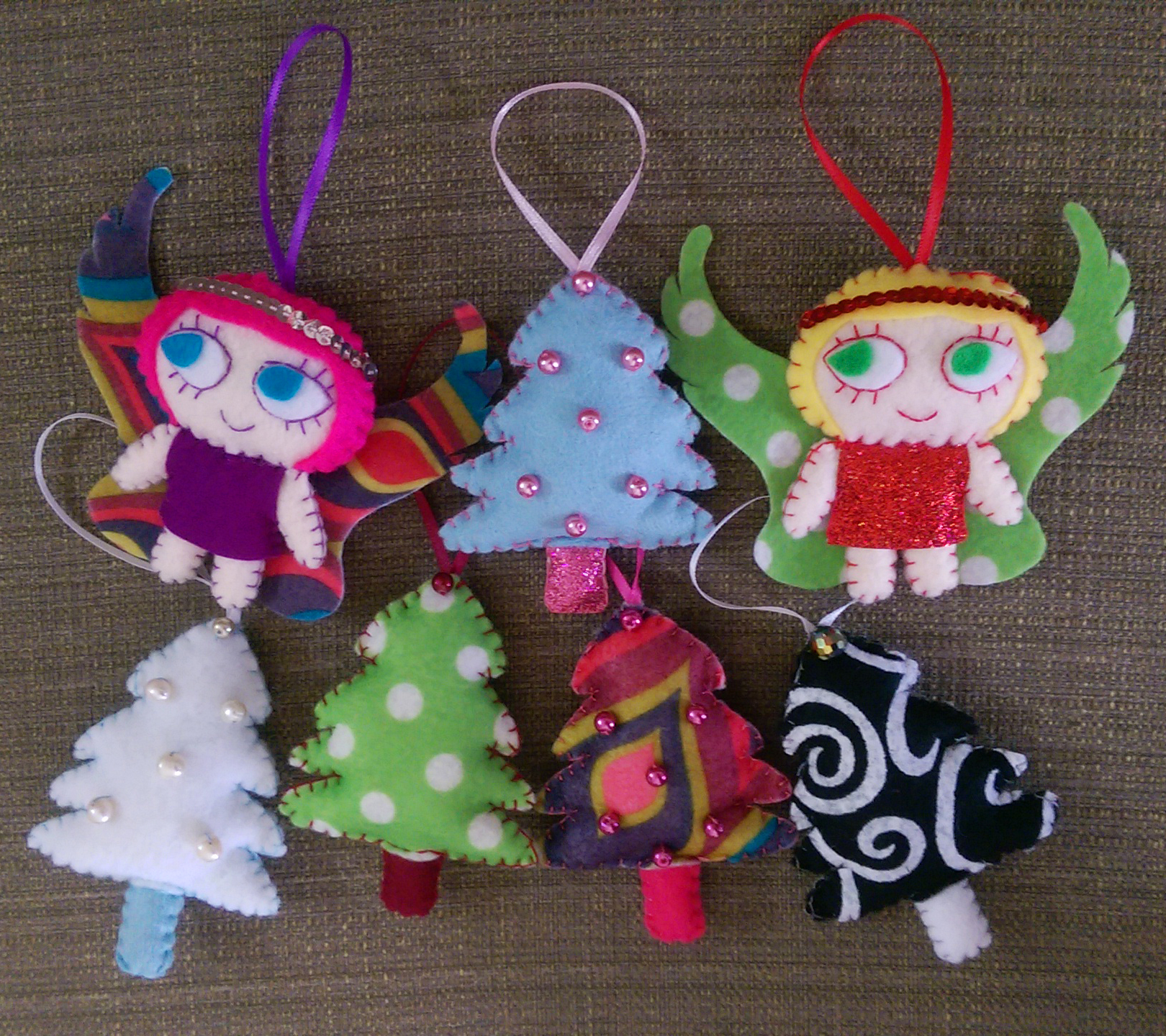
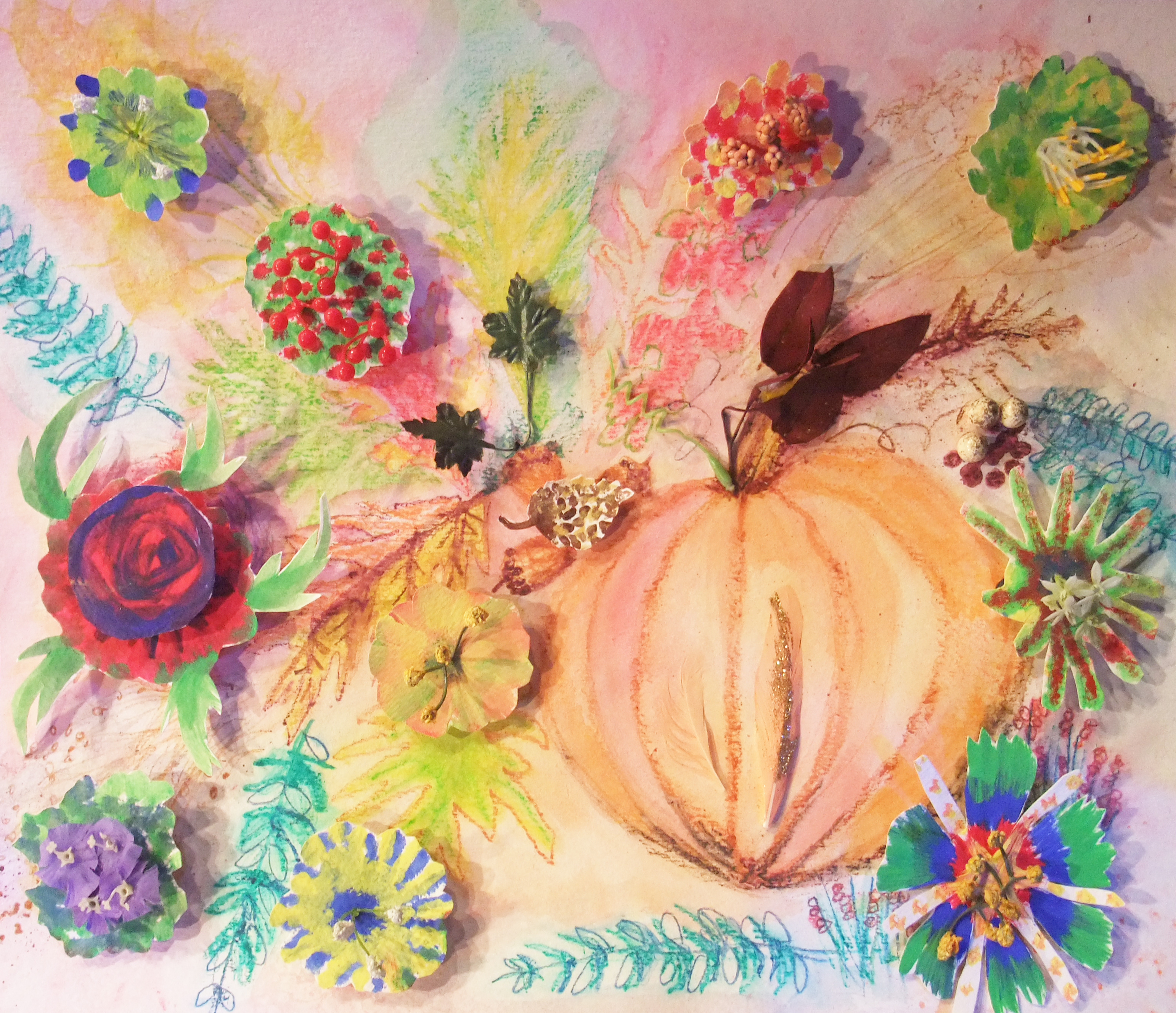
For other artists out there who only travel in the world of 2D, it can be easy to feel stuck in a rut materials-wise. After all, you can make sculptures out of anything.Ā 

0fb57244bef63cbbd90a127239d15868

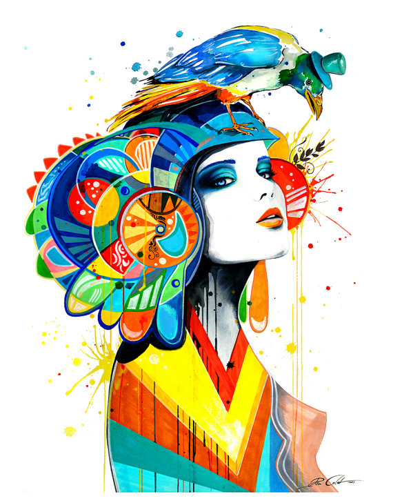
No, really, I mean ANYTHING …


If you think outside the box, “flat” art on paper or canvas doesn’t have to be limiting. Here are 10 ways I’ve found that can spice up your current drawings or paintings, no matter what style you enjoy working in.


1. Add Text
transformation

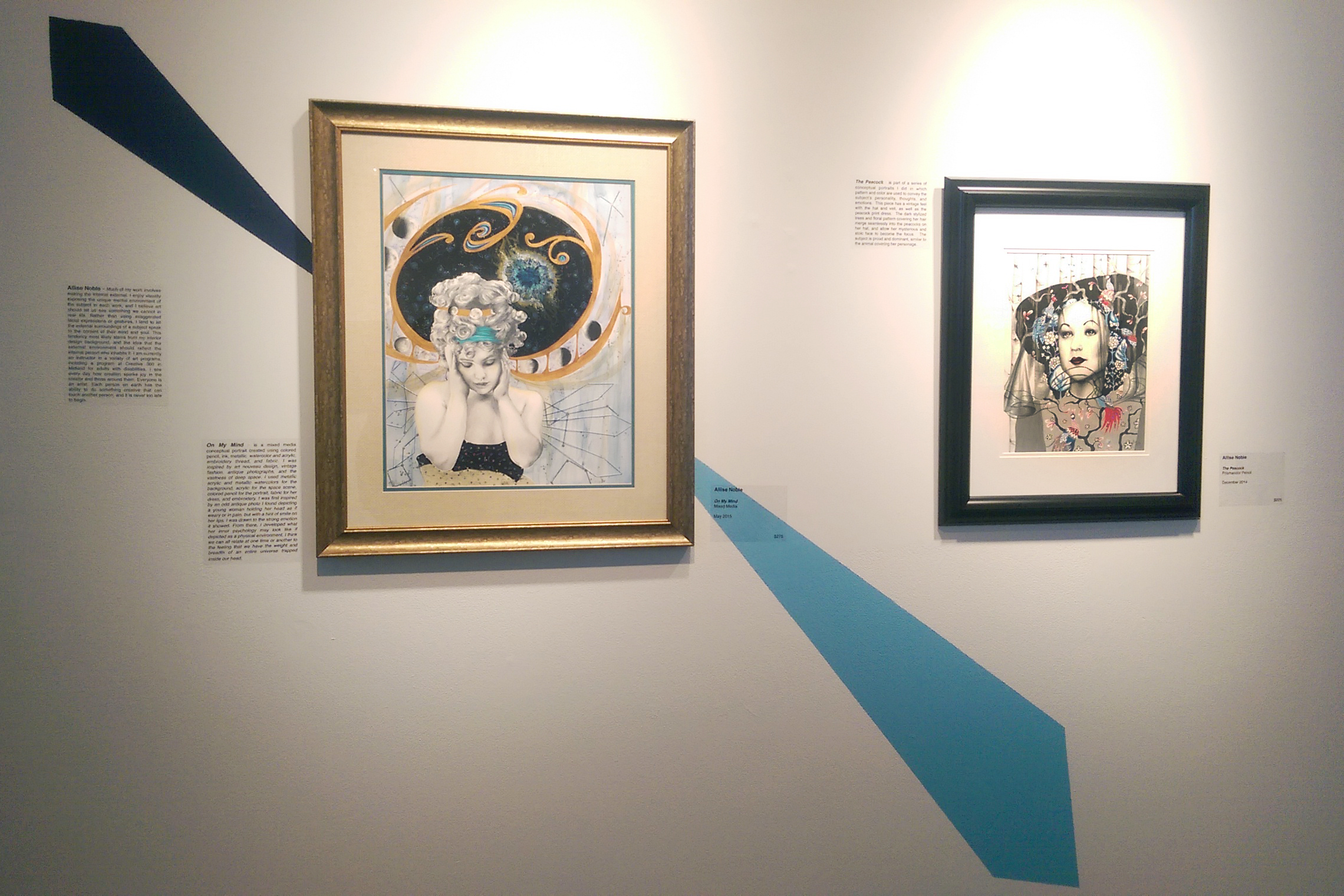
Transformation, 18×24 Mixed Media, Do-All of Bay City’s Annual Art Clash Award Winner

Adding pattern based text, small print from books, magazines, or the newspaper, automatically adds not physical but visual texture to a piece. It is a simple, intriguing way to add the appearance of greater detail to your piece, whether it is ripped and layered in the background or cut into shapes to fill in focal objects in the foreground.730a10c1435c579f6052846f164896a9

The meaning of the words don’t have to be important.Ā Or, you can choose theme appropriate text and emphasize certain words to add to your piece’s meaning. This is a popular technique borrowed from art journaling and found text poetry.


2. Include Texture
the dance

The Dance, Awarded Best 2D in Creative 360’s Piece By Piece Exhibition 2015; 18x 24 prismacolor pencil, ink, watercolor, fabric, book pages, embroidery thread

2D doesn’t have to mean completely smooth and flat. Oftentimes painters paint with a palette knife, slathering on thick layers of paint to create an uneven surface that raises and dips to create visual interest. Gesso can also be used to build up an uneven surface on canvas. Another option is applying mixed media elements to paper to create a textured surface. In the piece above, I crumpled white fabric and dipped it in glue, applying it to the surface for the ground. I crinkled and rolled strips of book pages for the raised texture in the tree trunks and branches.

3. Accent With Metallics
the peacock

The Peacock, Awarded Best 2DĀ in The Midland Artists Guild 2015 Juried Exhibition, 11×14 prismacolor pencil

Varying the surface sheen in a piece is a way to once again increase the visual interest, thus drawing viewer’s eyes and keeping their attention. Metallics are definitely something you want to use with restraint, but when not overdone they can really elevate a piece. It is harder to tell in a photo but in the drawing above, I used silver prismacolor for both the sleeves on her dress and the streaks in the pattern on the brim of her hat.

4. Include Pops of Color
hopeful

Hopeful, Award of Merit in The Midland Artists Guild 2015 Juried Exhibition. 11×14 Prismacolor PencilĀ 

Adding elements of color amongst an image of mostly black and white is a technique inspired byĀ photo-manipulation. Photographers have been tinting black and white photos since long before Photoshop was ever conceived.

902fa847868c397eded214cf4c8fee5f

Our eyes are naturally drawn to contrast, and including a bright color or two within a sea of black and white provides a “surprise” for the viewer.

5. DrawĀ Viewers To The Eyes

I may be a bit biased because eyes are my favorite part of the face to draw or paint, but then there is that famous saying, “eyes are the windows to the soul”. There are quite a few articles floating around online about a scientific study that found that staring into someone’s eyes for 10 minutes straight can even cause hallucinations. All this suggests that eyes themselves are something of an intense element. Whether depicting people or animals, using visual elements in your piece that guide the viewer’s eye to meet the eyes of your subject is sure to keep viewers locked on your piece longer, and to create a more dynamic composition.

6. Don’t Ignore The Background.

I used to be guilty of being a huge background-ignorer. Now, you don’t want a fully fleshed out, detailed, photo-realistic background all the time, and in some pieces there is a lot to be said for white space. But, there is a difference between a background looking purposefully understated to emphasize the main focus and a background looking incomplete, like the artist just ran out of ideas and didn’t want to bother. There are two pieces shown above, one from 5 years ago on the left and one from 2 years ago on the right. Notice the difference something as simple as some softly outlined trees makes. The background is still mostly white, but it looks complete.

7. Collaborate With Other Artists

This is a hard one for me, because I honestly hate collaborating. I’m the kid in school who dreaded partner assignments. I always wanted to work on projects alone, even if it meant I had to do triple the work. I have a hard time letting go of control and not getting to make all the creative decisions myself. However, you learn so much from working with other artists, especially if their style is the complete opposite of yours as was the case in the two collaborations above. Do I necessarily like the collaborative pieces above better than the work I traditionally do on my own? To be honest, nope, but that’s not the point. I practiced techniques and styles I never would have attempted otherwise, which has given me ideas in other pieces I’ve done on my own.

8. Carry AroundĀ A Sketch Journal
devotional gag reflex

Devotional Gag Reflex, 2011, Ink

Not only is keeping a sketch journal super stress relieving (the above was me relieving some of my fun relational stress by comically depicting how I felt in the moment), but it provides an arsenal of recorded ideas and references to use and combine in future pieces. Life is busy, and I strongly believe we forget most of our best ideas because they happen spontaneouslyĀ when we are in the middle of doing something, and we think oh I’ll remember it later and of course that never happens. Making yourself carve out a specific time to sit down and sketch may be good practice, but it isn’t when you’ll get your best ideas.

9. Draw From A Collage
collagepen_0001

Oceans Away, 9×12 Ink

One of my assignments in Drawing 101 way back in freshman year of college was to create a collage, and then drawĀ straight from it. This technique is a great way to organize the elements in a piece, and visually construct your conceptual vision. You end up with juxtapositions of disparate elements that you may never have placed together otherwise.

10. Be Purposefully Imperfect
wonderlandlt

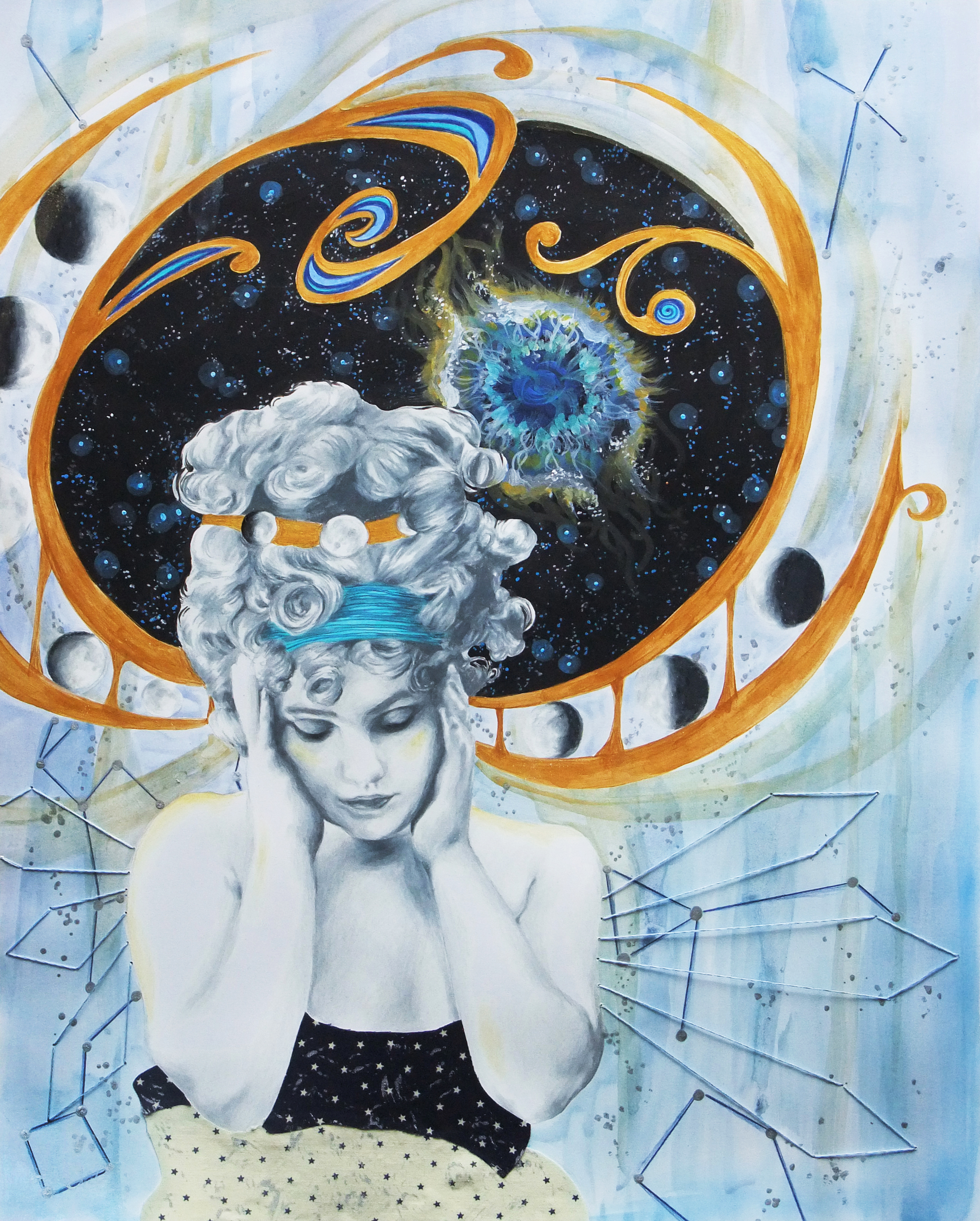
Wonderland, 18×24 Mixed Media

This comes back to one of those things I learned through reluctant artist collaboration. I am a clean edged, smooth linesĀ kind of person and I always used to look at smudges and drips as mistakes, not a tool an artist could use on purpose. Now, I am in love with it and every piece I create that includes watercolor has dripping or bleeding somewhere in it. For the longest time throughout art history, the purpose of creating a drawing or painting was to fool the eye into thinking what it was looking at was real, especially before photographs. The informality of declaring to the world, “Look! This is made out of paint, see the brushstrokes, see the dripping?” shakes up a piece, and the viewer’s expectation. In this particular piece above, the surrounding world was supposed to look as it would through the eyes of the subject, a child. The sketchy, imperfect outline of the colorful buildings behind help emphasize that.

Step out of that artistic rut and try something new. Other 2D artists out there, what do you do to add interest to your own work? What draws you to a piece when looking at a 2D work?

Standard
Exhibitions and Other News

Short, Sweet, and Full Of Eye Candy

I’ve been working on and off on the next piece in my new series, and wanted to give you an early sneak peek. There really is something to coloring in repetitive geometric shapes, because it was so incrediblyĀ therapeutic to begin coloring in the hexagonal pattern filling in the figure’s hair. Adult coloring books are becoming overwhelmingly popular for a reason!

12487087_10103668010030508_7892797755273639329_o

I also have posted my first piece completed in this series for sale in print form on my redbubble and ebay shops.

One lastĀ exciting tidbit this week, I sold this fun, textured octopus mixed media on canvas in myĀ ebay shop! He has been packaged with love and sent off to Ohio. Prints always sell with far more regularity than originals do, so when an original does get snatched up it is always thrilling. I plan to make more of these mixed media pieces featuring other animals as well in the future (So far, I’m 2 for 2 with the octopi. They are one of my favorite animals, I can’t help it!) To learn about my mixed media process for creating texture, check out my previous blog entry where I explain my work step by step.

I told you it was going to be short and sweet! It has been a busy couple of weeks, but I have continuedĀ to find time here and there to work on my new piece – my sanity may or may not depend on it ;).


Standard
New Work

New Work : January

Happy 2016 Everyone!

Since I took a year off after showing at Art Prize in 2014, I have been trying to come up with another big idea to enter in 2016. For Art Prize, you kind of have to go big or your art will get lost among the crowd. The problem is, I hate working large. I’ve tried, but it’s just not as fun for me. I like the intimacy of smaller pieces that you really have to step right up to to acknowledge all the finer details. I also can’t imagine limiting myself to just one subject or image. With art, I tend to zoom around from one idea to another like a little bee who has accidentally found its way into someone’s cup of espresso. Because of this, I knew I wanted to do another series of smaller pieces hung together for impact. Another thing I have to be careful of, as with any artist, is falling prey to the “Master of None” syndrome. Master of None :Ā Great television show, deathĀ when used to describe an artist’s body of work. After kicking around (and half starting) a variety of different ideas, I decided to stick to the conceptual portraitsĀ I have been developing over the last two years rather than trying a style that I like, but haven’t spent much time with. I will be doing a series of 12Ā mixed media, surreal, conceptual portraits in whichĀ the meaning is influenced by the use of pattern and color. They will depict women of all ages, races, and time periods, and each will communicate a different theme. I aim for the pieces toĀ speak to women’s collective experiences beyond their differences.

12331546_542941222549004_280564004_n

A new piece will be released each month, with an accompanying title, “She Is ________________”.

januaryr

January – She IsĀ Far Away

As with much of my other portrait work, I find my inspiration in nameless antique photographs. The simple, faded photos tell me a story, which I then bring to life in my mixed media drawings. I was drawn to a photo of a young girl, her hair piled and molded into an elaborate, fashionable sculpture, draped in a fine, silkenĀ dress an adult would surely appreciate, but that did not look like it was very conducive to play.Ā Her eyes had a far off look toĀ them. Her expression wasĀ a mixture of bored and melancholy, but to me it even looked like she was trying to hide these negative emotions to remain neutral and pleasant for the camera.

In “January”, her travelingĀ thoughts are personified as children’s drawings on a crumpled piece of notebook paper, flowing from her mind. Though she has been made up to look like a miniature adult, the very model of sophisticated fashion, her imagination dreams the dreams of children: dinosaurs, astronauts, rocket ships, and animal creatures of the air and sea. These thoughts areĀ purposefully camouflaged into the rest of the image, the colors so paled and harmonious the viewer almost doesn’t notice. What does stand out is the heavy grid work of the window behind and the bold, contrasting pattern of the adjacent curtains. She is closed in, separated from the free,Ā bright winter landscape outdoors, hidden behind frosted windowpanes.

How often are children treated like dolls, especially young girls?Ā I mean last week, I was at the mall and I saw sparkly high heels for babies. You heard that right, high heels for beings that haven’t even entirely learned how to walk yet. Let me know how that works out.Ā The words we use to describe them are even descriptors we would use for dolls : pretty, cute, adorable, beautiful … Now, there is nothing wrong with compliments, nothing wrong with telling someone they look nice. However, as parent Sharon Holbrook states in her Ā Washington Post article Little Girls Don’t Need To Be Told They’re Beautiful, “The more I talk about beauty and looks, even in a positive way, the more I’m conveying the importance of those things.” Disproportionately young girls are complimented for their looks, while young boys are complimented for their performance. The thing is, looks change, and by emphasizing “prettiness” over all other traits, girls can be set up for poor confidence in the future.Ā When girls feel that their value lies in how they look, it limits their perception of their own potential, and they will even start to limit the activities they engage in for fear that they will look “bad” or “ugly” while trying a new activity. I am a big fan of Amy Poehler’s Smart Girls, and think it is just about one of the coolest organizations out there right now. This concept is behind Smart Girls’ Get Your Hair Wet campaign, encouraging young girls to live life the fullest, be open to trying new things, andĀ focus on the experience itself rather than worrying about how you look while doing it. I remember being a kid, and seeing some of my female classmates refuse to get into the pool in swim class because they “don’t look cute with wet hair”, or not wanting to play tag at recess on a hot day because they might get sweaty and “look ugly”. Do you think any 9 year old boys were out there worrying about being sweaty???

All in all, it all comes down to a vocabulary adjustment, and complimenting girls on things that they actually have control over, rather than things gifted to them in the great lottery of nature. It comes down to being mindful,Ā complimenting a young girl (or adult woman for that matter) on the creative way she put together the awesome outfit she is wearing, or the great smile she has when she gets excited about something. It also comes down to treating kids like kids; holding them back from trying to grow upĀ too fast, letting them get messy, letting them wearĀ things that might look insanelyĀ goofy, and allowing them to hold onto that complete lack of self-consciousness that comes with being a kid for as long as humanly possible.


Standard
Artists To Know, Uncategorized

Artists To Know! Installment 7 : Seeing The Unseen

I have always been the type of artist and art appreciator who tires of complete realism. I abhorred the same old make-it-look-like-the-photo landscape assignments in school growing up. I liked portraiture a bit better, but only if IĀ made it my own, whether desired in the class assignment or not.

adrian brody goes punk

Circa 2005 – Oh noes! The punk’s left eyeball has cracked and now little rainbow glass shards are floating out into the universe towards the viewers eyeballs, surely meaning to skewer them!

I always believed art should only show us what we cannot see in reality, or else what was the point? However, how much of reality do we really see, and how much simply slips from our view unnoticed? Human perception is a funny thing. You could have two people walk down the same stretch of sidewalk in a park, and if in the end you asked them to describe the scene they just participated in, I am 99.9% certain that they would each describe it completely differently. We notice what draws us, and ignore what repels us. That idea is the basis of the following artists’ work, work that shows us the marginalized and disenfranchised; the very people who often slip to the periphery of our awareness either consciously or unconsciously.Ā Viewing these works, we are shown a reality that seems like a completely different world.

Aaron Draper

homeless2

For his “Underexposed” series, Aaron Draper captures lit photos of the homeless, aiming to portray them in the most pleasant, visually appealing way possible. Draper sites author John Steinbeck as an inspiration, and admires how he used his craft to highlight the plight of the poor, and expose social issues and inequities. Ā With this series, Draper is using lighting to draw viewers towards the person shown, causing the subject to be viewed with humanity and compassion. Draper says, “When it comes to social activism, you achieve greater public awareness by communicating hope as opposed to hopelessnessā€.

Diane Arbus

diane

Famed photographer Diane Arbus takes almost the complete oppositeĀ approach toĀ the previous artist. The black and white photographs of her subjects seem to be developed in such a way as to accentuate each imperfection, every wrinkle, blemish, and flaw. Her work turns its lens on society’s outsiders : those with physical abnormalities, nudists, transgender individuals, those with extreme tattooing or body modification, and rarities such as twins. Unlike Draper’s work, there is a darkness to it and a definite surreal quality (One of her photographs of twins actually inspired Stanley Kubrick’s iconic “The Shining twins”.). Ā She is certainly a disputed artist. Some argue she was voyeuristic and exploitativeĀ , her photos no better than the circus “freak shows” that thankfully no longer exist in this day and age. Her motives and connection to her subjects have beenĀ called into question since her photographs were not necessarily being used to communicate a social purpose or to inspire a change in the treatment of the individuals, but more for striking visual interest. Additionally, her series in which she photographed individuals living in group homes for those with mental challenges, of which the above is a part, brings up a consent issue. Since the photographs were taken between 1969 and 1971, a time when individuals at such institutions were given little to no rights, the permission to photograph the residents was not given by the individuals themselves but the institution. Such a projectĀ would not be allowed publication by today’s standards. Others argue she is possiblyĀ oneĀ ofĀ the most misunderstood artists of the 20th century. Consent between photographer and subject is important, and I cannot speak to the validity of the permission she received. However, to me, Arbus wasn’t looking at her subjects with revulsion and disgust. They don’t appear isolated or lonely but confident, happy and uninhibited. They are comfortable in their own skin and are completely unaware ofĀ how they appear to others. Arbus had a great respect for her unusual subjects she sought out, saying “Most people go through life dreading they’ll have a traumatic experience. Freaks were born with their trauma. They’ve already passed their test in life. They’re aristocrats.” (though I do flinch at the way she throws around the “f-word”.) If anything, it was the so called “normal people” Arbus portrayed as lonely and disconnected and silly.

dianearbus

Asa Johannessen

looking_out_looking20in_4

The subjects of Johannessen’s “Looking Out, Looking In” series are individuals who don’t identify with any gender, male or female. An article in Independent about her show describes the portraits as “challengingĀ the onlooker defiantly to try and categorize them”. All photographs are untitled, the subjects unnamed. The goal is to draw the viewers in to whom each individual is as a person, rather than the viewers obsessing over the single facet of “Are they male or female?” This is an interesting concept to me as someone who has always felt gender is about the last thing IĀ notice about someone. This has led to some interesting social kerfuffles in the form of myself ending up on dates I never knew I was on. I pretty much am this comic below anyway, only with brown hair and zero barista skills.

12189140_1042431189142860_184550205222405098_n

All that aside, the point is once again using art to bring humanity to those who are often misunderstood or ignored.Ā Everyone struggles with identity crises from time to time, but most of us can’t even imagine feeling that such a basic component of our personhood is alien to us. Many of us can’t imagine the feelings of confusion, isolation, and despair such a conflictĀ would bring. Individuals like the ones in Johannesson’s photographs often get treated like unicorns, an interesting idea, but they don’t really exist. This series confronts those misconceptions head on. No matter what we each individually believe, empathy and above all love is possible, and I daresay required.

Debbie Rasiel

dsc67311

The goal of photographer Debbie Rasiel’s “Picturing Autism” series is to explore what autism looks like across language and cultural barriers. The series spans New York, Mexico, Peru, Indonesia and Iceland.”I wanted to offer those not familiar with autism an opportunity to see what autism looks like, a safe space where social mores would not prevent them from staring,” Rasiel stated in an article forĀ The Huffington Post. Again, art has urged people to lock eyes with and confront images of individuals from whom they normally may avert their gaze due to unfamiliarity or uncertainty.

Art not only has the ability to show us things we can’t see in real life, but it has the ability to force us to see the unseen, and that is a wonderful and magical thing.


Standard
Exhibitions and Other News

Womens Perspective At Studio 23

Thursday night was the opening for the show I was included in at Studio 23, their yearly “Women’s Perspective” exhibition. It was a great night, and I even successfully mingled and talked about my work with a gaggle of guests without my face turning green or passing out – yay! My boyfriend, who accompanied me, was literally poking me in the back with his finger saying “Get up there, go stand over by your work and talk to people!” After much hissing back and forth, I cautiously made my way over and ended up having a fantastic time once I got into the swing of talking to a ton of random people I had never met all at once. It’s funny because being an instructor, I talk all day, but it’s all very planned and orderly and I know what I need to say. It’s the spontaneous small talk I fear, but I’ve found that despite the gigantic nerves, once I get going it’s easy to talk about my work with others and answer questions because honestly what on this earth can I possibly know more about, or love sharing with people more? I think most creatives be they artists, writers, musicians, tow a line between crippling self consciousness and an almost nauseating level of confidence ;).

Ready to go! I'd been dying for an outfit to wear that Betsey Johnson purse with - half off baby! (Which is literally the only way I'd ever bother with a designer purse) The retro barbie look got me.

Ready to go! I’d been dying for an outfit to wear that Betsey Johnson purse with – half off baby! (Which is the only way I’d ever bother with a designer purse – The retro barbie look got me.)

It's the little things ... I was over the moon excited when I saw the cool graphic detail they added to my display wall - just amazing, thanks Studio 23!

It’s the little things … I was over the moon excited when I saw the cool graphic detail they added to my display wall – just amazing, thanks Studio 23!

Standing like a proud parent next to my creations :).

Standing like a proud parent next to my creations :).

They included information about myself and my two pieces next to the work, which I’ve included below for some additional insight:

Much of my work involves making the internal external. I enjoy visually exposing the unique mental environment of the subject in each work, and I believe art should let us see something we cannot in real life. Rather than using exaggerated facial expressions or gestures, I tend to let the external surroundings of a subject speak to the content of their mind and soul. This tendency most likely stems from my interior design background, and the idea that the external environment should reflect the internal person who inhabits it. I am currently an instructor in a variety of art programs, including a program at Creative 360 in Midland for adults with disabilities. I see every day how creation sparks joy in the creator and those around them. Everyone is an artist. Each person on earth has the ability to do something creative that can touch another person, and it is never too late to begin.

The Peacock

The Peacock

On My Mind

On My Mind

ā€œThe Peacockā€ is part of a series of conceptual portraits I did in which pattern and color are used to convey the subject’s personality, thoughts and emotions. This piece has a vintage feel with the hat and veil and peacock print dress. The dark stylized trees and floral pattern covering her hair merge seamlessly into the peacocks on her hat, and allow her mysterious and stoic face to become the focus. The subject is proud and dominant, similar to the animal covering her personage.

ā€œOn My Mindā€ is a mixed media conceptual portrait created using colored pencil, ink, metallic watercolor and acrylic, embroidery thread, and fabric. I was inspired by art nouveau design, vintage fashion, antique photographs, and the vastness of deep space. I used metallic acrylic and metallic watercolors for the background, acrylic for the space scene, colored pencil for the portrait, fabric for her dress, and embroidery. I was first inspired by an odd antique photo I found depicting a young woman holding her head as if weary or in pain, but with a hint of smile on her lips. I was drawn to the strong emotion it showed. From there, I developed what her inner psychology may look like if depicted as a physical environment. I think we can all relate at one time or another to the feeling that we have the weight and breadth of an entire universe trapped inside our head.

If you are in the area around Bay City Michigan, I’d love it if you’d check out the show! It’s running through October 23. If the travel is not feasible, at the very least you got your own (VERY)miniature “virtual tour” here. But truly, there is much more fascinating work besides just my own that I have shared, if you can it is worth a visit.

Standard
Exhibitions and Other News

Coffee Is Love.

em6em5em4em3em2em1

So, I put an exhibit up in Espresso Milano for Midland Artists Guild last week. This was an especially fun venue exhibit for me because I pretty much lived here when I was in high school. For those of you unfamiliar with Midland, Michigan, it’s a nice town for sure but, well … there’s not a whole lot for young people to do! Hang out with friends on Saturdays drinking coffee all day, especially frappes in the summer? Not complaining too much. It was always either that, or spend the day at the mall reading comics and music magazines in Barnes and Noble, until they started shrink-wrapping the darn things so you actually had to pay for them to read :P.

Snooty face 2007.

Blast from the past : Snooty Face 2007.

My P.I.C., Erin - best friends since we were 2 and actually just had a craft day together last week!

My P.I.C. that day, Erin – best friends since we were 2, and still going strong. We actually just had a craft day together last week!

Speaking of coffee being just the best…

(a topic of conversation that I daresay never gets old, nor loses its truth), I have some really cool illustrated mugs for sale in my ebay store right now! On discount, too … sweet right? They are dishwasher safe, top rack, and really heavy and durable. I am an accidental collector of unique mugs, and can’t seem to ever stop buying drink-ware in general, so these made me super happy.

Designs available are Retro Flowers, Queenie, I'd Have Been Happier As A Bird, and Whimsical Peacock.

Designs available are Retro Flowers, Queenie, I’d Have Been Happier As A Bird, and Whimsical Peacock.

Other things I’ve been working on over this Labor Day weekend are, shockingly, Christmas plushies! I sell some of my fun creations at Imagine That!, also located in downtown Midland, and I need to have my holiday wares ready by mid-October. It’s weird to be thinking so far ahead already, but I can’t say I haven’t enjoyed getting in the holiday spirit a bit early :).

Whimsical trees and some pretty rad angels with halos made of strung sequins <3

Whimsical trees and some pretty rad angels with halos made of strung sequins ā¤

Midlanders (or Saginaw/Bay City dwellers nearby such as myself), if you happen to be downtown within the next 2 months don’t forget to check out the exhibit. And for those of you in the states, I hope you enjoy your Labor Day weekend as well!

Standard
New Work

This Is Why You Should Keep Old Work Forever.

The Beauty Of It All

The Beauty Of It All, 11×14 prismacolor pencil and watercolor

For about 2 years, I had an 11×14 piece of bristol board with this woman’s face covered in flowers on it, and a metallic silver world map view behind her. She was surrounded by nothing else but white space. I was convinced it looked absolutely horrible, and I had no idea what to do with the rest of the background. I chocked it up to a loss and tossed the drawing in my storage portfolio case. A couple times I ran out of paper and thought about just using the back of it when I had a new idea and didn’t want to delay inspiration with a drive to Michaels for more bristol board. Other times I almost chopped it up into pieces for scrap paper to sketch ideas onto. I thought of posting it on my artist facebook page as a giveaway for whoever wanted it, and letting them color all over it like crazy to see what happened; an impromptu collaboration over vast distances.

Luckily, I never did any of these things. I’ve been doing a lot with watercolor lately, and was wishing I had one more piece to hang in my upcoming exhibit. I didn’t have the time to start anything else from scratch, but when I found this I decided to play around with the background and see what happened. I spontaneously dripped blues and greens and metallic silvers over the entire background, throwing the paper this way and that to guide the drips. Once I stopped over-analyzing and worrying over how terrible I thought my piece looked and just started enjoying the process again, everything came together. Sometimes even something as subtle as a bold color splashed into the backdrop can turn an entire piece around. Mine went from a drawing of a girl who looked like she had a strange, alien, flower-shaped skin disease to a pretty nice finished piece.

This is why I cannot emphasize enough, don’t toss out old, unfinished work! Paper is flat, it keeps pretty easily. I’ve my seen students do some really cool things with incomplete projects they could have tossed away. In this piece below, a student cut out elements she liked from a “practice” acrylic painting from the semester before that didn’t really turn out. These made for some great smaller blooms popping out around the central focus of the pumpkin. Even if you don’t end up turning the leftover physical piece into anything, something half-finished could at the very least provide an idea or concept for a project you do later.

And again, I have the best students ever. Unique floral mixed media for autumn.

Nancy’s autumnal mixed media, salvaging cutouts from an old acrylic practice lesson the semester before.

I’m actually constantly revisiting old work, even from as far back as high school. Most of that is also unfinished because I, like any teen, had a real short attention span. This painting, which my mom fell in love with and now has hanging over the sofa in my parents’ living room, was created from scratch in 2012. But, it was based on an old colored pencil drawing from 2005 that I never finished shading in. The particular sketchbook the original drawing was in is still in the closet of my old bedroom in my parents’ house or I would post it here, but it was a color scheme of entirely red and black and the parasol people were dressed in old-timey but super goth attire, and the faces on the parasols looked like they could all be members of a My Chemical Romance copycat band. Trust me, it was something else. Behold, the reboot.

"Wait Out The Storm", 18x24 Watercolor and Ink

“Wait Out The Storm”, 18×24 Watercolor and Ink

Now that I’ve turned you all into hoarders, I have one more all-together new piece I’d like to share. I have always been deeply interested in the steampunk aesthetic, but never created any steampunk-esque art myself. This is my first, and I’m pretty excited about how it turned out.

"Dreams Of Gold", 11x14 Prismacolor Pencil and Chalk

“Dreams Of Gold”, 11×14 Prismacolor Pencil and Chalk

The deep gold is metallic, though you can’t tell in the digital image. I was heavily inspired by the Victorian aspect of Steampunk, even turning the classic Victorian lace pattern into something metallic and industrial. I am finally going to be hanging all of these pieces up tomorrow in Espresso Milano, and will be sure to take pictures. Have any cool steampunk art you yourself have created or that you’ve seen by other artists? Throw me a link! I am a long time appreciator, but creation-wise, a novice. As I’ve promised, photos soon!

Standard
Exhibitions and Other News

Back to Real Life, But Excited For What’s To Come.

I just got back from one of the most fun trips yet to the charming and exciting land of Ludington, MI; hiking, swimming, sketching on the beach … my boyfriend and I were determined to jam in everything that epitomizes summer before it’s too late! I vowed to not check my email to make it a true reprieve, but I did peek just once in the car on the way there, and I’m glad I did because I got some awesome news. Two of my pieces were accepted into Studio 23 in Bay City’s Women’s Perspective show for September! If you’ve read my earlier post, ladies sometimes get forgotten in the gallery scene even today, so I am excited and honored to be a part of what I’m sure is going to be a wonderful show. Below are the two works that will be showing. If you’d like to learn more about the process of creating “On My Mind”, you can visit my earlier entry focusing on this piece.

On My Mind

On My Mind

The Peacock

The Peacock

Another fun surprise was the new murals up in Ludington to take touristy photos in front of! Art truly is everywhere, and it is wonderful. Murals aside, not to be cheesy, but one can’t look at the serene layers of bright blue water, warm yellow-beige sand, and bold green foliage and not see the very world we live in as one of the largest, most complex creations to ever exist, and truly the largest, most interactive art project.

Me posing oh-so-cool in front of my favorite mural of the bunch.

Me posing oh-so-cool in front of my favorite mural of the bunch.

Behold!

Behold, bright colors! Yes, that is Spider-man on my t-shirt.

I just ate it after a wave literally knocked me on my butt while I was wading out. There were weather warnings out all day, which of course means perfect day to go swimming! Thrill seeker 4 life.

I just ate it after a huge wave literally knocked me on my butt while I was wading out. There were weather warnings out all day, which of course means perfect time to go swimming! Thrill seeker for life, man.

Standard