Long ago, I’m talking nearly 10 years ago, I had an idea to explore color theory and color psychology through 5 color-themed pieces centered around the 3 primaries, and black and white. I completed the piece representing “White” first to get the most difficult one over with as exemplifying the absence of color in a piece of art is not always so easy, and white in general has to be my least favorite color – probably why I never succeeded in my original field of interior design as that seems to be all people want nowadays. But I digress …

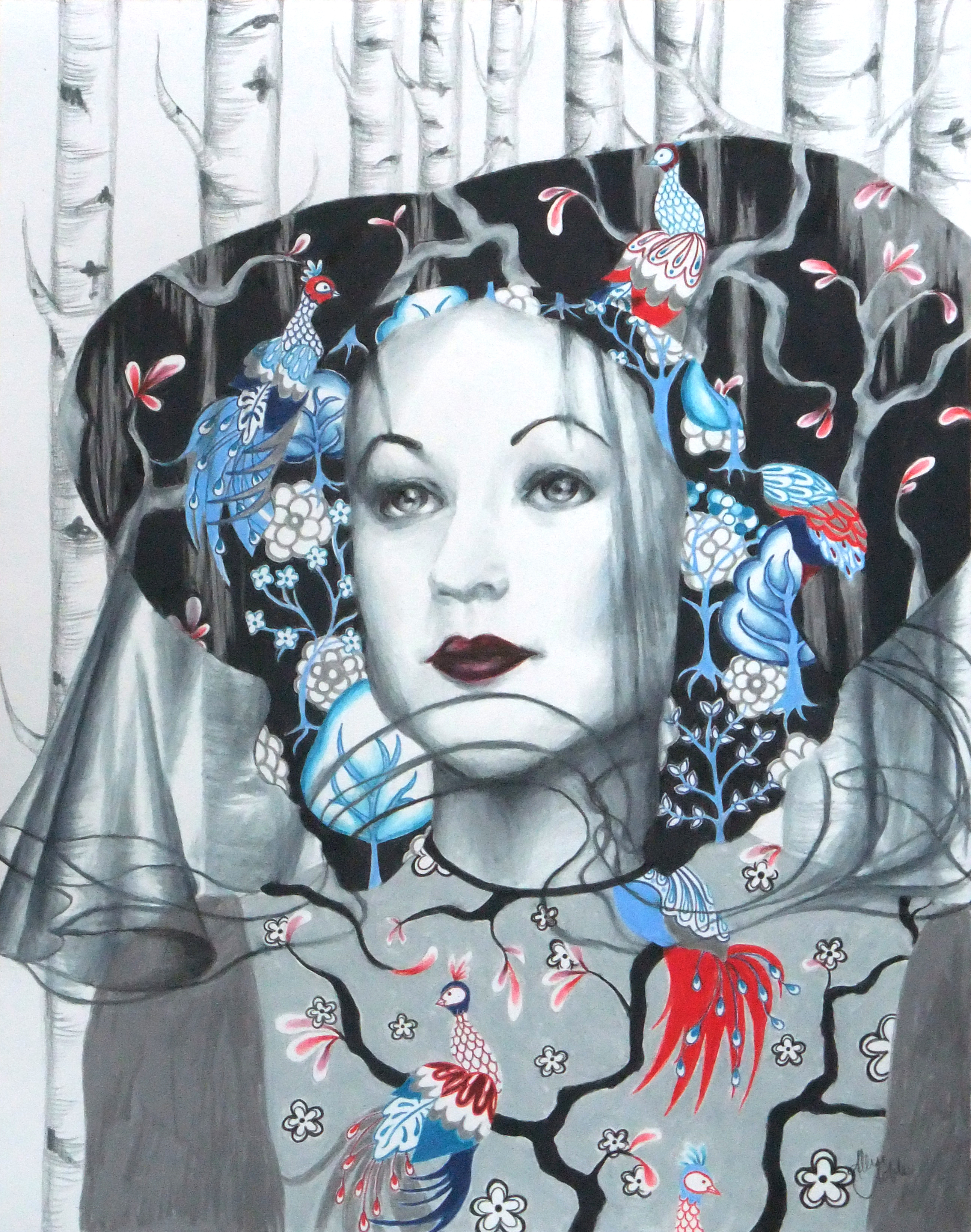
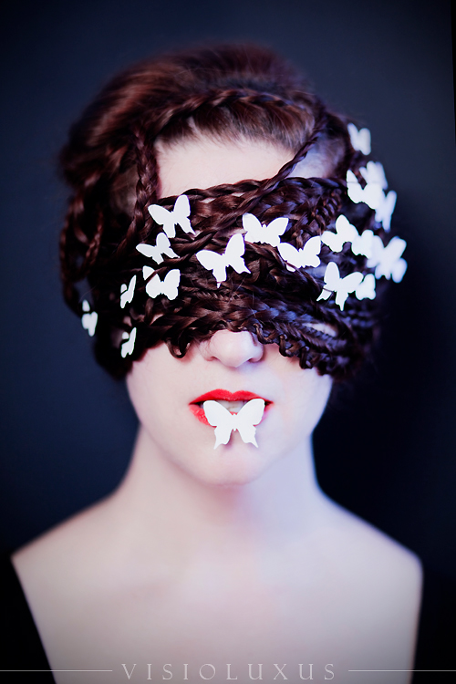
I immediately after finishing White/’The End Is Also The Beginning’, started a piece for “Red”, much more a color to my liking. But then, the great covid catastrophe happened, life was weird, I got going on other projects, I had no clue how to finish the background, I got tired of coloring the pattern on the dress (Why oh why didn’t I just use fabric again like the first piece!), and there it sat abandoned inside an XL drawing pad for 6 years. I thought about just throwing it away as I wasn’t sure I was ever going to finish this series anyway. I know you have to be careful with this, but I am a huge advocate of not throwing old or unfinished art away because with a new perspective years later, you can make magic out of it. Behold, Red, or ‘Attachment’.

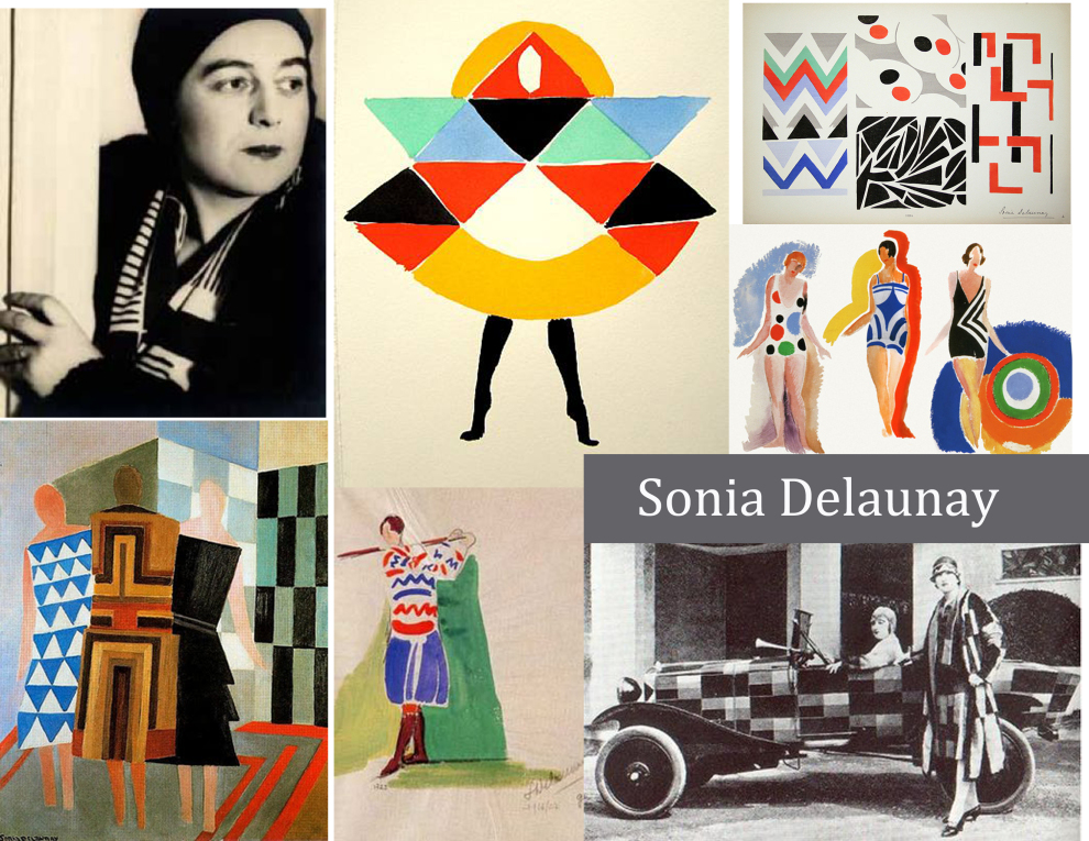
Red is without a doubt the strongest color emotionally, and the color that commands the greatest response both positive and negative. It’s no accident that stoplights and stop signs are red. Although, I remember reading the sort of bio in the front of an art book by one of my favorite artists, Ray Caesar. He mused on how he had always struggled with driving because to him red was an action color that meant “GO” rather than stop. That pretty much sums up the nature of red, commanding but conflicting.
It creates a response, but what kind of response widely varies by person and situation. Advertising uses red to create a sense of urgency, draw attention to a product or special sale, and make viewers think they HAVE to do something. Red is super stimulating especially when a bright primary but even when it’s a darker version as well, and can be overwhelming or off-putting to some. It symbolizes passion and romance, the color of the heart and of our blood. Fire is associated with red and red can also symbolize anger or rage (hence the saying “seeing red”), aggression and dominance. Red means luxury – think of the old Hollywood glamour classic red dress, red carpets, red lipstick, and the Christian Louboutin red soles.
Asian cultures have a particular relationship with red. In India, red is their traditional wedding dress color rather than white. In Japan, red is associated with cultural values of strength and sacrifice, but also expressions of joy, signified by a prominent red circle sun graphic on their flag. In China, red is an important symbolic color for good luck and prosperity. Across the continent, red is seen again as a warning color but this time to stave off ‘evil spirits’ or unpleasant circumstances.
Red tells stories of both joy and fortune, and tragedy and violence. It creates strong reactions and emotions, but which ones may come forward can be confusing and conflicting. Red, of all the colors, seems to be the color of our living story and our relationship to others.
Who knows, maybe I will revisit this series and keep going with it when I have the time. After all, I still have my concept sketches for blue, yellow, and black – As I mentioned, when it comes to drawings I don’t throw anything away! 😉


![fIMG_3759[1] sq](https://i0.wp.com/artistallisenicole.com/wp-content/uploads/2019/05/fimg_37591-sq.jpg?w=228&h=228&crop=1&ssl=1 "fIMG_3759[1] sq")
![fIMG_3761[1] sq](https://i0.wp.com/artistallisenicole.com/wp-content/uploads/2019/05/fimg_37611-sq.jpg?w=228&h=228&crop=1&ssl=1 "fIMG_3761[1] sq")


 Matières Fécales