Interior Design

Design Inspiration And Fun New Toys

One of the most difficult things we have to ask ourselves when buying a piece of art is, “Where the heck will I put it???!!!” I know I go through this same thing, because I love to put a lot of my own work up, but then I get tired of staring at things I spent hours focused on while I was in the act of creating it, and want to collect other artists’ work as well. Enter, polyvore – one of the most entertaining pastimes for a lover of both fashion and interior design. I discovered the app for droid while engaged in an epic Civilization V game on my laptop, waiting for my boyfriend to finish his turn (He takes really long turns). I’ve been hooked ever since. It’s been amazing to show people my prints in “real time”, actually in a room setting rather than just cropped on a screen. A piece of art you love and feel an emotional connection with can be the perfect inspiration piece.

For the Harry Potter fans out there, I think I may have unwittingly created Dolores Umbridge’s living room at home.  “Hopeful” Interior Inspiration by allise-noble

Of all of my designs thus far, this is the most reflective of my own personal “home” style.                “Rush Hour” Interior Inspiration by allise-noble 

But dear Allise … my house totally does not look like a magazine, you say. Yeah – mine neither … see below :).

A totally non-threatening, non-glamorous, everyday example of how I used original artwork in my kitchen. It's really all about repeating the colors found in the piece SOMEWHERE, ANYWHERE at all in the room to tie it in and make it your

A totally non-threatening, non-glamorous, VERY low-budget, everyday example of how I used original artwork in my kitchen. It’s really all about repeating the colors found in the piece SOMEWHERE, ANYWHERE at all in the room to tie it in and make it your “theme”. If the colors are harmonious, you can have as many different patterns, textures, and styles going on in one place as your heart desires.

In addition to redbubble, I also started using a new site, zazzle, which prints designs on an even wider range of products, and also offers multiple T-shirt options as far as cut, style, and price point. I am definitely a T-shirt girl, they make up 75% of my closet, but many have expressed to me that they aren’t sure how to make T-shirts look put together, and not like sloppy gym clothes. So, I’ve assembled some fun ideas, and I can tell you, you certainly can dress up a T-shirt, especially one that has lovely art on it :). I’m planning on doing more inspiration designs for both art prints and my clothing and accessories featuring original artwork, so continue to check back with me on polyvore. Remember, these are just ideas. A lot of the items featured on polyvore can be, well, ridiculously pricey. I found a pair of high heeled jelly sandals that looked like something I owned in 2nd grade going for $500 a pair (*cough* too much money, not enough brains *coughcough*). It’s just to give you an idea of how to make your new art print or shirt look awesome. Any of these items have similar, cheaper options at regular stores. Let me know what you guys think! So long for now.

Another awesome zazzle product, you can actually buy additional charms to hook on if you wanted more than just one, and you could have a whole art collection right around your wrist! 🙂

Standard
New Work

New Work Reveal – Wonderland

I have been slowly adding to this piece over the last couple months. It went through some stages where I wasn’t really sure if I even liked it, but lo and behold, in the end I think it all turned out just fine :). I usually use only one or two shocking, bright colors in a piece at a time (with the exception of illustration/graphic design stuff when it calls for it) and never primaries like this, so I must admit the color scheme did freak me out a bit and I was sure for a moment that I’d made a terrible mistake. However, adding the dripping watercolor from the bottom to blend into the blurred figures in the background really tied it together. I wanted to use these “childlike” colors to reinforce the idea that we are seeing the environment through the eyes of the girl. This is also the reason why I made the drawn on windows on some of the buildings in the back simplified, and more “sketchy” and didn’t use a straight edge. This decision also greatly freaked me out at first. Apparently I don’t do a whole lot of “childlike” illustration. This was definitely something new, and it’s been a wild ride and I am pumped to move on to the next thing :). I really don’t know how some artists work on one piece for years, I’m always anxious to finish up and get on to the next big idea! I took in-progress photos this time, a first, and really must remember to do this more often.

WONDERLAND – 18×24 – COLORED PENCIL, INK, AND WATERCOLOR

Starting with the midtone shading of the skin ... I know I have mentioned before it's usually best to start with the background first. However, since I knew I wanted to do the background in ink, I reversed the process. Since primsacolor pencils are oil based, they provide a barrier so that the ink mess doesn't get all over the area where I want the figure. Sometimes you have to alter your process to best suit the materials, learned mostly through trial and error.

Starting with the midtone shading of the skin … I know I have mentioned before it’s usually best to start with the background first. However, since I knew I wanted to do the background in ink, I reversed the process. Since primsacolor pencils are oil based, they provide a barrier so that the ink mess doesn’t get all over the area where I want the figure. Sometimes you have to alter your process to best suit the materials. I’ve learned this mostly through trial and error.

Next on to the hair, and I did a little trial filling in the rabbits in color on her shirt ... still scared of the bright color!

Next on to the hair, and I also did a little trial of the color idea by filling in the rabbits on her shirt … still scared of the bright colors!

Decided to fill in black behind the pattern on her shirt to balance the dark areas in the composition, and also to "anchor" those darn rabbits to something! I also inked in the blurred figures rushing by in the background, softened the edges with water, bleeding the ink.

I decided to fill in black behind the pattern on her shirt to balance the dark areas in the composition, and also to “anchor” those darn rabbits to something! I also inked in the blurred figures rushing by in the background, softening the edges with water, bleeding the ink.

Added more color by putting a pattern on the lapel of her jacket, and began rendering the cityscape in the background in ink.

I added more color by putting a pattern on the lapel of her jacket, and began rendering the cityscape in the background in ink.

Buildings inked in!

Buildings inked in!

Further developed shading on the skin where needed to have harmony with the values of the background, dripped colorful watercolor up from the bottom of the composition, and chalked dark clouds over the background to recede it further back, and draw the eye to the figure. I believe it is now finished :).

Last, I further developed the shading on the skin where needed to have harmony with the values of the background, dripped colorful watercolor up from the bottom of the composition, and chalked dark clouds over the background to recede it further back, and draw the eye to the figure. I believe it is now finished :).

Standard
Techniques and Tutorials

Drawing Profiles and Roaring 20s Twisted Damsels

In both portrait drawing and portrait photography, the most dynamic of compositions often involve partial or full profiles, because profiles by nature create more interestingly shaped negative space around a figure. Profiles are also THE most dreaded type of portrait to draw. For years I shunned them after far too many failed attempts, my lovely subjects coming down with the dreaded gorilla-lips curse; that tragic moment when you end up with either too much or not enough space between the nose and chin to squeeze the lips into, and then there is the question of how far should the lips actually stick out anyway? Hence, we end up with the look of a monkey trying to blow a patron a kiss at the zoo… not good. I forced myself to peruse tutorials after finding far too many wonderful 1920s flapper photographs of kickass ladies I wanted to include in my compositions, all taken in profile! Coupling this with my own experimentation, I believe I have come up with some pretty solid methods to make drawing profiles easier. What works for one artist may not necessarily work for another and there are many different approaches, but I hope this gets you started.

*Some of the angled guidelines appear to be a bit different in the photo versus the drawing, but don’t be confused! The images got put into my scanner and they simply weren’t all lined up *perfectly* straight since the paper I used was too big and hung off the edges of the scanner to begin with. So, ignore any of these visual discrepancies as scanner error :)*

*The reason I don’t start with the classic “oval head shape* is because a profile tends to deviate from that roundness eventually anyway, and you will inevitably run out of room in the end and wind up trying to squash the mouth into that restricting beginning oval size and shape. Doing this, you will either not have enough room between the nose and mouth, or have a nonexistent chin. It’s much easier for me to get the features down first, and then use a measuring tool (I always go with the eye) to inform you in how high the forehead should rise, how far back the rest of the skull should extend, etc; everything kept in proportion to everything else.

This is the image we will be working from. You will notice the line running diagonally from nose to chin - this is a lifesaver! On every single face, no matter what the proportions, the end of the nose, lips, and chin will all touch a diagonal line drawn from nose to chin, the exact angle of this line may just vary. This will be a HUGE help to us later.

This is the image we will be working from. You will notice the line running diagonally from nose to chin – this is a lifesaver! On every single face, no matter what the proportions, the end of the nose, lips, and chin will all touch a diagonal line drawn from nose to chin, though the exact angle of this line will vary. This will be a HUGE help to us later.

Have you ever seen artists when drawing a still life or model lifting their pencil up, squinting at it, and then laying it against their paper? They are using their pencil as a guide to gauge the correct angle, and we can do that with a photo reference as well.  Lay your pencil against the angle of the forehead to gauge the angle start, and then move the pencil over to your paper and create that same angle.

Have you ever seen artists when drawing a still life or model lifting their pencil up, squinting at it, and then laying it back down against their paper? They are using their pencil as a guide to gauge the correct angle, and we can do that with a photo reference as well. Lay your pencil against the angle of the forehead, and then move the pencil over to your paper and create that same angle in a light pencil line.

Use the same pencil technique to gauge the under slope of the forehead as well as the angle of the nose. Round out the intersections of these 3 lines. Don't worry about the length of the nose yet, just make the line.

Use the same pencil technique to gauge the under slope of the forehead, as well as the angle of the nose. Round out the intersections of these 3 lines. Don’t worry about the length of the nose yet, just make the line.

Next, outline the eye relative to the size of the slope between the forehead and nose. This is important because the eye will be used as a handy measuring tool in the future. Don't worry about the unique shape of the model's eye right now, just make a rounded off triangle of proportionate size to the bridge of the nose.

Next, outline the eye relative to the size of the slope between the forehead and nose. This is important because the eye will be used as a handy measuring tool in the future. Don’t worry about the unique shape of the model’s eye right now, just make a rounded off triangle of proportionate size to the bridge of the nose.

Now, use the eye height to measure the length the nose should be. How many eye heights fit down the length of the nose? In this case it was 3. Mark off that end point. From that point, draw your diagonal line that will be a guide for the mouth and chin as well, using your pencil to gauge the angle from the photo.

Now, use the eye height to measure the length the nose should be. How many eye heights fit down the length of the nose? In this case it was 3. Mark off that end point. From that point, draw your diagonal line that will be a guide for the mouth and chin as well, using your pencil to gauge the angle from the photo.

There are many different techniques for this step, just check out pinterest. What I've found easiest is concentrating on the shape of the negative space created between the diagonal line and the facial features rather than the facial features themselves.

There are many different techniques for correctly outlining the shape of a portrait’s features in profile, just check out pinterest. What I’ve found easiest is almost ignoring the features and concentrating on the shape of the negative space created between the diagonal line and the facial features rather than the facial features themselves.

Concentrate on the 3 shapes of negative space created, between the nose and top lip, between the top and bottom lip, and between the bottom lip and chin, and draw them in. Definitely use your pencil to gauge the angles. Then, step back and compare what you have to the photo, note if anything doesn't look quite right, and touch up where need be.

Concentrate on the 3 shapes of negative space created, between the nose and top lip, between the top and bottom lip, and between the bottom lip and chin, and draw them in. Definitely use your pencil to gauge the angles. Then, step back and compare what you have to the photo, note if anything doesn’t look quite right, and touch up where need be. Also, use your pencil to gauge the angle of the chin. Draw the line on your paper, and round off where this new line intersects with the already existing diagonal.

Go ahead and add the iris, and the eylid and the arch of the eyebrow. Don't just draw a generic, upside down smile eyelid on top. Pay particular attention to the reference's unique eyelid shape. Also, add some detail to the nose. Note that the nostril ends at about where the lip curves out. Also, gauge the angle with your pencil of the front edge of the eye to the curve of the side of the nose. Draw that angle lightly on your paper. This will indicate where the curve should fall. Once again, don't just draw a parentheses - note the distinct shape of the reference's curve around the nostril - it's a little more straight. As you draw more potraits, you will find that noses (and eyes, and mouths for that matter) are literally like snowflakes - absolutely no two exactly alike.

Go ahead and add the iris, and the eyelid and the arch of the eyebrow. Don’t just draw a generic, upside down smile eyelid on top. Pay particular attention to the reference’s unique eyelid shape. Also, add some detail to the nose. Note that the nostril ends at about where the lip curves out. Also, gauge the angle with your pencil of the front edge of the eye to the curve of the side of the nose. Draw that angle lightly on your paper. This will indicate where the curve should fall. Once again, don’t just draw a parentheses – note the distinct shape of the reference’s curve around the nostril – it’s a little more straight. As you draw more portraits, you will find that noses (and eyes and mouths for that matter) are literally like snowflakes – absolutely no two exactly alike.

Measure how many eye lengths are between the top of the eye and the hairline. Make a mark for the hairline. Use your pencil to gauge the angle between the corner of the eye and where the chin line ends. Make a mark on your paper where the jaw line should end, and curve it up.  Now also know where to properly add the bottom of the ear. It should line up with the angle off the end of the jaw line. The bottom of the ear should always line up with the height of the mouth on a face.

Now measure how many eye lengths are between the top of the eye and the hairline. Make a mark for the hairline. Use your pencil to gauge the angle between the corner of the eye and where the chin line ends. Make a mark on your paper where the jaw line should end, and curve it up. Now you also know where to properly add the bottom of the ear. It should line up with the angle off the end of the jaw line. The bottom of the ear should always fall height wise lined up with the height of the mouth on a face.

Gauge the angle of the hairline with your pencil, and draw that diagonal in where you had your mark at the top of the forehead. Gauge the angle between where the hair drops down and the mouth. Mark that line lightly, and create the second curve for the hair.

Gauge the angle of the hairline with your pencil, and draw that diagonal in where you had your mark at the top of the forehead. Gauge the angle between where the hair drops down and the mouth. Mark that line lightly, and create the second curve for the hair.

Voila! You have a pretty good start to a profile. It still is going to take a TON of practice, but hopefully this advice will make the practice considerably less painful :).

Voila! You have a pretty good start to a profile. It still is going to take a TON of practice, but hopefully this advice will make the practice considerably less painful :).

I took on profiles in this new design for redbubble, the classic flapper with a twist. Check out those eyes! I am having fun designing more bizarre vintage characters, though I'm eventually going to have to go back to my large piece I'm trying to finish. But... not yet ;).

I took on profiles in this new design for redbubble, the classic flapper with a twist. Check out those eyes! I am having fun designing more bizarre vintage characters, though I’m eventually going to have to go back to my large piece I’m trying to finish. But… not yet ;). This snazzy lady’s available on bags, phone cases, even a duvet cover!

Standard
Exhibitions and Other News

Art Clash 2015

Art Clash 2015

Art Clash 2015

"Inner Strength", 18x24 Watercolor, Ink, and Metallic Acrylic

“Inner Strength”, 18×24 Watercolor, Ink, and Metallic Acrylic

As promised in my last post, I wanted to share my finished piece from this year’s Art Clash! I was definitely feeling the time limit this time around, and did have to either hurry through or leave out some additional details that I wanted in the piece. I may consider a simpler composition next year haha, but I’m still happy with how this turned out, despite my having to be in literal hyperdrive just to finish with 5 minutes to spare.

I combined a variety of vintage photograph references (For those of you that don’t know, antique photos have been kind of my “thing” over the past year.) for the figure, coupled with classic superhero imagery. My concept was grappling with the idea that how we feel inside is rarely how the rest of the world sees us. We have this entire vast, complex universe inside us. We must never forget no matter what we are going through, that we are so much more than others may portray us as. We can be the heroes of our own story even in the small, day-to-day decisions that we make, and actions that we take.

Heather and I had a fantastic time, saw a lot of amazing art, and I got to work next to this awesome little kid watercolor painting his favorite scene from Star Wars. All in all, it was a good day.

Standard
Exhibitions and Other News

A Mixed Bag Of Epic Battles, Social Networking, and Therapeutic Craftiness

So, this update is going to be a bit all over the place. First off, I will be participating in Do-All of Bay City‘s Art Clash for the third year in a row with a new(ish) friend I met through teaching at Creative 360. Heather is a wonderful artist and keeps an art blog as well, so be sure to check her out! We had such a great time last year. It’s crazy for me to create a piece of art from scratch completely live, since I usually don’t even share idea sketches with anyone but (occasionally) my parents and boyfriend, and in progress works in my studio area are hidden when people come over to my apartment. An example, back in college I spied a friend that was over flipping through my sketchbook (Without even asking! The audacity! – other artists, you know what I’m talking about!) on the other side of the room and I took a running start and tackled him WWE style to get it back ASAP. A fun fact about me; I basically dislike all sports, but I flat out hate wrestling, and honestly find any activity whose basis centers around causing bodily harm to another human being to be fundamentally disturbing. Despite this, apparently in the right circumstances…

The vulnerability of allowing others to see your “in progress” work all the way through, even in its awkward phases, coupled with a pretty short time limit of only 3 hours makes this kind of event something I always swore I could never do. Then, in 2013 I forced myself to try it specifically because I swore I couldn’t do it, and now I am addicted. Art battles are everywhere, but the cool thing specifically about Do-All’s art battle is that 50% of the proceeds from finished pieces auctioned at the event go to Do-All, an organization that provides activities and services to people with disabilities – pretty cool! Many of the students from their Do-Art program also participate in the battle, so you’re immersed amongst all different types of people from all walks of life which makes it a really fun environment. Last year, my piece even made it into the top 10 award winners which was super exciting. I have an idea prepared for where I want to go with this year’s piece, but it cannot be revealed at this time :). I’ll post the finished product after tomorrow evening!

Transformation, 18x24 Mixed Media, Do-All of Bay City's Annual Art Clash Award Winner

Transformation, 18×24 Mixed Media, Do-All of Bay City’s 2014 Annual Art Clash Award Winner

Next bit of news, as if I don’t have enough social media accounts … (I just finally made a twitter after discovering that there is actually a ton of interesting information and inspiration bouncing around on there, and not simply “hey guys, I just made a sandwich!” which was my initial assumption. @AlliseNoble, get at me!) I recently discovered Artistically Social, and of course since it’s completely free, I couldn’t resist creating a gallery. It’s a bit bare bones right now, but I’ll be slowly adding more prints and hopefully a lot more originals for sale as well, so please check out the gallery.

I need to finish quite a few new pieces by the end of this coming summer for some solo local exhibits around town, but I had just been feeling really burnt out lately from doing so much *serious* fine art work and longed to work on some creative pursuits that were just crafty and fun. My paper dolls and stuffed creatures for sale at Imagine That, a local handmade gift shop in Midland, also got pretty cleaned out in March so I have a legitimate excuse. I’ll post photos once I get a little further on the new paper dolls, and also introduce you to some monster friends. Another “for fun” project I’ve been working on is the amazing Artist Leesy pop vinyl! I really don’t need anymore plastic toy clutter around (if you saw my apartment, you’d understand) so I’ve restrained myself from actually buying any, but I love Funko’s Pop! Vinyl characters so, so much. After Christmas, I was at the mall perusing all the after holiday discounts and I discovered they actually had DIY blank bodies. They were on clearance, and I had a Barnes and Noble gift card – score. I did buy actual books as well, not just toys, I promise. My little mini-me muse will grace my desk from this day forth.

3 of many monster friends who have found good homes

3 of many monster friends who have found good homes

So far just the paper mache hair! (Yes, my kitchen is very green)

Vinyl Pop! Leesy: So far just the paper mache hair! (Yes, my kitchen is very green)

Adding some color (complete with freckles)

Adding some color (complete with freckles)

My characteristic magical silver slippers are a go, and all painting is done - now for the details.

My characteristic magical silver slippers are a go, and all painting is done – now for the details.

Artist Leesy and her trusty resurrected brontosaurus companion, all in a day's work.

Skirt, check! Hair bow, check! Drawing utensils, check! Artist Leesy and her trusty resurrected brontosaurus companion, all in a day’s work.

Wish me luck at the Art Clash tomorrow, photos soon!

Standard
Interior Design

Happy Easter! (Plus some fine looking doors)

The Bunny Invasion has begun!

The Bunny Invasion has begun!

Sorry boyfriend, I'm leaving you.

Sorry boyfriend, I’m leaving you.

I discovered something wonderful a couple days ago, namely, the city of Saginaw Michigan had been taken over by giant bunnies. I love art like that, the kind of art that pops up and surprises you in your everyday environment. It makes you stop in your tracks, whatever you are doing, and just enjoy the moment. I ran around like a little kid visiting every single one; it was a great time.

Since Creative 360 was closed for Easter weekend, I also finally got the opportunity to finish the murals I’d been painting on the doors! These doors used to be a really gross shade of brownish-grey, and the goal was to wake them up to go with the rest of the imaginative, creativity-inspiring interior. You can’t exactly tell in these cropped shots that only show a part of the building, but this place is really really colorful – the ceiling gives a hint. I wanted to use the design on the door leading to the lower level to act as an indicator of what activities go on in the basement. I also wanted what was behind the door to be visually communicated in a clear manner so guests and customers wouldn’t be confused, but  without having to write out a big ugly, block lettered, “DOWNSTAIRS, or STEPS” plastered right over the mural. Since the door to the basement is usually left propped open when classes are in session, I also needed a design for the backside. I’m happy with how they turned out, especially stepping back and seeing all 3 together. Enjoy the photos!

I hope you all have a wonderful Easter, and even if you don’t have traditional activities planned, do/see/experience something that is out of the ordinary and makes you smile, even if only for 5 minutes.

The two restroom doors, and the exit to the downstairs classrooms.

The two restroom doors, and the exit to the downstairs classrooms.

Men's and Women's Restroom Doors

Men’s and Women’s Restroom Doors Closeup

Exit to downstairs classrooms where art, dance, and exercise classes take place

Exit to downstairs classrooms where art, dance, and exercise classes take place

The other side of the door to downstairs, which is often left open while classes are going on

The other side of the door to downstairs, which is often left open while classes are going on

Closeup

Closeup

Approximately 2 years ago. Clearly, I am no stranger to making friends with rabbit sculptures.

Approximately 2 years ago. Clearly, I am no stranger to making friends with rabbit sculptures.

Standard
Books

Inspiration From The Bookshelf

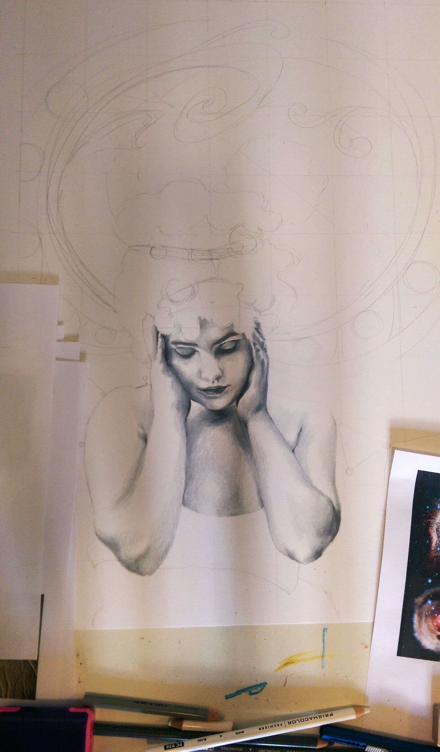
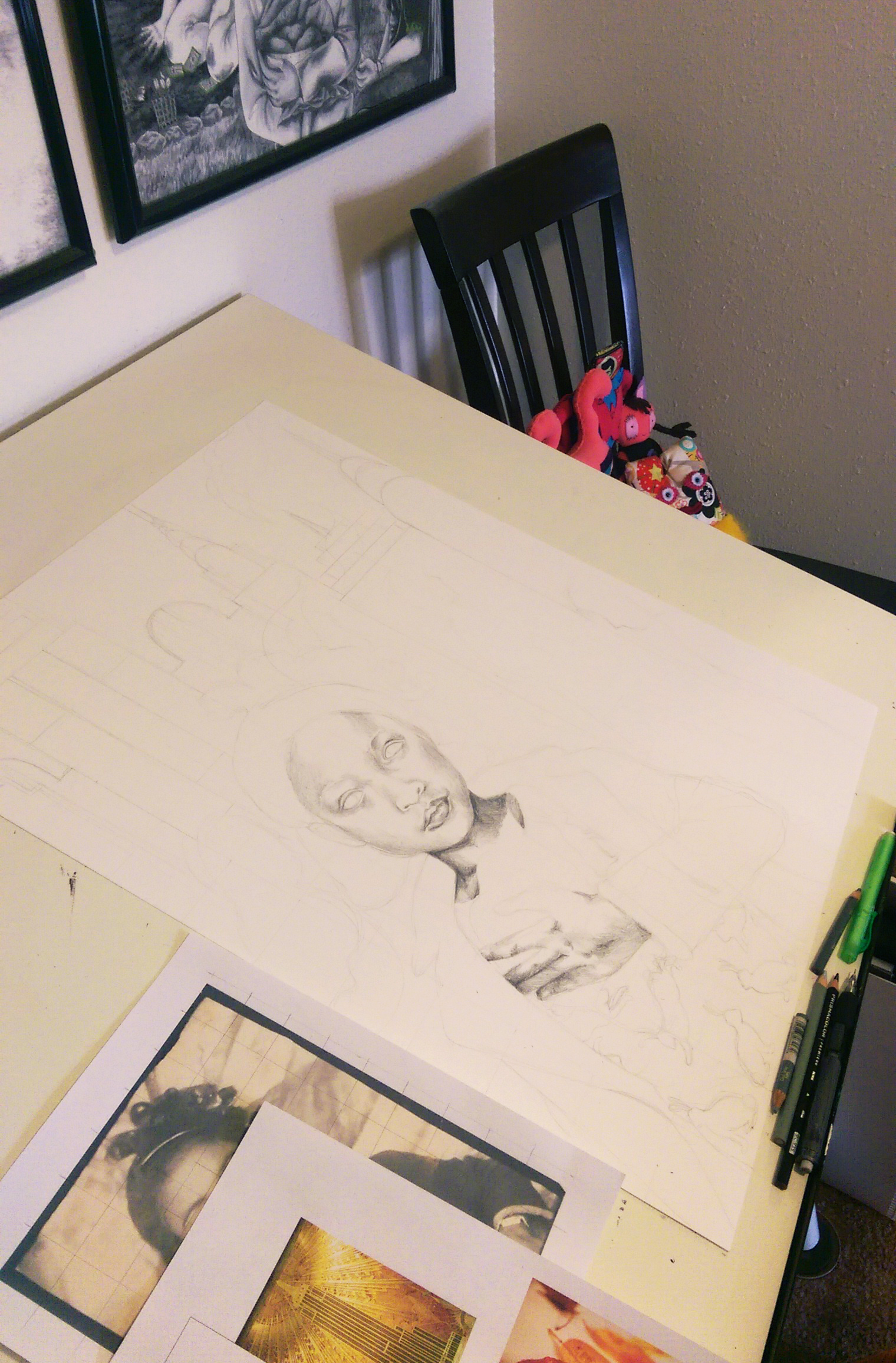
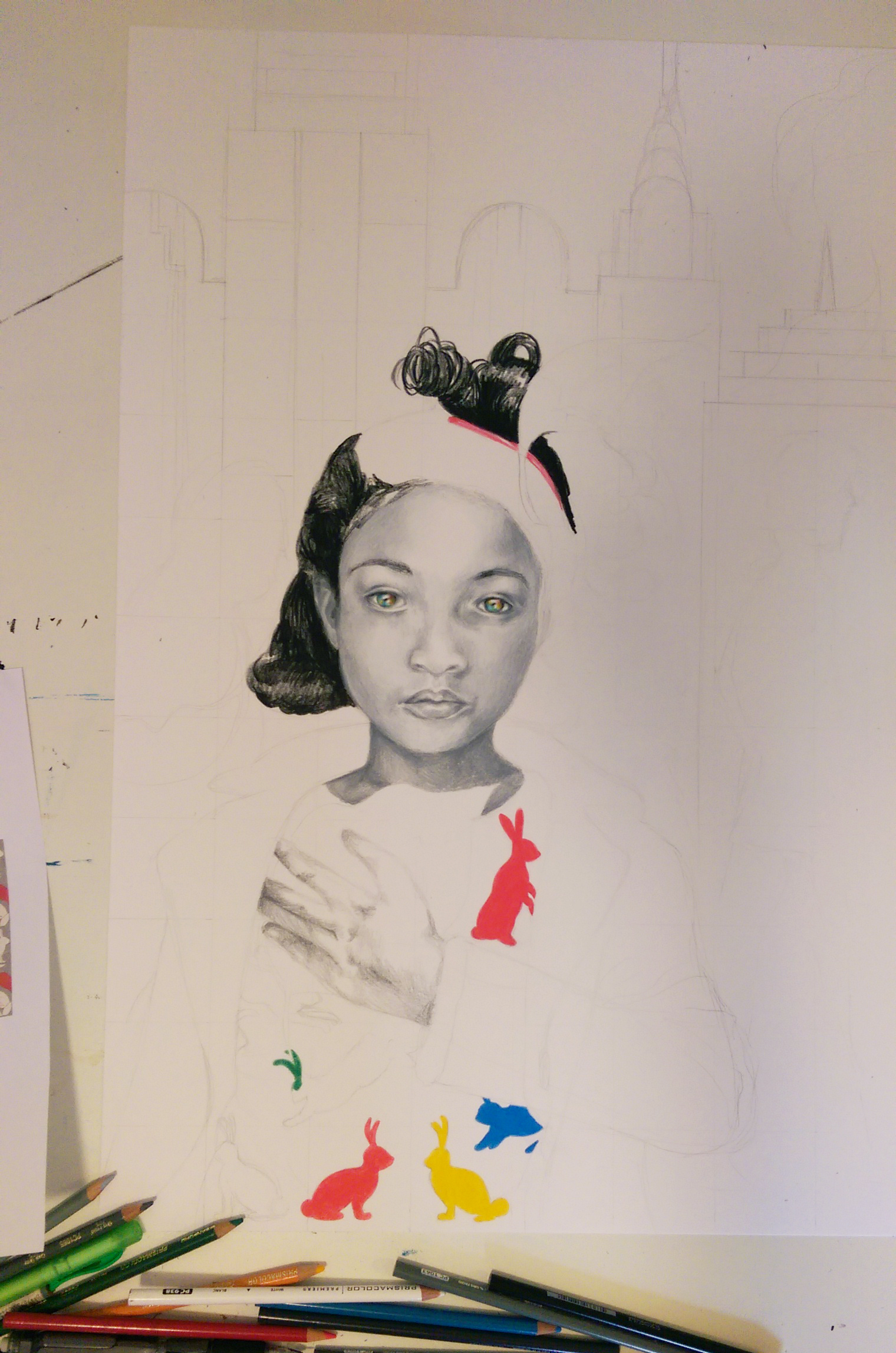
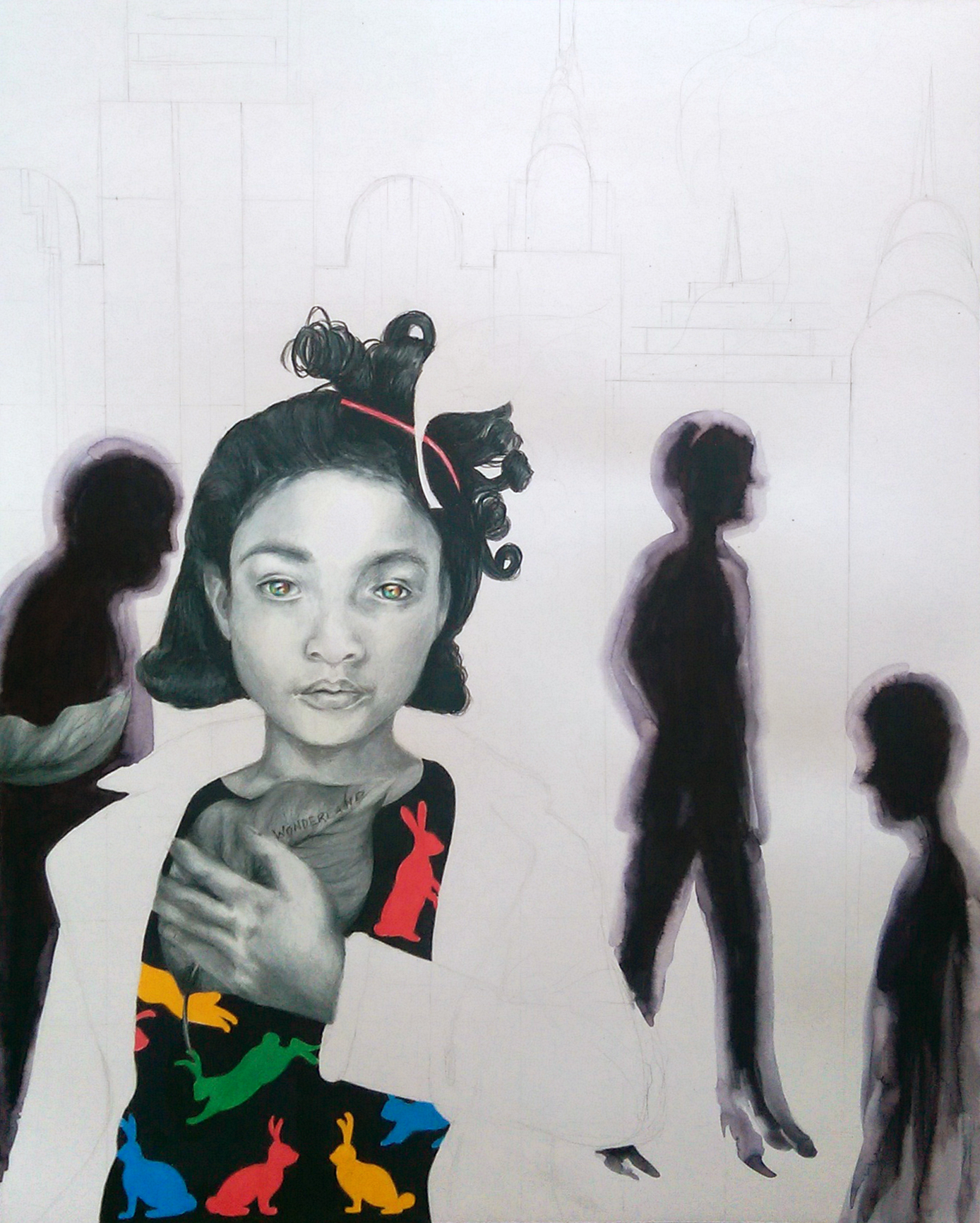
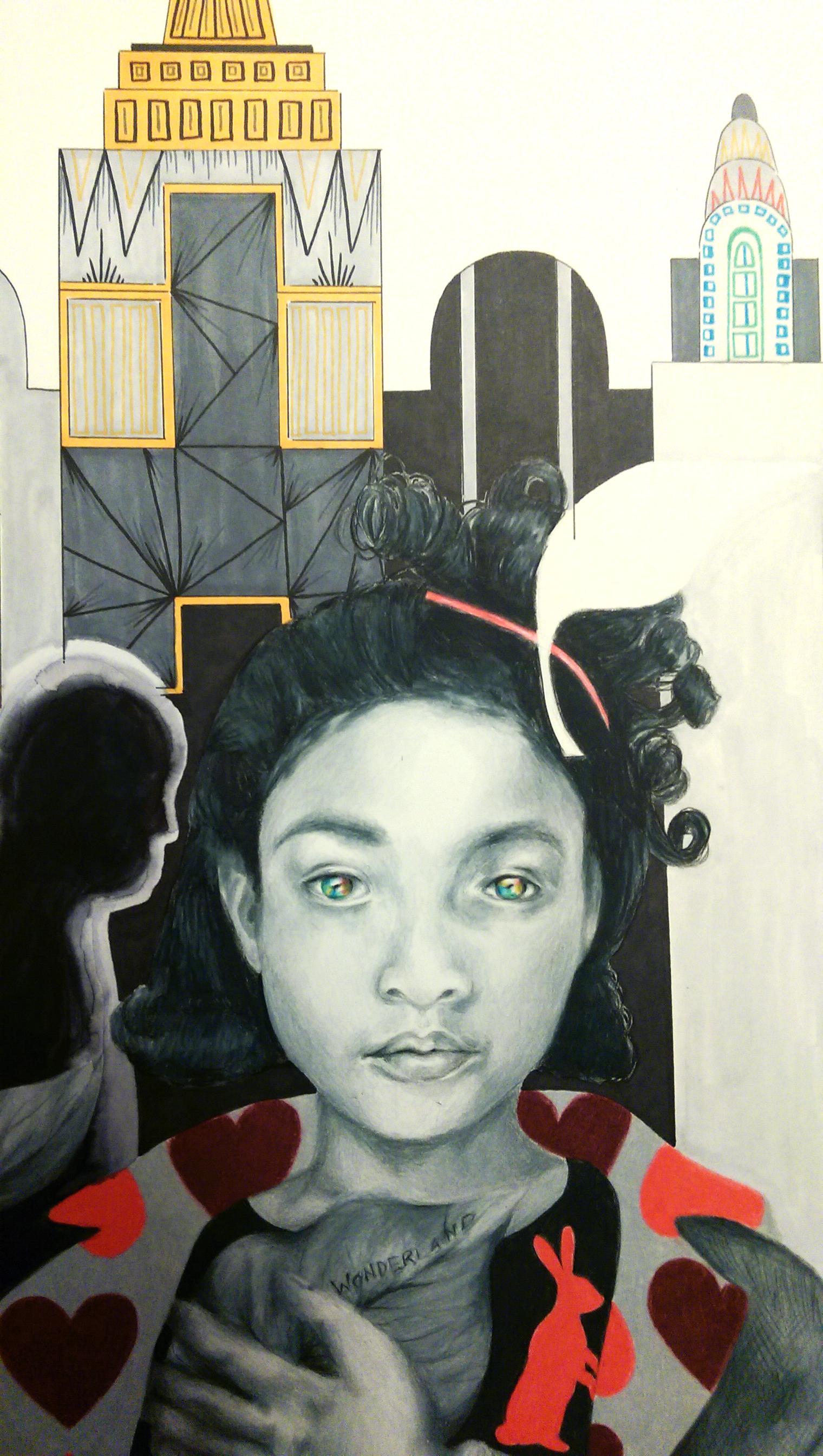
The Artisan Soul, Erwin Raphael McManus

I’ve been so busy lately I am still finishing up books I received as Christmas gifts! For anyone who knows me, you know how shocking this is as I tend to devour books. I’ve really been enjoying this latest one, The Artisan Soul. What’s great about it is it can apply to any passion, not simply the arts. I suppose I should say, it also applies to everything outside of what is “traditionally” viewed as art, since one of the major themes from the very beginning is the fact that everyone is an artist! Everyone has something they do that they love, that when they are engaging with it their creativity freely flows – yes yes yes!

The journaling prompts for each chapter in the back of the book are so helpful in synthesizing what you’ve just read and allowing you to apply it to your own personal journey. This is not one of those lame self help books, or else trust me, there is no way in hell I would be reading it. I’d like to share the latest journal, in which I was asked to write about what kind of world I will create through my work, choices, and actions – a manifesto of sorts. This is not at all polished and total stream of consciousness, but I’d like to include it: I will create a world in which everyone has the confidence to see themselves as creators. People are not afraid to express themselves creatively and stop shutting themselves off from the world due to fear or anxiety. No one will feel purposeless, and no one will feel isolated. Those who were once ignored, mistreated, or shut out will shine and show others their true worth. “Sameness” and monotony will vanish and people will be free to live as they truly are without persecution. All will have the power of fearlessness. We will not need to cling to what is “standard” or precedent, but know that we are responsible for creating the society and world in which we wish to live in, and all of us have the power to make the space around us more inspiring. We will no longer live dull, unfulfilled-seeming lives simply because we are afraid to risk new things, to be strange, to have fun, to engage in childlike moments of joy: go to a park, make masks and wear costumes, invent our own board game, build a tree fort, be undignified … make a mess, laugh more – worry what others will think or say less. It is our life and no one else has to live in it but ourselves. Those who are “different” (for we all are, truly) will be valued for those characteristics that make them unique, not criticized for them. Different will never again mean broken. We will realize in this new world that each person brings something vital to the table, that single piece of the grand puzzle that we cannot complete without them.

Some other awesome books relevant to creativity I’d like to recommend are:

Frida: A Biography of Frida Kahlo, by Hayden Herrera – An interesting, close look at the life of an iconic artist whose work was the most intimate form of self expression. After an accident that left her with severe health problems and a lot of time in and out of hospital beds throughout the rest of her life, she used art as a therapy in the purest sense. I read this before Express Yourself Artshop even existed, let alone I began working there. Still, I was always moved by the idea of art as a refuge for the wounded, and a voice for the stifled.

The Crowd, The Critic, and The Muse, by Michael Gungor – The ideas for this book started with a blog Gungor wrote entitled “Zombies, Wine, and Christian Music” (I’m sure I’m not the only one dissapointed his book bared not the same title, but ah well…). Gungor, a musician whose work is faith influenced, discusses how a creator must balance all the noise coming in from the voices of critics, fans, and one’s own internal voice. He cautions against creating only to please one or the other, especially giving fans and critics precedent in what we put out into the world over our own creative soul. Given that he is a faith inspired artist, he works in a genre filled with restrictions, expectations, and plenty of red tape that usually dominated by sappy pop music for middle aged suburban folks (He does not himself enjoy making sappy pop music, for the record). Because of this struggle, his personal stories give wise counsel for navigating the treacherous terrain of making a living in a creative field while still creating work you are passionate about, and also holds all creatives in this day and age to a higher standard of being not just well liked but world changing .

The Art of Asking, by Amanda Palmer – Love or hate this musician (and people tend to either feel one way or the other), this book holds fantastic insight about getting your craft out into the world from the bottom up. The stories within are told like a personal conversation with your best friend, but with lessons that can apply to anyone. There is no blatant advice or “Hey, you need to do this” included in these pages, just “Hello, this is my story, take from it what you will”. This book especially meant a lot to me, because I am one of those people who, like her, wants to do everything myself – especially with art. I have time and time again experienced her fear of the imaginary “fraud police” (That anxiety bubbling up form the fear that you only think you are a competent artist/musician/actress/teacher/chemist/whatever and will soon be discovered for the talentless charlatan you truly are). I also have at times experienced guilt over my chosen path, especially when it is not going as successfully as I’d hoped (What right do I have to try and pursue a field I actually enjoy, when so many others trudge off to jobs they hate day in and day out? Why do I think I deserve to be so happy? How dare I have the audacity to attempt to live out my dreams?) Seriously, life changing stuff here. This book even inspired my starting of this blog :).

So, what kind of world do you want to create? Be honest, we all think about it – what changes, either physically or in mentality, would make the world suck a little less? And of course, have any of you read any awesome books that inspired you creatively? I’m always looking for book suggestions – as I mentioned before, total bibliophile. Chatting is fun, don’t be shy!

Standard
Art Discussion

Art Discussion – Legacy

Legacy, 11x14 Prismacolor Pencil

Legacy, 11×14 Prismacolor Pencil

Today, I wanted to unpack a piece from my conceptual portraits series I’ve been working on since beginning of last year, titled “Legacy”.

The script scrolling from her head at the top right reads “I fear being ordinary most of all”. For this piece, I had been thinking a lot about how many decisions we make are rooted in a fear of mortality. We fear that once we are gone it won’t matter… we will have left nothing behind to be remembered by. We long to be KNOWN for something, to be successful at something, for others to know our name. Sometimes we don’t even care if what we are noted for is positive or not, just as long as our existence is eye-catching and out of the ordinary and commands fame and astonishment for good reasons or for terrible. LIke Oscar Wilde said, “The only thing worse than being talked about is not being talked about”. Everything we do, in the relationships we build, the work and pleasure we choose, is leading towards a legacy we hope to build and the perception by which we will be remembered. I used the repeated pattern of the skull and grave markers on her clothing as a motif symbolizing mortality. You will also notice the burning city in the background at the bottom of the composition, which she turns away from smiling, so inwardly focused that she takes no notice of the external destruction.

I have always been interested in masks, mainly because I am interested in almost any form of art that involves faces. Masks can also symbolize so many different things. They can symbolize falseness, pretense, anonymity, invisibility, the concealment of sins. But, they can also symbolize celebration, personal expression, the fact that human beings are flexible and multi-faceted and shades of grey – not black and white, and the power we have over who we want to be in our own story. I am especially drawn to the aesthetic of Japanese Kabuki and Noh masks, two forms of classical Japanese musical drama that involve masks and elaborate costumes to aid in telling the story. In Noh, each mask symbolizes a different type of character. For the background of this piece, I chose to tile the demon character mask (destructive, powerful) alternating with the traditional woman mask (usually symbolizing a character who is beautiful, refined, elegant, and demure). This symbolizes the interplay between a person’s two choices (or more accurately, what we perceive as our only two options). Too often we think that the only way to get ahead, be noticed, be outstanding, is to forgo our ideals and do what is best for ourselves and ourselves only. Those who make history do tend to have an awful lot of skeletons in their closet. But does doing what is right condemn us to having to play the role of the mouse smiling and curtsying in the corner? I’d ask you to also look to history (Think of Martin Luther King Jr., the most well known example!) and see that no, that is certainly not the case.

It is always interesting to hear others’ thoughts. Who are some of your favorite notable figures who broke the societal assumption of power and success being inseparable from selfishness and violence? What kind of legacy do you want your existence to build?

Standard
Art Education

Express Yourself Artshop – The End of Another Semester!

Another semester of Express Yourself Artshop is coming to a close, and so many amazing things have happened in just 12 weeks. I’ve watched students gain confidence and try new types of art, achieving inspiring projects that earlier they were convinced they wouldn’t be able to do. I’ve seen new friendships form. I’ve seen abilities grow – three of my students even got their work into the juried exhibition “Piece By Piece” that I showed work in as well in Creative 360’s gallery space, and one of them even made a sale!

My student Nancy's awesome mixed media piece, SOLD opening night of the show! :)

My student Nancy’s awesome mixed media piece, SOLD opening night of the show! 🙂

I am so glad that a little less than 2 years ago I responded to a mass email looking for instructors for a new program in Midland for adults with disabilities who love art. I sat on the email for awhile, and then finally shrugged my shoulders thinking, “Well, I don’t really teach but I do know quite a bit about art, so I might as well see what this is all about”. With that one decision to just go for it, I went from jumping between one uninspiring job to another, never feeling that I quite fit, to a job that I know I can excel at and that I actually feel passionate about. I have to be honest, I was feeling pretty defeated after doing quite well in college, expecting immediate success and a super-fun-creative-awesome job thereafter, and … you know, life happening. I was left bouncing around from one temporary job to another that was more of the same, where I wasn’t able to use any of my skills and the main goal wasn’t how can I invest in the people I came across on a day to day basis, but basically, how can I convince them to buy a ton of stuff they don’t need. Since then, Express Yourself Artshop has opened so many doors, and now I teach in a variety of locations and work with a wide range of programs for all different ages and abilities. I am so excited to work in a venue where the focus is on the personal growth, learning, and achievement of the individuals I work with, not how much money they can shell out for one product or service or another. Despite loving all my different classes, Artshop will always be a teensy bit in the lead as my favorite program to work with. Working with students with disabilities has opened my mind to new project ideas and materials, as I am forced to get creative in how I involve each student in a way that is best for their personal strengths and weaknesses. Be it cliche to say so, I’ve learned just as much from them as they have from me. I’d like to share an overview of the types of projects my students have worked on this semester. As you can see, we’ve been busy.

Mixed Media Pond Scene - Exquisite Detail!

Mixed Media Pond Scene – exquisite detail!

Awesome rings upcycled from vintage earrings - I loved how these turned out so much I'm making one at home just like the ring on the right for myself!

Awesome rings upcycled from vintage earrings – I loved how these turned out so much I’m making one at home just like the ring on the right for myself!

Vintage style fabric necklace made using marbles inside a fabric tube with pony beads in between

Vintage style fabric necklace made using marbles

Watercolor and Ink Silhouette, complete with 3D attached bow :)

Watercolor and Ink Silhouette, complete with 3D attached bow 🙂

Standard
Exhibitions and Other News

Wait, I Have Swag Now? There’s A First Time For Everything + New WIP

The Conceptual Portraits Collection

The Conceptual Portraits Collection

So, remember way back in the beginning of March when “I’d Have Been Happier As A Bird” was featured on RedBubble‘s front page? Well, one of the cool perks of that was I got a voucher to see some of my own designs in print, and I promptly ordered some greeting cards, a T-shirt, and a tote bag. I had been anxiously awaiting my fun packages trickling in (isn’t getting mail in general just the best, even when you’re expecting it?), and as of last week I received them all and wanted to share. I also have a new work in progress photo for an 18×24 conceptual portrait I’m working on, this time of a young girl rather than an adult which is something new. I tend to never take WIP photos, so appreciate it while you can! I’ll be sure to get better about that and share more of my progress as I begin new projects. I have quite a few idea sketches mounting up, so time to get to work!

Super cool T-Shirt in "I'd Have Been Happier As A Bird", and tote bag in "The Peacock"

Super cool T-Shirt in “I’d Have Been Happier As A Bird”, and tote bag in “The Peacock”

A little bit better lighting to truly see the designs ...

A little bit better lighting to truly see the designs …

Matching greeting cards! I was really pleased with how heavy they were, and with the sharp, high quality, gloss prints.

Matching greeting cards! I was really pleased with how heavy they were, and with the sharp, high quality, gloss prints.

"Wonderland" WIP

“Wonderland” WIP

Standard