Happy New Year everyone! I got a couple more months of ArtSnacks for Christmas this year, so let the unboxing begin! I will be honest, I hate the art journal page I created for the Artsnacks Challenge this month, which is too bad as it revolves around one of my favorite literary quotes :-/. No judging!
In this box I received a:
- Stabilo Sensor Black Fineliner
- 2 Colors of Golden Fluid Acrylics
- KINGART Original Gold 9000 Series Golden Taklon Brush, Round Size 2
- Stonehenge Aqua Coldpress Heavy Mini Paper Pad by Legion Paper
- Lifesaver and one of the more adorable Artsnacks logo stickers 🙂
Starting with the fineliner – So sad, but I hated this pen. It comes down to personal preference, but I felt the tip did not allow for fine details, and as you can tell from my end result below, it cannot be used with liquid media without bleeding really badly. I had to go over a lot of lines again because they had nearly disappeared after I applied paint, and the bleeding and smudging is still visible. The ink was definitely dry, as I outlined one day and came back the next to finish the journal page. I feel like it would be better suited for writing than drawing.
As for the paints, I have heard of Golden Acrylics because many of the artists I know will only use this brand exclusively. These paints lived up to their reputation for sure – smooth to work with, nice blending, bold colors that keep their rich look after drying, and great coverage. If anything, this exercise reinforced the fact that I need to sign up for that acrylic painting class I’d been debating taking next month. I mainly use acrylics on crafts or for small scale accents in my mixed media work, and my skills are pretty rusty. I kept trying to use the paints like watercolors, and ironically this line of Golden paints is a great option for acrylic painters crossing over from watercolor due to their intentional transparency.
I also had good luck with the paintbrush. I adore fine line brushes since when I do use acrylics, as mentioned previously, it is mainly just for adding subtle outlines or small details to enhance a larger project in other mediums. Taklon is the material I prefer for my acrylic brushes, and I could tell that this was a quality brush that was going to last. It was the perfect Goldilocks brush – not too soft, not too firm. I haven’t replaced my paintbrush collection since… probably about 10 years ago, so I will definitely be keeping these in mind when I need to get some new brushes.
I found the paper included very interesting as well. The surface is like watercolor paper, but the weight is like painting on a board. It’s a great option for acrylics when you don’t want to use a canvas, and I’d love to try it with watercolors as well … I feel like it wouldn’t ripple as much as traditional watercolor paper.
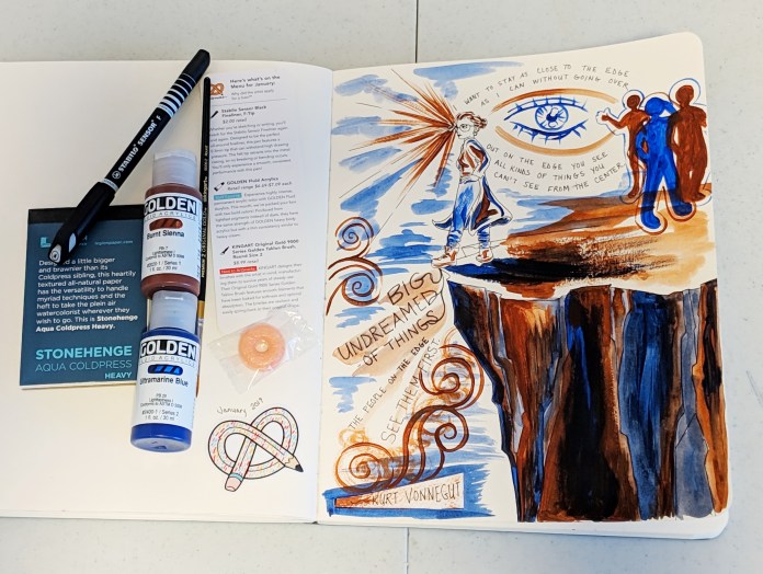
As I said, I really don’t like how this image turned out but, nevertheless … I apologize, Mr. Vonnegut, for besmirching your memory with this so-so art. So it goes … 😉
Watch out for another unboxing next month! I also will have some new art and project ideas in queue for posting, so keep your eyes peeled!


 My students in the


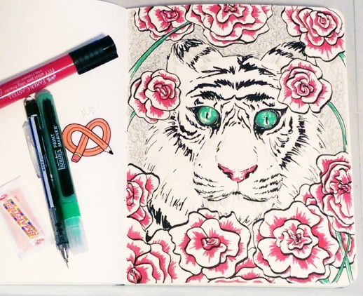
 So, first the scary thing which is the Copic Multiliner. I’m sure it would be a fantastic product if I knew anything about calligraphy, and that is about all I can say as I have no basis by which to judge calligraphy pens.
  Speaking of erasers, the next product was the KUM Correct-Stick eraser. I just now realized this product was hiding and didn’t make it into my picture, but here is what it looks like … This eraser did work really nicely and had a comfortable ergonomic grip, but I feel like it will lose its precise, pointed shape with use. As far as fine detail erasers I think my favorite will always be

 I am a bit late on my
  This was a very successful box for me – I loved the brush as well. The firmness and shape allows it to work well for both filling in tiny detail areas, and covering larger areas depending how you tilt the brush. It worked excellently for applying shading. Another success was the watercolor paper, which I expected since I already quite like the Canson brand :).


 So, I was having a really rough week y’all … and then I got this in the mail.
 The January box came with:
 I decided to do what a lot of artsnacks subscribers do after receiving their box, and join the fun of challenging myself to create a little picture using only the products in my box for the month. This is also a great way to test out the materials, especially if they are unfamiliar to you. Another fun thing about artnsnacks is the fact that the colors of the products you receive are totally random … The royal blue was lovely, but that olivey/sage green and bright orange? – maybe ok separate but kind of yikes together. So, here is my unique green penguin, swimming beneath the chilly arctic waters.