I’m sure there are a couple out there, but I don’t know any artist who creates to complete silence. The music we listen to can definitely have an effect on how we create. Earlier this year I worked with a group of kids and helped them paint while listening to an orchestral score, the kids painting what they envisioned as they listened to the music. I know as a highly visual person, whenever a song comes on I automatically see flashes of images in my head while I listen, even if it is just colors or patterns that the music brings to mind.When it comes to good art-making music, most people seem to swear by classical. I certainly don’t mind classical music, but I tend to prefer songs with lyrics to solely instrumental. I have a wide range that gets me going. Some days I love painting to Minor Threat and The Misfits, but I have found that for fine detail work calmer is better. I love accompanying art with coffee as well, so if the music is too energetic and I am too caffeinated, I will literally just pace and dance around and get about 1/2 as much work done. Also, when I’ve worked all day and been around lots of noise and chaos aka students (gotta love ’em) for the past 8 hours, it’s nice to listen to something tranquil. For your perusal, I’ve assembled a list of calm and creative music that is my muse while working, at least for right now.
Broadcast
Aside from the fact that the lead of Broadcast had one of the most soothing voices I’ve ever heard, the title of this album is called “Future Crayon” so you know it has to be good art-making-music.
San Fermin
I had the pleasure of seeing San Fermin live last fall, and it was one of the best shows I’ve ever been to in my life. I’ve never seen a group of people play so many instruments at once, and play them all like masters.
Michael Nyman
I’ve actually never watched the film this song is from, but a yoga class I took in college used this song in a playlist that would be on repeat during every session. All of his music is equally stunning and tranquil, though this song has remained my favorite.
Elliot Smith
What can I say, I love sad songs.
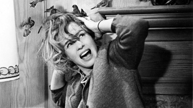
The Entire Old Boy Soundtrack
Ok, so this movie is far from peaceful as you can see from the featured movie poster above – so brutal – but the soundtrack is ahhhmazing. The music varies in style, but most of it is mainly instrumental and it’s very creative and fun, a perfect backdrop for art. This song I’ve featured is my absolute favorite. The movie is pretty visually amazing as well, if you have a strong stomach (or a blanket to peek through intermittently ;)). Watch the original, do not watch the shitty American version, please and thank you.
Beach House
Again, amazingly soothing vocals and creative melodies. I feel like I’m entering a mythical dreamland when I listen to this band.
Morrissey
I may get accused of being a fangirl, but I seriously do make the best things while listening to Morrissey. Both his solo lyrics and those from his songs with The Smiths also tend to have an eerie way of stating what I’m always thinking.
80s music videos … oy.
So, what do you listen to when you need to concentrate but can’t stand the quiet?


")
")

![IMAG3175[1]](https://artistallisenicole.com/wp-content/uploads/2016/07/imag31751.jpg?w=496&h=496)


")


")