Techniques and Tutorials

Blending With Watercolors – Stained Glass Ocean Project

wc blend 1

Hello! Today I want to show you a fun beginner project you can do to practice blending colors with watercolor paints and markers. If you are a complete beginner to color mixing, it is easiest to stick to either all warm colors (red, yellow, pink, orange …) or all cool colors like I did (blue, green, violet …). Some colors when blended together turn into “mud”, making a neutral like brown or gray. This is where understanding the color wheel comes in handy! For more about the color wheel, visit my earlier post Colors Aren’t Scary :). For this project, we will try out both flat brushes and round brushes. Round brushes have a teardrop shaped bristle that comes to a point at the end, and flat brushes have rectangular shaped bristles that are, well, flat on the end. Pretty easy to remember! It’s good to have a variety of sizes of each. Your brush size depends on the size of the area you are filling in. If your brush is too big, you risk getting paint where you don’t want it  but if your brush is too small, you will see all the little strokes and the paint won’t cover evenly.

wc blend 2

I started first with an outline, drawing my design in pencil on watercolor paper and then tracing over it with a waterproof black fine-liner pen (Sharpie fine points will work – You do not necessarily need a fancy art pen, though my preference when I do watercolor and ink work are these bad boys by Staedler.). You can draw your design however you want, or if you want to practice this technique without the added pressure of drawing, feel free to print this outline out and use graphite paper to transfer it right onto a piece of watercolor paper (Don’t have graphite paper on hand? Just shade over the back of your printout with a pencil, lay it on top of your watercolor paper, and trace over the lines and it will work the same way, though a bit more labor intensive.).


With watercolor, you want to start with the background and move to the foreground, and you always want to work lightest to darkest. It’s all about layering and building up colors since the paints themselves are translucent. In this more simplified project, we will be focusing just on blending this time, not layering. Still, working with the background first ensures that if any background color does find its way into the waves, which it inevitably will, we can just work right over it later and you won’t even notice by the end. Starting with the background, you want to choose a couple of colors (I used a cornflower blue and a cerulean blue.) and water them down so that they are consisting of mainly water with a small amount of pigment. Then you want to use a larger round brush and start filling in the space using circular motions. This will give our background wash a bit of texture, so that it has a hazy, cloud-like appearance rather than just flat streaks. I applied the cornflower blue on the bottom half of my sky and the cerulean on the top. Because both colors are wet, they should bleed into each other and blend together in a pretty seamless gradation. Be sure to overlap the two colors slightly where they meet. If they aren’t blending enough, you may also rinse off your brush and using the same circular motion run over the line where they touch with your damp brush to work them together further.

Color blending is one of the foundation skills of painting with watercolors, but it takes a lot of practice. Good thing you are about to get a lot of it! We did a textured blend for the background, but within an individual space inside our waves, we are now going to practice some flat blending with the goal of getting our colors to merge into as smooth of a gradation as possible. Now we are going to use a medium sized flat brush. A flat brush will be perfect for the smooth effect we need and will also be easier to keep inside the edges of our geometric shapes. You can tilt the brush so you are only using the tip rather than the whole side for narrower areas. Pick 2 different colors, and start painting one color on one end until you’ve gotten to about halfway across. Rinse your brush, and paint in another color starting on the opposite end, overlapping in the middle. A unique quality watercolor has is that when one color touches another while it is still wet, they WILL bleed into each other. In this case, that is a good thing as using wet-on-wet color with watercolors makes for some pretty low-effort, seamless blending. Still, watercolor can be finicky and things don’t always go as planned. I purposely filled the shape in so that there are darker, patchy areas and a harsh transition between the two colors. This happens sometimes, but can be easily rectified by going back over the uneven area with a damp brush. Be sure to always paint in the same direction, following the length of your shape.

Blending with watercolor markers is a similar process, but you need to be a bit more controlled with your water application so that you don’t completely lose the effect of the ink. I love watercolor markers because you can get such bold contrast, but a little bit of ink goes a long way, and with too much water your separate colors will just swim all together into one mass.  I cannot emphasize enough, quality also matters. If you get cheap markers, chances are they won’t blend nicely no matter how skillful the artist. They don’t need to be officially called “watercolor markers”, they just need to be water soluble so they will run when wet. I love using Tombow’s water soluble brush markers. You also need to think about the values of the markers you are using. Deeper colors will spread a lot farther than paler colors, and can overpower. I have started with a darker color, a royal blue, and a lighter more muted color, a sage green. Start by scribbling a bit of each color on opposite ends of your shape. You do NOT want to shade the entire area in. Again, a little bit of ink goes a long way when water is added. Then, still using a flat brush you want to dip your brush in some water, tapping off the extra on a nearby paper towel. Wet the ink on one side and work it into the middle of the shape. Rinse off your brush, and wet the ink on the other side, again working towards the middle where they will meet. The wet colors will again, flow together and seamlessly blend pretty much on their own once they meet, staying darkest where you first laid down the ink. You can see above that a gradation is apparent, but the blue has pretty much taken over as the main color you see.

Trying the process again using the same 2 colors, but shading in only a tiny bit of blue and more of the green, you can see we get a more balanced effect where the pure green color is still highly visible.


You can also create a gradation with only one color. The beauty of watercolor is the depth of value that can be captured from one single hue, simply by adjusting the amount of water added. To do this you would apply a bit of the same color on each end in a darker or medium value (mixing less water with your paint). Then, rinsing off your brush, add some water to the edge of the area of color on each side, again spreading towards the center from each end. The color will remain most saturated at the ends, and will be the lightest (most watered down) in the center.

If at any point you add too much water, your gradation is in danger of all just running together into one flat tone. If this happens, you can blot the area with a paper towel to lift the excess water (and some of the pigment), and then blend right over again. You don’t want to see any “puddles” pooling on your paper … that is a sign there is too much water being used. Also keep in mind damp is ok, but if you are filling in a new area next to an old one that is still very wet, the colors will bleed together over your lines. Sometimes it helps to use a blow-dryer to speed along the drying process. Or, you could just work on filling in areas that aren’t touching each other until each spot dries. The paint air dries pretty quick.

wc blend 1

Here is a reminder of the final image! It is the same blending process for each section, which is what makes it good practice. I filled in some spaces using the markers, and some with paint. I kept lighter colors on the crests of the waves, and alternated medium and dark tones throughout the body of water, making sure not to fill in too many of the same colors right next to each other. It always feels good to still have some sort of finished product after practicing techniques, and I guarantee you will start to see a difference in the first couple spaces you fill in versus the last! Remember, it’s all about playing with color. Have fun!

Standard
Project Ideas

Piet Mondrian – Creative Minds Art History Project

piet.mondrian
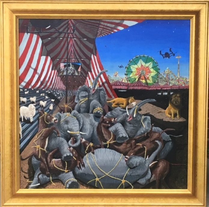
I promised I’d catch up in posting all my Creative Minds art history projects from the Fall and Winter semesters!

You may not recognize the name “Piet Mondrian“, but I guarantee you’ll recognize his imagery. Mondrian was interested in simplifying art down to its basic essence, and creating a type of universal design that could be used for everything: visual art, furniture, architecture, clothing … I’d say he was pretty successful, as his primary colored designs composed out of different sized squares and rectangles bordered by bold black lines can be found covering posters, furniture, jewelry, shirts, and the pair of Nikes I would buy if I were rich.

We do a lot of painting in the Express Yourself Artshop program, so though we easily could have done the whole “make a grid on canvas with blue painter’s tape” thing, I wanted to try something more original – transferring a Mondrian design onto glass. The glass we used was just glass from the inside of an inexpensive frame. This could be done in any size. The actual frame could easily be used on a future project. We used primarily colored tissue paper for our rectangles, though we happened to have a bit of patterned and textured vellum on hand that can be found in the scrapbooking section of craft stores and is great for mixed media art. The goal is to use thin, transparent paper so light can shine through the glass. I cut a variety of different sized rectangles and squares out of scrap cardboard for students to use as a pattern. Students chose their colors, and then traced different shapes using the patterns until they had a good pile to choose from. They then laid out their shapes on the glass to create the desired pattern. After they were happy with their design, it was time to glue. We just used traditional liquid school glue, but squeezed the glue out on a piece of foil and used a crappy paint brush to paint the glue on the back of the paper so it didn’t get too saturated.


The front of the finished product is going to be the glass side without anything glued to it, so if you do end up using papers with a one-sided pattern, you need to glue the side you want to see face down. Once the paper dried, we trimmed any paper that was hanging off of the glass and used a ruler to draw on the glass side (NOT the side the paper was glued on to) with a black, medium tip paint marker. This sharpens and finishes the design, and also disguises any uneven edges.

These can be as simple or as intricate as you want, and are a fun project with a beautiful end result that can be completed fairly independently by all ages and abilities. My students with disabilities who struggle with dexterity were still able to do this on their own and end up with a piece of art they were proud of. Display in a clear plastic plate stand … It would be especially cool in front of a window or other lighted area. Have fun creating :)!

Standard
Project Ideas

Alexander Calder – Creative Minds Art History Project

09e5c065d1594c85473cc0f55bc4e082I’m a bit behind on sharing my art history projects from Express Yourself Artshop … This one is from the first 5 weeks of the Fall semester! But, never fear, they will all be posted in due time! I am not really a 3D art person (love looking at it, hate creating it!) but even I enjoyed coming up with this upcycling activity based on Alexander Calder, the inventor of mobiles.

The great thing about this project is you can use scraps of literal junk that you have just sitting around the house (or if you are super cleanly and don’t let junk collect, start saving with this idea in mind 😉 ). We used primarily painted embroidery hoops, shower curtain rings, hardware odds and ends, painted toilet paper rolls, and the cardboard part that is left when you’ve finished a roll of colored duck tape!

Students were instructed to pick out a variety of small, medium, and large items that struck their fancy from the pile of supplies, and then start laying them out flat in front of them on the table so that they could plan the basic composition they wanted. Calder’s big focus was kinetic sculptures, which led to his eventual mobiles. These babies are meant to shift and move as they hang (part of why I couldn’t get very clear pictures … That and the fact that there is NO dead space to use as a backdrop in our art studio!). Once they had a layout they liked, they could start tying their most prominent “anchor” pieces together using fishing line with a dot of hot glue on the knot to secure it. After the main components were attached, they could focus on adding smaller pieces both to achieve the balance and/or movement they wanted and add visual interest.

If you have a spare hanger or anything else that you can hang your mobile on to step back and look at how it’s hanging while you create, this helps a lot. As they held it up, it bobbed and shifted and was a great opportunity to play around with some simple physics, adding different smaller weighted objects to either balance or cause purposeful imbalance to their growing mobile. Glass beads attached by making eye-hooks through them with jewelry wire made great counterweights if a student didn’t want to add anymore major elements to their design, but wanted to adjust how the mobile hung.

I work with adults with disabilities and some have dexterity issues and needed a bit of help from time to time with the knots, but this project is for the most part something that all ages can do relatively independently.  When you are done, you will have a dynamic piece of modern art that you’d never guess was made out of castaways!

Standard
Artist Bio

On Creativity & Leadership: New Year New Perspective

Though new year’s resolutions can be cliche and oft forgotten, using the turning of a year as an opportunity to refocus can’t hurt. My ongoing goal for this year is to not let the fear of others’ perceptions make me question my decisions either in art or as a leader. Not that I should never question why I am doing what I’m doing; questioning oneself is healthy and necessary, but only if done for the right reasons.

A quick background blurb for those new to the blog – My day job is running an inclusive creative classes program geared towards adults with disabilities and mental health, and I am also a freelance artist.

I was hit with this the other day when I came home from the first week of the program’s new semester on a high, because a new student had taken me aside and let me know that they had not been out in public to participate in group activities in a long time, and that I had been a stabilizing presence that kept them calm and made them feel safe. As I was browsing through facebook while waiting for dinner to cook, I came across an article (mainly aimed at women) that stated that being called reliable, stabilizing, nice, or accommodating were not compliments and were basically code for being a complete doormat. As an independent minded person, this horrified me. Immediately, every time I’d been called any of those adjectives by others rushed through my head and halfway through creating a plan to deconstruct and rebuild my entire personality, I suddenly stopped and asked myself why I was doing this. I don’t know the person who wrote this article personally, nor do they know me. Why does this opinion suddenly hold so much weight? Should I instead be unkind, stubborn, leave a path of division and stress in my wake? It makes no sense for either women or men to live their life that way.

wonder-woman-superman

Though it may not be fierce or glamorous or fit neatly within an awe-inspiring superhero persona, I don’t really want to be the leader who is kicking ass and taking names ;). I don’t want to be the leader that refuses to see the progress and can only focus on past mistakes in the people I work with. I don’t want to be the leader that kicks an employee when they’re down; I don’t want people to come to me with vulnerability, saying “Hey, I may need some extra support this week because I’m having a tough time with____________, or this hard thing just happened in my life, or I’m having this mental health struggle right now,” etc. and my response is, “That’s not my problem, leave your issues at home.” I can still hold people accountable without tearing down their self worth, and I don’t need the approval of those that are on the outside looking in that don’t know my group like I do.

I realized that without knowing it, I’d slipped into these same bad habits with my art … I’ve mentioned before how it was hard knowing what direction to go in after completing my last big 12 part series I’d worked on for around 2 years. When trying to come up with new concepts, I found myself constantly questioning myself based on how a new project may be perceived, and getting nowhere. If I start using more bright colors than usual will people think I’ve lost my edge, if I use my more dark imagery will I come across as an aging Hot Topic shopper, Will men feel left out since I draw mostly women, If I draw men will they think I’m trying to speak for them … ??? I’d gotten a lot of commissions done in the time since and some just-for-fun personal projects, but nothing with a strong direction.

When beginning your next creative endeavor for 2019, whether on your own or leading/educating a group, keep yourself in check by asking the right questions:

What kind of creator do I want to be? This question sounds simple, but is an ongoing process. I remember taking a fascinating hybrid philosophy/law class in college to fulfill one of my freshman year gen eds, and we started by discussing the tombstone question, basically when you’re gone, what do you want written on your tombstone? How do you want to be remembered? Now let that answer be in the back of your mind and guide your decisions, because our daily choices determine who we will become. Once you decide what kind of creator you want to be, the steps you need to take as a creative, the events you need to participate in, the programs you need to donate your time to, will no longer seem so up in the air, and won’t be so susceptible to changing with the wind the minute you hear a bit of noise.

Who am I trying to reach with this project? Oftentimes creative projects won’t be all about you, so there are indeed times you need to consider others’ possible responses to your work. But, if you are trying to appease everyone you will end up running yourself in circles, leading to a sub-par result that in trying to say everything to everyone, says nothing. Think of who you want to speak to with your project – It’s ok for you to create something that isn’t intended to resonate with everyone. Chances are, there will be others outside of your target that will end up getting something out of it, too.

What experiences am I drawing my ideas from? Creation flows most easily when it comes from the fount of something that the creator is passionate or knowledgeable about. Think about what in the world gets you stirred up, either positively or negatively. Think about what experiences you’ve had that have impacted you, that you remember every detail of; again, positive or negative. There may be an artist out there whose aesthetic and ideas you really admire, an artist you wish you could create exactly like, but it likely isn’t possible since they have a different story than you. Find your own voice rather than trying to retell another person’s story. And, if in the end you do want to use your voice to tell the stories of others, make sure you do your research and ask questions!

How would I want to be guided? Methods of leadership or teaching aren’t one size fits all as different styles are more effective for certain personality types, but this question is a good starting point. It pretty much boils down to the golden rule, and asking in each situation, “How would I want to be treated?” I’ve heard horror stories of art instructors sending students away in tears after a critique of their work. Yes, the work of a student or a fellow artist you are collaborating with may not meet your expectations, but how is destroying their enthusiasm for creation or any hope in them that they can improve going to help them get to where you want them to be? In leadership, treat others how you would hope they’d treat you, it’s really that simple.

What is distracting me from my purpose right now? Be mindful of what is going on when you feel yourself getting derailed like I described happening to me earlier … Stop yourself and note what activity was going on when the switch occurred, and what stimuli you were taking in. Is it criticism from toxic people in your life, comparing yourself to others on social media, taking opposing views personally without the lens of evaluation, forcing yourself into a box that is antithetical to who you are … Write it down if you have to, and when you start to notice a pattern do your best to remove or lessen that thing in your life, whether it means taking a break from certain friends or family members or spending less time putzing about online.

I have to decide for myself what kind of leader, and what type of creator I want to be… and so do you!


Standard
Artsnacks Unboxing

Happy New Year! ArtSnacks Unboxing

Happy New Year everyone! I got a couple more months of ArtSnacks for Christmas this year, so let the unboxing begin! I will be honest, I hate the art journal page I created for the Artsnacks Challenge this month, which is too bad as it revolves around one of my favorite literary quotes :-/. No judging!

In this box I received a:

Starting with the fineliner – So sad, but I hated this pen. It comes down to personal preference, but I felt the tip did not allow for fine details, and as you can tell from my end result below, it cannot be used with liquid media without bleeding really badly. I had to go over a lot of lines again because they had nearly disappeared after I applied paint, and the bleeding and smudging is still visible. The ink was definitely dry, as I outlined one day and came back the next to finish the journal page. I feel like it would be better suited for writing than drawing.

As for the paints, I have heard of Golden Acrylics because many of the artists I know will only use this brand exclusively. These paints lived up to their reputation for sure – smooth to work with, nice blending, bold colors that keep their rich look after drying, and great coverage. If anything, this exercise reinforced the fact that I need to sign up for that acrylic painting class I’d been debating taking next month. I mainly use acrylics on crafts or for small scale accents in my mixed media work, and my skills are pretty rusty. I kept trying to use the paints like watercolors, and ironically this line of Golden paints is a great option for acrylic painters crossing over from watercolor due to their intentional transparency.

I also had good luck with the paintbrush. I adore fine line brushes since when I do use acrylics, as mentioned previously, it is mainly just for adding subtle outlines or small details to enhance a larger project in other mediums. Taklon is the material I prefer for my acrylic brushes, and I could tell that this was a quality brush that was going to last. It was the perfect Goldilocks brush – not too soft, not too firm. I haven’t replaced my paintbrush collection since… probably about 10 years ago, so I will definitely be keeping these in mind when I need to get some new brushes.

I found the paper included very interesting as well. The surface is like watercolor paper, but the weight is like painting on a board. It’s a great option for acrylics when you don’t want to use a canvas, and I’d love to try it with watercolors as well … I feel like it wouldn’t ripple as much as traditional watercolor paper.

artsnacks jan 19

As I said, I really don’t like how this image turned out but, nevertheless … I apologize, Mr. Vonnegut, for besmirching your memory with this so-so art. So it goes … 😉

Watch out for another unboxing next month! I also will have some new art and project ideas in queue for posting, so keep your eyes peeled!

Standard
Artist Bio

The Best Art Toys Of The 90s (Or, The Toys That Propelled My Future Career)

As we get close to Christmas, I have no clue what kids today are asking Santa for! I don’t have kids myself, and don’t know many people with young kids. Also, 3-year-olds seems to have smart phones and tablets now, so … Do they still play with toys? Who are they planning to call, Big Bird? I have so many questions. All that aside, toys can be tools that help kids develop their interests and explore what they may want to be or do in the future. In homage to 90s nostalgia and the time when toys were still not quite high-tech, I’ve compiled a list of the best art and design toys from when I was a kid. I’m sure a lot of these will look familiar to many of you! And so our trip down memory lane begins…

Fashion Plates

fashionplatecards-12

This toy let you be a high-class big name designer, mixing and matching your own styles with plastic stencils you could shade over with a magic black crayon and then render in your favorite color story. That woman with the bob, chunky bracelets, and boots is basically the me of today. Check out that dapper lady on the top right adjusting her bow-tie!

Blush Art

First off, this commercial is just nauseating. That aside, this was a fun toy, again utilizing stencils so even those terrible at drawing could be a star, thus preventing any destroyed self esteem. I had the fashion design stencil set for this rather than the ones shown in this video – I was obviously a bit singularly focused. I liked my clothes far better than cuddly creatures, but I’m no Cruella de Vil, just cursed with being allergic to anything fuzzy.

Crayola Stampers Markers

You could make some wacky mosaic drawings with these markers, case in point the self portrait on the right, circa 8 years old. Remember the 70s revival yellow smiley face craze around that time? Those guys are in there.

Barbie Fashion Designer PC Game

Again with the fashion designing … I honestly did consider this career path but alas, discovered later on that I hated sewing.

scan0020

As you can see, the earlier self portrait was pretty spot-on.

Nickelodeon’s Mix ‘N Spin

ece0a94f8a84a07aedf4329a4605a677
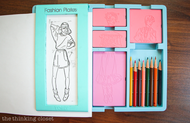
I never had this, but one of my friends did – The 90s kid version of all that
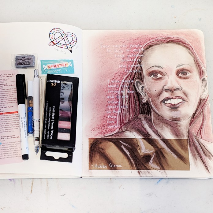
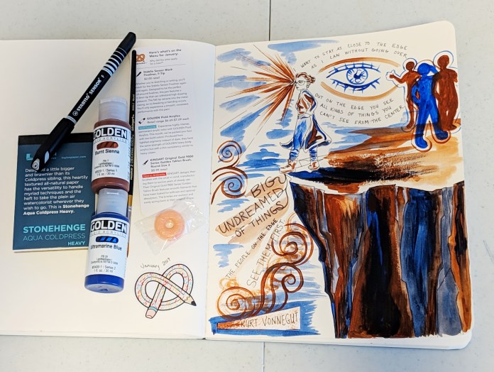
 pour art that is so popular now. Was there any design trend that people loved more than rainbow splatter painting in the 90s?


Watercolor Coloring Books

17741-bw58

These books really lulled you into a false sense of security, giving you perfect blending and shading with just a smear of water, provided you followed the coloring book code and stayed inside the lines ;). Nevertheless, they were so relaxing to sit and fill in, and I spent many a rainy day with a pile of these in front of me, completing one picture after another.

Sand Art

tlk-90s-sand-art

Like color by numbers but with colored sand, you would peel off one number at a time revealing a sticky surface to pour the corresponding colored sand upon to slowly reveal a finished masterpiece. Though Disney ones were always super popular, my sets were of unicorns and tropical birds!

Shrinky Dinks

pendants1

As a kid the shrinky dinks I had were pre-outlined, and you colored them in like a coloring book before putting the plastic sheets in the oven and watching them curl up, shrink, and harden into durable plastic pendants or flat mini figures. As an adult, I discovered the fun of using blank shrink plastic to design your own one of a kind pendants covered in art! I sold these for a couple years in a local handmade shop downtown, and they did really well.

These truly are the toys that made me! I hope everyone gets what they were hoping for this Christmas, though of course, no gifts could ever possibly be as epic as these.


Standard
Interior Design

Pantone Color Of The Year 2019: Living Coral

One of the most exciting things about the changing over of a new year is finding out what Pantone’s new Color Of The Year will be. No, I’m not kidding – I am a dork. Purple being my favorite color, I knew 2018’s Ultra Violet hue was going to be hard to beat. 

2019’s Living Coral is by no means an unpleasant color, but it isn’t a color I wear a lot or use in my art or design. I think it’s a little too pastel and preppy for me, but I’ve found I like it infinitely better when paired with black or grey, because black makes everything better. This was my philosophy with making some original-to-the-house bright yellow and silver foil wallpaper work in my bathroom update last year, and this personal rule of mine has held up!

I was hard pressed to even find any art I have done over the last 10 years that included this coral hue aside from “The Rush Hour”. This piece of art can be seen below, along with some of my favorite interiors, wallpaper, fabric, clothing, and flowers that pay homage to our 2019 Color Of The Year.

I am going to make it my goal now to create some coral colored artwork for the new year! I’m excited to see what comes from working with unexpected colors.

Enjoy the last wee bits of 2018 everyone! I hope it’s been a good one!

Standard
Art Education, Project Ideas

Salvador Dali – Creative Minds Art History Project

Yikes, it’s been a whole month since posting last! My blog isn’t the only thing I’ve neglected … I must tattle on myself and admit that I gave up on Inktober after week 15! A half marathon if you will … perhaps I should have only committed to every other day! I have kept up with doing art every day though, which was the entire goal of Inktober to begin with. I was finding myself in the sticky situation of having to de-prioritize commissions and actual projects with deadlines in order to get my Inktober illustration finished for each day, which seemed counterproductive in the end. I do have a lot of fun art history based projects queuing up to share with you, and today our inspiration is an artist from my favorite genre of art: surrealism … Salvador Dali!salvadore-dali-simpsons-persistence-of-memory

Dali is best known as “that melting clock guy” from his famous piece “The Persistence of Memory” that has now become a part of popular culture, parodied regularly. However, he also had a thing for tall and spindly creatures as evidenced from two more of his more well known works, “The Elephants” and “The Eye of Surrealist Time”.

tall frameMy students in the Artshop Program love drawing animals, and the idea of depicting real things in a distorted way by stretching out their features was a concept that would be easy for everyone to grasp, so this seemed like a great jumping off point for making Dali’s work accessible.
Every work of art looks better behind glass, from works created by a master to works created by someone who specializes in stick figures. Though not every drawing or painting has to be framed especially in a classroom/learning setting, it’s nice every once in awhile. Pro-tip! Frames are expensive, but often times nice frames with ugly artwork in them can be snagged for cheaper than so-so frames that are empty at your local art supply store. These long, framed pastel-dyed crinkly paper guys were clearanced out, because this dentist-office-esque art is really bland and kind of hideous, not something that people would be racing to put on their wall at home. So, we got some custom dimension frames perfect for this tall animals project for super cheap, and just discarded the mass produced “art” inside! This project could be executed with any drawing or painting materials, but I had my students use watercolor markers because it was a medium not all of them had the opportunity to try before,  and the markers would allow us to get bright, saturated, unnatural colors like the deep reds and golds behind Dali’s elephants.

They found a photographic reference of an animal they liked for their subject, and then were encouraged to sketch on scrap paper and brainstorm how they could distort the image. They then made a pencil drawing on watercolor paper pre-cut to size, and used a sharpie pen to outline over the pencil so they wouldn’t lose their guide as they added the ink. The images were filled in with color and water, and there you have it! A simple, yet beautiful and intriguing end result where students had to challenge themselves to distort reality in an effective way. All ages and abilities could take this project in their own direction.

Happy creating! Remember, you are the artist, so you get to determine how you portray your world. Don’t be afraid to play with reality a bit ;).


Standard
Artists To Know

Artists To Know: ArtPrize 2018 Edition!

I just made the last weekend of ArtPrize this year, and though to me it seemed like the venues had less art in them than usual, there were still some standout projects! Keep in mind I was only able to be in Grand Rapids for a day this year, so I by no means saw near everything. Of what I did see, the following were my favorites.

Rynita Shepherd, Sex Ability: Smashing Stereotypes With Sex Appeal

043052-000023

In approaching this piece, I experienced firsthand why I always tell people that when visiting a gallery or museum you absolutely should not just breeze by the artwork, but actually take the time to stop in front of each piece for at least 3 minutes. Looking at this series from way across the room, I thought it was just a set of typical boudoir photos. I am tattling on myself right now and admitting I assumed they were photos taken by a man, probably with some cringey artist statement about “appreciating female beauty”, and proceeded to internally rolled my eyes a bit. Then I actually walked right up to it and looked, and realized that first of all these are NOT photos! These were drawings with a story. Shepherd has a rare condition called Arthrogryposis which causes her to have limited mobility in her arms and legs. Because of this, she uses her mouth to draw. All of the women in these portraits have the same condition. Shepherd says, that society expects so little of people with disabilities, and that, “We are completely discredited as sexy, capable women by society due to our physical differences. We have the same hopes, dreams, and desires. We are every woman.” What a powerful statement, as this artist places the unseen right in our faces, and smashes stereotypes about disability!

Mher Khachatryan, Jesus

042564-000001

I remember this artist’s work from the 2 previous years he was featured at ArtPrize due to his trademark effect of having his images trail off into wisps of smoke and vapor. I’d encourage you to visit his artist profile and look at last year’s tribute to 9/11. Everyone remembers those paintings of a Jesus looking wistfully to the sky, with long eyelashes and glossy auburn hair that every Grandma had hanging in her dining room at one point … This is not that. Khachatryan is from Armenia though he now lives in the US, and wrote lovingly in his artist bio about being able to see one of the first churches ever built in his home country. I can actually see the emotional, spiritual, and cultural connection the artist had to this subject as I look at this piece. The light, airy, glowing feel he has achieved using oil paints and mainly dark black at that is no small feat. I saw many viewers stop and audibly gasp in wonder as they approached this large scale painting. For your art to have that kind of power is a beautiful thing.

John Gutoskey, PULSE Nightclub: 49 Elegies 

801191bb-29ba-4028-9933-1a095830fcc4-gram-402

I adore mixed media, and this series stopped me dead in my tracks. Each piece individually is intriguing and beautiful, but hung together the viewer feels immersed and transported. This series uses monoprints to commemorate each of the 49 people massacred at PULSE nightclub in Orlando, Florida in the summer of 2016. The series is rife with symbolism encompassing the themes of grief in the wake of a tragedy, and violence against LGBTQ individuals and people of color.

Daniel Robert Mattson, Sideshow

042041-000002

I appreciate so many things about this piece, and would encourage you to click on the link to the artist’s ArtPrize profile to read all he has to say about it. This surreal allegory feels like such a release from the built up tension I know I have been experiencing in our current political environment. It is bipartisan, and Robert has made a piece rich with symbolism though even in his bio he will not divulge everything that was going through his mind, preferring to let the viewer think for themselves – a truly American sentiment. Robert said that “This particular piece has haunted me years”, and it does make a startling picture of our society, one that is not to be desired. However, if we can recognize it and call it what it is, then we can change it.

Kimberly Wolz, Rainbow Connection

artprize_web_photos-01_768_183_90

In this piece, Wolz created a ton of small, square pieces of art featuring quilled paper animals and plant life arranged in color order using Fibonacci’s golden ratio. It is meant to represent harmony, and I have heard that the paper quilling process itself can be quite calming, meditative, and harmonious. The detail is exquisite, especially to someone like me who couldn’t even make a paper crane during an origami craft lesson as a kid!

George Cooley and Margaret Brostrom, Human Targets

042377-000017

This collaborative series confronts the psychological affects of using human targets. seven pieces exploring the dehumanizing qualities of human targets. The artists believe that using human shaped targets desensitizes the shooter towards real violence, and go as far to say practicing on human targets is premeditation for murder – In weapons training and competitions using these targets, more points are awarded for shots that would “kill” a real human in the area the competitors are aiming to hit. I am so far removed from recreational or even protective gun use that I honestly hadn’t a clue that these were the targets most commonly used at shooting ranges … No one in my family hunts, and growing up no one in my household was ever the least bit interested in owning a firearm even for protective use. I have never been to a shooting range, and always pictured targets as the little red and white concentric circles like Katniss Everdeen may use to practice her bow and arrow. It’s a lot to think about, and this artwork starts an important conversation. The artists produced over 50 target artworks, and chose 7 for the final display. I do a lot of series myself, and am impressed by their commitment to put their strongest work forward for this important and relevant issue.

This post comes a bit late, but I hope you all enjoyed learning about some new art and artists. Have an inspiring evening!


Standard
New Work

Inktober 2018 – The 1st 14 Days

This is my first year participating in Inktober, a fun tradition encouraging artists and designers to develop consistent habits, and make time to sketch regularly. I decided to do my daily ink drawings in ACEO form. The small trading card size makes completing daily drawings doable for a busy lady ;), and I’m putting them all up for sale in my Ebay Store for a reasonable price. ACEOs are such a fun way to collect original art. Even for someone who loves to draw, drawing every single day is quite the challenge. I’m about halfway through, wish me luck!

Standard