New Work

New Work – The Enchantress

Behold! In progress photos from instagram (allisenoble)! It’s been quite a journey.

11781827_10103309511210018_7514112424454279570_n 11099650_10103315701095438_2103193272238016512_n

11752533_10103316100020988_1678764587642196268_n
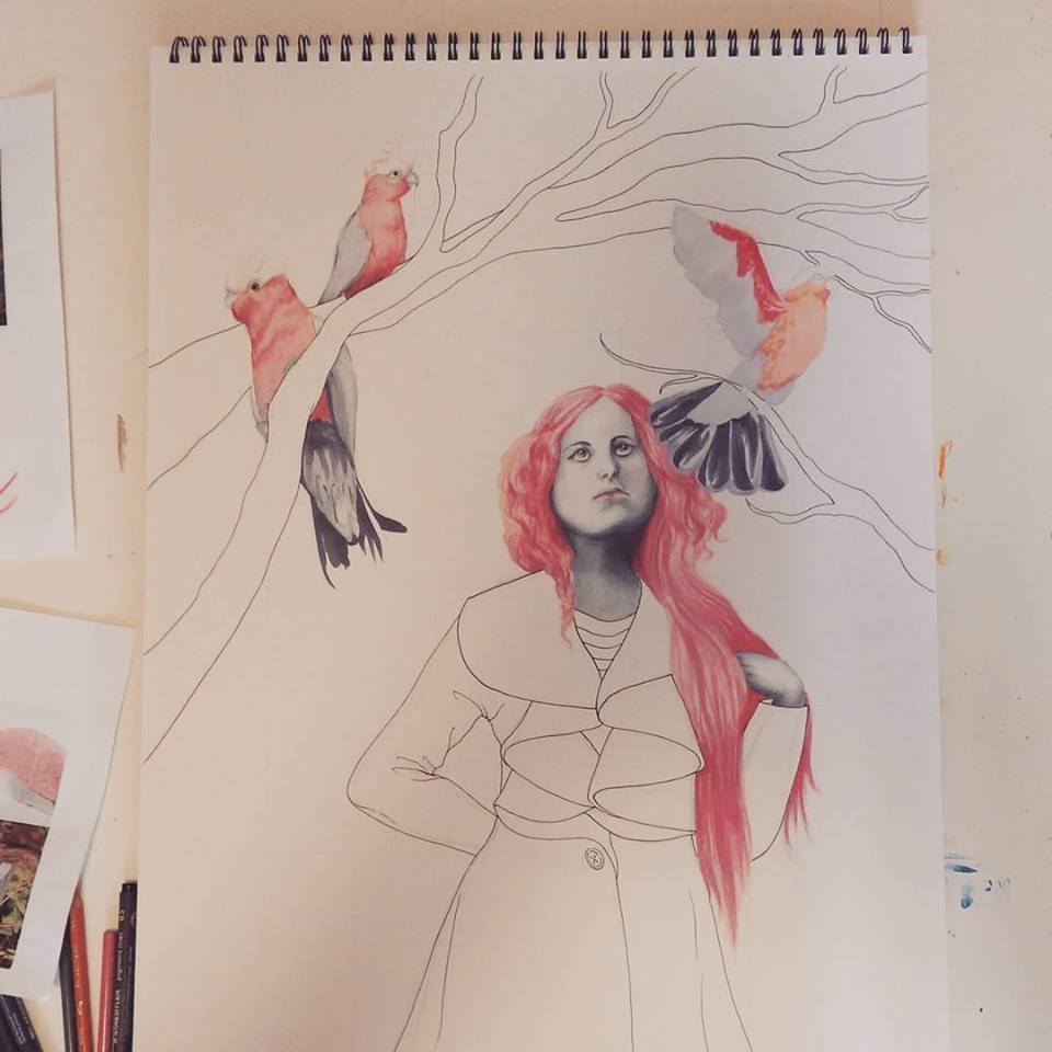
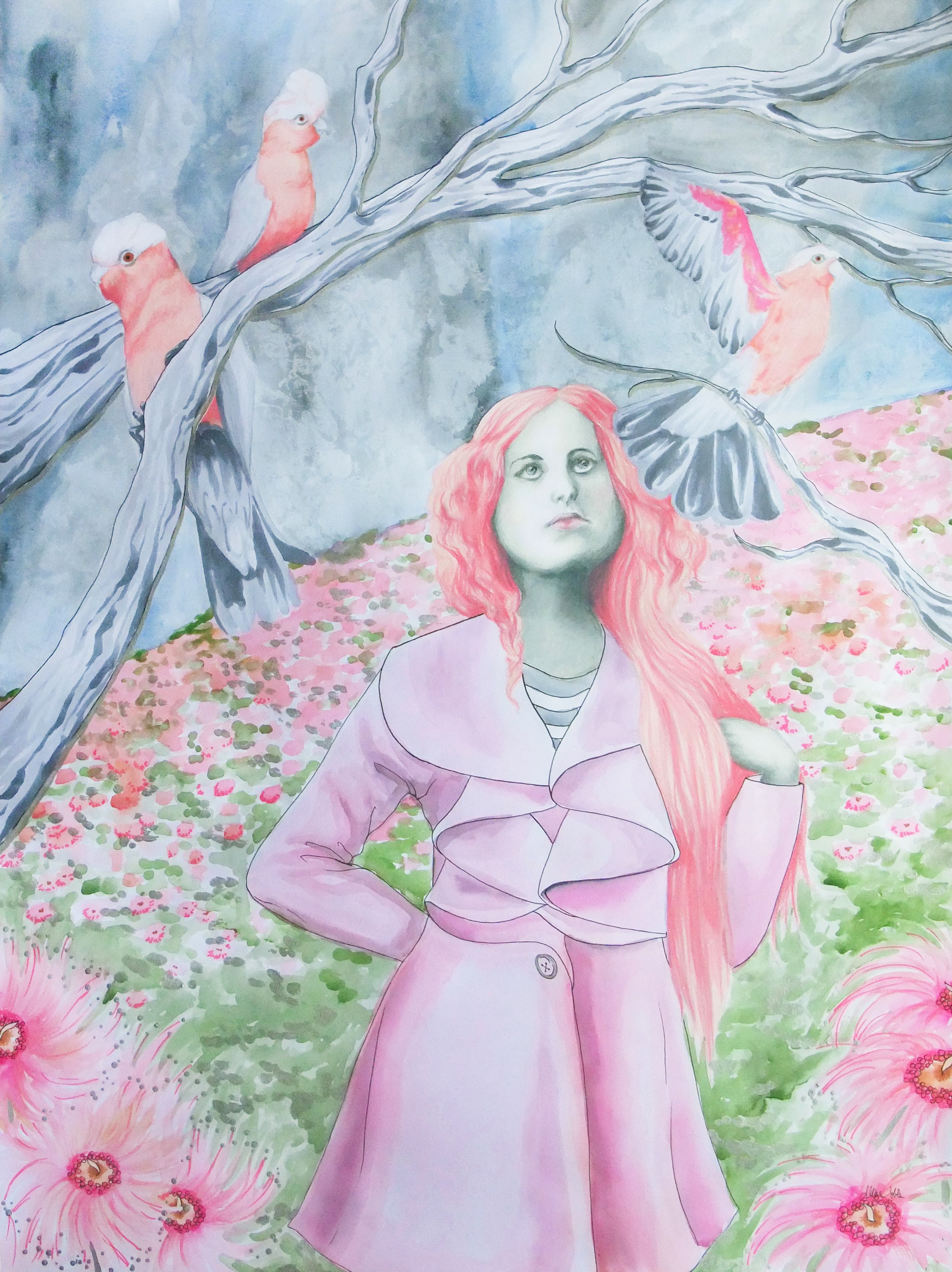
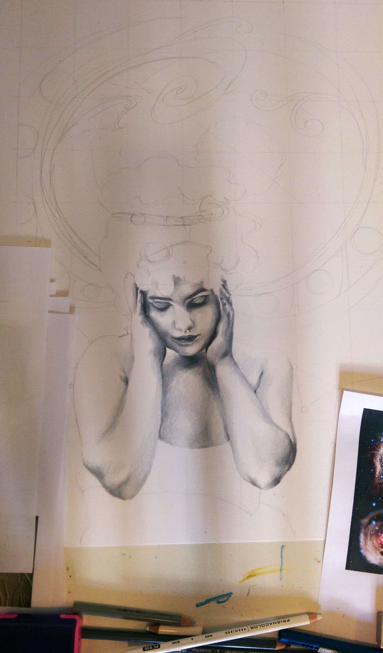
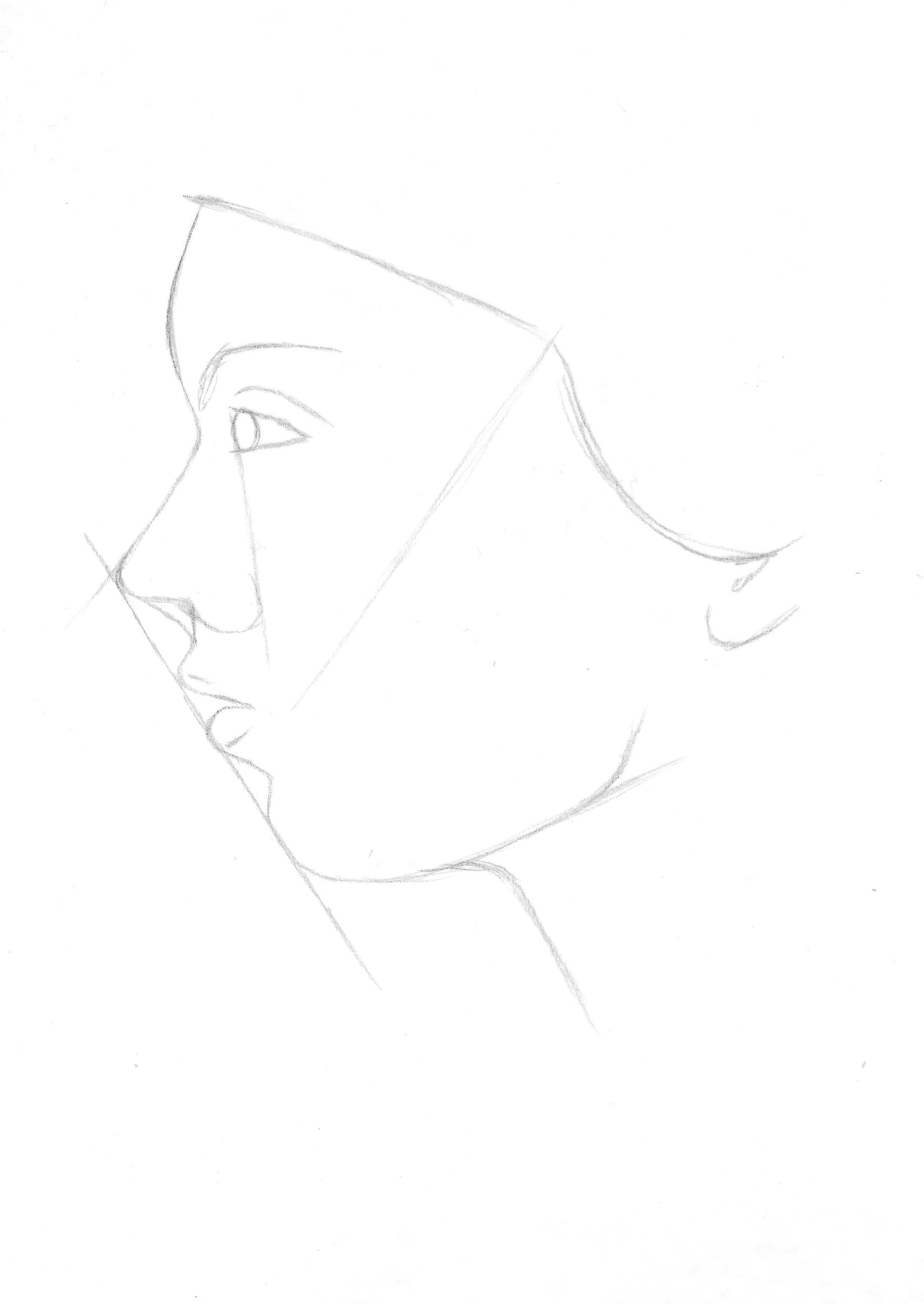
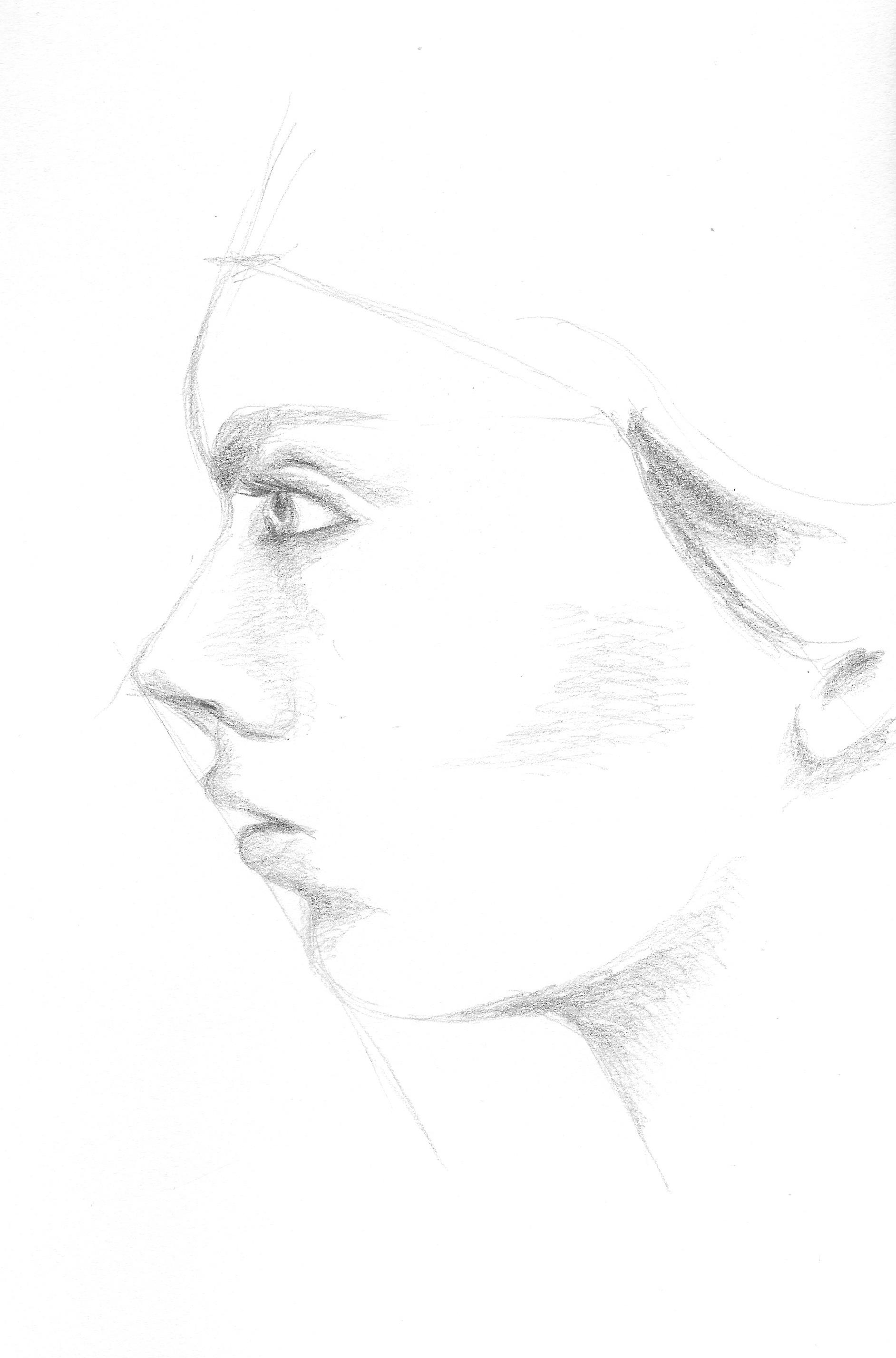
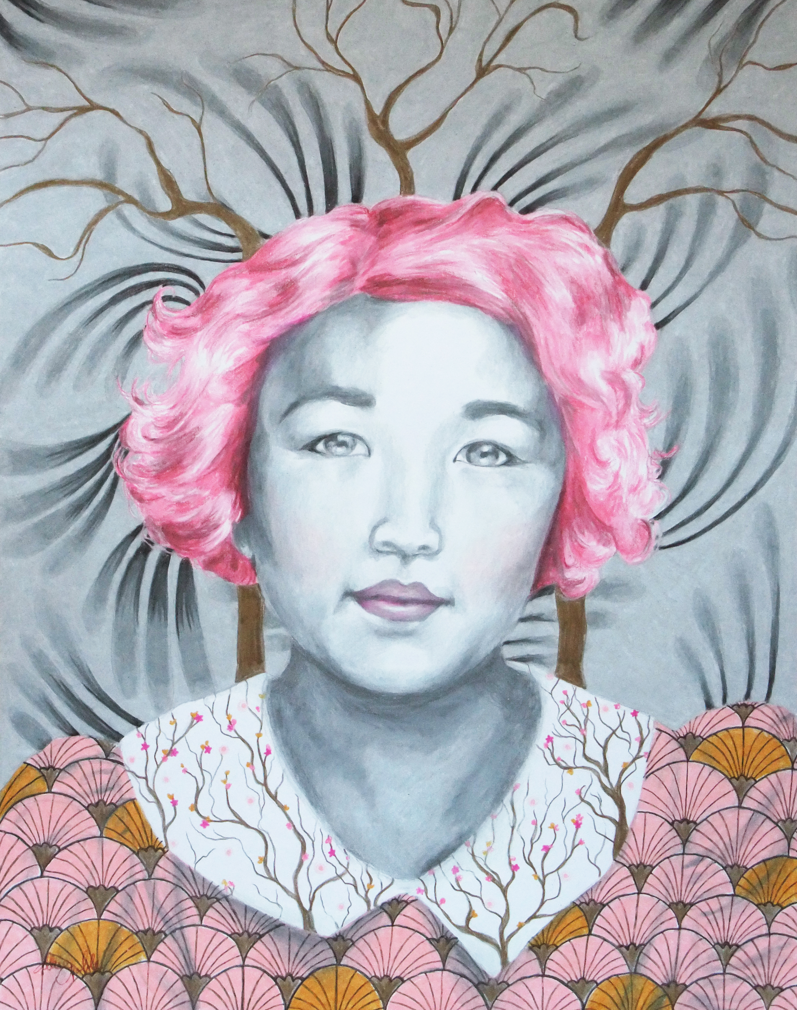
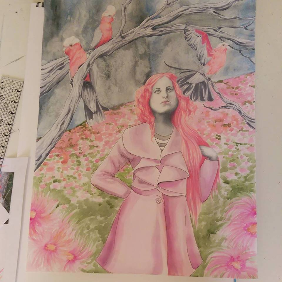
This piece was inspired first by the cockatoos. I then based the figure off of what I thought this bird’s matching human counterpart would look like. I wanted to use primarily pinks because pink is a color that is hardly ever found in serious art (i.e. not pretty-little-princess-time children’s picture books), and you know, it’s just light red so I don’t know what everyone is  so afraid of ;). I used ink for the birds and branches, pencil for the figure’s face and hair, watercolor for the background, and accented in metallic silver acrylic. The figure is mysterious and enchanting. The word “enchantress” is often cast in a negative way, as either a fantasy villain or else scheming heart-breaker. The dictionary definition of an enchantress is a “charming, irresistible woman”. It goes on to give examples such as “dangerous, sexually exploits innocent men”. Oh really? [insert facepalm here]. A woman can be powerful and captivating, mesmerizing and awe-inspiring, without being discredited as somehow “untrustworthy” or “dangerous” because of her strengths. It’s all in how you use the power that you radiate. I wanted to show a softer, positive side to the descriptor as a beautiful, intelligent and thoughtful, creative soul that shines a light wherever she goes. Let me know what you think!

the enchantress

Standard
Artists To Know

Artists To Know! Installment Four

I really don’t give photography or sculpture enough love. I tend to have my eye caught most by drawings, paintings, and mixed media because it’s what I do and I understand the process, but there is so much more thrilling art out there in every medium. So, for these next couple “Artist To Know” installments I am going to focus on art forms besides the aforementioned. Today is photography’s day to shine. Though there is also a lot of stunning landscape and animal photography out there (I mean come on, nature is amazing!), I chose to feature a type of photography less often explored, utilizing props, costumes, and often times incredibly extensive handmade sets to create a new and different world that the photographer envisions. These photographs tell a story beyond the appreciation of beauty. These are not about capturing the perfect moment, but creating the perfect moment to capture.

Tim Walker

British fashion photographer Tim Walker shot his first fashion story for Vogue at the young age of 25, and has continued shooting for British, American, and Italian Vogue ever since. He has also created stories for W magazine and LOVE magazine. I love the entrancing worlds he creates ranging from the soft and ethereal to the colorful and kooky. As a kid, I always wished there existed a magic television that could record people’s dreams while they slept, so I could watch others’ dreams (curious and nosy kid, for sure ;)). I imagine Walker’s photos are what the recordings would have looked like. He invites you into his dreams. You really have to visit his website and see his series of surreal photographs featuring well-known actors and actresses that he did for W – they are of the colorful and kooky variety, and some of my favorites. Amy Adams, Julianne Moore, Bill Hader, Keira Knightley, and Eddie Redmayne? Yes please.

Alex Stoddard

Alex Stoddard’s first exploration with photography was a series of self portraits he began taking at 16. I find people that are able to simultaneously compose amazing shots and also act as model in them and convey the correct body position and emotion on their face mind blowing as it is. It is clear that each of Stoddard’s photographs tell a story, and the viewer is dragged straight into it, no longer just a passerby gazing at a scene or figure but an active participant in whatever is going on.

Lindsey Adler

Lindsey Adler is a professional portrait and fashion photographer, known for her bold, graphic compositions. What is also cool about her is she loves sharing her passion with others, and lectures tens of thousands of photographers each year worldwide. Not every artist is willing to share their secrets, or wishes to take the time out of creating work to teach others, and I find that very admirable and inspiring. What I was most drawn to  about her work is her super-close-up face shots that turn her model’s face into a work of art. There is obvious careful attention to color, space, and line, even when working with the natural hues and contours of a face rather than adding fantastical artistic details like below.

Kirsty Mitchell

Winner of Lens Culture’s Visual Storytelling Grand Prize in 2014, Kirsty Mitchell worked as a successful senior fashion designer for an international label until personal illness brought on unexpected life changes. It is then that she connected with the camera, and she states that it changed her life forever. Her series “Wonderland”; my personal favorite and the series from which the image below is a part; was inspired by her mother, who sadly passed in 2008. The sets, costumes, and props are hand-created and filled with exquisite details, which is what captivated me in the first place. Mitchell says she found herself creating pieces that echoed her mother’s stories, and the need to create the worlds of her dreams and make them tangible grew. The greater meaning behind these images is evident in the awe-inspiring end results of the project.

Michael Belk

Michael Belk is an accomplished fashion photographer whose work has appeared regularly in Elle, Vogue, and many other publications. He always said of his work “There is no hidden meaning in my photography, no agenda beyond the image itself. I am attracted to beauty …” Then suddenly, his focus shifted away from the model of “art for art’s sake” and he began spending all of his time composing modern day biblical scenes. In an interview with The Christian Post, Belk says of the inspiration for his new passion, “I was in New York prepping for a photo shoot a week after 9/11 and saw many people searching for something.” It was out of this realization that in the midst of chaos people were fearful and didn’t know where to turn, in conjunction with Belk’s own experience of faith in what he calls one of his “darkest hours”, that “Journeys With The Messiah” was born. Belk places the stories of Jesus in a modern day context to communicate timeless biblical themes in a way that is sharply relevant to today’s culture and issues. The strong light source and worn, sepia filter over all the images in this series communicate a strong feeling of sincerity, and seamlessly merge imagination and creativity with history. “Journeys With The Messiah” is beauty, with a purpose.

I hope you’ve enjoyed this week’s photography! Next time, it’s sculpture. Have any favorite photographers I didn’t mention in this group? Give me a shout! I love learning about new artists myself.

Standard
New Work

New Work Reveal – On My Mind

My new piece ended up coming together rather quickly. I’m guessing it was due to a combination of the sudden dismal weather over the last couple days and also on and off feeling like I was coming down with something and being low on energy over the last week or so. Neither of these occurrences are fun, but they did force me to have lots of sit-down, indoor time when not at work which certainly upped my art production. Like the last conceptual portrait I did, I wanted this piece to be mixed media so I could use the artistic medium best suited for each part of the composition. I ended up using prismacolor pencil for the portrait, acrylic for the space scene, watercolor for the background, and fabric for her dress – the star print was just too perfect. I added some embroidery detail around the figure at the end to finish it off and really highlight the figure and bring her into focus despite her subtle, lighter tones. I found the inspiration photo first, and then built from there. I love finding interesting bits and pieces of inspiration in the unexpected. One wouldn’t expect a piece of art to spring from a blurred antique photo with poor lighting of a girl holding her head sulking as if she has a headache. But, I saw that photo and instantly thought of a heaviness or vastness she must be holding inside her mind. Hence, the universe concept. I wanted to add art nouveau detailing because I’ve never done an art nouveau inspired piece, and it is truly one of if not THE absolute favorite design period of mine. I knew the iconic swirling, rounded patterns would be perfect to compliment the outer space motif. I’ve actually been remembering to take progress photos to some extent. I’ll get the hang of this blogging thing yet ;).

Initial portrait shading finished, and just filled in the space scene with acrylic.

Initial portrait shading finished, and just filled in the space scene with acrylic.

Adding the art nouveau detailing by filling in the pencil outline with metallic gold acrylic.

Adding the art nouveau detailing by filling in the pencil outline with metallic gold acrylic.

Darkened some of the shading on the figure to balance the dark areas of deep space and the moon phases pattern, and added layers of metallic watercolor to the background. Also detailed some constellations over the watercolor.

Darkened some of the shading on the figure to balance the dark areas of deep space and the moon phases pattern, and added layers of metallic watercolor to the background. Also detailed some constellations over the watercolor.

More layers of watercolor, the final embroidery design around the figure, and voila!

More layers of watercolor, the final embroidery design around the figure, and voila!

Standard
New Work

New WIP, and Building An Army

I started a new conceptual portrait, this time involving stars and space imagery which I haven’t used a lot in the past – time to retire the flowers and forests for a bit. I am also going to be adding touches of art nouveau, one of my absolute favorite design periods. I’m not certain what main accent colors I will be using with the black and white as of yet, but I’m leaning towards navy and gold, we shall see. The tilted downward angle of the face is certainly more challenging then the classical head and shoulders portrait, but after much erasing, success! Even practiced artists are in love with erasers.

wip

When I need a break from the more technical, detailed work, I’ve been having fun growing my little army of wooden dolls – currently two strong. Who am I kidding, painting those tiny little clothing patterns and facial features on wood with a couple-hairs wide paint brush is still technical and detailed :P. I have always loved the simple cuteness of Japanese kokeshi dolls, and I wanted to try my hand at designing my own take on them. I figured wood would be easiest to paint with acrylics, so I perused the wood crafts aisle at Michaels after teaching a class one day and found 2 bags of shapes, one conveniently labeled “heads”, the other “bodies”. What luck! It doesn’t get much easier than that. Along with glue, I ran a heavy toothpick through the partial hole in the bottom of the head and the top of the body for extra support. This would be a really fun project to do with kids as well. You could even glue on small googly eyes, and some yarn for 3-dimensional hair, cut pieces of fabric or patterned paper to glue over the body, some small buttons down the front … the possibilities are endless. I will post pictures of their friends once I finish some more, promise! I will also keep you updated on the new portrait. Have a great start to the week everyone!

Pretty simple supplies ... it's all in how you decorate them!

Pretty simple supplies … it’s all in how you decorate them!

Two of my non-handmade modern kokeshi dolls

Two of my non-handmade modern kokeshi dolls

Each of them just has to have SOMETHING on her head. Yes, that is a real acorn on the left, brushed gold and sealed. I was on a hike and quite literally exclaimed to my boyfriend, "They look like mini hats!!!" and started frantically collecting as many as possible. I knew they would come to good use one day!

Each of them just has to have SOMETHING on her head. Yes, that is a real acorn on the left, brushed gold and sealed. I was on a hike and quite literally exclaimed to my boyfriend, “They look like mini hats!!!” and started frantically collecting as many as possible. I knew they would come to good use one day!

Standard
Techniques and Tutorials

Drawing Profiles and Roaring 20s Twisted Damsels

In both portrait drawing and portrait photography, the most dynamic of compositions often involve partial or full profiles, because profiles by nature create more interestingly shaped negative space around a figure. Profiles are also THE most dreaded type of portrait to draw. For years I shunned them after far too many failed attempts, my lovely subjects coming down with the dreaded gorilla-lips curse; that tragic moment when you end up with either too much or not enough space between the nose and chin to squeeze the lips into, and then there is the question of how far should the lips actually stick out anyway? Hence, we end up with the look of a monkey trying to blow a patron a kiss at the zoo… not good. I forced myself to peruse tutorials after finding far too many wonderful 1920s flapper photographs of kickass ladies I wanted to include in my compositions, all taken in profile! Coupling this with my own experimentation, I believe I have come up with some pretty solid methods to make drawing profiles easier. What works for one artist may not necessarily work for another and there are many different approaches, but I hope this gets you started.

*Some of the angled guidelines appear to be a bit different in the photo versus the drawing, but don’t be confused! The images got put into my scanner and they simply weren’t all lined up *perfectly* straight since the paper I used was too big and hung off the edges of the scanner to begin with. So, ignore any of these visual discrepancies as scanner error :)*

*The reason I don’t start with the classic “oval head shape* is because a profile tends to deviate from that roundness eventually anyway, and you will inevitably run out of room in the end and wind up trying to squash the mouth into that restricting beginning oval size and shape. Doing this, you will either not have enough room between the nose and mouth, or have a nonexistent chin. It’s much easier for me to get the features down first, and then use a measuring tool (I always go with the eye) to inform you in how high the forehead should rise, how far back the rest of the skull should extend, etc; everything kept in proportion to everything else.

This is the image we will be working from. You will notice the line running diagonally from nose to chin - this is a lifesaver! On every single face, no matter what the proportions, the end of the nose, lips, and chin will all touch a diagonal line drawn from nose to chin, the exact angle of this line may just vary. This will be a HUGE help to us later.

This is the image we will be working from. You will notice the line running diagonally from nose to chin – this is a lifesaver! On every single face, no matter what the proportions, the end of the nose, lips, and chin will all touch a diagonal line drawn from nose to chin, though the exact angle of this line will vary. This will be a HUGE help to us later.

Have you ever seen artists when drawing a still life or model lifting their pencil up, squinting at it, and then laying it against their paper? They are using their pencil as a guide to gauge the correct angle, and we can do that with a photo reference as well.  Lay your pencil against the angle of the forehead to gauge the angle start, and then move the pencil over to your paper and create that same angle.

Have you ever seen artists when drawing a still life or model lifting their pencil up, squinting at it, and then laying it back down against their paper? They are using their pencil as a guide to gauge the correct angle, and we can do that with a photo reference as well. Lay your pencil against the angle of the forehead, and then move the pencil over to your paper and create that same angle in a light pencil line.

Use the same pencil technique to gauge the under slope of the forehead as well as the angle of the nose. Round out the intersections of these 3 lines. Don't worry about the length of the nose yet, just make the line.

Use the same pencil technique to gauge the under slope of the forehead, as well as the angle of the nose. Round out the intersections of these 3 lines. Don’t worry about the length of the nose yet, just make the line.

Next, outline the eye relative to the size of the slope between the forehead and nose. This is important because the eye will be used as a handy measuring tool in the future. Don't worry about the unique shape of the model's eye right now, just make a rounded off triangle of proportionate size to the bridge of the nose.

Next, outline the eye relative to the size of the slope between the forehead and nose. This is important because the eye will be used as a handy measuring tool in the future. Don’t worry about the unique shape of the model’s eye right now, just make a rounded off triangle of proportionate size to the bridge of the nose.

Now, use the eye height to measure the length the nose should be. How many eye heights fit down the length of the nose? In this case it was 3. Mark off that end point. From that point, draw your diagonal line that will be a guide for the mouth and chin as well, using your pencil to gauge the angle from the photo.

Now, use the eye height to measure the length the nose should be. How many eye heights fit down the length of the nose? In this case it was 3. Mark off that end point. From that point, draw your diagonal line that will be a guide for the mouth and chin as well, using your pencil to gauge the angle from the photo.

There are many different techniques for this step, just check out pinterest. What I've found easiest is concentrating on the shape of the negative space created between the diagonal line and the facial features rather than the facial features themselves.

There are many different techniques for correctly outlining the shape of a portrait’s features in profile, just check out pinterest. What I’ve found easiest is almost ignoring the features and concentrating on the shape of the negative space created between the diagonal line and the facial features rather than the facial features themselves.

Concentrate on the 3 shapes of negative space created, between the nose and top lip, between the top and bottom lip, and between the bottom lip and chin, and draw them in. Definitely use your pencil to gauge the angles. Then, step back and compare what you have to the photo, note if anything doesn't look quite right, and touch up where need be.

Concentrate on the 3 shapes of negative space created, between the nose and top lip, between the top and bottom lip, and between the bottom lip and chin, and draw them in. Definitely use your pencil to gauge the angles. Then, step back and compare what you have to the photo, note if anything doesn’t look quite right, and touch up where need be. Also, use your pencil to gauge the angle of the chin. Draw the line on your paper, and round off where this new line intersects with the already existing diagonal.

Go ahead and add the iris, and the eylid and the arch of the eyebrow. Don't just draw a generic, upside down smile eyelid on top. Pay particular attention to the reference's unique eyelid shape. Also, add some detail to the nose. Note that the nostril ends at about where the lip curves out. Also, gauge the angle with your pencil of the front edge of the eye to the curve of the side of the nose. Draw that angle lightly on your paper. This will indicate where the curve should fall. Once again, don't just draw a parentheses - note the distinct shape of the reference's curve around the nostril - it's a little more straight. As you draw more potraits, you will find that noses (and eyes, and mouths for that matter) are literally like snowflakes - absolutely no two exactly alike.

Go ahead and add the iris, and the eyelid and the arch of the eyebrow. Don’t just draw a generic, upside down smile eyelid on top. Pay particular attention to the reference’s unique eyelid shape. Also, add some detail to the nose. Note that the nostril ends at about where the lip curves out. Also, gauge the angle with your pencil of the front edge of the eye to the curve of the side of the nose. Draw that angle lightly on your paper. This will indicate where the curve should fall. Once again, don’t just draw a parentheses – note the distinct shape of the reference’s curve around the nostril – it’s a little more straight. As you draw more portraits, you will find that noses (and eyes and mouths for that matter) are literally like snowflakes – absolutely no two exactly alike.

Measure how many eye lengths are between the top of the eye and the hairline. Make a mark for the hairline. Use your pencil to gauge the angle between the corner of the eye and where the chin line ends. Make a mark on your paper where the jaw line should end, and curve it up.  Now also know where to properly add the bottom of the ear. It should line up with the angle off the end of the jaw line. The bottom of the ear should always line up with the height of the mouth on a face.

Now measure how many eye lengths are between the top of the eye and the hairline. Make a mark for the hairline. Use your pencil to gauge the angle between the corner of the eye and where the chin line ends. Make a mark on your paper where the jaw line should end, and curve it up. Now you also know where to properly add the bottom of the ear. It should line up with the angle off the end of the jaw line. The bottom of the ear should always fall height wise lined up with the height of the mouth on a face.

Gauge the angle of the hairline with your pencil, and draw that diagonal in where you had your mark at the top of the forehead. Gauge the angle between where the hair drops down and the mouth. Mark that line lightly, and create the second curve for the hair.

Gauge the angle of the hairline with your pencil, and draw that diagonal in where you had your mark at the top of the forehead. Gauge the angle between where the hair drops down and the mouth. Mark that line lightly, and create the second curve for the hair.

Voila! You have a pretty good start to a profile. It still is going to take a TON of practice, but hopefully this advice will make the practice considerably less painful :).

Voila! You have a pretty good start to a profile. It still is going to take a TON of practice, but hopefully this advice will make the practice considerably less painful :).

I took on profiles in this new design for redbubble, the classic flapper with a twist. Check out those eyes! I am having fun designing more bizarre vintage characters, though I'm eventually going to have to go back to my large piece I'm trying to finish. But... not yet ;).

I took on profiles in this new design for redbubble, the classic flapper with a twist. Check out those eyes! I am having fun designing more bizarre vintage characters, though I’m eventually going to have to go back to my large piece I’m trying to finish. But… not yet ;). This snazzy lady’s available on bags, phone cases, even a duvet cover!

Standard
Art Discussion

Art Discussion – Legacy

Legacy, 11x14 Prismacolor Pencil

Legacy, 11×14 Prismacolor Pencil

Today, I wanted to unpack a piece from my conceptual portraits series I’ve been working on since beginning of last year, titled “Legacy”.

The script scrolling from her head at the top right reads “I fear being ordinary most of all”. For this piece, I had been thinking a lot about how many decisions we make are rooted in a fear of mortality. We fear that once we are gone it won’t matter… we will have left nothing behind to be remembered by. We long to be KNOWN for something, to be successful at something, for others to know our name. Sometimes we don’t even care if what we are noted for is positive or not, just as long as our existence is eye-catching and out of the ordinary and commands fame and astonishment for good reasons or for terrible. LIke Oscar Wilde said, “The only thing worse than being talked about is not being talked about”. Everything we do, in the relationships we build, the work and pleasure we choose, is leading towards a legacy we hope to build and the perception by which we will be remembered. I used the repeated pattern of the skull and grave markers on her clothing as a motif symbolizing mortality. You will also notice the burning city in the background at the bottom of the composition, which she turns away from smiling, so inwardly focused that she takes no notice of the external destruction.

I have always been interested in masks, mainly because I am interested in almost any form of art that involves faces. Masks can also symbolize so many different things. They can symbolize falseness, pretense, anonymity, invisibility, the concealment of sins. But, they can also symbolize celebration, personal expression, the fact that human beings are flexible and multi-faceted and shades of grey – not black and white, and the power we have over who we want to be in our own story. I am especially drawn to the aesthetic of Japanese Kabuki and Noh masks, two forms of classical Japanese musical drama that involve masks and elaborate costumes to aid in telling the story. In Noh, each mask symbolizes a different type of character. For the background of this piece, I chose to tile the demon character mask (destructive, powerful) alternating with the traditional woman mask (usually symbolizing a character who is beautiful, refined, elegant, and demure). This symbolizes the interplay between a person’s two choices (or more accurately, what we perceive as our only two options). Too often we think that the only way to get ahead, be noticed, be outstanding, is to forgo our ideals and do what is best for ourselves and ourselves only. Those who make history do tend to have an awful lot of skeletons in their closet. But does doing what is right condemn us to having to play the role of the mouse smiling and curtsying in the corner? I’d ask you to also look to history (Think of Martin Luther King Jr., the most well known example!) and see that no, that is certainly not the case.

It is always interesting to hear others’ thoughts. Who are some of your favorite notable figures who broke the societal assumption of power and success being inseparable from selfishness and violence? What kind of legacy do you want your existence to build?

Standard
Exhibitions and Other News

Wait, I Have Swag Now? There’s A First Time For Everything + New WIP

The Conceptual Portraits Collection

The Conceptual Portraits Collection

So, remember way back in the beginning of March when “I’d Have Been Happier As A Bird” was featured on RedBubble‘s front page? Well, one of the cool perks of that was I got a voucher to see some of my own designs in print, and I promptly ordered some greeting cards, a T-shirt, and a tote bag. I had been anxiously awaiting my fun packages trickling in (isn’t getting mail in general just the best, even when you’re expecting it?), and as of last week I received them all and wanted to share. I also have a new work in progress photo for an 18×24 conceptual portrait I’m working on, this time of a young girl rather than an adult which is something new. I tend to never take WIP photos, so appreciate it while you can! I’ll be sure to get better about that and share more of my progress as I begin new projects. I have quite a few idea sketches mounting up, so time to get to work!

Super cool T-Shirt in "I'd Have Been Happier As A Bird", and tote bag in "The Peacock"

Super cool T-Shirt in “I’d Have Been Happier As A Bird”, and tote bag in “The Peacock”

A little bit better lighting to truly see the designs ...

A little bit better lighting to truly see the designs …

Matching greeting cards! I was really pleased with how heavy they were, and with the sharp, high quality, gloss prints.

Matching greeting cards! I was really pleased with how heavy they were, and with the sharp, high quality, gloss prints.

"Wonderland" WIP

“Wonderland” WIP

Standard
Artists To Know

Artists To Know! Installment 3

Today’s Artists To Know Installment is all about faces!

Natalie Foss

I discovered this artist on Behance. She is a Norwegian illustrator who works mainly in colored pencil. I wish more magazines used interesting illustrations like these; I would subscribe to all of them just to save the pictures :). I adore how focus is brought to the faces of her subjects by making their skin the only three-dimensionally rendered element of a piece, leaving the rest flat and filled in with solid color or pattern. The unusual colors she uses also catch the eye. She makes blue toned skin completely believable by placing the undertones like pinks and yellows in just the right places. The faces have a reflective quality, and make the viewer believe they can reach out and touch them. I’ve truly never seen portraits quite like these.

Natalie Foss

Malinda Prud’homme

This artist I found on twitter via my newly created account (Look at me, getting with the times. @AlliseNoble if you’d like to follow :)), and was immediately drawn to her comprehensive range of portraits styles from photo-realistic to more stylized, in a variety of mediums. There are even three-dimensional mixed media elements in some of her pieces, like gems adhered to the surface of a subject’s jewelry rather than simply painting the ornamentation. It is rare for one artist to work in so many different styles, and they all look fantastic. On her website Malinda states, “My greatest passion is portraying a variety of natural female beauty in order to express that all women; regardless of age, size, style, or ethnicity; are beautiful in their own unique way.” – right on!

Malinda Prud’homme

Arisa Nakahara

I found Arisa Nakahara on pinterest. There is way more to pinterest than just recipes and cute wedding ideas – pinterest is another fantastic place to find some truly mind-blowing, excellent art. I love how most of Arisa’s portraits are painted straight on, and look you right in the eye. It’s a bit jarring and also captivating, especially since the eyes are the most detailed part of her faces. She says her theme is “The power to live”, and I can see that thread throughout all of her colorful portraits, saturated in lush fruits and floras and insects. All of her designs transport you to that magical warmth as spring and summer are just beginning. Her entire body of work is so cohesive and timeless, and the images, quite simply, make you incredibly happy.

Arisa Nakahara

Elsa Mora

Another artist I discovered on Behance (seriously, even if you don’t create art yourself it’s worth having a profile simply to browse and favorite all the amazing projects to be found here!). Elsa works in a variety of mediums including drawing and illustration and even extending into 3D mixed media sculptures and jewelry design, but I first found her through her paper cutting work. It is truly a testament to patience which I can never even imagine attempting. She creates whimsical storybook universes and achieves an unbelievable depth all with layered paper.

Elsa Mora

Lucy McLauchlan

I discovered this artist back in late high school when I still actually subscribed to magazines, and she was featured in an issue of Juxtapoz. Lucy McLauchlan is another artist whose work you can spot as hers from a mile away. The combination of heavy black and white contrast and the balanced flow of designs made entirely of undulating lines and stylized faces is hard to look away from. I would love to walk around in this place (and maybe have my bedroom painted like this, hm?)

Lucy McLauchlan

Ruben Ireland

Another artist who favors dramatic black and white contrast, Ruben’s art is one more find from pinterest. He uses the black and white to divide elements of the body and draw out or recede features into the dark. He seamlessly weaves animal and woodland/nature imagery through his portraits as well, forming almost a psychic connection between the two. His subject’s facial expressions are ambiguous and stoic, leaving you to look to other cues to imagine what is on their mind.

Ruben Ireland

Are there any other types of artists or artwork you’d like to see? Let me know! I’m always open to suggestions!

Standard
Exhibitions and Other News

Midland Artists Guild Annual Juried Exhibition 2015 – Time to Celebrate!

I am a member of the Midland Artists Guild in Michigan, a group of artists of all mediums and at all different levels who get together to share their work, socialize, learn new skills, and grow together. For two years I’ve served as the Program Chair on the Board of Directors, which means I get to seek out different guest artists to speak about their journey and present their work at each monthly meeting. Yes, it’s a pretty fun job. Last evening was the opening reception for MAG’s Annual Juried Exhibition – always something to look forward to. There was a wide variety of awesome art (on display at the Grace A Dow Memorial Library mezzanine – if you are in the area I suggest checking it out!), and I got some mind-blowing news. All 3 of my pieces I entered won an award, including Best 2D! It was a total surprise, and I couldn’t be more happy and excited. This year is off to a good start, and I am anticipating many more surprises and adventures. Thank you everyone for all of your interest, kindness, and support.

The Peacock, 11x14 Prismacolor Pencil

The Peacock, Best 2D

Hopeful, 11x14 Prismacolor Pencil

Hopeful, Award of Merit

Throwing Shadows, Honorable Mention

Throwing Shadows, Honorable Mention

These pieces are available as full size prints and ACEO mini prints in my ebay store, as well as T-shirts, phone cases, stickers, and other fun merch on redbubble.

Requisite goofy, awkward picture in front of my art

Requisite goofy, awkward picture in front of my art. Yes, I made my octopus necklace :).

Standard
Artists To Know

Artists To Know! Installment Two.

James Jean

James Jean is a double threat Taiwanese American artist – known equally well for both his commercial (DC Comics, ESPN, Prada, and Atlantic Records to name a few) and fine art gallery work. I know James Jean most from his arresting illustrations that grace the covers of Bill Willingham’s “Fables” graphic novel series. I am not one to ever keep up with series, but I cannot stop adding more of these books to my collection. Not only is the art obviously exquisite, but the stories are gripping, and the very reason I just cannot get into that “Once Upon A Time” TV show everyone is freaking out over – Same idea, but “Fables” is just so much better. Jean’s illustrations range from the ultra colorful to the monochromatic as featured below, but they all have a transparent, ghost-like quality to them that is just made for depicting fantasy characters, not fully “real” themselves. His website features a lot of his non-fables work, which was fascinating to see since I wasn’t as acquainted with it.

James Jean

Madge Gill

Madge Gill is not a current artist, being born in the late 1800s and passing in 1961. Though I usually highlight artists still working today, her primitive ink drawings drew me in the moment I first saw them. One of my workplaces had a couple-month-long focus on outsider art over the fall, which prompted me to want to learn more about the genre. Outsider art is literally art created by outsiders or untaught artists, art created outside the boundaries of official culture. I watched a documentary about outsider artists on youtube one evening, and Madge was one of the artists highlighted. She had a life filled with more hardship than many have to face. After delivering a stillborn child in 1920, one more painful life event, Madge claimed she had become inhabited by a spirit guide named Myrninerest. This connection continued throughout her life, and she would often go into trance like states, withdrawing more and more into herself. Though her detailed drawings of characteristic females; most of which took her only minutes at a time; continue to captivate viewers, it seems she never found peace. Near the end of her life, even her art-making had become a burden, more an obsessive-compulsion than a therapy. The biography on her website asks, “Are these in a sense self-portraits, or rather: attempts to stabilize her own fragile being, as it were through fleeting snapshots? Another reading equates the faces with Myrninerest, envisaged as the artist’s otherworldly alter ego, immune to the traumas of actual life.” (In the documentary, I noticed the alter ego’s name was pronounced as “My inner rest”, which would seem to suggest that the alter ego created as an escape or explanation for behavior she could not control is a plausible hypothesis). Her story is a sobering realization that although art helps us in coping with difficult emotions and can be a vital form of self-expression to those whose voices are stifled, creation alone is sometimes not enough, especially in isolation.

Madge Gill

Yayoi Kusama

I first saw Yayoi Kusama’s work at The Mattress Factory on a school trip to Pittsburgh (shown in the photo below). Though I wasn’t familiar with her at the time, this installation was my absolute favorite. Same as with Madge Gill, I learned about Yayoi Kusama through my outsider art documentary binge. A clip of a similar installation to the one I saw was shown in the film, and I suddenly realized “Oh my gosh, I’ve walked around inside her work before!” Also similar to Madge Gill, Yayoi Kusama has wrestled with psychological issues throughout her life, though her story has a far happier ending. Kusama began creating art with polka dot motifs as early as 10 years old, one of her first pieces a drawing of her mother with dots emanating from her portrait (Her mother was physically and emotionally abusive). She also began suffering hallucinations at an early age, seeing these dots everywhere, flowing towards her, in her own words trying to “obliterate” her. To date, many of her works include the words and themes of “self-obliteration”. In 1973, she checked herself into Seiwa Hospital for the Mentally Ill and still lives there to this day by choice, her studio nearby. Kusama has reached out, and come to enjoy the residents and staff and art continues to be a source of joy and purpose in her life. A creator of all trades (and master as well), she creates paintings, sculpture, installations, clothing and accessories, fashion editorials, films, and poetry and short stories all cloaked in her trademark surreal, ultra colorful, polka dot covered world.

Yayoi Kusama

Yayoi Kusama

Martine Johanna

Martine Johanna is a Dutch artist who started out in fashion design, but left the industry desiring more freedom to devote to her own work. The fashion influence is evident in her figure’s pose, gaze, and design. What I love most is how she sometimes leaves areas of pieces less developed to draw the viewer’s eyes to where she wants them to rest. If you look through the rest of her work as well, you will also see how she uses bold, bright colors you wouldn’t think of using for skin tones like blues and yellows to render her figures’ flesh. Bringing these natural undertones to the forefront gives her work an otherworldly quality that it is impossible to look away from, and highlights her imaginative nature.

Martine Johanna

Arabella Proffer

Google+ is a great place to discover artists as far as social media goes, and that is where I found Arabella Proffer. She was born in Ann Arbor, Michigan (woohoo, shout out to my home state, where I still reside) and now lives in Ohio (second shout out to where my parents are from and where most of my extended family still lives. I guess some cool art CAN come out of the midwest, huh?) – I thought that was pretty cool. Her work combines old school, aristocratic portraiture with pure 1980s punk rock and gothic culture. She also has an interest in medical history, remnants of which find their way into her work. The contrast of all these elements creates a tension that makes me want to get to know the fabulous women in her pieces, sit down and have a cup of coffee with them in their imaginary, velvet curtained living rooms – they all seem like so much fun.

Arabella Proffer

Standard