Art Discussion

Art Discussion – “God As The Artist”

I have always loved paper dolls, although they were a bit hard to find already even when I was young. I used to get American Girl Magazine in the mail, and each issue would come with a set of punch-out paper dolls based on REAL girls, with an outfit from present day as well as 3 more from women 1,2, and 3 generations back in her family. The dolls were my absolute favorite part, and I really wish I would have kept them now. The American Girl paper doll sets were the only ones I really played with, because more than just the different outfits to try on, I was captivated by all of the different PEOPLE!

This brings me back … I definitely had this one – along with near 50 others.

I would lay them all out and marvel over all of the differences – in build, in facial structure, hair color, skin color, eye color, smile … and no two people look exactly alike, even twins; how can this be? It blew my little 8-year-old mind.

Fast forward about a decade and a half later, and I got this crazy idea – what if I made a paper doll in which the “doll” was a skeletal structure and the “clothes” were the skin that goes over them? I adore detailing internal structures of both humans and animals. I swear if computers were never invented and they still needed people to hand draw the illustrations for medical textbooks, I would be your girl (then again, I would not be typing this blog either. No lie, I love technology. Goodbye obscure dream career, definitely worth the tradeoff.).

"God As The Artist"; bristol board, ink, acrylic, corrugated cardboard

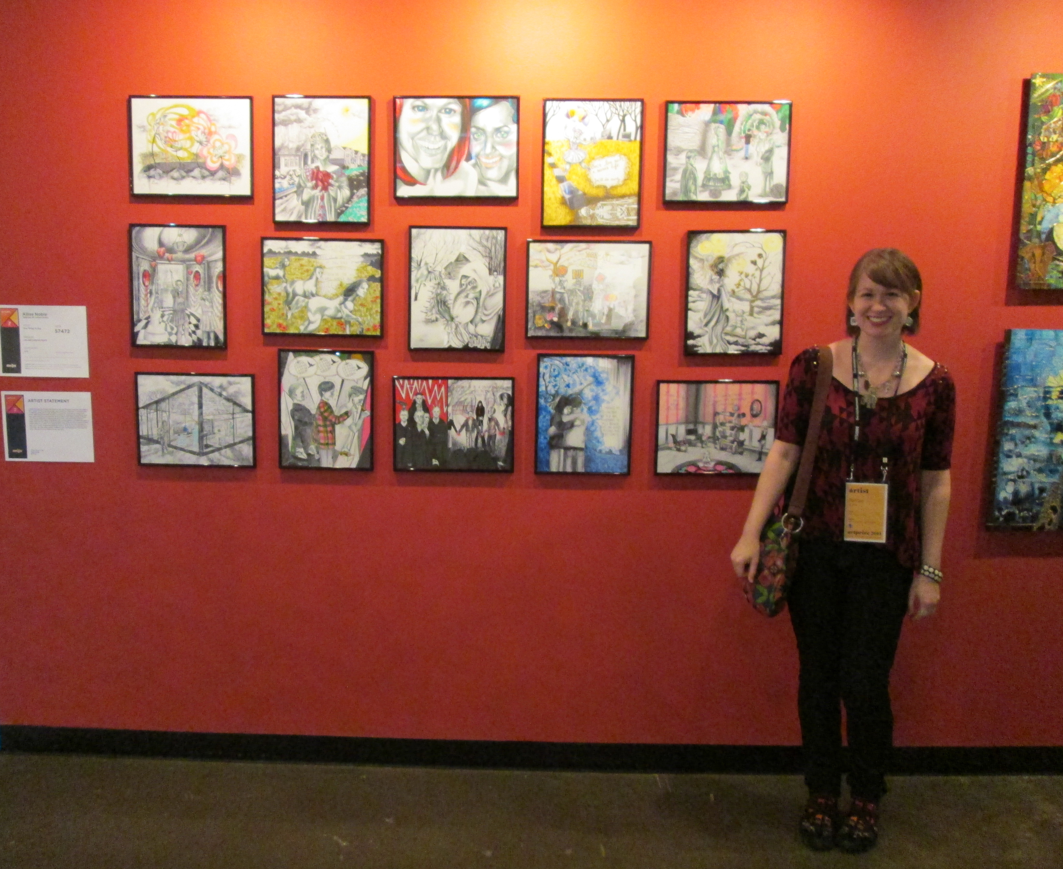
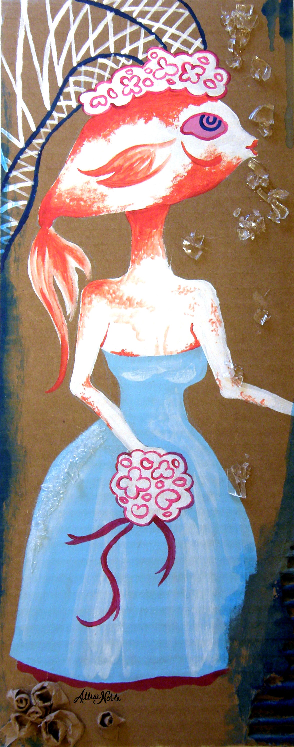
“God As The Artist”; bristol board, ink, acrylic, corrugated cardboard

At first this was just something quick I was going to do for fun for myself, but then I had to stop and think about why I was so excited about this idea. Both human beings and animals truly are moving, breathing works of art. They are living sculptures, filled with beautiful angles, textures and colors, and intricacies. We tend to idealize one type of beauty and overlook the artistry in anything that lies outside of that predetermined, narrow field. You would never walk into a gallery and say “My favorite color is violet, so I’m only going to look at the violet paintings. Any others, no matter how interesting or skillfully rendered, are completely worthless.” Yet how often do we write off other people in this same way?

Back view, depicted as a wall in an abandoned house complete with skeletal themed artwork and wallpaper print, "We are all living sculptures"

Back view, depicted as a wall in an abandoned house complete with skeletal themed artwork and wallpaper print, “We are all living sculptures”

"God As The Artist" aerial view

“God As The Artist” aerial view

I decided to include animals as well, because I really think we don’t have enough awe for how amazing they actually are. We get pumped about the unfamiliar and exotic, like lions and tigers at a zoo, but neglect to equally appreciate those living in our own backyards. In general, we kind of only notice animals when we need them for something, otherwise they are either an annoyance or just part of the furniture. I challenge you to go out for a walk on a nice day and pretend you are an alien from another planet who has never seen earth and its creatures before. Then really look, especially at the birds. Think of how tiny their skeletal system is, how it must interlock so that the framework of their wings can move as they need to in order to ascend into the air. Look at the colors and textures of their feathers. If that isn’t art, I don’t know what is. I guess that’s why I’ve never been one for hunting. There are increasingly less beautiful things in this world, why would you want to destroy something beautiful?

We are the most complex kinetic sculptures ever formed, and being alive surrounded by all this living and breathing wonder truly is a privilege. I forget that sometimes; we all do.

I still love drawing paper dolls for people to play with. Maybe every grown-up feels this way, but I’ve noticed that dolls, and the so-called “girl” sections in toy stores in general, kind of suck now. If I’m going to complain, I suppose I also have to do something about it! Since kids aren’t likely to play with skeletons, and also this crazy awkward giggling thing tends to happen when they are confronted with things like “boobs”, I have made many more child friendly sets since this one. I have two types of sets, one in which each girl has an “aspiration” theme (athlete, artist, chef, scientist …) and a pet, and another fantasy hero set in which your girl can save the world in various time periods and universes, from an imaginary world where superpowers exist to medieval Europe (Upon watching me draw the fantasy outfits, my boyfriend commented in surprise, “A girl knight?” and I swear to god, I almost clocked him. Exactly the kind of preconceptions I am trying to combat here ^_^.) Basically, I want to represent a wide variety of girls with a wide variety of personalities, styles, interests, talents, and dreams. I’m not done yet; as I touched on earlier, there are innumerable different types of people, that’s what’s so cool! But I’m working on it.

Zooey and Genesis Paper Doll Set

Zooey and Genesis Paper Doll Set

Fantasy Hero Layla Paper Doll Set

Fantasy Hero Layla Paper Doll Set

These paper doll sets and many more are available in my ebay store and etsy shop. If there’s a set you’d like to see, let me know! I take suggestions.

Standard
Artist Bio

The Value of Including Others’ Stories In Your Work

I’ve been talking a lot about stories lately.

Last year, I had the privilege of participating in ArtPrize in Grand Rapids, MI. ArtPrize is an international art competition held annually and decided by public vote in which the entire city is turned into a gigantic art gallery. For ArtPrize, you want to go big so I devised a 15 part series of drawings titled “One Thing To Say”. There was no guarantee of getting to display, so I was on pins and needles (I mean, 15 drawings take a long, LONG time) until I had secured a venue at Monroe Church.

A selection of the 15 part series "One Thing To Say".

A selection of the 15 part series “One Thing To Say”.

The premise was this: I asked a sampling of individuals this question: “If given the chance to say one thing that would be transmitted into the ears of every person on earth simultaneously, what would it be?” Methods of communication, of reaching people, in this modern age are virtually limitless. There have never been more avenues with which to share one’s views publicly, to impart something to multitudes of other people all at once. It is an amazing and fascinating opportunity. Yet, with so much freedom to express, one of two things seem to happen most : The ability is taken for granted, so we say nothing that is truly meaningful to us at all, or we abuse that which is so readily available, leading to a projectile vomiting forth of our thoughts and opinions on all things big and small, so easy to reach multitudes with one button click and little revision or afterthought. If we had to boil down our communication from pages and paragraphs into a small collection of related thoughts, a single sentence even, what would each person say? With one shot to speak to every person alive in our current time, what would be revealed as the most important to each of us, and what would that say about us personally?

"One Thing To Say", Monroe Church ArtPrize 2014

“One Thing To Say”, Monroe Church ArtPrize 2014

Me, timehop to 5 years past, showing my completed "Occupancies" series and some very black hair.

CMU Student Exhibition: Me, time travel to 5 years past, showing my completed “Occupancies” series and some very, very black dyed hair.

This was not the first time a design was prompted by the responses of other people outside of myself, some strangers some not. The first time I tried this approach was for the Student Exhibition my senior year at CMU. I entered two projects. One was a four part series of drawings. I asked a random sampling of individuals “If the inside of your mind were a physical space, what would it look like?” I then created four opposite environments in which I placed the “cast of characters”, or individual answers I received. Open “boxes” atop their heads depicting their described environment laid each person’s thoughts bare. This project was a way to combine my two loves, art and interior design (well, 3 loves – I also enjoy people watching /slash/ discovering fascinating intimate information about complete strangers). The second project was an art book. For this one, I asked the question “Think of all your life goals, those things that MUST happen before you die. Then pick the most obscure one. Funny or serious, just be honest.” I turned these answers into an illustrated book entitled “Underneath” that ended up winning the Best of Show Grand Award.

Underneath, art book

Underneath, art book, cover

Underneath, art book, watercolor and ink

Underneath, art book, watercolor and ink

Letting others’ stories inspire you in your work allows you to reach out to more people, and bridges connections between those you reach across ages, races, backgrounds, and beliefs.

One thing I aimed to reinforce with “Occupancies” as I chose whom I placed in which setting and how they interacted with the others, was that there do exist universal threads in our emotions and struggles and striving, no matter how different our brains might seem to work compared to those around us. With “Underneath”, I aimed to give a voice to those longings within us that we keep silent. Everyone wants to talk about wanting kids, finding true love, getting that dream job, but come on – we all know deep down that isn’t all there is to life. For most of us, that just isn’t enough. I hoped people would read the responses and smile, and laugh, and sometimes even nod in agreement as they realized, “I’ve imagined that before! I thought no one else thought about doing that, I thought no one else wanted that, I thought no one else…!”

Kurt Vonnegut wrote one of my favorite things once, “Still and all, why bother? Here’s my answer. Many people need desperately to receive this message: I feel and think much as you do, care about many of the things you care about, although most people do not care about them. You are not alone.” We are taught to cling to what makes us different, and wave it as a banner, and uniqueness is good, but it sure can be a lonely feeling to be convinced that your mind and soul is an isolated space with no doors and windows, a place that no one can see into or understand. I’ve been there, and I don’t think I’m the only one.

Communicating others’ stories through art is a unique challenge (and one that I don’t take lightly!) to consider life through a different state of mind in order to depict another’s inner thought life, and to realize through the eb and flow of a life, we all have different experiences but go through similar stages of feeling, positive and painful, doubting and confident. We just think we are the only ones so no one wants to vocalize how they feel, and therefore everyone else feels they are the only ones and …. so it goes, the cycle continues. But it doesn’t have to.

—————————————————————–

“Underneath” and “One Thing To Say” can be viewed in greater detail on my website, “Occupancies” can be found on my behance portfolio. High quality prints of my recent ArtPrize illustrations are also available in my ebay store or etsy shop.

Standard
Art Discussion

Art Discussion – “The Way I See It …”

In progress!

A rare in progress photo! I nearly never take these.

Many times I like to keep quiet about the specific message I had in mind when creating a piece, because I like my work to be allowed to speak to each viewer differently based on their own unique thoughts and experiences. At the same time, I myself am a curious individual and I hate when other artists flat our refuse to share what a piece means with their audience. So, every so often on this blog I want to pick a piece with a lot to say and explain the thoughts behind it. Today I’ve selected “The Way I See It”.

The Way I See It ... , 18x24 Watercolor, Ink, and Prismacolor Pencil

The Way I See It … , 18×24 Watercolor, Ink, and Prismacolor Pencil

In this piece, an average young woman sits, quiet and composed. She sits straight-backed, hands in her lap, legs together. The viewer can discern her reserved and unimposing nature simply based on how little space she purposefully occupies. Like many, she is probably good and bad, but mostly good. The other figure looks at her and sees evil. He can only see her shortcomings or what he views as such, and blames her for them as if any part of her person he doesn’t like was a planned attack against him. He paints her as a vampire, a monster, a whore. While she passively sits, he smears paint on her clothing and on her skin as he touches her. (An interjection, the gender choices in this piece are not significant. It is simply easier to depict the main character in this narrative as a woman so I could draw from my own perspective of when I have felt treated this way. The figures’ roles could easily be reversed, or it could be two men or two women.) The artist is delighted and proud of his portrait, his telling of her story and who she is as a person, be it true or not. Truth doesn’t matter when one is convinced they are right.

We run into serious problems when we let others be the artists or creators of our story, when we let them tell us who we are. Like the paint smears covering the young woman, as we let them sully what we think of ourselves, our own essence literally floats away before we even notice. Meanwhile, their incorrect perception creeps in like a vapor, taking its place.

Stories are tricky. We are not omnipresent, nor can we view the past or future in real time. So, when we view a situation, we are only inputting a piece of the overall story. We don’t like incompletes, it’s why in Hollywood Blockbusters everything gets hurriedly and inconceivably tied up all within the last 5 minutes of the movie, and we love it. Back to the situation we’ve just viewed, one of many in a given day: how do we complete the story we’ve caught just a chapter of? By either consciously or unconsciously inventing the rest of it in our minds. We can fit the puzzle pieces together so seamlessly that we often will even remember the inferred story as fact. We may have come close to truth … but then again there is a good chance we have not.

“What you remember is determined by what you see, and what you see depends on what you remember … a cycle that has to be broken” Tim O’Brien writes in his novel Going After Cacciato. No object or person is visually neutral. Think of our brains as a giant search engine. I’m going to get very simplified here – we see a person in a blue shirt. We “type” the input “blue shirt” and up pops images, videos, memories of all the experiences we’ve ever had with people with blue shirts. It’s hard to emotionally separate our memories from this new experience. We could see a person we’ve never even met as malicious simply because we’ve had negative interactions with others who look like them in the past. We could see a country or city as sinister, be wary of a new activity or experience because our memories literally distort our perceptions.

Chimamanda Adichie is a Nigerian novelist, and she also has a few great Ted Talks which is how I discovered her. This talk I’ve included a link to below about stories is fantastic. I was so interested when I came upon it after finishing this piece, because it deals with many of the issues I was thinking about when I came up with the artistic concept. I would highly recommend a listen.

I would also welcome any thoughts you may have on stories, perception and memory, or any different way you might have interpreted this piece. Sharing is fun, don’t be shy!

Standard
Artist Bio

The C Word – Every Artist’s Worst Nightmare

Though I’m sure many sweary virtuosos out there could come up with a laundry list of words unspeakable in polite society that begin with C (I’m pretty sure I know some of these people, quite well actually), the word I’m talking about in this case is criticism. Artists put so much emotional energy, so much of themselves into every piece, it is hard not to take “I don’t really like this” as “I don’t really like YOU, I don’t like your THOUGHTS, I don’t like your FEELINGS, YOU as a person are UNACCEPTABLE”. We have to develop a pretty thick skin.

My junior year of college, I had the opportunity to meet with a guest artist and have them review my work. I’d gotten kind of lucky up to this point, and most feedback I received went along the lines of “Whoa, this is so cool!” so I wasn’t too worried. I got there early for my scheduled appointment, and waited, and waited … and waited. I had carried my laptop bag and ultra-gigantic portfolio case packed full of stuff all the way from my apartment, through the woods, to the art building (I sound like Little Red Riding Hood). At that time I didn’t work out regularly, so I was feeling the strain on my non-existent biceps. I had also been wearing a winter coat, and seeing as I tend to sweat like a 45 year old obese man, by the time I had been standing in the heated building for more than 5 minutes I was embarrassingly drenched. I had to keep holding my stuff because I was just awkwardly standing outside a door in an incredibly narrow hallway where people were traversing, and there was no unobtrusive spot to set everything down. I thought my arms might break off. After waiting for an hour, it was my turn to meet with the visiting artist. I got 15 minutes before he dismissed me. In that 15 minutes, I was told that my art looked like it was done by mental patients or someone with no prior artistic knowledge whatsoever, but that it was “interesting and unique” (Seeing as I know many wonderful people who have needed mental health assistance at one point or another, I didn’t take the first half of his comment as an insult at all, though probably not the best choice of words.). I was also asked pointedly if I was trying to be an artist or an illustrator, the word illustrator spoken as if it was synonymous with “cocaine dealer”. I’m still not sure I understand this disdain. He also kept comparing me to the earlier student he had gone over by an hour with, to the tone of “He’s making art about important social issues and here you are drawing robots and silly cartoon animals”. The thing is, this kid and I were totally different people with totally different life experiences. To try to speak about what he was discussing with my art would be ignorant and a little offensive – I had never been close to any of those issues, why should I be spouting off about them as if I know? Even for my more whimsical pieces, I always have a message in mind that spurs me on to create the images that I do. There are different ways to speak, both in ways that are graphic, blunt, and in one’s face and also ways that are more symbolic and open to multiple interpretations. We need all types of art.

The next week, my drawing professor asked how it went. When I told him an abridged version, he simply scoffed and said, “Oh, well he has no idea what he’s talking about”. But, we should never entirely dismiss a critic despite their bedside manner. We simply have to sift out what is constructive from what is just a difference of taste or opinion (also knowing that some people just have that wonderful grouchy, never satisfied personality type). At the meeting I was also told that the figures’ proportions were off in some of the ink drawings of people that I brought. It was a movement-heavy piece including quite a few people on a busy street, but instead of getting references for each different position, I collected a few references to use for the main figures and for the rest simply filled in the blanks with guesswork. Now, even if I have to pose and take them myself I get references for every detail that is going to be included in a piece. It is time consuming, but worth every moment for the stress-free creation process from then on out as well as the end result. I was also told in some of my portrait drawings that the central figure looked disjointed from the background, as if cut and pasted on top of a flat stage-set. This is because I would always detail first not what part of the drawing made sense to begin with, but what part I found the most interesting (for me, always the person). Whenever you completely detail the foreground before the background whether in drawing or painting, it is much harder to try and color around that fully detailed, finished object and therefore you end up with the cut and paste on top of the background look. Background to foreground : this is something I tell my own students to this day.

In the years since then, I’ve done solo shows where the venue wants everything BUT the one or two pieces that I had considered amongst my favorites and had been really excited about exhibiting. I’ve had pieces of mine rejected from display due to a complete misinterpretation of the message, which then ended up upsetting someone. I’ve sold hand-sewn dolls at art fairs and had a begging child’s mother say right in front of me, “No, I’m not getting you one of those dolls they’re too ugly!” Art elicits strong reactions, that’s what makes it so powerful a force for communication and inspiring thought and change. We don’t know another person’s story, what causes certain images to trigger a negative reaction inside of them. Artists can’t take these things personally. Just because someone doesn’t like a piece that we’ve done doesn’t mean it should go in the garbage, but at the same time we need to recognize when negative feedback could be absorbed into our process to teach us how to do better next time.

Yes, on the surface, this is just a personified octopus slumped over a desk. Titled "The Devastating Awareness of Absurdity", the title is a concept drawn from existentialism. This image embodies the absurdity that we as humans face when we are forced into meaningless roles in which we will never fit, and don't belong living within. It also may just amuse someone, and if it encourages a smile, then that's good too.

Yes, on the surface, this is just a personified octopus slumped over a desk. Titled “The Devastating Awareness of Absurdity”, the title is a concept drawn from existentialism. This image embodies the absurdity that we as humans face when we are forced into meaningless roles in which we will never fit, and don’t belong living within. It also may just amuse someone, and if it encourages a smile, then that’s good too.

Another one of my drawings I brought to the critique. This is why you don't get discouraged just because one person doesn't care for a piece you've done - It was so well received elsewhere that I ended up using it as the main image on my website's homepage, as well as my logo for all business cards and print material before the newest one.

Another one of my drawings I brought to the critique. This is why you don’t get discouraged just because one person doesn’t care for a piece you’ve done – It was so well received elsewhere that I ended up using it as the main image on my website’s homepage, as well as my logo for all business cards and print material before the newest one.

Standard
Artists To Know

Artists To Know! Installment Two.

James Jean

James Jean is a double threat Taiwanese American artist – known equally well for both his commercial (DC Comics, ESPN, Prada, and Atlantic Records to name a few) and fine art gallery work. I know James Jean most from his arresting illustrations that grace the covers of Bill Willingham’s “Fables” graphic novel series. I am not one to ever keep up with series, but I cannot stop adding more of these books to my collection. Not only is the art obviously exquisite, but the stories are gripping, and the very reason I just cannot get into that “Once Upon A Time” TV show everyone is freaking out over – Same idea, but “Fables” is just so much better. Jean’s illustrations range from the ultra colorful to the monochromatic as featured below, but they all have a transparent, ghost-like quality to them that is just made for depicting fantasy characters, not fully “real” themselves. His website features a lot of his non-fables work, which was fascinating to see since I wasn’t as acquainted with it.

James Jean

Madge Gill

Madge Gill is not a current artist, being born in the late 1800s and passing in 1961. Though I usually highlight artists still working today, her primitive ink drawings drew me in the moment I first saw them. One of my workplaces had a couple-month-long focus on outsider art over the fall, which prompted me to want to learn more about the genre. Outsider art is literally art created by outsiders or untaught artists, art created outside the boundaries of official culture. I watched a documentary about outsider artists on youtube one evening, and Madge was one of the artists highlighted. She had a life filled with more hardship than many have to face. After delivering a stillborn child in 1920, one more painful life event, Madge claimed she had become inhabited by a spirit guide named Myrninerest. This connection continued throughout her life, and she would often go into trance like states, withdrawing more and more into herself. Though her detailed drawings of characteristic females; most of which took her only minutes at a time; continue to captivate viewers, it seems she never found peace. Near the end of her life, even her art-making had become a burden, more an obsessive-compulsion than a therapy. The biography on her website asks, “Are these in a sense self-portraits, or rather: attempts to stabilize her own fragile being, as it were through fleeting snapshots? Another reading equates the faces with Myrninerest, envisaged as the artist’s otherworldly alter ego, immune to the traumas of actual life.” (In the documentary, I noticed the alter ego’s name was pronounced as “My inner rest”, which would seem to suggest that the alter ego created as an escape or explanation for behavior she could not control is a plausible hypothesis). Her story is a sobering realization that although art helps us in coping with difficult emotions and can be a vital form of self-expression to those whose voices are stifled, creation alone is sometimes not enough, especially in isolation.

Madge Gill

Yayoi Kusama

I first saw Yayoi Kusama’s work at The Mattress Factory on a school trip to Pittsburgh (shown in the photo below). Though I wasn’t familiar with her at the time, this installation was my absolute favorite. Same as with Madge Gill, I learned about Yayoi Kusama through my outsider art documentary binge. A clip of a similar installation to the one I saw was shown in the film, and I suddenly realized “Oh my gosh, I’ve walked around inside her work before!” Also similar to Madge Gill, Yayoi Kusama has wrestled with psychological issues throughout her life, though her story has a far happier ending. Kusama began creating art with polka dot motifs as early as 10 years old, one of her first pieces a drawing of her mother with dots emanating from her portrait (Her mother was physically and emotionally abusive). She also began suffering hallucinations at an early age, seeing these dots everywhere, flowing towards her, in her own words trying to “obliterate” her. To date, many of her works include the words and themes of “self-obliteration”. In 1973, she checked herself into Seiwa Hospital for the Mentally Ill and still lives there to this day by choice, her studio nearby. Kusama has reached out, and come to enjoy the residents and staff and art continues to be a source of joy and purpose in her life. A creator of all trades (and master as well), she creates paintings, sculpture, installations, clothing and accessories, fashion editorials, films, and poetry and short stories all cloaked in her trademark surreal, ultra colorful, polka dot covered world.

Yayoi Kusama

Yayoi Kusama

Martine Johanna

Martine Johanna is a Dutch artist who started out in fashion design, but left the industry desiring more freedom to devote to her own work. The fashion influence is evident in her figure’s pose, gaze, and design. What I love most is how she sometimes leaves areas of pieces less developed to draw the viewer’s eyes to where she wants them to rest. If you look through the rest of her work as well, you will also see how she uses bold, bright colors you wouldn’t think of using for skin tones like blues and yellows to render her figures’ flesh. Bringing these natural undertones to the forefront gives her work an otherworldly quality that it is impossible to look away from, and highlights her imaginative nature.

Martine Johanna

Arabella Proffer

Google+ is a great place to discover artists as far as social media goes, and that is where I found Arabella Proffer. She was born in Ann Arbor, Michigan (woohoo, shout out to my home state, where I still reside) and now lives in Ohio (second shout out to where my parents are from and where most of my extended family still lives. I guess some cool art CAN come out of the midwest, huh?) – I thought that was pretty cool. Her work combines old school, aristocratic portraiture with pure 1980s punk rock and gothic culture. She also has an interest in medical history, remnants of which find their way into her work. The contrast of all these elements creates a tension that makes me want to get to know the fabulous women in her pieces, sit down and have a cup of coffee with them in their imaginary, velvet curtained living rooms – they all seem like so much fun.

Arabella Proffer

Standard
Travel

Back From Chicago With Amazing News!

My boyfriend and I spent the last 4 days in Chicago as a “Hooray, we don’t suck at relationships!” 3 year anniversary celebration trip. Though he’s been to Chicago far more often than I have, he had never seen The Bean so we had to rectify that immediately. It was a very educational trip – we went on a museum frenzy and probably absorbed 100x the daily recommended amount of visual stimuli. We lucked out that Rotofugi Gallery was having an opening for a show paying tribute to Tim Burton Friday night, and the night before we caught a theatrical, acrobatic rendition of “Through The Looking Glass” – it’s like they knew I was coming.

Next comes the good news part! That same Friday back in Midland, the “Piece By Piece” exhibit was debuting – one of the shows I was talking about getting ready for. I missed a call later that evening, and as I gave the voicemail a listen I was informed that I’d won Best 2D for my mixed media piece I’d entered, “The Dance”. The news was particularly exciting and surprising because this was a piece I’d struggled with. Like all mixed media works, the environment built literally “piece by piece” of book pages and fabric and thread and ink … it didn’t look too great when it was still in progress. About halfway through, the image just wasn’t coming out how I’d envisioned and I freaked out. I’d put way too much time into the project to abandon it, so I instead decided to step away for a couple of days, covering up the offender laying on my drafting table with a blank sheet of paper so that I wouldn’t even look at it. Once I decided to go back to work, I only added a tiny bit of alteration per day; I stepped back from the piece to see where it needed more texture for balance, where the colors in the background needed to be darkened, and where I needed to add more detail so parts of the piece didn’t look unfinished. Not abandoning “The Dance” paid off. What art actually looks awesome in the middle of the process, anyway? Although we expect it to, it’s impossible – it’s not yet finished! Even if you start completely despising a project, never send it straight to the bin on impulse. Walk away for a couple days and let it sit. Oftentimes you’ll come back with a fresh perspective and realize it’s not the mess you made it out to be.

“The Dance” is currently available as an 8×10 print and a numbered, limited edition ACEO print in my shop.

The view from the mirrored surface of the bean! No, my boyfriend is not imaginary. Though quite handsome I assure you, he does not like his photo being posted online, so you'll have to be content with this one of just me.

The view from the mirrored surface of the bean! No, my boyfriend is not imaginary. Though quite handsome I assure you, he does not like his photo being posted online, so you’ll have to be content with this one of just me.

From the Aquarium - I had no idea sea creatures like this even existed! Living things truly are moving, breathing sculptures - complete works of art.

From the Aquarium – I had no idea sea creatures like this even existed! Living things truly are moving, breathing sculptures – complete works of art.

The Dance, Awarded Best 2D; prismacolor pencil, ink, watercolor, fabric, book pages, embroidery thread

The Dance, Awarded Best 2D; prismacolor pencil, ink, watercolor, fabric, book pages, embroidery thread

Standard
Project Ideas

No Canvas, No Problem! – Using Unexpected Materials

I first discovered my love of corrugated cardboard when the movie “The Science of Sleep” came out. If you haven’t watched it, it’s an extremely visually fun movie and you should check it out. If you have, the various imaginary cardboard-based sets depicting the main character’s dream worlds, such as the car chase sequence or the cardboard cityscape, attracted me to corrugated cardboard’s simple, whimsical, DIY charm. I started using it for projects in college not only for the charm itself but for utilitarian reasons. After having to buy so many canvases and large pieces of illustration board for studio assignments, by the time I got around to my own personal projects I simply didn’t want to have to buy another damn thing! It was light and easy to transport for painting outdoors on nice days, and was readily available at no cost.

Cardboard also offers more easy textural options than canvases simply by layering or ripping away at its surface. Tearing away at the cardboard’s outer layer reveals the interesting ribbed texture beneath to be used as a design component. Layering torn edges automatically gives your piece an industrial, time weathered feel like the monochromatic cityscape below. Scraps can even be used to roll, crinkle, and fold 3D elements, such as the rosettes at the bottom of my fish bride piece. There is a story to this one; my roommates and I had 2 feeder goldfish we rescued from the tank at the grocery: Mr. Mustache and Mistress Bouffant. This is why I don’t have pets. Even the death of this tiny, normally dinner to bigger fish, goldfish caused distress, and I decided I needed to immortalize her. I used broken glass as bubbles due to the clear, reflective nature of the pieces. I still remember smashing bottles with a hammer on the front porch of our apartment. A neighbor asked what I was up to, to which my quick answer was, “Our fish just died.” I only realized in retrospect how that must have appeared, me furiously hammering away with that statement as my only explanation. No wonder they were never too chatty with us.

I’ve included some photos of my own experiments as well as some cardboard art by other artists as inspiration. The next time you get a package in the mail and have some extra cardboard laying around, I’d encourage you to give a project like these a try.

RIP Mistress Bouffant, Mr. Mustache will morn your absence. (A side note, the other goldfish really did have a black marking above his lip that looked exactly like a drawn on mustache.)

RIP Mistress Bouffant, Mr. Mustache will morn your absence. (A side note, the other goldfish really did have a black marking above his lip that looked exactly like a drawn on mustache.)

Painting on layered cardboard, using the texture of the corrugation as part of the design.

The flawless, traditional black and white portrait contrasts with a work surface left rough; with dents, tears, and even leftover paint smeared here and there as if the artist was cleaning off their brush.

Valery Koshlyakov – High-rise on Raushskaya Embankment (2006) – Tempera on Cardboard

Retro Barbies, acrylic on cardboard

My retro Barbies, acrylic on cardboard

Standard
Artists To Know

Artists to Know! Installment One.

In my first installment of Artists to Know, there are actually two digital artists, still unbelievably underrepresented in this day and age. Digital artists are highly under appreciated, and wrongly viewed as art “cheaters” in the fine art world. I myself have played around with digital work, and absolutely HATED it! Take it from me, what one can do in 10 minutes with a brush seems to take 10 hours on a computer. Digital art is used to achieve a desired effect, it is by no means a shortcut. I hope you see something new today, maybe something that sparks ideas of your own.

Ray Caesar

Ray Caesar describes his art on his website as “facing something unpleasant with calm and looking beyond what you’re viewing to see the beauty within”. His work is influenced by the time he spent working as a photographer and graphic designer at a children’s hospital, many of whom were abused or suffered from serious physical deformities. After his mother’s death, he had a dream in which she appeared to him as a child. The childlike figures in his pieces aren’t really children but the manifestation of people’s souls. His work is certainly not for everyone, and I know many who find his art too  creepy or disturbing, but it goes to show that as artists, our experiences do inform what we create. He uses digital programs to create a 3D world in which he can change poses, adjust the viewpoint angle, open and close drawers … He has said there are hidden secrets that never show up in the prints such as what are in the figure’s pockets or inside closets. If you have the time, read more in depth about the process by which these digital worlds are created because it is truly amazing and eye-opening.

Ray Caesar

Catalina Estrada

This lady does everything – Besides the typical art prints, she covers greeting cards, bedroom comforters, clothing and bags, even umbrellas with her beautiful designs; prints wallpaper; has her art made into difficult 1000 piece puzzles that I would probably end up throwing across the room in frustration! She embraces the concept that art doesn’t just have to hang on a wall, and captivating designs that make people smile and feel inspired can cover every imaginable surface. She makes her work accessible, and that is awesome.

Catalina Estrada

Elena Kotliarker

From the Ukraine, Elena classifies her work as Judaic Art. The flow from one element to the next in her pieces is so spot on, the effect is calming and dynamic at the same time. I love all the tiny details within each piece, so that you keep noticing new things the longer you look at it. Also interesting is the cultural symbolism she integrates into each work. I discovered her on ebay actually, and now have a gorgeous little ACEO prints as a souvenir.

Elena Kotliarker

Camille Rose Garcia

Camille Rose Garcia is an artist you can spot immediately. I love that all her art just GOES TOGETHER to form a cohesive body of work based on her distinctive style alone. While maintaining this continuity, she continues to keep things fresh and different with widely varying genres, stories and narratives, and color schemes. Much like Ray Caesar, I feel like her work is something you get or don’t. Being the fan of almost any form of surrealism or warped storybook illustrations that I am, I am in love.

Mia Araujo

Mia Araujo is interested in the complexities that make each individual unique, and the invisible universes that thrive inside us all. Manifesting inner landscapes through art, making the invisible visible, is something I am also passionate about as I touched on in my last post. It’s no surprise why I am so drawn to her work. Each piece has an entire fantasy story within it to absorb. For lovers of portraits, you’re in luck, because within each piece are embedded innumerable portraits, from the main subject(s) to the tiny faces embedded in the background and sometimes even within the subject’s hair or clothing. Can you tell I’m into detail?

Mia Araujo

I hope you’ve enjoyed exposing yourself to some artists you may not have heard of before. I did go heavy on the surrealism as that is what I tend to be drawn towards most, but even if the subject matter or style is not your bag, there is always something to learn by observing other artists’ technique. I’m constantly finding new artists and images that inspire me, so I will definitely be sharing more in the future – be on the lookout!

Standard
New Work

Bringing The Inside Out – Exploring Conceptual Portraits

Spring seems to be the time for exhibitions, and with many deadlines coming in mid-February, I’ve been going into hyper-drive to get pieces finished and ready. This past year has been all about conceptual portraiture. My drive to expose the subject’s thoughts and emotions through visual cues outside of themselves  came in part from my interior design study in college, where visual cues in the external environment are key, and part from a conversation I had with one of my best friends coupled with my overactive imagination. We were both at different colleges, and she had had a particularly stressful couple of weeks and was unloading over the phone because that’s what best friends do. One thing you have to know about me, as people talk, I get these vivid little reels of what they are describing playing in my head. It doesn’t mean I’m daydreaming and not listening, it’s just how my brain works. I immediately got this image of her overstuffed brain protruding from out of the ripped open top of her trademark top hat, with other random objects and various debris springing out everywhere. I told her, she burst out laughing, and we went on with our evenings. I made a concept sketch the moment we got off the phone, for future reference.

After doing a series of portraits in which visual manifestations of the subject’s emotions literally burst out of or hovered over the top of their heads (wouldn’t that make life far less more of a guessing game as far as relationships are concerned?), I began to think more about how not only literal objects but also the more subtle use of color and all over pattern could communicate about the subject’s mental state. If one’s emotions covered them like a fabric, what would it look like?

Today, my portraits are a combination of these earlier ideas. I used photos I’d taken of friends before, but now I’ve gotten really into using vintage photographs as references instead, because not knowing the people at all allows me to start with a blank slate and gives me more freedom to invent my own stories about them. Photographs of my girls are being taken, and jpegs sent or framed work dropped off to the various locations for jurying, so wish me luck in the next couple of weeks! If you’d like to see more portraits, check out my website (there is even one MAN portrait! – those of you who know me and my work know how rare this is). Prints are also for sale here!

Overaccumulation of Stimuli, Prismacolor Pencil, 2010 - The portrait that started it all.

Overaccumulation of Stimuli, Prismacolor Pencil, 2010 – The portrait that started it all.

Fight Or Flight, Prismacolor Pencil, 2011 - Through studying interior design, constructing environments for people, you learn that color and pattern SPEAK, and can affect the psychology of those who live in it (and the psychology of the viewer who looks at your art!)

Fight Or Flight, Prismacolor Pencil, 2011 – Through studying interior design, constructing environments for people, you learn that color and pattern SPEAK, and can affect the psychology of those who live in it (and the psychology of the viewer who looks at your art!)

Hopeful, 11x14 Prismacolor Pencil

Hopeful, 11×14 Prismacolor Pencil

The Peacock, 11x14 Prismacolor Pencil

The Peacock, 11×14 Prismacolor Pencil

A World To See, 11x14 Prismacolor and Mixed Media

A World To See, 11×14 Prismacolor and Mixed Media

Standard
Project Ideas

Textured Painting With Mixed Media (Or, The Upside of Hoarding)

Express Yourself Artshop, the art program I work with focusing on providing art instruction for adults with disabilities, runs mostly on donations. Because of this, I’ve gotten used to brainstorming how to transform materials not commonly used in art into something awesome. Though I appreciate sculpture, my passion definitely lies in creating 2D art. However, 2D doesn’t always have to mean “flat” – and that’s where mixed media comes in. Mixed media literally means “the combined use of 2 or more media”. Many times, it involves assembling multiple non-flat elements to a drawing or painting, working them into the overall composition. Knowing how to add all these extra elements in an effective manner, as well as recognizing when to stop so that the piece doesn’t become a massive junk pile, can be intimidating on the first go. An easy way for an artist who has never worked in mixed media before to dip their toe into the genre is by simply creating texture on their work surface, and then drawing or painting over it as they would were they using a flat canvas. The effect is something far more extraordinary that draws the viewer to come closer and really examine the finished piece, touch it even (if you allow it).

The main component you will need is a bottle of gesso; a white, thick, paste-like paint that can also be used to cover over used canvases. It can be pricey, but lasts a long time. This is the only thing you will need to purchase. Everything else used to create texture can be common household materials. Paper towel, especially if it has a pattern imprinted on it (you can use that!), is great as well as tissue paper. Are you an avocado or citrus fruit enthusiast? You know those net bags they come in at the grocery? Those are simply fantastic. Once you have your materials, lay them out on your canvas and pile on the gesso. It will act as a glue, but takes awhile to dry so don’t hesitate to manipulate, move, crinkle, your materials as you are covering them. After a few coats, you will have a paintable surface. For the octopus painting shown below, I used liquid watercolor. Watercolor is great because it will show darker on the textured areas and lighter on the flat areas, accentuating the visual texture. This next piece I’m trying with the black background I’m doing in acrylic this time. Play around, make some samples on cardboard until you find something you like (old cereal boxes work great to experiment on), and keep on the lookout for interesting textures in your everyday environment – they could come in handy for your next masterpiece!

New textured work, in progress.

New textured work, in progress.

Closeup, texture achieved using a net fruit bag and wrinkled tissue paper.

Closeup, texture achieved using a net fruit bag and wrinkled tissue paper.

Gilded Creatures, 16x20 mixed media - Behold, the wonders of gesso!

Gilded Creatures, 16×20 mixed media, and one of my more popular pieces – Behold, the wonders of gesso!

Standard