Techniques and Tutorials

Jellyfish Watercolor Tutorial

Another day, another tutorial! I’m making my way through my favorite animals first, with yesterday’s owl and now today a colorful jellyfish. Let’s paint!

You will need:

  • Watercolor paper (I used a 6×6″ piece, but you can work bigger if you’d like as well)
  • 3 Paint colors: A blue of your choice, and 2 accent colors. I chose magenta and lime green. You could also use 3 different shades of blue if you want. Jellyfish come in many colors!
  • A large (I used size 8), medium (I used size 5), and detail (I used size 0) round brush (The brushes that come to a point at the end).
  • A large flat brush (The brushes with rectangular bristles, flat on the end).

Start by adding a good amount of water to your main blue color choice to dilute it down to a light wash. Use your large flat brush to fill in the entire paper pale blue. Use long back and forth strokes, brushing in the same direction horizontally across your paper. There may be some streaks and this is ok as we are trying to create our water :). If you want to even anything out a bit more, you can brush over darker areas with plain water using the same brush to blend. Let this dry. Once the background is dry, grab your medium round brush. Dip the brush in some of the same blue color, but with less water so it goes on a bit darker. Outline a shape that looks like the top of a cupcake in the upper right corner.

Rinse off your brush, and with just water run your brush along the inside edge of that outline to blend it inward. Grab some more blue, and make 3 squiggly lines coming down from your cupcake shape. Curving them on the end makes it look more natural, like how they would be flowing as the jellyfish swims through the water. Using the same brush, grab some more of that same blue and add a paint streak along each side of your jellyfish top, and make some short strokes also along the bottom edge.

Rinse off your brush, then go over these blue streaks you just added with water to blend. Using the same brush, take your chosen accent color and make some squiggly lines over your blue ones in that new color. Next, we are going to use our small detail brush. Take your other accent color and make a curved bridge shape near the top of your jellyfish body. Streak some lines coming down from that bridge. Use your detail brush to make some thin tentacles flowing out from the body as well. Use the tip of your brush and drag it across with a light touch, hardly putting any pressure on the paper to get thin, flowing lines. If you are having trouble making a continuous stroke, just add more water. Your tentacles can flow in all different directions as they float through the water.

Rinse off your detail brush, and grab some of your first accent color that you used on the squiggly center tentacles. Make a broken scalloped outline along the bottom of the jellyfish body. You can also add an oval up top with some short, radial streaks coming down from the circle, like a simple sun shape. For a finishing touch, take your large round brush now and dip it in some watered down paint in the original color you used for the background – You don’t want this to be too dark. Make some bubbly, cloud-like texture in a portion of the blank space around your jellyfish by filling in the areas using a circular motion with your brush. Your brush should be laying at an angle as you do this.

These are so fun to make in different colors – You could create a whole jellyfish army!

Be sure to follow for more art fun to keep your mind and hands busy :).

Standard
Techniques and Tutorials

Barn Owl Watercolor Tutorial

In light of social distancing precautions, we all are ending up with some unexpected downtime. It can certainly be discouraging and frustrating, but we can also use this time to our advantage to bring something positive out of a negative situation. I will be posting some simple tutorials on a regular basis over the next couple weeks. The best thing to do when things are uncertain is to occupy your mind, especially with something creative. Let’s have some fun!

To create this owl, you will need:

  • Watercolor paper (I used a 6×6″ piece, but you can work bigger if you’d like as well)
  • 3 Paint colors: Grey (or if using black add a lot more water to lighten it), Burnt Umber (or any dark brown), and Raw Sienna (or any bright, warm brown)
  • A large (I used size 8), medium (I used size 5), and detail (I used size 0) round brush (The brushes that come to a point at the end).
  • A medium size flat brush (The brushes with rectangular bristles, flat on the end).
  • A pencil
  • Optional: Black liner pen (Like a fine point Sharpie!)

Start with a light pencil outline made from basic shapes to guide your painting. Draw a circle for the head, a teardrop shape coming diagonally out from that circle for the body, and another smaller teardrop shape sticking out from the bottom center of the body for the tail feathers.

Using your large round brush, water down your raw sienna paint – you do not want this first layer too dark. Following the shape of the body keeping all your brushstrokes in the same direction flowing downward, fill in the wings, leaving the head and the chest white for now.

Using your detail brush, make some jagged up-and-down strokes with a watered down grey along the front of the chest, underneath the head, and along the back of the neck.

Rinse off your detail brush, and using the same brush strokes go over your grey you just added to the chest and neck with water. This will help blend the grey so your transition from grey to white is more gradual, and you end up with a soft, feathery look. Next, using your detail brush and watered down grey, outline a pointed “U” shape in the center of the face. Make some radial brush strokes sticking out from the top of the U where the eyes will be using your detail brush.

Still using your detail brush, add some radial strokes along the outside edge of the head, including one ray down the center from the top pointing to the beak. Add some grey to fill in the end of the beak. Rinse off your brush, and lightly brush over what you just added with a damp brush to blend it.

Continuing to use your detail brush, add a border around the head with raw sienna using short, radial strokes pointing inwards towards the face. Don’t forget the widow’s peak up top :)! Water down your raw sienna a bit more, and add some of this pale warm brown to the area where the eyes will be, using radial brush strokes again pointing outward from the top of the U shape.

Next, we are going to start adding texture to the feathers. Dip your medium round brush in some raw sienna with a little less water so the coverage is a bit darker than the base underneath. Stamp up and down over the entire area to create blots of color (This is called stippling.).

Do the same thing overtop while the raw sienna is still wet with the burnt umber on the top section of the wings. Add a bit of water to your umber first, but you still want it to be pretty dark.

Then, use your detail brush to create some thin outlines in burnt umber. Hold your brush at a 90 degree angle to your paper and use a light touch, hardly pressing down at all as you drag your brush to create thin lines. Create a darker outline around the inner edge of the raw sienna outline around the face. Outline the wing, and add some lines to the bottom section of the wing and tail feathers following the direction of the shape.

Still using your detail brush and burnt umber, make some groupings of short, vertical brush strokes to create striping in the wing and tail feathers in between the lines. Make them jagged and uneven for a more realistic feathery look.

Next, using your flat brush add some more water to your burnt umber. Using the width of your brush, drag a diagonal line underneath the owl starting at the bottom of the chest.

Go back to your detail brush, and grab some burnt umber with a little less water mixed in so you get a darker color. Add some short streaks of this darker shade over the post while it is still wet. Then, using the very tip of your brush, lightly add some speckled dots over the chest. Less is more! You still want to see mostly white.

IMG_20200317_110314

Now for the finishing touches! Use your detail brush to create a hooked shape with the burnt umber for the talon. Use your medium round brush to add a dark burnt umber feather shape visible from behind, between the tail feathers and the post. The last step is the eyes. Create a downward slanted football shape in the area we shaded for the eyes. You may use your detail brush to fill in the eye in grey or black, but you can also use a black liner pen for a little extra control. Be sure to leave a small circle open near the top of each eye for the reflection – This is what really makes your owl look alive!

I hope you’ve enjoyed this tutorial! If it didn’t come out exactly how you expected the first time, remember it just takes practice and the goal is experimenting and fun. No matter the outcome, you know more than before you started!

You don’t have to use natural colors for this project either. I think it would be fun to try a whimsical, fantasy owl in wild colors like purples, oranges, magenta, lime green … There are no rules! If you feel like sharing, post a picture in the comments of how yours turned out and as always, if you have questions don’t hesitate to ask! Stay safe everyone!


Standard
Techniques and Tutorials

Mixed Media In Fine Art

Mixed media has become very popular in art over the last couple of years, and there is no question as to why … It is wonderful to be able to sit down and work on a project and not be limited to only one or two materials despite what may convey your idea best.  It is also a way to make 2D art more tactile, introducing elements of 3D art and design onto a 2D surface.

I’ve found that introducing mixed media to my drawings has given my pieces a new life. There is nothing at all wrong with using one material, and I enjoy a lot of artists’ work that create art that is all ink, or all watercolor, or all acrylic. However, for my own art working with multiple mediums has enabled me to break through the possibility of my work becoming repetitive or stagnant, and has helped me develop my own unique style.

It’s easy to be intimidated by mixed media art because it involves a lot of choices, but using multiple mediums can actually make the artistic process easier by removing the limitations of using one material at a time so that for each part of our piece we can use the medium that will lend itself best to creating the visual effect we desire. It can also allow us to be more efficient with our work; for example, yes I could find a fabric I like and copy it by hand onto the dress of a figure in my drawing, or I could add something tactile and interesting and adhere the actual fabric to my drawing as the figure’s dress.

Wondering how to incorporate mixed media into your drawings or paintings?

  • Start with what you know. Create a base drawing or painting first, and then assess where you could add some 3-dimensional or tactile elements. In the image below titled “Artist At Work”, fellow artist and art friend Emiliano Vega painted the scene first with acrylics and a palette knife, and then I applied mixed media accents evenly dispersed throughout the scene to finish it off. Think about what the objects depicted in your drawing or painting are actually made of be it wood, metal, fabric, leather … and try to incorporate those materials. I used thin cutouts from sheets of wood samples for the wood of the window frame and easel. Real fabric and leather samples were used for the furniture, with paint applied overtop for shading. Prints of an actual sketchbook were used for the book on the table, as well as a a closeup section of an actual painting for the work on the canvas. the artist at work
  • Go gathering and narrow down your choices! Look for materials with a similar color scheme, pattern, style, or period look to the 2D image you are creating. Once you’ve accumulated a store of like elements, it will be a lot easier to decide what you want to place where to add to your piece. For “Lunar Fantasy”, I painted everything in watercolor first and then determined what to accent in mixed materials. I gathered fabrics in dusty, muted tones of black, ivory, gray, blue, and violet. I also collected some gold metal/metallic pieces that reinforced the vintage style. Everything I collected was pretty and feminine with a definite older feel to it (think Grandma’s craft drawer) but with a whimsical, luxe element to it as well. I gave myself a couple fabric choices, a couple edging choices, and a couple metal choices and narrowed it down from there. I used actual fabric and ribbon for the top curtain and her outfit, and accented any of the metal with gold cord. I also reinforced the vintage circus look by using scavenged vintage jewelry for decoration.

lunar fantasy

  • Maintain your original style. There are literally no rules to mixed media art. When you google “mixed media art” or even watch youtube tutorials, a lot of what comes up are mixed media styles that are very “on trend” with a heavy art journaling influence. Much of it is very busy and colorful with all-over pattern and texture, visible paint strokes, and super stylized figures, flowers, or animals with a lot of elements of paper crafting and collage. If you’re a fine artist who likes sharp detail and realism you may feel like this is an area you aren’t able to dabble in but that isn’t true at all. I integrate mixed media into my pieces as an accent and an enhancement to the work I am already doing in either paint or pencil. The piece on the left is all colored pencil, and on the right colored pencil with the introduction of mixed media, both other 2D mediums as well as some 3D objects. In this piece on the right, I was able to use prismacolor pencil for the figure to achieve the sharp detail and realism that was desired, and watercolor for the background to create a softness and “fog” to the view through the window. I used prismacolor markers for the eye pattern undulating out from her line of vision because I wanted that to have a more hard-edged graphic print look with no visible pencil or paint strokes. I used actual fiber materials for the gold edging on her outfit and her dress as well as actual decorative gems for her jewelry because yes, you could imitate it by drawing, but using the real thing adds a surprise 3D element that makes viewers look twice and gives the piece depth. That is part of the fun of mixed media art – it draws viewers in encouraging them to investigate further, because it’s not just a painting or just a drawing – they are invited to try to figure out the artist’s process, and what they used for different parts of the piece. There are new discoveries the longer they take the piece in.
  • Start small. Try out different techniques and materials on a small surface. Bulk value packs of 8×10″ canvases or mixed media paper sketchbooks are great! Get out your paints, pencils, fabric, beads, odds and ends and play!

With many things being cancelled right now resulting in a lot of downtime, it’s not a bad idea to get creative and try something new! Fine art and crafting materials CAN coexist!


Standard
Artists To Know

Artists To Know : U of M Museum of Art

It had been awhile since I’d gotten out of town to do something fun, so I took a day trip this month to the University of Michigan Museum of Art in Ann Arbor, because who can say no to free inspiration? In addition to an array of art from centuries past with an especially robust Asian art section, there were some more recent pieces that really impacted mem resulting in some new favorite artists – all with amazing stories.

Guillermo Meza

guillermo_meza

I am a mask enthusiast as well as a fan of anything inspired by surreal or dreamlike imagery, and the composition and color in this piece propelled me over to it like a magnet the moment I walked into the first room.

Meza is known for fantastical landscapes and distorted figures. He grew up in Mexico City, the son of tailors. His family was not wealthy and he himself only completed school through 9th grade, but they were a family that valued arts, music, and culture, and he started drawing as a child and never stopped. He helped support his family by illustrating for magazines. Other working artists took notice, and he was recommended to Galeria de Arte Mexicana by none other than Diego Rivera. I love his story because it shows that yes opportunity helps, but what more so determines success or failure is an artist’s skill and devotion to creative practice. 

Marcus Jansen

marcus_jansen

Marcus Jansen is originally from South Bronx and now resides in Florida. He was always interested in art, but chose to enlist in the military as a career. He is a veteran of Desert Storm who upon returning to civilian life in 1999 found he had trouble adjusting, and struggled to find work. He started selling his paintings on the street, and garnered recognition for his unique, abstracted landscapes that often include social and political metaphor. ​He is the founder of the Marcus Jansen Foundation Fund, which assists low-income community organizations in South West Florida by bringing them arts, music, and cultural awareness. His foundation also supports organizations that help veterans diagnosed with PTSD, bringing them art as a form of expressive therapy. This is another artist who I liked even more after not only just seeing their physical creations but researching their personal story. His work for me created a dynamic new world that I couldn’t step away from, with a unique blend of realism and abstract and a specific style that is completely new, a hard thing to achieve in this time when it sometimes seems everything has been done. 

Ouk Chim Vichet

ouk_chim_vichet

The above piece was part of the Peace Art Project of Cambodia. PAPC is a project sponsored by the European Union as well as some celebrity donors in which students at the Royal University of Fine Arts in Phnom Penh worked on projects turning weapons technology into peace time vocations by using them as an art material for beautiful sculptures. This particular piece depicts Asapara, a female Buddhist figure whose traditional dance holds an important place in Cambodia’s culture and history. The juxtaposition of the elegant, peaceful figure with what she is created out of is a strong image conveying the end of violence. 

Mari Katayama

64-mari-katakama-768x1024-1

I had already been a fan of this artist, so in this case it was a very special moment for me to see one of her installations in person. I hadn’t even checked out the website for the museum beforehand, just decided to go, so I didn’t know she would even be showing. I love random life surprises like this! Mari Katayama is a Japanese artist who was born with a rare developmental condition. She had to have both her legs amputated at age 9, and has only 2 fingers on her right hand. She began photographing herself at first to understand her own identity beyond society’s simplistic, “one size fits all” view of individuals with disabilities. She says that she doesn’t view her images as self portraits though, more that she uses her body as an art material to communicate messages about body image that she feels speak to both individuals with disabilities and able bodied individuals. It’s no secret I’m big into mixed media, and I love the idea of someone using their own body as an art medium. I also am interested in her use of recreated fiber art limbs, and the mix of indoor and outdoor environments used in her overall installation. There is not near enough disability visibility in arts and entertainment, and Katayama’s work is incredibly important. 

I hope you’ve enjoyed my favorite finds! As always, if you have a favorite artist feel free to leave their name in a comment. I love discovering new sources of inspiration!


Standard
Exhibitions and Other News

Pantone Color Of The Year + What’s New For 2020

As I mentioned last year around this time, being an art and design nerd one of the things I look forward to with the turning of each year is finding out what the new Pantone Color of the Year will be. This year did not disappoint, and I swear I must have had some sort of premonition because I had been using shades of deep blue in almost all my art in the latter part of 2019. New color, new experiences in art!

In my personal art business, I’ve always worked alone and though it may be surprising given the fact that I’m employed at a gallery and on the board for a local artist guild, I don’t really know many working artists on a close personal level. Volunteering for a kids’ art event this past Summer, I had the opportunity to make friends with an artist whose vision and style compliment my own and vice versa (The koi fish and ballerina are his, the jellyfish a collaboration). Emiliano Vega creates fine art paintings and drawings but has also succeeded as a muralist and tattoo artist. He has been a part of a number of progressive collectives in Detroit and Saginaw earning him mainstream sponsors including Redbull, Sony and Ubisoft for his contributions to non-profit and volunteer work. I’d encourage you to visit his personal portfolio. I will also be representing his work in my eBay Shop, and you can visit his artist section for prints and original ACEOs.

As far as what’s next for 2020, we are preparing for a number of local dual shows beginning at Red Eye in January and Oracle in February for those in and around the Saginaw, MI area. We have plans to seek out opportunities outside the local radius later in the year. Those who are near enough to visit I hope will come out and see our art in person and get their hands on some original art or prints, and for everyone else, thank god for the internet ;).

I will also be setting aside time to do more teaching with Express Yourself Artshop, the inclusive arts and wellness program I direct. I will be continuing to teach my Creative Minds Art History class, and will also be working with a group to enter ArtPrize and collaborating with a fellow instructor on a Wearable Art class. As always, I will be sharing lessons here so readers can get inspired and try doing some creating at home :). Looking forward to all things new, Happy 2020 everyone!


Standard
Art Education, Exhibitions and Other News

Closing Up 2019: A Year In Art

I have been pretty transparent in both my face-to-face public life and my online life about 2019 being one of the toughest years I’ve had in quite some time for a variety of reasons. Though I am more than ready to let go and look forward to 2020, and though “blessed” is definitely not the first word that would come to mind when I think of this past year (the word I’m thinking of starts with an f, guys …) … I am blessed that my ‘day job’ was many times my anchor through a tumultuous 2019. How many people can really say that???

For those new to the blog, I direct an inclusive arts and wellness program called Express Yourself Artshop that is open to students of all abilities, largely serving adults with physical, intellectual, and psychological disabilities. I have worked with Artshop in some capacity since it’s inception a little over 6 years ago, and have had the opportunity to see it grow and transform just as the program helps its participants grow and transform on a personal level. Looking back, 2019 was full of positive experiences and new adventures in creativity in our corner of the world.

The focus this year was definitely getting the students’ art out into the community. Creative expression is invaluable for the peace, joy, and confidence it can give an artist while creating. People really should do art primarily for themselves, but still, getting an artist’s work out of their own home and into the world allows that creation to further make an impact on the public that views it. Especially when it comes to artists with disabilities, society makes a lot of assumptions about what they can and can’t do. Educating through art is another part of what we aim to do.

Our Artshop crew was chosen to participate in the community’s Downtown Summer Sculpture Series. We made a proposal as to how we would transform the default mold, and once accepted proceeded to work as a group to create “Let Your Light Shine”. Not only does the positive message reflect our goal for anyone who participates in our program, but the idea of piecing together different shapes, sizes, and colors of glass to create something that would not be as beautiful were it covered in identical decorations is also symbolic of neurodiversity and the celebration of differences.

2019 was also a year of collaboration. In addition to the sculpture above, students worked on many 2D mixed media group works in a larger scale. Collaborating allows students to play off of each other’s strengths, support each other’s weaknesses, and push themselves to come up with new ideas and creative solutions as they work towards a unified vision.

Two of the collaborations were featured in Creative 360‘s annual fundraiser for auction, both highlighting a creative practice 360 offers. One themed around theater was a collaboration between two of my students, Melanie and Colleen, under my guidance. They collaged the background of a large canvas and a set of masks with old newspapers and magazines, and then chose colorful words that embodied what Creative 360 meant to them to include. We worked together on an overall design and pattern for the painting, and they came up with the idea to place butterfly cutouts flying across and did the layout on their own. I asked questions to prompt ideas, but the vision was theirs and it was truly amazing to see them get excited about what they were doing and bounce ideas back and forth, supporting and encouraging each other along the way.

69717832_2870013613069260_7953038513060970496_o

flat,1000x1000,075,f.u1 (2)

The second piece was worked on slowly over the year with a couple of different class groups, starting with a colorful abstract background over which they applied stamping, texture, and doodling with paint markers. Afterwards, smaller silhouettes of figures doing yoga poses were stenciled on (including a shout out to wheelchair yoga on the far right). Last, larger cutouts were layered overtop to provide a main focus. It was amazing how completely different groups were able to come up with ideas to continue the evolution of this piece for a unified final masterpiece.

Another successful collaboration was Creative 360’s performance of scenes from Alice In Wonderland over the summer. Students this year took part in every step of the process of putting on a small production, from deciding costumes to hand creating some whimsical and summery nature inspired backdrops. One of our Acting Class “regulars” even stepped up to fill the role of stage manager, and helped facilitate practices and organize the final show.

Videos of our different performances, events, and open mics throughout the year, including those at our most recent holiday gathering, can be found on Artshop’s Facebook Page. If you want to support our students and also snag some very cool original art, visit our Virtual Gallery, Ebay Shop, and Redbubble Shop. Happy holidays!


Standard
Music and Film

Dir En Grey 2019 Tour: Music And The Power Of Vulnerability

I recently had the opportunity to get out of town and see one of my favorite bands, Dir En Grey, live in concert. I do not possess any musical talent or skill myself, but am a huge music appreciator. What I look for in bands is the ability to be diverse and work in a variety of styles while still staying true to their own unique creative expression, and Dir En Grey is one of the best examples of this I can think of. Each of their albums has its own distinct sound and story, and they can move between beautiful, melodic, and soothing and intense, hard, and aggressive seamlessly within the same song. I went into this experience with no expectations, just excited to hear a band I have enjoyed since late high school live. I never dreamed I would be so emotionally moved by an experimental metal band, or that I would leave with such a much-needed refill of artistic inspiration, a spark lit that caused me to reflect on my own life as both an artist and as simply a human being. The key to this connection was vulnerability.

The name of the tour was “This Way To Self Destruction“, and throughout the performance singer Kyo was playing a character that you could see slowly self destructing until their brand new, epic 10 minute song “World of Mercy” played at the end. The movements and miming, dance, and entrancing images played on the screen behind the band were so emotive that though the lyrics were in Japanese I could still understand exactly what each song was conveying.

Many of the band’s lyrics deal with depression, suicidal ideation, isolation, hopelessness, and anxiety, their art revolving around a lot of darker themes and imagery. However, the approach they use doesn’t glorify or romanticize negative emotions, but instead lays bare the things we all experience to some degree and asks us why there is so much greed, hatred, struggle, betrayal, and immorality in our society. Why is our world so hard to survive in? This raw honesty and straightforward, no-bullshit communication through their music is what makes them stand out, especially coming from a culture like that of their home country of Japan where transparency and public displays of emotion and opinion are more repressed and often considered inappropriate.

My friend Joannah, whom I attended with and who actually is a musician herself, posted this favorite quote of hers from 2007 before the show. For context, Kyo was asked in an interview ‘Is the purpose of Dir en Grey to disturb and unsettle your audience rather than simply to entertain?’

Maybe neither. I hate entertainment, but I’m not trying to disturb either: what I’m trying to do onstage is express the pain and frustration we all feel in life but also to look beyond it at a different world without that. If you’ve always lived in the light, then you won’t know what darkness is, and if you’ve only experienced happiness, then you can’t recognize real sorrow. You have to experience all of life to be truly alive.”

Just as their music moves back and forth from intense screams to melodic vocals and instrumentals, their ruminations on the burden of life are not without hope.

As a creator myself, I believe vulnerability is an inseparable entity from the creative process. Connecting with your viewers, watchers, or listeners requires honesty. One of my favorite TED Speakers, PHD Research Professor and Author Brene Brown, talks a lot about the power of vulnerability. I’d encourage you to take some time to watch her talk; it’s life changing.

I will leave you with another quote from Kyo,

“I think everyone has bad experiences and things they don’t want to say and I think there is meaning in letting it out.”

I’m definitely going to do a painting based on one of these photos. Any recommendations readers???


Standard
Exhibitions and Other News

Weekend Art Experience at Creative 360

This past Saturday I enjoyed being a part of an art experience at my workplace, Creative 360 Studio and Gallery. I call it a art experience rather than an art fair because it was so much more than just an opportunity for people to “buy stuff”.

We had a diverse group of local artists working in a variety of mediums and styles, and also featured beautiful art and handmade items from our artists with disabilities in the inclusive arts and wellness program I run, Express Yourself Artshop. Treats were catered by the program’s culinary class.

Throughout the day, we also enjoyed a number of performances by talent of all ages and abilities. Our Artshop Community Theater members each performed the monologues they wrote portraying themselves as their favorite artist, writer, or musician. There was a singer who performed a song they’d written about their personal faith. We were treated to a vibrant stand up comedy routine by a very young aspiring comedian, complete with some mind bending riddles at the end 😉. A young woman with autism who has been passionate about playing piano since she was 2 performed a series of pieces.

One of my personal favorite parts about participating in fairs is the fun of art trades, and I was thrilled to go home with a cozy fleece blanket perfect for the sudden descent into winter over here in Michigan, and an amazingly unique “80s Death Mask” (Check out the artist’s shop for some of their other sculpture and mixed media work).

Attendees found the fair inspiring, joyful, and uplifting with an environment of openness that encouraged sharing and connection. These events can only be as successful as the number of people who come out to support our local talent and enjoy the atmosphere of creative community! We are hoping to do another fair in the Summer, and in the more immediate future we have our Express Yourself Artshop Talent Show coming up this Monday the 18th at 6:00 inside Creative 360’s gallery.

I am also working on adding more inventory to Artshop’s online store featuring all student made fine art and crafts. Having the opportunity to get their creations out into the world provides a sense of confidence, ownership, responsibility and motivation for our students and also allows them to make income for themselves. Be sure to check back as I am going to start filling the store this week and next! For those in the area, hope to see you at our next event :).


Standard
Artist Bio

Interview With The Artist

A couple of months ago, I was interviewed for an article on the website of a local artists’ group I’m a part of. The interviewer asked some thought provoking questions, so I thought I’d share my answers here for those who are interested in gaining a little more insight behind my work and process. You can also check out the resulting article on the Exploding Circle of Artists website. Friend and fellow artist Heather Deogracia manages and writes articles for the site, and I’d also encourage you to check out her blog. She is an innovative artist, fierce mental health advocate, and regular volunteer and supporter of art happenings in the community.

1. Why do you do what you do?

I have been drawn to creating pretty much since birth, and was lucky to be supported and encouraged in this from a young age. Art has always been a therapy for me and a vital avenue for communication and expression as someone who has also experienced social anxiety well, pretty much since birth. In addition to creating art myself, I also run an inclusive arts and wellness program at Creative 360 geared towards adults with disabilities. Every day I see how creativity both empowers the creator and impacts those around them. Integral to my own personal art and my day job is the idea that everyone can be an artist, everyone can do something creative that touches another person and it is never too late to begin.

2. How do you work?

For the most part I work in my home studio. I started out as primarily a pencil and ink drawing and watercolor artist, but at this point it is rare that I only use one or two materials in a piece. I have fallen in love with mixed media, and though the main bones of my art are usually created in prismacolor pencil, ink or watercolor, I enjoy mixing in acrylic, metallic enamel paints, beads, fabric and lace, old jewelry pieces, collage from old books, and other findings. I especially enjoy using materials I have been gifted by friends or family that have a specific memory or story attached. For a recent project, I used sparkly lace scraps leftover from a very extra angel costume my mom sewed for me when I was five, and some mismatched clip-on earrings that belonged to my grandma.

3. What are the background themes and ideas that makes your work stand out?

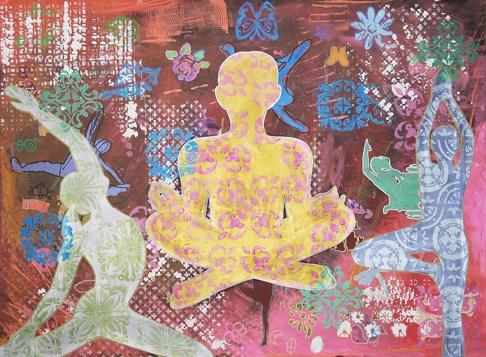
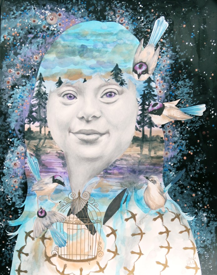
With my art, I enjoy making the internal external. I’m very interested in the dynamic of the individual’s public/interacting self versus their private self. Rather than using dramatic facial expressions in my portraits, I tend to leave their expressions mysterious and neutral and let the external surroundings speak to the content of the subject’s mind and soul. This most likely stems from my interior design background, and the idea that the external environment should reflect the people who inhabit it. Much of my work involves psychology and is inspired by my own thoughts and experiences, but I like to leave the visual narratives open ended so that each viewer can bring their own experiences to a piece and connect with it in their own way.

I am fascinated with the detail in both the external and internal structure of all living things; humans, plants, and animals. The natural world around us is truly filled with the most amazing forms of living sculptures if we take the time to look, and keeping this idea in mind reminds me even on the worst of days how luck we are to be alive. This appreciation of observing and exaggerating the most minute details in the world around us is another element that finds its way into my work.

4. How would you describe your style and how is it integral to your work as an artist?

My style is very vintage inspired, and I like to make my art timeless in a way by incorporating visual elements from all different time periods. I am also influenced by surrealism, and always want to show people something in my art that they can’t see in real life. In my work with portraits and figures, I look to antique photos as a reference and usually combine multiple sources to create the exact body and face I am picturing in my head for a certain piece. I am very much a visual thinker, and one day a friend was venting to me over the phone about a stressful week she’d had. (I promise I was listening, but …) As she was talking, I started to see a little cartoon in my head of her standing staring at me, wearing a tall top hat, and her brain was growing out of the top of the hat with all types of different objects representing what she was thinking about sticking out of the protruding brain … The image was a nice blend of hilarious and disturbing, and also gave me the idea to start doing portraits with visual representations of each subject’s thoughts flowing outside of their body.

5. What role does the artist have in society?

Though we don’t always realize it, art and design is everywhere around us in our society … In the music we hear, in the buildings we live and work in, in the ads or posters we see, the clothes we wear, the furniture we sit on, the movies and tv shows we watch, and the list could go on and on. Without art, our world would be empty, inefficient, and without meaning. Beyond that, art has the power to give people a voice. Art is an important tool for communication, and is able to open people’s minds to ideas they may not be as receptive to if delivered in a different way. Each artist has to define their own role for themselves based on the goals they have for harnessing their own personal form of creativity. As for me, I feel called to use art as a tool for connection and reaching out to others. Sharing the therapeutic benefits of creating with others is a priority for me because of the anchor I know it has been in my own life. I aim to make art and creativity accessible to all, no matter their age, ability, income, or any other qualifier. Do artists have to use their skills to make the world a better place? I suppose no one technically has to do anything as we all have autonomy over our own lives, but I certainly think they should.

6. What is your favorite artwork you’ve created and why is it your favorite?

This is a hard question as I develop a connection to almost every piece of art I create like they are my children, no joke. That being said, at this point my favorite piece of art I created is “July: She Is Free”. This piece was from a 12 part series titled “Unlimited” that I showed at Founder’s Brewing Company for ArtPrize 2017. The series was comprised of 12 mixed media, surreal portraits in which the meaning was influenced by the use of pattern and color. The series depicted women of all ages, races, and time periods, each communicating a different story. The aim was for the pieces to speak to women’s collective experiences beyond their differences. We tend to think of time and events in terms of our own personal history or the history of the nation in which we currently reside. But of course, there are women everywhere living out their day to day lives all over the world, with hopes, dreams, fears, relationships… Our situations and struggles are very different, but were we in some alternate reality all given a chance to meet, I suspect we would find some surprising similarities, maybe more than we ever expected. We are all worthy of love, safety, respect, and dignity. I am particularly attached to July because it depicts someone with a visible disability, something that is almost never seen in portrait arts. I am a huge proponent of disability rights, empowerment, and visibility. This piece was shown and awarded at the Midland Artists Guild’s Annual Juried Exhibition of 2018, and I actually overheard an attendee afterwards whispering to a friend, “But why would you want to draw those kind of people?” This is why I do what I do. Visibility and education are vital, as prejudice is rooted in ignorance. I aim to continue to challenge what beauty is in art.

Standard
Art Education, Project Ideas, Travel

Isaiah Zagar : Creative Minds Art History Project

I love to travel, and was lucky growing up to be part of a family who enjoys a change of scenery every so often as well. An experience that still stands in the forefront of my mind is accidentally happening upon one of the most breathtaking displays of public art I have ever seen while in Philadelphia on one of the last trips my immediate family and I would take together in our little quartet before my brother and I were “officially” grown-up with our own jobs, schedules, and lives.

Mosaic artist Isaiah Zagar has his work across buildings all over Philadelphia and throughout the rest of the country as well, but his Magic Garden is something special, a truly immersive art experience that really does feel like you are being transported into a different universe temporarily as if by magic.

Though he started as a painter, he ended up becoming most known for his public mosaic work. He became an integral part of the “South Street Renaissance” in the 1970s, bringing excitement, inspiration, and beauty to the ignored and abandoned areas of his hometown. The interesting thing is, he only discovered this medium because of others’ willingness to invest and believe in the talents and well-being of those who are struggling. It was while being hospitalized for a breakdown related to undiagnosed bipolar disorder that he was introduced to mosaic making, and he credits this art practice with bringing him out of his depression. Zagar has stated that he was determined to use his breakdown as a springboard into positive mental and spiritual growth, and though mental health is a chronic struggle, he has done just that. At 80 years old, he is still here, filled with an enthusiasm for lifelong learning.

Zagar’s mosaics aren’t just glass and tiles. He utilizes a wide range of materials, much of it upcycled “trash”, and integrates painting and poetry into his designs as well. I had my students make their own mini mosaic on 12×12 tiles using a variety of mixed media materials such as glass pieces, broken jewelry, beads, discarded board game pieces, and more. This is a great way for art programs to use up any odd donations or miscellaneous supplies. I work with students with a wide range of abilities in my Express Yourself Artshop program, and we also have time constraints since we typically spend 1-3 weeks on one project before moving on to the next. To make mosaic art work for our needs, we had students paint the background of their tile whatever color they wanted to show through in between their mosaic pieces, and after they had chosen their pieces and laid out their design we used Weldbond adhesive to attach the parts rather than using grout.

It was interesting to see the messages and themes students were drawn to include in their work, and I was happy to hear that many of them found the process inspiring and therapeutic, same as Zagar did.

If you are interested in learning more about this artist, one of Zagar’s sons created a fantastic documentary about his father’s journey. You do not have to be perfect or feel like you have everything figured out to use your gifts and skills to bring light and life to others. Even through his intense struggles, Zagar has had a profoundly positive impact on his community and continues to do so to this day.

Standard