New Work

New Work Reveal – Wonderland

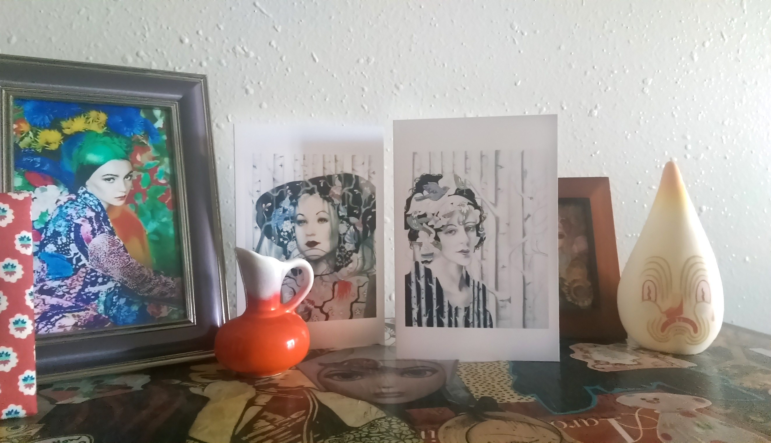
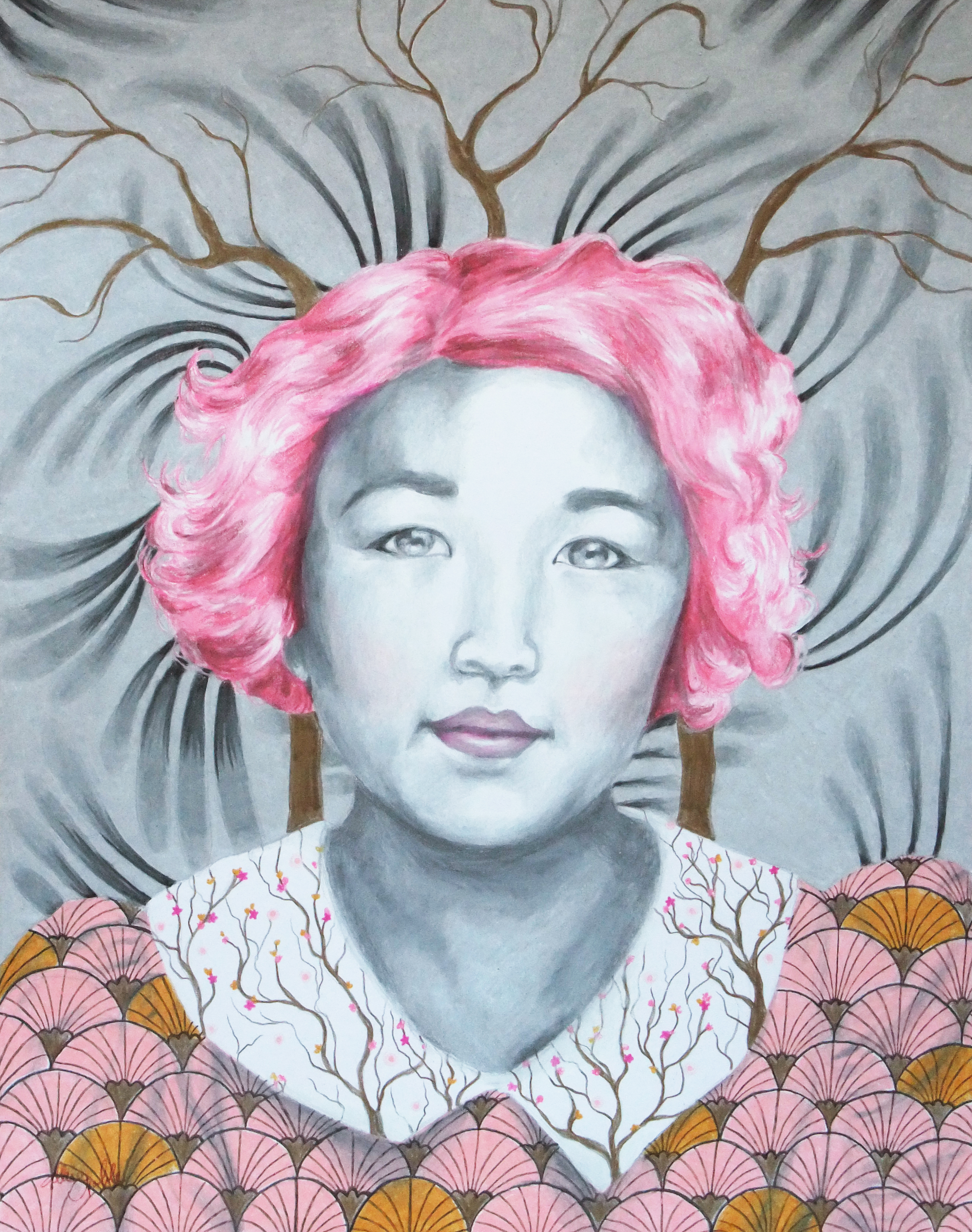
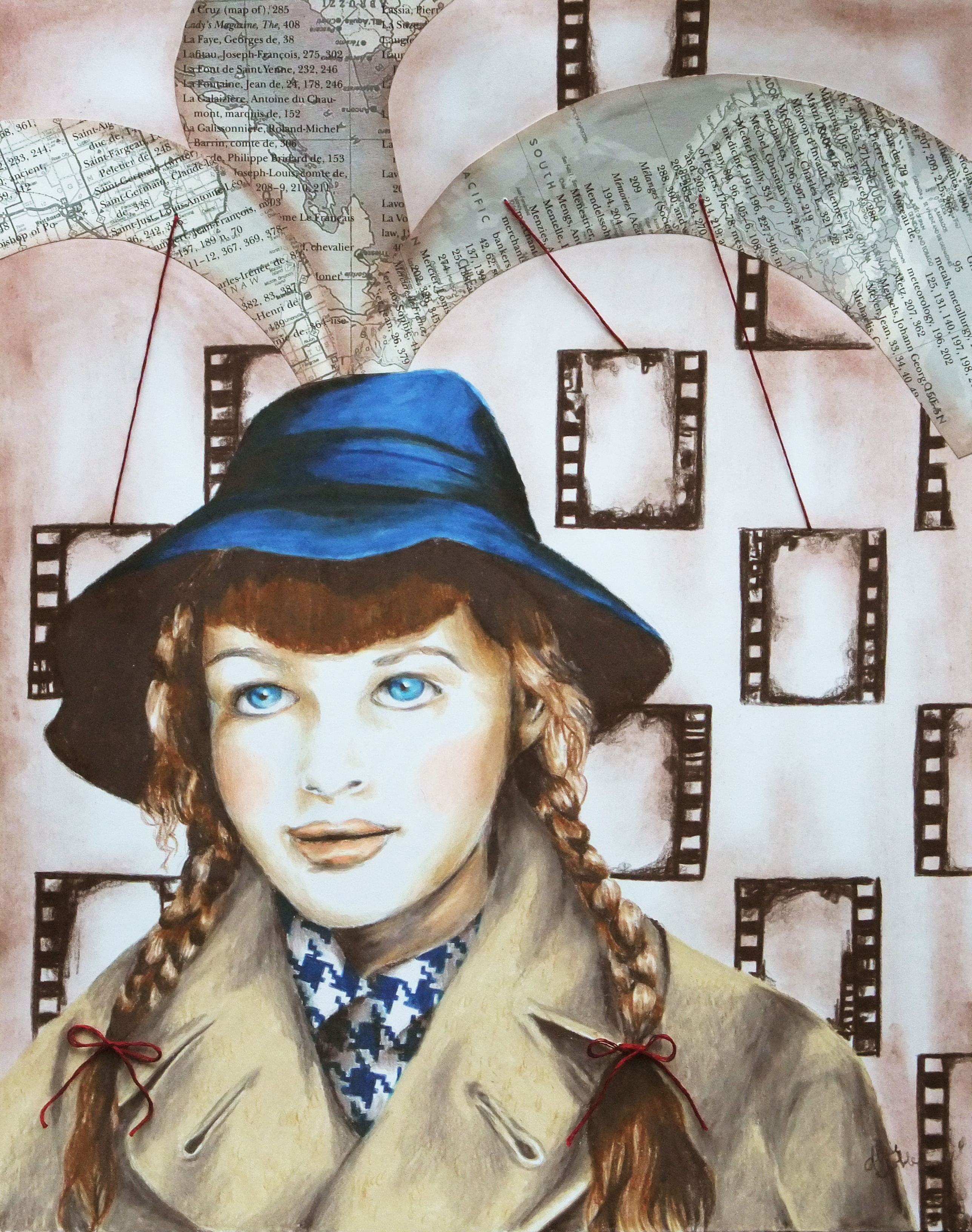
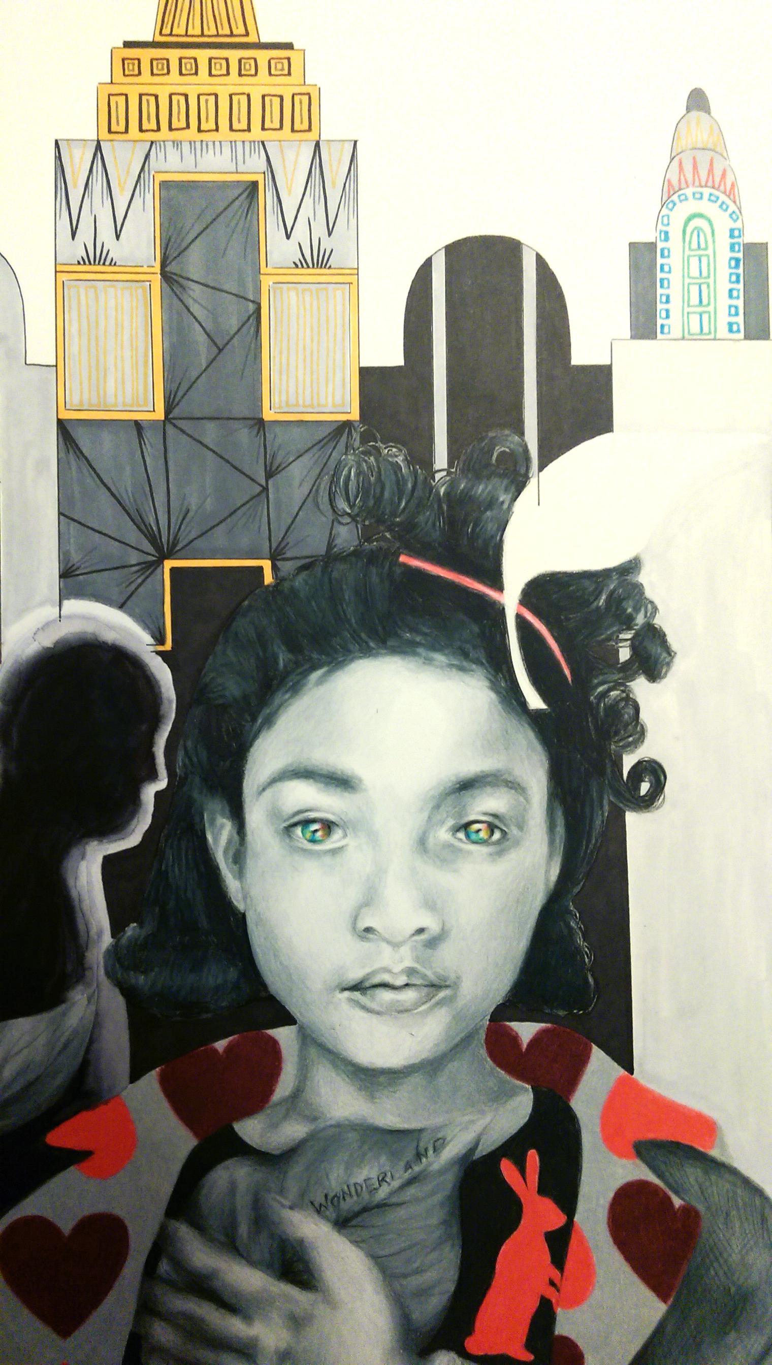
I have been slowly adding to this piece over the last couple months. It went through some stages where I wasn’t really sure if I even liked it, but lo and behold, in the end I think it all turned out just fine :). I usually use only one or two shocking, bright colors in a piece at a time (with the exception of illustration/graphic design stuff when it calls for it) and never primaries like this, so I must admit the color scheme did freak me out a bit and I was sure for a moment that I’d made a terrible mistake. However, adding the dripping watercolor from the bottom to blend into the blurred figures in the background really tied it together. I wanted to use these “childlike” colors to reinforce the idea that we are seeing the environment through the eyes of the girl. This is also the reason why I made the drawn on windows on some of the buildings in the back simplified, and more “sketchy” and didn’t use a straight edge. This decision also greatly freaked me out at first. Apparently I don’t do a whole lot of “childlike” illustration. This was definitely something new, and it’s been a wild ride and I am pumped to move on to the next thing :). I really don’t know how some artists work on one piece for years, I’m always anxious to finish up and get on to the next big idea! I took in-progress photos this time, a first, and really must remember to do this more often.

WONDERLAND – 18×24 – COLORED PENCIL, INK, AND WATERCOLOR

Starting with the midtone shading of the skin ... I know I have mentioned before it's usually best to start with the background first. However, since I knew I wanted to do the background in ink, I reversed the process. Since primsacolor pencils are oil based, they provide a barrier so that the ink mess doesn't get all over the area where I want the figure. Sometimes you have to alter your process to best suit the materials, learned mostly through trial and error.

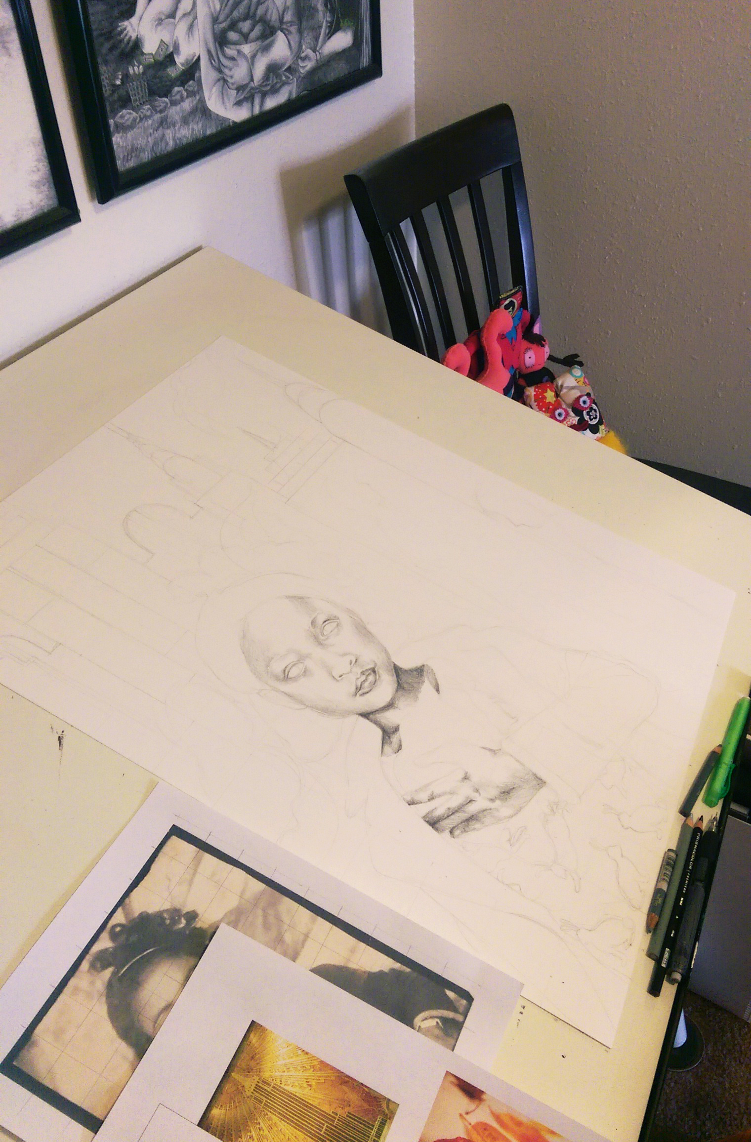
Starting with the midtone shading of the skin … I know I have mentioned before it’s usually best to start with the background first. However, since I knew I wanted to do the background in ink, I reversed the process. Since primsacolor pencils are oil based, they provide a barrier so that the ink mess doesn’t get all over the area where I want the figure. Sometimes you have to alter your process to best suit the materials. I’ve learned this mostly through trial and error.

Next on to the hair, and I did a little trial filling in the rabbits in color on her shirt ... still scared of the bright color!

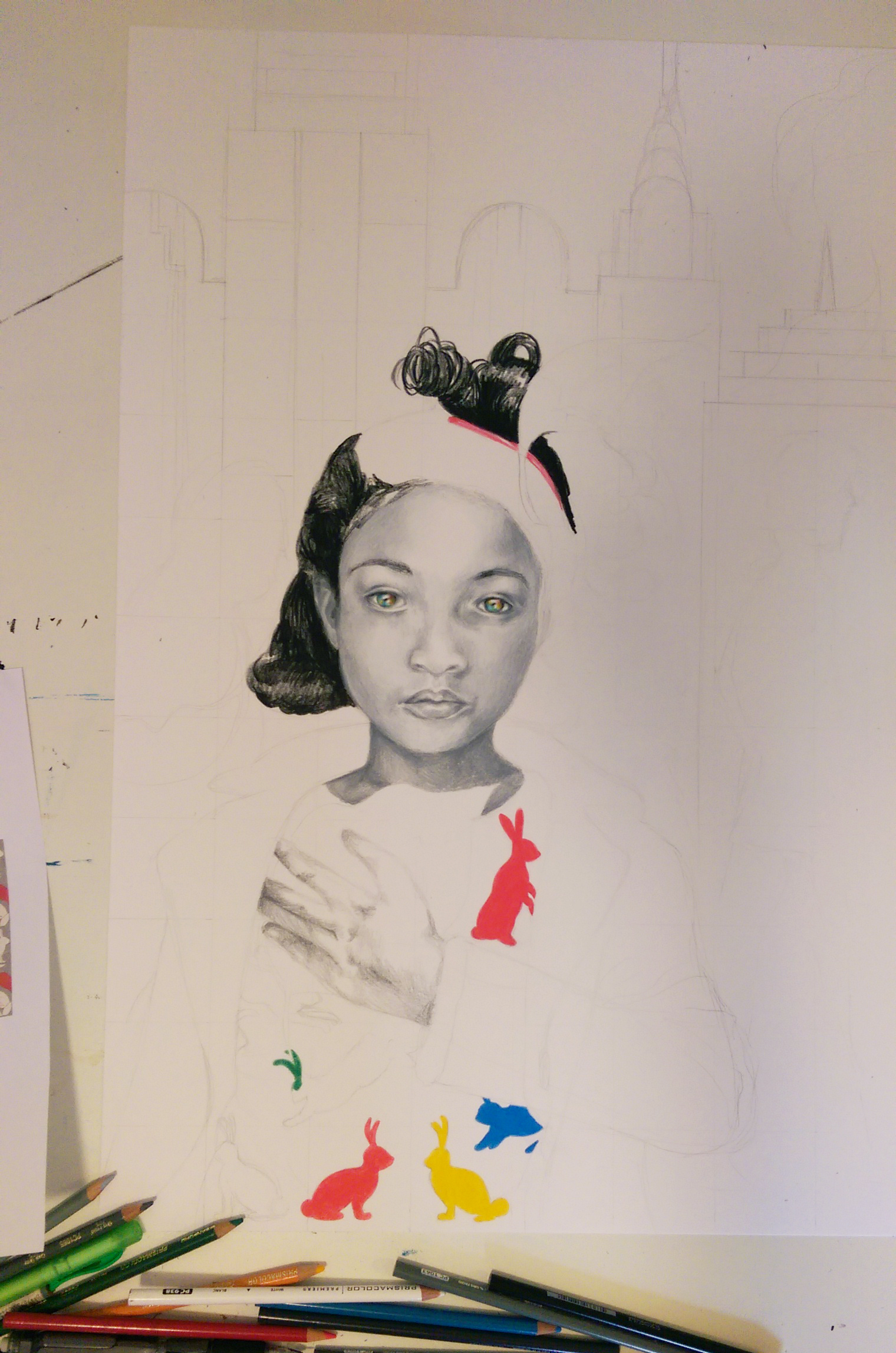
Next on to the hair, and I also did a little trial of the color idea by filling in the rabbits on her shirt … still scared of the bright colors!

Decided to fill in black behind the pattern on her shirt to balance the dark areas in the composition, and also to "anchor" those darn rabbits to something! I also inked in the blurred figures rushing by in the background, softened the edges with water, bleeding the ink.

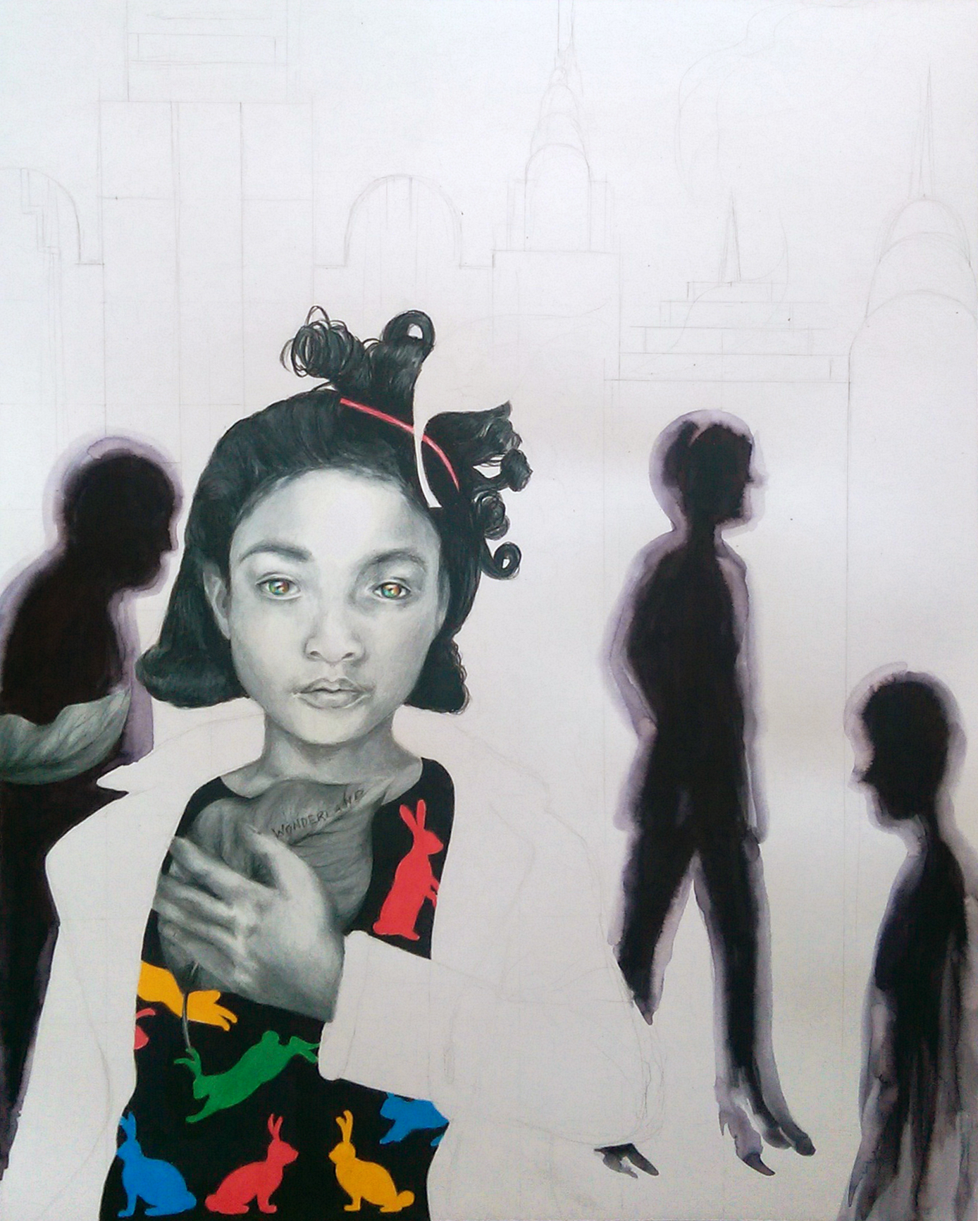
I decided to fill in black behind the pattern on her shirt to balance the dark areas in the composition, and also to “anchor” those darn rabbits to something! I also inked in the blurred figures rushing by in the background, softening the edges with water, bleeding the ink.

Added more color by putting a pattern on the lapel of her jacket, and began rendering the cityscape in the background in ink.

I added more color by putting a pattern on the lapel of her jacket, and began rendering the cityscape in the background in ink.

Buildings inked in!

Buildings inked in!

Further developed shading on the skin where needed to have harmony with the values of the background, dripped colorful watercolor up from the bottom of the composition, and chalked dark clouds over the background to recede it further back, and draw the eye to the figure. I believe it is now finished :).

Last, I further developed the shading on the skin where needed to have harmony with the values of the background, dripped colorful watercolor up from the bottom of the composition, and chalked dark clouds over the background to recede it further back, and draw the eye to the figure. I believe it is now finished :).

Standard
Art Discussion

Art Discussion – Legacy

Legacy, 11x14 Prismacolor Pencil

Legacy, 11×14 Prismacolor Pencil

Today, I wanted to unpack a piece from my conceptual portraits series I’ve been working on since beginning of last year, titled “Legacy”.

The script scrolling from her head at the top right reads “I fear being ordinary most of all”. For this piece, I had been thinking a lot about how many decisions we make are rooted in a fear of mortality. We fear that once we are gone it won’t matter… we will have left nothing behind to be remembered by. We long to be KNOWN for something, to be successful at something, for others to know our name. Sometimes we don’t even care if what we are noted for is positive or not, just as long as our existence is eye-catching and out of the ordinary and commands fame and astonishment for good reasons or for terrible. LIke Oscar Wilde said, “The only thing worse than being talked about is not being talked about”. Everything we do, in the relationships we build, the work and pleasure we choose, is leading towards a legacy we hope to build and the perception by which we will be remembered. I used the repeated pattern of the skull and grave markers on her clothing as a motif symbolizing mortality. You will also notice the burning city in the background at the bottom of the composition, which she turns away from smiling, so inwardly focused that she takes no notice of the external destruction.

I have always been interested in masks, mainly because I am interested in almost any form of art that involves faces. Masks can also symbolize so many different things. They can symbolize falseness, pretense, anonymity, invisibility, the concealment of sins. But, they can also symbolize celebration, personal expression, the fact that human beings are flexible and multi-faceted and shades of grey – not black and white, and the power we have over who we want to be in our own story. I am especially drawn to the aesthetic of Japanese Kabuki and Noh masks, two forms of classical Japanese musical drama that involve masks and elaborate costumes to aid in telling the story. In Noh, each mask symbolizes a different type of character. For the background of this piece, I chose to tile the demon character mask (destructive, powerful) alternating with the traditional woman mask (usually symbolizing a character who is beautiful, refined, elegant, and demure). This symbolizes the interplay between a person’s two choices (or more accurately, what we perceive as our only two options). Too often we think that the only way to get ahead, be noticed, be outstanding, is to forgo our ideals and do what is best for ourselves and ourselves only. Those who make history do tend to have an awful lot of skeletons in their closet. But does doing what is right condemn us to having to play the role of the mouse smiling and curtsying in the corner? I’d ask you to also look to history (Think of Martin Luther King Jr., the most well known example!) and see that no, that is certainly not the case.

It is always interesting to hear others’ thoughts. Who are some of your favorite notable figures who broke the societal assumption of power and success being inseparable from selfishness and violence? What kind of legacy do you want your existence to build?

Standard
Exhibitions and Other News

Wait, I Have Swag Now? There’s A First Time For Everything + New WIP

The Conceptual Portraits Collection

The Conceptual Portraits Collection

So, remember way back in the beginning of March when “I’d Have Been Happier As A Bird” was featured on RedBubble‘s front page? Well, one of the cool perks of that was I got a voucher to see some of my own designs in print, and I promptly ordered some greeting cards, a T-shirt, and a tote bag. I had been anxiously awaiting my fun packages trickling in (isn’t getting mail in general just the best, even when you’re expecting it?), and as of last week I received them all and wanted to share. I also have a new work in progress photo for an 18×24 conceptual portrait I’m working on, this time of a young girl rather than an adult which is something new. I tend to never take WIP photos, so appreciate it while you can! I’ll be sure to get better about that and share more of my progress as I begin new projects. I have quite a few idea sketches mounting up, so time to get to work!

Super cool T-Shirt in "I'd Have Been Happier As A Bird", and tote bag in "The Peacock"

Super cool T-Shirt in “I’d Have Been Happier As A Bird”, and tote bag in “The Peacock”

A little bit better lighting to truly see the designs ...

A little bit better lighting to truly see the designs …

Matching greeting cards! I was really pleased with how heavy they were, and with the sharp, high quality, gloss prints.

Matching greeting cards! I was really pleased with how heavy they were, and with the sharp, high quality, gloss prints.

"Wonderland" WIP

“Wonderland” WIP

Standard
Artists To Know

Artists To Know! Installment 3

Today’s Artists To Know Installment is all about faces!

Natalie Foss

I discovered this artist on Behance. She is a Norwegian illustrator who works mainly in colored pencil. I wish more magazines used interesting illustrations like these; I would subscribe to all of them just to save the pictures :). I adore how focus is brought to the faces of her subjects by making their skin the only three-dimensionally rendered element of a piece, leaving the rest flat and filled in with solid color or pattern. The unusual colors she uses also catch the eye. She makes blue toned skin completely believable by placing the undertones like pinks and yellows in just the right places. The faces have a reflective quality, and make the viewer believe they can reach out and touch them. I’ve truly never seen portraits quite like these.

Natalie Foss

Malinda Prud’homme

This artist I found on twitter via my newly created account (Look at me, getting with the times. @AlliseNoble if you’d like to follow :)), and was immediately drawn to her comprehensive range of portraits styles from photo-realistic to more stylized, in a variety of mediums. There are even three-dimensional mixed media elements in some of her pieces, like gems adhered to the surface of a subject’s jewelry rather than simply painting the ornamentation. It is rare for one artist to work in so many different styles, and they all look fantastic. On her website Malinda states, “My greatest passion is portraying a variety of natural female beauty in order to express that all women; regardless of age, size, style, or ethnicity; are beautiful in their own unique way.” – right on!

Malinda Prud’homme

Arisa Nakahara

I found Arisa Nakahara on pinterest. There is way more to pinterest than just recipes and cute wedding ideas – pinterest is another fantastic place to find some truly mind-blowing, excellent art. I love how most of Arisa’s portraits are painted straight on, and look you right in the eye. It’s a bit jarring and also captivating, especially since the eyes are the most detailed part of her faces. She says her theme is “The power to live”, and I can see that thread throughout all of her colorful portraits, saturated in lush fruits and floras and insects. All of her designs transport you to that magical warmth as spring and summer are just beginning. Her entire body of work is so cohesive and timeless, and the images, quite simply, make you incredibly happy.

Arisa Nakahara

Elsa Mora

Another artist I discovered on Behance (seriously, even if you don’t create art yourself it’s worth having a profile simply to browse and favorite all the amazing projects to be found here!). Elsa works in a variety of mediums including drawing and illustration and even extending into 3D mixed media sculptures and jewelry design, but I first found her through her paper cutting work. It is truly a testament to patience which I can never even imagine attempting. She creates whimsical storybook universes and achieves an unbelievable depth all with layered paper.

Elsa Mora

Lucy McLauchlan

I discovered this artist back in late high school when I still actually subscribed to magazines, and she was featured in an issue of Juxtapoz. Lucy McLauchlan is another artist whose work you can spot as hers from a mile away. The combination of heavy black and white contrast and the balanced flow of designs made entirely of undulating lines and stylized faces is hard to look away from. I would love to walk around in this place (and maybe have my bedroom painted like this, hm?)

Lucy McLauchlan

Ruben Ireland

Another artist who favors dramatic black and white contrast, Ruben’s art is one more find from pinterest. He uses the black and white to divide elements of the body and draw out or recede features into the dark. He seamlessly weaves animal and woodland/nature imagery through his portraits as well, forming almost a psychic connection between the two. His subject’s facial expressions are ambiguous and stoic, leaving you to look to other cues to imagine what is on their mind.

Ruben Ireland

Are there any other types of artists or artwork you’d like to see? Let me know! I’m always open to suggestions!

Standard
Exhibitions and Other News

Midland Artists Guild Annual Juried Exhibition 2015 – Time to Celebrate!

I am a member of the Midland Artists Guild in Michigan, a group of artists of all mediums and at all different levels who get together to share their work, socialize, learn new skills, and grow together. For two years I’ve served as the Program Chair on the Board of Directors, which means I get to seek out different guest artists to speak about their journey and present their work at each monthly meeting. Yes, it’s a pretty fun job. Last evening was the opening reception for MAG’s Annual Juried Exhibition – always something to look forward to. There was a wide variety of awesome art (on display at the Grace A Dow Memorial Library mezzanine – if you are in the area I suggest checking it out!), and I got some mind-blowing news. All 3 of my pieces I entered won an award, including Best 2D! It was a total surprise, and I couldn’t be more happy and excited. This year is off to a good start, and I am anticipating many more surprises and adventures. Thank you everyone for all of your interest, kindness, and support.

The Peacock, 11x14 Prismacolor Pencil

The Peacock, Best 2D

Hopeful, 11x14 Prismacolor Pencil

Hopeful, Award of Merit

Throwing Shadows, Honorable Mention

Throwing Shadows, Honorable Mention

These pieces are available as full size prints and ACEO mini prints in my ebay store, as well as T-shirts, phone cases, stickers, and other fun merch on redbubble.

Requisite goofy, awkward picture in front of my art

Requisite goofy, awkward picture in front of my art. Yes, I made my octopus necklace :).

Standard
Exhibitions and Other News

Work Featured Today In “Found On Redbubble” Front Page!

I got a big surprise this morning, one of my conceptual portraits “I’d Have Been Happier As A Bird” was featured on the found by redbubble front page!

It's the grey-scale portrait second row, 3 over!

It’s the grey-scale portrait second row, 3 over!

Redbubble in general is amazing, and I can’t believe I have waited this long to set one up. Not everyone is interested in hanging something on their wall, and this site splashes your designs over all kinds of objects you can use in day to day life like T-shirts and tank tops, mugs, phone or tablet cases, stylish tote bags, decorative pillows … Given my interior design background, having my designs printed onto custom pillows makes me way too excited. The prices are very reasonable as well, not much different than what you’d pay for the same items in a “regular” store, and those with boring stock designs decorating them rather than unique artist-made work! Please check out my shop; I am working on some new designs specifically for RedBubble, and will also be adding some more of my more popular fine art work as well. I may just have to feed my coffee addiction and get a travel mug in the “I’d Have Been Happier As A Bird” design for myself :). I’ve always been attached to that piece, and it makes me so happy that others are appreciating it as well. Thank you, world!

Standard
New Work

Bringing The Inside Out – Exploring Conceptual Portraits

Spring seems to be the time for exhibitions, and with many deadlines coming in mid-February, I’ve been going into hyper-drive to get pieces finished and ready. This past year has been all about conceptual portraiture. My drive to expose the subject’s thoughts and emotions through visual cues outside of themselves  came in part from my interior design study in college, where visual cues in the external environment are key, and part from a conversation I had with one of my best friends coupled with my overactive imagination. We were both at different colleges, and she had had a particularly stressful couple of weeks and was unloading over the phone because that’s what best friends do. One thing you have to know about me, as people talk, I get these vivid little reels of what they are describing playing in my head. It doesn’t mean I’m daydreaming and not listening, it’s just how my brain works. I immediately got this image of her overstuffed brain protruding from out of the ripped open top of her trademark top hat, with other random objects and various debris springing out everywhere. I told her, she burst out laughing, and we went on with our evenings. I made a concept sketch the moment we got off the phone, for future reference.

After doing a series of portraits in which visual manifestations of the subject’s emotions literally burst out of or hovered over the top of their heads (wouldn’t that make life far less more of a guessing game as far as relationships are concerned?), I began to think more about how not only literal objects but also the more subtle use of color and all over pattern could communicate about the subject’s mental state. If one’s emotions covered them like a fabric, what would it look like?

Today, my portraits are a combination of these earlier ideas. I used photos I’d taken of friends before, but now I’ve gotten really into using vintage photographs as references instead, because not knowing the people at all allows me to start with a blank slate and gives me more freedom to invent my own stories about them. Photographs of my girls are being taken, and jpegs sent or framed work dropped off to the various locations for jurying, so wish me luck in the next couple of weeks! If you’d like to see more portraits, check out my website (there is even one MAN portrait! – those of you who know me and my work know how rare this is). Prints are also for sale here!

Overaccumulation of Stimuli, Prismacolor Pencil, 2010 - The portrait that started it all.

Overaccumulation of Stimuli, Prismacolor Pencil, 2010 – The portrait that started it all.

Fight Or Flight, Prismacolor Pencil, 2011 - Through studying interior design, constructing environments for people, you learn that color and pattern SPEAK, and can affect the psychology of those who live in it (and the psychology of the viewer who looks at your art!)

Fight Or Flight, Prismacolor Pencil, 2011 – Through studying interior design, constructing environments for people, you learn that color and pattern SPEAK, and can affect the psychology of those who live in it (and the psychology of the viewer who looks at your art!)

Hopeful, 11x14 Prismacolor Pencil

Hopeful, 11×14 Prismacolor Pencil

The Peacock, 11x14 Prismacolor Pencil

The Peacock, 11×14 Prismacolor Pencil

A World To See, 11x14 Prismacolor and Mixed Media

A World To See, 11×14 Prismacolor and Mixed Media

Standard