Art Education

Back to Artshop for Spring!

We’re about halfway through the new spring semester of Express Yourself Artshop, and I wanted to share what some of my students have been working on. My two painting classes in particular are pretty full this time around, which has been a lot of fun. It is exciting to discover everyone’s own unique preferences and styles. I really must just let the pictures speak for themselves.

Acrylic and Watercolor Spring Painting

Acrylic and Watercolor Spring Painting

Acrylic Abstracted Roses

Acrylic Abstracted Roses With Gold Outlining

Acrylic and Pastel Abstracted Figure

Acrylic and Pastel Abstracted Figure

Metallic Acrylic Owl

Metallic Acrylic Owl

Anyone interested in education, teaching, or mentoring in any way should give this video I found awhile ago a watch.

Yes, it’s focus is on kids and tech, but I found the takeaways applicable to many ages, abilities, and fields. People really do have unimaginable potential when they are actually allowed to experiment, explore and discover.

“Get out of their way, and let them be amazing.”

Standard
New Work

New Work Reveal – On My Mind

My new piece ended up coming together rather quickly. I’m guessing it was due to a combination of the sudden dismal weather over the last couple days and also on and off feeling like I was coming down with something and being low on energy over the last week or so. Neither of these occurrences are fun, but they did force me to have lots of sit-down, indoor time when not at work which certainly upped my art production. Like the last conceptual portrait I did, I wanted this piece to be mixed media so I could use the artistic medium best suited for each part of the composition. I ended up using prismacolor pencil for the portrait, acrylic for the space scene, watercolor for the background, and fabric for her dress – the star print was just too perfect. I added some embroidery detail around the figure at the end to finish it off and really highlight the figure and bring her into focus despite her subtle, lighter tones. I found the inspiration photo first, and then built from there. I love finding interesting bits and pieces of inspiration in the unexpected. One wouldn’t expect a piece of art to spring from a blurred antique photo with poor lighting of a girl holding her head sulking as if she has a headache. But, I saw that photo and instantly thought of a heaviness or vastness she must be holding inside her mind. Hence, the universe concept. I wanted to add art nouveau detailing because I’ve never done an art nouveau inspired piece, and it is truly one of if not THE absolute favorite design period of mine. I knew the iconic swirling, rounded patterns would be perfect to compliment the outer space motif. I’ve actually been remembering to take progress photos to some extent. I’ll get the hang of this blogging thing yet ;).

Initial portrait shading finished, and just filled in the space scene with acrylic.

Initial portrait shading finished, and just filled in the space scene with acrylic.

Adding the art nouveau detailing by filling in the pencil outline with metallic gold acrylic.

Adding the art nouveau detailing by filling in the pencil outline with metallic gold acrylic.

Darkened some of the shading on the figure to balance the dark areas of deep space and the moon phases pattern, and added layers of metallic watercolor to the background. Also detailed some constellations over the watercolor.

Darkened some of the shading on the figure to balance the dark areas of deep space and the moon phases pattern, and added layers of metallic watercolor to the background. Also detailed some constellations over the watercolor.

More layers of watercolor, the final embroidery design around the figure, and voila!

More layers of watercolor, the final embroidery design around the figure, and voila!

Standard
Techniques and Tutorials

Drawing Profiles and Roaring 20s Twisted Damsels

In both portrait drawing and portrait photography, the most dynamic of compositions often involve partial or full profiles, because profiles by nature create more interestingly shaped negative space around a figure. Profiles are also THE most dreaded type of portrait to draw. For years I shunned them after far too many failed attempts, my lovely subjects coming down with the dreaded gorilla-lips curse; that tragic moment when you end up with either too much or not enough space between the nose and chin to squeeze the lips into, and then there is the question of how far should the lips actually stick out anyway? Hence, we end up with the look of a monkey trying to blow a patron a kiss at the zoo… not good. I forced myself to peruse tutorials after finding far too many wonderful 1920s flapper photographs of kickass ladies I wanted to include in my compositions, all taken in profile! Coupling this with my own experimentation, I believe I have come up with some pretty solid methods to make drawing profiles easier. What works for one artist may not necessarily work for another and there are many different approaches, but I hope this gets you started.

*Some of the angled guidelines appear to be a bit different in the photo versus the drawing, but don’t be confused! The images got put into my scanner and they simply weren’t all lined up *perfectly* straight since the paper I used was too big and hung off the edges of the scanner to begin with. So, ignore any of these visual discrepancies as scanner error :)*

*The reason I don’t start with the classic “oval head shape* is because a profile tends to deviate from that roundness eventually anyway, and you will inevitably run out of room in the end and wind up trying to squash the mouth into that restricting beginning oval size and shape. Doing this, you will either not have enough room between the nose and mouth, or have a nonexistent chin. It’s much easier for me to get the features down first, and then use a measuring tool (I always go with the eye) to inform you in how high the forehead should rise, how far back the rest of the skull should extend, etc; everything kept in proportion to everything else.

This is the image we will be working from. You will notice the line running diagonally from nose to chin - this is a lifesaver! On every single face, no matter what the proportions, the end of the nose, lips, and chin will all touch a diagonal line drawn from nose to chin, the exact angle of this line may just vary. This will be a HUGE help to us later.

This is the image we will be working from. You will notice the line running diagonally from nose to chin – this is a lifesaver! On every single face, no matter what the proportions, the end of the nose, lips, and chin will all touch a diagonal line drawn from nose to chin, though the exact angle of this line will vary. This will be a HUGE help to us later.

Have you ever seen artists when drawing a still life or model lifting their pencil up, squinting at it, and then laying it against their paper? They are using their pencil as a guide to gauge the correct angle, and we can do that with a photo reference as well.  Lay your pencil against the angle of the forehead to gauge the angle start, and then move the pencil over to your paper and create that same angle.

Have you ever seen artists when drawing a still life or model lifting their pencil up, squinting at it, and then laying it back down against their paper? They are using their pencil as a guide to gauge the correct angle, and we can do that with a photo reference as well. Lay your pencil against the angle of the forehead, and then move the pencil over to your paper and create that same angle in a light pencil line.

Use the same pencil technique to gauge the under slope of the forehead as well as the angle of the nose. Round out the intersections of these 3 lines. Don't worry about the length of the nose yet, just make the line.

Use the same pencil technique to gauge the under slope of the forehead, as well as the angle of the nose. Round out the intersections of these 3 lines. Don’t worry about the length of the nose yet, just make the line.

Next, outline the eye relative to the size of the slope between the forehead and nose. This is important because the eye will be used as a handy measuring tool in the future. Don't worry about the unique shape of the model's eye right now, just make a rounded off triangle of proportionate size to the bridge of the nose.

Next, outline the eye relative to the size of the slope between the forehead and nose. This is important because the eye will be used as a handy measuring tool in the future. Don’t worry about the unique shape of the model’s eye right now, just make a rounded off triangle of proportionate size to the bridge of the nose.

Now, use the eye height to measure the length the nose should be. How many eye heights fit down the length of the nose? In this case it was 3. Mark off that end point. From that point, draw your diagonal line that will be a guide for the mouth and chin as well, using your pencil to gauge the angle from the photo.

Now, use the eye height to measure the length the nose should be. How many eye heights fit down the length of the nose? In this case it was 3. Mark off that end point. From that point, draw your diagonal line that will be a guide for the mouth and chin as well, using your pencil to gauge the angle from the photo.

There are many different techniques for this step, just check out pinterest. What I've found easiest is concentrating on the shape of the negative space created between the diagonal line and the facial features rather than the facial features themselves.

There are many different techniques for correctly outlining the shape of a portrait’s features in profile, just check out pinterest. What I’ve found easiest is almost ignoring the features and concentrating on the shape of the negative space created between the diagonal line and the facial features rather than the facial features themselves.

Concentrate on the 3 shapes of negative space created, between the nose and top lip, between the top and bottom lip, and between the bottom lip and chin, and draw them in. Definitely use your pencil to gauge the angles. Then, step back and compare what you have to the photo, note if anything doesn't look quite right, and touch up where need be.

Concentrate on the 3 shapes of negative space created, between the nose and top lip, between the top and bottom lip, and between the bottom lip and chin, and draw them in. Definitely use your pencil to gauge the angles. Then, step back and compare what you have to the photo, note if anything doesn’t look quite right, and touch up where need be. Also, use your pencil to gauge the angle of the chin. Draw the line on your paper, and round off where this new line intersects with the already existing diagonal.

Go ahead and add the iris, and the eylid and the arch of the eyebrow. Don't just draw a generic, upside down smile eyelid on top. Pay particular attention to the reference's unique eyelid shape. Also, add some detail to the nose. Note that the nostril ends at about where the lip curves out. Also, gauge the angle with your pencil of the front edge of the eye to the curve of the side of the nose. Draw that angle lightly on your paper. This will indicate where the curve should fall. Once again, don't just draw a parentheses - note the distinct shape of the reference's curve around the nostril - it's a little more straight. As you draw more potraits, you will find that noses (and eyes, and mouths for that matter) are literally like snowflakes - absolutely no two exactly alike.

Go ahead and add the iris, and the eyelid and the arch of the eyebrow. Don’t just draw a generic, upside down smile eyelid on top. Pay particular attention to the reference’s unique eyelid shape. Also, add some detail to the nose. Note that the nostril ends at about where the lip curves out. Also, gauge the angle with your pencil of the front edge of the eye to the curve of the side of the nose. Draw that angle lightly on your paper. This will indicate where the curve should fall. Once again, don’t just draw a parentheses – note the distinct shape of the reference’s curve around the nostril – it’s a little more straight. As you draw more portraits, you will find that noses (and eyes and mouths for that matter) are literally like snowflakes – absolutely no two exactly alike.

Measure how many eye lengths are between the top of the eye and the hairline. Make a mark for the hairline. Use your pencil to gauge the angle between the corner of the eye and where the chin line ends. Make a mark on your paper where the jaw line should end, and curve it up.  Now also know where to properly add the bottom of the ear. It should line up with the angle off the end of the jaw line. The bottom of the ear should always line up with the height of the mouth on a face.

Now measure how many eye lengths are between the top of the eye and the hairline. Make a mark for the hairline. Use your pencil to gauge the angle between the corner of the eye and where the chin line ends. Make a mark on your paper where the jaw line should end, and curve it up. Now you also know where to properly add the bottom of the ear. It should line up with the angle off the end of the jaw line. The bottom of the ear should always fall height wise lined up with the height of the mouth on a face.

Gauge the angle of the hairline with your pencil, and draw that diagonal in where you had your mark at the top of the forehead. Gauge the angle between where the hair drops down and the mouth. Mark that line lightly, and create the second curve for the hair.

Gauge the angle of the hairline with your pencil, and draw that diagonal in where you had your mark at the top of the forehead. Gauge the angle between where the hair drops down and the mouth. Mark that line lightly, and create the second curve for the hair.

Voila! You have a pretty good start to a profile. It still is going to take a TON of practice, but hopefully this advice will make the practice considerably less painful :).

Voila! You have a pretty good start to a profile. It still is going to take a TON of practice, but hopefully this advice will make the practice considerably less painful :).

I took on profiles in this new design for redbubble, the classic flapper with a twist. Check out those eyes! I am having fun designing more bizarre vintage characters, though I'm eventually going to have to go back to my large piece I'm trying to finish. But... not yet ;).

I took on profiles in this new design for redbubble, the classic flapper with a twist. Check out those eyes! I am having fun designing more bizarre vintage characters, though I’m eventually going to have to go back to my large piece I’m trying to finish. But… not yet ;). This snazzy lady’s available on bags, phone cases, even a duvet cover!

Standard
Exhibitions and Other News

Wait, I Have Swag Now? There’s A First Time For Everything + New WIP

The Conceptual Portraits Collection

The Conceptual Portraits Collection

So, remember way back in the beginning of March when “I’d Have Been Happier As A Bird” was featured on RedBubble‘s front page? Well, one of the cool perks of that was I got a voucher to see some of my own designs in print, and I promptly ordered some greeting cards, a T-shirt, and a tote bag. I had been anxiously awaiting my fun packages trickling in (isn’t getting mail in general just the best, even when you’re expecting it?), and as of last week I received them all and wanted to share. I also have a new work in progress photo for an 18×24 conceptual portrait I’m working on, this time of a young girl rather than an adult which is something new. I tend to never take WIP photos, so appreciate it while you can! I’ll be sure to get better about that and share more of my progress as I begin new projects. I have quite a few idea sketches mounting up, so time to get to work!

Super cool T-Shirt in "I'd Have Been Happier As A Bird", and tote bag in "The Peacock"

Super cool T-Shirt in “I’d Have Been Happier As A Bird”, and tote bag in “The Peacock”

A little bit better lighting to truly see the designs ...

A little bit better lighting to truly see the designs …

Matching greeting cards! I was really pleased with how heavy they were, and with the sharp, high quality, gloss prints.

Matching greeting cards! I was really pleased with how heavy they were, and with the sharp, high quality, gloss prints.

"Wonderland" WIP

“Wonderland” WIP

Standard
Exhibitions and Other News, Uncategorized

Hello Spring! Holidays Are The Best.

The first day of Spring is here (Well, I live in Michigan so it sure doesn’t feel like it yet, but at least there are blue skies and lots of SUN!). For those like me who may in fact be some sort of human/plant hybrid as we absolutely wilt in the cold and require a certain amount of sun each day to function happily and properly, this is fantastic news. I must say, I didn’t get the winter doldrums this year like I usually do, and I think being busy creating has a lot to do with that :).

Along with the possibility of temperatures above 20 degrees (woohoo! Again – Michigan), spring also brings us into the holiday times again after that lull that falls following the nonstop celebration over the 3 months from Halloween through Christmas. I am a big holiday person, mainly because my family has always kept up special traditions for all the major through minor holidays, and I look forward to any reason to do something out of the ordinary and shake up the routine of life. Any excuse to get excited and celebrate something? I’m all over it.

Along with my birthday in 10 days, Easter and Mother’s Day are coming up! I love finding people unique gifts that they aren’t going to find anywhere else, especially items with beautiful artwork that really fits the recipient’s personality. Local handmade gift shops as well as Etsy, Redbubble, 10,000 Villages, and other online shops featuring independently designed or handmade gifts are always my go-to. Back to the thing about my family really loving holidays, I still get an Easter basket. I’m turning 27 end of this month. If you too have Easter baskets to fill, I have a lot of fun, super affordable gifts that will make both younger (and maybe older) kids smile.

Small, inexpensive wallet size prints of my artwork (called ACEO for Art Cards, Editions, and Originals if you haven’t heard of them) are available on ebay in a ton of different designs and are an easy gift to stick inside a basket or card. In addition to the fun stuff I have on etsy and ebay, I also have a RedBubble shop which offers a lot more functional items and home decor featuring my designs. For kids, there are die-cut waterproof STICKERS of my art. Who doesn’t like stickers?! There is a wide range of unique gifts handy for Mother’s Day, even if all you need is a card.

Paper doll sets available on both etsy and ebay

Paper doll sets available on both etsy and ebay

Plush hair clips perfect for Easter - bunnies, strawberries, little birds, and more on etsy!

Plush hair clips perfect for Easter – bunnies, strawberries, little birds, and more on etsy!

Coloring book enjoyable for kids and adults alike featuring lineart versions of my most popular illustrations! Available on ebay and etsy.

Coloring book enjoyable for kids and adults alike featuring lineart versions of my most popular illustrations! Available on ebay and etsy.

All kinds of earrings from chandelier to stud on etsy

All kinds of earrings from chandelier to stud on etsy

Surround yourself with art, and turn someone else's world into a more interesting, inspiring place :).

Surround yourself with art, and turn someone else’s world into a more interesting, inspiring place :).

This Spring, why not surround yourself with art? I promise it will help to melt away that dull, uninspired winter fog. As for me, I am going to continue being my own little self-sustaining factory and will be cranking out more designs daily so be on the lookout! So long for today, going on a nice long walk while the sun lasts :).

Standard
Project Ideas

Creating Mixed Media Work Inspired By Photography

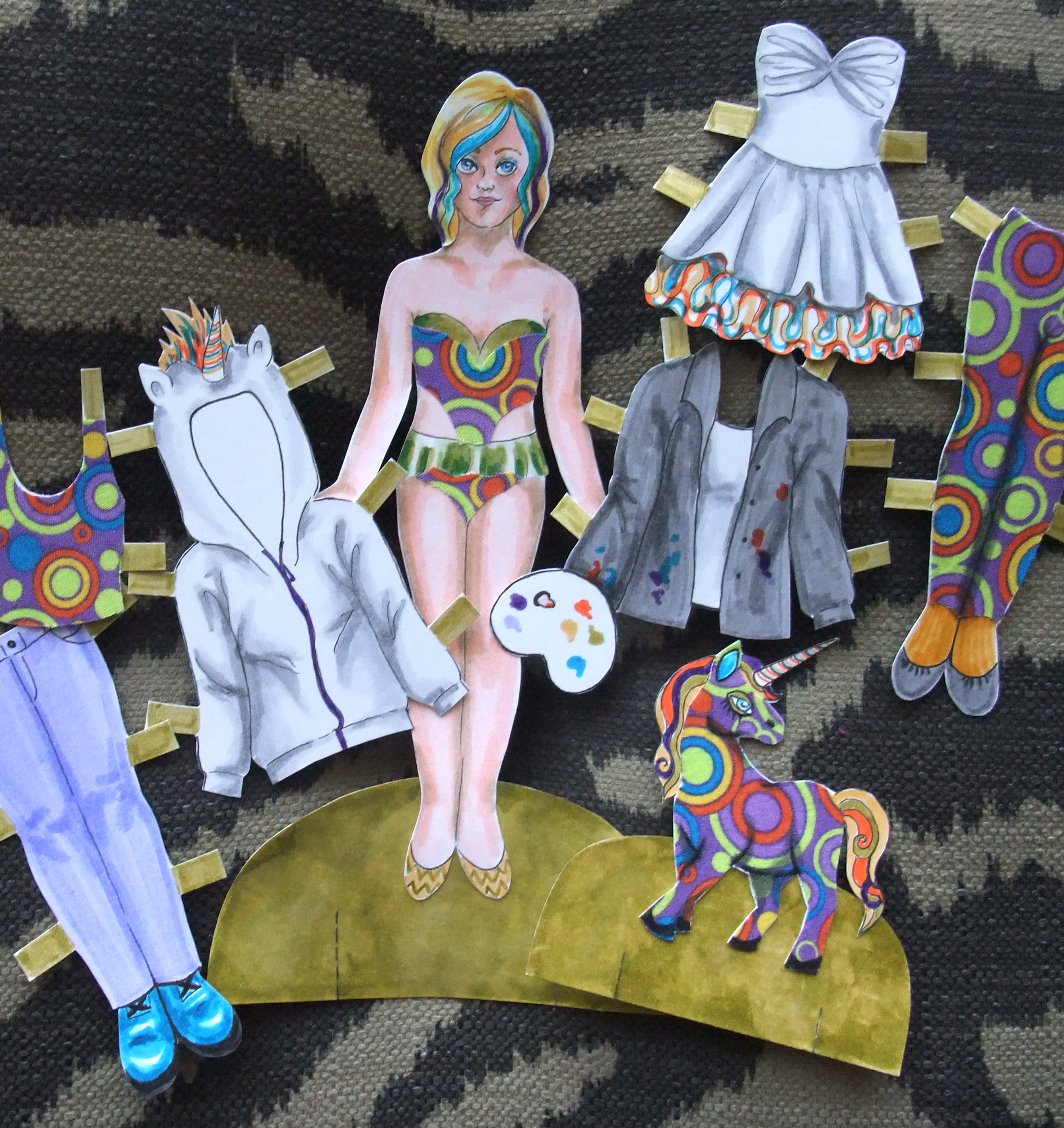
I love mixed media work that layers and collages varying elements into one piece, but still creates a cohesive universe, a dreamworld with the same depth and breadth as the natural world around us. I’ve found the best way to create mixed media work that maintains perspective and three-dimensionality is to base your piece off of photos you’ve taken. I usually build a concept first, then find photos that support the design I’ve constructed in my head. Those that don’t know where to start can begin with a photo that has meaning to them, one they find inspiring, or one that just plain looks pretty and build from there. I’m going to take you through my process for creating mixed media pieces inspired by photography, but each person may approach their own process a little differently once they get started.

The Dance, Awarded Best 2D; prismacolor pencil, ink, watercolor, fabric, book pages, embroidery thread

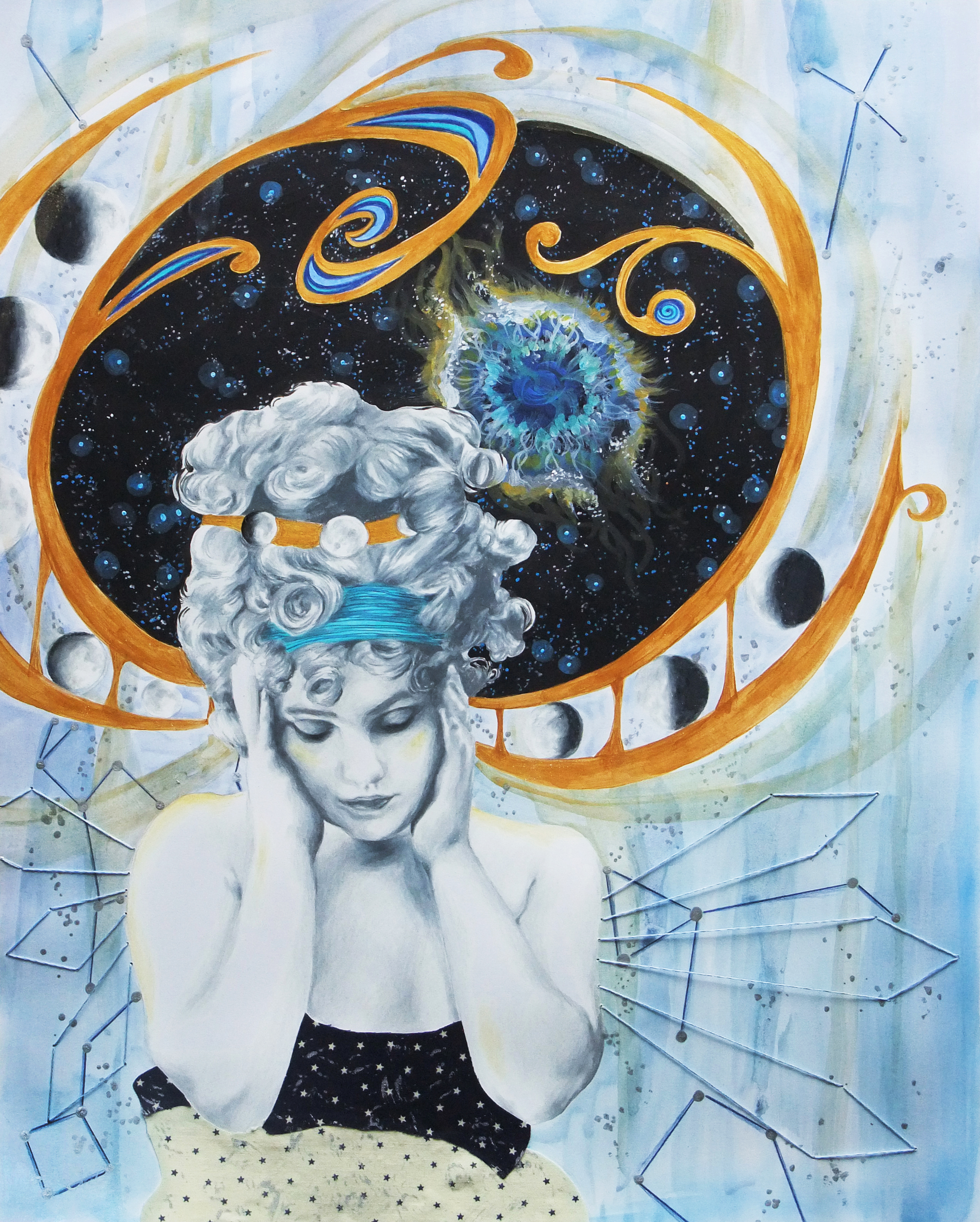
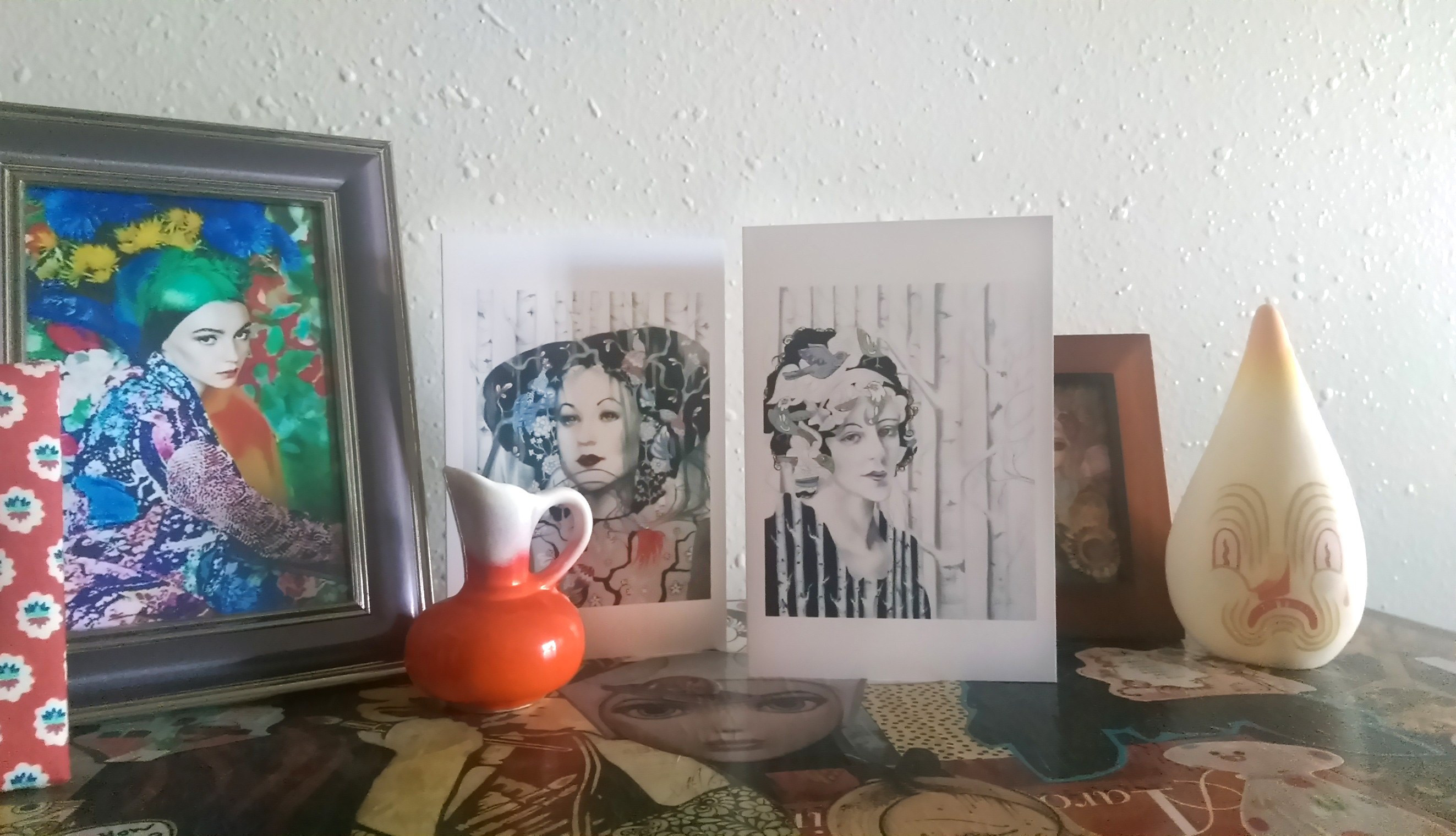
The Dance, Awarded Best 2D “Piece By Piece” at Creative 360 Gallery; prismacolor pencil, ink, watercolor, fabric, book pages, embroidery thread

Quite literally, frolicking in the woods. I knew these poses wood come in handy for something one day ...

Quite literally, frolicking in the woods. I knew these poses would come in handy for something one day …

An outtake from playtime :)

An outtake from playtime 🙂

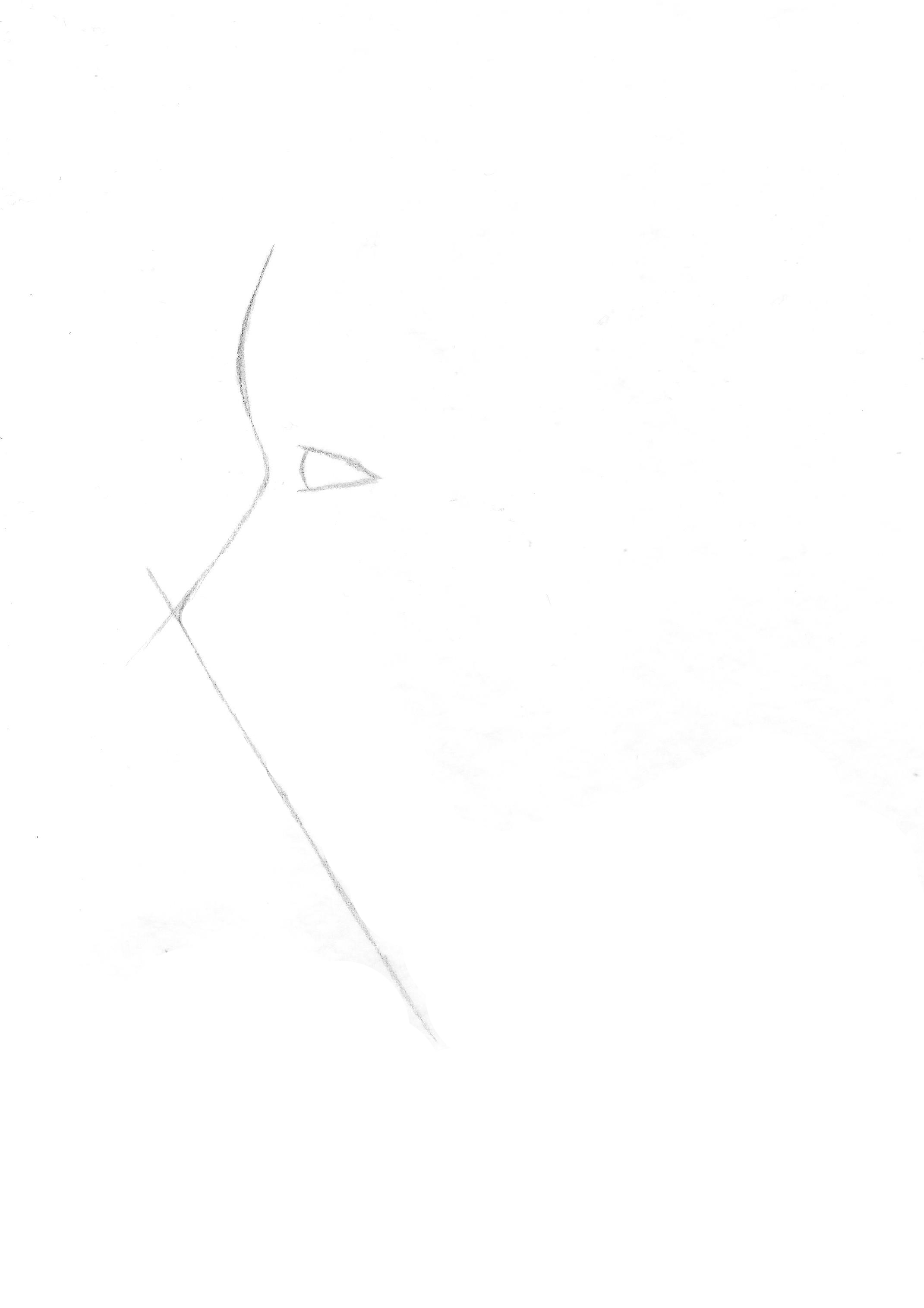
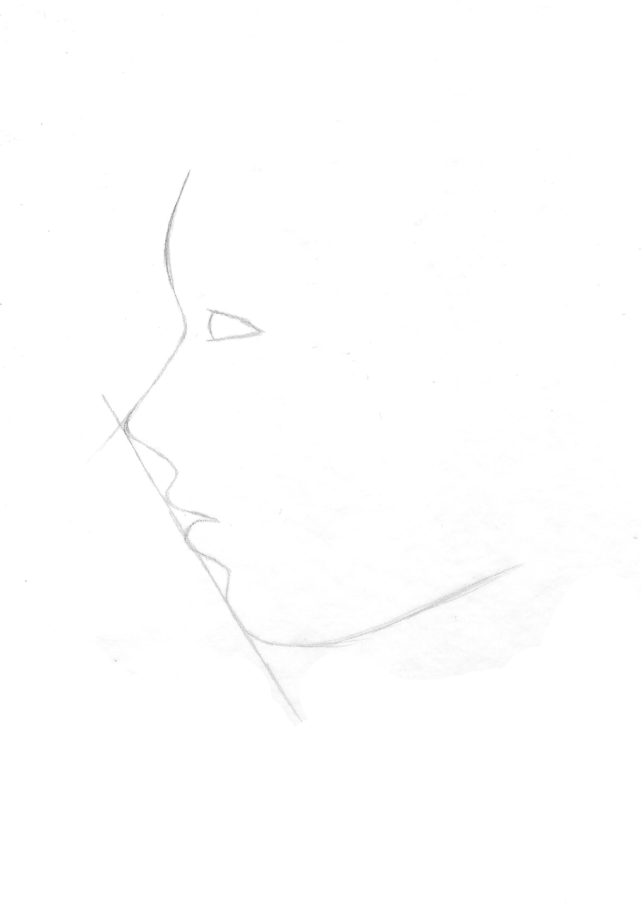
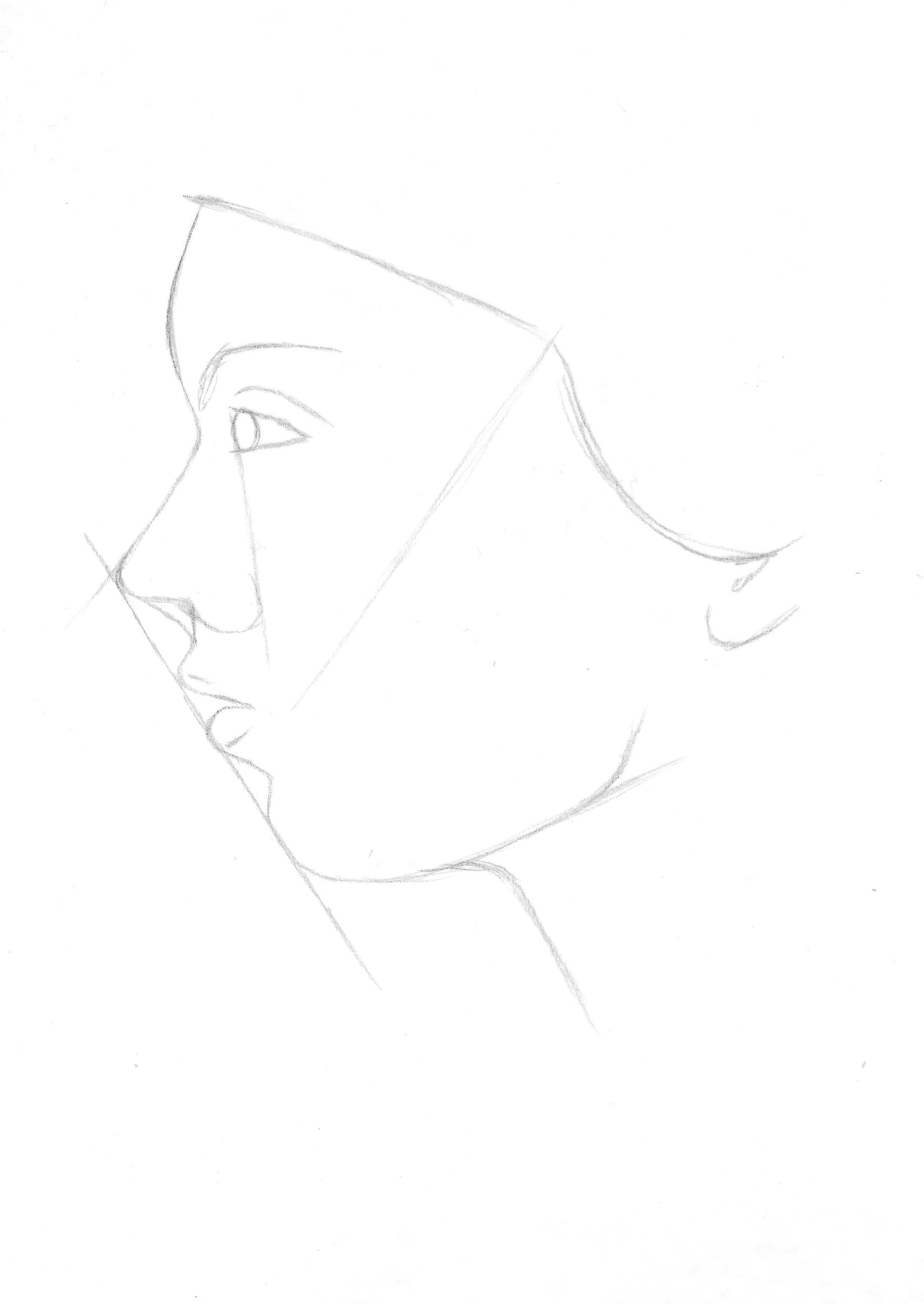
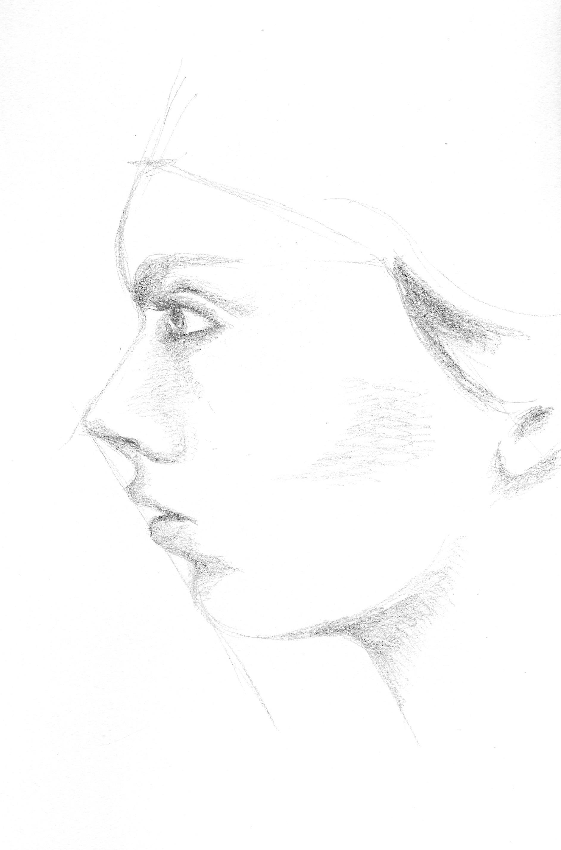
Once you have your concept and your photo(s), the first thing you want to do is break your image down into components, and decide what material will be used for which component. A sketchbook comes in real handy for jotting down notes during this part of the *adventure*.

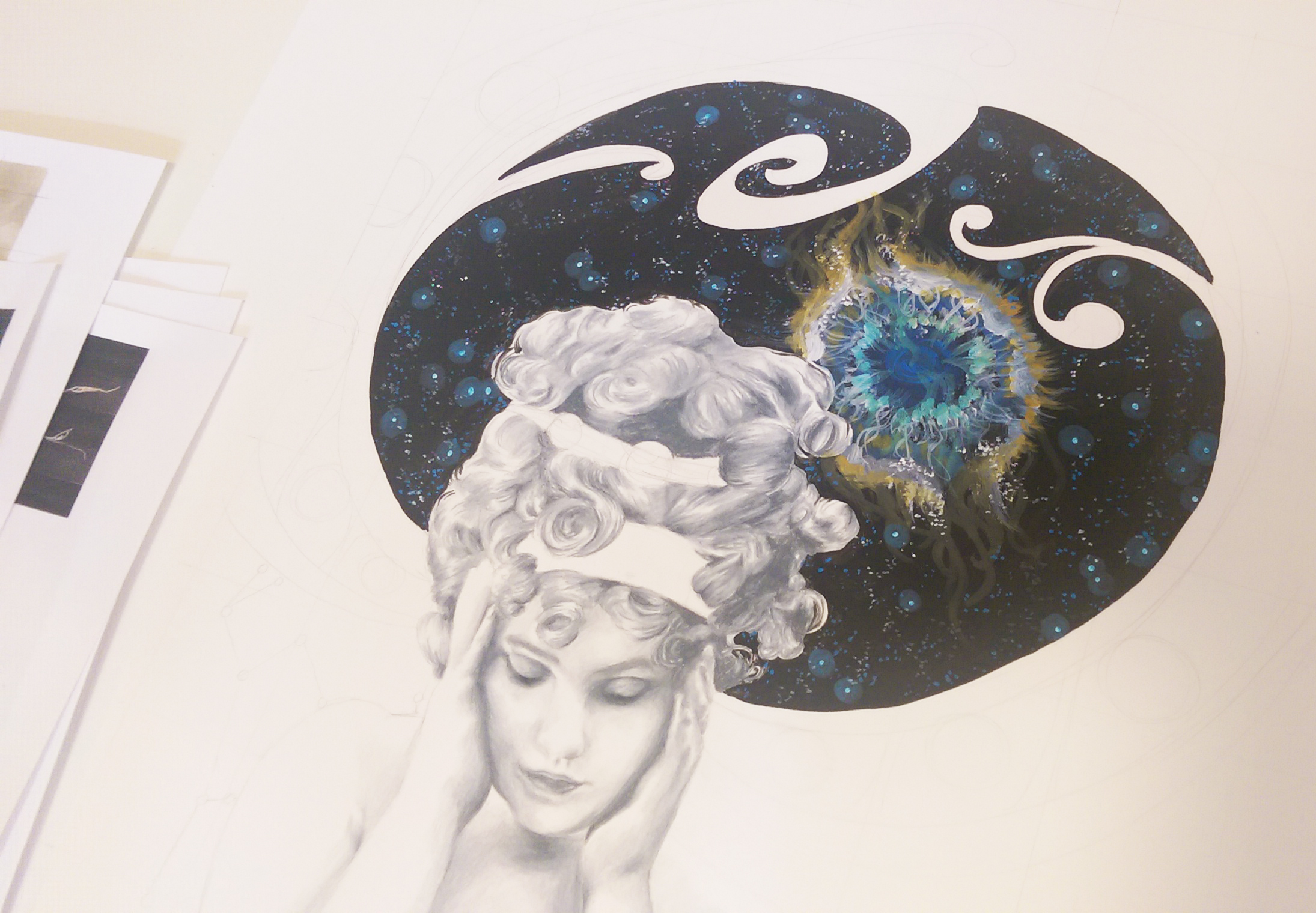
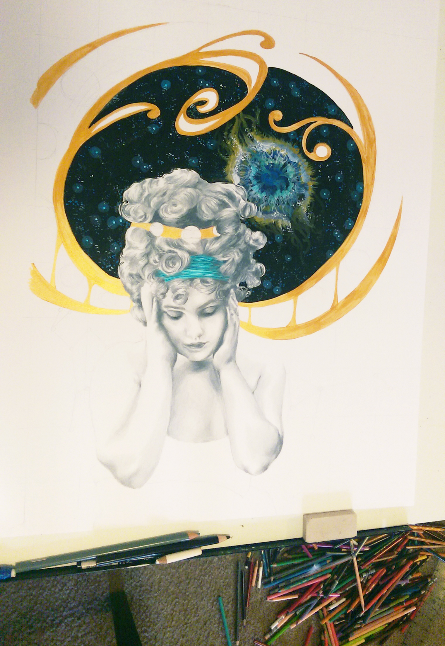
For “The Dance”, I first thought of what needed texture, and what didn’t. The ground covered in fallen leaves was certainly full of visual texture, as was the bark on the trees. The figures and the path could be left flat – you don’t want to overdo the texture or a piece can get confusing. Framed by the raised texture, this would also help the figures stand out as the focus. Only a handful of the trees in the woods were actually birch, but I knew I wanted a lot of light colors so the girl’s gowns would be in stark contrast to the background, similar to in the black and white photograph. Therefore, I decided to make all the trees in my mixed media birch bark. FYI, book pages are fantastic as birch bark. The color is already spot on, and the all over text compliments the black circles and rings that tattoo its surface. I twisted the paper into thin tendrils for the roots and branches to bring the trees off the page. As for the ground, I used torn muslin fabric. The white color allowed me to use the fabric similar to plain paper once applied, and layer watercolor paint over it until it reached the desired color. Torn fabric is great for ground cover because it frays, creating a believable texture all on its own. I knew I wanted the dresses to be done in ink because ink appears lighter in weight and airier, and would communicate the translucent flow of the skirt. Colored pencil works well for tiny, precise detail and I also am far better at drawing the human body than painting it, which is why I used pencil for the head and hands. Ink was used for the path as well, because once again I wanted a “light” feel to the path to help it stand out and so I could better capture the strong light source hitting it from the sun. The ink also transitions well into watercolor. Transitions are still important even in more “assemblage” type projects. When creating mixed media scenes, though you are in essence collaging, you don’t want to completely have that seamed together, cut and paste look.

The choices I made for “The Dance” were based on two things; first, what look do I want to achieve but also second, what is practical based on my strengths and weaknesses with the various materials? This second deciding factor will be different for each artist. I have learned from teaching that many, many other artists do not enjoy drawing people as much as I do, and quite a few even flat out despise it. If this is you, for a piece with people in it you may choose to have the figures printed and cut them out, pasting them into the scene rather than drawing them. A way to work photography into the piece so it doesn’t look separate from the rest of the environment would be to perhaps print them in black and white or sepia and then “colorize” the photos by lightly shading over the eyes, hair, cheeks, etc. with a colored pencil. You can also add three dimensional elements over the photo such as some fabric leaves blowing across the body, a small paper flower on the person’s jacket or in their hair, or gluing actual fabric over their clothing. This “anchors” the photo of the person/people within the environment to become part of the entire piece rather than a separate cutout element.

"Actually, It Is This World That's Too Small", Mixed Media

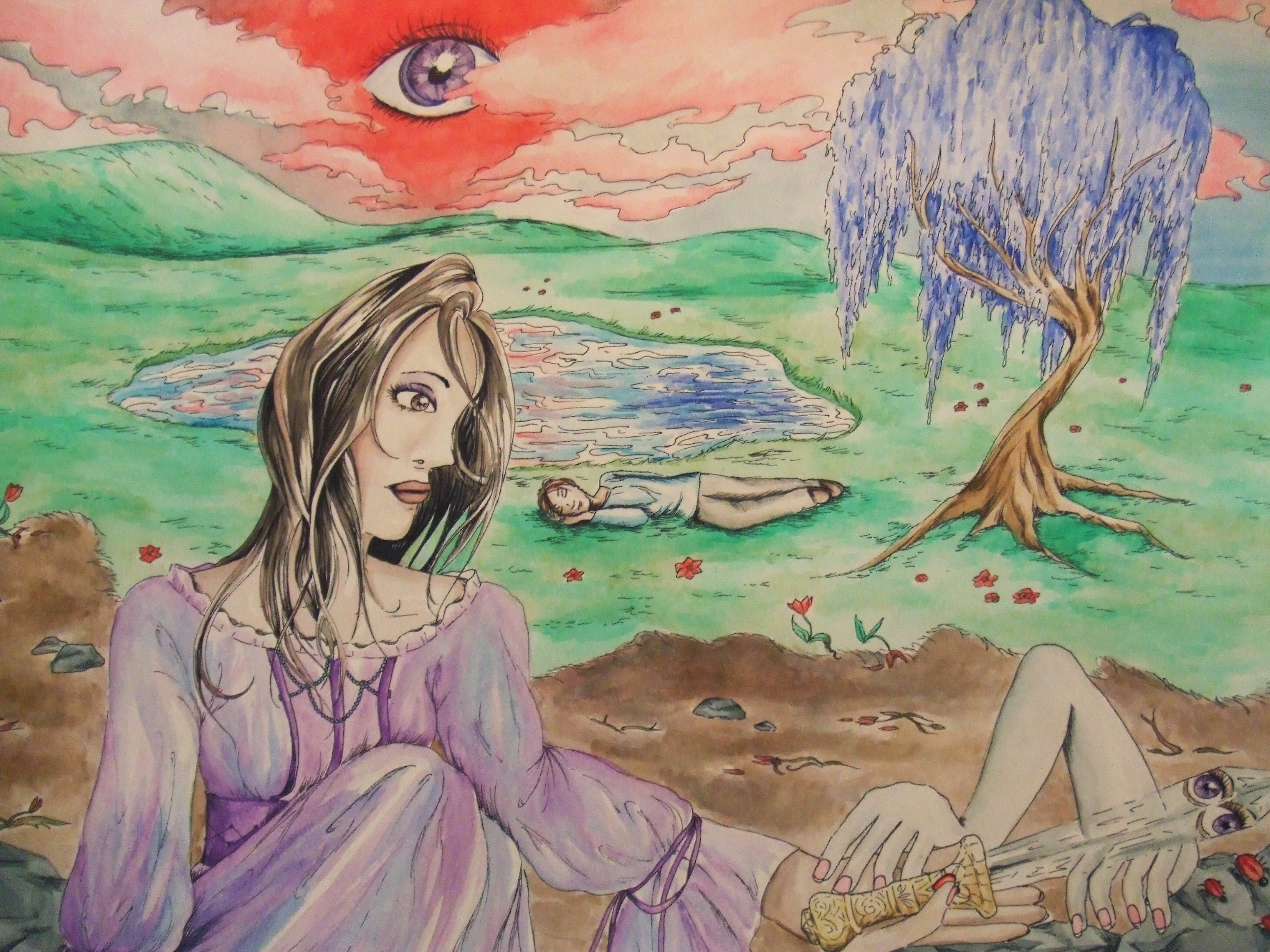
“Actually, It Is This World That’s Too Small”, Mixed Media

My 10 year reunion is coming up next year, and the clothes I used to wear are officially beginning to look silly. Short sleeved turtleneck sweaters for the win! And always striped tights, because The Dresden Dolls (would still rock those!)

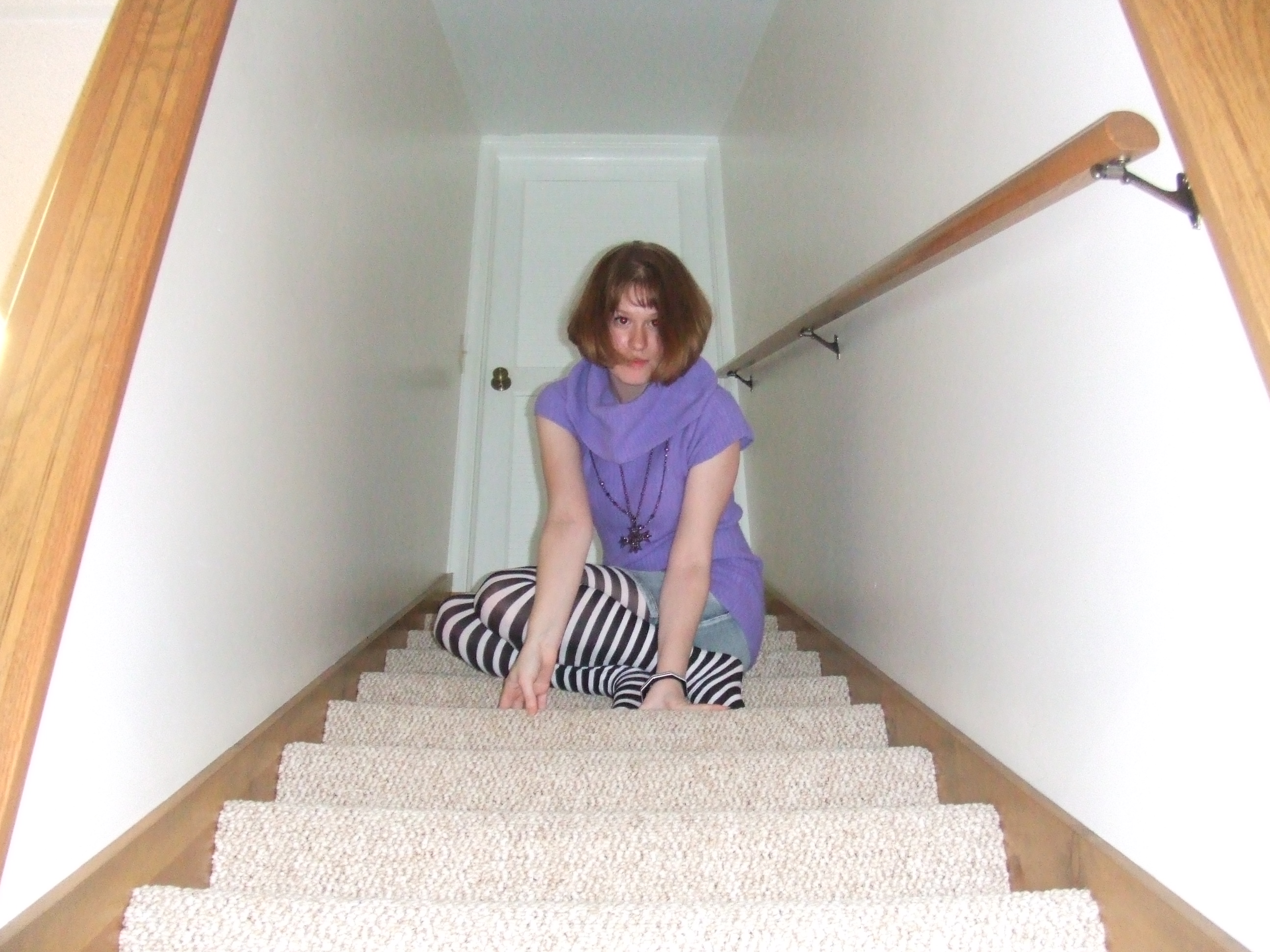
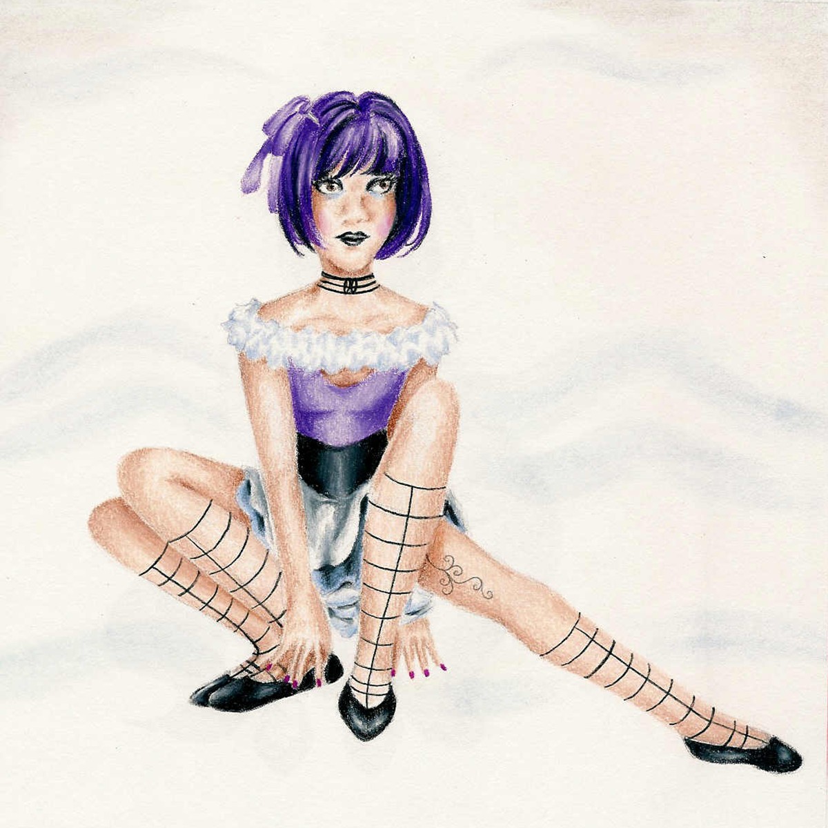
My 10 year reunion is coming up next year, and the clothes I used to wear in high school are officially beginning to look silly. Cap sleeved turtleneck sweaters and pre-worn jean skirts for the win! And always striped tights, because Amy Brown fairies and The Dresden Dolls (I would still rock those!)

“Actually, It Is This World That’s Too Small” is a mixed media piece I based on a photo a friend took in high school while we were hanging out, playing around with cameras in my basement. I never felt that I shared much in common with “typical” teenage girls, but a desire to constantly take photos of each other was one stereotypical trait my friends and I all did share – just sometimes my photos involved face painting or cardboard masks rather than manicures and false eyelashes. I found it interesting how the angle of the photograph made it look like the door behind me was miniature, like the door the white rabbit escapes through in Alice In Wonderland. You can see how the photo serves as a guide and an inspiration, but by no means dictates what your final piece has to look like. Creative alterations are always an option, and encouraged.

Old family photo with Grandpa (I can't believe I'm posting this, but for the sake of art ... I will publicly expose baby photos - at least the non-embarassing ones).

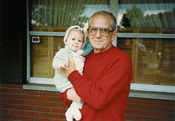
Old family photo with Grandpa (I can’t believe I’m posting this, but for the sake of art … I will publicly expose baby photos to the online universe – at least the non-embarassing ones).

What’s really awesome is that beyond conceptual art, you can apply this same technique to family photos, and make a truly meaningful piece of work that is entirely personal. I’m going to talk you through how I would approach this photograph above if I were going to turn it into a mixed media piece. This will give you another example that will hopefully help you solidify how to proceed on a project of your own. I would probably draw the people since I adore portraits and figures, but once again if figures are not your thing, you could print yours from an enlarged photo and collage them in – it’s totally allowed :). There is really no reason to just color in a solid red shirt, so I would probably trace a pattern to get the right shape, and then cut the sweater out of fabric and paste it over my grandpa like I did with the purple dress in the staircase piece shown previously. Remember, always look for places to add interest with different materials. Due to the light, reflective nature of the window glass, I would use a mix of ink and watercolor for that part. The bricks are definitely the most textural element in this particular photo, so for those I would mix a gritty element like sand into acrylic paint, and create a rough, uneven texture in dark red on the wall. Once dry, I would then paint the grey cement lines over with a thin brush. For the sake of my sanity and also to make it more interesting and less institutional looking, I would probably change the brick to an uneven pattern of varying size and shape as opposed to the uniformity that was there in real life. How else can we add interest? In the photo, there are no flower boxes on the windowsill, but why can’t there be? You can cut flowers out of paper or white fabric and color them with ink or watercolor, or you can glue on small ribbon rosettes available in the floral or wedding aisle of most craft stores.

I hope this post has given you some ideas, and I’d like to end with a simple (though not set in stone) guide as to when certain materials are most beneficial when creating your own mixed media wonderland.

Watercolor: overall background coverage, light or translucent forms, florals, glass, water

Ink: flowers and plants, light or translucent forms, fabric, glass, water, figures/faces/skin/hair

Colored Pencil: small details, figures/faces/skin/hair, birds or furry animals, stone or bark

Fabric: clothing, flowers and plants, ground cover (soil, grass, leaves, etc), interior wallpaper

Book Pages: trees and bark, interior wallpaper, flowers

Sand Mixed With Paint: brick, stone, dirt

Other Accoutrements: embroidery thread sewn through the paper as anything composed of thin lines: tree branches, eyelashes, veins, flower stems …; small ribbon flowers, tiny prints on photo paper as interior wall art, strung seed beads or glued on flatback rhinestones as jewelry, use your imagination and don’t be afraid to try something new!

Feel free to comment or message if you need any advice on a project you’re working on or a new one you are beginning. I’m happy to help!

Standard
Art Discussion

Art Discussion – “The Way I See It …”

In progress!

A rare in progress photo! I nearly never take these.

Many times I like to keep quiet about the specific message I had in mind when creating a piece, because I like my work to be allowed to speak to each viewer differently based on their own unique thoughts and experiences. At the same time, I myself am a curious individual and I hate when other artists flat our refuse to share what a piece means with their audience. So, every so often on this blog I want to pick a piece with a lot to say and explain the thoughts behind it. Today I’ve selected “The Way I See It”.

The Way I See It ... , 18x24 Watercolor, Ink, and Prismacolor Pencil

The Way I See It … , 18×24 Watercolor, Ink, and Prismacolor Pencil

In this piece, an average young woman sits, quiet and composed. She sits straight-backed, hands in her lap, legs together. The viewer can discern her reserved and unimposing nature simply based on how little space she purposefully occupies. Like many, she is probably good and bad, but mostly good. The other figure looks at her and sees evil. He can only see her shortcomings or what he views as such, and blames her for them as if any part of her person he doesn’t like was a planned attack against him. He paints her as a vampire, a monster, a whore. While she passively sits, he smears paint on her clothing and on her skin as he touches her. (An interjection, the gender choices in this piece are not significant. It is simply easier to depict the main character in this narrative as a woman so I could draw from my own perspective of when I have felt treated this way. The figures’ roles could easily be reversed, or it could be two men or two women.) The artist is delighted and proud of his portrait, his telling of her story and who she is as a person, be it true or not. Truth doesn’t matter when one is convinced they are right.

We run into serious problems when we let others be the artists or creators of our story, when we let them tell us who we are. Like the paint smears covering the young woman, as we let them sully what we think of ourselves, our own essence literally floats away before we even notice. Meanwhile, their incorrect perception creeps in like a vapor, taking its place.

Stories are tricky. We are not omnipresent, nor can we view the past or future in real time. So, when we view a situation, we are only inputting a piece of the overall story. We don’t like incompletes, it’s why in Hollywood Blockbusters everything gets hurriedly and inconceivably tied up all within the last 5 minutes of the movie, and we love it. Back to the situation we’ve just viewed, one of many in a given day: how do we complete the story we’ve caught just a chapter of? By either consciously or unconsciously inventing the rest of it in our minds. We can fit the puzzle pieces together so seamlessly that we often will even remember the inferred story as fact. We may have come close to truth … but then again there is a good chance we have not.

“What you remember is determined by what you see, and what you see depends on what you remember … a cycle that has to be broken” Tim O’Brien writes in his novel Going After Cacciato. No object or person is visually neutral. Think of our brains as a giant search engine. I’m going to get very simplified here – we see a person in a blue shirt. We “type” the input “blue shirt” and up pops images, videos, memories of all the experiences we’ve ever had with people with blue shirts. It’s hard to emotionally separate our memories from this new experience. We could see a person we’ve never even met as malicious simply because we’ve had negative interactions with others who look like them in the past. We could see a country or city as sinister, be wary of a new activity or experience because our memories literally distort our perceptions.

Chimamanda Adichie is a Nigerian novelist, and she also has a few great Ted Talks which is how I discovered her. This talk I’ve included a link to below about stories is fantastic. I was so interested when I came upon it after finishing this piece, because it deals with many of the issues I was thinking about when I came up with the artistic concept. I would highly recommend a listen.

I would also welcome any thoughts you may have on stories, perception and memory, or any different way you might have interpreted this piece. Sharing is fun, don’t be shy!

Standard
Artist Bio

Throwback Thursday – Art Is An Organism

I have always had an attraction to the unreal. Part of this is I have always been a vivid dreamer. I recall crying one morning, my heart filled with the sting of injustice, because I’d dreamed my mother had promised to fill my room with pink balloons and when I awoke, lo and behold not a single balloon! I unfortunately also had frequent nightmares, see first drawing below. Coupled with this was a fierce sense of individualism. I had a strong aversion to directly copying any influence. It seemed like cheating. I was also a coloring book addict, and due to this strong attachment to individuality, I ended up with quite a few pictures of Belle from “Beauty and the Beast” with purple hair, or green skin, or even shooting metallic red and gold lasers from her fingertips at the personified wardrobe. Color her jumper blue? Please.

I suppose I always figured if you’re going to draw something that you can already look at right in front of you in real life, the live version is always going to look better anyway. Show me something I CAN’T see. What I’ve learned, however, is that the whole “You have to learn the rules before you can break them” thing I was always told in school by teachers (which I HATED, by the way) is totally true. Just as an inventor certainly can’t go about building a time machine if he doesn’t know how to rewire a lamp, if an artist doesn’t know the basic techniques that allow him or her to replicate reality, he or she can’t know how to bend it. The very last drawing of the girl with the crazy possessed sword was a project for school my junior year based on a fantasy novel I was writing at the time. I said, “gather drawing references? Grid the facial proportions? Psh, boring!” and went full steam ahead. Note the oddly shaped alien skull, the giant mutant hand larger than said skull, and the strangely sized and placed nose and eye. Like, her eye is literally way up where her hairline should be. If you have innovative, mind-bending, insane ideas, never abandon them! Keep sketching! But in between all that, practice some of that “boring, mundane” stuff in between, because this practice is the key to unlocking the worlds inside your head, allowing you to transfer them into plaster, paper, wood, corrugated cardboard…! Go on google image search and look at pictures of eyes, of hands, and practice sketching them. Look outside your window and even if it’s just for 10 minutes, grab a pencil and try to draw what you see. Use scrap paper, the backs of envelopes from all those credit card applications that fill our mailboxes day after day and just DRAW WHAT YOU SEE once a day. I promise you’ll notice a difference. Each person’s art is like a little organism, and it has to keep evolving.

So there's the regular mom, and then there's the mom with sharp teeth. Note the little girl on the left looking up and being like, "Oh shoot, it's on!"

So there’s the regular mom, and then there’s the mom with sharp teeth (Thank you real mom for the convenient labels!). Note the little girl on the left looking up and being like, “Oh shoot, it’s on!”

Early 80s punk hair, fangs, a bug infested abode with poor sanitation standards and broken windows ... nothing good can come of this.

Early 80s punk hair, fangs, a bug infested abode with poor sanitation standards and broken windows … nothing good can come of this.

Lest you think I'm morbid, here's a perfectly normal drawing of a girl in a bohemian skirt and bangle bracelets jamming out to a cassette player.

Lest you think I’m morbid, here’s a perfectly normal drawing of a girl in a bohemian skirt and bangle bracelets jamming out to a cassette player.

Behold, Emmie the four legged girl! Having only two legs is for squares.

A later drawing from high school. Behold, Emmie the four legged girl! Having only two legs is for squares.

Amethyst Eyes, the fantasy epic that never was. What evil being is living inside that sword, and why does that woman have such a flat head???!!!

Amethyst Eyes, the fantasy epic that never was. What evil being is living inside that sword, and why does that woman have such a flat head???!!!

Standard