New Work

This Is Why You Should Keep Old Work Forever.

The Beauty Of It All

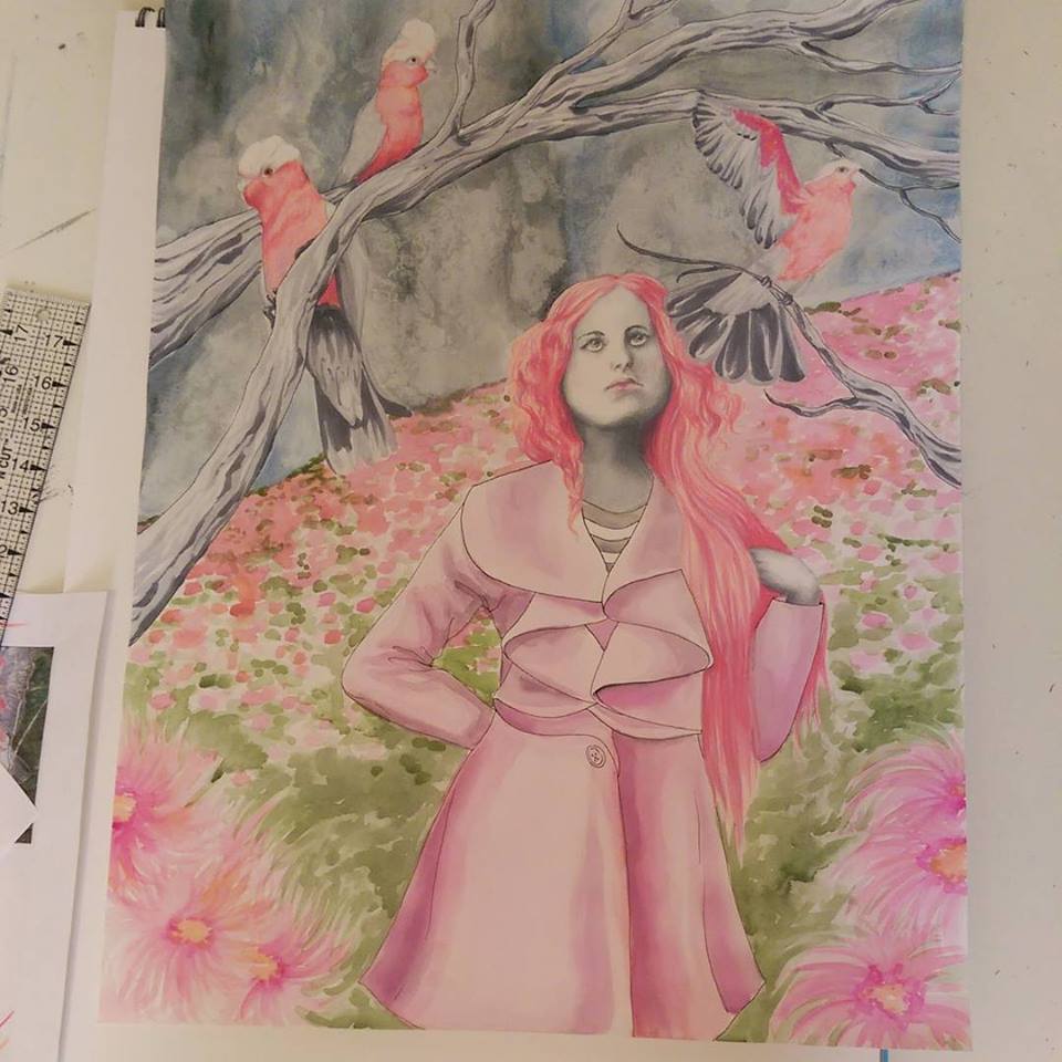
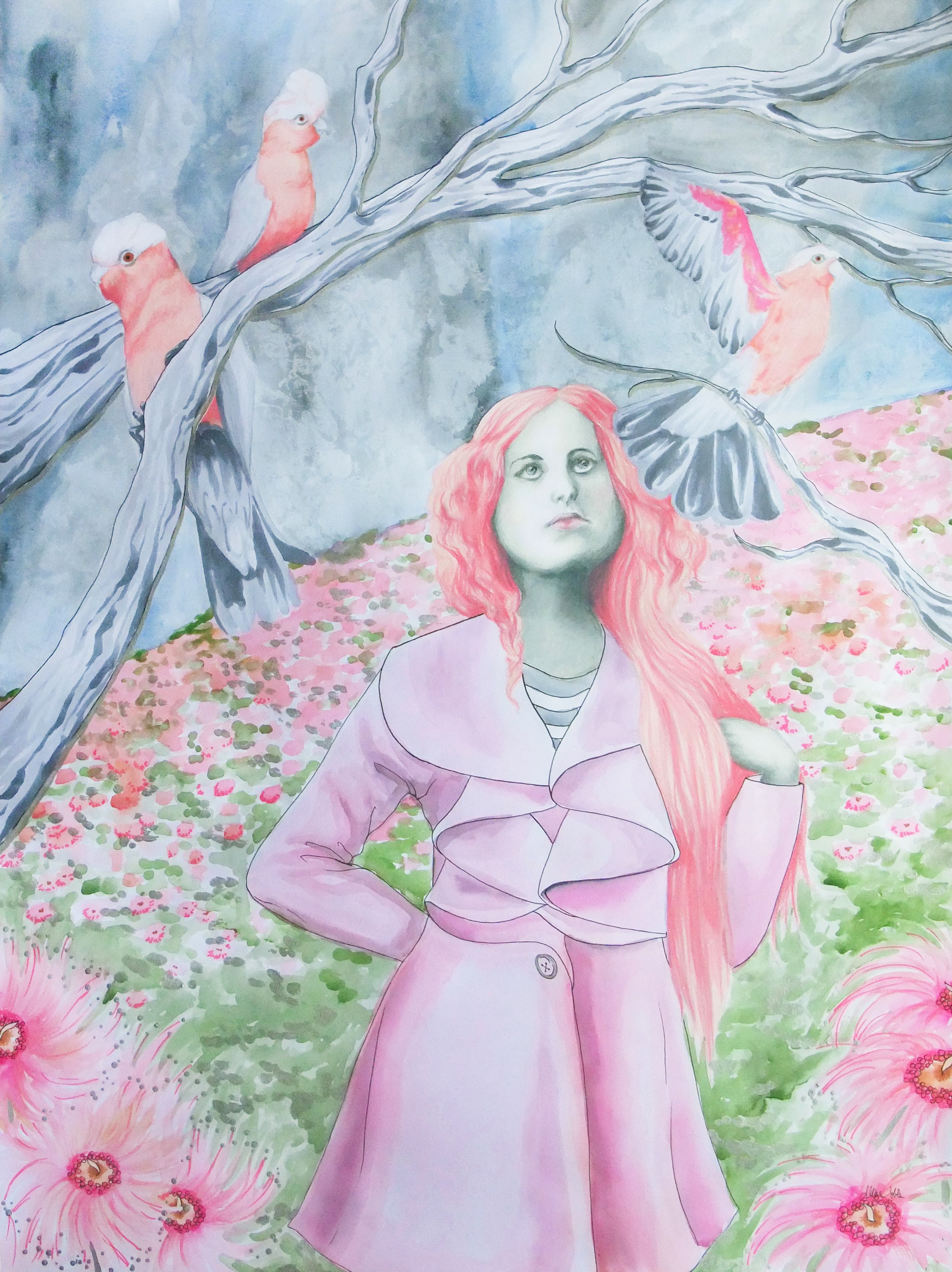
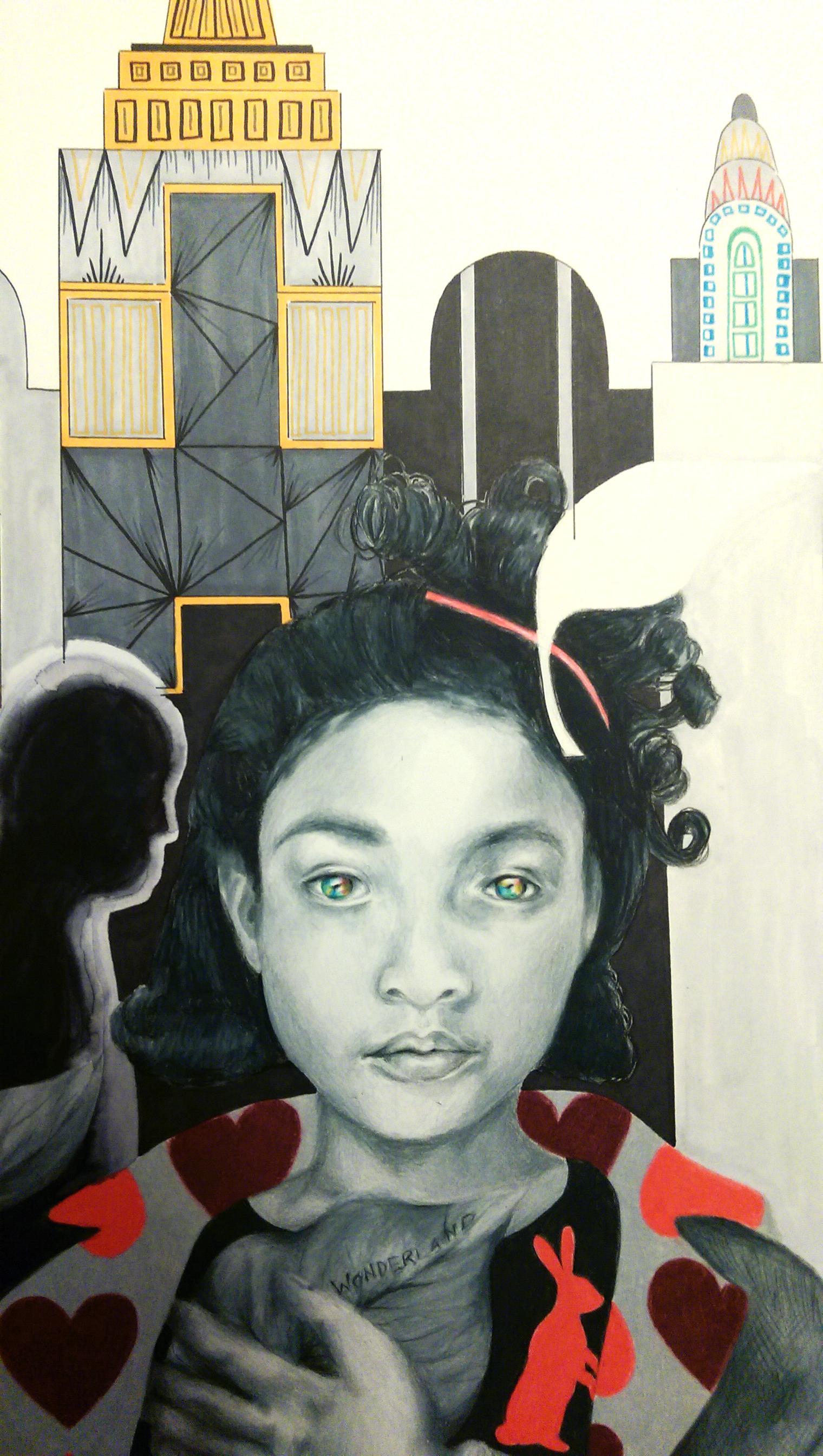
The Beauty Of It All, 11×14 prismacolor pencil and watercolor

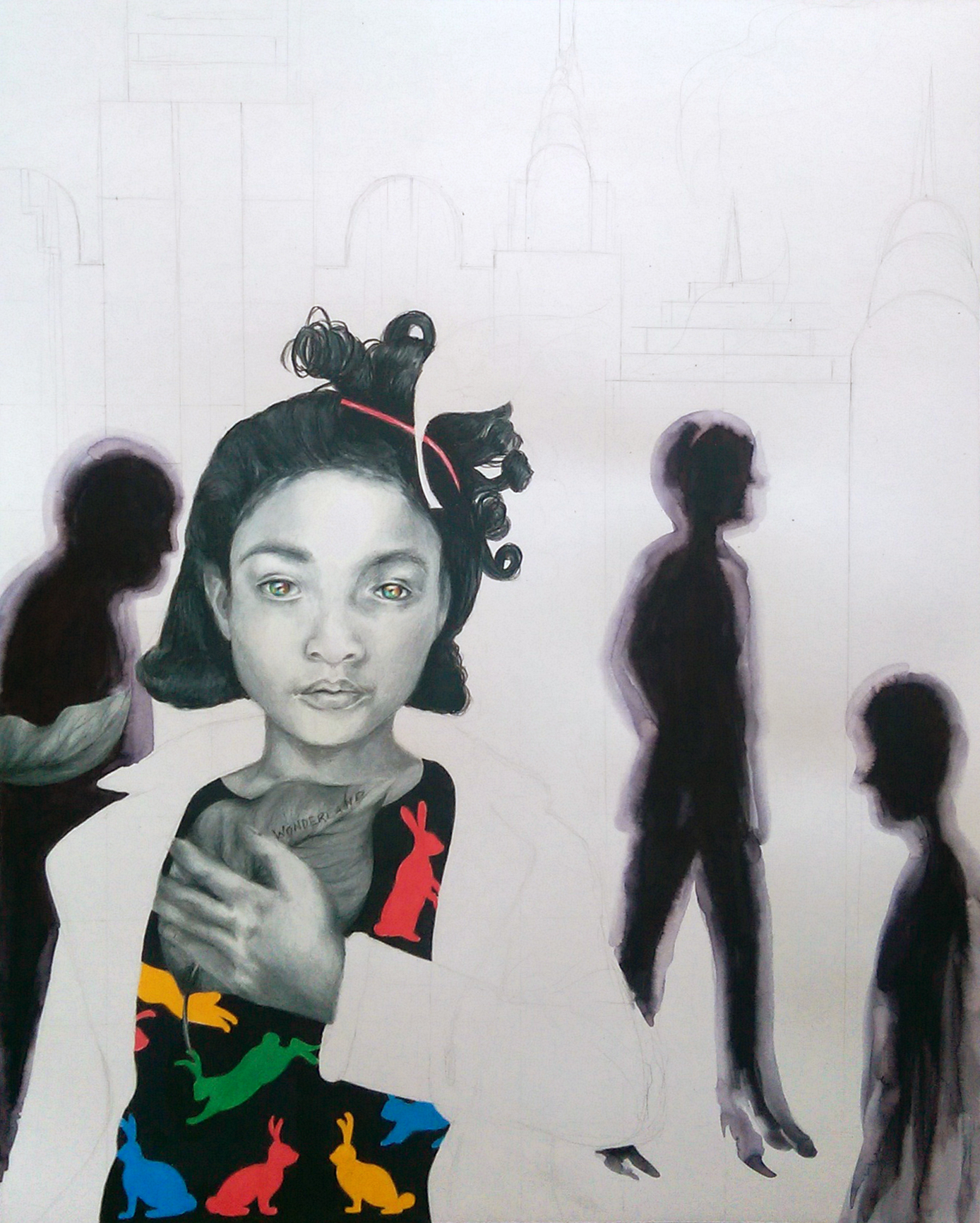
For about 2 years, I had an 11×14 piece of bristol board with this woman’s face covered in flowers on it, and a metallic silver world map view behind her. She was surrounded by nothing else but white space. I was convinced it looked absolutely horrible, and I had no idea what to do with the rest of the background. I chocked it up to a loss and tossed the drawing in my storage portfolio case. A couple times I ran out of paper and thought about just using the back of it when I had a new idea and didn’t want to delay inspiration with a drive to Michaels for more bristol board. Other times I almost chopped it up into pieces for scrap paper to sketch ideas onto. I thought of posting it on my artist facebook page as a giveaway for whoever wanted it, and letting them color all over it like crazy to see what happened; an impromptu collaboration over vast distances.

Luckily, I never did any of these things. I’ve been doing a lot with watercolor lately, and was wishing I had one more piece to hang in my upcoming exhibit. I didn’t have the time to start anything else from scratch, but when I found this I decided to play around with the background and see what happened. I spontaneously dripped blues and greens and metallic silvers over the entire background, throwing the paper this way and that to guide the drips. Once I stopped over-analyzing and worrying over how terrible I thought my piece looked and just started enjoying the process again, everything came together. Sometimes even something as subtle as a bold color splashed into the backdrop can turn an entire piece around. Mine went from a drawing of a girl who looked like she had a strange, alien, flower-shaped skin disease to a pretty nice finished piece.

This is why I cannot emphasize enough, don’t toss out old, unfinished work! Paper is flat, it keeps pretty easily. I’ve my seen students do some really cool things with incomplete projects they could have tossed away. In this piece below, a student cut out elements she liked from a “practice” acrylic painting from the semester before that didn’t really turn out. These made for some great smaller blooms popping out around the central focus of the pumpkin. Even if you don’t end up turning the leftover physical piece into anything, something half-finished could at the very least provide an idea or concept for a project you do later.

And again, I have the best students ever. Unique floral mixed media for autumn.

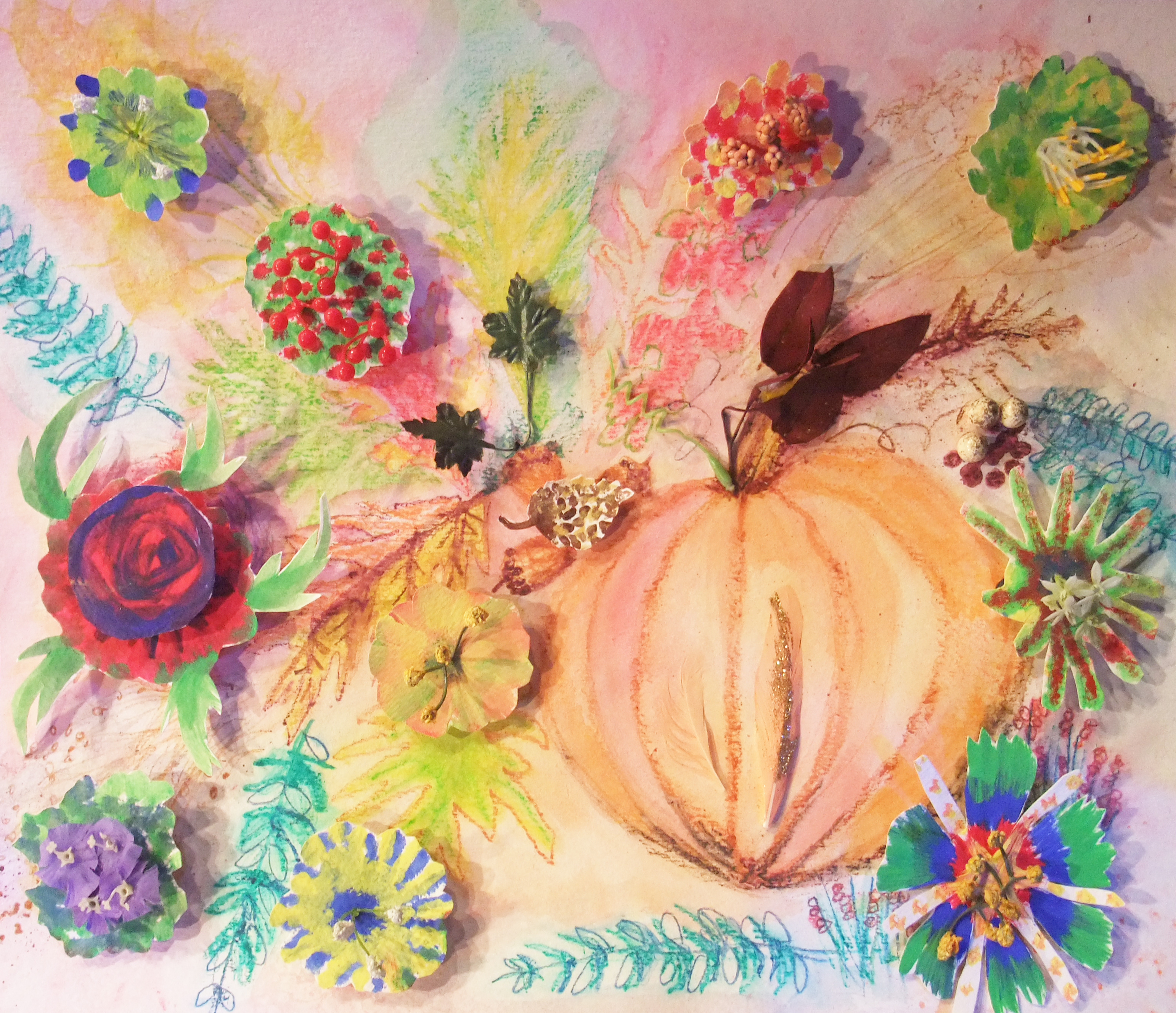
Nancy’s autumnal mixed media, salvaging cutouts from an old acrylic practice lesson the semester before.

I’m actually constantly revisiting old work, even from as far back as high school. Most of that is also unfinished because I, like any teen, had a real short attention span. This painting, which my mom fell in love with and now has hanging over the sofa in my parents’ living room, was created from scratch in 2012. But, it was based on an old colored pencil drawing from 2005 that I never finished shading in. The particular sketchbook the original drawing was in is still in the closet of my old bedroom in my parents’ house or I would post it here, but it was a color scheme of entirely red and black and the parasol people were dressed in old-timey but super goth attire, and the faces on the parasols looked like they could all be members of a My Chemical Romance copycat band. Trust me, it was something else. Behold, the reboot.

"Wait Out The Storm", 18x24 Watercolor and Ink

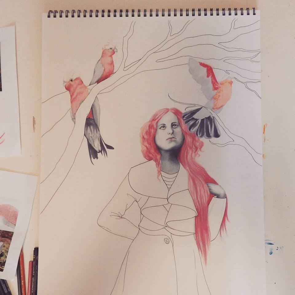
“Wait Out The Storm”, 18×24 Watercolor and Ink

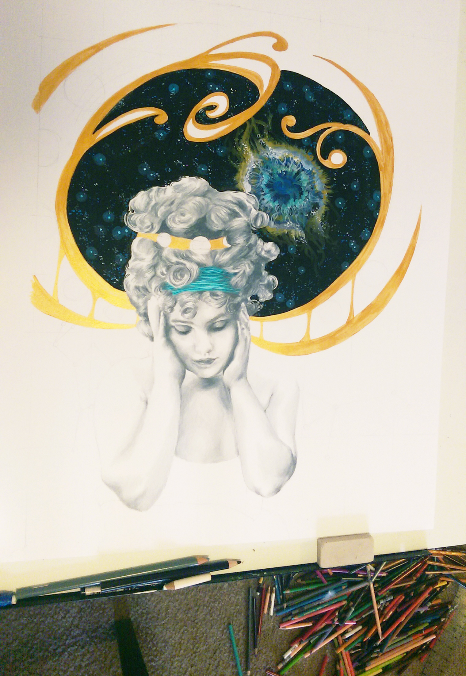
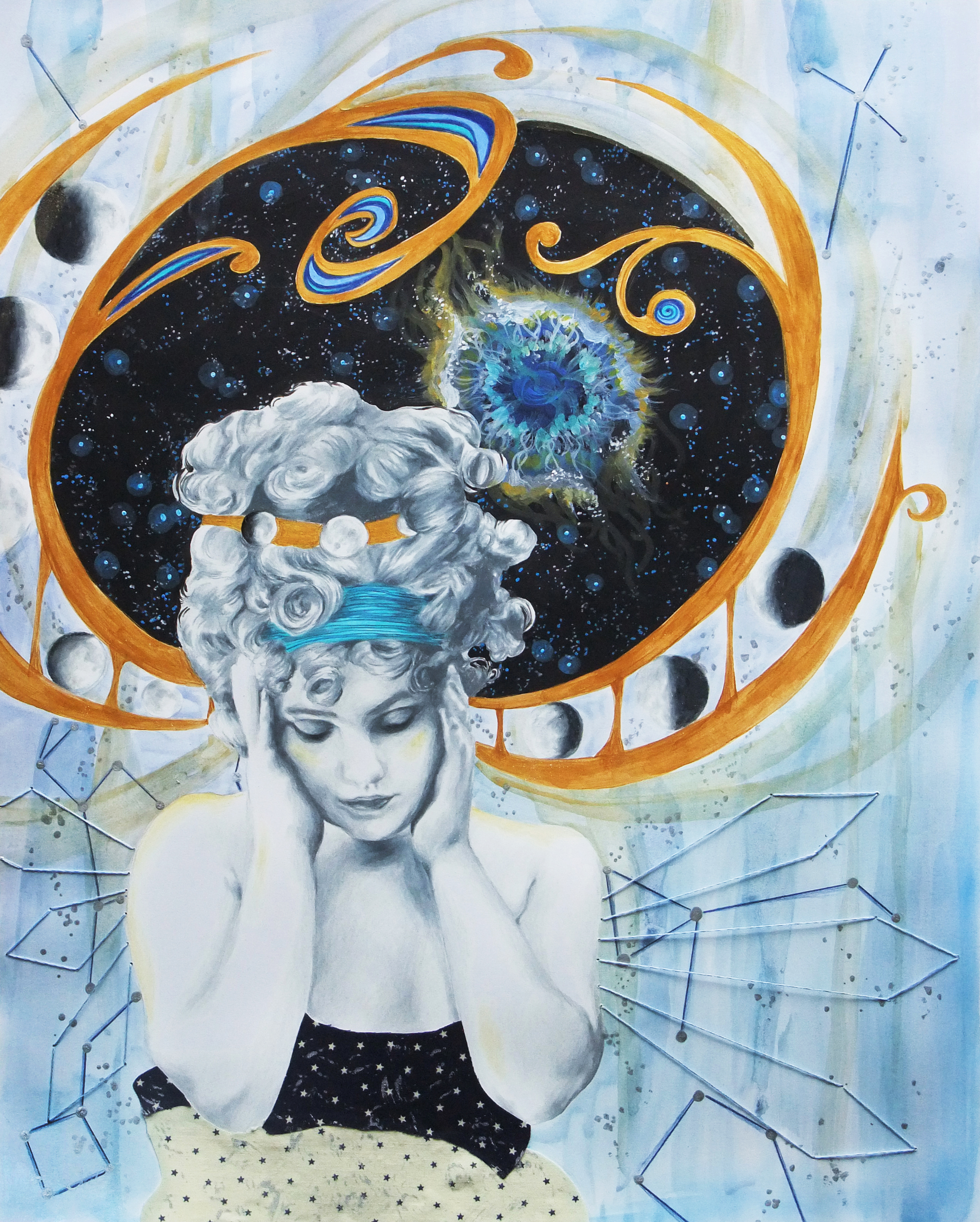
Now that I’ve turned you all into hoarders, I have one more all-together new piece I’d like to share. I have always been deeply interested in the steampunk aesthetic, but never created any steampunk-esque art myself. This is my first, and I’m pretty excited about how it turned out.

"Dreams Of Gold", 11x14 Prismacolor Pencil and Chalk

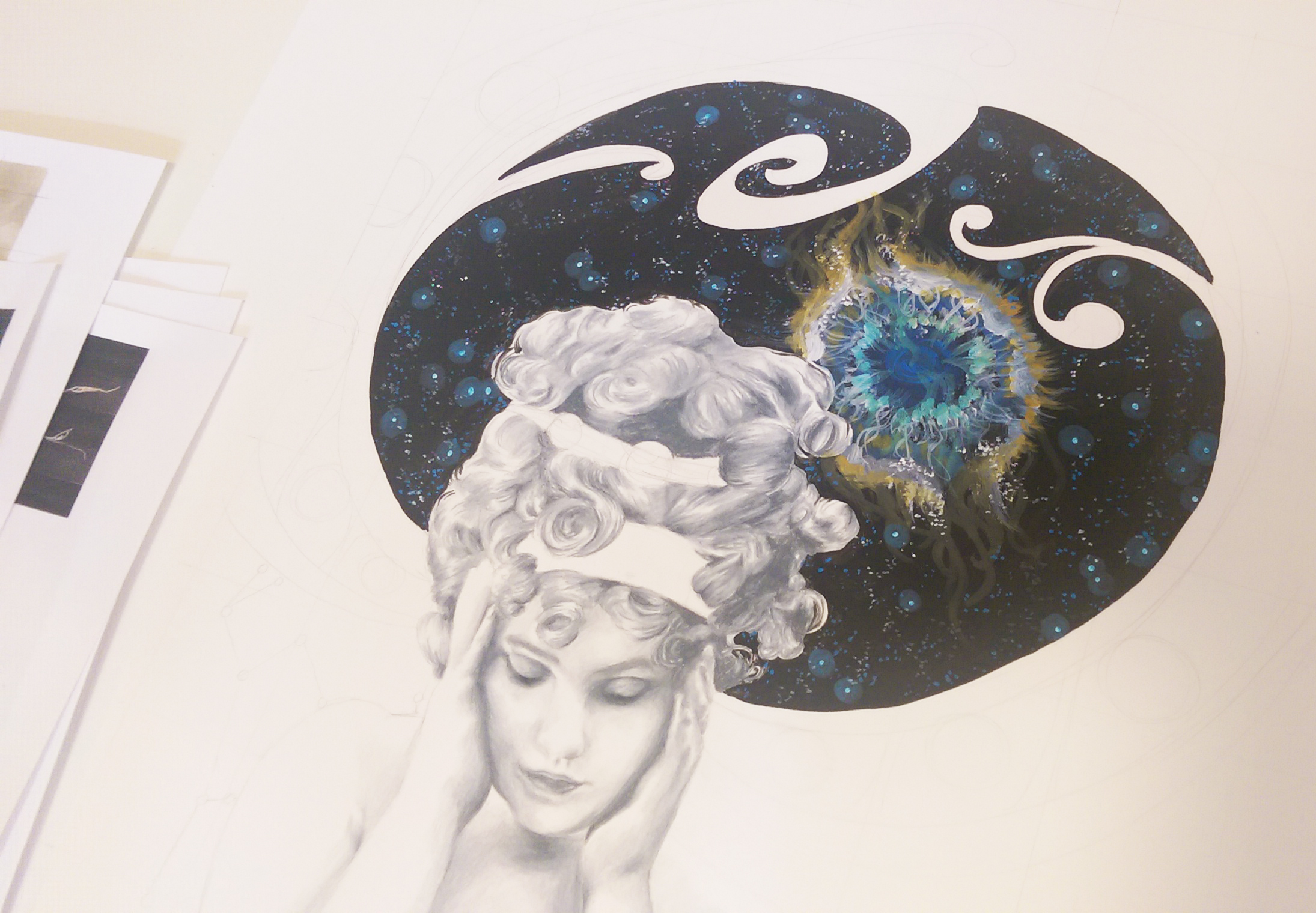
“Dreams Of Gold”, 11×14 Prismacolor Pencil and Chalk

The deep gold is metallic, though you can’t tell in the digital image. I was heavily inspired by the Victorian aspect of Steampunk, even turning the classic Victorian lace pattern into something metallic and industrial. I am finally going to be hanging all of these pieces up tomorrow in Espresso Milano, and will be sure to take pictures. Have any cool steampunk art you yourself have created or that you’ve seen by other artists? Throw me a link! I am a long time appreciator, but creation-wise, a novice. As I’ve promised, photos soon!

Standard
New Work

New Work – The Enchantress

Behold! In progress photos from instagram (allisenoble)! It’s been quite a journey.

11781827_10103309511210018_7514112424454279570_n 11099650_10103315701095438_2103193272238016512_n

11752533_10103316100020988_1678764587642196268_nThis piece was inspired first by the cockatoos. I then based the figure off of what I thought this bird’s matching human counterpart would look like. I wanted to use primarily pinks because pink is a color that is hardly ever found in serious art (i.e. not pretty-little-princess-time children’s picture books), and you know, it’s just light red so I don’t know what everyone is  so afraid of ;). I used ink for the birds and branches, pencil for the figure’s face and hair, watercolor for the background, and accented in metallic silver acrylic. The figure is mysterious and enchanting. The word “enchantress” is often cast in a negative way, as either a fantasy villain or else scheming heart-breaker. The dictionary definition of an enchantress is a “charming, irresistible woman”. It goes on to give examples such as “dangerous, sexually exploits innocent men”. Oh really? [insert facepalm here]. A woman can be powerful and captivating, mesmerizing and awe-inspiring, without being discredited as somehow “untrustworthy” or “dangerous” because of her strengths. It’s all in how you use the power that you radiate. I wanted to show a softer, positive side to the descriptor as a beautiful, intelligent and thoughtful, creative soul that shines a light wherever she goes. Let me know what you think!

the enchantress

Standard
New Work

New Work Reveal – On My Mind

My new piece ended up coming together rather quickly. I’m guessing it was due to a combination of the sudden dismal weather over the last couple days and also on and off feeling like I was coming down with something and being low on energy over the last week or so. Neither of these occurrences are fun, but they did force me to have lots of sit-down, indoor time when not at work which certainly upped my art production. Like the last conceptual portrait I did, I wanted this piece to be mixed media so I could use the artistic medium best suited for each part of the composition. I ended up using prismacolor pencil for the portrait, acrylic for the space scene, watercolor for the background, and fabric for her dress – the star print was just too perfect. I added some embroidery detail around the figure at the end to finish it off and really highlight the figure and bring her into focus despite her subtle, lighter tones. I found the inspiration photo first, and then built from there. I love finding interesting bits and pieces of inspiration in the unexpected. One wouldn’t expect a piece of art to spring from a blurred antique photo with poor lighting of a girl holding her head sulking as if she has a headache. But, I saw that photo and instantly thought of a heaviness or vastness she must be holding inside her mind. Hence, the universe concept. I wanted to add art nouveau detailing because I’ve never done an art nouveau inspired piece, and it is truly one of if not THE absolute favorite design period of mine. I knew the iconic swirling, rounded patterns would be perfect to compliment the outer space motif. I’ve actually been remembering to take progress photos to some extent. I’ll get the hang of this blogging thing yet ;).

Initial portrait shading finished, and just filled in the space scene with acrylic.

Initial portrait shading finished, and just filled in the space scene with acrylic.

Adding the art nouveau detailing by filling in the pencil outline with metallic gold acrylic.

Adding the art nouveau detailing by filling in the pencil outline with metallic gold acrylic.

Darkened some of the shading on the figure to balance the dark areas of deep space and the moon phases pattern, and added layers of metallic watercolor to the background. Also detailed some constellations over the watercolor.

Darkened some of the shading on the figure to balance the dark areas of deep space and the moon phases pattern, and added layers of metallic watercolor to the background. Also detailed some constellations over the watercolor.

More layers of watercolor, the final embroidery design around the figure, and voila!

More layers of watercolor, the final embroidery design around the figure, and voila!

Standard
New Work

New Work Reveal – Wonderland

I have been slowly adding to this piece over the last couple months. It went through some stages where I wasn’t really sure if I even liked it, but lo and behold, in the end I think it all turned out just fine :). I usually use only one or two shocking, bright colors in a piece at a time (with the exception of illustration/graphic design stuff when it calls for it) and never primaries like this, so I must admit the color scheme did freak me out a bit and I was sure for a moment that I’d made a terrible mistake. However, adding the dripping watercolor from the bottom to blend into the blurred figures in the background really tied it together. I wanted to use these “childlike” colors to reinforce the idea that we are seeing the environment through the eyes of the girl. This is also the reason why I made the drawn on windows on some of the buildings in the back simplified, and more “sketchy” and didn’t use a straight edge. This decision also greatly freaked me out at first. Apparently I don’t do a whole lot of “childlike” illustration. This was definitely something new, and it’s been a wild ride and I am pumped to move on to the next thing :). I really don’t know how some artists work on one piece for years, I’m always anxious to finish up and get on to the next big idea! I took in-progress photos this time, a first, and really must remember to do this more often.

WONDERLAND – 18×24 – COLORED PENCIL, INK, AND WATERCOLOR

Starting with the midtone shading of the skin ... I know I have mentioned before it's usually best to start with the background first. However, since I knew I wanted to do the background in ink, I reversed the process. Since primsacolor pencils are oil based, they provide a barrier so that the ink mess doesn't get all over the area where I want the figure. Sometimes you have to alter your process to best suit the materials, learned mostly through trial and error.

Starting with the midtone shading of the skin … I know I have mentioned before it’s usually best to start with the background first. However, since I knew I wanted to do the background in ink, I reversed the process. Since primsacolor pencils are oil based, they provide a barrier so that the ink mess doesn’t get all over the area where I want the figure. Sometimes you have to alter your process to best suit the materials. I’ve learned this mostly through trial and error.

Next on to the hair, and I did a little trial filling in the rabbits in color on her shirt ... still scared of the bright color!

Next on to the hair, and I also did a little trial of the color idea by filling in the rabbits on her shirt … still scared of the bright colors!

Decided to fill in black behind the pattern on her shirt to balance the dark areas in the composition, and also to "anchor" those darn rabbits to something! I also inked in the blurred figures rushing by in the background, softened the edges with water, bleeding the ink.

I decided to fill in black behind the pattern on her shirt to balance the dark areas in the composition, and also to “anchor” those darn rabbits to something! I also inked in the blurred figures rushing by in the background, softening the edges with water, bleeding the ink.

Added more color by putting a pattern on the lapel of her jacket, and began rendering the cityscape in the background in ink.

I added more color by putting a pattern on the lapel of her jacket, and began rendering the cityscape in the background in ink.

Buildings inked in!

Buildings inked in!

Further developed shading on the skin where needed to have harmony with the values of the background, dripped colorful watercolor up from the bottom of the composition, and chalked dark clouds over the background to recede it further back, and draw the eye to the figure. I believe it is now finished :).

Last, I further developed the shading on the skin where needed to have harmony with the values of the background, dripped colorful watercolor up from the bottom of the composition, and chalked dark clouds over the background to recede it further back, and draw the eye to the figure. I believe it is now finished :).

Standard
Exhibitions and Other News

Work Featured Today In “Found On Redbubble” Front Page!

I got a big surprise this morning, one of my conceptual portraits “I’d Have Been Happier As A Bird” was featured on the found by redbubble front page!

It's the grey-scale portrait second row, 3 over!

It’s the grey-scale portrait second row, 3 over!

Redbubble in general is amazing, and I can’t believe I have waited this long to set one up. Not everyone is interested in hanging something on their wall, and this site splashes your designs over all kinds of objects you can use in day to day life like T-shirts and tank tops, mugs, phone or tablet cases, stylish tote bags, decorative pillows … Given my interior design background, having my designs printed onto custom pillows makes me way too excited. The prices are very reasonable as well, not much different than what you’d pay for the same items in a “regular” store, and those with boring stock designs decorating them rather than unique artist-made work! Please check out my shop; I am working on some new designs specifically for RedBubble, and will also be adding some more of my more popular fine art work as well. I may just have to feed my coffee addiction and get a travel mug in the “I’d Have Been Happier As A Bird” design for myself :). I’ve always been attached to that piece, and it makes me so happy that others are appreciating it as well. Thank you, world!

Standard