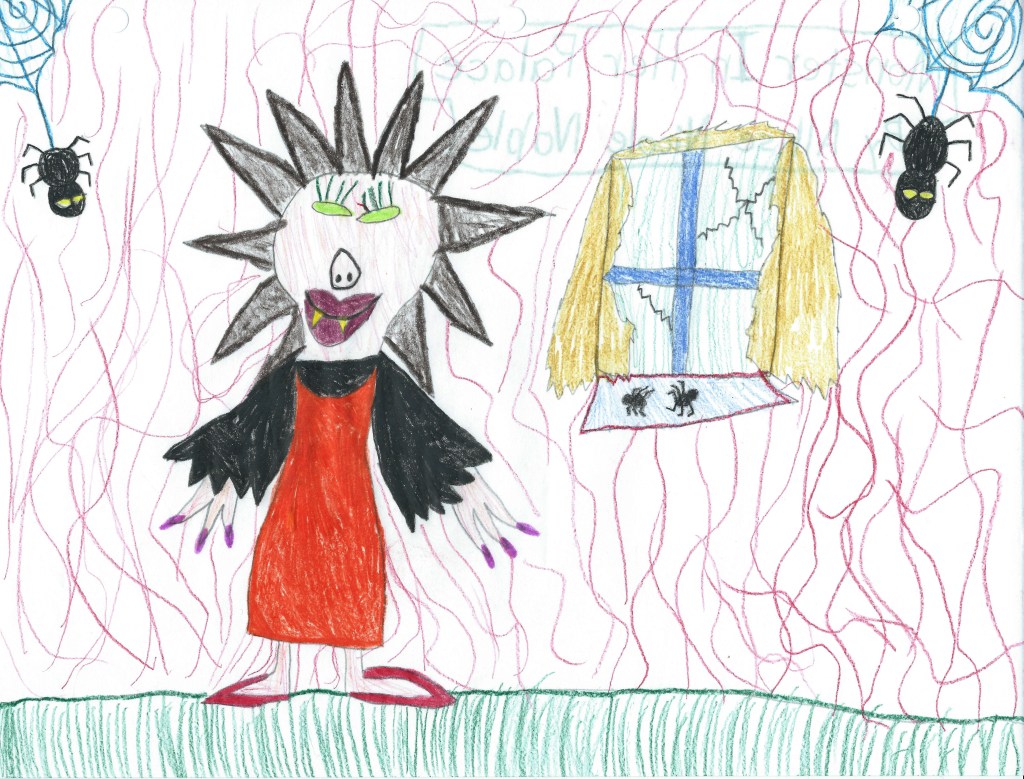
When people ask me when I first got into art and my answer is shortly after birth, I inevitably end up mentioning my mother’s astonishing archival skills. I have drawings from every year of my life starting at 1.5 years old. After mentioning this, the response is usually that they sure wish I would share some of these older drawings on my website. As I was going through my past sketches and choosing some to post, I realized though my style over the years has changed quite a bit, there are common themes and purposes behind my work, including within my childhood scribbles. So begins the first part of a series using the past to delve into why I create what I do… I hope others find this interesting and entertaining, and I hope it helps readers reconnect with their past selves and realize how all of those different “us-es” had a part in creating who we are today, even those versions of us we don’t like to spend too much time with.
I have always been drawn to art depicting people. Portraits and figures were typically the vehicle for my art’s story from early on. Growing up I loved studying the differences in faces, how some could look so similar but no two were exactly alike. I would sit for hours studying my elementary school yearbooks as a kid, just staring at the different faces, observing. From a very young age I found beauty in that which was different and unfamiliar to me. I grew up in a very non-diverse setting, and didn’t see many people of color in my day to day life. However, I loved watching movies and television shows. As I started to see people who looked completely different from me and my family on the screen, I was fascinated by the wide range of hues and textures that could be present within these other faces – beginning to see people as truly living, breathing sculptures. I went through a period in younger elementary school where much of my figures I would draw were actually POC, much to the amusement and at times confusion of those around me. I also drew plenty of scenes from my day to day life; illustrations of my family, of my friends and neighbors playing outside; but only creating art depicting my own day to day existence just seemed so boring to me. Though a very socially anxious kid, I loved learning about other people and what their life was like, and even enjoyed when friends would show me photos and video of trips their family went on and other important life events. As you can imagine, they were quite pleased to have a not only captive but eager audience.
I’ve been told I was always one to stand up for the underdog, and this extended into the realm of art and fantasy. Although of course I drew princesses, I was also interested in the stories of supposed villians, witches, and other outsiders despite being quite the kind hearted soul and a bit too much of a rule-following goody-two-shoes, at least outside of the home ;).
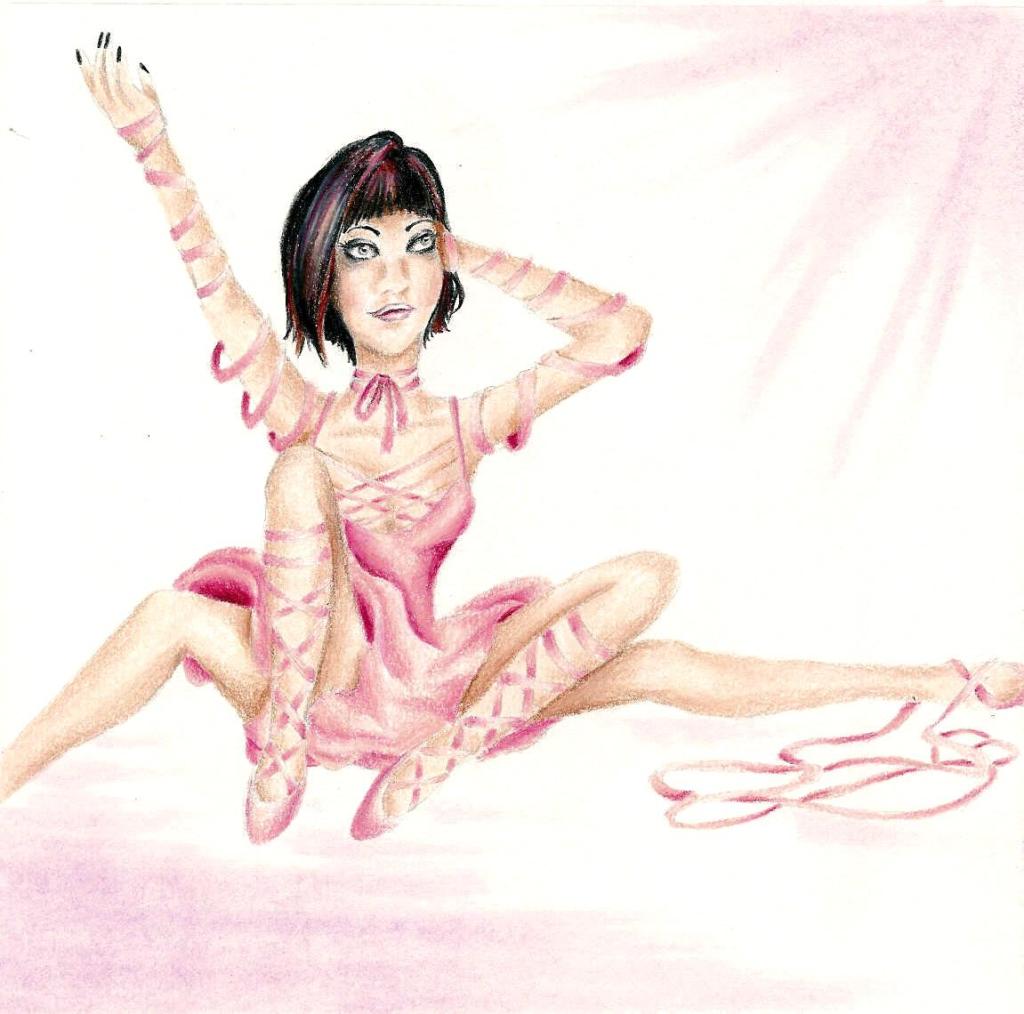
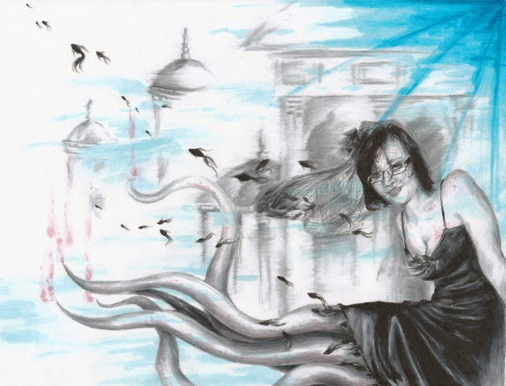
Once I got a bit older and started actually learning about art, I connected instantly with surrealism, especially as it relates to the human figure. In junior high one of my favorite shows to watch was Ripley’s Believe It Or Not. My favorite stories were the aesthetically bizarre tales of extreme body modification which are all over on youtube now, but back then such slices of life weren’t as readily available. There was the man who had turned himself into a human-tiger hybrid, the woman who got specialized dental implants so she could live out her dream of being a real life vampire, the one who got their tongue split into 3 independent forks that could all move on their own … Though I am in no way a big advocate for plastic surgery, there was something interesting to me about individuals “making the internal external”, a term I use often to describe the aim of my artwork. The idea of people crafting their external persona as a living sculpture to match who they are on the inside was captivating, and though these exact characters never made their way into my art, I did end up drawing a series of 4-legged ballerinas and people with animal heads.
As I continued to develop my surreal portraiture, I depicted facial expressions that wouldn’t typically be captured in a portrait drawing or be considered beautiful, such as negative emotions like fear, anger, or anguish. I also continued to blend human and animal physiology in some of my portrait and figure drawings under the observation that oftentimes, animals can be seen acting like people would and people can act more like we assume an animal would act and react. The lines blur more often than we’d like to think.
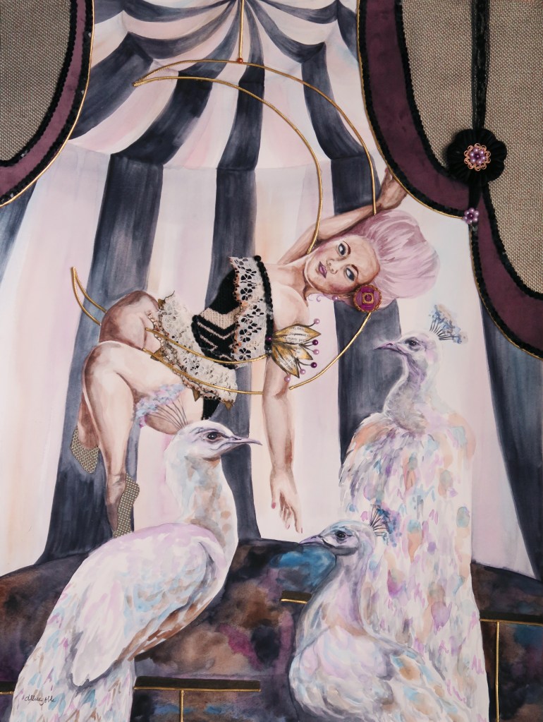
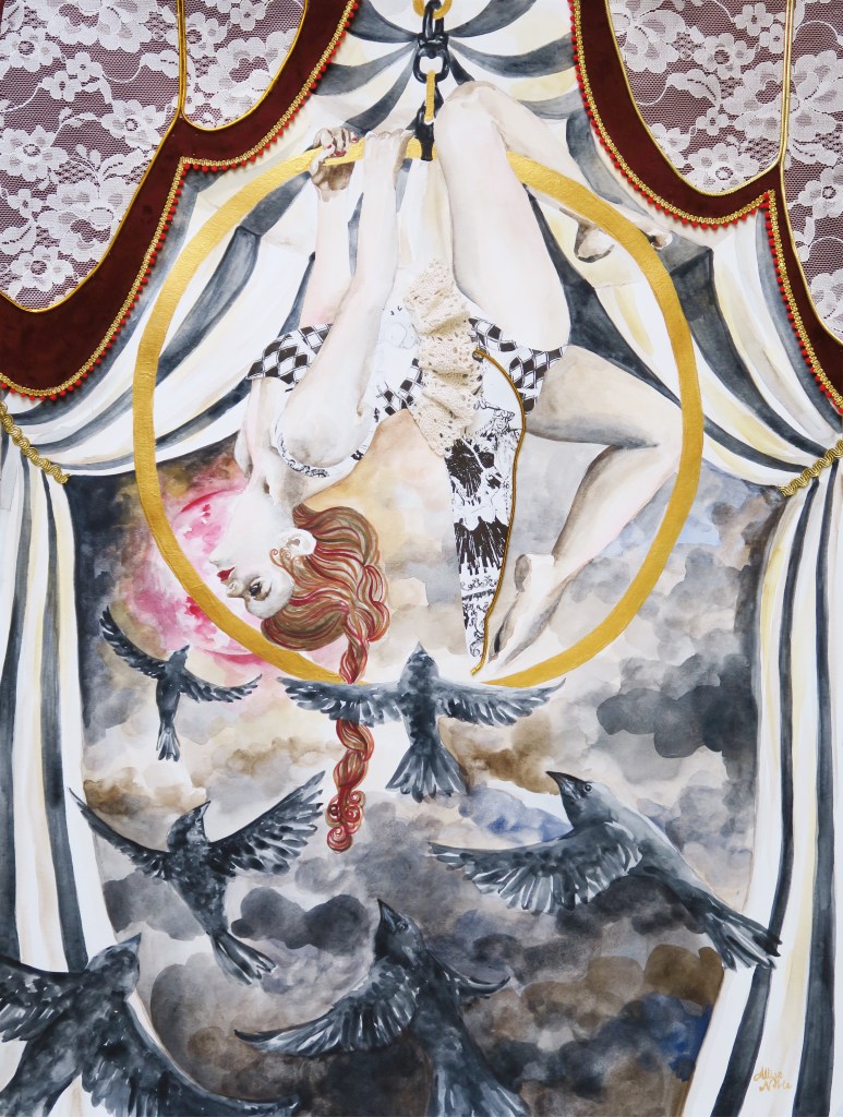
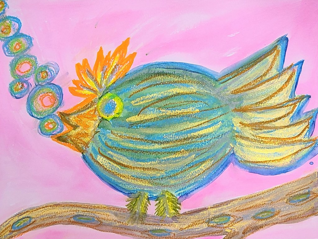
Today, uniqueness of spirit, self expression, and animal representations still play a large part in my art just in a different way. When I look at my aerialist mixed media works, I can’t help but be reminded of the dark, vintage circus aesthetic of my earlier 4-legged ladies. I have no tie to gymnastics or dance myself – I am horribly awkward and unskilled at anything requiring physical coordination and spent my time in gymnastics lessons as a kid climbing up to the highest possible spot at the recreation center and simply jumping into the foam pit over and over. I took a ballet class once as well and recall ending the day giggling with a friend as we rolled ourselves up in the dance mats and pretended to be burritos. I pretty much joined just for the outfits. But, again there is that attraction to the completely foreign, those characters that are completely different from myself. Animal imagery abounds, mainly in the form of birds, but it is no longer a bodily extension and more instead a physical representation of the figure’s soul.
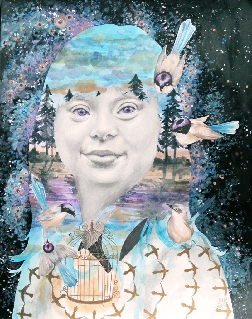
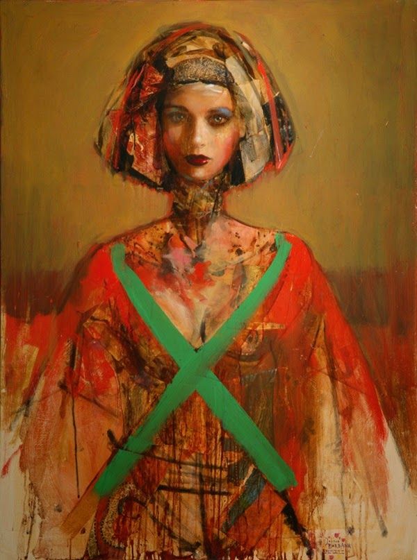
I continue to celebrate beauty in all of its forms, especially that which is underrepresented. One of my favorite pieces to date that I’m sure I will cherish forever is the portrait in the center that was part of a 12 part series I created for ArtPrize on year depicting a young woman with down syndrome. She exudes joy, confidence, and freedom.
For a number of years I have worked with an inclusive arts program suited for young adult and adult artists of all abilities, including those with disabilities. I suppose looking back I was always meant to use my gifts to reach people of all abilities. I have a distinct memory from first grade. 2-3 students from special education would spend the first half of the day in the traditional classroom I was a part of, including recess and lunch though during lunch all of the kids from special education would sit at their own separate corner of the lunchroom. One of the girls who visited our class in the mornings wore a fantastic velvet dress with black and pink flower print on it one day, and though remember, I was severely socially anxious at this age and only ever spoke to my one neighborhood friend in class, I gathered my courage and told her I liked her dress because it was just too cool to not say something. From that point on we were kind of friends. She asked me to swing with her at recess, and eventually invited me to sit with her at lunch. Ridiculously enough, I accidentally caused quite a scandal by breaking social lines and sitting at (I will not repeat the name fellow classmates had for this particular table) with my new friend. Differences were never seen as anything for me to fear, but parts of another to appreciate and learn about.
Appreciation for all living beings that make up our wonderful world are a large part of the emotion that goes into my current work, and though sometimes I fail at this concept in practice as do we all, I hope the impulse to draw towards and not shrink away from diversity is a part of myself I always keep with me.

