In both portrait drawing and portrait photography, the most dynamic of compositions often involve partial or full profiles, because profiles by nature create more interestingly shaped negative space around a figure. Profiles are also THE most dreaded type of portrait to draw. For years I shunned them after far too many failed attempts, my lovely subjects coming down with the dreaded gorilla-lips curse; that tragic moment when you end up with either too much or not enough space between the nose and chin to squeeze the lips into, and then there is the question of how far should the lips actually stick out anyway? Hence, we end up with the look of a monkey trying to blow a patron a kiss at the zoo… not good. I forced myself to peruse tutorials after finding far too many wonderful 1920s flapper photographs of kickass ladies I wanted to include in my compositions, all taken in profile! Coupling this with my own experimentation, I believe I have come up with some pretty solid methods to make drawing profiles easier. What works for one artist may not necessarily work for another and there are many different approaches, but I hope this gets you started.
*Some of the angled guidelines appear to be a bit different in the photo versus the drawing, but don’t be confused! The images got put into my scanner and they simply weren’t all lined up *perfectly* straight since the paper I used was too big and hung off the edges of the scanner to begin with. So, ignore any of these visual discrepancies as scanner error :)*
*The reason I don’t start with the classic “oval head shape* is because a profile tends to deviate from that roundness eventually anyway, and you will inevitably run out of room in the end and wind up trying to squash the mouth into that restricting beginning oval size and shape. Doing this, you will either not have enough room between the nose and mouth, or have a nonexistent chin. It’s much easier for me to get the features down first, and then use a measuring tool (I always go with the eye) to inform you in how high the forehead should rise, how far back the rest of the skull should extend, etc; everything kept in proportion to everything else.

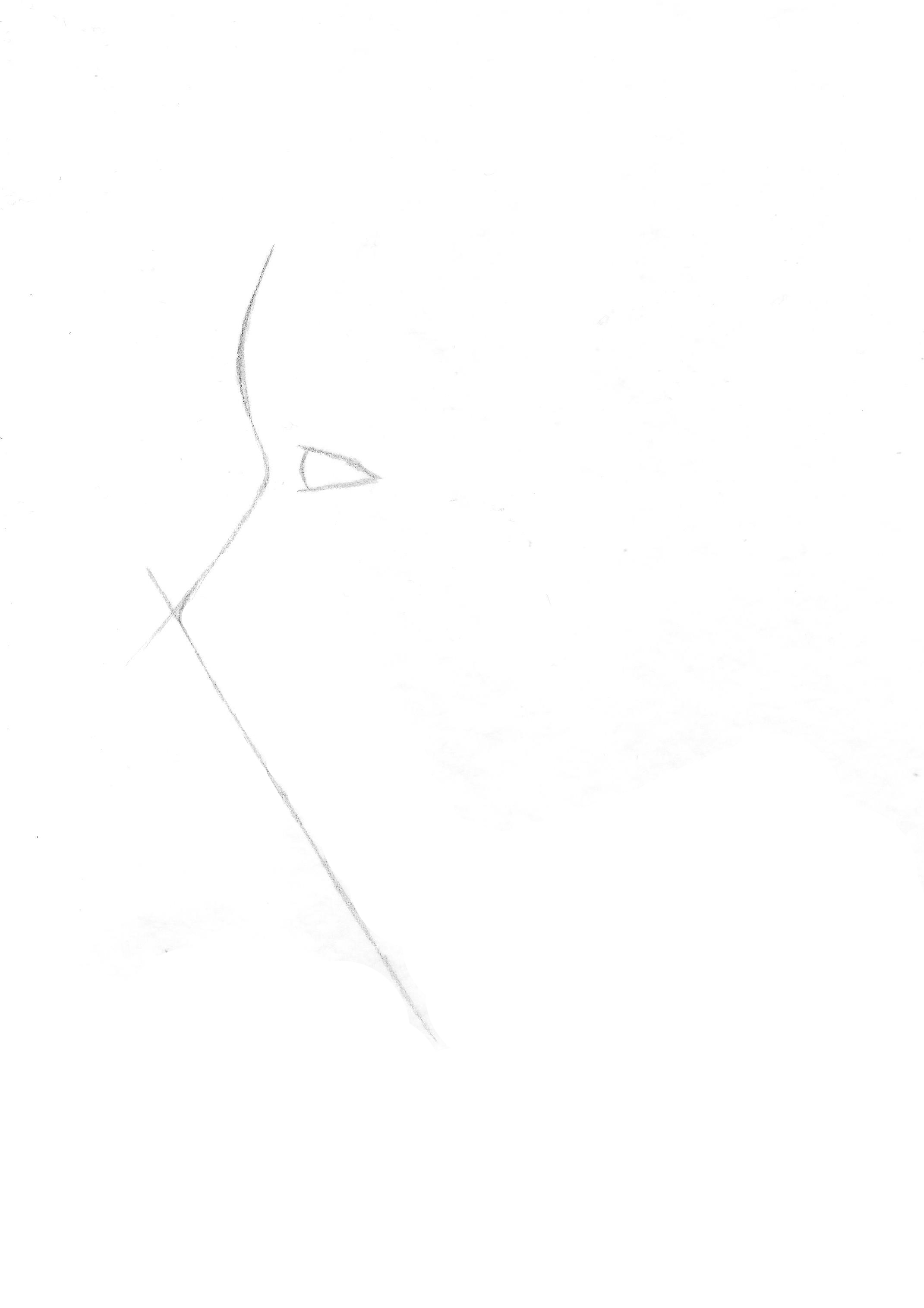
This is the image we will be working from. You will notice the line running diagonally from nose to chin – this is a lifesaver! On every single face, no matter what the proportions, the end of the nose, lips, and chin will all touch a diagonal line drawn from nose to chin, though the exact angle of this line will vary. This will be a HUGE help to us later.

Have you ever seen artists when drawing a still life or model lifting their pencil up, squinting at it, and then laying it back down against their paper? They are using their pencil as a guide to gauge the correct angle, and we can do that with a photo reference as well. Lay your pencil against the angle of the forehead, and then move the pencil over to your paper and create that same angle in a light pencil line.

Use the same pencil technique to gauge the under slope of the forehead, as well as the angle of the nose. Round out the intersections of these 3 lines. Don’t worry about the length of the nose yet, just make the line.

Next, outline the eye relative to the size of the slope between the forehead and nose. This is important because the eye will be used as a handy measuring tool in the future. Don’t worry about the unique shape of the model’s eye right now, just make a rounded off triangle of proportionate size to the bridge of the nose.

Now, use the eye height to measure the length the nose should be. How many eye heights fit down the length of the nose? In this case it was 3. Mark off that end point. From that point, draw your diagonal line that will be a guide for the mouth and chin as well, using your pencil to gauge the angle from the photo.

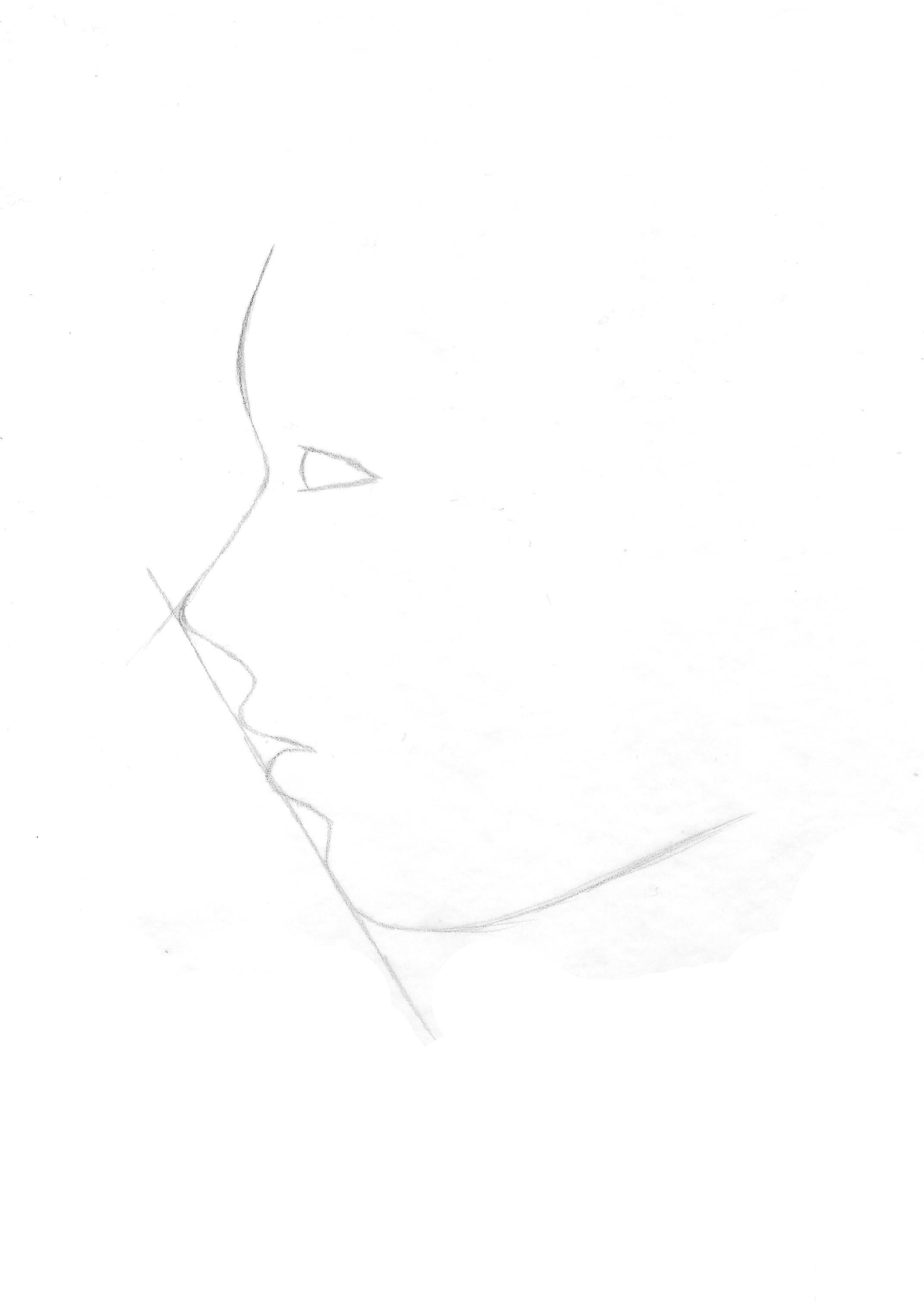
There are many different techniques for correctly outlining the shape of a portrait’s features in profile, just check out pinterest. What I’ve found easiest is almost ignoring the features and concentrating on the shape of the negative space created between the diagonal line and the facial features rather than the facial features themselves.

Concentrate on the 3 shapes of negative space created, between the nose and top lip, between the top and bottom lip, and between the bottom lip and chin, and draw them in. Definitely use your pencil to gauge the angles. Then, step back and compare what you have to the photo, note if anything doesn’t look quite right, and touch up where need be. Also, use your pencil to gauge the angle of the chin. Draw the line on your paper, and round off where this new line intersects with the already existing diagonal.

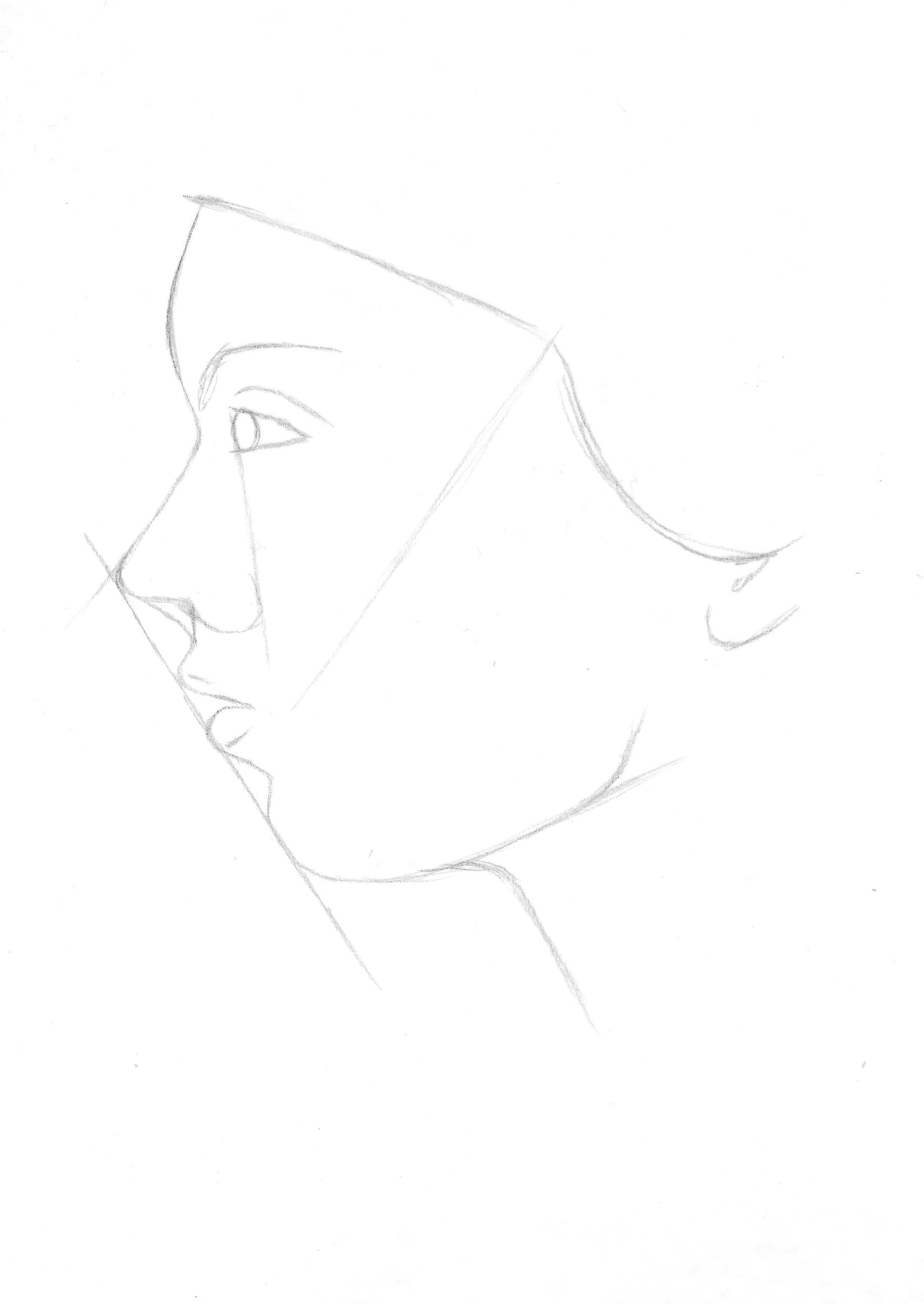
Go ahead and add the iris, and the eyelid and the arch of the eyebrow. Don’t just draw a generic, upside down smile eyelid on top. Pay particular attention to the reference’s unique eyelid shape. Also, add some detail to the nose. Note that the nostril ends at about where the lip curves out. Also, gauge the angle with your pencil of the front edge of the eye to the curve of the side of the nose. Draw that angle lightly on your paper. This will indicate where the curve should fall. Once again, don’t just draw a parentheses – note the distinct shape of the reference’s curve around the nostril – it’s a little more straight. As you draw more portraits, you will find that noses (and eyes and mouths for that matter) are literally like snowflakes – absolutely no two exactly alike.

Now measure how many eye lengths are between the top of the eye and the hairline. Make a mark for the hairline. Use your pencil to gauge the angle between the corner of the eye and where the chin line ends. Make a mark on your paper where the jaw line should end, and curve it up. Now you also know where to properly add the bottom of the ear. It should line up with the angle off the end of the jaw line. The bottom of the ear should always fall height wise lined up with the height of the mouth on a face.

Gauge the angle of the hairline with your pencil, and draw that diagonal in where you had your mark at the top of the forehead. Gauge the angle between where the hair drops down and the mouth. Mark that line lightly, and create the second curve for the hair.

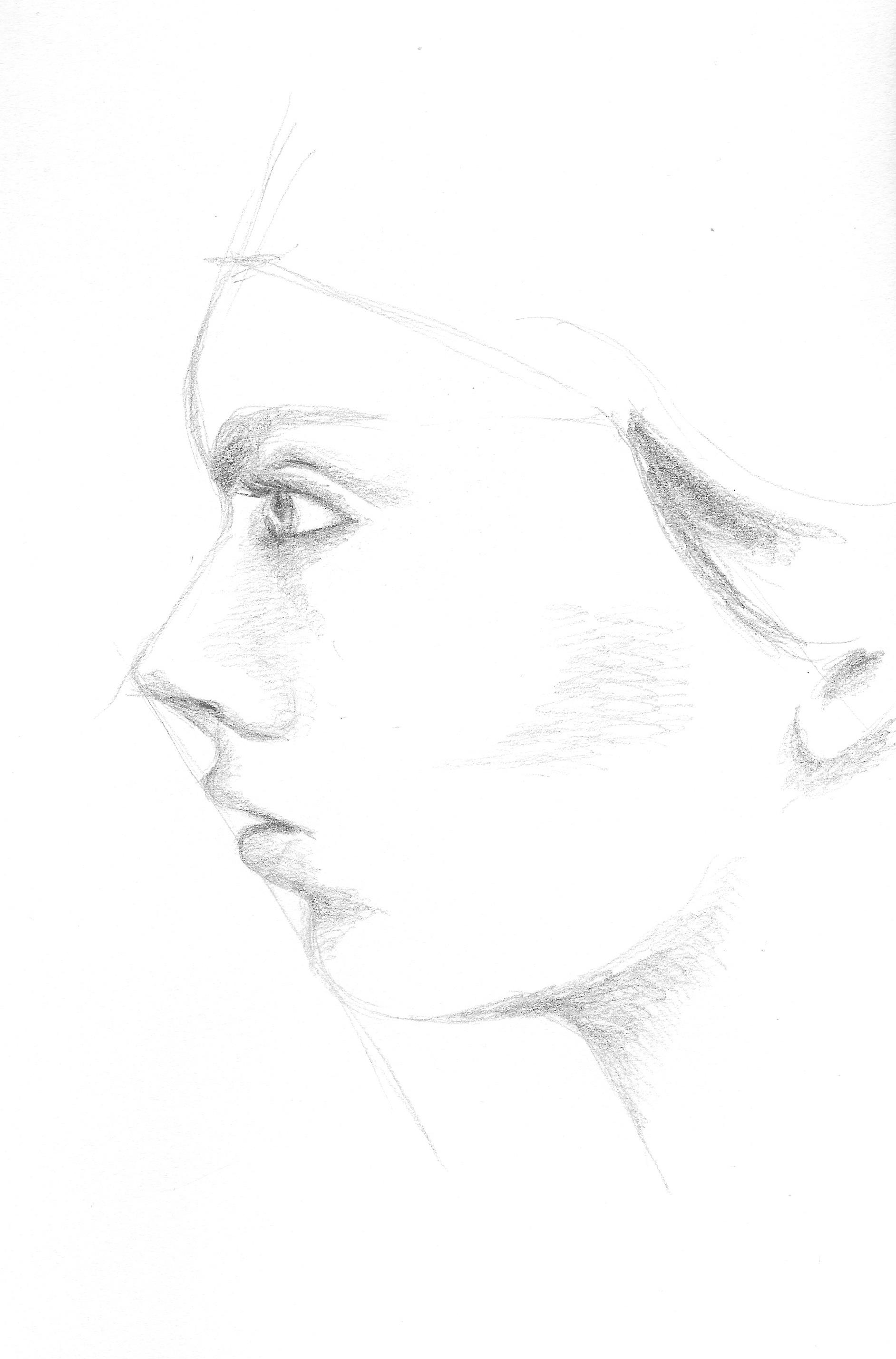
Voila! You have a pretty good start to a profile. It still is going to take a TON of practice, but hopefully this advice will make the practice considerably less painful :).

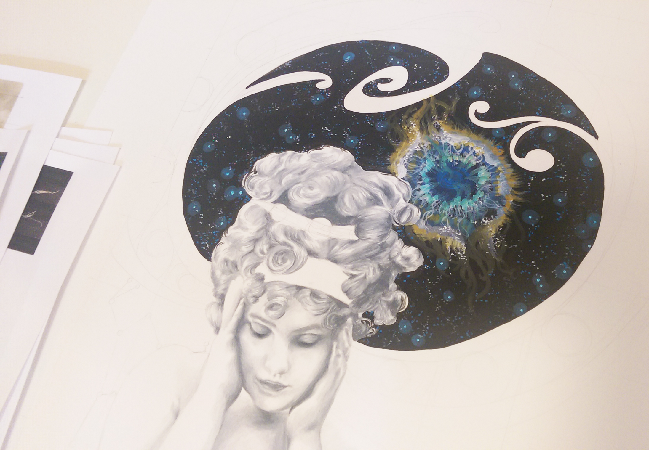
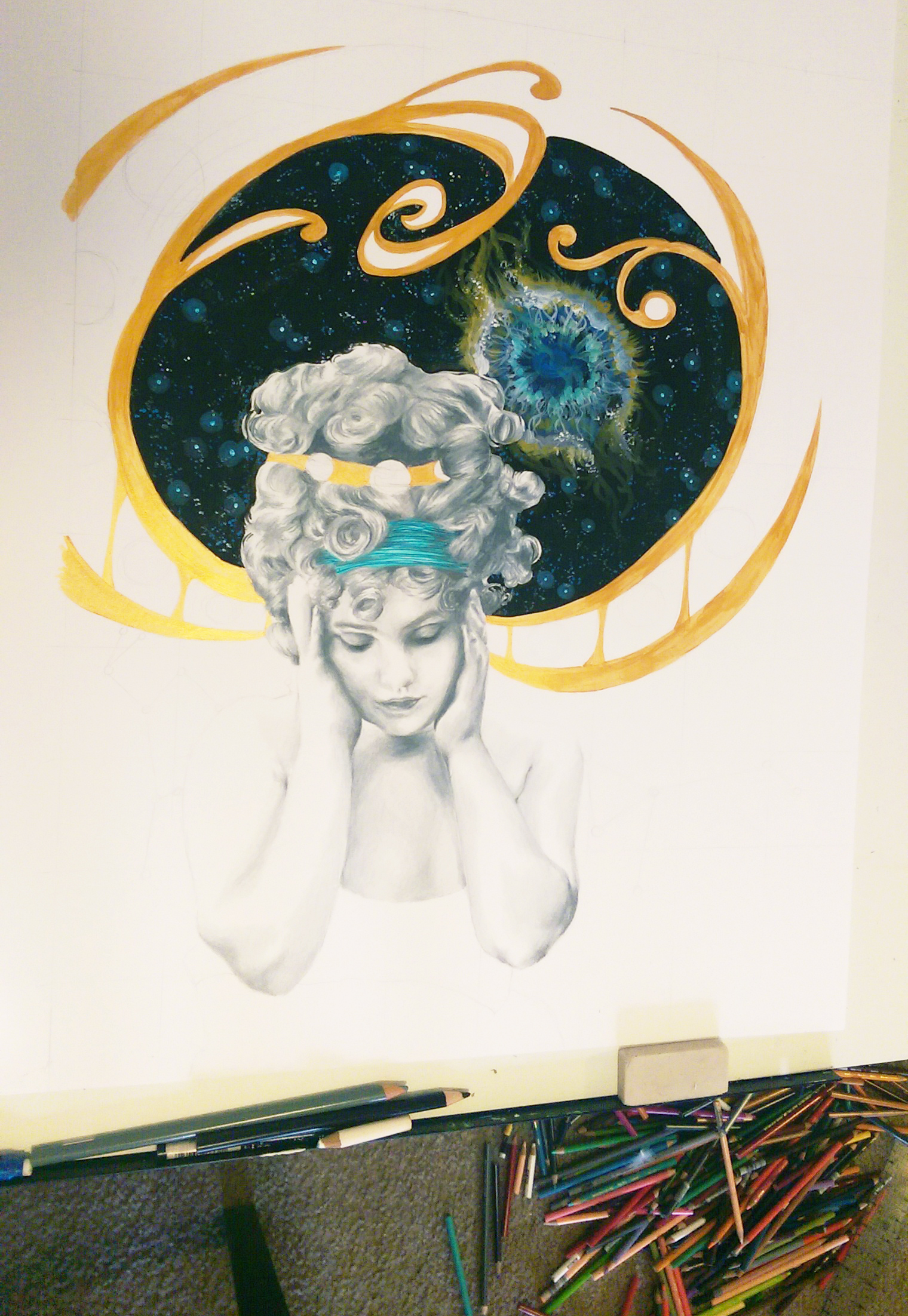
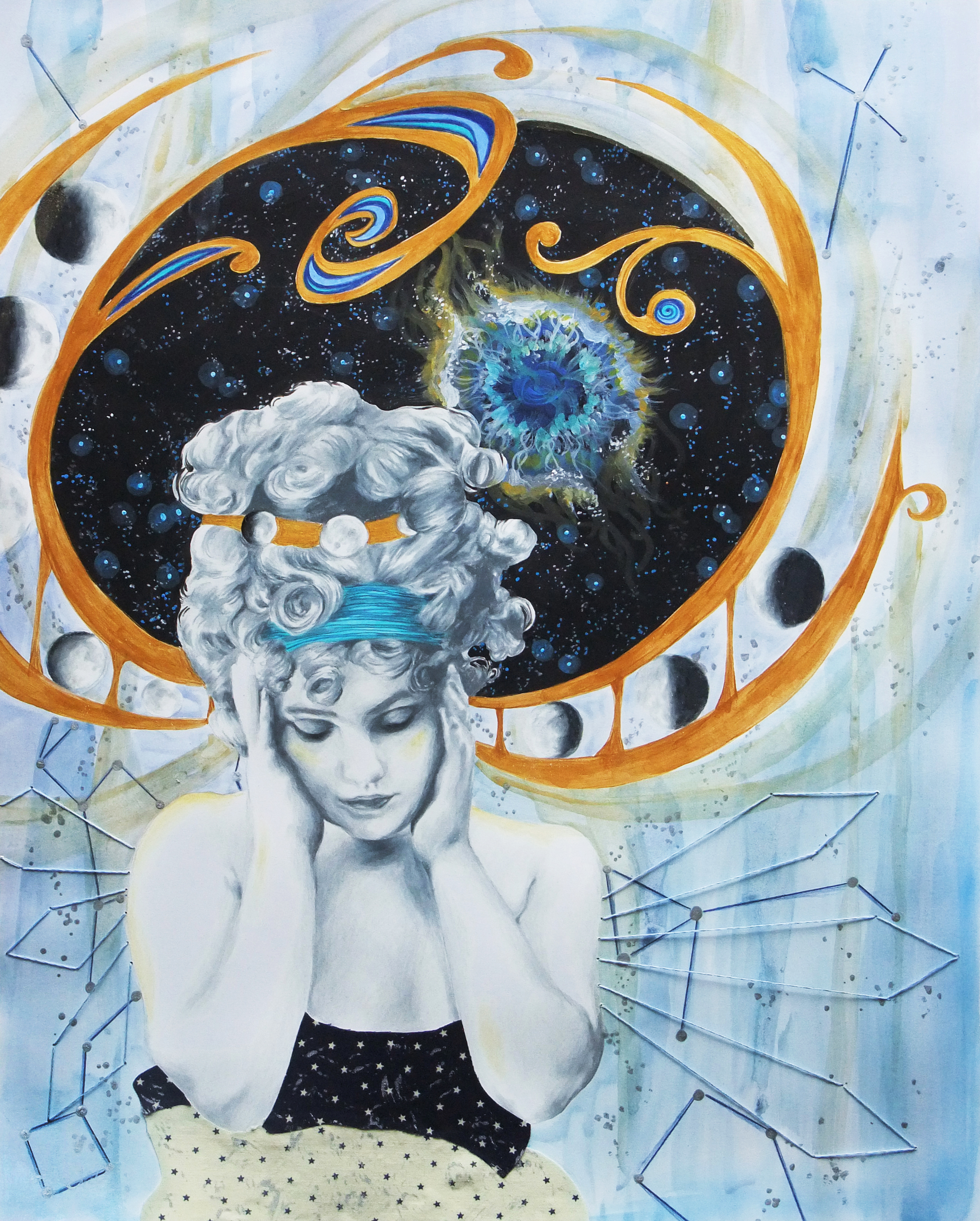
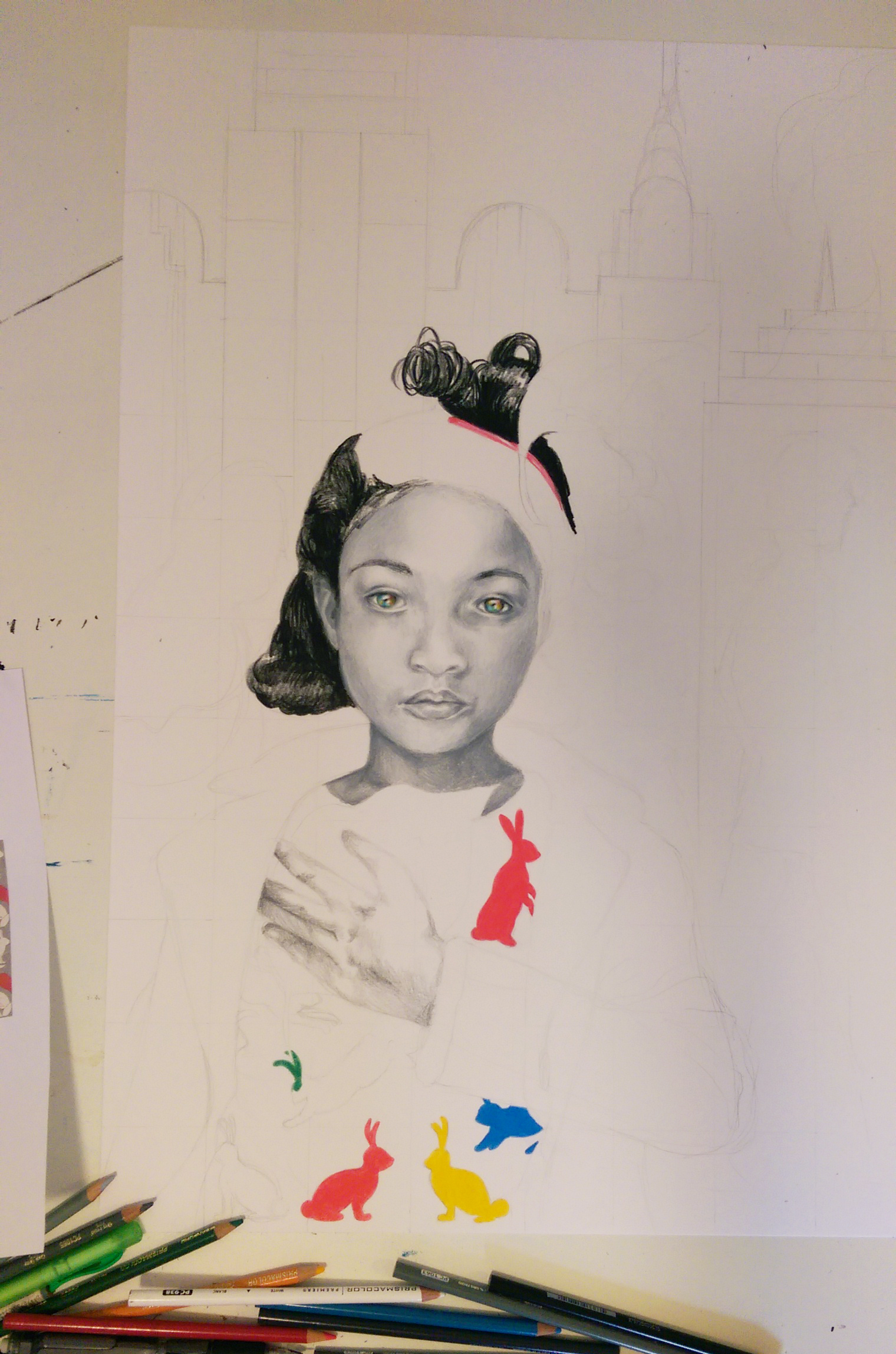
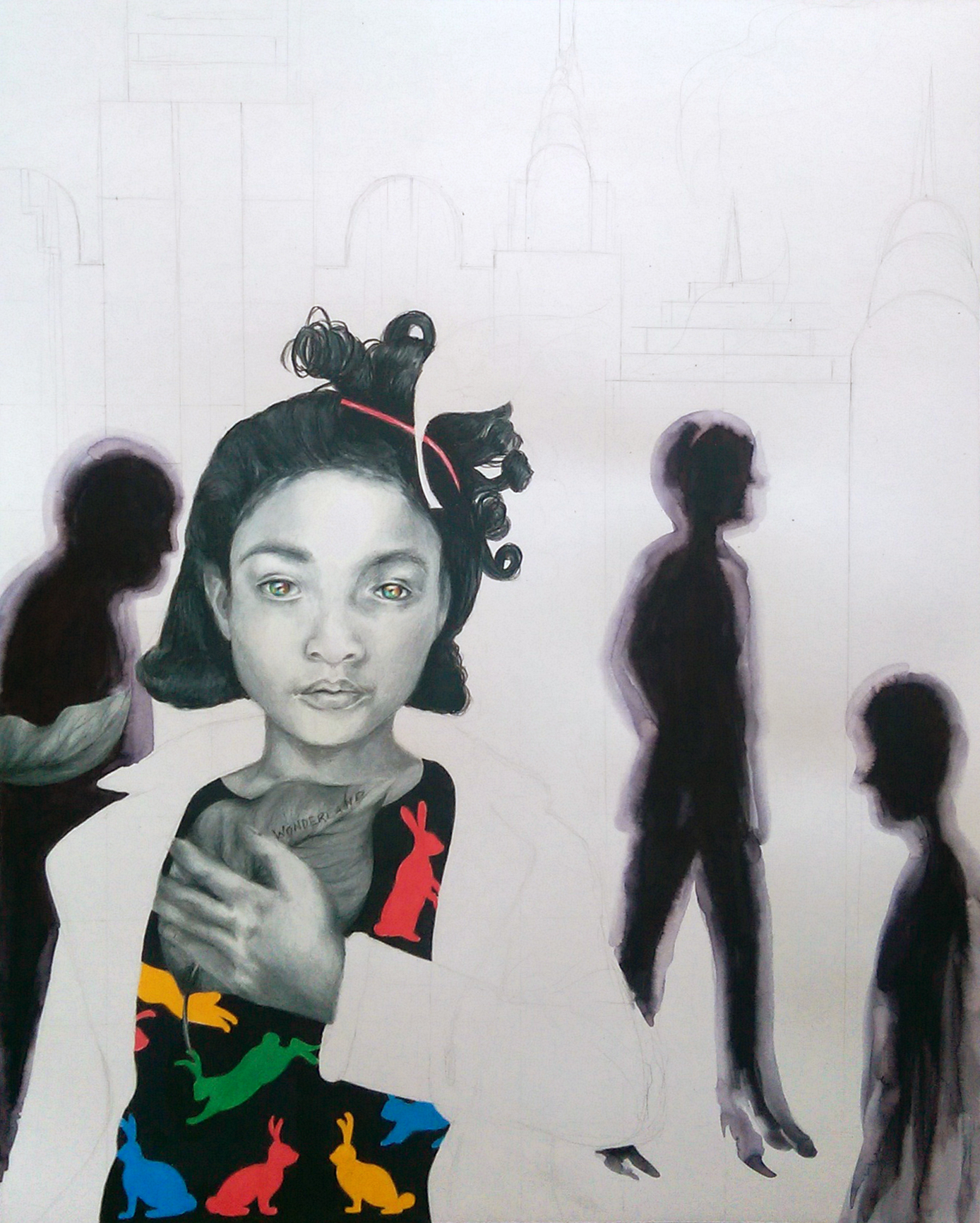
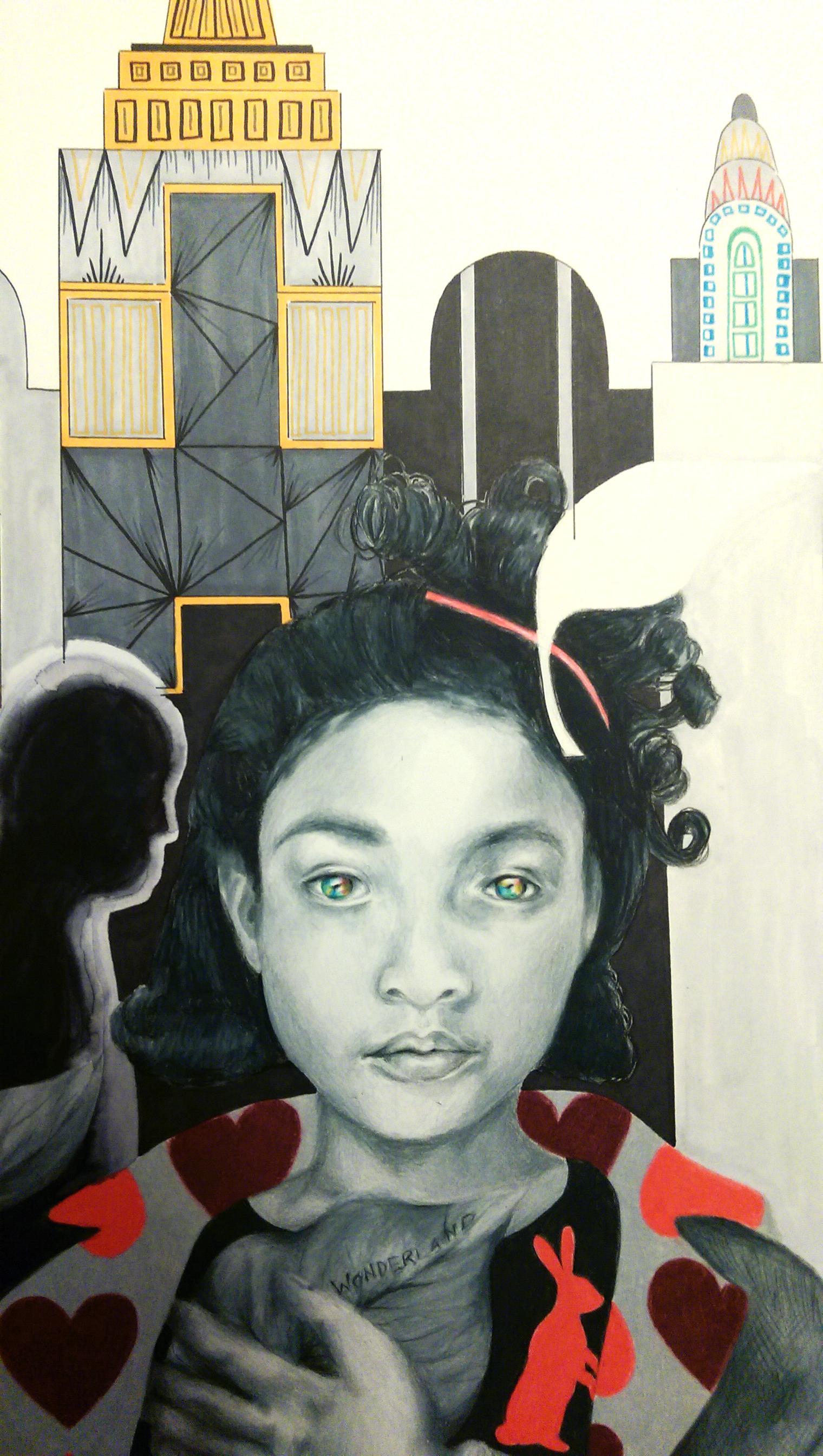
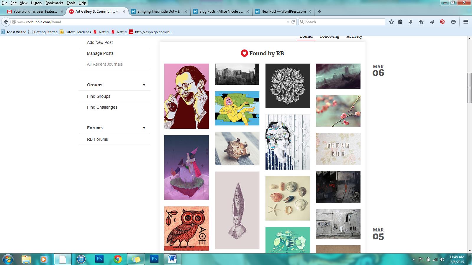
I took on profiles in this new design for redbubble, the classic flapper with a twist. Check out those eyes! I am having fun designing more bizarre vintage characters, though I’m eventually going to have to go back to my large piece I’m trying to finish. But… not yet ;). This snazzy lady’s available on bags, phone cases, even a duvet cover!