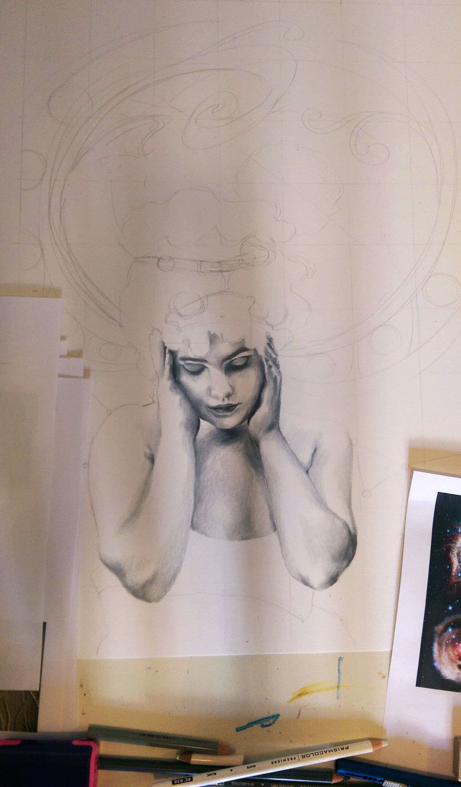
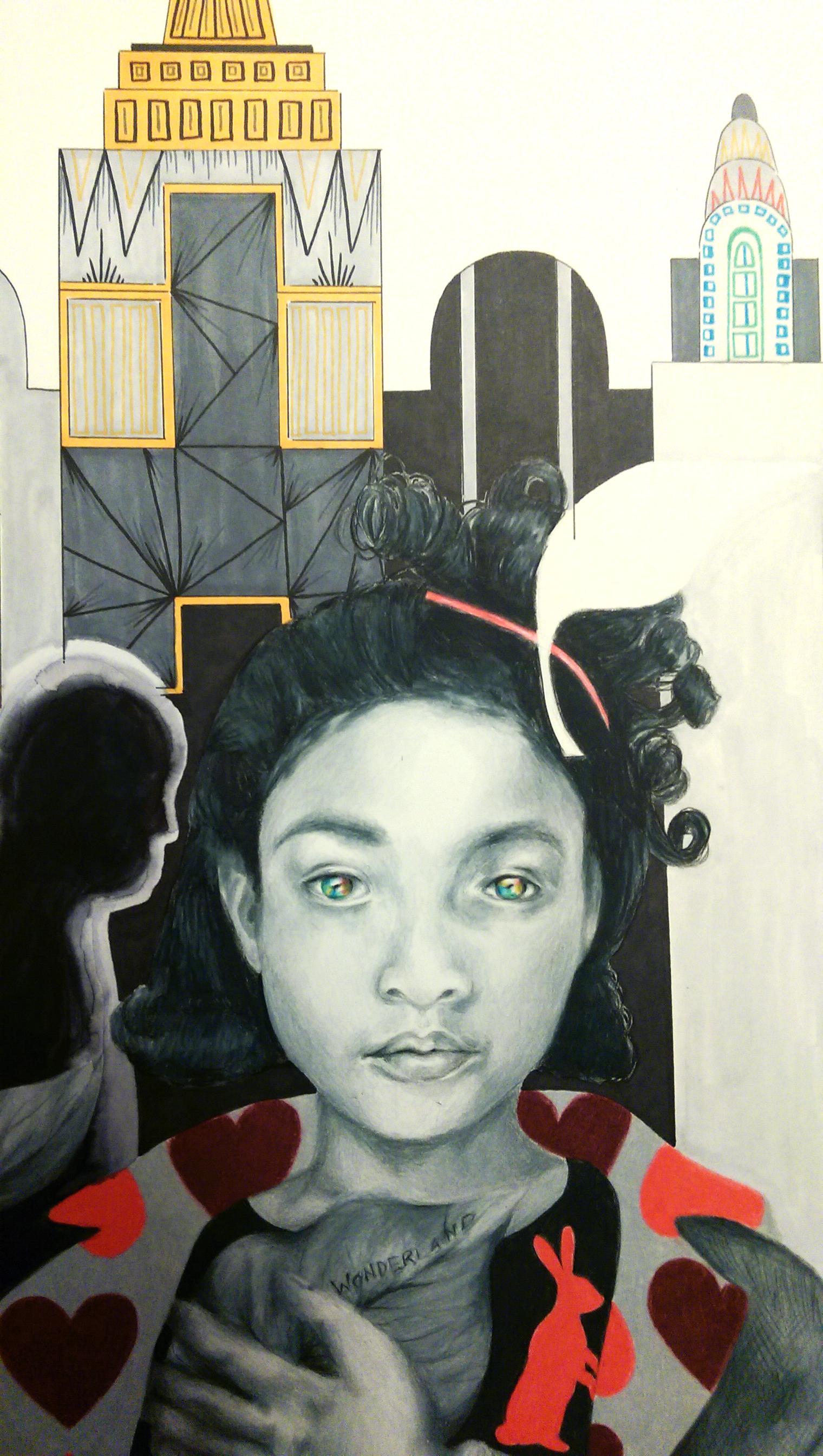
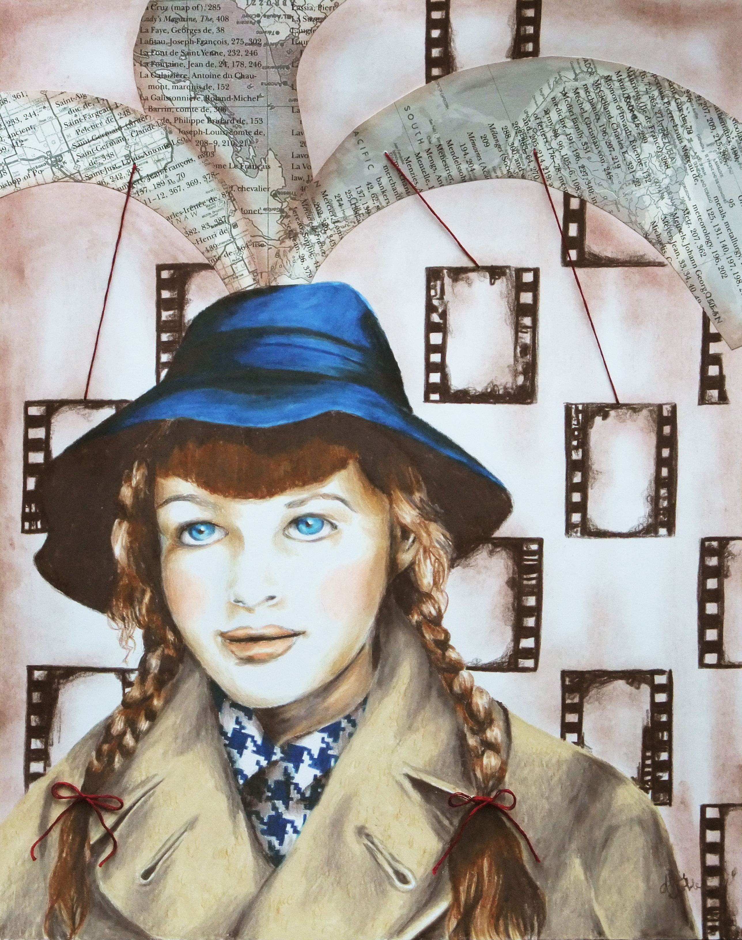
My new piece ended up coming together rather quickly. I’m guessing it was due to a combination of the sudden dismal weather over the last couple days and also on and off feeling like I was coming down with something and being low on energy over the last week or so. Neither of these occurrences are fun, but they did force me to have lots of sit-down, indoor time when not at work which certainly upped my art production. Like the last conceptual portrait I did, I wanted this piece to be mixed media so I could use the artistic medium best suited for each part of the composition. I ended up using prismacolor pencil for the portrait, acrylic for the space scene, watercolor for the background, and fabric for her dress – the star print was just too perfect. I added some embroidery detail around the figure at the end to finish it off and really highlight the figure and bring her into focus despite her subtle, lighter tones. I found the inspiration photo first, and then built from there. I love finding interesting bits and pieces of inspiration in the unexpected. One wouldn’t expect a piece of art to spring from a blurred antique photo with poor lighting of a girl holding her head sulking as if she has a headache. But, I saw that photo and instantly thought of a heaviness or vastness she must be holding inside her mind. Hence, the universe concept. I wanted to add art nouveau detailing because I’ve never done an art nouveau inspired piece, and it is truly one of if not THE absolute favorite design period of mine. I knew the iconic swirling, rounded patterns would be perfect to compliment the outer space motif. I’ve actually been remembering to take progress photos to some extent. I’ll get the hang of this blogging thing yet ;).
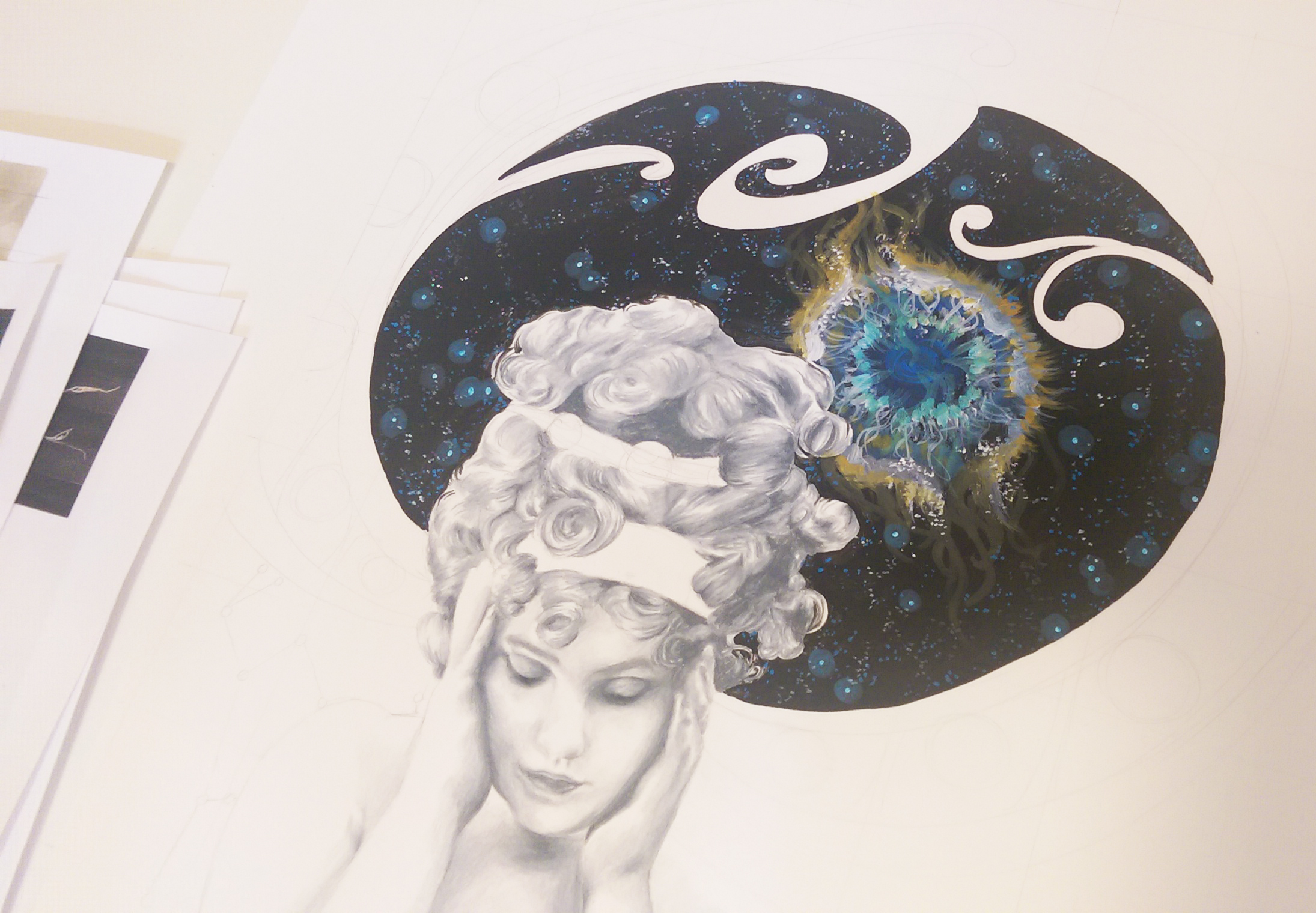
Initial portrait shading finished, and just filled in the space scene with acrylic.
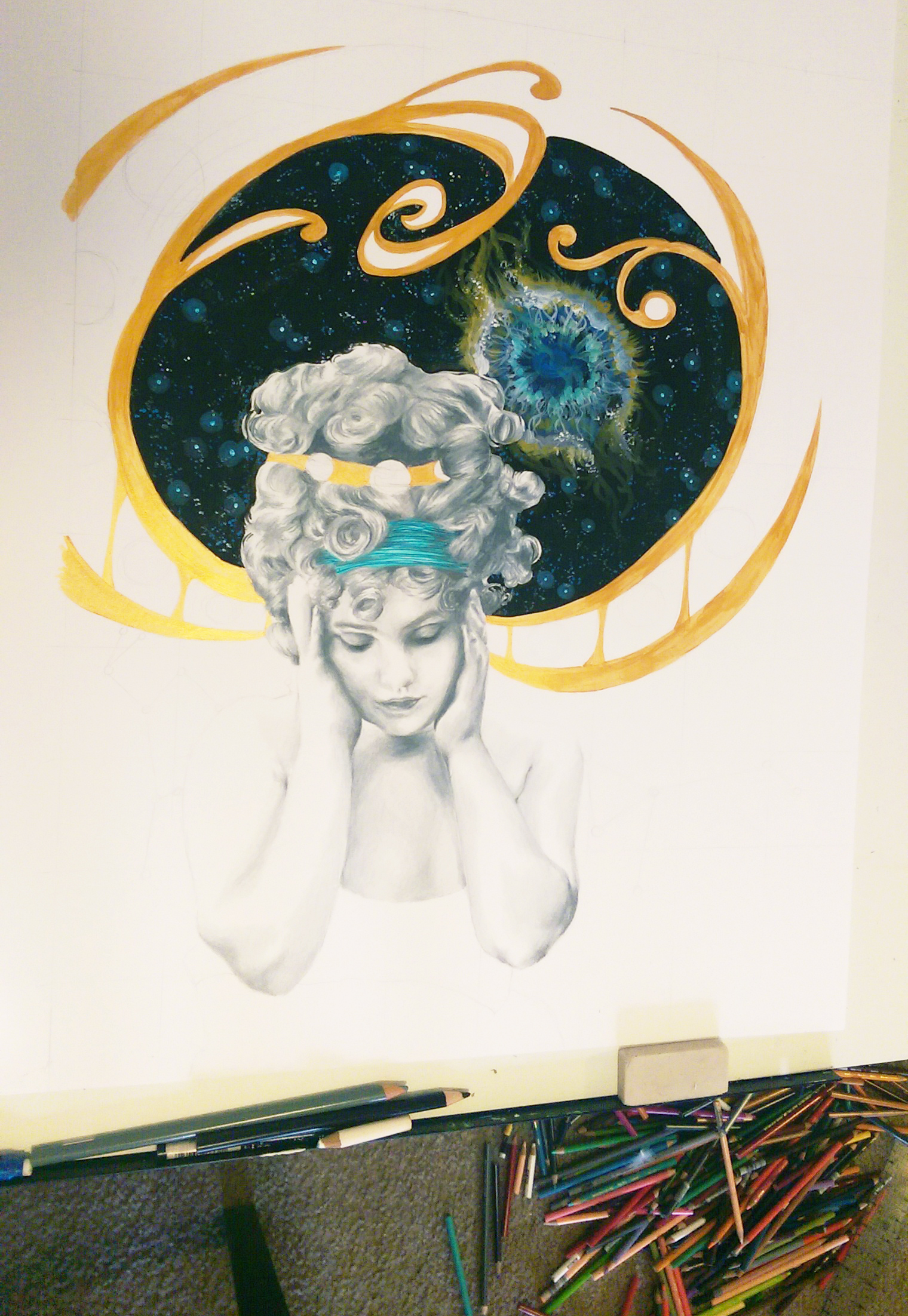
Adding the art nouveau detailing by filling in the pencil outline with metallic gold acrylic.

Darkened some of the shading on the figure to balance the dark areas of deep space and the moon phases pattern, and added layers of metallic watercolor to the background. Also detailed some constellations over the watercolor.
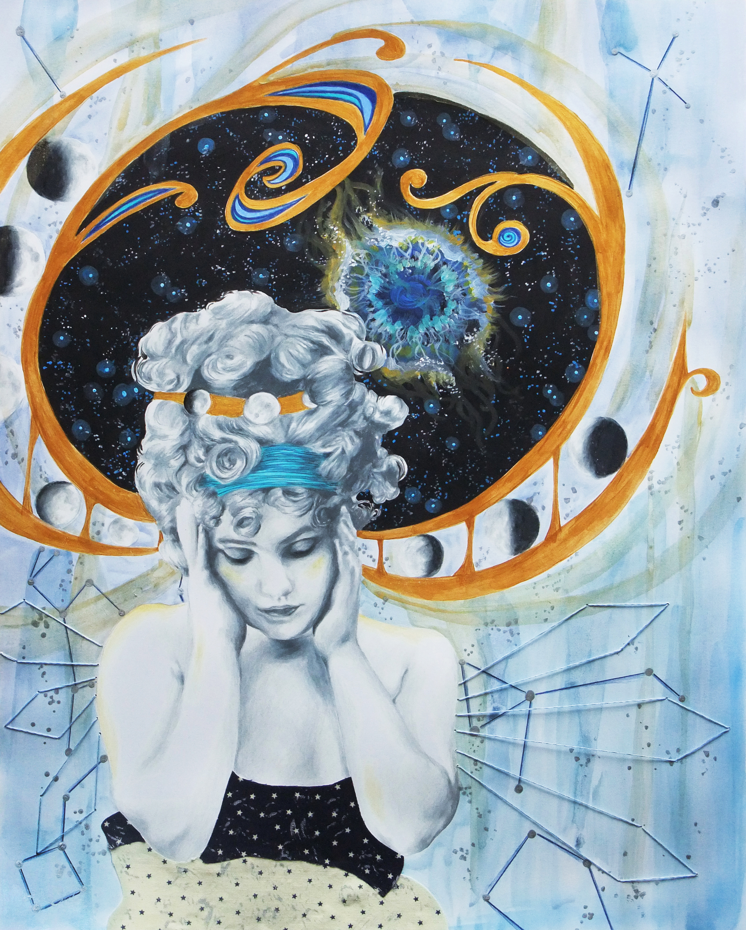
More layers of watercolor, the final embroidery design around the figure, and voila!