Artists To Know

Artists To Know! Installment Four

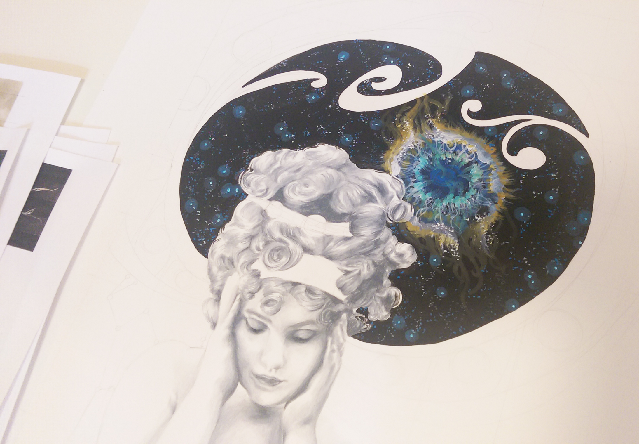
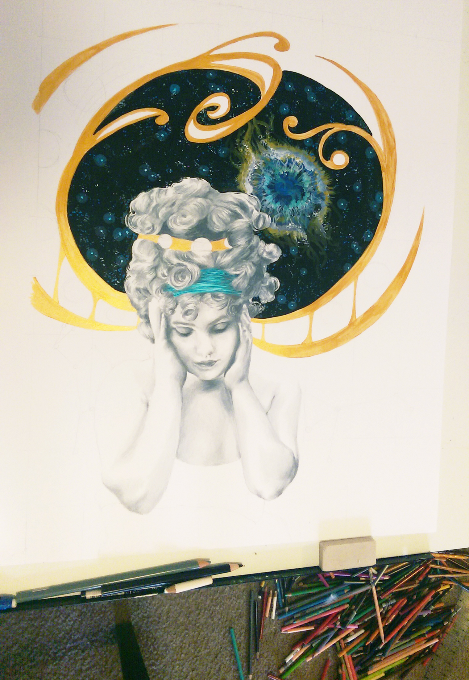
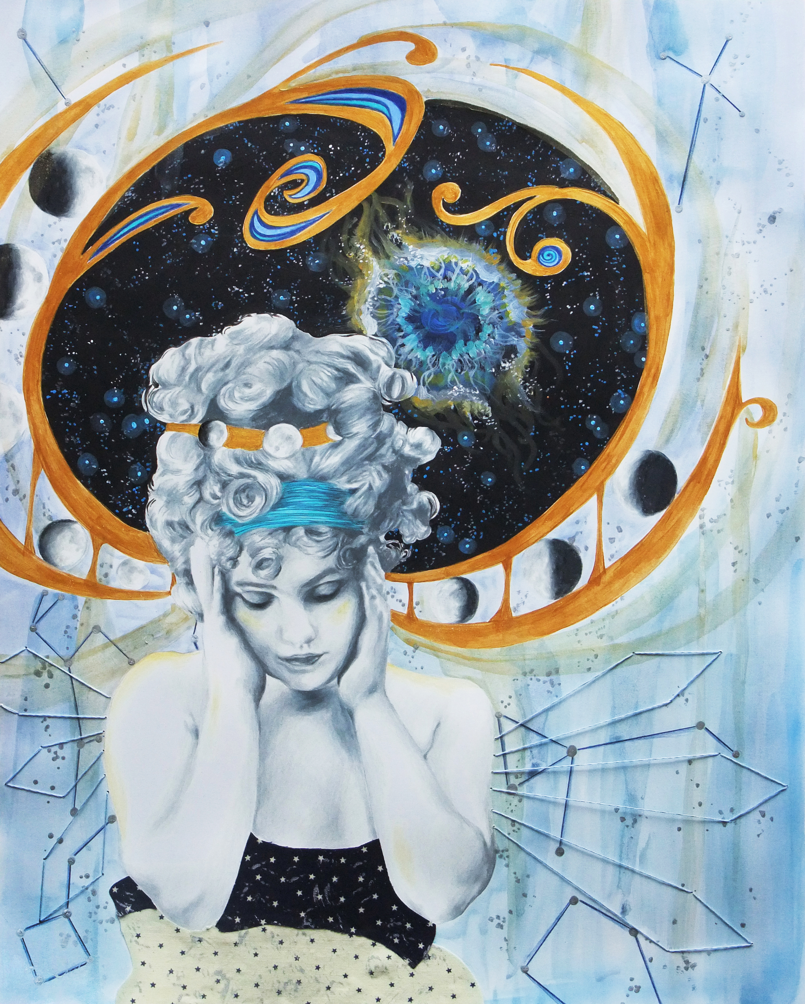
I really don’t give photography or sculpture enough love. I tend to have my eye caught most by drawings, paintings, and mixed media because it’s what I do and I understand the process, but there is so much more thrilling art out there in every medium. So, for these next couple “Artist To Know” installments I am going to focus on art forms besides the aforementioned. Today is photography’s day to shine. Though there is also a lot of stunning landscape and animal photography out there (I mean come on, nature is amazing!), I chose to feature a type of photography less often explored, utilizing props, costumes, and often times incredibly extensive handmade sets to create a new and different world that the photographer envisions. These photographs tell a story beyond the appreciation of beauty. These are not about capturing the perfect moment, but creating the perfect moment to capture.

Tim Walker

British fashion photographer Tim Walker shot his first fashion story for Vogue at the young age of 25, and has continued shooting for British, American, and Italian Vogue ever since. He has also created stories for W magazine and LOVE magazine. I love the entrancing worlds he creates ranging from the soft and ethereal to the colorful and kooky. As a kid, I always wished there existed a magic television that could record people’s dreams while they slept, so I could watch others’ dreams (curious and nosy kid, for sure ;)). I imagine Walker’s photos are what the recordings would have looked like. He invites you into his dreams. You really have to visit his website and see his series of surreal photographs featuring well-known actors and actresses that he did for W – they are of the colorful and kooky variety, and some of my favorites. Amy Adams, Julianne Moore, Bill Hader, Keira Knightley, and Eddie Redmayne? Yes please.

Alex Stoddard

Alex Stoddard’s first exploration with photography was a series of self portraits he began taking at 16. I find people that are able to simultaneously compose amazing shots and also act as model in them and convey the correct body position and emotion on their face mind blowing as it is. It is clear that each of Stoddard’s photographs tell a story, and the viewer is dragged straight into it, no longer just a passerby gazing at a scene or figure but an active participant in whatever is going on.

Lindsey Adler

Lindsey Adler is a professional portrait and fashion photographer, known for her bold, graphic compositions. What is also cool about her is she loves sharing her passion with others, and lectures tens of thousands of photographers each year worldwide. Not every artist is willing to share their secrets, or wishes to take the time out of creating work to teach others, and I find that very admirable and inspiring. What I was most drawn to  about her work is her super-close-up face shots that turn her model’s face into a work of art. There is obvious careful attention to color, space, and line, even when working with the natural hues and contours of a face rather than adding fantastical artistic details like below.

Kirsty Mitchell

Winner of Lens Culture’s Visual Storytelling Grand Prize in 2014, Kirsty Mitchell worked as a successful senior fashion designer for an international label until personal illness brought on unexpected life changes. It is then that she connected with the camera, and she states that it changed her life forever. Her series “Wonderland”; my personal favorite and the series from which the image below is a part; was inspired by her mother, who sadly passed in 2008. The sets, costumes, and props are hand-created and filled with exquisite details, which is what captivated me in the first place. Mitchell says she found herself creating pieces that echoed her mother’s stories, and the need to create the worlds of her dreams and make them tangible grew. The greater meaning behind these images is evident in the awe-inspiring end results of the project.

Michael Belk

Michael Belk is an accomplished fashion photographer whose work has appeared regularly in Elle, Vogue, and many other publications. He always said of his work “There is no hidden meaning in my photography, no agenda beyond the image itself. I am attracted to beauty …” Then suddenly, his focus shifted away from the model of “art for art’s sake” and he began spending all of his time composing modern day biblical scenes. In an interview with The Christian Post, Belk says of the inspiration for his new passion, “I was in New York prepping for a photo shoot a week after 9/11 and saw many people searching for something.” It was out of this realization that in the midst of chaos people were fearful and didn’t know where to turn, in conjunction with Belk’s own experience of faith in what he calls one of his “darkest hours”, that “Journeys With The Messiah” was born. Belk places the stories of Jesus in a modern day context to communicate timeless biblical themes in a way that is sharply relevant to today’s culture and issues. The strong light source and worn, sepia filter over all the images in this series communicate a strong feeling of sincerity, and seamlessly merge imagination and creativity with history. “Journeys With The Messiah” is beauty, with a purpose.

I hope you’ve enjoyed this week’s photography! Next time, it’s sculpture. Have any favorite photographers I didn’t mention in this group? Give me a shout! I love learning about new artists myself.

Standard
New Work

New Work Reveal – On My Mind

My new piece ended up coming together rather quickly. I’m guessing it was due to a combination of the sudden dismal weather over the last couple days and also on and off feeling like I was coming down with something and being low on energy over the last week or so. Neither of these occurrences are fun, but they did force me to have lots of sit-down, indoor time when not at work which certainly upped my art production. Like the last conceptual portrait I did, I wanted this piece to be mixed media so I could use the artistic medium best suited for each part of the composition. I ended up using prismacolor pencil for the portrait, acrylic for the space scene, watercolor for the background, and fabric for her dress – the star print was just too perfect. I added some embroidery detail around the figure at the end to finish it off and really highlight the figure and bring her into focus despite her subtle, lighter tones. I found the inspiration photo first, and then built from there. I love finding interesting bits and pieces of inspiration in the unexpected. One wouldn’t expect a piece of art to spring from a blurred antique photo with poor lighting of a girl holding her head sulking as if she has a headache. But, I saw that photo and instantly thought of a heaviness or vastness she must be holding inside her mind. Hence, the universe concept. I wanted to add art nouveau detailing because I’ve never done an art nouveau inspired piece, and it is truly one of if not THE absolute favorite design period of mine. I knew the iconic swirling, rounded patterns would be perfect to compliment the outer space motif. I’ve actually been remembering to take progress photos to some extent. I’ll get the hang of this blogging thing yet ;).

Initial portrait shading finished, and just filled in the space scene with acrylic.

Initial portrait shading finished, and just filled in the space scene with acrylic.

Adding the art nouveau detailing by filling in the pencil outline with metallic gold acrylic.

Adding the art nouveau detailing by filling in the pencil outline with metallic gold acrylic.

Darkened some of the shading on the figure to balance the dark areas of deep space and the moon phases pattern, and added layers of metallic watercolor to the background. Also detailed some constellations over the watercolor.

Darkened some of the shading on the figure to balance the dark areas of deep space and the moon phases pattern, and added layers of metallic watercolor to the background. Also detailed some constellations over the watercolor.

More layers of watercolor, the final embroidery design around the figure, and voila!

More layers of watercolor, the final embroidery design around the figure, and voila!

Standard
Exhibitions and Other News

Art Clash 2015

Art Clash 2015

Art Clash 2015

"Inner Strength", 18x24 Watercolor, Ink, and Metallic Acrylic

“Inner Strength”, 18×24 Watercolor, Ink, and Metallic Acrylic

As promised in my last post, I wanted to share my finished piece from this year’s Art Clash! I was definitely feeling the time limit this time around, and did have to either hurry through or leave out some additional details that I wanted in the piece. I may consider a simpler composition next year haha, but I’m still happy with how this turned out, despite my having to be in literal hyperdrive just to finish with 5 minutes to spare.

I combined a variety of vintage photograph references (For those of you that don’t know, antique photos have been kind of my “thing” over the past year.) for the figure, coupled with classic superhero imagery. My concept was grappling with the idea that how we feel inside is rarely how the rest of the world sees us. We have this entire vast, complex universe inside us. We must never forget no matter what we are going through, that we are so much more than others may portray us as. We can be the heroes of our own story even in the small, day-to-day decisions that we make, and actions that we take.

Heather and I had a fantastic time, saw a lot of amazing art, and I got to work next to this awesome little kid watercolor painting his favorite scene from Star Wars. All in all, it was a good day.

Standard
Artists To Know

Artists To Know! Installment Two.

James Jean

James Jean is a double threat Taiwanese American artist – known equally well for both his commercial (DC Comics, ESPN, Prada, and Atlantic Records to name a few) and fine art gallery work. I know James Jean most from his arresting illustrations that grace the covers of Bill Willingham’s “Fables” graphic novel series. I am not one to ever keep up with series, but I cannot stop adding more of these books to my collection. Not only is the art obviously exquisite, but the stories are gripping, and the very reason I just cannot get into that “Once Upon A Time” TV show everyone is freaking out over – Same idea, but “Fables” is just so much better. Jean’s illustrations range from the ultra colorful to the monochromatic as featured below, but they all have a transparent, ghost-like quality to them that is just made for depicting fantasy characters, not fully “real” themselves. His website features a lot of his non-fables work, which was fascinating to see since I wasn’t as acquainted with it.

James Jean

Madge Gill

Madge Gill is not a current artist, being born in the late 1800s and passing in 1961. Though I usually highlight artists still working today, her primitive ink drawings drew me in the moment I first saw them. One of my workplaces had a couple-month-long focus on outsider art over the fall, which prompted me to want to learn more about the genre. Outsider art is literally art created by outsiders or untaught artists, art created outside the boundaries of official culture. I watched a documentary about outsider artists on youtube one evening, and Madge was one of the artists highlighted. She had a life filled with more hardship than many have to face. After delivering a stillborn child in 1920, one more painful life event, Madge claimed she had become inhabited by a spirit guide named Myrninerest. This connection continued throughout her life, and she would often go into trance like states, withdrawing more and more into herself. Though her detailed drawings of characteristic females; most of which took her only minutes at a time; continue to captivate viewers, it seems she never found peace. Near the end of her life, even her art-making had become a burden, more an obsessive-compulsion than a therapy. The biography on her website asks, “Are these in a sense self-portraits, or rather: attempts to stabilize her own fragile being, as it were through fleeting snapshots? Another reading equates the faces with Myrninerest, envisaged as the artist’s otherworldly alter ego, immune to the traumas of actual life.” (In the documentary, I noticed the alter ego’s name was pronounced as “My inner rest”, which would seem to suggest that the alter ego created as an escape or explanation for behavior she could not control is a plausible hypothesis). Her story is a sobering realization that although art helps us in coping with difficult emotions and can be a vital form of self-expression to those whose voices are stifled, creation alone is sometimes not enough, especially in isolation.

Madge Gill

Yayoi Kusama

I first saw Yayoi Kusama’s work at The Mattress Factory on a school trip to Pittsburgh (shown in the photo below). Though I wasn’t familiar with her at the time, this installation was my absolute favorite. Same as with Madge Gill, I learned about Yayoi Kusama through my outsider art documentary binge. A clip of a similar installation to the one I saw was shown in the film, and I suddenly realized “Oh my gosh, I’ve walked around inside her work before!” Also similar to Madge Gill, Yayoi Kusama has wrestled with psychological issues throughout her life, though her story has a far happier ending. Kusama began creating art with polka dot motifs as early as 10 years old, one of her first pieces a drawing of her mother with dots emanating from her portrait (Her mother was physically and emotionally abusive). She also began suffering hallucinations at an early age, seeing these dots everywhere, flowing towards her, in her own words trying to “obliterate” her. To date, many of her works include the words and themes of “self-obliteration”. In 1973, she checked herself into Seiwa Hospital for the Mentally Ill and still lives there to this day by choice, her studio nearby. Kusama has reached out, and come to enjoy the residents and staff and art continues to be a source of joy and purpose in her life. A creator of all trades (and master as well), she creates paintings, sculpture, installations, clothing and accessories, fashion editorials, films, and poetry and short stories all cloaked in her trademark surreal, ultra colorful, polka dot covered world.

Yayoi Kusama

Yayoi Kusama

Martine Johanna

Martine Johanna is a Dutch artist who started out in fashion design, but left the industry desiring more freedom to devote to her own work. The fashion influence is evident in her figure’s pose, gaze, and design. What I love most is how she sometimes leaves areas of pieces less developed to draw the viewer’s eyes to where she wants them to rest. If you look through the rest of her work as well, you will also see how she uses bold, bright colors you wouldn’t think of using for skin tones like blues and yellows to render her figures’ flesh. Bringing these natural undertones to the forefront gives her work an otherworldly quality that it is impossible to look away from, and highlights her imaginative nature.

Martine Johanna

Arabella Proffer

Google+ is a great place to discover artists as far as social media goes, and that is where I found Arabella Proffer. She was born in Ann Arbor, Michigan (woohoo, shout out to my home state, where I still reside) and now lives in Ohio (second shout out to where my parents are from and where most of my extended family still lives. I guess some cool art CAN come out of the midwest, huh?) – I thought that was pretty cool. Her work combines old school, aristocratic portraiture with pure 1980s punk rock and gothic culture. She also has an interest in medical history, remnants of which find their way into her work. The contrast of all these elements creates a tension that makes me want to get to know the fabulous women in her pieces, sit down and have a cup of coffee with them in their imaginary, velvet curtained living rooms – they all seem like so much fun.

Arabella Proffer

Standard
New Work

Bringing The Inside Out – Exploring Conceptual Portraits

Spring seems to be the time for exhibitions, and with many deadlines coming in mid-February, I’ve been going into hyper-drive to get pieces finished and ready. This past year has been all about conceptual portraiture. My drive to expose the subject’s thoughts and emotions through visual cues outside of themselves  came in part from my interior design study in college, where visual cues in the external environment are key, and part from a conversation I had with one of my best friends coupled with my overactive imagination. We were both at different colleges, and she had had a particularly stressful couple of weeks and was unloading over the phone because that’s what best friends do. One thing you have to know about me, as people talk, I get these vivid little reels of what they are describing playing in my head. It doesn’t mean I’m daydreaming and not listening, it’s just how my brain works. I immediately got this image of her overstuffed brain protruding from out of the ripped open top of her trademark top hat, with other random objects and various debris springing out everywhere. I told her, she burst out laughing, and we went on with our evenings. I made a concept sketch the moment we got off the phone, for future reference.

After doing a series of portraits in which visual manifestations of the subject’s emotions literally burst out of or hovered over the top of their heads (wouldn’t that make life far less more of a guessing game as far as relationships are concerned?), I began to think more about how not only literal objects but also the more subtle use of color and all over pattern could communicate about the subject’s mental state. If one’s emotions covered them like a fabric, what would it look like?

Today, my portraits are a combination of these earlier ideas. I used photos I’d taken of friends before, but now I’ve gotten really into using vintage photographs as references instead, because not knowing the people at all allows me to start with a blank slate and gives me more freedom to invent my own stories about them. Photographs of my girls are being taken, and jpegs sent or framed work dropped off to the various locations for jurying, so wish me luck in the next couple of weeks! If you’d like to see more portraits, check out my website (there is even one MAN portrait! – those of you who know me and my work know how rare this is). Prints are also for sale here!

Overaccumulation of Stimuli, Prismacolor Pencil, 2010 - The portrait that started it all.

Overaccumulation of Stimuli, Prismacolor Pencil, 2010 – The portrait that started it all.

Fight Or Flight, Prismacolor Pencil, 2011 - Through studying interior design, constructing environments for people, you learn that color and pattern SPEAK, and can affect the psychology of those who live in it (and the psychology of the viewer who looks at your art!)

Fight Or Flight, Prismacolor Pencil, 2011 – Through studying interior design, constructing environments for people, you learn that color and pattern SPEAK, and can affect the psychology of those who live in it (and the psychology of the viewer who looks at your art!)

Hopeful, 11x14 Prismacolor Pencil

Hopeful, 11×14 Prismacolor Pencil

The Peacock, 11x14 Prismacolor Pencil

The Peacock, 11×14 Prismacolor Pencil

A World To See, 11x14 Prismacolor and Mixed Media

A World To See, 11×14 Prismacolor and Mixed Media

Standard